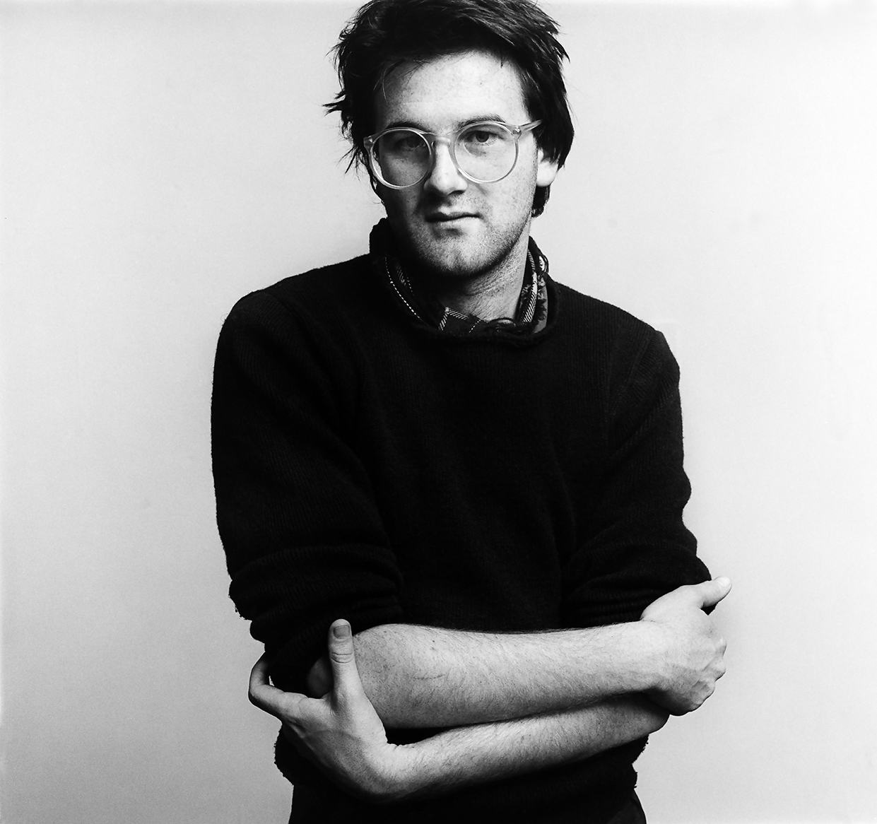
Ken Downie took this photo of me around 1987. He photographed everyone in his circle in Wellington as if we were worthy of the David Bailey Box of Pin-Ups treatment—as if photographing us like stars might make us stars. It’s weird viewing this image of myself looking so sensitive and thoughtful (when I wasn’t), unlike now (when I am).
•

Thank Christ
Here’s a view of our latest exhibition at the Institute of Modern Art, Duty of Care: Part One. It shows a controversial United Colors of Benneton ad from 1992, reproduced billboard scale. (I’m old, so I remember how edgy the ad was when it first came out.) Here, it’s accompanied by Michael Parekowhai’s 1994 sculpture Acts II on loan from Queensland Art Gallery. Its title refers to the The Acts of the Apostles from the Bible.
Benneton is an Italian knitwear brand. In the 1990s, it courted controversy with its polarising ad campaigns drawing on hot-button political issues. Its art director Oliviero Toscani often made his ads using found press images, never showing the product. By aligning itself with urgent social issues and humanitarian crises, the brand pioneered corporate virtue signalling, but also opened itself up to criticism for exploiting pain and suffering to sell sweaters. Many publications chose not to run the ads. At the time, the Benetton campaigns were widely discussed in the art world; they were part of the art discussion.
This particular ad shows a Christ-like David Kirby dying from AIDS in Ohio. It is a classic care image, showing parents tending to their dying son. The photographer and the family agreed to let Benetton use the image, to raise AIDS awareness. The original photo was in black and white, but has been coloured to give it a nostalgic, Catholic-kitsch feel. The scene recalls images of the deposition, the pieta—Christ with mourners. In a painting in the background, we can see caring Christ-like hands reaching down over the scene.
It’s a reminder of how much Christianity informs Western ideas of care.
•
The Curatorial Spotlight
For as long as I can remember, I wanted to be a contemporary art curator. I’m often asked if I ever wanted to be an artist, but I never did. I love the curator’s role. To me, curators are at the centre of contemporary art, straddling the worlds of the artist (production) and the audience (reception). We make exhibitions (like artists), but are also readers of art (like audiences). And we can be mobile in a way that artists can’t. To succeed, artists have to be invested in their brands, to perfect their oeuvres. They can’t stray far. They have to stick to their knitting even as the wheel turns, as the spotlight moves on, just in case it returns. But curators aren’t so constrained. We can be fickle, attracted to every new emerging thing. We are the spotlight.
•
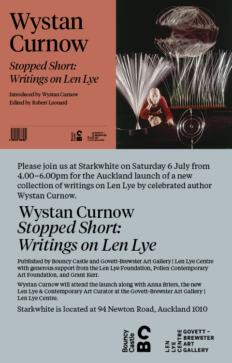
Another Day, Another Book Launch
Join us.
•
Black Mirror
Doreen Chapman’s paintings of ATM machines are one of the hits of the current Sydney Biennale; they have people talking. They are prominently installed at the entrances of each of the Biennale’s venues, where actual ATMs might once plausibly have been located, as if standing in for them. One scours the Biennale’s wall texts and catalogue in vain for clues of the artist’s purposes in making them or the curators’ purposes in including and positioning them. They remain a curious presence.
Born at Jigalong Mission in the early 1970s, Chapman primarily lives in Warralong Community and paints at Spinafex Hill Studios and Martwill Artists. Her naïve-style paintings often feature landscapes, flora and fauna, cars and aeroplanes, but ATM machines are a new subject for her. Chapman is deaf and non-verbal, and, as much as we may ponder the new works’ significance for her, she’s not telling.
Chapman’s ATM paintings are a mixed bag. Where they feature the acronym ‘ATM’ or a bank logo, the subject is clear. Where they don’t, we would be pushed to recognise the subject, without being told. The paintings have different characters. One, with chubby numerals, reminds me of Claes Oldenberg’s soft sculpture; another is more Rothkoesque.
It’s odd to see abstracted frontal views of ATMs where one might expect to find abstracted aerial views of landscapes. I imagine a gallery guide standing in front of them explaining how money works and what a PIN is, where they might otherwise be telling tales of Country.
The Biennale wall texts describe the paintings as depictions of contemporary Indigenous life. For the urbanised Biennale audience, in the EFTPOS epoch, ATMs and cash may feel like things of the just past—most of us have stopped using them. However, in remote communities, where many are poor, isolated from the internet, and live on benefits, ATMs play a big and central role. They can be few and far between and can run out of money.
I find it disorienting to see these ubiquitous, banal forms from my own culture—the mundane machinery of money—explored as mythic-poetic objects, oddly mirroring the way we are drawn to expressions of other cultures as enigmatic.
•
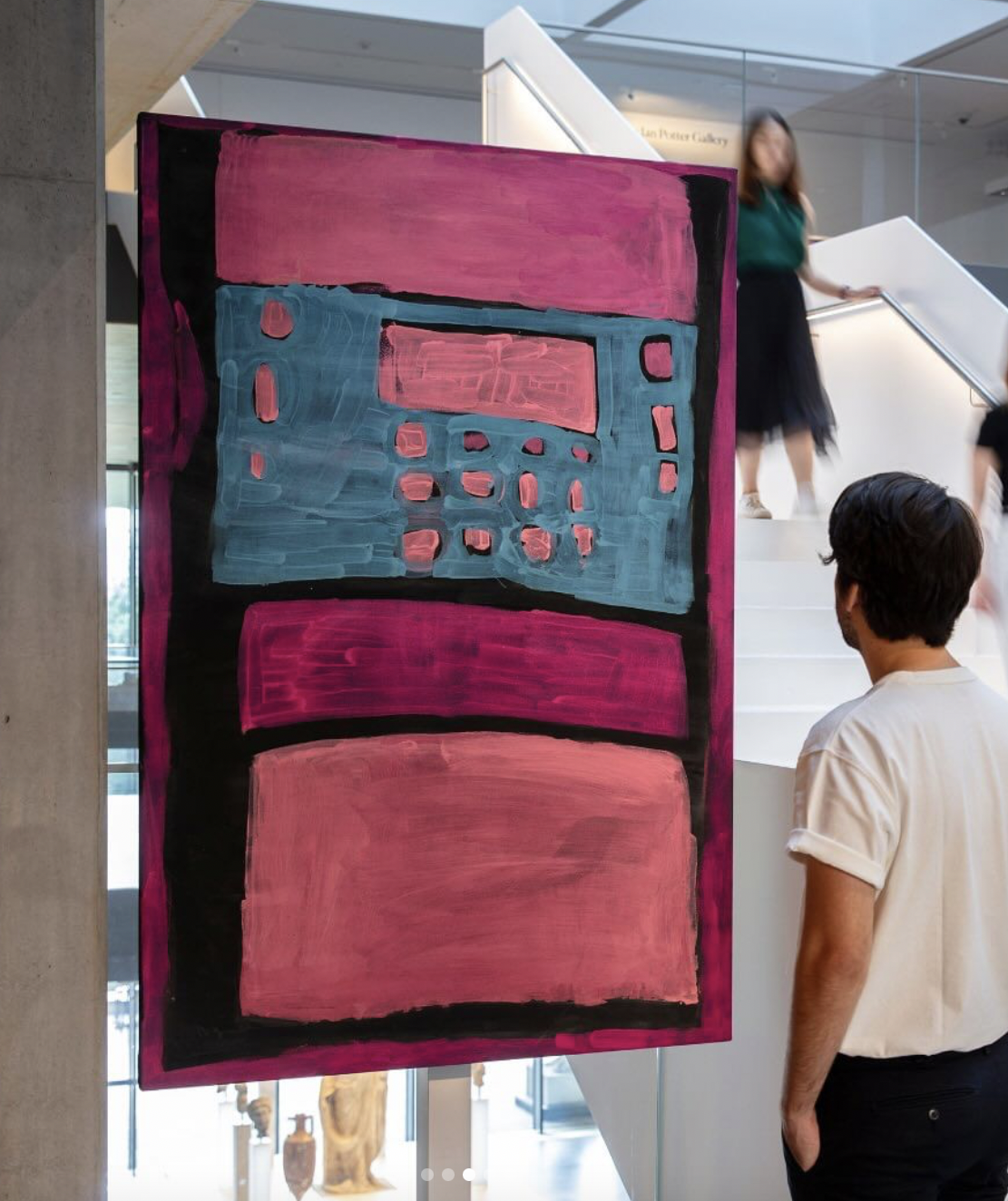
Sprezzatura
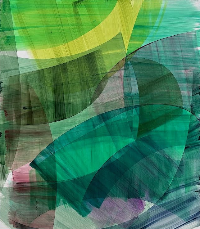
Gemma Smith’s show at Brisbane’s Milani Gallery is a breath of fresh air. At a time when our galleries are laden with issues and identity—and nothing makes sense without consulting the wall text—Smith’s immediate, joyous, eye-candy abstraction comes across as a guilty pleasure.
The Sydney artist’s work may be easy on the eye, but it’s smart. At first, I couldn’t work out how the paintings were made. I thought she may have used masking to generate the shapes. Not so. Actually, she brushes on a thin veil of colour, then shapes it by wiping off excess paint with a cloth. Then another veil is overlaid and shaped. And so on. Smith’s wipes generate arcs. The resulting forms are transparent—hard edged, yet soft and brushy.
In these paintings, everything is busy, yet light and lightness prevail. It’s all contrast and counterpoint. Paint is applied in one direction, then removed in another. There’s the movement (and implied speed) of the application, the movement (and implied speed) of the removal. Plus, there’s the optical drama built up from the interactions of lines and colours. Each work has its own distinct architecture and personality.
These are big paintings, produced up close but to be viewed from a distance. Smith’s ability to keep everything under some control while improvising at the coalface is impressive. She reconciles the geometric and the gestural—drawing and painting—in a new way. Gemma Smith: Orbits, at Milani Gallery, until 27 April.
[IMAGE: Gemma Smith Infinitely 2023]
•
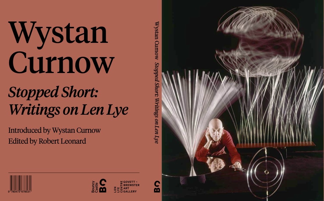
Our Third Book
Bouncy Castle’s third book, out in the New Year.
•

Knowing Me, Knowing You, A Ha …
Years ago, I was in a marketing workshop. It focused on a case study: promoting a fancy new biscuit. The instructor explained that the target market had been time-poor solo mums, hankering for a daily treat, an affordable luxury. But what to call the biscuit? They resembled Melting Moments, so he called them simply ‘Moments’. Tagline: ‘Give yourself a moment.’ He framed the biscuit as an opportunity for miserable moms to press the whole world—including their absent partners and over-present kids—out of the frame, and attend to themselves for a change. And, as people are suggestible, perhaps it worked, perhaps it became the reward: a temporal interruption in tablet form, a sugar pill, permission to enjoy. I was in two minds about the presentation, which felt cynical. Our instructor seemed to deeply understand the mindset of solo mums, but in order to exploit it. Understanding can assist us in helping others, but also in helping ourselves. Perhaps the instructor would say: everyone wins. I’m not so sure.
•
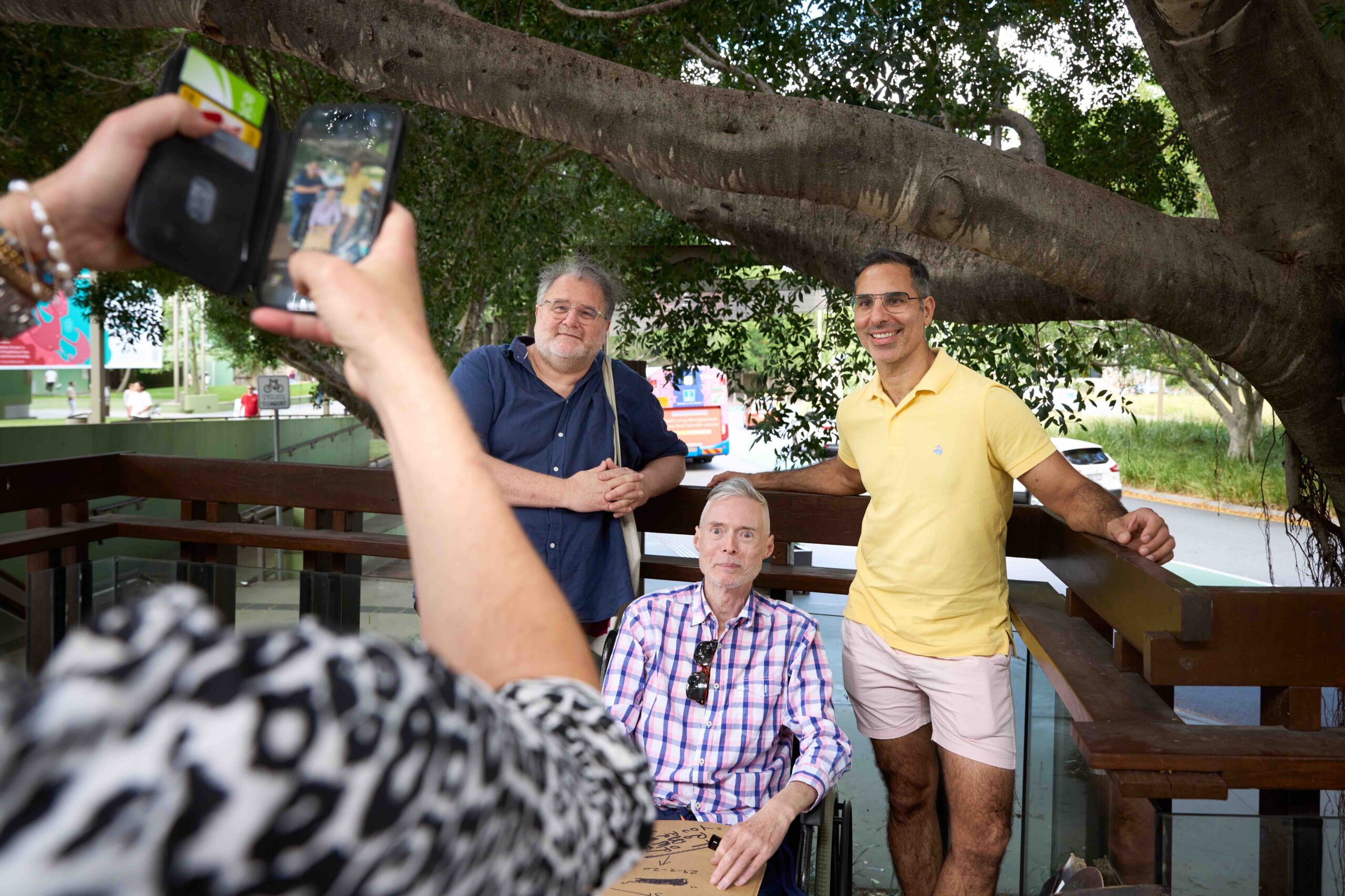
Judgement Day
Here I am, at the Scott Redford art giveaway, outside GOMA, last Saturday. It was all the fun of the fair, missing only the candyfloss. Redford was planning to hand out his freebie paintings on cardboard to people as they arrived—you get what you’re given! But, instead, he allowed everyone to rummage around and make their own selection. Good call. People were on the hunt for an overlooked masterpiece, a diamond in the rough, exercising their connoisseurship (or bias), perhaps assuming something special in the work might speak to something special in them.
As Redford gave away his works, undermining his market, it was also the first day of Living Patterns—the abstraction show at Queensland Art Gallery curated by Ellie Buttrose—which he was also in. Young artists, in town to give talks in front of their works there, then headed over to pick a free Redford. Later, at a Negroni bar in Fish Lane, their acquisitions were lined up, with the owners debating and defending their selections, discussing whose was best, the merits of gesturalism over constructivism, etcetera.
Like everyone else, I bonded with my personal pick. Redford offered to inscribe the back. Having curated his work in the past, I suggested ‘You complete me.’ He said no. What about ‘You deplete me.’? He said no. Then, spontaneously, he wrote ‘You are the wind beneath my wings.’ Redford at his most charming.
•
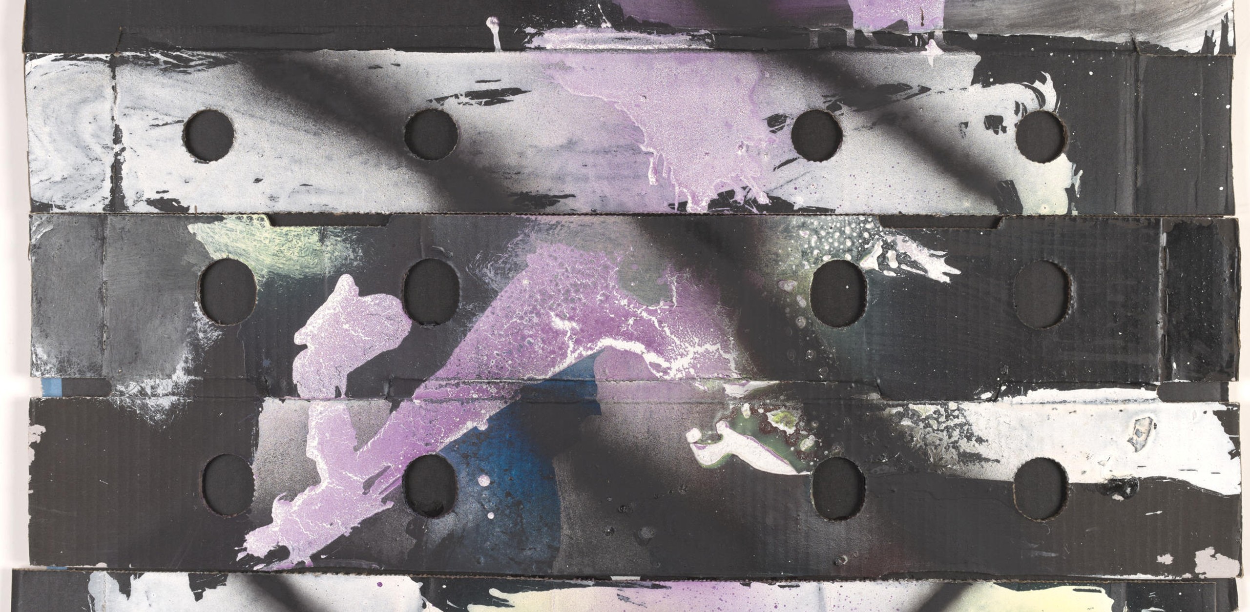
Do You Want a Piece of Scott Redford?
On Saturday—the opening day of Queensland Art Gallery’s show Living Patterns: Contemporary Australian Abstraction—pop-punk provocateur Scott Redford will be outside, bringing abstraction to the people.
Redford made his Iso Paintings over several years, including during Covid lockdowns. But now he’s combating isolation, reconnecting with the people, by giving away the lot for free, from 10am on the Gallery of Modern Art forecourt. But only one painting per person—don’t be greedy! And you must agree to be photographed with your new acquisition—quid pro quo! His booth closes at 4pm or when there are no works left—so come early.
While you’re on campus, take the opportunity to see Living Patterns. It includes Redford’s giant work Reinhardt Dammn: Things the Mind Already Knows (2010). This fact frames Redford’s forecourt giveaway stunt—him being at once inside the institution and out, an insider outsider, ever in two minds.
•