Exhibition making is constrained by logistics: space, time, and the laws of physics; contacts, politics, and money. There are artists and lenders to convince, bills to be paid. Status is important in securing work. Artists, galleries, and collections make judgement calls about where their work is placed. Everyone wants to enhance their reputation, their cultural capital.
It’s easy to put works in conversation in a slide lecture or reproduced in a book. It’s another thing to bring them together in a room. Art works tend to be more-or-less unique things, which have to be sourced, transported, insured, invigilated, and returned. Here’s a great example …
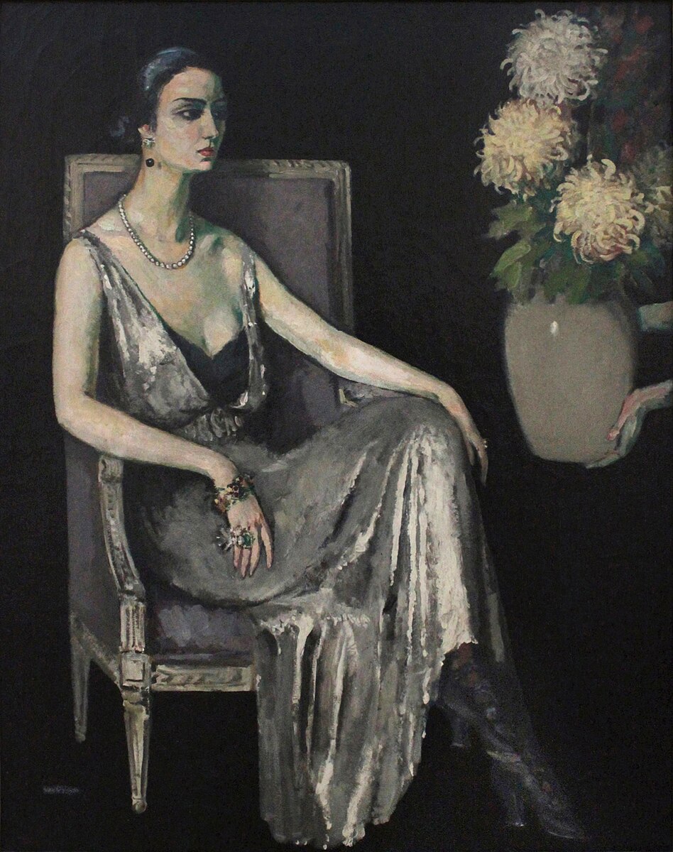
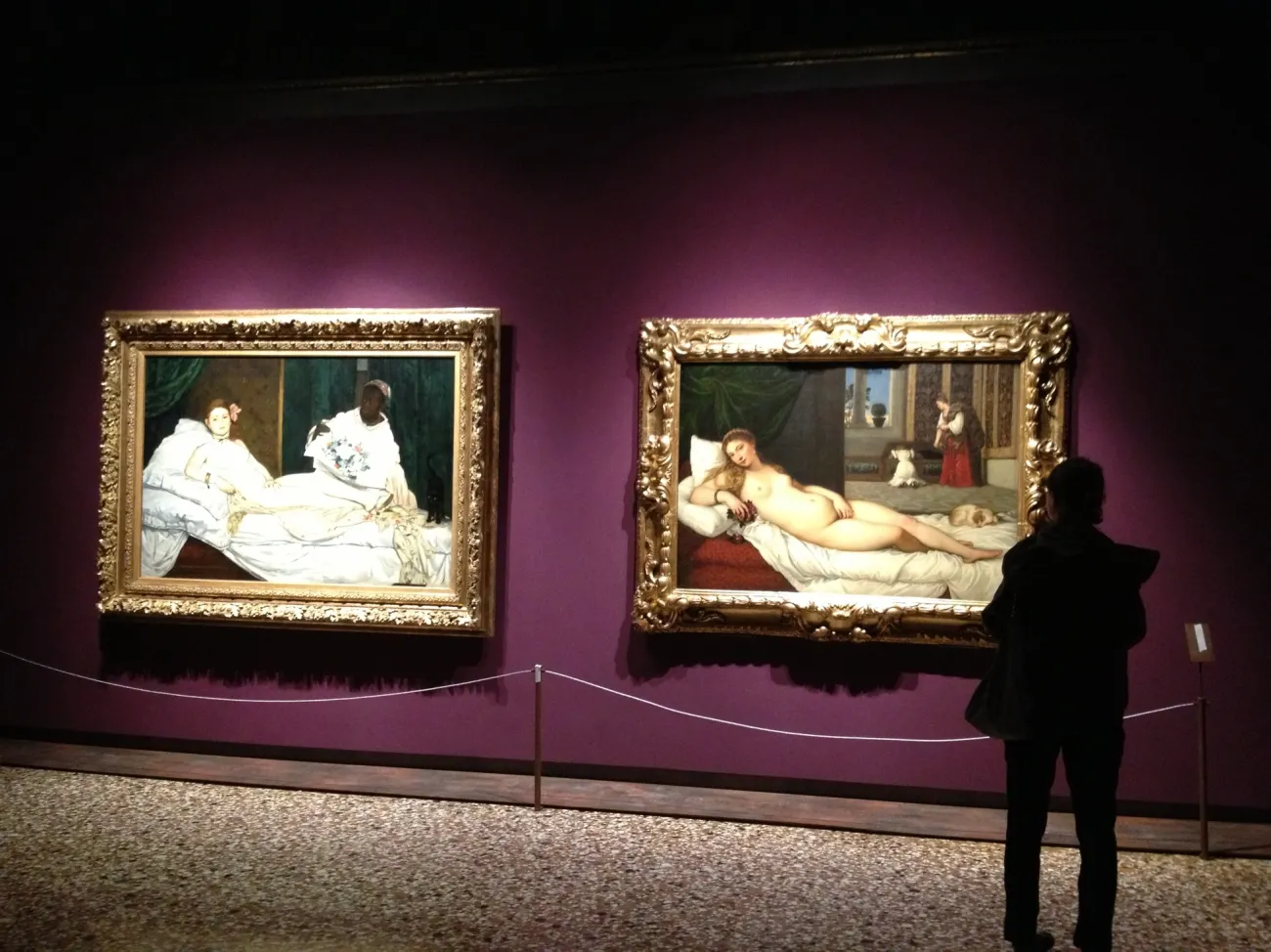
One of art history’s classic cause-and-effects, compare-and-contrasts, is the pairing of Titian’s Venus d’Urbino (1538) from the Uffizi in Florence and Manet’s Olympia (1863) from the Musee D’Orsay in Paris. Manet knew the Titian, though perhaps not in the flesh. He was riffing on it, updating it, 325 years later, replacing a goddess with a prostitute. The point is made in so many slide lectures and art history texts as to have become a cliché. However, the works themselves had never shared a wall.
So it was shocking to step into the exhibition Manet in Venice in the Doge’s Palace in 2013, during the Venice Biennale, and see these two unique works finally brought together in the flesh. As they are roughly the same size and proportions, it looked like the classic two-projector art-history comparison. It looked great, obvious, but as a curator I was too aware of the epic negotiation and complexity involved in making this juxtaposition of priceless works happen.
•