Vault, no. 51, 2025.
_
Jarrod van der Ryken’s video installations are odes to cruising and cottaging. In the past, the Meanjin/Brisbane artist has staged them in grungy spaces that already suggest out-of-the-way spots where guys might share a quiet moment. In 2022 he used the rough-and-ready Wreckers Artspace for Could It Be Found in Gardens of Dust? and in 2024 the graffitied, unclad Besser-block bunker of Milani Carpark for The Buds on the Trees and the Night Were Still. On both occasions, he inserted video footage into these unlikely spaces. Quivering between prosaic and poetic, his languid long takes of benign unpeopled details were occasionally interrupted with more sexually suggestive shots.
In creating That Night They Went Out Painting, his latest work, for the Institute of Modern Art’s new-artists exhibition Platform 2025, Van der Ryken had a problem: a neutral space, offering little to riff off. His solution was to construct a set to situate his videos within, importing aesthetic features that were part and parcel at Wreckers and Carpark into the white cube. The gallery walls were painted black; lighting was low, moody. (He would have preferred no lights at all, suggesting visitors could use their phone torches to find their way.) He enlisted local graffiti artists to tag the walls with shiny black spray paint. (An early plan was to scatter spray cans through the gallery, so visitors could add their own tags to the walls.) In the space, he built two floor-to-ceiling walls. The first, rendered in concrete, had an incongruously graffiti-covered door in the centre, which you could open and pass through. The other was clad in corrugated steel on one side; Gib on the other, with a framed photo hung on it. In places, framing was exposed and cladding torn. Between the walls, Van der Ryken arranged freestanding metal-mesh building-site barriers covered in scrim, also layered with graffiti. It all had a transitional demolition-site/construction-site vibe.
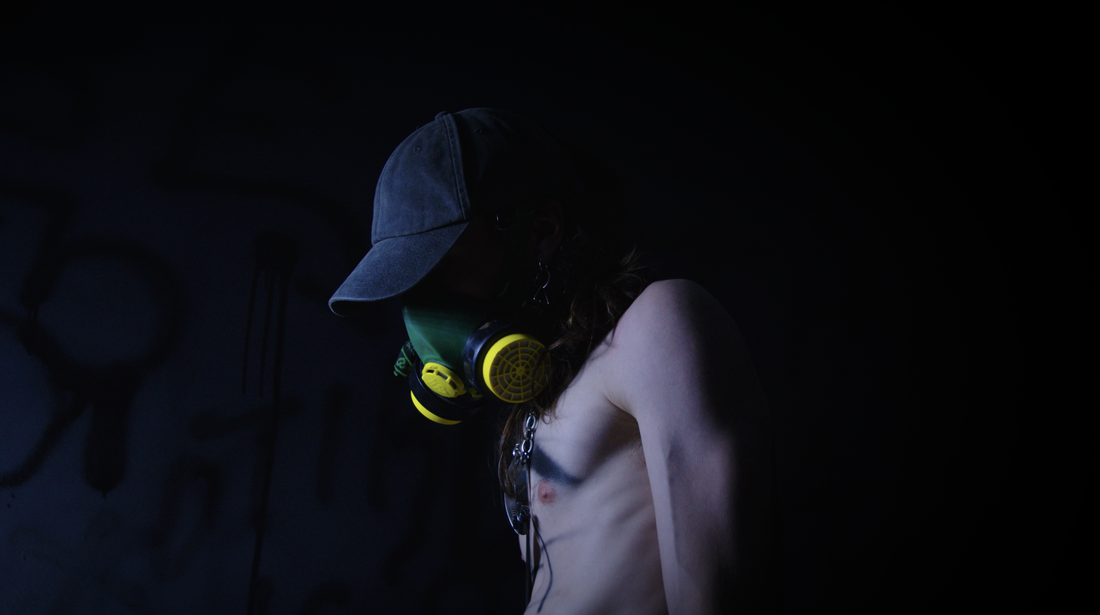
Two large flatscreens hung on the barriers, and a third on one of the new walls. Two kinds of footage were intercut across all three. There were close-ups of luminous flowers in the artist’s swampy New Farm back yard at night. And there were equally lingering shots, made within the installation earlier, some showing crime-scene details, including a forlorn, spent spray can, and some the man himself, semi-naked, not moving, lurking. In one shot, he wore a respirator, presumably to protect him from spray-paint fumes, but making him look creepy and menacing nevertheless. All the images were filmed under flickering fairy lights and synced up, so they pulsed as one.
Three details offered keys.
First. The door in the wall was the first thing viewers would likely encounter, inviting them, double daring them, to open it and walk through, to cross the threshold. But, if they felt timid or cautious, they could just as easily walk around the wall. Like the one in Franz Kafka’s The Trial, this door created anxiety and uncertainty, symbolising both access and exclusion.
Second. A full-length framed mirror leant casually against a gallery wall. Its rotting silver backing was further compromised with an ejaculation of spray paint on its face. It seemed perverse, to offer us a mirror we couldn’t see ourselves in. Perhaps he had already gotten off while watching himself in it, desecrating it. (On the gallery walls, Van der Ryken had also created several ‘flowers’, by disgorging the contents of a spray can at a single point, until the fine spray became liquid dribble.)
Third. That framed photo. It showed a magazine The Exhibitionist—its cover featuring a black-and-white reproduction of Michelangelo’s David—pinned to, we’re told, a Berlin apartment wall. It was an in-joke. It suggested niche pornography, but The Exhibitionist is an art-curators trade journal, boring as batshit. It’s risqué effect here, its innuendo, turned entirely on misrecognition.
Van der Ryken’s walk-on-the-wild-side installation linked illegalities: tagging and dogging. But, while it suggested danger, it dwelt lovingly, tenderly, on the details. If the space was dank, it was also womblike. If the flowers were potentially toxic (maybe psychotropic), they were also beautiful. The synthesiser soundtrack went from chilling to lulling, once you tuned in to it. Van der Ryken found a perverse poetry in ruin and squalor, balancing romantic and raw, enticing and repellent, safe and unsafe.
The work was underpinned by narcissism. In the video, Van der Ryken—pallid, lithe, and fashionably dissipated—reminded me of another show off, the early American photographer F. Holland Day, who starved himself so he could play the crucified Christ in his soft-focus pictorialist photos. While Van der Ryken’s work implied a space of risky encounter, we didn’t see any encounters. Instead, we found him in his lair, perhaps engaged in masturbatory activities—perhaps solitary, perhaps exhibitionist—though we never quite knew what we were seeing. Our relation to him was unclear, obscured like that mirror. Was he predator or prey, sadist or masochist? Had we unwittingly uncovered him in his masturbatorium, or had he lured us to this point, with no trigger warning, to show off? Where was the power, the agency?
Van der Ryken had brought in local graffiti artists to do the tagging, to guarantee some authenticity. He said he didn’t want the work to look like a theatre set, mocked up. But I liked the idea that his installation felt a little artificial, like a carefully contrived trap. It added to the unease. I recalled Marcel Duchamp’s notorious last work Étant Donnés (1966), where, through a peephole, typically unwitting viewers spy an obscenely splayed and clammy female nude—this vision staged in advance, frozen like a handcoloured postcard, perfectly pervy but equally repellant. Similarly, Van der Ryken made us into voyeurs, like it or not. Was this for his pleasure or ours? Or was the feeling mutual?
Van der Ryken described himself and the work as queer, but I wonder: Who was it designed for? Was it addressed to fellow queer people or to straights—as a nod to insiders in solidarity or to titillate and torment tourists? Could Van der Ryken himself be some kind of tourist, indulging his own fantasies of otherness? Who was getting off, and who was along for the ride?
[IMAGE: Jarrod van der Ryken That Night They Went Out Painting 2025.]