Robert Leonard

Contemporary Art Writer And Curator

Brent Harris: Hidden Figures

Here, no. 20, 2023.
—


It’s 1975. Brent Harris—just nineteen—is transfixed before a Colin McCahon painting, The Family (1947). It’s hanging in Manawatu Art Gallery, in Harris’s hometown, Palmerston North. In the painting, a man looks towards a woman; she looks the other way. They are estranged, disconnected. She’s suckling a baby; its needy face disappearing into her breast. The man’s and the baby’s faces are foreshortened, featureless—they rhyme. The trio appear homeless—like refugees—in a cold, unforgiving landscape. Does this miserable painting refer to the Holy Family, to some ur-family, to McCahon’s own family, or all the above? The grim scene spoke to Harris, who was beginning to process his own family issues—a monstrous father. 

In 1975, Harris also got married, but he didn’t take to the life. Three years later, he’d left his wife, escaped to Auckland, and come out. ‘She was talking about babies, so I ran off’, he confesses. ‘In Auckland, I met a range of gay men who opened up a different cultural life for me, something not available to me in the Palmerston North of that time.’ Harris did art courses at Outreach on Ponsonby Road. In 1981, he crossed the ditch to follow a lover. The next year, he enrolled at Melbourne’s Victorian College of the Arts. As he studied, AIDS loomed large in his community. ‘I was a mess’, he says. ‘There were two castrating influences in my life: my father, then AIDS.’

The virus would inform his work. In 1989, he unveiled his fourteen-painting cycle The Stations of the Cross to critical and commercial acclaim. A classic subject in Catholic art, the Stations prompt us to meditate on the passage of Christ’s passion, crucifixion, and death. For Harris, it was a readymade AIDS narrative. ‘Christ was only thirty-three. If you’re an old person going to your death, you’re probably not fighting so much’, Harris says. ‘But Christ falls three times and each time his ego is reduced a bit more. I saw that, watching my young friends die. And station five is “Simon helps Jesus to carry the cross”. Well, we all carry the burden of each other’s death and we certainly did then.’ 

The Stations had been explored by American abstract expressionist Barnett Newman in the late 1950s and 1960s, and by McCahon in the 1960s and 1970s. Harris riffed off both. He represented the journey in a series of large canvases, where black-and-white geometric elements—with nods to Newman, McCahon, Malevich, and others—emblematised each step. It was a time of postmodern irony, and Harris played on the tension between his work’s heavy themes and cool quotation.

In the early 1990s, Harris veered away from abstraction. ‘I’d been working on these charcoal drawings of dots, very abstract, very minimal, when this stupid elephant trunk appeared.’ He went with the rude irruption, titling the resulting paintings Appalling Moment. He says, ‘At that moment, things opened up. The body entered in a more playful, sometimes threatening way. Abstract forms suggested body parts, penis, scrotum, breast, anus.’ The work became figurative, but hardly realistic. 

Harris may have been estranged from his parents, but they haunted his art. Between 2001 and 2009, Harris developed his epic twenty-six painting Grotesquerie series, exorcising his demons. These psychodrama scenes are full of figure-ground games and duck-rabbit problems. They star a devilish, horned father and a faceless, fleshy mother, whose coiffure suggests a hidden face—the father, perhaps. In one work, the father devolves into silhouettes of stylised children turning away from him and each other. However, the negative space between them suggests a contradictory figure, whose needy arms are outstretched towards the father. In some images, the negative space around the mother’s body suggests a suckling mouth. In one, the father seems to suck on a penis-like protrusion from a limbless, headless body, whose bumps suggest both breasts and testes. Father and mother, male and female, balls and breasts, penis and nipple get royally scrambled in this primal-scene confusion. 

Despite the psychological mayhem so cooly represented in his art, Harris’s home life is rather stable, even routine. He’s been with his partner, Andrew Browne, another successful painter, for twenty-three years. They are fixtures on the Melbourne scene. ‘We both got into Gertrude Street in 1987’, Harris says. ‘Andrew was with a girl then. We got together thirteen years later, in 2000. Now, we eat together, sleep together, work together. In Melbourne, we both show at Tolarno.’ About twelve years ago, they bought a studio together, near their house in Fitzroy. Browne spotted the two-storey commercial space. ‘We’ve got about 120 square metres each. I’m upstairs. I get a bit more light than Andrew.’

In Harris’s works, forms reiterate and morph to generate suggestive scenarios, but they also leave space for us to project ourselves into them. ‘I make weird twists and turns, but my collectors continue to engage’, he says. 

His works are complex. First, there’s a soul-searching aspect. Harris uses automatic drawing to conjure up images from his psyche, like finding faces in the fire. ‘I would take two or three of my monoprints to my shrink and we’d chew them over’, he recalls.

Second, as his motifs migrate from the drawings, small studies, and monoprints into the big refined paintings and prints, they become slick, graphic, pop. A nagging emotional disconnect between subject and treatment emerges, harking back to McCahon in the late 1940s, rendering trauma in the jaunty language of comics.

Third, there’s a self-conscious but restless riffing on art history. Goya, Munch, McCahon, and Bourgeois are compass points.

In 2016, Harris’s father died and finally he felt able to return to New Zealand, to reconnect. In 2018, he had his first show with Wellington’s Robert Heald Gallery. That year, he also gave a large selection of his prints to Christchurch Art Gallery. Harris has always been a prolific printmaker, owing to the early encouragement of James Mollison, the legendary inaugural director of the National Gallery of Australia. ‘James made the point that institutions can easily hold works on paper spanning an artist’s career and that I should get on with printmaking.’ Harris held back examples of most of his prints to give to a New Zealand museum one day. In 2019, Christchurch mounted Towards the Swamp, showing the prints and a recently acquired painting.

Harris’s relationship with Heald has proven solid. He’s had three stunning solo shows with Heald in the capital, plus a memorable two hander with Susan King at Heald’s booth at the 2018 Auckland Art Fair. In 2022, Harris unveiled a second series of Stations at Heald. They are so different. Where the first set is black-and-white, the second is fleshy pink. Where the first is abstract, the second is figurative, even illustrative, looking back to McCahon’s earlier works of the late 1940s. ‘I worked on them during Covid, and it was the perfect isolated, inward kind of moment. I keep saying that I’m not religious, but I guess every religion is just trying to understand death.’

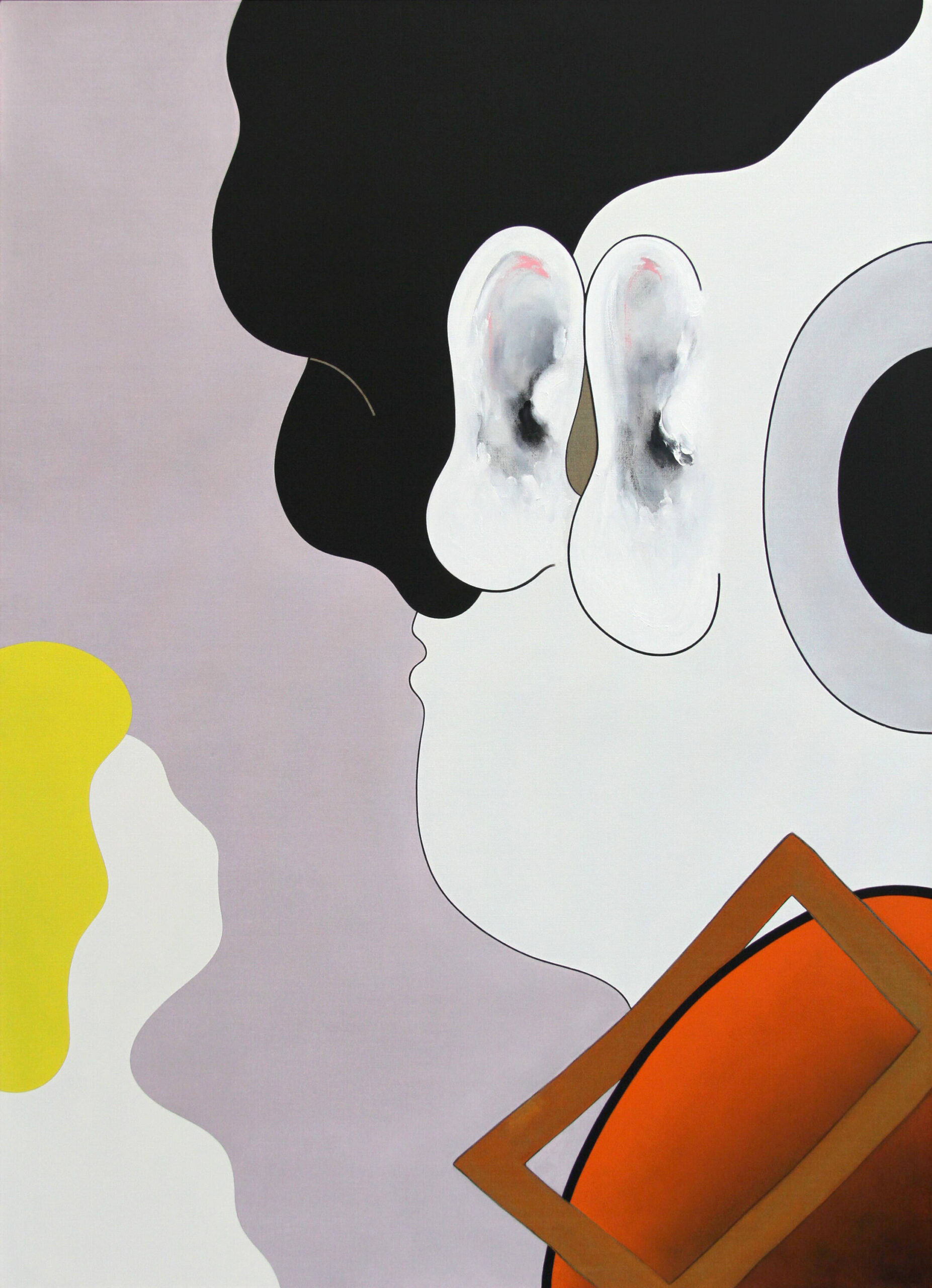
Harris’s repatriation campaign has now climaxed in a survey show, The Other Side at Auckland Art Gallery, which opened in May. The hero image is Listener (2018). Harris painted it after his father died. It riffs on those foreshortened faces from McCahon’s The Family. ‘It’s a self-portrait’, Harris explains. ‘It’s got two big ears together, my ears, replacing eyes. I’m waiting to hear something’—an apology?—’but it never comes.’ Harris’s deranged Picassoid self portrait also has a picture frame or painting stretcher—a cross? a chip?—on its shoulder, and a big cyclops eye. ‘My mother is down low in the corner. She’s mute, as my mother was. And now, the father’s face is forming in my hair’, he explains.

Australian audiences have watched Harris’s complex oeuvre gently unfold, chapter by chapter, but New Zealand audiences are coming up to speed with it all at once, so it’ll be interesting to see how The Other Side is received. Harris’s work may be new to us, only arriving on our doorstep now, but he’s an older artist, with his roots in the last century. Nevertheless, I expect a younger audience will gravitate to his work, partly because he’s not part of the inherited New Zealand art canon, at least not yet. Three of his paintings found their way into Mānawatia Takatāpui/Defending Plurality, curated by Shannon Novak at Tauranga Art Gallery in 2021. I asked Harris how he felt about being conscripted into a new queer moment. ‘I’m really not queer enough’, he replied. ‘I’m just a standard old homo.’


[IMAGE: Brent Harris Listener 2018]

Michael Zavros: The Devil’s in the Detail

Michael Zavros: The Favourite (Brisbane: Queensland Art Gallery, 2023).
–


21 October 2022. It was a dark and stormy night—unusual for Brisbane. My flight from Wellington had been delayed, so I had to get changed in the cab. I was racing into Fortitude Valley to catch openings by two local-hero artists running simultaneously—200 metres apart in reality, worlds apart artistically. Philip Bacon was unveiling Michael Zavros’s new show, Thomas Sees a Lion. Around the corner, the Institute of Modern Art was launching its survey of Waanyi artist Gordon Hookey. Zavros was offering deft photo-realist still lifes, where vases of flowers are arranged to suggest rabbits and jellyfish, while Hookey’s paintings were all politics—cartoony, riddled with slogans. The shows were chalk and cheese, but each had its own distinct fan base. A few of us in the business—with feet and friends in both camps—happily shuffled back and forth between them. It was a great chance to reflect on Zavros’s work in context and on the way it has riffed on art-world dynamics. 

In the late 1990s, Michael Zavros seemed to arrive effortlessly, fully formed. Graduating from Queensland College of Art in Brisbane in 1996, he quickly found fame as a photorealist painter, rendering fashion-plate images of men in designer suits and shiny shoes, on the runway and doing deals. These sartorial studies were jewels, often small enough to hold in your hand. For me, they recalled Robert Longo’s photorealist Men in the Cities (1977–83), which showed young Wall Street types contorted as if dancing or dying, while eschewing that dystopian dimension. Zavros’s images came direct from fashion magazines, unfazed, unapologetically fusing beauty and authority, power and privilege. They established his MO: paint beautiful things beautifully, no apology, no alibi. As he continued, Zavros’s canon of quality subjects expanded to include thoroughbred horses, peacocks, and pedigree Onagadori chickens; period rooms and contemporary interiors; formal gardens and follies; jewels and perfume bottles; luxury cars and luxury handbags. His oeuvre became a world unto itself—choice bits of the real world, insulated from the real-world squalor that made them possible. 

Zavros became a golden boy. He won prizes: the Moran in 2010, the Bulgari in 2012, the Mossman in 2016. His projects were successful and about his success. For the 2014 Melbourne Art Fair, he had male models, the Stenmark twins, dispense gold-coin MZ-monogram chocolates from a Rolls Royce Wraith. In 2016, he titled his Philip Bacon show A Million Dollars Exhibition. He and his curator-writer wife Alison Kubler became celebrities, society-page staples, wormholes between the garret and the gala. Everything Zavros did seemed to be news. He was favoured. He was commissioned to paint Governor-General Quentin Bryce and war hero Ben Roberts-Smith. 

As his fame and fortune grew, Zavros’s work seemed less aspirational, more autobiographical, illustrating the good life he could now live. Into his work, he incorporated references to his own trophy possessions and to himself. As a svelte, handsome man, he fitted seamlessly into his own pantheon of beauty and privilege. His self portrait V12/Narcissus (2009)—showing him reflecting on and reflected in his Mercedes—referred to the myth of a beautiful boy fatally seduced by his own reflection. Short-circuiting subject and object, it made an analogy between the self-satisfied artist enjoying his reflection in his new car and the self-satisfied collector-owner who might admire themself reflected in his painting. Versailles’s Hall of Mirrors would become a favoured Zavros subject, his whole oeuvre became a metaphorical hall of mirrors, with each subject reflected in all the others. In 2009, he presented a show of drawings of designer handbags alongside actual designer handbags in Jean Brown, a Brisbane designer-handbag store. Reality and representation had become interchangeable.

When I was Director at the Institute of Modern Art in the late 2000s, early 2010s, Zavros was a talking point. Some loved him (and what he represented), some hated him (and what he represented). For his lovers, his work affirmed their idea of art (beauty, luxury, craft, privilege); for his haters, it was everything art shouldn’t be (beauty, luxury, craft, privilege). His fans couldn’t get enough; his haters had had enough—they burred up with every new glossy-magazine column inch toasting his refined art, his charmed life, and his picture-perfect family, and resented him hogging the limelight. He was not their people. 

In 2010, at the Institute, I made a show with Zavros, partly because—as an avant-garde outpost—it was the last thing we were supposed to do, and, to me, that seemed interesting. That year, Zavros began incorporating his kids into his art, starting with his first, daughter Phoebe. ‘She was wanting to be very grown up and she would act like a little lady and she wear these little plastic heels that we got her from Crazy Clarks and she liked to put on makeup’, he said. ‘She would regard herself in the mirror, or she would pose for you in front of the camera.’ 

My IMA show—a two-hander with Scott Redford—included Zavros’s first video, We Dance in the Studio (To that Shit on the Radio) (2010). It found the artist painting in his studio accompanied by the five-year-old—in a tutu, shades, and Mouseketeer hat— in front of a mirror, dancing and posing to Lady Gaga’s hit ‘Paparazzi’. The work was observational, recording something his ‘little monster’ already did instinctively, as if it were in her nature not her nurture, while nevertheless embodying her family’s upmarket lifestyle. A chip off the old block, she performed Zavros’s thesis for him as he continued painting in the background, as though her innocent childish narcissism legitimised his studied adult narcissism—because maybe she was ‘born this way’.

Phoebe also played dead a lot. Zavros made a painting of her doing so, wrapped in an Alexander McQueen skull scarf. Phoebe Is Dead / McQueen (2010) was provocative, combining a status symbol (that shroud scarf) with real tragedy (McQueen had just killed himself). Perhaps it suggested fashion’s transcendental power, perhaps not. Perhaps it suggested neglect, perhaps not. The work certainly revolved around a Catch–22: those who want to protect children are always imagining—fantasising—terrible things that might befall them. 

Zavros would paint precocious Pheobe, showing off in Tom Ford and Linda Farrow sunglasses, playing a mermaid, wearing fur coats too big for her, munching on jewellery—always an attention seeker. In the giant portrait Amore (2018), her exaggerated hair and fire-engine-red lipstick suggest a child impatient to be an adult. She was only 14 and obsessed with YouTube makeup tutorials. While these images were based on observation of what Phoebe already did, they were also what Zavros chose to paint, for his own reasons. 

Zavros would go on to make similarly coy paintings, photos, and videos of son Leo, often bare bodied, wearing a rainbow wig, bathing, posing before a fan, and swamped in an adult jacket. In White Crash (2019), however, Leo stands in front of a smashed-up white luxury SUV looking troubled, with storm clouds reflected in its tinted windows—for Zavros, a rare critique of white privilege and status. 

Zavros began picturing his children during a time of moral panic around the depiction of children in art. In 2008, the Australian art scene was paralysed by the wildfire controversy over Bill Henson’s photos of under-age subjects. Zavros was on the Visual Arts Board of the Australia Council when it drafted its Protocols for Working with Children in Art in response. So he knowingly chose to work in this hot-potato area, as a commentary on it. Taking pleasure in his children’s beauty and coquetry, investing his vanity in theirs, he plays on line calls between child and adult, innocent and knowing, raising questions about parenting and privilege. These works split audiences. Some find them creepy, others charming, but so much is in the eye of the beholder. 

Occasionally, works have stirred up trouble. In 2021, HOTA—the new art museum on the Gold Coast, Zavros’s hometown—opened with a collection show, including his painting Zeus/Zavros (2018), a recent acquisition. It showed Phoebe and Leo in their backyard pool cavorting with an inflatable-swan pool toy. There were calls forthe painting be taken down, because, it was claimed, in baring Leo’s bottom, it promoted peadophilia. To most, however, the painting would have seemed entirely benign. ‘What’s the problem?’, I thought. ‘Aren’t art museums where we expect to see bums. Putti, cherubs, and cupids are staples of Old-Master art. So why make an example of Zavros? ‘

However, strangely, throughout this mini-furore, angered parties failed to mention the work’s provocative title. Zeus/Zavros was a nod to Greek mythology. According to legend, the god Zeus metamorphosed into a swan to ‘rape’ Leda. In the Renaissance, the erotic implications of the tale energised works by Leonardo da Vinci, Michelangelo, and others. Read through its title, Zavros’s painting becomes more ominous. Phoebe hangs from the neck of the inflatable-swan pool toy, vulnerable, while Leo rides on its back, as if Zeus in hiding. Into this more-or-less idyllic suburban scene, where his own children are the subjects, the title introduces suggestions of child sexuality, violation, and incest. But it’s the framing title that surely adds the trouble, not what is shown. It’s meta—a double entendre. (I’m reminded of Paolo Veronese, who took the opposite route, escaping a heresy charge by retitling his dodgy 1573 Last Supper painting The Feast in the House of Levi.)

Of late, Zavros’s work has itself polarised, splitting into two paths. He continues to produce immaculate paintings, including those deft still lifes beloved by collectors, but he’s also developed a flair for self parody, as if reaching out to his haters. In 2020, he made a funny video for Griffith University’s online Lockdown Studio series, taking the piss out of himself, while nevertheless presuming his persona and lifestyle were familiar to all. To a Vivaldi soundtrack, he appears in his lavish studio in a dressing gown, stating, proudly, ‘I’m making a painting that will go into a museum show in Germany next year. Today I’m painting the water. I love painting water.’ As the kids couldn’t go to school, they joined him in the studio. Zavros claims to support their free expression—‘We are all artists here.’—but we witness his distain at their lame efforts. Pets—Mars the cat and Finch Farm Bono the horse—have also invaded the studio. Leo holds up Mars so Zavros can paint him, asleep under the tyre of a red Merc—as if roadkill in waiting. The film is attributed to daughter Olympia.

The Dad works addresses those who complain that Zavros is superficial, plastic, in love with himself, Mr Perfect. Zavros talks about Dad as a sharper version of himself, but the dummy looks dead and dopey, with stiff poses and a vacant expression. And the detachable head is a giveaway. One journalist described it as the garrotted-Ken-Doll look. To me, much of Zavros’s description of these works is wilful misdirection. They play on the idea that he is a narcissist, in love with himself, but undermine the fantasy. 

When Sydney gallery Sullivan and Strumpf presented the Dad images in a solo show in late 2020, it released a promo video, which I like to think of as a work in itself. It’s even more off-putting, more tragic, than the photos. After we see the artist tending his horses, he confronts his substitute. We hear him explaining, deadpan, ‘I’d call him Dad, that strange word that replaced my name, and in some way replaced me. Maybe he’ll be a good dad, an engaged one, a listener. The kids would love him.’ Then we join Dad at the dinner table with the kids, as they continue, either preferring the plastic version or oblivious to the difference, as the real Zavros looks on from afar. 

The Dad works play on the repugnance that emerges from the ‘uncanny valley’, when lifeless representations appear almost lifelike. They also nod to fairy tales like Pinocchio and android movies like Ex Machina that channel the pathos of artificial beings, desiring agency and status in the world. The Dad works are weird and confusing, generating interference patterns. They may have been a bridge too far for the artist’s loyal buyer base,

5 November 2022. I’m back in New Zealand, and Zavros has just Instagrammed me a new photo, Rom Com, asking what I think. Dad and Phoebe stand back to back. Over her shoulder, she yanks him by the tie—perhaps throttling him. She looks at the camera, at us, smiling; he looks dopey, with dead eyes. The work’s a power play—it’s about agency. Phoebe is now grown up and seems to be getting the better of her father. Now, it’s like she’s in charge, running the show. Of course, the real Michael Zavros is standing behind the camera, directing the action. So maybe he’s still in charge, perhaps getting some perverse thrill from seeing his avatar bested (albeit by his own flesh and blood).

The image is familiar. I know I’ve seen it somewhere before. Of course! It’s based on the promo image for the film Pretty Woman, with Dad replacing Richard Gere (as Edward Lewis) and Phoebe replacing Julia Roberts (as Vivian Ward). That rather twists things. Pretty Woman was made in 1990, a lifetime ago, fifteen years before Phoebe was born. Ward, an LA streetwalker, is picked up by Lewis, a bored corporate raider who needs some arm candy for upcoming social events. But they fall in love: ‘She walked off the street, into his life and stole his heart’, reads the tagline. The film was a huge hit, cementing Roberts’s career, even if the story was implausible, eliding the grubby, uneven power dynamics necessitated by such exchanges in reality. That’s what made it magical. 

Zavros’s work here is about intertextuality. Trying to read his photo through Pretty Woman sends my brain into a tail spin of contradictory thoughts. Having Lewis and Ward played by Dad and Phoebe triggers uncomfortable incest overtones, if your mind goes there—mine does. I’m reminded of ‘Something Stupid’, the love-song duet by father Frank and daughter Nancy Sinatra that went to number one in 1967. (Interestingly, atthe time of Pretty Woman’s release, Gere was 40, Roberts just 22, but the age difference was largely overlooked.) In the Pretty Woman poster, Gere’s in a suit while Roberts wears kinky thigh-high boots—business attire for both. But, in the Zavros image, Dad’s in a suit and Phoebe’s in a neutral white blouse and a demure long black skirt. If either party is sexualised, perhaps it’s Dad, who’s become a doll, a passive object to play with, a psychological chew toy.

Is the photo a feminist statement? Ward and Phoebe grabb Lewis and Dad by their ties—their phallic symbols. Or is that a coy conceit—just another male fantasy? (Zavros has make paintings of foppish designer ties, standing upright, like cobras ready to strike.) In the photo, Phoebe eyes the camera and us, and smiles. But isshe in on the joke? From where she’s standing, in front of the camera, does she know she’s being directed into the Pretty Woman promo pose? Is the film even a reference point for her? We can only guess. 

Zavros has said he thinks of his Phoebe images as self portraits. Perhaps Dad and Phoebe are both facets of him. I wonder, then, if this work might also be read in terms of his own rags-to-riches Cinderella story, as a Greek kid on the Gold Coast, seduced by fashion, aspiring to a perfect art-life. 

On Instagram, Rom Com was accompanied by a note: ‘What do you think? Should I put it in the Queensland Art Gallery show?’ I replied: ‘Why not? They can only execute you once.’

The Last Word

Artlines (Queensland Art Gallery).
_


Every issue, we invite an artist, curator or friend of the Gallery to share their practice and passions with us. Here, Artlines spoke with curator Robert Leonard, who recently re-joined Brisbane’s Institute of Modern Art as Director (for a second time), and whose career spans more than thirty years of curatorial, publishing, and gallery directorship experience.


Explain the essence of your practice.


I’m an art curator, an exhibition maker. I make shows out of curiosity. I trained at the National Art Gallery in New Zealand in the mid-1980s, where I worked directly with collections, rather than with artists—which would come later. Curators occupy a central place in art, straddling art production (the realm of the artist) and art reception (the realm of the viewer).


Where did you grow up and how do you think this has influenced your practice?


I grew up in Auckland in the late 1960s and 1970s. I had a monocultural upbringing. Television was our window on the world—British and American programs—on just two channels. Magazines took months to arrive by sea and were full of ads for stuff we couldn’t buy. My parents hadn’t been to university and weren’t cultured, but my father did take me to the MoMA Surrealism show at Auckland Art City Gallery when I was nine. Other than that, I came to art through the public library, through art books.


Describe your work area.


I work on a laptop, lying on the couch at home or sitting at tables in cafés. I got thrown out of a café recently for ‘treating it as an office’.


What, if anything, do you listen to while you work?


At home, I work with the TV on. It really doesn’t matter what, so long as I can vaguely follow it or totally ignore it, without getting caught up in it. I get more distracted by silence.


What is your most important tool?


The delete key.


What are your favourite parts of the creative process?


Spitballing at the beginning and celebrating at the end, less the slog in the middle.


What do you procrastinate over?


I don’t procrastinate over starting projects, but I do over finishing them. I get lost in the pleasures of tweaking—putting in a comma, taking it out, putting it back in.


What do you do when you’re not feeling inspired?


I proofread, I put things in alphabetical order, I scroll Facebook, I check my bank balance.


What international art destination do you most want to visit?


I love art pilgrimages. I’ve been to the Emma Kunz Zentrum in Würenlos, to Theaster Gates’s Stony Island Art Bank in Chicago, and to Anselm Kiefer’s complex La Ribaute in Barjac. Michael Heizer’s City in the Nevada desert is next on my bucket list.


What’s the best piece of advice you’ve been given?


In 1992, I had the ludicrous idea that the world’s most famous art critic might write for a small magazine I was publishing from the small regional museum in New Zealand where I was curator. I found Rosalind Krauss’s number in Flash Art Diary and gave her a call. When I put it to her, she said, calmly but pointedly: ‘Why should I do that?’ I froze; I had no answer. Now, I never ask anyone anything without asking myself first: What’s in it for them?


Which of your shows are you most proud of? Why?


Mixed-Up Childhood. Janita Craw and I curated it for Auckland Art Gallery in 2005. It had a wild lineup, including AES+F, Christian Boltanski, Louise Bourgeois, Jake and Dinos Chapman, Henry Darger, Robert Gober, Mike Kelley, Inez van Lamsweerde, Sally Mann, Shintaro Miyake, Steven Meisel, Tracey Moffatt, Grayson Perry, Yvonne Todd, and Sima Urale. The show looked at our twisted, conflicted views of children and childhood. It managed to be edgy but relatable, pushy but popular. Chris Saines was Director at the time, and bravely backed us to the hilt.


How has your practice changed over time?


As a curator, I used to juxtapose works explicitly, overtly. Now I tend to do it more subtly, so viewers think they are themselves making the connections. When viewers mansplain my shows to me, it’s working.


Are artists valued in our society?


We value the idea of the artist, but not the reality.


Who’s your favourite living artist?


Pierre Huyghe. I left his show After ALife Ahead, in Munster in 2017, feeling disoriented and decentred, questioning my very terms of reference. ‘Heterogeneous dynamic systems—organisations, biotic and abiotic, real and symbolic, material and immaterial—are shifting configuration in real time in an uncertain symbiosis’, as someone explained.


What’s your favourite local watering hole or restaurant?


Jamie’s in Robertson Street. It’s perfect for those of us who want to remain at an arm’s length from James Street glamour, but only an arm’s length.


[IMAGE: Rosalind Krauss, in the late 1970s. What was I thinking?]

Kathy Barry: Within You Without You

Here, no. 17, 2023.
–


I’d seen a few paintings by Kathy Barry around the galleries, but it wasn’t until I caught her show at Te Pātaka Toi Adam Art Gallery in Te Whanganui-a-Tara Wellington last year that I came to appreciate her work’s epic ambition and scope. Everything clicked. 

The show was a two-hander with fellow traveller Sarah Smuts-Kennedy: Barry upstairs, Smuts-Kennedy down. With its metaphysical flavour, Energy Work wasn’t your typical Adam Art Gallery show. According to the press release, both artists ‘give visual form to intuited energy fields that exceed the human sensorium’, ‘connect us to the planet and to alternative dimensions of time and space’, and ‘decentre the human subject and sensitise us to a multi-dimensional universe’. 

Barry showed three major series, each encompassing twelve framed watercolours: Twelve Energy Diagrams (2015), The Loom of Time (2018–9), and Search Engine for Her Future Self (2020–2). Plus there were some earlier watercolours and a video. This is the preponderance of the work Barry has produced over the last ten years and the show was her biggest outing yet. 

The watercolours have a common format. Each is around 700-millimetres square—not big, not small. Barry rules up an irregular pencil grid, then colours in its polygon compartments, usually leaving some unpainted white paper. Each shard has qualities of hue, dimension, and direction. We flip between reading them as individuals and experiencing them cumulatively, as an energised field. The effect recalls looking through those sheets of fancy patterned glass that refract light, suggesting that larger shapes and logics may be embedded, lurking behind the chaotic dazzle. 

There’s a play between the delicate modesty of watercolour and the juggernaut ambition of Barry’s project. Watercolour is a tough medium for this brand of hard-edged geometric abstraction. It’s time consuming and unforgiving. It demands precision—no room for mistakes. When you look at Barry’s paintings, you can’t help but consider the contrast between the grinding labour involved and their optical immediacy and vitality. 

Combining the high-tech and the handmade, Barry conjures a variety of eye-popping effects. In trying to describe her works, I fall back on metaphors. I talk about speed and saturation; frequency, fracture, and dilation; radio static, magnetic fields, and interference patterns. Showing them in series alerts us to subtle shifts in emphasis and tuning. 

Barry’s works could be taken at face value, as appealing geometric abstractions, but there’s a backstory that prompts us to look deeper. In 2012, while on a McCahon House residency, Barry had a road-to-Damascus experience, an awakening of sorts, and everything changed. She explains: ‘I softened my gaze. I felt energy, pulsating light-yellow energy, coming into me. I became aware of other presences in the room. They inhabited my body and showed me what to do.’ 

Barry abandoned ideas of artistic agency and intentionality, of conceptualising and problem solving—the backbone of her art-school training. Since then, she has produced work that is ‘100-percent guided’, with every decision directed by those external presences, bit by bit by bit. ‘I took the visual language I was working with and infused it with something else, an intelligence that was beyond myself’, she says. To casual viewers, perhaps her work didn’t change so much, but, for her, its logic, the experience of making it, and its purpose were something new. 

Barry’s watercolours represent energy fields and are energy fields. When I observe that she doesn’t use curves or spirals, she quickly corrects me, explaining that most of the works are based on spirals, on looking down through a spiral, a vortex. She explains: ‘At any given time, I’m aware of the key energy centres in my body. I feel energy coming through in a strong spiralling current. The chakras are experienced like rotational energy vortexes.’

Barry’s project is a big commitment and required major lifestyle change. She gave up her Massey University art-school teaching job and sold her house to pursue it. ‘I let go of a lot to focus on the work. I gave myself over completely to something that wants to be articulated. I lived precariously. It’s been lonely’, she says. For a while, she was itinerant, a housesitter, but these days she flats with her dealer, Jenny Neligan of Bowen Galleries. 

The art is just part of a wider project. In addition to her paintings, Barry does healing energy-activation work on herself and on others—all of it guided. At the Adam, her video Twelve Minute Movement (2016) showed her doing energy-activation work as a performance. ‘For years, my practice has entailed a full day in the studio and then almost the same amount of time after dinner, doing energy-activation work sometimes until 3am’, she says. ‘I’ve worked on many people in the art world, including writers and curators—you would be surprised’. 

It can take Barry over two months to complete a single painting, and two years to make a series. The work’s long-haul exegesis requires monklike discipline. Barry works in a small quiet studio in Wellington City Council’s Toi Poneke studio complex, largely free from distractions. The set up is simple. She works on one painting at a time. When she finishes it, she puts it away and begins the next. She paints sitting at a table, with the paper taped to a board, propped up on an angle. When I visit her in January, a new work is coming to life. She’s applying the first colour—filling in all the red bits. 

Introducing Barry’s work in a talk, Adam Art Gallery Director Tina Barton was anxious to distance her practice both from modernist abstraction and from postmodernism, saying it lay outside both traditions. Clearly, it isn’t ironic postmodernism, but it does resonate with the metaphysical ambitions of early modernist painting, when Kandinsky, Malevich, Mondrian, and Co. were informed by spiritualism and theosophy. Indeed, Barry’s paintings recall all manner of modern-art precedents: pointillism, cubism, orphism, futurism, vorticism … op art. But I take Barton’s point. Barry’s work doesn’t seem to be looking back to them. It’s not quoting them, not leaning on them. It doesn’t need art history. 

That said, Barry’s work does find precedents in three recently discovered pioneer female abstractionists who were spiritualists and mystics: from Britain, Georgiana Houghton (1814–84); from Sweden, Hilma af Klint (1862–1944); and, from Switzerland, Emma Kunz (1892–1963). None were recognised in their time, but today they are the talk of the art world. Their examples simultaneously erase and enrich the received wisdom of art history. Barry relates to Houghton, with her swirling energy fields; to af Klint, who painted her large instructive cycles under instruction from the High Masters; and to Kunz, who developed square-format geometries on graph paper for use in healing rituals.

Barry’s paintings are about conducting new energy, new consciousness, into the world. She describes them as charts, teaching aids, healing tools. What do we make of her insistence that she’s stepped aside and that others are calling the shots, as we cling to an idea of art as the product of individual artistic intention and sensibility. If we take her at her word, are Barry’s works ‘art’? And does it matter? Perhaps her project transcends art, its contexts and histories, becoming something bigger. 

Barry is serious and she’s careful with her words. She is disdainful of faddish new agers and hates talk of mediums and channelling. To her, that suggests communing with the dead—which, she says, has nothing to do with anything. While some will be sceptical of her claims, her work is undeniably compelling. It excites us regardless—it hums. As Barry says, ‘The energies described in the work are from the universe, and then there is energy that the body emits. You don’t have to believe it, you are simply in it, of it, and are it.’

Anselm Kiefer Has Left the Building

Unpublished, 2023.
_


In April last year, I received a short video message from artist Brett Graham. He was in Venice for the Biennale vernissage. I wasn’t. I was lying on the couch at home—jealous. Panning across Anselm Kiefer’s spectacular new show in the Palazzo Ducale, the clip was accompanied by a note: ‘Truly inspirational’. Graham was in the sinking city to speak at Aabaakwad, the Indigenous-art hui. I fancied he had nipped out to enjoy Kiefer’s spectacle as a guilty pleasure, but I could also see its relevance. Not only is Kiefer a reference point for him, an exemplar from art-school days, there’s a real connection between his recent work and Kiefer’s. Both artists combine ambitious architectural scale and historical erudition; both conjure with myth to telescope past, present, and future; both are concerned with trauma and healing; both want to knock us off balance with wow factor; both do towers. I messaged back. ‘If you liked that, we should visit Kiefer’s studio in Barjac.’

Kiefer was a child of World War II. He was born in 1945, just months before the War ended, in the small town of Donaueschingen in Germany’s Black Forest. He spent his formative years playing in its bombed-out remains. He would later say, ‘Ruins, for me, are the beginning. With the debris, you can construct new ideas.’ In 1969, as an art student, he exemplified this thought by photographing himself in his father’s Wehrmacht uniform giving the ‘Sieg Heil’ salute in locations in France, Italy, and Switzerland. This raised eyebrows. Was he being ironic or sincere?

In the 1970s and 1980s, Kiefer made powerful paintings that scrambled references to the War and to German political, cultural, and intellectual history. They featured haunted forests and killing fields, rhetorical Nazi architecture and pragmatic Nazi railway tracks (recalling those that conveyed millions to the camps). Stirring the pot, Kiefer explored a once-glorious tradition that now seemed irrevocably poisoned. Ultimately, his gestures would be embraced as a brave response to his generation’s unwillingness to confront its uncomfortable past.

Alchemy was always a big reference point for Kiefer, optimistically implying that his transformation of materials might induce some wider spiritual transformation, or pessimistically implying that this quest may be futile or naive. His paintings incorporate symbolic substances (straw and lead) and found and made objects (ladders, palettes, and books; dried sunflowers and tree branches; clothes). Surfaces are literally and symbolically distressed. Despite their hefty, brutal appearance, his works can also be fragile—a conservator’s nightmare. (I remember, back in 1986, when we unpacked the Kiefers in the Wild Visionary Spectral show at Wellington’s Shed 11, there were plastic bags in the crates to collect the bits that inevitably fell off.)

In the 1980s, Kiefer was on everyone’s lips, but, when the Berlin Wall fell, the discussion turned against the German neo-expressionists. Kiefer’s work would also change. It would increasingly reference ancient histories: Mesopotamian, Egyptian, and Jewish. Flirting with kabbalism and string theory, Kiefer’s encyclopaedic know-it-all erudition could seem preposterous, its reach absurd. He moved increasingly into sculpture and installation, and his work went from big to massive. 

In 1992, Kiefer uprooted, leaving Germany for the South of France. He established his residence and studio, La Ribaute, in an old silk factory on a forty-hectare site in Barjac, a picturesque Renaissance town—population 1,600. The land would supply materials for his work (sticks, clay, and sunflowers). It became his playground, cut off from the outside world. He erected fanciful architectures and installed works in giant pavilions and glasshouses. He remained in residence until 2007, when he moved operations to an old department-store warehouse in Croissy-Beaubourg, on the outskirts of Paris. 

Since then, La Ribuate has been legendary, but inaccessible. It only opened to the public in May last year. It seems likely to become a new art-pilgrimage site—the ideal place to view Kiefer’s work on its own terms, in splendid isolation. On 22 September, Brett Graham and I joined fifty-odd devotees for the three-hour tour. Nothing prepared us for the scale.

Our tour started with Die Himmelspaläste (2003–18), Kiefer’s iconic tower complex. Crude concrete boxes—cast off shipping containers—were precariously stacked to form towers, up to seven stories high. Some towers were linked by concrete-box bridges. Badly built, with rebar jutting out, they both suggested and countered minimalism. Kiefer had raised his towers without the help of architects or engineers, and, with bits and pieces littered around the site, it was hard to know if they were being built (rising up as ‘ruins in reverse’) or falling down. The towers have been compared to concentration-camp watchtowers and to Pisa’s precarious tower. However, the literature says they illustrate a Hebrew narrative of celestial ascension, which involves progressively shedding your material body until you reach the palace where your soul resides forever. I don’t like the explanation. I find the towers more evocative without it, in simply suggesting an archaeological site—the remains of some mysterious civilisation that rose and fell—leaving us to speculate at the details.

We entered nearby greenhouses full of sculptures. One contained giant lead books, implying the weight of history, of knowledge. Impossible to open, the books looked world weary, deformed by time. Perhaps they were artefacts from the culture represented by the towers, as if we had passed from these architectural ruins into a museum housing its artefacts. Hanging from the ceiling, an amorphous lead blob—an ectoplasm-like ‘emanation’, a frozen flash—suggested some miraculous, transformative event. Another greenhouse was haunted by ghostly female figures. Die Frauen der Antike (1999–2002) presented women from mythology and history as spectres; their dresses petrified, their heads replaced with allegorical items: chains, books, globes, barbed wire.  

We climbed uphill in order to descend into La Ribaute’s other great architectural set piece, Kiefer’s brutalist Amphitheatre (1999–2002). This inverted ziggurat is also made of cast-concrete boxes. Five stories and fifteen-metres deep, its stepped structure recalls theatres, prisons, quarries, and ancient wells. The space feels theatrical and ritualistic, but its purpose remains obscure. The structure was again improvised. Kiefer built it without foundations, comparing the process to child’s play, recalling when ‘I had only the bricks of the bombed houses around and I made houses with them’. Individual works were installed here and there, on the landings and in the cells. Some felt like afterthoughts, somewhat upstaged by the set. 

The Amphitheatre backed onto a cavernous but otherwise conventional gallery space, with massive paintings. Instead of being hung on the wall, they were fixed to stands with wheels, so they could be moved. Scale is crucial for Kiefer. Early on, his trick was marrying the authoritative size and internationalist feel of American abstract expressionism with his own assertively figurative German content—as if in a return of the repressed. Among this group of epic paintings, I was particularly drawn to several speckled views of the cosmos. White spots were annotated with NASA-assigned star names, numbers written on scraps of paper and glass, as if some occult code. They are, in fact, the names we—here and now—assign to those pinpricks of light that address us across millions of light years. Some labels were peeling off, some had already fallen to the floor, as if we were looking back on our current scientific knowledge from the distant future, when it will have been superseded. Some paintings featured join-the-dots constellation lines, recalling earlier attempts to understand the heavens.

From there, we descended further still, to explore subterranean areas. In addition to exposing existing basements, Kiefer created a primitive crypt suggesting a prehistoric temple, by drilling into the ground and filling the bores with concrete to make crude columns, then excavating around them. He made tunnels connecting to other parts of his complex, including pavilions above ground. He said: ‘I have often compared my studios to laboratories. But one can also picture them as refineries or mines.’ The overall effect was curious. It was hard to know what Kiefer found and what he made, what he discovered, and what he invented. One tunnel was lined in beeswax by another German artist, Wolfgang Laib.

Returning to the surface, we toured a string of more conventional white-cube pavilions. One, devoted to an installation on the theme of Palm Sunday, featured an array of glazed frames containing palm branches, suggesting pressed botanical samples, with a uprooted palm tree laid on the floor. Another housed canvases dedicated to the poet and Holocaust survivor Paul Celan, whose ‘Death Fugue’ has been a touchstone for Kiefer. Yet another contained an installation about the Russian futurist philosopher-poet Velimir Chlebnikov and his oddball theory that, every 317 years, cataclysmic sea battles shift the course of human history. Passing in and out of these pavilions, I thought how strange it was to be encountering these maudlin works on a sunny day in the idyllic French countryside. But it also made me appreciate that trauma is Kiefer’s rich, happy place. It’s where he prefers to linger. He’s allergic to the lite. I fancy he would be more nauseated by a pastel Alex Katz scene.

We ended on a bang. The last pavilion, the biggest yet, contained tennis-court-sized paintings that made me feel like I’d stepped into an episode of Land of the Giants. On the end wall, Sol Invictus (2007)—10.2 metres high, 4.4 metres wide—showed a sunflower looming triffid-like over Kiefer prone, resting in peace. It seemed telling that the final work on my itinerary would address ‘the death of the author’, as if the whole fantasy of this place ultimately turned on Kiefer’s literal and symbolic departure, making La Ribaute his necropolis. 

Walking around La Ribuate with Brett Graham, considering how he might see it, I wondered what Kiefer may have to say to us now. Our current postcolonial, eco-minded art moment is a tug of war between the demands of an identity politics that centres us (locating us within our ethnicities, our tribes, our genders, and our dispositions—where, perhaps, once we were defined by our nations) and more-than-human ecological and mystic thinking that decentres us (prompting us to transcend ourselves, our personal needs and corporate interests). Can these imperatives be reconciled? Could Kiefer’s work bridge this antinomy? 

La Ribaute may exemplify alpha-male-artist presumption—and possess a giant carbon footprint—but it’s also the opposite. Kiefer’s project began by speaking to identity, to Germanness, but surpassed it, losing itself in distant places and times. On the one hand, it’s an Ozymandian folly, an ego palace. On the other, it dwarfs and dilates its creator, leaving him for dead under a sunflower, to be reclaimed by nature. Is La Ribaute a vain, escapist ‘world unto itself’ or an Archimedean point offering us leverage on the here and now? Time will tell.

Tia Ranginui: My Other’s Other

Vault, no. 41, 2023.
—


Photographer Tia Ranginui (Ngāti Hine Oneone) was raised in Koriniti, up the Whanganui River, in Aotearoa New Zealand. As a child, her grandfather and uncle told her about patupaiarehe, the original inhabitants of Aotearoa according to some Māori traditions. They had pale skin and red or fair hair, lived a nocturnal life in the mountains and forests, and were veiled in swirling mists. They were occasionally heard singing and playing flutes, but seldom seen. They were said to bewitch people—especially young women—to lure them away. Redhead and fair-haired Māori offspring were sometimes said to be the result of coupling with them. 

A less-known term for patupaiarehe is pākehakeha or pākepakeha, which may be the source of the word Pākehā, which is used to distinguish the Europeans who arrived later. It has been suggested that, in 1642, when Ngāti Tūmatakōkiri clashed with the first European explorers, they may have seen them as patupaiarehe.

But who or what were patupaiarehe? They are referred to as the ‘first people’, but also as ‘fairies’. Were they natural or supernatural, actual or imagined, real or mythic? In recent times, some have taken the stories literally, as evidence that white people arrived in Aotearoa before Polynesians, hence undermining Māori claims to indigeneity. They include the white supremacists Kerry Bolton, who compiled the book Legends of the Patupaiarehe: New Zealand’s White Fey Folk (2004), and Martin Doutré, who runs the website Ancient Celtic New Zealand. In 2015, a two-part television documentary, New Zealand: Skeletons in the Cupboard, also promoted this view, but was quickly denounced. Following complaints, TVNZ pulled it from their on-demand site, though it’s still on YouTube. Such thinking resonates with earlier theories, like Norwegian explorer Thor Heyerdahl’s hypothesis that Polynesia was settled by white people from South America.

Ranginui believes in patupaiarehe, but dismisses the conspiracy theorists as ‘full of shit’ for ‘exploiting our stories, against us’. Since 2020, she has been making photographs playing on patupaiarehe and their curious status. Her series Tua o Tāwauwau / Away with the Fairies consists of twelve images thus far. In them, patupaiarehe are played by two ‘red-headed cool kids’—apathetic-looking slackers she recruited locally: a boy, Noah; a girl, Jett. In her images, it’s as if these patupaiarehe have come down from the mountains and out of the forests to hang out in her neighbourhood—suburban Gonville and Castlecliff. They are out in daylight, hiding in plain sight. They still conjure the mist, but now it’s supplied by smoke machines and vapes.

Tipua (2020) is a key image in the series. Jett walks along a low brick boundary wall, in front of a red-brick house. She wears a red-and-black maxi dress—a bit hippie. She’s not wearing shoes, just socks. There’s a puff of smoke, but it’s hard to know if she’s inhaling or exhaling it. The tiny cloud is perfectly framed between her mouth and the house’s white guttering and white downpipe in an uncanny, decisive moment. This small miracle is down to the alignment of house, subject, and photographer—it’s specific to Ranginui’s viewpoint, her witnessing. The Māori title means, as a noun, ‘goblin, foreigner, demon, object of fear, strange being, superhero’, and, as an adjective, ‘strange, supernatural, abnormal, terrifying’. 

Ranginui’s work is a kind of magic realism, scrambling the documentary and the theatrical, the suburban and the supernatural. It often turns on mundane documentary-level details, like a suggestive moth already tattooed on Noah’s leg and the amusing inscriptions on his boxers (the model’s own). The work offers Lynchian twists, where the familiar and benign turns uncanny. Taniwha (2020) finds Jett and Noah sitting back to back in a dinghy in the artist’s backyard, their long hair hiding their faces, like female demons in Japanese horror movies. They could just be playing, goofing off. They could be conjoined twins, demented doppelgangers, or a pushmi-pullyu. They’re draped in the artist’s kimono, which happens to be embroidered with a Chinese dragon. The title is Māori for those monstrous creatures who haunt and guard waterways. 

While some of Ranginui’s titles are in Māori, many refer to Norse myth—a prod at Heyerdahl perhaps. Sleepthorn (2020)—which shows Noah asleep in the dinghy—is named after a Viking symbol used to dispatch people to the land of nod. This prompts us to think of the vessel as a longship. Niflheim (2020)—which finds him sunbathing on the grass, veiled in mist—is the name of the dark, misty realm of the dead ruled by the goddess Hel (as played by Cate Blanchett in Taika Waititi’s Thor: Ragnarok). Heimdall (2022)—which shows Noah again, bare-chested, viewed from below, posed heroically against the sky—takes its name from ‘the whitest of the gods’, who kept watch for invaders and the onset of Ragnarok from his dwelling Himinbjörg, where the burning rainbow bridge, the Bifrost, meets the sky. Similarly, Billow—which sees Jett emerging from water—refers to the Billow wave maidens, who were Ægir’s daughters and Heimdall’s mothers. 

Three images, made in 2021, operate like a subchapter, addressing those tales of patupaiarehe abducting Māori girls. One shows Noah on the prowl in a white Ford Mustang GT convertible. Its title, Sleipnir, cross-references the car with Odin’s legendary eight-legged white horse. Without a Paddle shows a Māori girl in the car, suggesting she’s been shanghaied, though she seems rather unfazed. In Stolen, we peek through the windscreen on the couple—presumably now with the roof up—shrouded in mist, dope smoke perhaps.

Ranginui’s photos may be lucid visually, but they tell us little about patupaiarehe, instead playing on their obscurity. The titles of other works in the series refer to obscuring mists and optical distortions. Pūrerehu (2020) shows Jett on a far-off bank, emitting a puff, her hair obscuring her face. The Māori title can mean misty, dim, and distant, cloud or moth. Røyk (2022)—where Noah lies on a tennis court and also emits a puff—is Norweigan for smoke. The title of an earlier shot of him—Sun Dog (2020)—refers to an optical illusion caused by the refraction of sunlight off ice crystals. 

As much as the series has expanded, Ranginui never really gets to the bottom of the mystery: who are patupaiarehe and what do they want? In fact, we need her series title to frame the work as being about patupaiarehe. Without it, we wouldn’t know we were looking at fairies, rather than just local kids up to their tricks. Ranginui’s images are offered up like documents of alien sightings, which we might choose to accept or reject. The project turns on the leverage her titles exert on her images, offering multiple and alternative frames of reference. But is this direction or misdirection? Is Ranginui suggesting a wormhole between Māori and Norse archetypes or pointing to the absurdity of imagining one? Is she posing a question for the curious or setting a trap for the gullible? (Interestingly, she does herself claim a drop of Norse blood.)

As a Pākehā, I am alert to the ways we have framed Māori as our other, projecting our issues and fantasies—positive and negative—over them. But here, Ranginui addresses the way Māori have framed patupaiarehe as their own other. By using local white kids as stand-ins for the enigmatic fairies, Ranginui teases us with the possibility that she herself might be mistaken, conflating Pākehā and patupaiarehe in her own fanciful conspiracy theory. Is she away with the fairies, or just toying with us?

[IMAGE: Tia Ranginui Billow 2022]

Copyright © 2025 · Genesis Framework · WordPress · Log in