Robert Leonard

Contemporary Art Writer And Curator

Giovanni Intra: The Light that Burns Twice as Brightly

Introduction to Giovanni Intra: Clinic of Phantasms: Writings 1994–2002, Bouncy Castle, Auckland, and Semiotext(e), Los Angeles.
–


Giovanni Intra will always be remembered for going out on a high in New York on 17 December 2002, following a friend’s opening at Metro Pictures. An overdose cut short the life and work of this charismatic artist, writer, and gallerist from whom so much more was expected. He was just thirty-four. In the space of a few years, Intra’s art-world odyssey had taken him from Auckland to Los Angeles, from the provinces of the art world to one of its new centres.

Back home, writing his obituary for the New Zealand Listener, Tessa Laird observed: ‘Giovanni Paolo Intra was fond of telling people that he was born in May 1968, the year and month of the famous Paris uprising, when art and anarchy ruled the streets. What Giovanni usually omitted from this romantic tale was that he was raised in Tūrangi.’1

Today, the North Island town has a population of 3,650 (fewer than Twin Peaks).
•
I first met Intra in 1990, while I was working as a curator at the National Art Gallery, in Wellington. He was completing his BFA in sculpture at Auckland’s Elam art school. He was five years younger than me, but it felt like a generation. Back then, Intra was scrambling punk references with the aesthetic of the wayside shrines he had observed on a trip to India the year before.

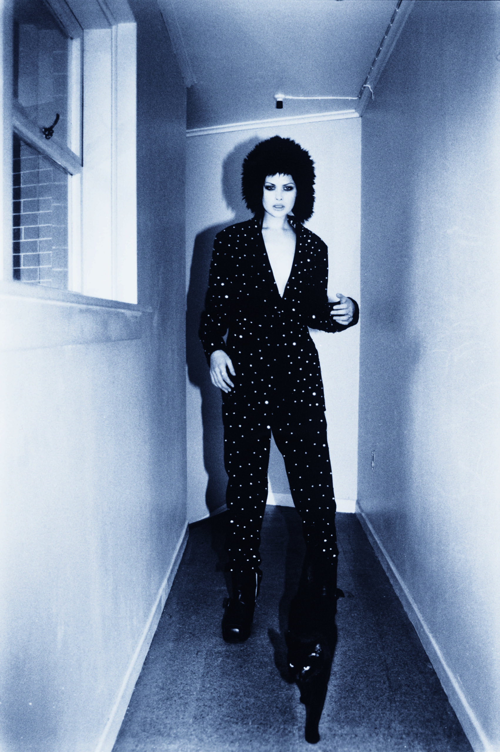
Intra’s best-known work from then is the studded suit he made to wear to the Elam ball. ‘The outfit was a huge success—even if the fastenings did leave the bare-chested Intra lacerated and bleeding by the end of the evening.’2 Intra exhibited his suit on a hanger, as Joseph Beuys had shown his dour felt suits. Where Beuys’s uniform exemplified an idea of artist as healer, Intra’s was transgressive—part punk, part S’n’M, part Liberace. The suit crossed over into fashion, featuring in an iconic fashion spread in Planet magazine, worn by a model accompanied by a bewitching black cat. After Intra died, the suit was jointly acquired by the Chartwell Collection and Auckland Art Gallery.
•
Intra was blessed with entrepreneurial can-do—a kiwi DIY attitude. In 1992, with a circle of artist friends, he founded Teststrip in Vulcan Lane. It may not have been the country’s first artist-run space, but it was new and dangerous. It proved the perfect platform for Intra’s subcultural inquiries and alternative activities. For the disorienting 1993 installation Waiting Room, Intra and Vicki Kerr surgically altered the space, curving walls, ceiling, and floor into one another, dousing them with antiseptic and cranking up the lights. Space evaporated in a hygienic white out, leaving nowhere for germs or shadows to hide. Visitors were asked to wear covers over their shoes.

Relocating to sleazy K Road the following year, tiny Teststrip would become the most talked-about gallery in the country—a treehut for the wannabe avantgarde. On the other side of the world, Artforum would publish an enthusiastic notice about the startup from supporter, collaborator, and publicist Stuart McKenzie: ‘Teststrip shows often tread a fine line between reporting and celebrating social dysfunction. There is a Nietzschean amorality here, and also a strenuous Romanticism in the style of Keats’ promise that til we are sick we understand not.’3

Linking punk, situationism, and surrealism, Intra’s art took diverse forms: a still-life arrangement of punk attire—Doc Martens, a studded cuff, and a cut-throat razor—in a vitrine; a Blood Mobile of red glass drips—a nod to Hans Bellmer; drawings with arcane citations and gimmicky hand lettering; product photos of medical paraphernalia indexed to the stations of the cross; a rotating CT scan of a pelvis accessed through a peephole viewer; a lab rat scratching away behind a wall of pink fibreglass insulation; X-rays and installations of smashed cameras. There were always lots of medical references, reminding us that the surrealists André Breton and Jacques-André Boiffard had been a doctor and a medical photographer respectively. And there were endless drug references, which now seem sadly prophetic.

As a young artist, Intra was provocative but successful—a rising star. Despite the punk posturing, he had supportive dealers, including surprisingly classy ones, such as Wellington’s Brooker Gallery and Auckland’s Claybrook Gallery. His work was acquired by prominent collections (public and private) and included in important exhibitions (featuring on the cover of the catalogue for the Museum of New Zealand’s 1994 survey show Art Now). While Chris Kraus emphasises the Teststrippers’ fuck-you attitude in her intro later in this book, Intra could really work a room. He was a charmer.
•
Writing became important early on. Intra’s art needed words. Texts featured in his hand- lettered, collaged, and photocopied drawings, posters, handouts, and fanzines. And, in 1989, he started contributing to the bFM student-radio magazine Stamp, cutting his teeth reporting on art, bands, comics, even a comedian. Between 1989 and 1992, he wrote for most issues: twenty-seven pieces in all. In addition to reviews, there were creative-writing experiments, including an invented interview with Picasso and an account of an imaginary historical woman artist who had slept with Picasso. A real artist took umbrage at being the subject of an invented interview, worried that fiction may pass for fact, requiring a disclaimer.

Stamp enabled Intra’s experimentalism and tolerated his in jokes. His writings there demonstrate his flair for parody. His piece ‘When You Sell Me’ was particularly scatterbrained: ’At the opening I wore my tweed coat, my polka-dot tie, my green trousers, my armour plated knickers, and I painted my nose red. / The artist rejects symbolism and borrowing from indigenous cultures, rather he attempts through a process of reduction and distillation to penetrate a common level of collective consciousness. / We know our positions too well. There is enough measured contempt and praise to keep our frustrations and pleasures balanced for a lifetime. / I’ll do the mail-out, you do the mail-out, she got sent a mail-out, he’s on the mail-out list, let’s hope the mail gets lost in the mail. / I fuck you and spit at you, you ruin me, you sell me, and this is the best art there ever is. / Everything would be totally diffgerent if the opportunity to sell out actually existed.’4

By 1993, Intra had quit writing for Stamp and was head down, completing his MFA dissertation Subculture: Bataille, Big Toe, Dead Doll, becoming more disciplined as a writer and reader. His text mapped the web of concerns he was exploring in his art—subculture and the iconography of revolt—via the now-available writings of Georges Bataille and the new commentaries on surrealism by Rosalind Krauss and Co. that appeared in their wake.5

In writing Subculture, Intra hit his stride as writer. In 1994, he began contributing to Midwest, a magazine I co-edited. For us, he wrote on painter John Hurrell, on surrealism and skin disease, and on Ava Seymour’s rubberist collages. He was always precocious and opinionated. He wrote about art that intersected with and extended his interests as an artist, but, if subjects didn’t fit, he could make them fit. In his Hurrell piece, he rejected the older artist’s concerns—postmodernism and provincialism—preferring to discuss the work in terms of situationism. Midwest also profiled Intra’s own work. We took him on as an artist-writer package. In 1994, Intra also met LA-based Semiotext(e) publisher Sylvère Lotringer. He was visiting his partner, the writer and filmmaker Chris Kraus, who was in Auckland making a film. Lotringer suggested Intra embark on a master’s degree in the fledgling Critical Theory programme at ArtCenter College of Design, Pasadena, where he was teaching. Escape became Intra’s plan.

In 1995, Intra began writing for the Sydney-based magazine Art and Text, becoming their New Zealand reviewer and review wrangler. It would become an important relationship. After doing just one review, Intra got to write a profile on fellow Teststripper Denise Kum. Art and Text had outgrown Australia and aspired to become a key international art journal. Looking for a bigger context, it too was plotting a move to LA. In 1996, it announced its arrival with its ‘Los Angeles’ issue. After frantic fundraising and securing a Fulbright Scholarship, Intra also landed there that year.

In LA, Intra stopped making art to focus on writing. At ArtCenter, he embarked on a thesis on Daniel Paul Schreber, the paranoid schizophrenic German judge who penned Memoirs of My Nervous Illness (1903).6 Intra quickly assimilated into the LA scene, but he kept exercising his New Zealand connections, and they him. He continued to write on New Zealand artists and for New Zealand publications, while taking on reviewing gigs for Artforum, Art.net, and Flash Art. For a while, his head was in both places. Oddly, it wouldn’t be until 2000 that he became a regular contributor for Art and Text, writing for them like clockwork.
•
In 1998, during a rave in the desert, Intra and ArtCenter friend Steve Hanson cooked up a plan to start a gallery. With some friends, they found a space in Chinatown, taking their name from the sign left by the previous tenant. Opening in January 1999, China Art Objects Galleries was instantly influential, elevating a new cohort of LA artists, including Jon Pylypchuk and David Korty, and leading the transformation of Chung King Road into a gallery district. Early shows included Laura Owens and Scott Reeder, Jorge Pardo and Bob Weber, Sharon Lockhart and George Porcari. There was a Stephen Prina record release, a Mike Kelley poetry reading, and a Mia Doi Todd concert. Intra was a midwife to a moment. Like Teststrip, China Art Objects was a platform. But, even after the place became successful, Intra’s existence remained precarious, his clothes op shop, his apartment grubby, his car impounded. Intra was no trustifarian, but he was energised by the game, continuing to hustle, banging out essay after essay on his old laptop.
•
Intra remained New Zealand art’s go-to person—our base camp in LA. He was forever hosting New Zealanders, and sponging off them—quid pro quo. His ethos was ‘transactional’. Intra parlayed Slave Pianos and Teststrip co-conspirator Daniel Malone into the China Art Objects programme and wrote on them. He also accessed LA artists for New Zealand galleries. He curated Span, with Diana Thater and Jessica Bronson, for me when I ran Artspace, Auckland. He helped place Eric Wesley into the Govett-Brewster Art Gallery’s 2000 show Drive, and David Korty and Paul Seitsema into Allan Smith’s 2001 Auckland Triennial Bright Paradise. He also wrote essays for all three shows.

Intra wore many hats, sometimes simultaneously. His texts were often advocacy and promo, written to support artist friends, artists he represented, artists he loved. His 1996 preview of Ann Shelton’s photobook Redeye describes it as ‘a charismatic exposé of the hideous truths and self-conscious mythologies of unemployed psychopaths who frequent Verona cafe and actually believe in drag’.7 He neglected to mention that he and Ann had been an item, that he was the subject of many of her images, that he was no stranger to Verona, and that he had been photographed in drag. But, as Intra became established and earned the opportunity to write on heavy hitters, the stakes got higher, and he couldn’t take as many liberties. His last pieces included insightful but respectful essays on Julia Scher and Isa Genzken.
•
Intra’s writing was informed by his appetite for theory, but it was never dense or abstruse. His writing had wit and verve; his insights felt intuitive and immediate. He also enjoyed mimicry. He had an ear for the edgy, disruptive prose of dadaists, surrealists, situationists, and punks, but also for their pompous, conservative critics. He enjoyed the battlefield rhetoric of manifestos and takedowns, toggling between formality and informality, snottiness and spit. The piece that opens this collection, ‘Journalism’, sets the scene. Made for a photocopied ‘micrograph’ to accompany a Tony de Lautour show at Teststrip, it has little to say about its subject, offering instead an absurd, adolescent mash of art criticism and pulp fiction. The text incorporates a patronising rejection letter from the editor of Harper’s Bazaar, Louis Leroy: ‘Sure, De Lautour has shrewdly reclaimed the moral high ground—head and shoulders above the usual chic critiques. But, as much as he in ates his own fame with his grin-and-bear-it portraits of disease, his basic thickness repudiates what he has done so much to justify in painterly terms. It is largely for intellectual reasons that we would not consider publishing commentaries on this kind of work.’8 In reality, Louis Leroy was the nineteenth-century art critic who christened an art movement by satirising its practitioners as ‘impressionists’.

Fictocriticism returned in 1997’s ‘For Paranoid Critics’, which casts the art world as a theatre of cruelty and payback for the critic: ‘One by one, each of your victims takes their revenge: Walter de Maria pelts your earlobes with one-thousand brass rods! Daniel Buren peels stripe-width strips of skin from your naked body! The Nutty Professor, played by Eddie Murphy, lowers the full weight of his body onto your right arm! Colin McCahon tattoos unspeakable passages from Revelation on your forehead! Linda Benglis throws you into a vat of boiling foam rubber! And Donald Judd drops you into a steel cube and then welds it up personally!’9

Intra was always drawn to the idea of the world as a paranoid projection. In 1995’s ‘Discourse on the Paucity of Clinical Reality’, he had recalled Breton’s formative experience as a doctor in a World War I field hospital: ‘Cases of mental distress, even acute delirium. These psychic casualties of war were the kind of cases that passed through the centre. One in particular struck Breton’s attention. A well-educated man, straight from the front, who had an astounding confession: the war, he said, was a complete sham. This testimony, which he elaborated in the most literary terms, did nothing but utterly convince Breton of the paucity of our own reality. This unnamed patient insisted that the gruesome hack jobs of the battlefield were nothing but skilful applications of prosthetic makeup, the shells flying overhead were only make believe, and the battlefield itself was the false counterpane of a set dresser. Upon hearing this, the soon-to-be leader of surrealism jumped back in his seat. The movement followed soon after.’10

Schreber also suffered from hallucinations. The paranoid Judge believed God was turning him into a woman in order to impregnate him and repopulate the planet. Schreber constructed a vast, novel cosmology to support his fears. His Memoirs is disorienting, detailing his experiences and accusations with surprising lucidly, scrambling insight with insanity. Intra called it ‘a cross between Napoleonic battle strategy and the Starr Report’.11 This mad, impossible book would become the basis of a case study by Freud that would prove foundational for psychoanalysis. After Freud had his way with Schreber, other theorists—including Jacques Lacan, Gilles Deleuze and Félix Guattari, and Elias Canetti—took turns making an example of him. As much as he wanted to rescue Schreber from their clutches, Intra would also make use of him, writing Schreber into essays on Slave Pianos and Julia Scher, as well as devoting two essays to him.

Schreber haunts other Intra pieces where he isn’t named: in Intra’s discussion of Salvador Dalí’s paranoid-critical method (where insights emerge in conflating inner and outer worlds), in his account of John McCracken’s minimalism (inspired by alien contact), and in his description of Mike Kelley and Paul McCarthy’s Sod and Sadie Sock (with its Salo-esque debauches).12 Intra’s interest in Schreber was keyed to paranoia as the engine of the art world, underpinning the way artists build their own worlds in their work as well as the wider scene’s sado-masochistic machinations.

In his obituary for Intra in Frieze, Will Bradley describes Intra’s Schreber thesis as an attempt ‘to suggest ways that art writing might be reinvented’.13 Intra certainly saw art writing as an invention, a game. A ne example is the reviews and CV of Pat Scull, a ctional artist. Intra ghost wrote them for a 1997 Danius Kesminas solo show, which posed as a two-person show with Scull. Casually presented in the gallery as a set of xeroxed documents, they supported the art-nerdy hoax. Aping the bogus fluff of reviews, they say everything but nothing: ‘Content to deliver quietly powerful work which is highly ambiguous in content, Scull provides a new form of artistic thinking for those of us who remain in the gallery, and retain our belief in the gallery.’

Intra’s Scull reviews and CV were the last pieces I found for this collection, and I only discovered them as a result of fact checking Intra’s Slave Pianos essay, which I had assumed to be a more-or-less straight piece of art history. In it, Scull is mentioned alongside real, canonical figures. Only by googling Scull did I uncover the con. Intra had playfully smuggled him—and, perhaps, a few other furfies—into the account, echoing the liberties Slave Pianos itself took with art history.14
•
The title spread of Intra’s 1995 Teststrip micrograph Untitled: The Poetics of Modern Reverie features a prophetic Samuel Beckett epigraph: ‘It’s suicide to be abroad. But what it is to be at home? A lingering dissolution.’ It’s juxtaposed with an image of the sealed souvenir glass phial of exotic-erotic Paris air—an atmosphere present but invisible and inaccessible—that Marcel Duchamp gave to the American collector Walter Arensberg.15

Intra’s thinking was informed by distance in space and time: being provincial (coming from New Zealand, away from the action) and belated (too late to be a real surrealist, situationist, or punk). Writing on Daniel Malone, he mapped cultural cringe as both malaise and strategy: ‘In New Zealand and Australia, segments of the population are afflicted by what is referred to as cultural cringe. Although this syndrome appears in many countries, these nations boast their own regionally specific varieties, as with tropical diseases. A complex that has not yet yielded a master list of diagnostic criteria, cringe is nonetheless a burgeoning field of study, and indeed practice … Paul Hogan of Crocodile Dundee fame is the patron saint of cringe, not for downplaying himself—as his identity is already paradoxical—but for the opposite reason: a hyperbolic intensity of character performed to sickeningly theatrical proportions. Cringe is to identity what wealth is to debt: the hallucination of prosperity, sophistication, and authenticity ascertained through an ironic hall of mirrors. Not so much the opposite of national pride, it is a perversion of pride.’16

Intra may have left New Zealand in search of a bigger context, but the transition wasn’t quite what he was expecting. It was more of the same. As much as he aspired to escape his small-town origins, in LA he simply found a larger village. In his catalogue essay for a New Zealand art show presented in out-of-the-way Missoula and Maui, he confesses: ‘My first wish for Los Angeles was that it wasn’t anything like New Zealand with its small, insular art world. Of course, my hopes were dashed as I rapidly discovered that all art scenes are horrifically regional in their imperatives: Los Angeles, just like New Zealand, is most signi cantly intrigued by the development of its own artistic mythology and, again like New Zealand, in the export of its mists to foreign shores. The doctrine of exoticism applies equally in both places.’17

Back home, Intra would himself become exotic (a figure of dinner-party rumour and speculation) and an exemplar (proof that escape was possible). Megan Dunn—director of Fiat Lux, an Auckland ARI that opened in the wake of Teststrip—remembers a note pinned to the wall of a Williamson Avenue share house in the late 1990s. It read: ‘Who the hell is Giovanni Intra?’

A new generation of New Zealand artists would follow in Intra’s footsteps, many enjoying success offshore. Intra’s posthumous profile in Metro magazine would be titled ‘Golden Boy’. It was riddled with errors—as befits a legend.18
•
After Intra died, friends in New Zealand and the US began talking about publishing a collection of his writings. The idea was repeatedly picked up, but stalled. It has now happened, twenty years on. More time has now elapsed since Intra died than he was writing for, making this book a time capsule—a guide to artists and ideas that animated the New Zealand and LA scenes of the 1990s—the way we were. In the intervening years, Intra’s writings have become even harder to find, being dispersed through defunct journals and obsolete catalogues, shipwrecked in library stack rooms and mouldering in vertical files. Clinic of Phantasms not only puts them back into circulation (giving them a second wind), it gathers them for the first time (exposing Intra’s trains of thought like never before).

In selecting the pieces for this collection, I bypassed Intra’s juvenilia and started in 1994, after his Subculture dissertation. I was keen to stress his voice over his subject matter, so I left out pieces where he simply served his subjects, preferring those where he could stretch out, saying something of his own in his own way. Towards the end, I included almost everything. It’s a variety show. There are informative pieces on key New Zealand and LA artists. There are think pieces, front-line reports, and a few blistering take-down reviews. There are also observations upon airplane terrorism and Mexican food.

Clinic of Phantasms will doubtless have a split audience. New Zealand readers may head first for familiar New Zealand stuff, and Americans for the American stuff, but I hope some readers will be energised by the quirky journey that linked them—Intra’s singular adventure as a writer, his personal wormhole.


  1. Tessa Laird, ‘34: A Tribute to Giovanni Intra, 1968–2002’, New Zealand Listener, 8 February 2003: 54.
  2. Kelly Carmichael, ‘Forget It, Jake. It’s Chinatown.’, NZ Edge, www.nzedge.com, June 2002. No longer online.
  3. Stuart McKenzie, ‘Junk Joint’, Artforum, March 1993: 40.
  4. ‘When You Sell Me’, Stamp, no. 13, September 1990: 4.
  5. The publication of Georges Bataille’s selected writings in English—Visions of Excess: Selected Writings, 1927–1939, ed. Allan Stoekl (Minneapolis: University of Minnesota Press, 1985)—precipitated an explosion of interest in the work of the dissident French surrealist.
  6. Intra doesn’t seem to have completed his thesis. His academic transcript doesn’t list it and no one can find it in the ArtCenter library—although he graduated in 1999 anyway, a straight-A student.
  7. ‘Ann Shelton: Drive-By Shootings’, Pavement, no. 10, 1996: 10.
  8. ‘Journalism’, Tony de Lautour: Bad White Art (Auckland: Crushed Honey Press, 1994), np.
  9. ‘For Paranoid Critics’, PreMillennial: Signs of the Soon Coming Storm(Sydney: Darren Knight Gallery, 1997), 16.
  10. ‘Discourse on the Paucity of Clinical Reality’, Midwest, no. 7, 1995: 40.
  11. ‘Daniel Paul Schreber: Memoirs of My Nervous Illness’, Bookforum, vol. 7, no. 2, Summer 2000: 15.
  12. Intra taught a course on ‘Hallucination’ at the University of California, San Diego, in Fall 1999. He published the course outline: Giovanni Intra, ‘Contemporary Critical Issues: “Hallucination”’, Log Illustrated, no. 9, Summer 2000: 20.
  13. Will Bradley, ‘Giovanni Intra 1968–2002’, Frieze, no. 73, 2003: 54.
  14. ‘Slave Artists of the Piano Cult: An Introduction’, Slave Pianos: A Reader: Pianology and Other Works 1998–2001 (Frankfurt: Revolver, 2001). I’m reminded of an anecdote: ‘In a certain French convent, today, the novices permit themselves a perverse literary amusement. During the evening meal, as the others eat, one novice is entrusted with reading, out loud and in Latin, the Lives of the Saints. The game is to add additional tortures to the multitude already suffered by the martyrs in such a manner as to escape notice of the spiritual director supervising the reading.’ Allen S. Weiss, Iconology and Perversion (Melbourne: Art and Text Publications, 1988), 9.
  15. See Marcus Moore, ‘Marcel Duchamp and New Zealand Art, 1965–2007: By Means of Duchamp’s Peripheral Vision: Case Studies in a History of Reception’ (PhD thesis, Victoria University of Wellington, 2012), 209.
  16. ‘Daniel Malone: Triple Negative’, Art and Text, no. 70, 2000: 42.
  17. ‘Leaving New Zealand: The Question of New Zealand Art Abroad’, Te Ao Tawhito | Te Ao Hou: Old Worlds | New Worlds: Contemporary Art from Aotearoa | New Zealand (Missoula MT: Missoula Art Museum, 2000), np. This essay also opens with the Beckett epigraph.
  18. Tim Wilson, ‘Golden Boy’, Metro, May 2003: 66–73. ‘Friends and colleagues’ of Intra’s wrote a letter correcting Wilson’s errors. ‘Record Straight’, Metro, July 2003, 7–8.

Brett Graham: Art of Forbearance

Here, no. 14, 2022.
_


Brett Graham (Ngāti Koroki Kahukura, Tainui) is one of the ‘young guns’, the generation of Māori artists that emerged in the 1990s, which includes Michael Parekowhai and Lisa Reihana, Shane Cotton and Peter Robinson. Right now, Graham is the most visible of the cohort. He’s making some of his best work ever and turning heads. 

The show was three years in the making. Graham says: ‘Making an exhibition is usually a headlong rush to meet the deadline. But Covid slowed down the process, so I could take my time. I did a lot of fine tuning. It was the show I wanted to make, not compromised in any way.’ Tai Moana Tai Tangata was greeted by a tsunami of engagement and acclaim, andGraham picked up an Arts Foundation laureate. A version of the show was presented at City Gallery Wellington last year (although two of the sculptures were too big for the building) and the full show travels to Christchurch Art Gallery later this year. Works will surely find their way into major New Zealand public collections. 

For artists, big shows can be a mixed blessing. If you aren’t defeated by hubris, success itself can arrest you. But, in May this year, Graham fronted up with his first solo show since Tai Moana Tai Tangata—and it was bold. Ark of Forbearance at his Wellington dealer, Bartley and Company Art, made no concessions to commerce. The work was constructed in situ—a five-day build—and was demolished at the end of the show, leaving nothing to sell. ‘I’m not very good at making commercial shows’, Graham says. ‘I make things to get them out of my system. I never think about what’s going to happen to them after. It’s always been a problem.’

Graham’s minimalist boat-hull form dominated Bartley’s gallery, occupying the space like a ship in dry dock or a ship in a bottle. It loomed over visitors and impeded their passage, compelling them to circle it ritualistically, like the Kaaba, or approach it tentatively, like Kubrick’s monolith. Its imposing but sleek form was clad in cedar weatherboards, stained red, suggesting kōkōwai, the ochre traditionally used on Māori carvings—the blood spilt in the primal division of Rangi and Papa. Beingsymmetrical, you couldn’t tell which way the ship was heading. It may have been a vehicle of salvation, but there was no way to get on board. Would we be left behind?

The title was a nod to Te Whiti. When his followers at Parihaka faced invasion by the Crown, he reassured them, saying: ‘Forbearance is the sole ark of your safety. As Noah built the ark to carry his people safely through the flood, so let fortitude be the ark to save you.’ However, in November 1881, troops invaded, looting and sacking the village. Te Whiti and Tohu were arrested and jailed, most of the villagers were expelled, and those who remained were issued with government passes to control their movement. 136 years later, the Crown apologised.

While the Ark’s form was deceptively simple, the wall text prompted you to interpret it through a litany of calamity: climate change, pandemic, war, terrorism, challenges to women’s rights, and, pointedly, the recent occupation of Parliament grounds by anti-vaxxers. Citing the occupation complicated matters. Jacinda Ardern’s ‘team of five million’ had been our prevailing Covid-period ark image. But there will always be outliers, who put their faith elsewhere, and want to build their own arks. 

Arks and memorials have much in common. Both are invested with faith, which can be misplaced. Graham remembers: ‘As a child, most of my early encounters with sculpture were with obelisks and cenotaphs, memorials to the New Zealand Wars and World War I. They would honour British soldiers and friendly Māori. If you belonged to one of the unfriendly tribes, you knew you were on the wrong side of history.’ 

Right now, Graham is turning his gaze to Christchurch. Not only is Tai Moana Tai Tangataheading there, he’s also developing a public work for the city’s public-art project Scape, to be installed in November. He and his assistant, stone sculptor Steve Woodward, are in a tent in Henderson, chipping away at a nine-ton block of Norwegian Arctic White granite. It will be a memorial to the Antarctic explorer Roald Amundsen (1872–1928)—but, really, it’s a meta-memorial, a memorial about memorials. ‘It will be called Erratic’, Graham says, ‘referring to the erratic way we chose to memorialise one person over another.’

It’ll be installed on the Avon river, opposite the old statue of another Antarctic explorer, Captain Robert Falcon Scott, disputing its pride of place. ‘We celebrate Scott, but Amundsen—who beat him to the Pole—has been forgotten, because he was Norwegian, not British’, says Graham. And he attributes Amundsen’s success to his engagement with indigenous knowledge. ‘He spent time with Inuit in the north and adapted their knowledge: their clothing, their use of huskies, their survival skills.’ Graham has little time for second-place Scott: ‘He was a bungling English aristocrat, but a master of publicity.’ 

So, what form will the work take? ‘It’s large, horizontal, and oval. On the surface, mounds—referring to indigenous calendars, sundials, and the rocks Inuit used to mark their pathways over the Arctic circle—will spiral out. There’s ninety-nine of them—the number of days Amundsen’s journey took.’ As I listen to Graham, I can’t help but see something of the intrepid Antarctic explorer in him too, given the scale of his own ambition and enterprise. When I ask him what’s the biggest impediment in making his art, he says, ‘The weather. I’m in a tent in Henderson. It’s pouring with rain. It’s not pretty.’

Divergent

Exhibition blurb, Divergent: New Photography Aotearoa, The Renshaws, Brisbane, 2022.
_


When the Renshaws asked if I could curate a show from Aotearoa New Zealand, I instantly thought of three emerging photographers, each of whom is putting their own spin on our identity-politics, melting-pot moment: Cao Xun, Telly Tuita, and Tia Ranginui.

When I first saw Cao Xun’s work, I felt like I’d stumbled on a niche pornography site. His photos are full of fun and games, with male bodies pursuing their pleasure. The images range from casual-looking documentary shots to slick-looking advertising-style ones. Bodies are wrapped in second-skin clothing (pantyhose and spandex) and engage fetishistically with utilitarian objects (a cellphone earpiece, a bike seat, packing tape, a plastic funnel). Much of the activity is solitary, but, where there is coupling, bodies are entangled, so we can’t easily see where they begin and end. As a charged cocktail of tactility and intimacy, Cao Xun’s photos place us on a knife edge of attraction and repulsion. They can also involve leaps of logic. Take Hand Plugs (2022), a product shot of a transparent plastic glove, its fingers occupied by orange ear plugs. It seems to make an analogy between those plugs and the fingers we might also shove in our ears (not wanting to hear). Meanwhile, the glove itself suggests both our need for contact and our fear of it. Cao Xun’s project may be rooted in an interest in the discomfort, awkwardness, and shame linked to the queer body and its failure to meet heteronormative expectations, yet it has a defiant, playful, witty edge.

Telly Tuita is doubly displaced. He left Tonga as a young boy, to live with his father in Australia. Later, as an adult, he relocated to wet, windy Wellington, to live with his Māori husband. In his photographs, Tuita is enthroned before his painted faux-tapa backdrops, posing with props that await our interpretation. His campy, theatrical tableaux vivant recall colonial-period photographs of exotic ‘big chief’ types. Tuita calls his work ‘TongPop Nostalgia’, admitting he’s indulging a childhood fantasy of an idyllic homeland. He is one of the New Zealand–based Pasifika artists curator Leafa Wilson has called ‘cold islanders’. They relate to Māori, yet have tauiwi status; they are ‘cold’: away from the warmth of the islands literally and left out in the cold metaphorically. In his photos here, Tuita links the four horsemen of the apocalypse from the Book of Revelation (Famine, Conquest, War, and Death) with the four seasons (autumn, winter, spring, summer). He dons costumes and elaborate headdresses. In War in Spring, he wears footy shorts and is draped in diaphanous pink tulle, queering the iconic look of Aussie yobs wearing Australian flags.

When she was a child, Tia Ranginui (Ngāti Hine Oneone) heard about patupaiarehe from her grandfather. In Māori lore, they were the first people of Aotearoa. They were nocturnal, lived in the mountains and forests, and built their homes from swirling mists. They had pale skin and red or fair hair, and bewitched people—especially young women—luring them away. Redhead and albino Māori were sometimes said to be the result of coupling with patupaiarehe. But should these stories be taken literally? And are patupaiarehe ‘people’ or supernatural beings—‘fairies’? Certainly, some Pakeha have taken these tales as literal evidence that early Europeans arrived here before Polynesians. Ranginui dismisses such theories, for ‘exploiting our stories, against us’. In her photograph series Tua o Tāwauwau/Away with the Fairies (2020–2), she adds her own spin to these tales and their interpretation. In her images, patupaiarehe are now ‘red-headed cool kids’, out and about in the Whanganui suburbs where she lives—in full daylight, hiding in plain sight—indulging their slacker-teenager ennui. They still conjure the mist, only now it’s supplied by smoke machines and vapes. Some of her titles are te reo Māori, others refer to Norse myth—a cheeky nod to those conspiracy theorists (and an acknowledgement of her own Norse side). For instance, Niflheim refers to the dark, misty world of the dead, ruled by the goddess Hel, while Sleipnir—showing a patupaiarehe on the prowl in his Mustang car—was Odin’s legendary eight-legged horse. Observing rather than explaining, Ranginui plays on the way Māori themselves encountered patupaiarehe as an unknowable other. 


[IMAGE: Cao Xun Hand Plugs 2022]

Brent Wong: Twilight Zone

The Bank of New Zealand Art Collection (Auckland: Webb’s, 2022).
_


In the 1980s, when Peter McLeavey was assembling the BNZ Art Collection, the New Zealand art discussion was dominated by one question: nationalism or internationalism? McLeavey said he wanted the Collection to ‘reflect a national identity’.1 I assume this was partly because it fitted the brand of the Bank. But, by then, what did ‘national identity’ even mean?

In earlier times, New Zealand art and literature were seen as spearheading a search for national identity. Gordon Brown and Hamish Keith’s classic nationalist account An Introduction to New Zealand Painting 1839–1967 (1969) argued that New Zealand painting was, at its heart, about capturing the truth of New Zealand’s distinctive light and landscape. But, as New Zealand art developed and expanded in the late 1960s, 1970s, and 1980s, this settler perspective became less relevant, less tenable. Old tropes of New Zealandness were challenged—even satirised—as wobbly fictions. By the time the Introduction was republished in a revised form in 1982, the national-identity thesis had become passé. The book didn’t need a new update chapter but an overhaul, argued critic Francis Pound.2

Of course, no matter how internationalist we wanted to be, distance and smallness still made New Zealand’s art scene provincial. Even in the 1980s, New Zealand art remained an intimate, enclosed discourse. New Zealand art was made in New Zealand, shown in New Zealand, written about in New Zealand, and collected in New Zealand, with little visibility or cachet beyond these shores. Artists looked over the horizon for reference points and aspired to be part of a larger discussion, but their art found its reception here. New Zealand art was a bubble. We wouldn’t get to the Venice Biennale until the next century.

When McLeavey said he wanted the collection to ‘reflect a national identity’, he didn’t simply mean a nationalist one. As part of its national story, his BNZ Art Collection embraced old-school nationalists, modernist abstractionists, ironic postmodernists, and more. Works in the collection, especially from the 1980s, took liberties with now-familiar tropes of nationalist landscape painting. Colin McCahon was famous for abstracting the New Zealand landscape, but, in Fly Away Girl (1969­–70), Ian Scott took this to an absurd pop extreme. In Bill Hammond’s It’s the Lay of the Land My Son (1985), classic New Zealand mountains were reiterated and arranged like clip art. In Russian Cruise Ship, Princes Wharf (1987), Julian Dashper overwrote Michael Smither pebbles with geometric abstraction. In On the Forest Road to the Headwaters of the Tarawera River (also 1987), Dick Frizzell revisited the dead-tree school with his tongue in his cheek. 

These works are jokey takes on the nationalist tradition, but, for me, the work that distinguishes itself now is Brent Wong’s hyperrealist New Zealand landscape painting Town Boundary (1969). It pictures a confrontation between a heritage house with its finial in the foreground and a menacing sci-fi monolith in the distance. Back in the day, the Wellington painter was seen as adding a pinch of surrealist spice to that vein of hard-edged regionalist-realist landscape painting exemplified by Don Binney, Michael Smither, and Robin White. But, against the nationalist vision that they advanced, his works were more disorienting, more corrosive, because they weren’t obvious parodies.

In 1969, the year Brown and Keith’s Introduction came out, Wong had his first solo show at Wellington’s Rothmans Cultural Centre. He was just twenty-four. His iconic monolith paintings3 seemed to come from nowhere—a big idea already fully formed. They all involved three pictorial elements: bone-dry New Zealand landscapes, deserted Pākehā buildings (some wooden, some concrete; sometimes intact, sometimes dilapidated or ruined), and, of course, the monoliths. These complex, Escheresque geometries floated enigmatically in the sky or appeared in the distance. They looked like cast concrete, like ‘convoluted masonry’. Titles like Misconception, Dissolving Speculation, Recapitulation, and Matrix just added to the mystery.

The relationships between natural landscape, human building, alien monolith, and title played out in different ways in different paintings, but the paintings had a cumulative logic. There was a sense that the local landscape was being visited by miraculous alien ships with a purpose—perhaps ominous, perhaps generous. Ufology was big at the time. Erich von Däniken’s book Chariots of the Gods?—which speculated that ancient human cultures had been exposed to visiting-alien technologies—was published in 1968. That year, New Zealand pilot Bruce Cathie’s Harmonic 33—which hypothesised the existence of a world grid system, an electromagnetic field exploited by UFOs as an energy source for levitation—was also published. 

I do like Gregory O’Brien’s reading of Town Boundary as an allegory of New Zealand art, representing a tipping-point confrontation between the old colonial-period settler aesthetic and a newly minted modernism—as something alien, coming over the horizon.4 But it’s more complex. The monoliths aren’t a known quantity, but necessarily a mystery, an enigma. And, while the buildings and the monoliths seem at odds at first glance, there is also a suggestion that they could be related. Their structures echo one another. In Town Boundary, for instance, the house’s ceramic chimney cap points towards the monolith, as if wanting to align with it, target it, communicate with it. The chimney cap also rhymes with pipe-like forms in the monolith. Is there a link between the building’s architects and the monolith’s engineers? Perhaps that old building is not what it seems. Was it designed to blend in, while awaiting this arrival? 

The monolith paintings find parallels in surrealist art and science fiction. In surrealism, they nod to the impossible floating stone forms in René Magritte’s paintings, like The Glass Key (1959). In sciencefiction, they recall all those moments when something unaccountable enters the frame, revealing a previously accepted reality to be an illusion, paper thin: the monolith in 2001: A Space Odyssey (1968), the falling theatre light in The Truman Show (1998), and Morpheus’s phone call to Neo in The Matrix (1999). Similarly, Wong implies that New Zealand’s supposedly truthful realist art could be a cover up, a veil of appearances masking the true reality.

The monolith paintings exemplify British theorist Mark Fisher’s aesthetic categories of the weird and the eerie.5 For Fisher, the weird is when things appear where they shouldn’t, upsetting our epistemological categories, our basic understanding of reality. The eerie is more to do with absences, and is typified by depopulated landscapes. The monoliths are out of place; they are weird. But his depopulated landscapes are also eerie. Why are there no people? What happened? Where have they gone? (Later, when Wong made deserted New Zealand landscapes without monoliths, apparently dropping surrealism for plain realism, his scenes still felt haunted. Expecting to see the monoliths, we were left wondering where they had gone and if they might return.)

Another question hanging over the monolith paintings is not ‘where are we?’—it seems to be New Zealand (or some parallel New Zealand)—so much as ‘when?’ Are we in the present or in the future, and, if so, how far in the future? Is this a time ‘after people’, with buildings left as remnants and ruins—like pyramids at Giza or stone heads at Rapanui? Has the nationalist project—which was about reconciling settlers with this place—failed, leaving these vacant buildings for future alien archaeologists to visit and speculate over? Or has the settler population been ‘beamed up’?

Wong’s iconic works may be well known, but he has always been an outlier. The monolith paintings were strangely absent from the debate on nationalism and internationalism through the 1980s, and remain something of a blindspot in New Zealand art history generally. Wong isn’t indexed in Pound’s magnum opus The Invention of New Zealand: Art and National Identity 1930–1970.6 However, the monolith paintings did play a key role in David Sims’s largely forgotten documentary Painting in an Empty Land, made in 1981, the year before Brown and Keith’s revised edition was published.

The film ‘explores the responses of four New Zealand painters to a landscape illuminated by a distinctive light, but yet to feel the full impact of human settlement’.7 It is a ripe, occasionally hysterical distillation of old-school nationalist thinking. It’s nationalist-art rhetoric on steroids, albeit belated. The film’s central chapters on key New Zealand–identity artists—Toss Woollaston, Smither, and McCahon—are bookended with sequences focusing on Wong’s monolith paintings.

The film opens with a pan across an ‘empty land’ as a male narrator quotes Katherine Mansfield’s 1912 short story, ‘The Woman at the Store’: ‘There is no twilight in our New Zealand days, but a curious half-hour when everything appears grotesque—it frightens—as though the savage spirit of the country walked abroad and sneered at what it saw.’ The pan ends on a Wong monolith—constructed by the props department—standing incongruously in this ‘empty’ landscape. We match cut to a Wong painting in which the same form floats miraculously over its landscape. Then the camera pulls back to show that the painting is leaning against a wall in a dilapidated building, a ruin, itself in a rural landscape. It’s a mise-en-abyme, with Wong’s imagery framing Wong’s imagery, and so on and so on. We see other paintings in the building, some hung casually, off kilter. They are a mixed bag—including works by Rita Angus, Ralph Hotere, Milan Mrkusich, Alvin Pankhurst, and Michael Smither—not all representative of a nationalist viewpoint. The voiceover continues anyway: ‘Painting. Alien images in an ivory tower or expression of the soul unearthed in an empty land?’

We work through segments on Woollaston, where he celebrates his ‘Mapua mud’ backyard, and Smither, where he celebrates his kitchen table; then onto McCahon, whose Christian heroism is writ large. Of McCahon, we are told: ‘That painter, contracted to pity, who first laid bare in its offended harshness the act of life in this land, expressed the perpetual crucifixion of man by man that each must answer. Rendered in naked light, the land’s nakedness that no one before had seen or seeing dared to publish, and outraged all whose comfort trembles, hollow, against such vision of light upon darkness.’ Then, we segue back to Wong, to seal the deal. 

Paraphrasing Patrick Hutchings, Wong’s critic-champion, the narrator describes the monoliths: ‘An enigmatic impossible folly floating above a beautifully recorded landscape. These uneconomic pieces of architecture look like concrete, as they float over the windswept New Zealand countryside. Brent Wong has painted with meticulous attention his concrete cloud castles. With regret for what is not there, their presence is a visualisation of absences.’8 Sims then cuts to a Milan Mrkusich museum show, where men in suits and women in frocks sit in modernist chairs and sip wine. He pans across the works, perhaps implying that their ‘empty’ fields are akin to those aforementioned ‘visualisations of absences’. Then, the narrator is replaced by an annoying ingénue, who recites an inane poem. ‘I can see a picture. Tell me what you see. Bluebells in a beechwood and green leaves on a tree …’ As we cut from the gallery back to the dilapidated building, and come to rest on an empty picture frame lying on the floor, she concludes: ‘I can see a picture. Tell me what you see.’ If the male voiceover communicated one kind of authority, hers suggests another—the innocent, uncluttered gaze; the inner child.

Painting in an Empty Land is riddled with contradictions and clutter, but, through its rhetorical momentum, it seeks to flatten these out, to make the diversity of New Zealand art answer to a governing idea or sensibility—the ‘empty land’. It attempts to assimilate works with antagonistic viewpoints, perversely conscripting Mrkusich’s modernist abstraction to its nationalist cause. But, now, when I watch the film, it’s Brent Wong who sticks out like a sore thumb. The very work Sims used to frame his account is its undoing. Wong’s explicit fantasies rupture the implicit fantasy that once passed for realism in this place. 

[IMAGE: Brent Wong Town Boundary 1969]

  1. Peter McLeavey to J.C. Hiddleston, Bank of New Zealand, 17 June 1982, Peter McLeavey papers, Alexander Turnbull Library, Wellington.
  2. Francis Pound, ‘The Real and the Unreal In New Zealand Painting: A Discussion Prompted by a New Edition of An Introduction to New Zealand Painting’, Art New Zealand, no. 25, Summer 1982–3: 42–7. 
  3. People call them monoliths, but Wong calls them ‘constructions’. ‘A Conversation’, Brent Wong at the Dowse Art Gallery (Lower Hutt: Dowse Art Gallery, 1977).
  4. Gregory O’Brien, We Set Out One Morning: Works from the BNZ Art Collection (Auckland: Bank of New Zealand, 2006), 59.
  5. Mark Fisher, The Weird and the Eerie (London: Repeater Books, 2016).
  6. Francis Pound, The Invention of New Zealand: Art and National Identity 1930–1970 (Auckland: Auckland University Press, 2009).
  7. www.nzonscreen.com/title/painting-in-an-empty-land-1981.
  8. See P.A.E. Hutchings, ‘Young Contemporary New Zealand Realists’, Art International, vol. 17, no. 3, March 1973: 20.

Brett Graham: Ark of Forbearance

Art News New Zealand, Spring 2022. Review of Brett Graham: Ark of Forbearance, Bartley and Company Art, Wellington, 19 May–18 June 2022.
–


In 2020, Brett Graham (Ngāti Koroki Kahukura, Tainui) unveiled an ambitious project at New Plymouth’s Govett-Brewster Art Gallery. Through monumental sculptures and grainy videos, Tai Moana Tai Tangata addressed the history of interaction between Taranaki and Tainui iwi against the background of colonisation and the New Zealand Wars. Years in the making, it filled the Govett and unleashed a tsunami of commentary and acclaim. The show was adapted for City Gallery Wellington in 2021 and heads to Christchurch Art Gallery later this year. The artist was riding high. But what to do next? No pressure.

Ark of Forbearance at Bartley and Company Art was a bold follow up. Graham’s simplified, minimalist boat-hull form dominated Bartley’s second-floor gallery, miraculously occupying the space like a ship in dry dock (out of water) or a ship in a bottle (how did it get there?). It loomed over visitors and impeded their passage through the space, compelling them to circle it like the Kaaba. It divided the room, and separated visitors from one another. Its imposing but sleek form was clad in cedar weatherboards, stained red, suggesting kōkōwai, the ochre traditionally used on Māori carvings. Beingsymmetrical, one couldn’t tell front from back, couldn’t tell which way it was heading. It may have been an ark, a vehicle of salvation, but there was no door—no way in. Visitors were physically excluded.

Graham’s title referred to the nineteenth-century Māori pacifist leader Te Whiti, who advised his people at Parihaka: ‘Forbearance is the sole ark of your safety. As Noah built the ark to carry his people safely through the flood, so let fortitude be the ark to save you.’ It didn’t work out so well at the time. At dawn on 5 November 1881, soldiers invaded the village. They looted and destroyed most of the buildings, Te Whiti and Tohu were arrested and jailed for sixteen months, most villagers were expelled and dispersed throughout Taranaki without food or shelter, and those remaining were issued with government passes to control their movement. Today, Te Whiti’s pacifist stance is lauded. In 2017, the Crown finally issued an apology.

Graham’s Ark was accompanied by a pair of hemispherical timber shields, presented in another space. Incised with grooves converging on a vanishing point, they were visually ambiguous: literally convex, optically concave. The red one was titled Manawanui, te reo Māori for forbearance, tolerance, patience, and restraint; the gold one Aceldama, from the Aramaic, referring to the field the Pharisees acquired with Judas’s bribe for betraying Jesus. Te Whiti predicted that Māoridom would be beset by those accepting bribes to betray their own.

Read through the Te Whiti reference, Ark suggested a righteous memorial to resistance. However, it wasn’t quite so simple. Graham’s wall text also mentioned Covid, rising oceans from climate change, war, terrorism, and, pointedly, the recent anti-vax protests on Parliament grounds, prompting other readings. The issues confronting Noah and Te Whiti were scrambled with other floods (literal and metaphorical) and with those anti-vaxers (Māori among them). Some didn’t want to be in Jacinda Ardern’s ark, her ‘team of five million’, and were building their own. 

Graham’s Ark put me in mind of other arks. I thought of the black nationalist Marcus Garvey, who created his shipping company Black Star Line, to enable African-Americans to return to Africa. And I remembered Marshall Applewhite’s Heaven’s Gate cult, whose suicidal adepts assumed they were being beamed up onto ufos—extraterrestrial arks. Circling Graham’s Ark, like the elephant in the room, I pondered the obvious questions: Whose ark? Whose forbearance? Is faith always good, or can it be misplaced? Am I on board? 

Graham’s City Gallery show Tai Moana Tai Tangata was still fresh in the local audience’s memory. Ark rhymed with another sculpture in that show—Monument—which was based on a Pākehā redoubt from the New Zealand Wars, complete with gun loops. Both works were large, elongated, weatherboard-clad structures, filling similarly proportioned galleries in similar ways. But Ark was red, Monument white; Ark had curved planes, Monument flat ones; Ark tapered down, Monument tapered up; Ark referred to Te Whiti’s plan for Māori salvation, Monument to Pākehā plans for their annihilation. It was easy to understand them as a pair—entwined particles, inversions of one another. In a way, Ark was also a redoubt and Monument also an ark. It all came down to whose side you were on, where you placed your faith. 

Graham’s Ark offered faith as an image of unity, but also of division. His call for faith in troubled times was tempered with caution.

Julian Dashper: Are You Talking to Me?

15.08.22 Works of Art (Auckland: Webb’s, 2022).
–


Julian Dashper is a key figure in New Zealand art. His work frames our art history as much as it frames him. He emerged in the 1980s, at a time when our idea of the artist was changing, with the discussion turning away from tormented expressionism (Philip Clairmont) towards detached professionalism and postmodern irony (Billy Apple). More than any other New Zealand artist, Dashper exemplifies this transition. He may have been the first to get a business card.

Dashper completed his studies at Elam art school at the end of 1981. Back then, struggling creatives often sought convenient shift work while pursuing their dreams. Dashper became a taxi driver. There were two ways to do it: own your own cab and licence or work for someone who did. Owners took it easy and worked during the day, engaging others to do the less-desirable night shifts. From 1982 to 1991, Dashper drove at night, and painted by day. Taxi driving had its own lore and lexicon. In Auckland, you had to learn the local version of ‘the knowledge’ to pass the exam. In the 1980s, the titles of Dashper’s neo-expressionist paintings often referred to taxi-driver geography, particularly the locations of taxi stands and hotels.

As a nocturnal taxi driver, Dashper haunted all-night cafes and observed the city’s seedy side. The job suited him. Required to talk to randoms, he perfected his taxi-driver patter. Partly, he modelled his persona on Travis Bickle, the psychotic New York cabbie played by Robert De Niro in Martin Scorsese’s 1976 film Taxi Driver. For Dashper, the sedentary junk-food-laced lifestyle took its toll. He inevitably put on weight, as De Niro did more deliberately in order to play Jake LaMotta, the boxer who ‘could have been a contender’ in Scorsese’s 1980 film Raging Bull. And Dashper loved reciting LaMotta’s famous dressing-room speech, where De Niro was himself channelling Marlon Brando from On the Waterfront (1954).

In 1987, Dashper went to Europe and America on a four-month art odyssey that, he said, ‘forever changed my way of making and thinking about art’. He returned to Auckland svelte and jettisoned his painterly ways, in favour of the cool and conceptual. For a few more years, he continued to drive cabs and his work occasionally referred to this. For the 1989 exhibition Occupied Zone at Auckland’s Artspace, he made a wall painting of one word writ large: ‘Drive’. But was it a reference to taxi driving, to his artistic ambitions, or to McCahon’s legendary Rinso packet? (Drive was an alternative brand of washing powder.) He also created a laminated taxi-driver photo ID, identifying himself as ‘Travis 1’.

Around 1992, Dashper was commissioned to make a body of works quoting Bickle’s line, ‘You talkin’ to me?’ In Taxi Driver, Bickle is home alone, eyeing himself in the mirror, practicing menacing lines and drawing his handgun, rehearsing a confrontation with his own reflection: ‘You talkin’ to me? Then who the hell else are you talkin’ to? You talkin’ to me? Well I’m the only one here. Who the fuck do think you’re talking to?’ This monologue wasn’t in the script. De Niro came up with it on the spot in a moment of method-acting genius. 

For the commission, Dashper made a series of pencil drawings and printed a typeset bumper sticker. The drawings rendered Bickle’s words in an absurd, cartoony hand-lettering style, using drafting tools, including French curves and rulers. Dashper just did the outlines, as if he might return later to colour them in. These jazzy improvised variants re-present Bickle’s words this way and that, shifting the visual emphasis, like Bickle himself repeating his line with different emphases. However, dislocated from the noir context of the film, the line is drained of menace. It’s benign. It’s Bickle as comedy, Bickle as bumper sticker.

It’s an art joke too. The line seems to refer to the drawings themselves, as if they were accusing us of talking to them, while also courting our attention. In this, they recall American painter Ad Reinhardt’s famous 1940s art cartoon, where a cubist painting talks back. ‘Ha ha, what does this represent?’, asks the viewer, pointing at the painting; only for it to come alive and reply angrily, ‘What do you represent?’, knocking the viewer for six.

Of course, Dashper was no Bickle—no toxic male. Even as a neoexpressionist, he was a campy, self-conscious one. There’s a great shot of him on the cover of Art New Zealand in 1987, taken before his transformative big trip. He’s thick set with a buzz cut, legs astride, attended by dogs. He’s standing in front of a corrugated-iron building with a gestural abstract painting beside him to match his paint-smeared slacks. The scenario is a nod to Hans Namuth’s photos of Jackson Pollock at his barn. In retrospect, the shot seems drenched in irony—a set up, a pose. But, at the time, Listener critic Lindsey Bridget Shaw took it at face value. Drawing attention to Dashper’s girth, she snipped: ‘Art New Zealand 43 showed us that Julian Dashper, not content with ripping off the ideas of Julian Schnabel … is actually beginning to look like him.’ I like to imagine Dashper turning his head to respond. ‘You talkin’ to me?’


Yvonne Todd and Geoffrey Heath: Mould in the Lens

Art News New Zealand, Winter 2022.
–


Yvonne Todd and Geoffrey Heath met while doing the two-year professional-photography course at Unitec in Auckland, in 1994. While their peers wanted to do commercial work, they wanted to make art, but they ended up moonlighting as wedding photographers to make ends meet. They reminisce with Robert Leonard. 


Robert Leonard: How did you come to do wedding photography?


Yvonne Todd: Geoffrey started photographing weddings in his second year, getting jobs by word of mouth. Around 1997, we decided to do them together. We got our first job through a friend of a friend—a low-key shoot at Bastion Point. There were maybe ten guests. It felt like a Covid wedding would now. Over five years, we shot about fifty weddings, each with its own unique demands.


Geoffrey Heath: My gear was decrepit. I had a Canon AE-1 Program 35mm camera with a hefty old Metz flash that took six AA batteries. The camera was old, with mould growing in the lens, which worked like a soft-focus filter.


Yvonne Todd: I had a 35mm camera and an impressive Mamiya RZ medium-format camera. Geoffrey would say, ‘Pull out the big gun.’ Even though I had the bigger camera, people would assume he was the photographer and I was his assistant. I felt like Miss Brahms from Are You Being Served? They would always approach him to talk about camera gear.


Geoffrey Heath: I would run around as a documentary photographer, then Yvonne would come in with her medium-format camera and do these beautiful portraits.


Yvonne Todd: We did no research. We didn’t have any business training. We didn’t know what to charge. But we had to look like we knew what we were doing. Often one of us was hungover and the other had to cover.


Geoffrey Heath: As wedding photographers, we were on display. I got performance anxiety. At one reception, I told Yvonne I couldn’t do it and locked myself in the toilet. But I pulled myself together.


Yvonne Todd: Funny stuff happened. When the bride arrived by limousine, guests who were hobbyist photographers would jostle for position in front of us. Suddenly, from nowhere, some bossy cousin, with their own camera, was barking instructions at the bride.

Geoffrey Heath: We tried to present ourselves as professionals, but we were making it up as we went along. We operated from a kitchen table, but we did have standards.


Yvonne Todd: We called ourselves Absolute Images, thinking it would come up first on search lists. We had a website and advertised in wedding magazines. We were critical of other wedding photographers, especially of their cheesy and awkward shots.


Geoffrey Heath: We could have made a real go of it, if we’d been more into marketing and done wedding fairs.


What are wedding fairs?


Yvonne Todd: Trade shows for people who provide services for weddings. Couples come. You have your table, examples of your work. You chat, and hand out cards and price plans. But they’re for serious wedding photographers. We weren’t hustlers, and we were distracted, doing other jobs and study.


Geoffrey Heath: We didn’t charge like the high-end photographers. I think of all the hours we spent with clients outside of the wedding day itself that we never charged for.


Yvonne Todd: We were B list. We got jobs more successful photographers rejected. We didn’t charge anywhere near enough. At one point, we had two dollars in our bank account and they closed it without telling us. But our wedding photos have stood the test of time. I don’t cringe at seeing them now.


What did you charge?


Yvonne Todd: We had three packages. Basic, $995. Standard, $1,500, which most couples went for. And deluxe, $3,000, which no one went for. Making up the albums was a big job. They had to be thoughtful, elegant, and tell the story of the wedding. We didn’t want to give people something half assed.


What happened to the negatives?


Yvonne Todd: We offered them for a small extra charge, but few clients took us up on it. I’ve got most of them. I can’t throw them out, even though it’s been twenty years.


How do you see weddings?


Yvonne Todd: They are performances. The couple are the lead players, the wedding party is the supporting cast, and the guests are the audience. Weddings can be status symbols, displays of taste and class, but they can also reject social norms. The Civil Union Act wasn’t passed until 2004, so, when we were doing them, weddings were a straight thing. But we did multicultural and non-religious ones. We did weddings all over Auckland. Some couples had rich parents; others were paying for it themselves. Some were very modest.


Geoffrey Heath: Non-religious couples often wanted to get married in a church, because it was part of the idea for them.


Yvonne Todd: One couple had to sign up and start attending the church they wanted to get married in, but had no intention of continuing. They just wanted it in their photos. I like that level of commitment, even if it’s fraudulent.


Geoffrey Heath: People spent so much money. I could never fathom why they’d spend $50,000 and get divorced two years later. It would have been a deposit on a house and they blew it on one day. I was sad when couples we photographed broke up. I lost faith in marriage.


Yvonne Todd: I know, because everyone seemed so happy at the time. Are weddings a celebration of love or a wasteful exercise in self aggrandisement?


Did clients assume you were a couple?


Yvonne Todd: People would ask, ‘Is Geoffrey gay?’


Geoffrey Heath: At one wedding, the groom got drunk and felt me up in front of his bride, which was weird. Another groom asked me to come for a ride in his police car.


Yvonne Todd: There would always be some technical hitch. I remember photographing a couple signing the register. There was a massive candle on the table and my camera would only focus on it, not the couple. I froze.


Geoffrey Heath: I’d get so stressed that I’d go to weddings with a dry mouth and I’d have to carry a water bottle. In one hushed church wedding, my flash unit’s batteries fell out and scattered across the floor but I had to carry on like normal.


Yvonne Todd: We had to improvise. Sometimes it was raining or the sunlight was too harsh or locations wouldn’t be available and we’d have to find somewhere else. 


Geoffrey Heath: It’s stressful, because you can’t recreate these moments.


Yvonne Todd: We had to get it right. But with two 35mm cameras, plus the medium format, we had it covered. You’ve got to make people look good. That’s the main thing.


Geoffrey Heath: Now, with digital, you can preview your shots. But, back then, you couldn’t see them until the film was processed and printed. There was always anxiety before we collected the prints.


Yvonne Todd: Photoshop was around, but we didn’t use it much. I shot a bride signing the register and you could see down her bra. I Photoshopped out that one, but it was a huge rigmarole. I had to get the film scanned and work out how to do it.


Everything has to be perfect.


Yvonne Todd: In weddings, details carry immense weight and meaning. A ribbon will have to be exactly the same as the one the bride’s mother had at her wedding. My cousin, a florist in Sydney, got out of the wedding game because of stress. She couldn’t deal with micromanaging mothers of the bride stalking her. They’d leave voicemail messages at 4am with minutiae that needed to be attended to at first light.


Geoffrey Heath: Managing expectations was a big part of the job. People would casually mention that they’d like their photos to resemble Annie Leibovitz’s work for Vanity Fair.


Yvonne Todd: I would grimace inwardly, aware of her legendary big-budget shoots and legions of assistants. We didn’t have those resources. It was just us, our manual cameras, and our can-do attitude.


Geoffrey Heath: Wedding photography is hard work.


Yvonne Todd: You have to be able to photograph people and food. Emma Bass, who went through Unitec a few years before us, used to be the country’s pre-eminent wedding photographer. She did high-profile weddings, like Richie McCaw and Gemma Flynn’s. On her website she says, ‘Weddings are a massive job and incorporate most of the photographic genres: portraiture, reportage, fashion, still life, etc. It is multitasking on a huge level!’ 


Geoffrey Heath: And to be a counsellor, when there are family issues, when relatives who don’t get on have to be arranged for a group shot.


Yvonne Todd: We liked the glamorous depiction of photographers in films like Funny Face, Blow-Up, and The Eyes of Laura Mars, and in the TV show Melrose Place,with Jo Reynolds. Geoffrey and I came up with a movie idea—Double Exposure—in which we would play toxic professional photographers, doing big-budget shoots for ad campaigns. Geoffrey’s character was a sexual predator, driven by power and money. Mine was a substance abuser, broken by the demands of her perfectionism, recovering from a breakdown at her parents’ place, a brick-and-tile bungalow in Glenfield. We discussed an opening scene, featuring tracking shots, with Geoffrey flying over Auckland Harbour Bridge in a helicopter while I drove over it in a sports car. Double Exposure was us on steroids. 


According to Emma Bass, wedding photography is considered the ‘lowest rung’ on the photography ladder. So you were lowly wedding photographers aspiring both to be high-end advertising photographers in your fantasies and to be artists in reality.


Geoffrey Heath: Double Exposurewas our escapist fantasy. But we had an alternative scenario, where my character turned up late for a wedding in a clapped-out car, in stubbies and jandals, smelling of booze, cigarettes, and BO, totally unprepared.


Yvonne Todd: We also talked about making a TV informercial for a self-help programme called PhotoTherapy, where we were flaky new-age gurus promoting selfies—before they were a thing—as a path to self fulfilment. 


What were the wedding trends of the late 1990s? 


Yvonne Todd: Funky, bright colours. Lots of gerberas. In photos, brides and grooms would face each other, bend at the waist, and kiss like cuckoo-clock automata.


Geoffrey Heath: And jumping shots. The groom and the guys would jump, and we’d have to shoot them in mid-air. Or the groom would hold the bouquet and pull some camp pose. Also, wedding-party shots with everyone in sunglasses. Rose-petal shots were often requested.


Yvonne Todd: We’d have to set up an elaborate shot, with all the guests in a semicircle and the bride and groom in the middle performing some ritual with rose petals flying around.


Geoffrey Heath: We had to herd and coax our subjects, while juggling cameras with manual light meters. We had to be people people and technical people. Afterwards, we’d have intense debriefs over a lot of wine to let off steam.


Yvonne Todd: People were often quite stiff. Men would be uncomfortable in their suits. If you want good photos, you can’t have people looking awkward. Geoffrey was good at directing. He would encourage people, saying, ‘Oh my God, this looks amazing.’ Then I’d say, ‘Gosh, you look great. Let’s do this.’ 


Geoffrey Heath: We’d cull out the shots that we couldn’t give to clients, but I’d love to shoot a wedding with everyone looking awkward, before they relax, because that’s the truth. But no one wants photos of themselves like that.


As wedding photographers, you have to fulfil other people’s ideas of what a tasteful artistic photo is.


Yvonne Todd: There were taste misalignments. In a briefing, clients might show us an example of a photo they liked, and it would be a canvas print with a purple sunset. We’d just say, ‘We don’t do that.’


Geoffrey Heath: We learned there was no accounting for taste. We’d steer clients towards what we were able to give them.


Yvonne Todd: Some clients valued the photography, but for others it was just a tool to document the day. Wedding photographers had more status in the 1990s. Now, with digital cameras and zoom lenses, it’s easy. Photographers just give clients a CD of images or email them. Video is used a lot, and sometimes they just print stills from videos. Also, the documentary approach is favoured—it’s seen as more contemporary—rather than having people pose formally. Today, those lavish albums seem antiquated. 


How did you reconcile being wedding photographers with being artists?


Yvonne Todd: As artists, we were worried about being outed as wedding photographers. But it didn’t matter, because it was so oddball.


Geoffrey Heath: It never worked against us. I showed my portrait series Spare Room at Rm, back when it was above Real Groovy Records in Queen Street, in 1999. The work was a mix of documentary informality and studio formality, with unsmiling subjects presented front on, in their homes. A couple saw the show and booked me for a wedding, wanting that specific look. They were art savvy—they had their wedding at Artspace. That’s one time when my art photography and my wedding photography crossed over.


Was there a voyeuristic element?


Geoffrey Heath: We’re voyeurs, and weddings are the perfect occasion to watch people. We were super nosy.


Yvonne Todd: Occasionally, the bride would be getting ready at her parents’ place, and there would be interesting knick-knacks on the mantelpiece. I’d steal a couple of shots, pretending I was testing the camera. We’d also shoot the family pets. 


Did making wedding photographs inform the way you made your own work?


Geoffrey Heath: For me, the main connection was in my interest in domestic environments. When we shot weddings, we’d end up in people’s homes, seeing how they lived, how they decorated, their furniture, their taste. That spilled over into my art, where I shoot people in their homes. My photos are like constructed snapshots.


Yvonne Todd: In my work, the staging—all the behind-the-scenes preparation to get the shot—is crucial. So wedding photography didn’t seem like a sidestep. In terms of craft, it was a great way to challenge myself.


Your joint show Sunnynook at Fiat Lux back in 1999 was like the antithesis or the unconscious of your wedding work.


Yvonne Todd: We made shots of unpretentious, mildly grim domestic scenes around the North Shore. There were no people, just traces of them. There was no glamour. The work had a 35mm-snapshot aesthetic. We showed the images as laminated laser copies. It was a welcome reprieve from weddings. 


Geoffrey Heath: I loved your shot of the abandoned spa pool. I remember doing shots of a turps bottle in a garage window, a bedside lamp leaning against a bedhead, and a faux-marble table with glare from the flash.


Yvonne Todd: We called it Sunnynook because we’re both from the North Shore.


Geoffrey Heath: Sunnynook is a white, white-bread neighbourhood on the Shore. When I was a born-again Christian in the 1980s, I got baptised in an indoor swimming pool in a house there. One of my best friends, a prostitute at the time, attended in leopard-skin tights. When I came out of the water, they took a photo of me. My hair was slicked back and I had a moustache, so I looked like an Italian waiter.


Yvonne, your series Asthma and Eczema (2001) included three images of faceless, looming, back-lit, zombie brides—like wedding photographs gone wrong. 


Yvonne Todd: Asthma and Eczema was a mélange of wedding photography, Virginia Andrews book-cover art, and sympathy cards from Paper Plus, with a North Shore spin. The brides were shot at a North Shore cemetery, on a hill. They’re in synthetic lace op-shop wedding dresses that I dyed pastel colours, but they appear as silhouettes. I was low, with the camera angled up. I wanted viewers to feel like they were lying in a grave at the brides’ feet. Geoffrey and I were still shooting weddings around that time. Our last one was early 2002.


You got married in 2008.


Yvonne Todd: I had a big wedding with lots of time to prepare. Now, if I were to get married, it would be small, low key. I managed the whole wedding. I wasn’t a bridezilla. Actually, I don’t think that term is fair. If you want things done well, that doesn’t make you an unreasonable person.


My idea of a bridezilla is someone who thinks the groom is just a detail, about as important as the flowers or the gilding on the invitation.


Geoffrey Heath: Maybe it’s changed, but, when we were doing it, it was all about the bride. It was the bride’s day.


Yvonne Todd: You hear of women who have known the wedding dress they’ve wanted since they were ten. They know exactly what they want. 


What did you wear?


Yvonne Todd: Valentino. It’s on my Instagram. I bought my wedding ring from a shop in the Albany mall that sold cheap bling. It cost $14.50 and left a green tinge on my finger. Our celebrant asked, ‘What song do you want when you walk down the aisle?’ I said ‘We’ve Only Just Begun’ by The Carpenters, ‘because Karen Carpenter died of anorexia’. I said it too gleefully and she just looked at me. 


What songs were popular at the weddings you photographed?


Yvonne Todd: Shania Twain’s ‘From This Moment’ and Celine Dion’s Titanic theme ‘My Heart Will Go On’ were ubiquitous.


Who photographed your wedding?


Yvonne Todd: Evotia Tamua did documentary-style coverage on the day. And Geoffrey did pool-side shots at home the day before. It was important to get the pool-cleaning gear in the background.


Geoffrey Heath: I was channelling Helmut Newton. They were shot on film, medium format. It was my wedding present.


You look so glamorous.


Yvonne Todd: I’m a bit older now. I’ve had three children. But, yes, I was hamming it up.


Geoffrey, if you were getting married, what look would you go for?


Geoffrey Heath: It would be outside, in a natural environment—a beach or a park, under a large tree—not in a church. Just friends and family. Very relaxed. I’d wear an open-necked pirate shirt, maybe a gold medallion. But my partner has already been married twice and doesn’t want to get married again, so it’s not looking likely. 

John and Jane

Art News New Zealand, Winter 2022.
_


John Lethbridge was born in Wellington in 1948. In the early 1970s, he moved to Auckland to study at Elam School of Fine Arts, becoming part of the post-object-art scene in the sculpture department under Jim Allen, and presenting his show Formal Enema Enigma as part of Auckland City Art Gallery’s 1975 Project Programme. In 1976 he moved to Australia, and, the following year, he bought a Hasselblad camera and began to concentrate on photography. The iconic, staged photographs he made in the late 1970s and early 1980s had one foot in the literalism of performance documentation and the other in the glitz of fashion photography. Equal parts Joseph Beuys and Helmut Newton, they scrambled psychological and spiritual enquiry with camp theatrics, and would come to epitomise the postmodern turn. 

In the late 1970s, Lethbridge’s photos featured his then partner Jane Campion, who would go on to become the celebrated director of the films Sweetie (1989), An Angel at My Table (1990), The Piano (1993), The Portrait of a Lady (1996), Holy Smoke! (1999), In the Cut (2003), Bright Star (2009), and The Power of the Dog (2021)—for which she won the best-director Oscar this year—and the television series Top of the Lake (2013–7). 


Robert Leonard: How did you meet? 


Jane Campion: We first met in about 1970. I would have been about sixteen. It was in Wellington, at a casual dinner at the film producer John O’Shea’s place. I was boarding with the O’Sheas, because my parents had just moved out of Wellington, having bought Te Ko ̄ whai Farm, about three kilometres out of Waikanae. John [Lethbridge] was there with his then wife, Lindsay, a graphic designer for Pacific Films. 


John Lethbridge: It would have been 1970, because in 1971 I moved to Auckland and went to Elam art school. It was a brief but memorable encounter. 


Jane Campion: I went on to complete a degree in anthropology at Victoria University, but I didn’t want to continue in an academic way. My aim was always to go to art school. First, I went to art school in Venice for a few months, but my Italian wasn’t good enough and I got depressed. So I went to London and did the foundation year at Chelsea, but I found myself missing home, my parents, and my New Zealand friends. But I needed space from my family to find myself, so I decided to complete my fine-arts degree in Australia. I looked at a few art schools there, including Prahran in Melbourne. But, when I visited Sydney College of the Arts, John was teaching in the sculpture department so at least I knew someone. That made the decision for me. 


What was your art practice at that time? What kind of art did you make? 


Jane Campion: I was in the painting department. I was naive. I didn’t understand much about making art. I was copying other art I thought was good, art I liked. Then I went through that difficult process of realising I didn’t know anything. Whatever love of art had brought me there, I knew I’d have to let go of it, because I’d have to find my work within myself. The whole of my class was like that. Hardly anybody did anything, because we saw that everything we did was so derivative and ridiculous that we froze. This time of confusion—of not knowing, of being really scared—was incredibly important for me in my career. Then, at a certain point, I just made the decision to go for it and used everything I had. I started painting my thoughts about love and relationships, and the ironies of them. 


John Lethbridge: I remember your paintings. You were already visualising narratives, telling stories about particular events in your life. 


Jane Campion: There was a real change in my energy. I shifted into a way of being that was present, committed, and at risk. And I had enormous energy for the work, because I put everything in. I could work eighteen hours a day. It was about that time that John and I became a couple. 


What was the creative context of that period? 


Jane Campion: Sydney College was a wild place. There was a lot of performance work going on. Richard Dunn was my painting teacher. He was a great teacher and encouraged my eventual focus on film. 


John Lethbridge: It was a radical art school. For a long time, it was the art school. In 1978, Jim Allen came over from Elam, and he was very liberal. Jane started making Super 8 films. I remember her going up to her studio with a flask of tea to write scripts and never coming out. It was real commitment. 


Jane Campion: Film was my first love, but I never thought I’d have the capacity to make films. They seemed to me to be the work of geniuses. But I started to turn my little plays or performance works into films. I learned filmmaking from a manual. 


Your parents—Edith and Richard Campion—were New Zealand theatre royalty. 


Jane Campion: That had a lot to do with it. My interest in performance came from their obsession with it. I used to go to the theatre a lot when I was in England. Performance intrigued me. 


When did things click for you? 


Jane Campion: There were a couple of clicks, but the most important was making that decision to commit, to expose myself, to be vulnerable. From there, the learning was fast. When it happened, it was like every resistance was gone, and, even though my work was primitive, it was going somewhere. It was exciting to not feel trapped and unable to express myself, worried about not being really present in the world. It was exciting to be expressing this wholehearted feeling about life and what I was doing. From there, everything went fast, because, once you’ve released that energy, you can work every minute of the day and it feels like play. And I think that was John’s and my connection too. We were really playful together. We laughed a lot and had fun. 


When did you start to make photos together? 


Jane Campion: Was it when we went to the farm or did it start before that? 


John Lethbridge: I think it started a bit before. 


Jane Campion: That’s right. And then, in 1977, we were going on a Christmas holiday to my parents’ farm and John decided to shoot some photos there. That’s when we made Farm Life. We took some items of costume and props, and we added items from my mother’s wardrobe. The gold lamé pants, the Paris booties, the gold cowboy boots, and the rabbit boa were hers. 


I love the way you were mimicking or responding to animals from around the farm: chicken, turkey, rabbit. 


Jane Campion: We were just playing around, intuitively building up an image that had a mysterious surrealist quality to it. Mystery was a big thing for me. I wanted it to be ambiguous and resist literal decoding. John was definitely the artist, and I was his support person, his performer. Sometimes I understood what was happening, other times he’d just tell me what to do. But I did whatever he asked. 


John Lethbridge: It was creative play—intuitive, experimental image making. Jane had a wonderful innate presence, which gives these images a real edge. I love how photographs can be imprinted with a psychic presence. 


Jane Campion: Even with a pillowcase on my head? 


John Lethbridge: Even with a pillowcase. Covering the head was an established theme in my art, suggesting an internalised inquiry. We identify with our heads—but that’s outward looking. The pillowcase was about going inside. I was trying to symbolise that. 


I think of Magritte’s The Lovers II (1928) in the National Gallery of Australia, Canberra, where the couple’s faces are shrouded. 


John Lethbridge: I love the surrealists. Magritte was my favourite. 


Jane Campion: And I used that in The Piano, when Holly Hunter’s character, Ada, has a cloth over her head when she’s learning to speak. 


So how did your thinking about the series develop? How did you understand your character? 


Jane Campion: I don’t know if I was terribly aware of it, because I was in it, I wasn’t looking at it. Now, when I see the images, I have more insight into them. My favourite one from Farm Life is The Ride, where I’m on the saddle with the carrot held out in front. It’s got strength and ambition. 


John Lethbridge: Blinded by ambition! 


Jane Campion: Chasing a carrot. When you are looking ahead to some goal that you never get to. The Ride has a great feeling of the craziness of life, of things going full pelt with a great determination. It’s a Don Quixote-type thing. 


Full pelt, yet standing still. There’s also the riding crop. I like the element of carrot and stick. 


Jane Campion: I remember seeing The Ride again about five or ten years ago, and thinking how strong it was. It’s a good portrait of me. It’s got a lot of vigour. There’s just something I love about it. I think the best thing is when you can’t quite put your finger on it. 


This image was made over forty years ago, but you’ve just made The Power of the Dog, which involves the psychosexual implications of a saddle. 


Jane Campion: That’s true. I hadn’t thought about that. That’s funny. 


John Lethbridge: Synchronicity. 


Jane Campion: Growing up, I always had a pony. I loved riding on the farm. That helped me when it came to making the film, because I had some experience of cattle and farm life. It’s incredible how things come around. 


At that time, in New Zealand art and literature, the rural, man-alone ethos was coming unstuck. Your figure in Farm Life seems like such an alien and urban presence in this rural setting. 


John Lethbridge: And I love that about it. 


Jane Campion: The character’s androgynous quality has always been attractive to me. I think I’m androgynous, more or less. 


John Lethbridge: Me too. 


Jane Campion: Being playful about stereotypes of gender. 


John Lethbridge: I love the ambiguity. I was totally into shamanism—masculine and feminine, yin and yang, the receptive and the active coming together. I have my own interpretation of the images, but whatever readings others make are okay by me. I wanted to make dream- like images capable of holding different interpretations at the same time. 


There’s a punky, fetishy, queer quality, like Jane’s character has just stepped out of a nightclub. 


John Lethbridge: Well, that’s me. 


Jane Campion: I didn’t think you’d ever been to a nightclub. 


John Lethbridge: No, I hadn’t. I was very innocent, but I loved the look. Fetishes are objects loaded with psychology. When I saw your mother’s shoes, I thought, wow, I could spend my lifetime photographing them. I’m reminded of Max Klinger’s surrealistic print series about the glove. 


I find those shoes fascinating, too. They’ve got stiletto heels but lacy-looking uppers. They’re conflicted. 


John Lethbridge: Those shoes and the gold lamé pants are at odds with the rustic setting. It’s not a pretty landscape. It’s a very basic farm. 


Jane Campion: I kept those gold pants for a long time. They were retired just after film school. The shoes I passed on to my daughter. 


John, you presented your photos in art and in fashion contexts, in art galleries and fashion magazines. 


John Lethbridge: I always saw myself as an artist first, as bringing art into a fashion context.


Jane Campion: Guy Bourdin was one of your great drivers. 


John Lethbridge: I usually cite Helmut Newton, but, yes, Bourdin’s amazing tableaux in Paris Vogue were the strongest influence. But I could never succeed simply as a fashion photographer. I couldn’t submit myself to the demands of a fashion editor. I clashed with all my editors, except at Pol magazine, where they gave me complete freedom. Most of my best images were in Pol. There were images of Jane in the show Pol: Portrait of a Generation at the National Portrait Gallery, Canberra, in 2003. 


How were your photos received in the art scene? 


John Lethbridge: I thought I was doing great, progressive images. They were put in lots of international shows, but they weren’t really picked up by the Australian scene at the time. There was resistance to my particular blend of art and fashion. 


In the Divination pictures—made back in Sydney, on the Harbour Bridge—Jane’s in a suit, sunnies, and bathing cap, sitting in an inflated inner tube, with a divining rod, from which dried sardines dangle. There’s a broken boomerang. 


John Lethbridge: That was 1979. The images were of Jane, but represented psychological states I was going through at the time, adjusting to leaving New Zealand. I saw that I was on a journey and couldn’t return home. There’s Piscean symbolism, that I was a fish out of water, a fish trying to find water, trying to find my heart, my feelings. And the broken boomerang was ‘no return’.


There’s also a boomerang in your Searching for Beuys photos. They look like they’ve been shot at night with a flash. Where were they taken? 


John Lethbridge: In Hyde Park, after they’d pruned the plane trees. It was so surreal. It looked like the trees had been turned upside down, roots up. I would often look for locations that would be successful as photographs in their own right, then add in the performer and all the symbolic paraphernalia. Jane’s wearing a uniform, her grey suit, just as Joseph Beuys had his uniform, with his fishing jacket and fedora. The sausages trailing out of the suitcase are another Beuys connection. 


Jane Campion: I loved that suit. I don’t know where you found it, but I kept wearing it for so long. It was my favourite going-out outfit. I wore it when I won my very first award—the Rouben Mamoulian Award at Sydney Film Festival—for A Girl’s Own Story (1984). I felt super comfortable in that suit, because of its androgynous quality. I liked to combine my golden locks and the Beuys suit. It made me feel free. Being in frocks never felt right. 


Why Beuys? 


John Lethbridge: Beuys was my art hero. I was interested in shamanism and symbolism.


Jane, you’ve also noted Beuys’s influence. 


Jane Campion: He’s one of my favourite artists, but I don’t pretend to be anything like him. I love artists that I can’t be like. 


The title Searching for Beuys suggests travelling abroad, but the boomerang suggests travelling into the Australian interior. I noticed that the boomerang also turns up in the performance Gold Found by the Artists that you, John, worked on with Marina Abramovic and Ulay in 1981, after they spent time in the outback. 


John Lethbridge: Around that time, there was little Aboriginal art around. Boomerangs were seen as tourist items, which was how I was referring to them. Marina and Ulay were trying to reenergise the boomerang as a symbol. 


Jane, your film Holy Smoke! also links a spiritual quest in a faraway place—India—with the Australian interior. Do you share John’s interest in Eastern philosophies? 


Jane Campion: I do, but I come from a different place— mostly meditation and yoga. Early on, I was curious about the connection between mind and body. I realised my mind was a problem for me. I dreamed of enlightenment from age seventeen, when I first heard the word. It felt like the most exciting possibility, but I didn’t understand that there was a path there. Right now, I have a meditation practice, where I do thirty minutes to an hour every day, and I do Ren Xue and retreats. For me, it’s sanity and a good community. 


Farm Life has an improvised, performative quality. But in the Divination and Searching for Beuys works, you operate more as a model in tableaux that John has devised in advance. 


Jane Campion: I felt a little less engaged in those later ones, because they were more symbolic, and there wasn’t much for me to do. 


John Lethbridge: We started to go in different directions. I was dealing with a reluctant Jane, who was moving on, going her own way, on a totally different journey. She was powering into writing her scripts. And, for me, I was beginning to get more symbolic and shamanic. There was a serious shift there. 


So, when did it all come to an end? 


Jane Campion: It hasn’t. We’ve always been friends. 


John Lethbridge: After 1979, Jane wasn’t in my images. She was making her films. There was a wonderful coming together in Farm Life, then a natural separating out. I went to New York, where I had the Australia Council’s Greene Street residency. Jane went to AFTRS, the national screen and broadcast school in Sydney. 


John, how do you feel about your images of Jane now? 


John Lethbridge: After forty-plus years, they still stand up and look fresh and mysterious. I’m excited to see them again. 


Jane, was making these images important in your artistic development? 


Jane Campion: Working with John—seeing how seriously he took on the business of learning about photography and photographing subjects—really informed my practice moving into film. I saw how John worked every minute of the day, learning from others and getting me to model for him—which in the end I got a bit sick of—but it taught me what hard work is. From John, I learnt what it means to develop work—or to develop yourself to do the work. I learned from him and copied his work ethic. And that’s been absolutely essential to how I’ve been able to make my career. 

Simon Ingram with Terrestrial Assemblages: Machine in the Garden

Art News New Zealand, Winter 2022. Review of Simon Ingram with Terrestrial Assemblages: Machine in the Garden, Whangārei Art Museum, 18 December 2021–4 May 2022.
–


In the past, artists have often been characterised as creative-genius types, impressing themselves on the world rather than being impressed by it. But Auckland painter–producer Simon Ingram rejects this attitude. Decentring and dethroning ‘the artist’, he generates his abstract paintings not spontaneously, not intuitively, but via algorithms. Whether he executes them by hand (as with his Automata Paintings) or delegates the task to programmed machines (as with his Radio Paintings), their compositions exceed his ultimate control. Ingram’s elegantly installed show Machine in the Garden places his Automata Paintings (2004–8) and related Powder Games gouaches (2021) into conversation with his Tree Models (2021)—one of the new computer works he’s been producing with artist-programmer-environmentalist John-Paul Pochin under the moniker Terrestrial Assemblages.

The  Automata Paintings  are based on ‘cellular automata’—mathematical grid models in which the states of cells change through repeatedly applying a basic rule. While grounded in simplicity, cellular automata generate fascinating forms of emerging behaviour. A famous example, Langton’s Ant, for instance, produces seemingly chaotic patterns until it suddenly starts to form a ‘highway’. Ingram’s Automata Paintings are like snapshots of developing cellular automata. Although he can’t previsualise their compositions, he can influence their look, by the way he establishes the initial rules (and the number of ‘moves’) and by setting other aesthetic parameters (like size, medium, palette, and manner of execution). Looking like classic modernist paintings, they have an undeniable visual appeal, even before we learn how they were done.

For Tree Models, three ‘unboxed’ computers in Perspex cases are linked to a potted tītoki tree in the centre of the gallery. Sensors on the tree feed data—concerning light, air pressure, sap flow, soil moisture, and temperature—into the computers. Using cellular automata-like rules, they are programmed to imagine a living tree—partly informed by data from the actual tree—in real time. On the three screens, the imagined tree is rendered in different aspects in a variety of blocky schematics. Tree Models combines elements of Ingram’s Automata Paintings (defined by a closed mathematical system) and his Radio Paintings (made by machines responding to external real-world inputs). It adds an ethical twist to his project, giving it new relevance in our climate-change-concern moment. Here—with Ingram operating as part of an assemblage of nature, technology, and the human—his longstanding approach of decentring the artist plugs into a new political imperative to not lord over nature, to promote more-than-human ecological perspectives. Nerd becomes tree hugger.

Ingram reveals and conceals. His works are exemplary, but not explanatory. The Automata Paintings don’t betray their underlying rules. And, even with Tree Models, where we witness the metamorphosis, there’s too much going on to fully clock what’s happening. Instead, we are transfixed by the work’s aesthetic, appreciating the beauty of trees via the beauty of computer modelling. Tree Models transcends being a maths-science demonstration to become a meditative ‘art’ experience, fudging distinctions between nature and art, chaos and order, the real and the ideal, the ghost and the machine. 
.
[IMAGE: Simon Ingram with Terrestrial Assemblages Tree Models 2021]

Venice for Beginners

Art News New Zealand, Autumn 2022.

–

The new Venice Biennale opens in April. For those who haven’t been, Robert Leonard explains why we go and the difference it makes.
.
In the past, isolation has been a problem for New Zealand art. We considered it our fate to suffer from the ‘tyranny of distance’. Our artists enjoyed local careers. International opportunities were rare—the occasional icing. However, that has changed. In the last thirty years, our artists, curators, and artbaggers have made international exchange a priority, shifting the dynamics of production and reception, transforming the way our art is made and understood. Now, we’re part of a bigger conversation. Participating in the Venice Biennale has been key.

The Venice Biennale may have begun at the tail end of the nineteenth century, but, for New Zealand, it’s a twenty-first–century thing. We’ve been going since 2001. Getting on board was a big commitment, signalling our entry into the international art world, just as it was itself going ‘global’. Venice is the oldest and biggest of the world’s regular contemporary-art mega-shows. It has three components: a ‘state of the art’ curated show (assembled by the Biennale’s director, who is different each time), national pavilions, and collateral projects. In addition, unofficial shows—some of them vast—piggyback on the opportunity, capitalising on the Biennale’s critical mass.

The national pavilions distinguish Venice from similar endeavours. Participating countries develop and present their own shows—they have skin in the game. They bring their own people to front them. They get deeply involved and competitive. Consequently, the three-day professional preview, or ‘vernissage’, has become a massive networking event, greased by receptions and parties—an art-world schmooze fest.

The Biennale has two main locations. The Giardini is home to the Central Pavilion (a museum-standard space that houses half the curated show) and to purpose-built, dedicated national pavilions (developed and maintained by their countries). The Arsenale, more rough and ready, houses the other half of the curated show, and, increasingly, spaces there are also rented out for national pavilions. The Biennale also overflows into the city, with offsite national pavilions and collateral projects. For visitors, seeing the Biennale takes time: the Giardini and Arsenale each take a day, offsites a couple more. Plus, there are endless other art pleasures on hand, including historical ones. Titian and Tintoretto anyone? No one gets to see everything.

For the national pavilions, most countries do solo shows, unveiling new work. New Zealand usually sends one artist, but twice we’ve spread our bets—or dissipated our message—by sending two. Of the eleven artists we’ve sent, five are women, four are Māori. Apart from 2017, with Lisa Reihana in the Arsenale, New Zealand has had its pavilions offsite. Creative New Zealand funds our involvement to the tune of $700,000 a pop. Additional support comes from patrons, from the artist, and from their dealers. If the work impresses, artists get invitations to show here, there, and everywhere. There can also be a big pay day, if work is sold. In the past, Te Papa has often acquired New Zealand Venice works. Parts of Simon Denny’s 2015 project were acquired by Te Papa and New York’s Museum of Modern Art.

New Zealand artists have barely featured in the curated component of the Biennale, and, when they have, it’s been those already operating offshore—the Berlin-based Denny in 2013 (before he was our national representative in 2015), the globe-trotting Lemi Ponifasio in 2015, and London-based Francis Upritchard in 2017 (after she had been our representative, in 2009). No Biennale director has ever visited New Zealand to scout for artists for the curated show, and there’re no New Zealanders in it this time. But New Zealand artists have been included in collateral events, including Brett Graham and Rachael Rakena, who presented their show Āniwaniwa in 2007.

In Venice, nothing is easy, nothing is cheap. Presenting a national pavilion is complicated and costly, requiring endless site visits, negotiations, consents. Things have to be moved around on canals and carts and it’s hard to get basic stuff that elsewhere would be taken for granted. (In 2015, Simon Denny had to rewire the Marciana Library to get enough electricity.) Work is shown in protected historical buildings you can’t bang a nail into and that often overwhelm the art. Some venues flood during the acqua alta. Even the Giardini’s purpose-built national pavilions have issues. Many are architect’s follies, quite unsuitable for art. Canada’s has trees growing through it, as does the Nordic Pavilion.

Once the Biennale is up, pavilions must be maintained and staffed for seven months. The Biennale keeps the city afloat: venues rented, hotel rooms and restaurants occupied, and a local workforce engaged. There are also Venice Biennales for architecture, music, theatre, and dance, and a Venice Film Festival. Venice is a continuous biennale, a biennale machine.

The Biennale is a welter of contradictions. It presents edgy contemporary art in a picturesque historical setting crawling with tacky tourists buying carnival masks and languishing in gondolas; bridges are unpassable because of selfie sticks. The vernissage is attended by artworld insiders, but also by the rich and famous and by journos on junkets. Serious, politically righteous, save-the-world art (the centrepiece of the 2015 Biennale was a marathon live reading of Marx’s Das Kapital) is attended by wealth and glamour (super yachts, oligarchs, Elton, Cate). But, for those of us in the business, the Biennale is simply compulsory viewing. Artbaggers the world over synchronise their watches in Venice. It creates common reference points.

In our globalist era, when artists don’t necessarily live in their birth countries and show all over the place, the Biennale’s national-pavilion structure feels anachronistic. However, it also harnesses and reveals the competitiveness of the art world, as countries bankroll their artist show ponies to make indulgent, ambitious projects. There’s a lot on the line. For an artist, doing Venice can be uplifting, traumatising, or both—a moment of truth. And truth is a great teacher, if you survive. Venice can make or break.

With national pavilions, there are different approaches. Some countries treat them as lifetime-achievement awards for national-treasure artists, others as springboards to propel younger talent into the big league—which has been New Zealand’s approach, generally speaking. Timing is crucial. New Zealand’s selectors don’t simply pick the best project, they pick one they anticipate will play in Venice this time, based on the artist’s professional trajectory and their reading of art-world weather patterns.

The Venice Biennale has transformed New Zealand art. It’s partly a matter of scale. The US is a big country with lots of artists; New Zealand a tiny one with far fewer. If both countries send a representative artist each time, New Zealand artists have a far greater chance of being a national representative than US ones. So, as an opportunity, Venice looms large for our artists. And it’s not just for the few who get picked; it’s also about the many who contemplate being picked, or pitch for it. The Venice prospect has changed the way our artists think about their work, their careers. The Biennale has become our window on the world and integral to our domestic art ecology—a talking point.

Of course, everything changed with Covid. No one’s been travelling and it’s put a major dent in our international strategy. At first, we wondered when we might be back on planes, grazing biennales, visiting art capitals, doing business. Now we’re thinking, when borders reopen, if they do, will there be biennales, art capitals, and art as we know them? Will the game change fundamentally? Will we go back to normal or will there be a new normal? Was our international moment just a blip?

Italy was hit hard by Covid. Venice closed down. After the tourists evacuated, dolphins were spotted in the Grand Canal. The 2021 Biennale, the fifty-ninth, was postponed. Taking a gamble that people will travel, it will now open in April. Director, Cecilia Alemani, borrowed her title, The Milk of Dreams, from surrealist artist Leonora Carrington.

For its part, New Zealand is sending Samoan-Japanese artist Yuki Kihara, whose transgender credentials are press-release perfect for this moment. Like most Venice projects, details of Kihara’s exhibition Paradise Camp are under wraps. But Creative New Zealand has told us that this ‘politically urgent and creatively astute’ work will address ‘small-island ecologies, climate change, queer rights, Gauguin’s gaze, intersectionality, and decolonisation’, among other things. It will be in the Arsenale.

New Zealand typically sends a team to support its show, through the install, the vernissage, and for the duration. Our patrons organisation, NZ at Venice, is also usually out in force. But, this time, kiwis will be thin on the ground. We can’t travel. With Covid, Creative New Zealand is organising things by remote control, hiring in locals on the ground. ‘Ensuring that we could still deliver our planned artistic outcomes while also ensuring the health and safety of our people is a priority for us’, explains Creative New Zealand Chair Caren Rangi.

This may be necessary, but it’s unfortunate. In the past, the beneficiaries of New Zealand’s participation have not just been the artists and their dealers, but the whole scene, with our pavilion functioning as base camp and calling card for kiwis operating in the international art world, helping everyone to work the room. (Many of our curators and writers cut their teeth as pavilion attendants.) This time, there’s a lot in the balance, not just for the future of the Biennale but for the future of New Zealand’s international strategy. Will the art world return to Venice? Can we sustain our international strategy? And what will we do if we can’t? Here’s hoping.

Next Page »

Copyright © 2025 · Genesis Framework · WordPress · Log in