Robert Leonard

Contemporary Art Writer And Curator

Robin White: The Tide Turns

Art News, Spring–Summer 2021.


.
Dame Robin White is having a moment. At seventy-five, she’s busier and more visible than ever. A White retrospective—curated by Sarah Farrar, Nina Tonga, and Jill Trevelyan for Wellington’s Te Papa and Auckland Art Gallery Toi o Tāmaki—opens next year, accompanied by a big book. White has just had a solo show, Aio Ngaira (This Is Us), at Wellington’s McLeavey Gallery. She’s one of sixteen senior women artists currently showcased in Another Energy: Power to Continue Challenging at Tokyo’s Mori Art Museum. And she’s one of four artists exploring Henri Matisse’s legacy in Matisse Alive, on now at Sydney’s Art Gallery of New South Wales—a sidebar show to their Matisse: Life and Spirit blockbuster from the Pompidou. Curator Justin Paton says, ‘we invited Robin for three reasons: her deep sympathy as a painter for Matisse, her unique perspective on him as a visitor to the Pacific, and, above all, the sheer beauty and wisdom of the art she is currently making—the richest in a remarkable career.’

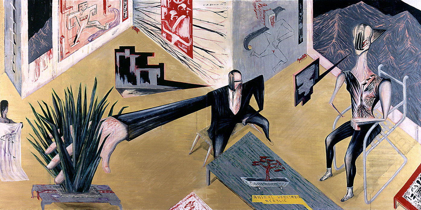
White has come a long way. Through the 1970s, she was an exemplary regional-realist painter, creating iconic New Zealand images. Alongside Michael Smither and Don Binney, she updated Colin McCahon and Rita Angus’s Pākehā nationalist-pioneer-settler art idea for a new generation. (Although White is Ngāti Awa on her dad’s side and attended Ngā Puna Waihanga conferences, this wasn’t explicitly reflected in her work and largely passed without comment.) Her rural landscapes featured rolling green hills, clear blue skies and seas, and isolated buildings—colonial wooden houses, churches, and tiny railway stations. Her portraits presented friends and family as stoic, salt-of-the-earth types. Her plain-speaking, frontal compositions and crisp, clean, idealising aesthetic would translate beautifully into the logic of the screen prints that popularised her vision. The title of her 1981 monograph said it all: Robin White: New Zealand Painter.

But things would change, dramatically. In 1982, White—who had embraced the Baháʼí faith of her parents—responded to a call to support the emerging Baháʼí community in the Republic of Kiribati, formerly the Gilbert Islands. (They call it ‘pioneering’.) She and her family decamped to the remote atoll of Tarawa. If her work had celebrated a simple life in New Zealand, her life would get even simpler. She quickly abandoned the complexity of oil painting and screen printing to focus on making wood-block prints. Her new work responded to her new location: Beginner’s Guide to Gilbertese (1983) was about learning the local language and the diaristic Twenty-Eight Days in Kiribati (1985) was about showing visiting New Zealand friends her new home. Had White turned her back on her established career, her brand? Her work was still about place, but now a different one. In 1984, after her first show with him since departing, her dealer Peter McLeavey wrote to her, acknowledging that collectors preferred her earlier New Zealand ‘ikons of place’, but reassuring her that ‘soon, the tide will turn’.

In 1996, a fire razed White’s home and studio on Tarawa, but it proved to be a blessing in disguise, as she would later see it, quoting Baha’u’llah: ‘My calamity is My providence.’ As an artist, White was forced to turn to what was available on her doorstep, engaging local weavers to convert her designs into pandanus-leaf placemats. New Angel (1998)—based on logos for basic products available from the island’s local stores—conflated commercial pop imagery with customary weaving, the imported and the homegrown. It played on latent religious symbolism: Instant Sunshine (milk powder) and Paradise Twist (tobacco), Fresh Bread and New Angel (tinned mackerel). Loaves and fishes! In White’s works, the humble proves portentous.

New Angel set White on a new path. Collaborating with Pacific Island women artists would become her MO. This would continue—indeed, rev up—after she returned to New Zealand in 1999, settling in Masterton, farming heartland, an hour’s drive from the ocean, the farthest from it she had ever lived. White had long admired ngatu (painted tapa cloths), particularly some fine examples hanging in Fiji’s Nadi Airport. In 2000, a Baháʼí friend, Leba Toki, agreed to teach her. Ngatu are created using a variety of techniques. Sometimes, patterns and images are transferred using relief rubbing plates (kupesi) placed under the cloth; other times they are directly stencilled on. White related to such techniques from her background in screen printing. She would go on to make Teitei Vou (A New Garden) (2009) with Toki and Bale Jione for the Asia Pacific Triennial in Brisbane in 2010. It presented a utopian image of ‘Sugar City’, conflating Lautoka, in Fiji, and Mt Carmel, the administrative centre of the Baháʼí faith in Israel, with many allegories integrated into the scheme. In 2010, at a Baháʼí summer school in New Zealand, White met Ruha Fifita, a young Tongan woman studying at QUT in Brisbane. They collaborated on ngatu that were presented in Kermadec (City Gallery Wellington, 2012) and Ko e Hala Hangatonu: The Straight Path (Pātaka, Porirua, 2014), often working with the women of Haveluloto village on the execution. Recently, she has been working with Ruha’s sister Ebonie and others.

White’s eclectic ngatu combine different traditions (Fijian and Tongan), and drew their imagery from here and there. They bridge the customary and the contemporary, the individual and the collective. While they have a cross-cultural dimension, they are also a product of the artists’ common Baháʼí faith, which stresses a fundamental human unity underpinning cultural diversity. As Baha’u’llah said: ‘The Earth is but one country, and mankind its citizens.’ Describing her work with Toki, White has said: ‘By using tapa to convey designs that include recognisable Indian and European elements, we aimed at suggesting the possibility of one culture embracing, in a positive way, features of other cultures, and that this process generates change without necessarily compromising the essential values that form the basis of a secure sense of identity and belief.’ White’s collaborations operate on multiple levels. Sometimes, her ngatu are designed and executed with others, but, increasingly, as with the works in Matisse Alive, she is responsible for the designs, bringing in others on the execution. She has also found new ways to collaborate. In 2019, she started working with Taeko Ogawa from Hiroshima, who generates avant-garde calligraphy to incorporate into White’s designs.

•
White has now been back in New Zealand for longer than she was in Tarawa. When she left her homeland, she seemed to close one chapter of work (to do with a settler aesthetic), ultimately opening another (engaging with Indigenous cultures of the Pacific). But perhaps these phases of her work have more in common than is immediately apparent. When curator Justin Paton commissioned White to respond to Matisse’s engagement with the Pacific for Matisse Alive, it was an opportunity for her to reflect on her own engagement with the Pacific through the work of her French predecessor.

Matisse was inspired by exotic locations. Early on, trips to French colonies—Algeria in 1906 and Morocco in 1913—proved decisive in the development of his art. In 1930, at the age of sixty, he spent three months in French Polynesia, including two months chilling out in Tahiti. He was on holiday. He didn’t make much work: one small painting, some drawings, a few snaps. ‘I came back from the islands empty handed’, he confessed to Brassaï. However, impressions of the place—of its light and lagoons, its flora and fauna, its tivaevae—would percolate in his memory. A few years later, he made two paintings based on the view through his hotel window in Papeete (Window in Tahiti I, 1935, and II, 1936). But it wasn’t until 1946 that the memories would fully kick in, inspiring his iconic silk-screened hangings, Oceania, the Sea and Oceania, the Sky. It was the start of his most radical work, the cutouts, which sustained him until the end. 

In preparation for her project, White read books: Hilary Spurling’s Matisse biography, Paule Laudon’s Matisse in Tahiti, and the exhibition catalogue for the 2017 Matisse in the Studio exhibition at London’s Royal Academy, which charted the ways Matisse employed domestic objects as ‘actors’ in his paintings. In Pierre Courthion’s Chatting with Henri Matisse, she noted a passage: ‘He knows his props and he knows how to arrange them. Already, the armchair, the table, the chairs, everything around him seems to have taken the impress of his personality.’ For the Sydney show, White decided to make interiors, studio scenes, as settings for imagined conversations, where objects owned by Matisse and others would stand in for them, as if impressed with their personalities.

Assisted by EbonieFifita and other helping hands, she produced four ngatu for the show. The largest of these, the widescreen Vaiola addresses Matisse’s response to the light he saw in the ocean at Fakarava (vai means water, ola light or life). From within a ngatu-lined room, we glimpse stylised-patterned ocean waves through two sets of windows—although these could also be framed pieces of ngatu. White references Matisse’s Window in Tahiti paintings, where the window also features a drawn curtain. 

In Vaiola, two wooden chairs—based on chairs from White’s home in Masterton—wait for people to meet and converse. Matisse? And who? A coffee pot, cups, shells, and a pineapple—White’s versions of items familiar from Matisse’s still lifes—rest on a table between them. On the far left are Matisse’s shoes and hat, copied from a photo taken the day he arrived in Papeete. His shoes sit on the floor; his hat is above them, half in and half out of the picture, overlapping its decorative border—perhaps hanging on it, perhaps flying free. 

There’s also a gridded band of repeated images of a stylised bird. White says they were based on the white-dove crest of Ikale Tahi, the Tongan rugby team, but turned into ngongo (seabirds). One seems to have escaped, and is hiding in the pattern of the ngatu lining the wall. It’s hard to tell whether we are to read this band of birds as part of the interior or a decorative border around it. Along the top, ‘Vaiola’, a poem by ‘Akesa Fifita—Ruha and Ebonie’s grandmother—runs as another margin and border. The work plays games with windows and frames, and frames within frames; with borders, margins, and thresholds. As a ngatu that depicts a ngatu-lined interior, it’s a mise-en-abyme.

If Matisse fancied Tahiti as idyllic unspoiled nature, Vaiola quietly contradicts this. Palm corned-beef logos crown both sets of windows. The logo—showing a sun setting over the ocean, glimpsed through parted palms—evokes an island paradise. This logo has become a local icon; however Palm is not from the islands. It’s a New Zealand brand exported to the islands, where the fatty, salty meat has become a loved but problematic staple of the local diet, contributing to the decline of the local fishing industry and rampant obesity. The logo’s presence suggests how the islands are seen by outsiders, but also how their gaze might also be accepted and integrated by insiders. (Matisse scholar John Klein has observed a parallel case of misrecognition. Tivaevae had a massive influence on Matisse’s cutouts, yet these ‘indigenous’ designs were already informed by fabrics manufactured in Europe for the island market, based on colonialist assumptions regarding native taste.)

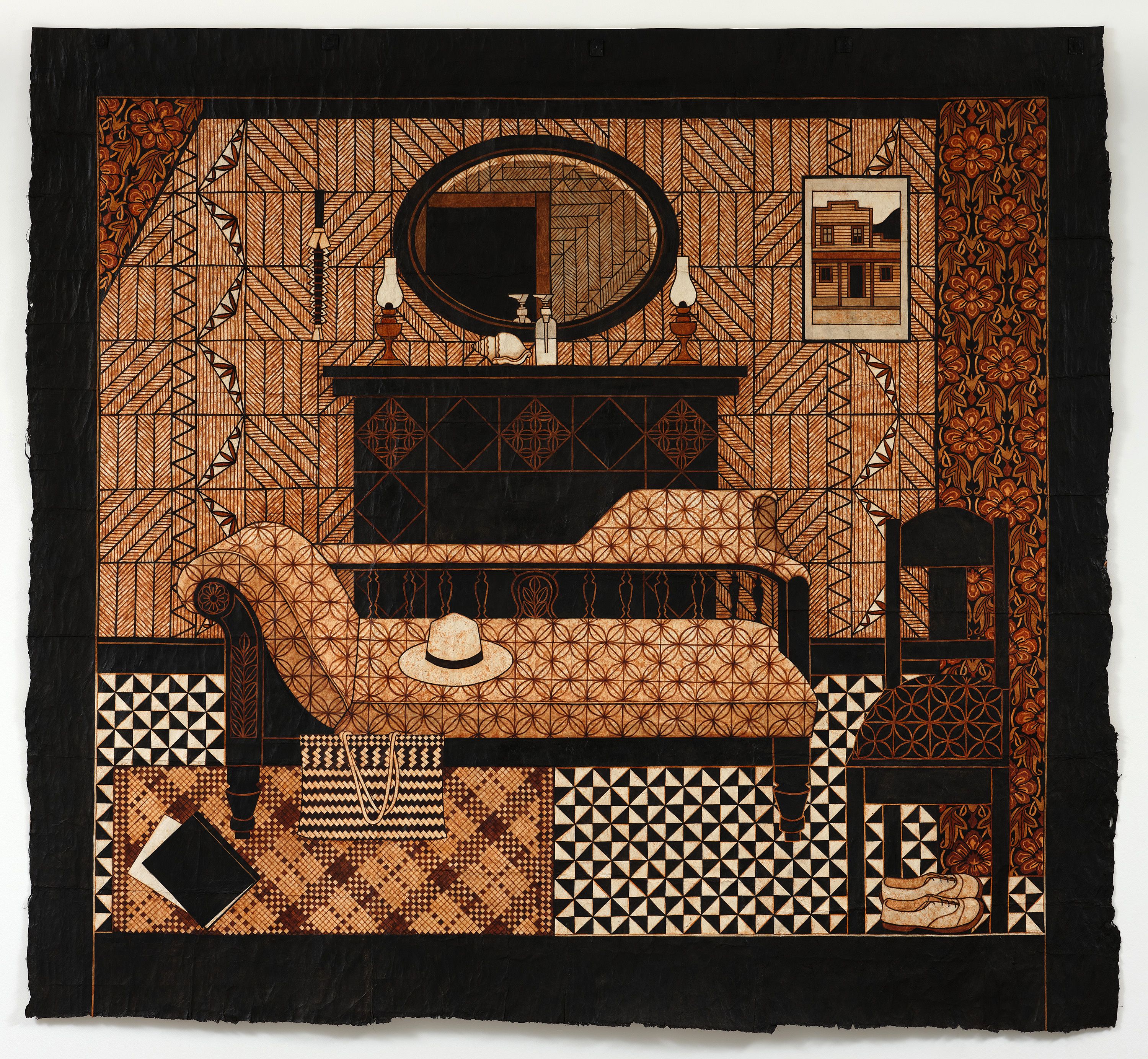
Matisse was hardly the first Westerner to head to Polynesia. He knowingly travelled in the footsteps of Paul Gauguin and Scottish novelist Robert Louis Stevenson. White’s Soon, the Tide Will Turn is based on the Tapa Room at Villa Vailima in Sāmoa, where Stevenson lived from 1890 until his death in 1894. Now a tourist attraction, the Tapa Room is a mélange of the colonial and the local, here and there. While its walls are lined with ngatu, there’s also a fireplace. It was totally unnecessary, given the climate, but Stevenson had it built anyway, as a symbolic hearth—home away from home. In her work, White includes Stevenson’s fireplace, his oval mirror, and a local weapon hung as an objet d’art. European-style floral drapes frame the scene, perhaps contrasting with the ngatu, perhaps akin. 

This set is occupied by the notorious chaise longue that dominated McLeavey’s Wellington gallery for decades, standing in for him, even after he died. The work’s title, of course, quotes McLeavey’s advice to White. Alongside the chaise is a wooden chair (one of White’s, from Masterton). Together, chaise and chair suggest a psychoanalytic session, and McLeavey did enter analysis. Matisse’s hat rests on the chaise, while his shoes are parked under the chair. McLeavey’s kete leans against the chaise, and perhaps those are his notebooks on the floor. On the mantelpiece, White has arranged a shell (perhaps a reference to Tahitian shells in Matisse’s still lives), two gas lamps (which could be original to Villa Vailima, but could also be a McCahon reference), and a hand-sanitiser dispenser (recalling the soda-water siphons in the Tapa Room, but updated as a nod to Covid). White is also present in the tableau. Hung over the ngatu-lined wall is a framed picture recalling Mangaweka, a screen print White made in New Zealand in 1974. Displaced, it reads as an exotic curio, a souvenir of another time and place. 

White’s suite of works stages a complex conversation between departed souls—who never met, and who never could meet, because they occupied different historical moments (Stevenson, Matisse, and McLeavey). But the conversation also includes the living (White, Ebonie Fifita, and ‘Akura Fifita). In the third ngatu of a ngatu-lined interior, To See and to Know Are not Necessarily the Same, White incorporates a calligraphy design by Ogawa—a fellow Matisse fan. It presents a Chinese proverb: ‘When you drink water, think of the source.’ Ogawa’s design is a nod to the Chinese calligraphy panel Matisse’s wife gave him for his sixtieth birthday, which features in numerous photos of him and his studio.

A fourth work, a ngatu ‘uli (black ngatu)—Hufanga‘anga—completes the room. Made using a black dye from the soot of burned tuitui (candlenuts), ngatu ‘uli are difficult to make, highly valued, and associated with Tongan royalty. Hufanga‘anga (meaning sanctuary) is a big, solid-black rectangle surrounded by an ochre border. White calls it a ‘portal’, and compares it to Matisse’s windows. It hangs vertically, like a door, as a threshold between here and there. This abstract ngatu sits in the company of three highly illustrative and decorative ones, yet all four suggest spaces the viewer could step into. 

While Matisse is a constant reference point in these works, they are hardly Matisse like. Where are the blocky colours, the free expressive lines, and the nature focus we associate with Matisse’s Pacific works? While celebrating Matisse, White prefers interiors, prioritises culture, and adopts a dark palette of blacks and browns. Her manner also holds ngatu tradition at arm’s length. While ngatu are generally pattern based, White’s are increasingly like pictures. Her outline drawing delineates forms in space, even if the outlines are ‘snapped to grid’ and filled in with flat patterns, generating a push–pull between 2D and 3D. The approach recalls White’s early screen prints, which also involve meticulously deconstructing an image and patiently reconstituting it, step by step. As with the screen prints, much of the appeal here lies in seeing how the logic of the process has become implicit in the final image.

White’s Matisse works have a magical, uncanny dimension. She says they belong to ‘the fluid yet episodic world of dreams’, which may explain the jumbled time frames and prompt us to hunt for hidden meanings, like psychoanalysts. One tell-tale correspondence catches my eye. In Soon, the Tide Will Turn, an ambiguous form—a black rectangle with an ochre border—is reflected in Stevenson’s mirror. The shape could be a window (one is reflected in the mirror in photos of the Tapa Room I found online). It could also be a door. Or it could be Hufanga‘anga itself, which, at the Art Gallery of New South Wales, hangs nearby. Beside the mirror is White’s nod to her Mangaweka print. In it, the building’s front door—a black rectangle with an ochre border—echoes the form reflected in the mirror. When I compare it with the actual Mangawaka print, I see White has removed the ute from in front of the building to offer us an unimpeded view of that door. Is this visual rhyme a secret message or a red herring; a deliberately baited hook, an unconscious Freudian slip, or serendipity? 

And, with this show, when and where are we anyway? Are we in White’s home in Masterton with her wooden chairs or in McLeavey’s Gallery in Wellington with his chaise, in Stevenson’s mansion above Apia or in Matisse’s studio in Nice? Are we somehow in all these places and moments at once, confounding the issue of who is guest and who is host? Riddled with portals, actual and metaphorical, these works emphasise the porousness of cultural spaces—suggesting opportunities to come and go, physically, psychologically, culturally.

White’s project speaks to our current moment, which demands cultural engagement but is fraught about cultural appropriation. White is not fraught. She embraces Stevenson and Matisse as fellow travellers, who passed through the Pacific with open eyes and hearts, and were positively transformed by the experience. When asked if she identifies as Māori, Pākehā, or Pacific Island, she dodges the question, replying either ‘I’m a hybrid’ or ‘I’m a Baháʼí’. Her approach is in sync with a Baháʼí world view that asserts a fundamental unity underpinning human diversity, and that understands religions—which frequently find themselves at war—as part of a common faith. Her ngatu express this through how they are made and how they are—means and ends. With their decorative quality, they transmute pictorial principles of balance and integration into an ethic or politic of peace and civility, absorbing and managing multiplicity, downplaying discord. ‘Difference without opposition’, as art critic Craig Owens once put it. At a time when division is our default setting, White offers a work around. 

For me, so much turns on that one detail: White discovering her Mangaweka print—that fragment of her past life—hanging in the Tapa Room alongside the charged remnants of other kindred spirits who passed this way. In this humble detail, White’s early insular settler New Zealand ethos reaches out to, holds hands with, and is incorporated into her new Moana cosmopolitanism, suggesting how much things have changed, how much they remain the same. Or am I dreaming?
.
[IMAGE: Robin White Soon, the Tide Will Turn 2021]

Telly Tuita: Telly Vision

Here, no. 10, Summer 2021–2.


.
In July, Tauranga Art Gallery was installing its show Mānawatia Takatāpui/Defending Plurality. It was only half up, but Stephen Cleland, the gallery’s new director, walked me through. I found myself transfixed by four large photographs by an artist I didn’t know. Telly Tuita posed in photo-studio-style sets with colourful faux-tapa backdrops, wearing crazy, improvised costumes, surrounded by suggestive props. Based on the Four Horsemen of the Apocalypse from the Book of Revelation, his images were part regal, part op shop; a bit kids’ play, a bit mardi gras; with a dash of disco and a pinch of something sinister. I was surprised to learn he was from Wellington, my town. After lockdown, I tracked him down and we met in the Lyall Bay bungalow he shares with his husband and their chow chow.

Tuita was born in Tonga in 1980. He’s never met his mum, who deserted him at birth. As a child, he was whāngai-ed around, between family members. When he was nine, his grandfather thought he’d be better off with his dad, by then living in Australia with his Pālangi wife. So, the little boy—who didn’t speak English and hadn’t been off the island—was put on a plane and plunged into another world. ‘I was told I was being sent to a better life, but I had no concept of what that would be’, he says. 

He had difficulty relating to his new environment, especially his religious step mum. ‘She thought it’d be great to bring over a little jungle boy from Tonga to civilise him, but, by then, I’d already lived a thousand lives’, he says. They fought. ‘She used to threaten me for misbehaving, saying, “I’ll send you back to Tonga!” And I’d say, “Send me back! Send me back!” She kicked me out when I was fourteen. Maybe, by then, she had a feeling that I was gay.’ 

Despite such early bumps, Tuita did well. Being a party boy, Sydney was a pleasure for him. He went to university and was the first in his family to graduate. He did a teaching degree, then a master’s in special education, becoming a deputy headmaster. All the while, he made art, riffing on memories of his Tongan past. In 2017, he met his husband-to-be, a boy from Pōneke visiting for the weekend. They crossed paths one morning: Tuita heading home from a party, Hoani heading out for a jog. Tuita relocated to Aotearoa in 2017 and they married in 2020. His plan was to teach, but Hoani suggested he make art full-time. ‘It was like a child being told he could go into a massive lolly shop and eat whatever he wants.’ 

When I ask what life in Tonga had been like, he alludes to family complications, but also offers a more idyllic account. ‘It was exactly what an islander life should be’, he says. ‘Like most village kids, I did chores, I spent time in nature. I didn’t have any notion of the west.’ Tuita’s Tonga is a child’s memory. There are no photographs. ‘The first time I had my photo taken was for my passport to go to Australia’, he says. 

Curator Leafa Wilson coined the term ‘cold islanders’ to describe Pasifika artists based in Aotearoa. As Polynesians, she says, they relate to Māori, yet they have tauiwi status. They are ‘cold’, she says: away from the warmth of the islands literally and left out in the cold metaphorically. Cold islanders often idealise their homeland—Tuita titled a 2020 solo show TongPop Nostalgia. Nostalgia is a malaise. This yearning to reconnect with a perfect, fantasy past generates a proliferation of signifiers of Tonganness in his work. Tuita’s TongPop is part of a globally prevalent art idiom defined by the collision of indigenous and pop sensibilities, where colonised and colonising rub together, where traditional, grounded, oral cultures dance with global mass media. The spectre of a secure identity and the allure of shiny new things compete for attention. 

Tuita’s gay sensibility offers another turn of the screw. His 2020 painting The Captain is perverse. ‘It’s Captain Cook as a young man, based on a marble sculpture by a French artist’, he explains. ‘I like it because he looks like a sexy twink. It’s so un-Captain Cook.’ In The Captain, the stylised carved-wooden features of the Tongan goddess Hikule‘o are superimposed over Cook’s cold marble ones—two totemic figures going head to head. After the introduction of Christianity in Tonga, worship of Hikule‘o was outlawed, yet she persists as a ubiquitous image of the nation. She crops up throughout Tuita’s work, sometimes as a mask he wears. In The Captain, it’s like we are caught in the middle of a filmic dissolve between Cook and Hikule‘o, but we don’t know which way it’s going. Has he usurped her or is she overwriting him? 

Like many artists from colonised cultures, Tuita has a love-hate relationship with the early colonial images he references. They exemplify an idealising, exoticising gaze, but also provide a real bridge with the past. ‘It’s like drugs. I had my first hit with John Webber prints’, he says, referring to the artist who accompanied Cook on his third Pacific voyage. ‘I always laugh that some of the most sexy photographs of islanders were made by missionaries.’ 

The tableaux vivant he stages in his back yard with photographer Nick Shackelton allow him to embody and act out his conflicts, making himself their vanishing point, with everything converging on his body. In the Four Horsemen photos, he matches the dark riders (Famine, Conquest, War, and Death) with the seasons (autumn, winter, spring, summer). Tuita’s avatars wear elaborate headdresses and superhero capes. One wears a blue skull mask, another wears footy shorts and is draped in diaphanous pink tulle, queering the iconic look of Aussie yobs draped in Australian flags. 

Archetypes pervade Tuita’s work. Right now, he’s planning a new cycle of seven self-portraits. He outlines the plan, reading from his workbook: ‘The Terrorist is immortalised as the Hero. The Celebrity is always the Lover. The Mogul overpowers the King. Warriors of the Right and Left! The Jester is a mask for Queers. The Bloke a Hero. The Immigrant is a forced Warrior.’ It’s like he’s creating a TongPop tarot. 

Tuita has shown with Precinct 35 in Wellington and Weasel in Hamilton, but he doesn’t have a dealer—not yet. His work has been more visible in public spaces, including Objectspace and Tautai in Auckland, and CoCA in Christchurch. A recent commission for Wellington City Council will see his imagery enlarged and wrapped around buildings, impossible to ignore. His next show is a Wellington pop-up organised by the concept store Kaukau, with artists Sione Monu and Pusi Urale. And he has his first residency coming up, with Artspace Aotearoa in Auckland. 

‘Someone called my work window dressing’, Tuita says. ‘It was the best compliment. Going past David Jones when I was young, I thought “That’s art.”’
.
[IMAGE: Telly Tuita Summer Death 2020]

Brett Graham: Written on the Wind

Artist Profile, no. 57.


.
When I went to school, in the twentieth century, we weren’t taught New Zealand history. I remember studying the histories of England, Europe, and Japan, but not of New Zealand. Like many Pākehā, I grew up in a convenient state of cultural and political amnesia. It wouldn’t be until I was an adult that I’d learn about the New Zealand Wars (1845–72) and the myriad mechanisms by which Māori had been separated from their lands. Discovering that—the detail of it—was disorienting. 

Such ignorance was symptomatic and systemic. In the introduction to his 2019 book The New Zealand Wars Ngā Pakanga O Aotearoa, Vincent O’Malley writes: ‘The wars loom large in the national narrative, but we have not always cared to remember or acknowledge them. For much of the period from 1872, most Pākehā clung to a highly romanticised version of these wars that emphasised mutual chivalry and heroism, avoiding more disturbing truths. When this position was no longer tenable, many simply chose to ignore them altogether.’

These days, as the Wars and their legacy move to front of mind, the past floods the present. Old markers and memorials cease to feel quaint, and previously benign street names—Cook Street, Victoria Street, Grey’s Avenue, McLean Street, Wakefield Street—turn toxic. In this time of reckoning, people ask: Should memorials be left standing? Should the curriculum be revised? Should place names be changed? Should the flag be ditched? What forms should remembrance take? And whose?

Sculptor Brett Graham has thought a lot about monuments and memorials. He’s one of the so-called ‘young guns’ generation of Māori artists that emerged in the 1990s. He studied in New Zealand and Hawaii, and has travelled extensively, immersing himself in Indigenous histories and issues, politics and philosophies. He’s known for his large public works, like his Kaiwhakatere: The Navigator (2001) in Parliament grounds, in Te Whanganui-a-Tara Wellington. Late last year, Graham opened his career-defining project exhibition Tai Moana Tai Tangata at Ngāmotu New Plymouth’s Govett-Brewster Art Gallery. The show addressed the New Zealand Wars, focusing on the historical relationship between the local iwi, Taranaki, and his own, Tainui, from the Waikato. During the Musket Wars, they had been enemies, but, during the New Zealand Wars, they formed a pact, finding common cause in their resistance to colonisation. Each would lose over a million acres. 

Graham’s project itself claimed the entirety of the old Govett-Brewster. Mixing the architecture of war from the colonial frontier and the language of war memorials that followed, it felt like a return of the repressed. Consisting of four monumental sculptures, a carpet, and three videos, it exploited the Gallery’s distinctive split-level architecture, which determines the order in which works are encountered while generating complex sightlines between them.

The first work—Cease Tide of Wrong-Doing/Taiporohēnui—was based on nui (news) poles. In 1862, in Taranaki, in the face of colonisation, Te Ua Haumene founded the Pai Mārire faith. His followers erected the poles as antennae for communicating with God via the winds. The poles’ arms terminated in knobs, representing the gods Riki (war) and Ruru (peace). Graham’s nine-metre-high, matt-black version rose from the Govett’s ground floor, through a void, symbolically puncturing all levels of the Gallery. It felt futuristic yet traditional, with its sleek sci-fi rocket profile and surfaces embellished with pākati patterns. Its arms had house-shaped cross sections, suggesting pātaka (Māori storehouses or treasure houses). The title quoted Te Whiti o Rongomai, opposing confiscation of Māori lands. Even if you had no knowledge of the history of niu poles, the form itself—this big black spike—felt awesome.

From there, you ascended a staircase that Graham custom carpeted. Purutapu Pōuriuri (Black Shroud) featured the long-forgotten insignia of British regiments that served during the New Zealand Wars. Visitors had little choice but to tread on the mana of the Crown. The carpet looked distressed and the insignias’ original colours had gone, yet it was also lush, velvety, like new. Its patches of floral patterns suggested charred wood, perhaps prompting us to recall the Crown’s ‘scorched earth’ tactics. The title was a nod to the queen of New Zealand, Queen Victoria, and the veil she wore for decades following the death of her husband, Prince Albert, in 1861. But, if this was a widow’s veil, what or who was it mourning? Might it imagine an empire lost? How far could you take the metaphor?

At the top of the stairs stood O’Pioneer. Its cylindrical architecture had a specific reference, to the twin gun turrets of the Pioneer, a government gunship commissioned to invade the Waikato in 1863. The turrets were later redeployed as war memorials and still stand: a World War I memorial in Mercer, where the Waikato was invaded, directed toward Te Paina pā, where Te Puea Hērangi would lead her anti-conscription campaign; and a New Zealand Wars memorial in Ngāruawāhia, on the pā site of Pōtatau Te Wherowhero, the first Māori King, where the Union Jack was hoisted by colonial forces in 1863. Graham clad his replica turret with white plaster-relief panels so it looked like a giant wedding cake—albeit one punctuated with gun loopholes. The panel’s decorative floral pattern recalled the ‘royal icing’ of Queen Victoria’s wedding cake from 1840, the year the Treaty was signed. Graham’s message was clear. As Walter Benjamin put it, ‘There is no document of civilisation which is not at the same time a document of barbarism.’ Don’t candy coat this.

If O’Pioneer made its point swiftly, the third sculpture was enigmatic, ambiguous. In Maungārongo ki te Whenua, Maungārongo ki te Tangata, an uprooted carved pātaka was placed on wheels, converting it into a wagon. There was something Magritte-like about this metaphoric house on wheels, prompting us to ponder its past and future. Why had the pātaka been uprooted? Where had it come from? Where was it going? Who had drawn it? Had it been abandoned or was someone coming back to collect it? Was anything left inside? Was it a Trojan horse? 

Maungārongo asks to be read, yet it can be read in very different ways. It plays with time. Graham sandblasted the carvings to make them look old, then covered them in graphite to make them glisten like new. Its title translates as ‘peace to the land, peace to the people’, but it’s more dualistic. The wagon’s arms terminate in stylised faces with different expressions, representing Riki and Ruru (a nod to the niu poles), epitomising the contrasting responses of Taranaki iwi to colonisation—the militarism of Titokowaru and the pacifism of Te Whiti and Tohu at Parihaka. While the work could refer to Māori being dispossessed of land generally, it could also refer to the way Taranaki iwi specifically dispatched wagons with food and water to Pākehā surveyors and road builders as an assertion of their manaakitanga and sovereignty. Very different ideas. 

But there’s more twists. Graham’s pātaka recalls the Motunui Panels. Carved before 1820, these pātaka panels were hidden in a swamp by Taranaki iwi during the Musket Wars. Some of Taranaki’s Te Āti Awa would migrate south to the Kāpiti Coast and Te Whanganui-a-Tara Wellington. Maungārongo could also refer to that migration. Interestingly, the Motunui Panels would continue their journey. In the early 1970s, they were discovered, disinterred, illegally exported, and acquired by a Swiss collector. After failed legal attempts to have them repatriated, in 2014 the New Zealand government bought them and restored them to Te Āti Awa as part of the Treaty-redress process. They are now displayed in the Ngāmotu museum Puke Ariki, a stone’s throw from the Govett. Those Panels—Maungārongo reminds us—have been passing through history on metaphorical wheels.

In the fourth sculpture, Graham took the positive associations of lighthouses and gave them a malevolent spin. The towering Grande Folly Egmont confused the form of a lighthouse with those of military watchtowers and blockhouses. It referred to the Cape Egmont lighthouse at Pungarehu, which was completed to enable the invasion of Parihaka in 1881. By then, Taranaki was a military complex, peppered with redoubts and watchtowers. The work’s weatherboard logic would become the default settling for New Zealand domestic dwellings, with Graham prompting us to understand our own homes as part of the invasion. 

Graham’s four sculptures were huge—their scale implied historical weight. They were also colour coded—two were black (Cease Tide of Wrong-Doing and Maungārongo), referring to good Māori attitudes; two white (O’Pioneer and Grande Egmont Folly), referring to bad Pākehā ones. They were like giant chess pieces, sitting on their own squares, in separate spaces, but extending their influence throughout the Gallery, perhaps holding one another in check. They were contextualised by three black-and-white panoramic videos of unpeopled landscapes. Manukau, Ohawe, and Te Namu each pictured an important site in Graham’s story. Te Namu, for example, was where Taranaki repelled Tainui in 1833, where Pai Marire was established in 1962, and where a future Māori king was baptised into the faith in 1864, forging the Tainui–Taranaki pact. The video, however, showed a landscape studded not with niu poles but oil derricks, signalling its subsequent exploitation by the oil and gas industry. ‘I wanted to extend on the idea of “prophecy” by looking into the future’, said Graham, picturing the scene as a polluted steampunk dystopia, or like something out of Metropolis. Graham’s videos also played with time; they used drone footage and computer animation, yet their black-and-white, degraded, stuttering quality suggested early film.

In Tai Moana Tai Tangata, conflict and connection between Māori and Pākehā were played out in Graham’s art language, which incorporated logics of construction, carving, and casting, carpentry and carpetry, architecture and engineering … and video. Māori and Pākehā were related and distinguished: Māori with their carved decorations, Pākehā with their military insignia; Māori with their serpentine forms, Pākehā with floral ones. Graham drew on customary Māori forms but also on minimalism and conceptualism. He addressed complex, devil-in-the-detail histories, but through radically simplified forms and elevator-pitch high concepts (a pātaka–wagon). His sculptures felt like eyes in historical storms.

Graham addressed human hubris, while perhaps also exemplifying it. His ambition enfolded so much, not only past historical conflicts but anticipated future environmental catastrophes, with nods to rising sea levels with global warming. The show scrambled past, present, and future, echoing the prophetic sensibility that arose in Māori millennial movements like Pai Marire, where Māori would read the coloniser’s good book only to realise they were the Israelites. Graham would say his non-linear understanding of time is Indigenous, non-Western, but you find something similar in Walter Benjamin’s conception of Jetztzeit (those moments of revolutionary crisis and possibility ‘shot through with chips of Messianic time’) and in science fiction’s historical uncanny (with monoliths, stargates, and other portals).

Exhibitions are social events. Other visitors are part of the experience. I was lucky to be able to attend the show’s opening-day pōwhiri, where Tainui iwi (bused in from the Waikato) and Taranaki iwi gathered at Cease Tide of Wrong-Doing, activating it through song and oratory. They responded to it not as a sculpture referring to niu poles, but as a niu pole, a ritual object. For a moment, the Gallery became a different kind of space. But even after this special occasion, visitors to the show would feel self conscious, realising they were looking at it alongside other visitors who may have had a very different relation to it—because they were Pākehā or Māori, Tainui or Taranaki, landed or landless, knowing or unknowing. If you could join the dots, you could appreciate the show in one way, but, if you couldn’t, you got it in another; the gaps in your education—your cultural amnesia—becoming its reference point. Graham emphasised this by having wall texts in English and Māori, where the Māori clearly wasn’t a translation, as if to remind Pākehā that Māori already had different access points to the works and that some things don’t translate. 

Tai Moana Tai Tangata generated interest and accolades, including an Arts Foundation laureate for Graham. Galleries were interested in taking the whole show, but found it wouldn’t fit, literally, perhaps metaphorically (although City Gallery Wellington did show a version of it without its twin towers). Providing a new model for projects that want to both stretch and exploit institutional frameworks, Tai Moana Tai Tangata raised the bar. What will Graham do to top it?

.
[IMAGE: Brett Graham Maungārongo ki te Whenua, Maungārongo ki te Tangata 2020]

Florian Habicht: Everything Is Kapai

Art News New Zealand, Winter 2021.

–

Florian Habicht’s new film James & Isey—a documentary about a son organising his mum’s hundredth birthday party—opened on eighty screens around the country.
.
Robert Leonard: How did James & Isey come about?
.
Florian Habicht: Long story. I was having a tough time. I’d had a big success with my 2014 film Pulp: A Film about Life, Death, and Supermarkets and had offers to make more band films, but I decided to come back to New Zealand. I made Spookers (2017), a documentary on people who work at the Auckland scream park, but it bombed commercially. Then, I was struggling to get my new drama, Under a Full Moon, made. I thought I could self fund it and shoot it with a small crew. But, when we went up north, everything that could go wrong did. If we’d filmed that, it would have been a cult film. A week in, I pulled the plug. All our savings went into that shoot. My partner, Teresa Peters, was supportive, but I feared she would dump me, because I was this mad man, trying to pull off an epic shoot with a tiny crew. It was a low point.

After that, I wanted to have a quiet, normal life. I joined Curious Film and made TV commercials. I made two car-safety campaigns. One featured people at a car yard unselling cars. For the car salespeople, we cast real-life paramedics and police—people that attend accidents. And, for the car buyers, we used real people who didn’t know what was going on. They thought they were going to a car yard to buy a car. It was a successful campaign. 

Then they wanted a director who could work with real people to do an Instant Kiwi campaign. The idea was: people across Aotearoa sharing their Instant Kiwi stories—how they play and what do they do to bring them luck. That’s how I met Isey Cross. We were casting and I got a postcard from Kawakawa: ‘Hi, my name is James. I live with my mum. She’s turning 100 in a few months and we play Instant Kiwi, and, if you cast us for your commercial, Mum promises to bake you one of her famous apple cakes.’

When I got James and Isey’s audition tape, it was like a little documentary. One of my questions was: if you could take one thing from this life to the next, what would it be? James said: ‘My mum.’ Then, when we made the ad, and James asked me to film Isey’s birthday party. He’d approached a couple of people already, but they wanted to charge too much. I said I’d love to do it, no charge. I’d promised myself no more docos for a while. I just said I’d film the birthday party, but, in James’s mind, I was already making a whole film.
.
What impressed you about the duo?
.
I’ve spent years writing scripts, but, when I met James and Isey, it was like, ‘Oh my God, you can’t script this.’ Their chemistry! They’re a comic double act. James loved Knight Rider as a kid and he’s got a car called Black X that looks like Kitt. And they both wear 1980s outfits. The whole time I filmed them, there was never a moment where things settled down or got boring.
.
The film is structured chronologically. There’s separate chapters for each day in the week leading up to the party—a countdown.
.
Sometimes it takes me ages to come up with a structure, but this came to me during the shoot. It was a really simple device.
.
The opening sequence is languid, with a long take of horses with subtitles sketching out Isey’s life history.
.
There were no images of Isey from when she was young, so we showed these horses, while people read about her life. When Isey was young, she would ride her horse from Kāretu into Kawakawa. Then she got her pink 1973 Holden Premier. They only have cows on the farm now. The wild horses on the beach come back later in the film, when James visits Spirits Bay. I got pressure to make the opening bit go faster and it almost got cut. But, now, when I ask people which is their favourite bit, they often say the beginning. The idea wasn’t mine. It was Jarvis Cocker’s. He watched an early edit and said it would be nice to contextualise Isey within history. What was Isey doing when people were landing on the moon?
.
So, in Cocker’s promo quote for the film—‘A truly alternative (and uplifting) history of the twentieth century’—he is applauding his own idea.
.
Ha. Yes, he is. But I love that idea. The opening gets the past out of the way, because the film’s not about the past. Isey lives in the present; she refuses to look back. To get Isey to live so long, James is always talking about the future. A week after her hundredth birthday, he was ordering the chairs for her 101st. Seriously.
.
There’s an early scene of James killing and burying a sick cow. It’s a morbid note, which you ultimately leave behind, because it’s not a film about death.
.
James is so affected by the cow’s death—it shook him up. When his animals die, he gives them a proper burial. What I didn’t realise, when I was editing, was that, from that scene, audiences would be wondering whether Isey would even make it to her birthday. People sit right through the end credits to check that Isey is still going strong.
.
I’m amazed that you can make a film entirely on your own and present it at cinema scale.
.
It feels like a miracle when I see it on the big screen. I shot it with no crew and edited it on my laptop. It was so direct. I didn’t tell anyone I was making it until I had a rough cut. Some shots are bumpy, because there was no time to think. The magic was happening and I had to capture it intuitively. When the camera’s shaking, it’s because I’m laughing. It’s shot using old Russian Lomo 35mm cinema-camera lenses so the picture’s beautiful and imperfect. Not everything’s sharp.
.
Isey is the stable centre of the film, while our understanding of James lurches about. He’s this, then that, then something else again.
.
His personality is so rich. The film is the tip of the iceberg. James wants to make a sequel with me. I also have ideas for a sequel, but I’m keeping them to myself.
.
James and Isey are showoffs, attention seekers, playing up to the camera like naughty children. I assume Isey doesn’t go marlin fishing every week.
.
She wouldn’t have gone fishing if I wasn’t filming, but, when we went, it was one of the best days of her life. She looked so happy. James loves showing off. Wherever he goes with Isey, he tells strangers, ‘My mum’s a hundred.’ And Isey, disgruntled, says, ‘Don’t mention my age!’
.
One has to wonder if James is for real—he’s so theatrical. He claims to be a tohunga and shaman, speaking in ancient tongues, but we don’t see others endorsing this. Then he’s weeing in the backyard, driving Black X, and ordering McDonald’s. Maybe he’s a tohunga, maybe he isn’t. From the film, many won’t know. Does it matter?
.
If it matters, that’s up to audience members individually. For me, it makes the film interesting. I’ve never had trustworthy subjects in my docos, not even for the Pulp film—that’s what makes the films and the subjects special. I also like juxtaposing extremes. It’s why the McDonald’s scene is powerful, coming after the marae visit. James is complex. People have different responses to him. At one screening, a Christian woman was so moved by him that after the credits she stood up and spoke in an ancient tongue. But, there are people who see his language as a product of colonisation and the loss of te reo. Everyone is entitled to their thoughts.
.
The scene of James holding out his phone showing old video footage of himself as a lounge singer, covering Duran Duran is amazing, cheesy, and confronting—him in the present framing this past, before and after.
.
He showed me the footage on his phone and I immediately thought let’s shoot it in the street, because it’s always good having things moving in the background. Then, I thought, if he’s in his car, there’ll be traffic in the background. So we drove into town and did it in one take. I had to write to Duran Duran to get permission to use ‘Hungry Like the Wolf’. I said the film would only be big in New Zealand.
.
To me, James and Isey seemed exotic, remote, living in a bubble. But that collapsed when I saw them engage with people I knew: Jacinda Ardern and Kelvin Davis (a relative), and then Matiu Walters from Six60 is at the party (another relative). Suddenly, they’re connected.
.
James’s dream was to be a famous, sexy singer, like Matiu. He certainly had the talent. But there are so many factors at play when it comes to finding success, or it finding you. It makes me happy for James that our film has been more successful at the New Zealand box office than the Six60 film. More people went to see the unknown mother-and-son duo from Kawakawa than our most famous band.
.
There’s a lot of tragedy in James’s life. He had a stroke. He had to come back to care for his father, then his mother.
.
Maybe that’s why Isey refuses talk about the past. Colonisation is the other tragedy in the film. The racism James describes and Isey being forbidden to speak Māori at school is heartbreaking.
.
And yet that bleak stuff also seems to be there in order to be overcome. Despite everything, it’s an optimistic film. Isey says, ‘Don’t worry, be happy.’ That seems to be an overriding message.
.
Colonisation can’t be ignored, but the film is about aroha.
.
The scene of James and Isey and Isey’s older son Gavin in the car in the garage feels nostalgic, recalling a childhood playing in parked cars. I was reminded of Taika Waititi’s Two Cars, One Night (2003) and his Blazed ad (2013), and that great scene in your film Kaikohe Demolition (2004).
.
Maybe it’s a coincidence. That scene just happened. When it did, I knew it was like the scene in Kaikohe Demolition. But then, it’s also like my NZTA ads with people in parked cars. I reused the Human Instinct soundtrack from Kaikohe Demolition for that scene—Billy TK, the Māori Jimmy Hendrix.
.
You’ve got a connection with Northland. You spent your childhood there.
.
We moved to Paihia when I was eight, and I was there until I was seventeen. I used to think home was anywhere in the world where I had my suitcase. But I’ve spent a lot of time up north recently, reclaiming my roots. And I made all my early films there. I feel happiest there. I’ve made friends with birds in the bush. The further north you go, the more special it gets. Just being able to go up to Cape Reinga.
.
As a child, were you engaged with Northland’s Māori communities?
.
Yes and no. As a child, some of my friends were Māori. But Paihia is a more Pākehā place, Kawakawa’s more Māori.
.
James & Isey
is a feel-good film, but it owes something to a timewarped ‘Ten Guitars’ view of Māori. You use Daphne Walker’s song ‘Haare Mai, Everything Is Kapai’, from 1955 and James sings the Lou and Simon song ‘A Māori Car’ from 1965.
.
That’s James and Isey’s Northland. It’s like going back in time. Lots of the music in the film is from Isey’s era. It opens with the Howard Morrison Quartet singing ‘He Kainga Tupu’ (Home Sweet Home). The lyrics are perfect for James’s journey. The Tāhiwis’s cover of Arthur Freed’s ‘Should I?’ would have been a pop song in Aotearoa back in the day. Isey would have been a teenager. The Tāhiwis recordings are from the 1930s and haven’t been featured in a film before.
.
James & Isey
feels like an antidote to Vincent Ward’s In Spring One Plants Alone (1980). There’s a connection in terms of subject matter—a Māori mother and son living together in a remote setting, observing their daily rituals—but it couldn’t be more opposed in feeling. In Ward’s film, the old woman is the carer for her son, who’s schizophrenic and violent. In Spring feels bleak; James & Isey uplifting.
.
After making James & Isey, I watched In Spring, because friends said I had to. It feels so different. Leon Narbey shot In Spring using a long lens. He was far away from the action for the whole film. But, with James & Isey, I’m in the film with them. I didn’t have a sound recordist and the mic was on the camera. I wanted good sound, so I had to be extremely close.
.
Today, there’s anxiety about Pākehā representing Māori, rather than them framing themselves. But James & Isey complicates this, because you became an instrument for your subjects to depict themselves.
.
I’m not representing Māori, I’m creating a portrait of two individuals. I’m celebrating and capturing their magical world without judgement, as I did with Warwick Broadhead in Rubbings from a Live Man. And, yes, I do become an instrument of sorts. James approached me to make the film. He determined that we include Tāne Mahuta, Spirits Bay, and Te Rerenga Wairua (Cape Reinga) to bring the spirit world on board. He was creatively involved with the making of the film.
.
There’s a parallel with your drama Love Story (2011), in which you ask random people what they think should happen next and film that. But this is also a distinctive aspect of your cinema.
.
That’s true. With Love Story, I let my subjects—the people on the streets of New York City—dictate the film’s narrative. They were stand-ins for the audience, so when you watch the film, it feels like a pick-a-path book. It’s become the way I make my hybrid docos. In Rubbings from a Live Man, Warwick came up with his own cast of alter egos, and he performed the entire documentary—or ‘fuck-you-mentally’ as he called it.
.
As a filmmaker, you walk a line between sympathy and detachment, with abrupt shifts in tone, from hand held documentary scenes to grand cinematic fantasy ones, like the scenes at the waterfall and Te Rerenga Wairua. We are jolted out of reality and into James’s head, into his fantasy.
.
Kaikohe Demolition
has those shifts too. It’s part of my language. That these more cinematic scenes signal a shift into fantasy is your interpretation. James and Isey are nuanced human beings and nothing is black and white in the film. That’s what makes James & Isey still interesting for me, after watching it a hundred times.
.
Isey sings ‘Que Sera, Sera’. Doris Day sang it in Hitchcock’s The Man Who Knew Too Much (1956), where she is a mother calling out to her kidnapped son. ‘Que Sera, Sera’ has been described as ‘cheerful fatalism’.
.
I haven’t seen the Hitchcock film, but I’ve read about it. ‘Que Sera, Sera’ is Isey’s philosophy. James is always giving her his big ideas for the future but her response is always, ‘Que Sera, Sera’. She’s happy with whatever happens. It was hard getting that song. A big chunk of the film’s budget went towards the rights.
.
What will your future be? You’re still planning to go back and make dramas, despite your success with James & Isey.
.
I just made a video called Waves. During the James & Isey shoot, I slowed down and captured life in Isey’s pace. I felt like a David Attenborough wildlife camera person. When you briefly see the sun setting in the film, I probably filmed the sun for an hour. That kind of meditative filming inspired Waves, which is fifty-two minutes of waves, basically. It’s inspired by the forces of nature being greater than us all. It’s going to be on the giant video screen in Fed Square, in Melbourne, for a week in September. And yes, I’m doing drama. In 2012, I read the book on the ‘inner movie method’,  How to Write a Movie in Twenty-One Days. I enjoyed it and recommend it, but I’ve been working on one of my scripts for seven years and the other for nine. The revision of Under a Full Moon—my ‘Titanic’ film-shoot experience—is ready to go, but I need financial support.
.
Do you think James & Isey has an international audience?
.
Yes. Jarvis Cocker and his girlfriend Kim loved the film. So did other European friends. But, so far, the big decision makers don’t think so, apart from Australia. I’m going to show it to Mubi and Netflix soon. I thought Kaikohe Demolition would have an international audience, but it was ‘too New Zealand’. It played in New York at the Margaret Mead Film Festival at the American Museum of Natural History, and that was about it.
.
I went to the James & Isey premiere at the Civic. Half of Kawakawa seemed to be there.
.
The Bay of Islands kapa haka group was the highlight for me. Weren’t they amazing? James wanted to have the premiere at the Civic, partly because it’s so grand and partly because the last time Isey went to the movies it was at there during World War II with her brother Len. Our distributor, Madman, said it’d be easier having the premiere in Newmarket or Kerikeri, but James only wanted it at the Civic. We asked and it was a definite no, unless we did it in winter. Most dates also had about five pencil bookings. Then a date opened up and it just happened to be Isey’s 102nd birthday!
.
Will the film change James and Isey’s lives?
.
I don’t think it has changed Isey’s, except that strangers come up and kiss her. She doesn’t like that at all. I think she would have been happy to have a little party for the premiere. She didn’t need a thousand people at the Civic, but she did enjoy it. At 11:30pm, she got on stage in the Wintergarden and was dancing. I thought she’d be tired, but she was up for it. James, on the other hand, always wanted to be a movie star. When he saw his first cowboy movie as a kid, he heard a voice saying, ‘Become a movie star.’ He was singing in a band in Las Vegas and acting and it was going well, but he gave it up to come back and look after his parents. But now, from him putting his family first, that dream has come true. He’s in the ultimate movie—with his mum.

Andrew Beck: Photography Backwards

Here, no. 8, Spring 2021 (abridged).


.
Wellington artist Andrew Beck is lanky and clean cut. He dresses normcore. The thirty-three-year-old lives in a cinder-block bedsit in Hataitai’s Park Mews—the village designed by Roger Walker in 1973 and famous for its iconic turrets and portholes. Beck’s crib is spartan, free of nicknacks and clutter—just the books he is currently reading and the food he is about to eat. His studio is in town, in Marion Street, on the first floor of a charming art-deco building, near galleries, cafes, and boutiques. Walking past, I can always see him from the street, sitting in the bay window, but he can see me too. I never know whether he fancies himself to be a prisoner in the panopticon or the guard.

Beck makes photograms—cameraless photographs. They are produced by placing objects over photographic paper and exposing it to light, capturing the objects’ shadows in negative. Before cameras, photograms were used to make one-to-one-scale documents of cuttings of plants, lace, and the like. Early last century, modernist artists—including Christian Schad, Man Ray, László Moholy-Nagy, and our own Len Lye—experimented with them, shoring up their place in the avantgarde tradition. Later, they became a classic darkroom exercise, helping students understand photographic materials and processes. There’s something appealing about their primitive, cave-painting-like quality.

Beck hybridises photograms with painting, sculpture, and installation. For his MFA show at Massey University’s Engine Room in 2011, he used the beams of light that poured in through the gallery’s skylights and onto its walls. Over the course of a week, he pinned up sheets of photographic paper and exposed them, always at 11:45am, capturing the light beams’ positions at that moment. After processing the sheets, he reinstalled them in the same spots. Visitors saw light passing through the space, coming in and out of alignment with the impressions indexed in the photograms, turning the gallery into some kind of sundial. Later that year, in Steel-Bar Shadow, he condensed this idea. He made a photogram of a steel bar, then used the bar to prop the photogram to the wall. The photogram indexed the bar’s shadow from a particular moment, but the bar casts a fresh shadow onto it—in a play of real and represented, presence and absence, now and then.

After graduating, Beck lived in Europe for a year or so. He enjoyed shows with ParisCONCRET and Berlin’s Galerie Luis Campaña. Campaña took his work to Art Cologne, the big art fair—twice. The second time, he got his own booth, as part of the fair’s New Positions programme. Despite some success, Beck returned home in 2014 and has established himself here happily. He says, ‘Obviously, I want to show internationally, but, for me, making art in New Zealand makes sense. New Zealand is my home.’

Although he doesn’t identify as a photographer, Beck’s work is all about photography. He’s constantly making references and analogies to its processes, mechanics, and optics. There are different branches to the project, but Beck is best known for his iconic constructed photograms. These feature hard-edged geometric forms, particularly triangular shards and circles, which suggest vision, optics, and photography—focused and projected light beams. Beck creates photograms using diverse techniques. Some times they are made using paper negatives; other times by bouncing light off sheets of glass at odd angles. Beck cuts, collages, and overpaints photograms. He conceals them behind painted-glass masks and coloured glass. There’s a convoluted self-referential aspect: they look like diagrams illustrating the behaviour of light, while being created by exploiting the behaviour of light.

Beck wants to make a good first impression. He says: ‘I like art that precedes interpretation, that prompts an emotional response before you understand what you’re seeing.’ His titles can sound descriptive, technical, and scientific, like Focus Point, Visual Appearance and Internal Representation, Prism in an Ultraviolet Field, Vertex Figure, and Glass Strata. But the images also have a mysterious, auratic quality. They remind us that, for all its apparent rationality, modernist abstraction was freighted with the authoritarian and the sacred.

Beck says, ‘I’m trying to make images where there’s just enough information to trigger an association. If you combine a horizontal line with a gradient, it’s hard not to read it as sky and land, as distance; as something coming towards you, something receding.’ The constructed photograms may be simple and suggestive, but they are also hard to place. They could refer to early modern art or to recent computer-generated imagery; they could belong to the past or the future. They have a sci-fi quality.

Beck says: ‘I began by referencing geometric abstract art—Malevich, Rodchenko—but now I’m more interested in cheesy Internet-art movements from the last decade, like vaporwave.’ Beck talks a lot about vaporwave, a faddish electronic-music microgenre that used slowed-down and screwed-up samples from muzak, smooth jazz, and pop, and computer sounds. It was accompanied by a visual language that recycled defunct computer aesthetics, with Greco-Roman-statue and sunset memes thrown in. Vaporwave presents a view of the future from an earlier time, a future gone stale.

Beck can relate: ‘Vaporwave was made by Internet nerds my age who grew up with dial-up Internet and are nostalgic for that time.’ He reads its retrofuturism through the work of a British philosopher, the late Mark Fisher. For Fisher, our current moment is haunted by promised futures from the past that never arrived, that were cancelled by postmodernity and neoliberalism. He argues that we are doomed to nostalgically replay these past-future imaginings, unable to generate new futures for now. We’re stuck. But, in citing vaporwave aesthetics, is Beck challenging this malaise or embracing it self consciously? Is he part of the solution or part of the problem? Either way, he offers an odd spin on this question. He admits as much: ‘In evoking a computer aesthetic via the darkroom. I’m labouring over an image that a computer can produce perfectly—easily.’

The constructed photograms look good and have made Beck a hit with collectors. He’s shown with a number of New Zealand dealers, but is currently represented by Visions, Auckland. His works were a hit on its stand at the Auckland Art Fair earlier this year, with whole editions selling out. But, while his slick aesthetic appeals, it’s telling to visit the studio and confront the detritus of Beck’s low-tech analogue process. These days, digital photographers don’t get their hands wet, but Beck still does it the hard way. There are curled-up, fibre-based prints piled up everywhere, and he’s taken over the bathroom with his processing trays, with prints pinned up to drip dry.

Beck splits his time between consolidating what he’s known for and trying out new things. He may be associated with crystalline geometries, but he’s been quietly exploring a diametrically opposed look in parallel. For five-or-so years, he’s been exposing photographic paper under water, so it registers the water’s ripples and eddies. He says: ‘I use a body of water as a lens. It’s like lying on the bottom of a pool and looking upwards to the water’s surface. That’s what the photographic paper sees.’ Perhaps he got the idea from those hours in the darkroom, processing prints in baths. The water photograms allowed Beck to break out of his comfort zone. He says, ‘With my constructed photograms, I know what I’m doing. I introduced the water because it’s chaotic, something I can’t control. The water photograms are what they are, good or bad. I can’t finesse them, can’t make them better, but I know which ones I want to keep pretty quickly.’ Scale can be ambiguous. Some look like vast atmospheres or aerial views.

The water photograms featured in Beck’s first Auckland solo show, at Bowerbank Ninow in 2018. Its centrepiece—Open Surface (Holon) (2018)—consisted of sixteen of them. Each was dominated by a horizontal line left by the edge of the glass sheet he used to hold down the paper as it was exposed, dividing the swirling waters. The photograms were abutted and aligned to create a common horizon, suggesting both a continuous beachscape and discretely framed meteorological moments. (In case you’re wondering, a ‘holon’ is a part-whole, a part that contains the logic of the whole within it—think an acorn or a fractal pattern.)

In 2019, while on a Rauschenberg Foundation residency in Captiva, Florida, Beck turned a corner with his water photograms. Another resident, Puerto Rican performance artist Nibia Pastrana Santiago, prompted him to use his body in these works. He admits, ‘I’d never thought to do this. Physically, I’d been absent from all my work. But when I started waving my arms and legs through the water, when I put my body into the image, new references came into play.’ Beck’s resulting works have an eerie, blurry, haunted quality, recalling X-rays and spirit photography—the artist as ghost.

The water photograms look so different, but are no cul-de-sac. They’ve been feeding into the way Beck makes his constructed photograms, which increasingly suggest chaotic miasmas, force fields, and flocking patterns. His 2020 Visions exhibition Iris included constructed photograms where fields of shards converge on a vanishing point or explode out from it. They reminded one critic of a view from a spaceship jumping into hyperspace or navigating space debris. In another 2020 work, a flock of triangles suggested a body dematerialising in the Transporter on the Starship Enterprise.

What’s next? Beck’s making a sculpture out of car windscreens—those curved pieces of glass that operate both as lens and screen. There’s a story: ‘I grew up sweeping the floor of my parents’ windscreen repair shop, with heaps of broken glass everywhere’, Beck says. Sculpture makes sense. ‘A lot of my installations are already sculptural, playing two-dimensional photographic representation back into the three-dimensional real world’, he says. ‘It’s photography, but backwards.’
.
[IMAGE: Andrew Beck Open Surface (Holon) 2018]

Judy Millar: Paint, Canvas, Action

Judy Millar: Action Movie, ex. cat., City Gallery Wellington, 2021.


In 1950, Hans Namuth photographed American ‘drip’ painter Jackson Pollock at work. The images would be published in Art News and elsewhere. Namuth returned with a movie camera and made a short film, Jackson Pollock 51 (1951). It showed Pollock painting on glass filmed from underneath, as if he were painting directly onto the film itself. Namuth’s photos and film cemented the idea of Pollock as expressive authenticity: ‘I don’t paint nature, I am nature’, he said. However, the contrivance of performing for the camera infuriated Pollock, who reportedly told Namuth, ‘I’m not a phoney, you’re a phoney!’ 

The film may not have been true for Pollock, but it came to represent authenticity. At the end of 1952, Art News published critic Harold Rosenberg’s influential essay ‘The American Action Painters’, which was inspired by Namuth’s photos, securing the idea of painting as the index of an act—direct and performative: ‘At a certain moment the canvas began to appear to one American painter after another as an arena in which to act—rather than as a space in which to reproduce, redesign, analyse or ‘express’ an object, actual or imagined. What was to go on the canvas was not a picture but an event. The painter no longer approached his easel with an image in his mind; he went up to it with material in his hand to do something to that other piece of material in front of him. The image would be the result of this encounter.’1 While the idea of ‘action painting’ was limited, it was also compelling. It paved the way for artists to carry painting into performance—performing painting before audiences or for the camera.

In revisiting the old idea of action painting, Auckland painter Judy Millar constantly emphasises painting’s mediated quality. In Action Movie, her work stands alongside films of Kuzuo Shiraga, Yves Klein, Lucio Fontana, and Paul McCarthy performing painting in the wake of Pollock, as well as ‘direct’ films by Len Lye and Stan Brakhage that draw on the abstract expressionist ethos but complicate it by scrambling expressive mark making with a vitality artificially generated by the mechanics of cinema. I talked to Millar about her work and the show.

.
Robert Leonard: In 2020, you painted
Pink Trap. What was the impetus?
.
Judy Millar: I wanted to make an episodic painting that would read like a comic strip. I’d tried painting sequences of images on separate canvases, where one painting led to the next, but, I thought, if I painted them on one canvas, maybe the sense of story would become more obvious, the transition from one frame to the next more crucial. In Pink Trap, I taped up individual frames thinking I would later remove the tape and each separate image would be surrounded by a white border, mimicking a comic-strip layout. However, after I painted it, there was a lot of painting on the tape that seemed important, so I left the tape on. Even though the canvas became one thing, it still had the feeling of an image mutating across the canvas like a cartoon strip. The forms are like letters, like script.
.
They are also like figures.
.

Figures have been in my work for some time. I want to have a spatial image that viewers can relate to with their own bodies; that they can enter imaginatively, but with a sense of their own physicality. They need something to measure themselves against.
.
You did one painting with tape, then two more without—Wrestle and Double Hand.
.
I thought I could get the same feeling without the obviously taped-up frames. With the other two, I ruled pencil lines to demarcate the frames. Apart from this, I tried to paint them with the same attitude and using the same movements.
.
What are they painted on?
.
Vinyl used for billboards. I wanted to make long paintings and it comes in 100-metre lengths. It’s beautiful to paint on. The acrylic paint loves the material quality of the vinyl. Plastic on plastic. The vinyl is very thin, so, when you hang it unstretched on a wall, it almost becomes the wall.
.
Did you execute the frames separately, one at a time?
.
I painted each frame separately, consecutively. Using thin acrylic paint, you have to work quickly and you can’t return to make changes. Once each frame is painted, it has to be left alone, and the next frame worked on.
.
Were they painted on the wall or the floor? How were you oriented?
.

They were painted on the floor. I start with a strong sense of top and bottom, but it can shift during the painting process. Once I begin, it’s pretty frantic, so up or down, left or right, cease to have any meaning. Often, the best works look great from all directions.
.
How did you make the marks?
.

With a big bundle of rags. Fingers and hands find their way in there too.
.
The marks are figurative and muscular. They’re like writhing bodies, while also indexing your own body making those marks.
.
When I’m working, there’s complete absorption. Every bodily movement is imprinted directly on the surface, so the painting becomes a recording of sorts. But the use of rags means I take paint off the surface at the same time as I put it on. There is a constant exchange between the visible and the removed, between recording and obliterating. It’s as much about the absence of the figure as its presence. It’s hovering between absence and presence.
.
These paintings have a crude, primitive figuration. The forms arrayed across them seem to writhe in some state of becoming. They’re foetal.
.
The forms are either coming into being or dissolving from being. The magic of drawing, the magic of making a line, means you are forming a volume on a flat surface. The forms emerge from simple volume making. In that way, they are foetal, or, at least, nascent. Not necessarily human, but lifelike.
.
The palette is interesting: lipstick pinks, bloody reds, and bruise blues.
.
I’ve been working with colours historically used to depict Caucasian skin tones for a while—also the bloody reds—wanting to index the body more directly in the works. Bruising the surface, yes, but also thinking of the darks and violets of night. Recently I found an entry in an old notebook: ‘There are colours for hurt and for giving hurt.’ That still stands.
.
So, what were you thinking about when you were painting them?
.
Reach, stretch, stroke. Be tender, be aggressive. I want the full gamut of feeling to be in the work, so I have to play that out for myself in the making. But I also have to keep my eyes open, to be fully there.
.
Why make three of these paintings?
.
I’ve been rereading The Unbearable Lightness of Being, one of my favourite books. Milan Kundera puts forward the idea that if something happens once it’s meaningless. It must be repeated to be meaningful. I repeat myself, but in the hope of getting to a new place.
.
Is there a risk in showing all three works together—same same?
.
No. You’ll see the same colours, the same approach, but, within that, different possibilities and feelings.
.
After these warm-palette landscape-format paintings, you made a series of seven cold-palette portrait-format ones, which we are also showing.
.
I often react against what I’ve just done.
.
Are they painted with rags too?
.

They are, but they’re also painted with my new plastic-bag-full-of-sand dabber, which I started using a couple of years ago. In printmaking, dabbers are used to ink plates. I wanted to find something like an enlarged fingertip. In painting, fingers are good, because they’re immediate, dextrous, and smeary, but I wanted to upscale the fingertip, to exaggerate it, so I could make fingertip marks like boa constrictors.
.
Do you have a different relationship to the painting when you use the dabber as an intermediary, or are you in the painting regardless?
.

Yes, I’m in there, and I’m pretty close, because I still have to use quite a lot of physical force to get it to push through the paint. It increases my exertion.
.
In the show, we’re presenting these seven works together. Their theme-and-variation approach quality will generate a kind of animated zoetrope effect.
.
They belong together and that’s the best way for them to be seen—filmically.
.
People once imagined that painterly marks conveyed feelings in some direct, unmediated way. ‘Action painting’ may have been a bogus idea, but it was a compelling one. How do you relate to it, distance yourself from it, play with it?
.
The ‘action painting’ idea became a distraction and people stopped seeing the paintings. I’m trying to renovate or reanimate the cliché. Of course, I want to convey feelings, complex feelings. Any art form mediates emotions, enacts them, presents them. Direct expression is a noble quest, but in the end, in painting, feelings are conveyed through a sticky medium. And paint is a medium that’s already been used for centuries in all sorts of amazing ways. Transference through a medium makes expression no less meaningful, but it is an artifice. Art always has a cliché hiding in there. You’re trying to avoid it, but, in the end, you have to embrace it.
.
You made Space Work 7 for the Adam Art Gallery’s 2014 show Cinema and Painting. It was a sculpture—with painting applied to a giant ribbon-like 3D support.
.
There were two things, the printed image and the sculptural form to hold it. The image came from a painting that I had converted into a screen print. Then I dropped that image into Photoshop, re-rasterised it, stretched it out maybe ten times, and stuck it to the surface of the curved sculptural form. I was putting a handmade image through a series of technological shifts and stretching out the temporality of painting, hypermediating the image.
.
What was its connection with cinema?
.
It was about the relationship of space and time, image and movement. It was a time warp, a space warp. That’s how I relate to cinema, as a warping of presence.
.
It suggested a length of film footage.
.

Yes, but I didn’t want that to be read too literally. I was more interested in the relationship of the printed image on the surface to the physical structure holding it—the stretching of the image in relation to the bending and warping of the physical structure.
.
When you look at a length of film, you can see the images on it, but, when you look at a length of videotape, you can’t. And, now that we have various forms of digital capture, it’s not even linear, just a stack of ones and zeros.
.
And yet we still think of moving images as time unfolding in strip form. Another thing about film that’s always intrigued me is that, while with a painting the physical presence and the illusion are present as one, with a projected film, if you put your hand into the light, the image vanishes. With film, you have the illusion and no physical presence, so there’s a completely different relationship between presence, illusion, time, space, and our bodies. In cinema, the presence is always a haunted one. These were things I was playing with.
.
In Action Movie, we’re showing your paintings with two ‘direct’ painted films: Len Lye’s All Souls Carnival (1957) and Stan Brakhage’s The Dante Quartet (1987). In both, there may be a vital, expressive quality to each painted frame, but, when the films are run through a projector and animated, they take on a different life. There’s a play between painterly expressive vitality and cinema’s mechanical vitality.
.
What amazes me about painting on film is the tiny scale that’s involved. Painting directly on a piece of film a few centimetres wide is such a different experience to the work I do. There’s not much room to move in or on. This is compensated for by the movement from one frame to the next, which, as you say, gives the vitality. The understanding has to be in the totality of the film experience rather than in the individual images, frame by frame.
.
The Dante Quartet
 slows down and speeds up, and combines different aspect ratios. So the painterly aspect grinds against the mechanical-cinematic one.
.
Yes. Of course, these aspects of the cinematic medium interest me because they transform the directly handmade mark into something new. It’s important for there to be a distance between the work and the way it’s made. At times, I’m surprised at how my paintings look printed or photographic. I’ve deliberately used technological processes—camera, Photoshop, printing—to create distance between my hand and the viewer.
.
In Action Movie, we’re also including films of four artists performing painting. There’s documentary footage of Japanese artist Kazuo Shiraga, from the Gutai group, painting with his feet while hanging from a rope, which he did in the late 1950s and early 1960s. We see French artist Yves Klein employing women’s bodies as paint brushes for performances in 1960 and 1961. Italian artist Lucio Fontana punctures a canvas for Belgian TV in 1962. American performance artist Paul McCarthy paints a line along the floor using his face in 1972. Judy, you introduced me to Shiraga.
.
Coming from a small country, away from the ruling paradigm of New York painting, I’ve always been interested in Gutai. Shiraga dragged his feet through extremely thick oil paint as a direct painting method. Maybe five years ago, at Art Basel, I saw lots of his works. I was shocked by what great paintings they are.
.
Why shocked?
.
Previously, I thought the foot thing was a gimmick, but they are extraordinarily good paintings. What still amazes me is that Shiraga would not have been able to see what he was doing during the act of painting. His bodily movements weren’t at all connected to vision. There’s a complete separation of the bodily and the optical. I once hung a rope in my studio and tried it out myself. It was very difficult.
.
There’s a link with Carolee Schneemann’s ‘painting up to and including her limits’ and Matthew Barney with his ‘drawing restraints’.
.
Yes, it is to do with drawing restraints, but, with Shiraga, there’s also a total immersion in material. And there’s something missing in that, because, for me, painting must always exist between the material and the illusionistic, between the body and the optical. Shiraga completely gives himself over to materiality.
.
While trying to transcend it?
.
Trying to push through it to reach another place, certainly. I assume there’s a desire for total immersion, being totally in the moment, totally present—a transfixing. The works carry that. Shiraga later became a Buddhist monk.
.
His paint is so thick.
.
Very thick.
.
And in your works?
.
Very thin. Painting is a grubby process, but I don’t want the grubbiness to stick to the work. The grubbiness is part of my own experience. I think the world is grubby enough, actually.
.
And the space in your works is very illusionistic, whereas, in his, it’s the opposite.
.
Yes, his is absolute materiality. I want my work to have this hovering illusionism. For me, the greatness of painting is being able to be material and illusion at the same moment. In the most basic sense, it seems that our biggest problem as humans is that we live in this dual world of materiality and of dreams, aspirations, and fantasy. Religion and art are all about trying to harmonise these two aspects.
.
Did Shiraga’s feet inform your use of dabbers?
.
No, because he used his feet directly. The dabber was an attempt to make my fingermark bigger, to be larger than I am. Actually, using the dabber is another kind of mediation. The use of rags to apply and wipe away paint often makes marks that look like phoney brushstrokes, a sort of mimicry. The dabber is another version of that.
.
On the one hand, there’s Klein using naked women as paintbrushes to apply blue paint, evoking the ideal and beautiful. On the other, there’s McCarthy, at his most abject, and materialist, face in the mud.
.

Yes, but they’re all very materialist. I think the difference is that I’m trying to make my works very immaterial, even though I use the material means to do it. As a child, I had a fantasy of being invisible. It’s a push towards lightness. Could we hover? The poet Kay Ryan has said ‘the most beautiful thoughts and feelings must be light or they’ll break us’.
.
Your paintings are perky, full of movement. They’re energetic, vital. They have attention-deficit disorder. Your gestures want to spring off the surface and jump out of the frame.
.
The gestures become characters. I want to animate them, but surprisingly they often take on a life of their own. They separate themselves from ‘the field’, even when being a detail of that field.
.
When you take a small sample of a field, the pattern disappears and there’s a new relationship between the mark and empty space. I think of Gerhard Richter taking 128 detail photos of a single painting. Richter also made all those squeegee paintings. In a way, he’s wiping off, like you. In 2011, Corinna Belz made a film of him painting them.
.

It was amazing to see how quickly his paintings were transformed by a slash or a swipe, or another colour on or off. In showing the simplicity of the trick, he made himself more of a genius.
.
Where Richter kills expression, you amp things up.
.

Richter’s work is cold, whereas I overplay the heat. I believe that a good painting is an energy transmitter.
.
We looked at a film of the French ‘tachiste’ Georges Mathieu painting on stage in 1971, ‘improvising’ alongside Vangelis playing music and a woman dancing. It was a campy, theatricalised idea of painting performance. We didn’t include it.
.
Some of Mathieu’s paintings are great. But that particular video, well, apart from the nubile, young woman being used …
.
She looks like a hangover from Klein’s performances.
.

… whatever she’s doing there. There’s painting’s theatricality and there’s theatricality brought to painting. Mathieu brings the theatricality to painting. I’m not sure what he achieves by doing that.
.
But Klein’s ‘performing’ too. He’s also a dandy.
.

But he’s operating on a metaphysical level, isn’t he? The music, the formality of the event, the women’s bodies, and the blue paint—all of it is implicit in the finished work. I’m more sympathetic to that.
.
Fontana was quite the dandy too.
.

Yes and no. To me, his slash is all about Christian iconography, the wound in the side of Jesus—opening up the wound. When you first go to Italy, you are confronted with paintings of the wounded Christ and this desire to open up the male body.
.
Fontanas flip-flop between the material and the immaterial. Are these punctures in canvas or a constellation of stars?
.

It wasn’t called ‘spatialism’ for nothing. Of course, Fontana also came out of ceramics, out of the earth. So there’s this incredible combination of being in the mud and reaching for the heavens.
.
While McCarthy remains face down in the mud.
.
The abject McCarthy. I know, on one hand, it’s a pisstake, but on the other, I see him, just as much as Shiraga, as trying to really get through the constraint of material. I see that ambition there.
.
You would never perform a painting, would you?
.

In that sense? Never. I’m interested in painting being an object. A thing that carries all that inside itself, not a thing that absorbs it from the outside. As a painter, you need to be out of the picture in order for the gesture to seem vital, not to be a distraction from it.
.
[IMAGE: Judy Millar Pink Trap 2020]
.

  1. Harold Rosenberg, ‘The American Action Painters’ (originally published in Art News, November 1952), reprinted in The Tradition of the New (London: Paladin, 1970), 36–7.


Julian Dashper: Autumn 1989

A talk given at Sumer, Tauranga, in the exhibition Julian Dashper: Autumn 1989, 3 July 2021.


I often return to the opening lines in the essay Francis Pound wrote for Julian Dashper’s Water Color catalogue back in 1991. In ‘Deathdate’, Pound explained: ‘The museum wants the artist timeless. It is waiting for the death. Only with the closure of death does the oeuvre completely and happily begin.’ How prophetic. Of course, today, Dashper is dead (he died in 2009); so is Pound (died 2017). Both are now history, reborn as oeuvres. Rest in peace.

Born in 1960, Dashper was three years older than me. I’ve had a long relationship with him and his work. Over the years, I’ve curated and written on it repeatedly. I like to say that I ‘co-evolved’ with it, as my thinking developed alongside his. Dashper’s work was all about negotiating his relationship with art, with the art world, and with art history. It shaped the way I think about them too, the way I work. 

Back in the day, Dashper could be amusing but also annoying. He was something of an enfant terrible, a prankster. He took liberties. He was a riposte to art history, while also screaming ‘let me in, let me in’. And he was. He’s been absorbed into art history. His works, which once rippled with provocation and attitude, are now pedigreed, blue chip. They are not simply art-about-art or art-about-art-history, they are art-history-art. They uphold art history. You can buy a piece of it; there are a few works left.

I like this show: Julian Dashper: Autumn 1989. It samples a key moment in Dashper’s work. Thirty-plus years ago, back in the twentieth century, he produced these charming, easy-on-the-eye, gentle-on-my-mind graphics, as he transitioned from being a Julian Schnabel neo-expressionist type to being a cooler, more geometric, and ultimately more conceptual artist. 

Dashper’s work here typifies the larger postmodern turn of the 1980s, when our relation to abstraction changed fundamentally. Previously, abstraction was routinely touted as advanced, superior, the future, art’s objective and endgame. It was entangled, variously, with notions of formal and philosophical self-criticality (‘thoughts’) and notions of deep spirituality (‘feelings’). It was veiled in complex, monolithic, churchy theories—high seriousness. Abstractionists turned up their noses and kicked sand in the faces of lesser artists. 

But, in the 1980s, this rhetoric wore thin. With the pendulum swing of postmodernism, abstraction was no longer understood as form, but as sign. If we no longer took modernism so seriously, it wasn’t so long ago that we had—which gave these works of Dashper’s their illicit frisson. When they came out, no-one quite knew whether they were homage or pisstake—or what was the proportion of homage to pisstake there was. Allan Smith expressed this perfectly writing: ‘Much of the work’s motive-force comes from its ability to play on the memories and expectations of high-modern abstraction while subjecting these expectations to witty deferrals and reorientations.’1

Modernist abstraction involved formal enquiry, but there’s no real formal enquiry here. Dashper wasn’t trying to forge a new language, but to mimic an existing one—something different was at stake. He wasn’t a modernist, but a mock modernist. His modernism had a dashed-off, faux, amateurish quality, like he was creating mock-ups, stand-ins, or imposters, rather than the genuine article. The work was saturated with quotation and parody. Plus bathos. If Dashper seemed to make grand claims, it was only ever to fall short. The work looked like modernism to emphasise its distance from it. It was modernism in scare quotes.

With the works massed here, one can see Dashper was knocking them out according to a formula, willy nilly, as so many arbitrary variations on a theme, foregrounding the repeated use of templates and ‘colouring in’. Perversely, as if to highlight their interchangeablity, he gave his works titles that seemed to distinguish them. I remember we included three 1988 Dashper gouaches in the 1992 Headlands exhibition: Design for a Dust Jacket on Dancing, Mural for a Disco Hall, and Logo Design. It prompted everyone to ask the obvious: ‘Why is that one about dancing? They all look the same to me.’ That said, I remember, Design for a Dentist’s Waiting Room sent one critic off on an interpretive tangent, asking if Bertie the Germ had gotten into modernism.

Dashper pulled the rug by linking his work to the banal specifics of everyday life. In this show, Philip Shave Green (1990) is one of a number of apparently abstract works that recall the face of the Philishave electric razor, with its three circular heads—a modern design classic. However, you wouldn’t think of that razor if it weren’t for the title, and the work really has nothing to say about the razor. The title ties this inoffensive abstract—which could be about something else or nothing—too close to a real-world referent. (Interestingly, doing my extensive Wikipedia research, I discovered that the Philisave triple-head razor was test-marketed in New Zealand and Australia in 1956, and wasn’t introduced globally for ten years. For once, New Zealand was ahead of the game. And yet, I don’t think Dashper knew that, because, if he did, he surely would have mentioned it.)

The works here play with history. The Seventies! 5 and 6 mess with dates explicitly, in a way destined to confound future cataloguers and fact checkers. They come from a series of drawings and paintings of the year ‘1960’—that of Dashper’s own birth—drawn with french curves and other drafting tools. They read ‘1960’, but they were done in 1988 in a retro 1950s-ish style, and titled The Seventies! And, of course, now, both works are in a show called Autumn 1989 staged in Winter 2021. Go figure.2

I always assumed that Dashper’s ‘1960’ works were a nod to a Rita Angus’s rebus-landscape painting, AD 1968. Angus wrote that year using images of a stick, two seahorses, and a tank. But there was no temporal confusion intended—Angus painted it in 1968. While the Angus feels like an obvious reference point for the Dashper, the upshot isn’t clear. Dashper’s ‘1960’ works aren’t in Angus’s style—although they do have something of her colouring-in quality. They don’t have much to say about her or her work. They are simply parasitic upon it.

I used to call such Dashper works ‘perverse homages’, because they made reference to canonical artists, but not necessarily to what was important about them. They prompted endless nerdy art-historical digressions by people like me. But, such references would only be ‘live’ for those local aficionados and insiders alert to them, members of the inner circle. For us, such contextual trivia override the works’ formal qualities; we are more likely to discuss the Angus connection than the way the works actually look.

With works like these, Dashper reminds us that modernism was always a multiple and messy thing. We have contrasting, contradictory ideas about it. On the one hand, it can be avantgarde, challenging, disruptive—shock the system; on the other hand, it can be domesticated and instrumentalised, making life easy and efficient, with form following function—serve the system. In the late 1980s, Dashper was playing in the space between these apparently opposing aspirations. That chasm became his sandpit.

Dashper’s works were about timing, bad timing, about belatedness, about missing the modernism bus. For him, as a New Zealander born in 1960, this belatedness was not simply temporal, it was spatio-temporal. Being behind the game—having to play catch up—was part and parcel of our provincial condition. Dashper joked that modernism had to travel a long way to get here, and got distorted and damaged on the way, dissipating as it travelled further from its source, getting lost in translation. 

Dashper drew an implicit parallel between the general way edgy art gets watered down as generic corporate and domestic decor everywhere, and by the specific way it was watered down by provincial imitators here in New Zealand. Doubly diluted. 

Colin McCahon is doubtless a reference point here. In a frequently cited memoir, he wrote: ‘… the Cubists’ discoveries had become a part of our environment. Lampshades, curtains, linoleums, decorations in cast plaster: both the interiors and exteriors of homes and commercial buildings were influenced inevitably by this new magic. But to see it all as it was in the beginning, that was a revelation …  We were looking through copies of the Illustrated London News. The Cubists were being exhibited in London, were news, and so were illustrated. I at once became a Cubist, a staunch supporter and sympathiser, one who could read the Cubists in their own language and not only in the watered-down translations provided by architects, designers and advertising agencies … I began to investigate Cubism, too enthusiastically joining the band of translators myself.’3

Here, McCahon doesn’t seem to know if he’s part of the translation solution or part of the translation problem. Anyway, bowdlerisation and provincialism were conflated in Dashper’s mind. Wellington public artist Guy Ngan exemplified both and was the fall guy for some of Dashper’s tongue-in-cheek ‘homages’. When I look at Dashper’s Sketch for Transportation in this show, I think of Ngan’s Ministry of Works modernism.

Ultimately, with these Dashper works, what appeals is their deftness, their campiness, their knowing vacuousness, their lite touch, their preferring all this to the consequence and pomp of the modernism they recalled—their attitude. They are an antidote—a morning-after pill. They footnoted modernism, consigning it to history as a repertoire of quotable quotes. These Dashper works are utterly of their moment, as modernism became a period style, became retro. Modernism rest in peace.
.
[IMAGE: Julian Dashper Philip Shave Green 1990]

  1. Allan Smith, ‘Six Abstract Artists’, master’s thesis, University of Auckland, 1992: 115.
  2. Another painting from 1989, not in the show, of the year ‘1982’ is titled Nineteen Eighty-Four.
  3. ‘Beginnings’, Landfall, no. 80, 1966: 361.

Yona Lee: Fix and Fit

Here, no. 6, Autumn 2021.


.
All over the world, wherever we go, generic stainless-steel handrails and barriers are there to aid us, impede us, and control us. They’re so ubiquitous, they’re invisible. We don’t give them a second thought. But sculptor Yona Lee insistently draws our attention to them. The thirty-four-year-old is unofficial artist in residence at Special Wire and Tube Limited, in Onehunga. She makes her works in one corner of this cavernous metalwork factory, alongside gruff workers in grimy overalls, who shuffle around, knocking out fixtures and fittings, trolleys and display stands. Lee has made their quotidian grammar of bent and welded metal her own, elevating it from the ordinary.

Lee is known for her ambitious In Transit installations. In these works, she cuts and welds hundreds of metres of stainless-steel pipe to form rectilinear maze-like installations, secured to floors, ceilings, and walls. These cagey structures incorporate a diversity of familiar off-the-shelf fixtures: bus seats and ‘stop’ buzzers, coat hangers, umbrellas, lamps, mop heads, one-way swing gates, beds, chairs and tables, letterboxes, shower curtains, phone chargers, bathtubs, signs, cymbals—and, recently, even a kitchen sink. Some fixtures invite interaction, others deny it by being installed out of reach or upside down. It’s hard to tell if they provide the alibi for the steel structure or vice versa.

Lee plays with a design language that’s international, but is especially prevalent in her homeland of Korea. The In Transit idea came into focus while she was on residencies in Seoul in 2016, during which she spent time on its Metro, one of the world’s most efficient subway systems. Lee became enamoured with its turnstiles, barriers, handrails, and poles. During the residencies, she created her first In Transit installations. For the one at Alternative Space Loop, she couldn’t spare time to commute and had to work around the clock. So she slept on site in a bed that became part of the work.

I saw Lee’s work in the flesh for the first time the following year at Te Tuhi in Pakuranga, a community centre that aspires to be all things to all people. ‘It’s like a small version of the world’, Lee says. ‘Art-gallery people turn left; community people turn right. Down the corridor, there’s a pastor preaching, ballet lessons, an orchestra practicing, and an art class. I wanted to mix up all these communities.’

Lee didn’t put her work—In Transit (Arrival)—into the gallery, but into the foyer and the common areas. Visitors didn’t know whether to read it as art or not, but seemed happy to be shepherded by it. ‘I brought bus handles into the kitchen, cleaning mops into the office, and put a public shower into the courtyard’, she says. Her intervention interrupted the space, physically and socially. The structure seemed to absurdly elaborate on itself, metastasising, like there had been a glitch in the code, with fixtures popping up in random places, laughing in the face of function. The work prompted activities, both real (press the buzzer, sleep in the bed) and imaginary (a table was suspended from the ceiling).

The show at Te Tuhi was a step up. The budget meant everything could be fully functioning. When I visited on a Saturday morning, little girls in tutus had co-opted a railing as a ballet barre, cafe goers were sitting at Lee’s tables sipping flat whites, and phones were being charged, but no one was game to strip off and take a shower in the courtyard. Meanwhile, the knowing art crowd hung back, observing punters engage with the structure, unwittingly absorbed into the spectacle, becoming part of the art. It worked like a dream. The work was a hit, but it took a beating. ‘My welding wasn’t prepared for that amount of public interaction. I had to keep returning to repair the structure’, Lee admitted. The project worked like a charm. I was surprised it wasn’t nominated for the Walters Prize. What does an artist have to do?

With In Transit, Lee had developed an Instagram-friendly idea she could elaborate anywhere, endlessly. And invitations rolled in, enabling her to play out the idea in conversation with different architecture: Sydney’s Art Gallery of New South Wales (2018), City Gallery Wellington (2018), Lyon Biennale (2019), and Busan Biennale (2020). In Lyon, for instance, Lee was offered space in an old factory. She exploited its vast height, building a suspended walkway from which you could look down on the work of other artists, her competition. The handrails needed to be secure, to protect visitors from falling.

In Transit’s neutral, normcore aesthetic is the antithesis of kitschy sentimentality, decorative embellishment, and historical patina. Lee makes nonsense from this no-nonsense language, imbuing it with a wayward slapstick humour, using it to create crazy obstacle courses or adventure playgrounds. She transforms its impersonal look into her signature style.

Lee knows what it means to be in transit. She came to New Zealand in 1997, aged eleven, during Korea’s emigration boom. ‘Mom heard stories of how great things are here, the environment, the education. She thought it would be better for us kids. My brother went first, but he wasn’t able to survive by himself, so Mom and I came too, and ended up staying. Dad stayed in Korea and supported us. Now Mom’s back in Korea with Dad, and my brother’s in Singapore.’

She wasn’t always going to be an artist. Lee started learning the cello aged seven and planned to go to music school. But, towards the end of high school, she hurt her wrist and her inspiring cello teachers returned to Korea, so she started thinking about working in a different art form. She tried spatial design at AUT, then went to Elam. ‘Going to Elam was my first personal decision. It was exciting because it was so selfish’, she confesses. Lee focused on sculpture. ‘I had Peter Robinson and P. Mule as teachers all the way through. Peter taught me about the formal language of sculpture—materials and space. Mule took a more personal approach, drawing out my connection with music.’ Her cohort included Shannon Te Ao and Luke Willis Thompson.

At Elam, Lee made metal sculptures and worked with found objects, but mostly separately. Her metalworking was limited by the school’s workshops and its technicians. Her project didn’t really click until after she completed her MFA in 2010. A friend’s uncle, who ran Drake and Wrigley, a company that make metal doorknobs, gave her the run of his factory, where she learnt cutting, drilling, and TIG welding. ‘I entered the male-dominated culture of metal engineering, with nude calendars on the wall. It was interesting to work alongside the guys who make the real-world stuff. I watched over their shoulders and asked lots of questions. We got on. They missed me when I was away’, Lee says.

In 2012, Line Works, her show at Auckland’s Artspace, required specialist wire bending. Lee was referred to Special Wire and Tube, who make hooks and holders, and started working with them too. ‘Drake and Wrigley taught me how to make articulate, polished products, but Special Wire and Tube taught me how to incorporate objects into steel display structures.’ She hadn’t just got access to commercial-level fabrication, she had discovered a readymade language. Things opened up formally and conceptually.

Lee has always made analogies between the languages and mechanics of her sculpture and of her music. She played cello in front of Constrained Organism, her window project at New Plymouth’s Govett-Brewster Art Gallery in 2011. She incorporated a cello into her work Composition, at Te Tuhi in 2012. And she and James McCarthy used cello bows to play the steel rods in Line Works at Artspace, turning the attic into a resonating chamber, also in 2012. Later, she described her City Gallery Wellington In Transit exhibition as ‘a sonata’.

Museums love Lee, but sculptors cannot live on museum shows alone. They need ‘catwalk shows’ in museums (to build their brand) but also ‘ready-to-wear’ for dealers (to sell). Lee made her name with large site-responsive gallery installations, but she’s also been developing a parallel ‘product line’ of portable works keyed to domestic settings. In these works, incongruous twists and knots of pipe support a range of lamps, a round table, a handle, a mop, a towel. Installed in chic collectors’ homes, they might not look like art at first glance, but don’t exactly fit in either. Their incongruous Bunnings aesthetic is usually a give away.

Lee doesn’t have a dealer in New Zealand, but her dealer is a New Zealander. For now, she’s exclusively represented by Ryan Moore of Fine Arts in Sydney. ‘I’d never worked with a dealer before. No-one tells you what it’s about. Artists don’t talk openly about their relationships with dealers’, Lee says. ‘It’s not just about selling. Ryan works with me on ideas and gives me feedback. These days it’s all phone and email. It doesn’t make sense to have dealers in every city.’

Lee is also diversifying into graphics and video. She used to design her pipe installations in SketchUp, but now uses Blender, which enables more photogenic outcomes. Her computer drawings are starting to take on a life of their own—she’s even been animating them. Her new videos, Propositions, are a nod to 3DPipes, the classic screensaver, with its endless variations on pipes snaking through space, turning at right angles. In her videos, her animated pipes are superimposed onto tourist snaps she took around the world—in museums, hotels, terminals, the street, the subway. They navigate their way through these scenes, riffing on their existing pipe fixtures. Lee sneaks more pipes into the Pompidou Centre’s facade; handrails proliferate in a subway carriage, leaving nowhere to stand; and an illuminated barber’s pole sprouts up next to a conventional streetlamp.

Like many success-story artists, Lee’s practice is premised on travelling from residency to residency, country to country, responding to new spaces, surprising new audiences, being ‘in transit’. She needs offshore opportunities to maintain momentum. Smart but popular, her installations seemed destined to become a biennale staple until Covid-19 cramped her style. Not only has the virus slowed travel, it’s changed museums’ and audiences’ relation to her kind of work. In this new era of social distancing, participatory works that were once catnip for museums have become tedious sanitising chores. Things are getting tougher. She was able to install her work in Busan last year, even though it meant two weeks quarantine at either end. That’s commitment. And, she has residencies coming up at Cité in Paris and Jan van Eyck Academie in Maastricht. Even if the world has come to it a halt, she’s still in transit.
.
[IMAGE: Yona Lee In Transit (Arrival) 2017]

Tia Ranginui: Gonville Gothic

Art News New Zealand, Autumn 2021.
_

Tia Ranginui is a Whanganui photographer whose works range from the polemical and political to the enigmatic and poetic. Her photo Power—from the series The Intellectual Wealth of a Savage Mind (2015)—is at the polemics-and-politics end. It’s a formal portrait of a young woman—the artist’s avatar perhaps. She sits defiantly, in a red dress and a balaclava, brandishing a rifle. The photo was taken in Whanganui’s Savage Club Hall, a shameful site where, last century, white men goofed off, mimicking Māori, when they should have known better. Behind the sitter, we see caricature-style portraits of key members from back in the day, bare-chested in their piupiu. How embarrassing!

Ranginui’s photo suggests that Māori women militants have stormed the racist-sexist citadel, are now in control and have taken a picture to prove it. In fact, no direct force was required. Ranginui simply borrowed the keys. As offensive as the Club once was, its old Hall is now a toothless, kitschy remnant, occupied by the local musicians’ club. TrinityRoots have played there.

While the work has a serious message—reminding us of the banal and shocking forms racism once took—there is also a witty prankster dimension to it. This combination of politics and play gives the image its ambiguity and kick. The first-glance reading may be simple: this place is under new management; racism and sexism are bad, but times have changed; Māori and women are righteously asserting themselves. But there’s something else going on. This young woman, armed and dangerous—an allegorical personification of ‘power’—is herself a trope, rather like the Savage Club caricatures that she has superseded (or joined). She too is involved in an act of masquerade, looking to the world like a Zapatista or Pussy Rioter—out of context.

In another image from the series, Property, the same woman stands on the Savage Club Hall stage, which melds someone’s idea of a wharenui with a proscenium. She wears a black mourning dress and a veil, has her arms by her sides, and the rifle is now slung across her back. Again, the image is more questions than answers. Does the stage frame the woman, or does her presence reframe the stage? Who or what is she mourning? Is there about to be a performance? Is this the performance? Does the title refer to the building or the woman? I don’t think there are right answers, but the image gets mental wheels turning.

Ranginui mines Whanganui as a subject even when politics take the backseat. The place is part of her USP. In the same year she made her Savage series, Ranginui found herself battling insomnia following a break-up. Unable to sleep, she took photos at night. Ten resulting images, featuring people and locations, make up her 2016 series Hours between Sleep. A boy on a couch and a girl tucked up in bed are both bathed in the cold artificial light of their devices (Boyhood and She’s Filled with Secrets). A troubled-looking youth in a hoodie is buckled into the back seat of a car (Mister Lonely). A girl sits alone at the edge of a gloomy motel pool eyeing the photographer (Oasis Motel). No one seems too happy.

The location shots are also bleak. There’s a dilapidated bungalow with a decrepit picket fence, Christmas lights visible through its window (Christmas Greetings from the Cliff). A low-budget motel spruiks its ‘Honey Moon Unit’ with a tragic love-heart graphic (A Gonville Honeymoon). A nondescript walkway seems eerie, because there’s no indication why it should even be photographed (Pavement). In a dim interior, Axminster carpet, patterned wallpaper, red curtains and an upholstered chair conspire in a miscarriage of taste (Red Room).

Hours reads like a series of establishing shots from a film, setting scenes for actions to come. Its pervasive sense of gloom, alienation and exclusion reminds me of Peter Peryer’s morbid photo sequence Gone Home (1975) or Gaspar Noé’s film Enter the Void (2009), which is seen from the viewpoint of a departing soul. Hours has a similar voyeuristic quality, as if the photographer were hovering over people or lurking outside places in which they sleep—her intentions unclear. We are left to ponder her relationship to her subjects: is she menaced or menacing?

Of course, Ranginui is hardly alienated from this place—it’s her neighbourhood. Although her shots generally show Whanganui as basic and unembellished, they also accord it a haunted dimension. Take, for instance, her two night shots of nondescript houses miraculously mirrored in glassy flood waters—life continuing inside, despite this surreal inundation (Suburban Melancholy, 2015). Other local views include a swan gliding through haze (Lake Rotokawau, Whanganui, 2014), a forlorn soccer goal at frost-covered, deserted Peat Park (Winter, Whanganui III, 2014), a night swimmer enjoying a public shower at Castlecliff Beach (Huria, 2019), and a white horse glimpsed amongst trees across the river (Mauri III, 2020).

Ranginui’s neighbourhood romance continues in her latest series, Tua o Tāwauwau/Away with the Fairies (2020). In contrast to the gritty, documentary quality of Hours, it is stagey and whimsical. Its subject is patupaiarehe – fairy folk. In Māori lore, they are the original people of Aotearoa. They lived in the forests and mountains, building their homes from swirling mists. They were mostly nocturnal—direct sunlight could be fatal to them. They had pale skin and red or fair hair. They could be mischievous. They were known to lure people, especially attractive women, into their company. Redheaded and albino Māori were considered evidence of interbreeding. When Ranginui was a child, her grandfather told her stories about patupaiarehe: about going hunting and being swept into their mist; about their tricks, their laughter, the footprints they left; about them taking a child, but returning her, leaving her in the hollow of a tree trunk.

Patupaiarehe are ambiguous figures. It’s been argued that Māori may have confused Abel Tasman’s crew for patupaiarehe when they clashed in 1642. Another name for patupaiarehe is ‘pākehakeha’, a possible source for the word ‘Pākehā’. Today, some claim that patupaiarehe were early Europeans who discovered New Zealand before Polynesians. Ranginui dismisses such theories as ‘full of shit’, ‘exploiting our stories, against us’, but knows they go with the territory.

Ranginui’s six images feature two stunning young redheads, a man and a woman, who consort with mist (special effects generated by a smoke machine and a vape). Mist accompanies them and shrouds them, but their relationship with it isn’t clear. Do they produce it or draw it towards them? In one image, the woman stands on a low block wall, marking the edge of someone’s property. Is she a trespasser? Is she a sleepwalker? A puff of smoke is perfectly framed between her face and the white guttering and downpipe on the brick house behind her. We are witnesses to a spooky irruption in an otherwise nondescript suburban scene—although its magic has everything to do with the camera’s position.

This series was also shot in Gonville and Castlecliff (even though patupaiarehe supposedly live deep in the forest, away from people) and in full daylight (though they are nocturnal). Now, it would seem, those fairies are out and about, living among us; hiding in plain sight, passing for mortal. In the artist’s backyard, they play in her dinghy, as if it were a Viking longship. To scramble matters further, the titles of the photographs encompass Māori and Norse references. Tipua and Taniwha refer to Māori goblins and water demons. Niflheim and Sleepthorn refer to Norse myth—to the primordial world of mist and to a device for inducing sleep. Ranginui herself boasts Norwegian Viking heritage, on her Māori side.

Patupaiarehe may be part of Māori tradition, an expression of a Māori mindset, but within it they already represent an inscrutable, enigmatic other. Ranginui’s pictures don’t explain anything about them. Here, they could be benign or malevolent, cute or deadly, pathetic or powerful. They are floating signifiers, magnets for conflicting desires, while their own desires remain a mystery. I’m reminded of Bill Hammond’s famous bird-people, who are at once birds and people—the birds who preceded people, the Māori who came after, and the colonists who followed them—in a Möbius strip of self and other.

These contrasting series—Hours between Sleep and Tua o Tāwauwau—read through and past each other like night and day: one is light and theatrical, the other dark and brooding. In one, the photographer observes nocturnal fringe dwellers, displaced, getting about in daylight. She asks: what do they want? In the other, she is herself a fringe dweller, out of sorts, wandering about when she should be in her bed. We ask: what does she want? Tia Ranginui is one to watch.

.
[IMAGE: Tia Ranginui Tipua 2020]

In Memory of Bill Hammond 1947–2021

.Art News New Zealand, Autumn 2021.


.
The last time I saw Bill Hammond was at Peter McLeavey’s wake, at Wellington’s Thistle Inn, back in 2015. Even then Hammond was looking frail, so I wasn’t entirely surprised to hear he had died in January, aged seventy-three. I have a bunch of saved-up questions that I will never get to ask him, not that he would have given answers—he never did.

Hammond was an artist of my generation. I was a follower. I witnessed shifts in his work as they occurred, not knowing where he was ultimately headed. I was already a fan of the ‘gritty’, ‘repulsive’ work, before he turned a corner in 1993 and started making the bird-people paintings that everyone loves and that established him as a market darling. I love them too. 

However, my favourite Hammond work will always be Animal Vegetable Acrylic from 1988. I think it’s a key to his whole oeuvre. Painted just after the stock-market crash, this widescreen canvas shows a couple—yuppie collector types—at home in their modernist interior, with their coffee tables and designer chairs. They wear hip clothes with padded shoulders and sport wacky new-romantic haircuts that mask and blind them. Through what seems to be a big picture window, we see a vast, grey mountain range. It’s viewed from an incongruously high angle, apparently at night—the sky is black. This textbook vista recalls those illustrations from Professor Cotton’s Geomorphology of New Zealand, the book that so excited McCahon. A painting of a similar scene also hangs on a wall.

Animal Vegetable Acrylic addresses our alienation, from nature and from each another. For this urbane couple, living in their designer shoebox, nature has become remote and landscape a sign: a view through a window, a painting on a wall. Desperate to reconnect, the man reaches out to run his monstrously enlarged fingers through the spiky leaves of a pot plant—a mother-in-law’s tongue—on a coffee table. A picturesque bonsai—diminished, domesticated nature—rests on another table. Hammond’s title riffs on the twenty-questions game Animal, Vegetable, or Mineral?, but replaces a natural category with an artificial one. Of course, the painting is itself an acrylic.

Animal Vegetable Acrylic is a hot mess, a compendium of visual gimmicks and devilish details. There’s too much to decipher. On the edge of the scene, a vampy, smaller-scale woman holds up a sheet or a towel bearing a shark graphic, like Veronica with her veil. But why? Hammond suggests analogies between things through how they are painted. The veins in the woman’s neck and the man’s hands, and veiny patterns printed on their clothes, echo those in the landscape beyond, as if they might be expressions of the same awesome forces. Or is this a red herring?

This painting is not easy on the eye. Its jarring spaces recall Ames rooms and the isometric perspectives of Japanese prints. The man and the woman inhabit different planes, as if to highlight their emotional disconnection. Their jagged 3D speech bubbles contain no clear messages for one another or for us, just brushstrokes and scribble. Despite this, Hammond wants us to identify with their anxiety and confusion, to connect with them in their inability to connect. They are us.

When we curated Headlands—the big postwar New Zealand art show at Sydney’s Museum of Contemporary Art, back in 1992—we included Animal Vegetable Acrylic as an historical bookend. It was a sign that New Zealanders could no longer fantasise about having a direct romantic relationship with landscape. People got it: a detail from the painting was singled out on the cover of the issue of Art New Zealand that reviewed the show.

Back then, Animal Vegetable Acrylic was owned by venerable blue-chip New Zealand landscape painter Sir Toss Woollaston. That always seemed strange to me, because—besides being roughly the same size and proportions as Woollaston’s big late landscapes—it was the antithesis of Woollaston’s art, stylistically and thematically. Hammond rejected his elder’s earthy colours, love of nature, and bucolic expressivity. He trumped Woollaston. I always wondered why the older artist acquired the painting and what he saw in it. A nail in his art’s coffin, perhaps.

But the painting wasn’t quite the last word that we, the Headlands curators, imagined it was. A year after our show, Hammond started producing the bird-people paintings that would make him world famous in New Zealand and occupied him until the end. These new works emerged from a eureka moment back in 1989. While witnessing the bird life on a trip to the subantarctic Auckland Islands, Hammond imagined he had been transported to a primordial New Zealand, before people, when birds were at the top of the food chain and ruled the roost. It was as if Hammond had made contact with the nature he had previously placed in quote marks.

Joining a tradition of ornithological illustration and bird painting, Hammond’s new works had an undeniable charm. They tapped our romanticism and nationalism, even as they messed with it. His bird-people were floating signifiers. They could be whoever we wanted: us or them. They might stand in for the birds that preceded people, or for Māori, or for Pākehā (in some paintings, they play pool, drink, and smoke). If the bird-people paintings were largely an escapist fantasy conjuring up a mythic past, it was one haunted by future trappings. Its inhabitants were always-already ‘waiting for Buller’.

Hammond flip-flopped, from being an artist centred on modern alienation to one centred on nostalgia and romance. I can’t help but think of him as the opposite of Neo in The Matrix. He started out revelling in a real-world, rat-race, rock’n’roll hell, but took the blue pill and ended up in birdland, communing with Bosch and Bruegel.

I will always read the bird-people paintings through Animal Vegetable Acrylic, as if they picture what’s happening in the head of that modern alienated art collector as he rubs his hand on the leaves of that pot plant in search of a nature fix and is psychically transported to elsewhere and elsewhen, even as his body remains in that hygienic apartment in the here and now. Away with the birds.
.
[IMAGE: Bill Hammond Animal Vegetable Acrylic 1988]

Next Page »

Copyright © 2025 · Genesis Framework · WordPress · Log in