Robert Leonard

Contemporary Art Writer And Curator

Zac Langdon-Pole: Containing Multitudes

Zac Langdon-Pole: Containing Multitudes, ex. cat. (Wellington: City Gallery Wellington, 2020).


1
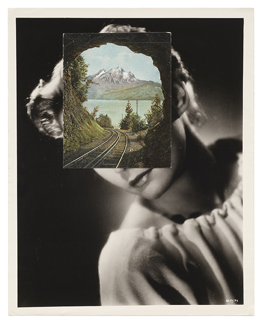
Someone has left a wooden toolbox on the gallery floor. It contains two items: a replica royalist tiara (a classy bauble) and a rusty old calf weaner (used down on the farm to separate cows from their calves, preventing suckling). These items make odd bedfellows, being radically opposed in purpose and aesthetic (nice and nasty, high and low, decorative and pragmatic) yet related (both attach to heads and are similar in shape). What are they doing together here? Whose toolbox is this? 

The work’s title Emic Etic refers to contrasting methodologies in anthropology: emic stressing the cultural perspective of the subject, etic that of the observer. The title prompts us to imagine that there might be two ways of approaching this work, as an insider and as an outsider. But whose are these perspectives? Should we view the weaner from the viewpoint of the tiara or the tiara from the viewpoint of the weaner—or both from that of the toolbox? Should we privilege the perspective of calf or Queen (or someone fantasising they’re one or the other) or the perspective of the owner of the toolbox (whoever they might be)? Should we approach the task of interpretation like some proverbial Martian or imagine that it’s already a Martian’s toolbox? Should we take a local perspective and assume the work is about how New Zealand was weaned from the motherland after Britain joined the EEC in 1973 and stopped favouring our meat and cheese—or is that taking the metaphor a bit too far? 

Perhaps there’s a wall text to explain it, to quell the disorienting proliferation of interpretive options. Perhaps not.
.
2
Emic Etic
is a work by Zac Langdon-Pole, a young New Zealand artist based in Berlin. Sometimes it’s hard to judge whether his works are straight or absurd, philosophical or pataphysical—whether they make sense or unmake it. They do foster a certain quality of attention—inquiring and open, sensitive and poetic.

Since graduating with a master’s degree from Frankfurt’s Städelschule art school in 2015, Langdon-Pole has gone on to great things, exhibiting widely—and travelling. He was one of the winners of the 2017–8 Ars Viva prize, which took him to a residency on remote Fogo Island in Newfoundland, Canada. In 2018, he won the seventh BMW Art Journey. It enabled him to conduct an extensive trip through Europe and the Pacific—following an itinerary based on the routes of migrating birds—to explore celestial-navigation systems used by Pacific peoples and their colonisers. Such opportunities have fed his immense curiosity.

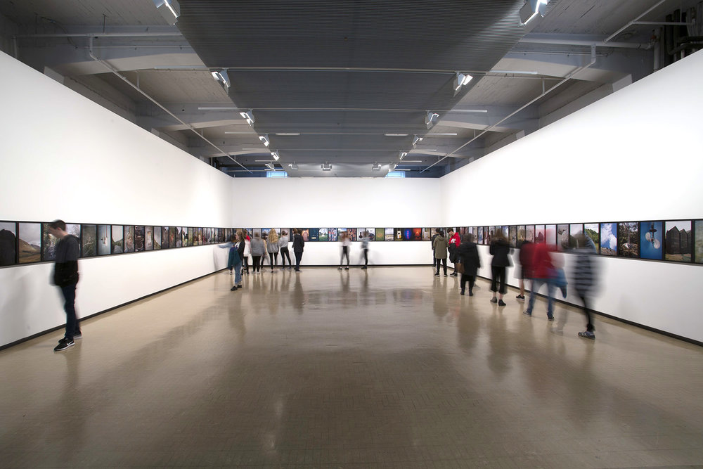
In February 2020, the frequent flyer was back home for Interbeing, his sixth show at Michael Lett, his Auckland gallery, with works made as a result of the BMW trip. They included photograms of sprinkled sand that looked like views of deep space, anatomical models collaged with exotic flora and fauna, and a meteorite fragment hiding in a children’s educational game. When Covid-19 hit in March, the artist found himself stuck here with borders closed and European gigs cancelled. He took the opportunity of this enforced stay to develop a show for City Gallery, combining works from Interbeing, earlier projects, and new works made especially for the show. The new works include a native-timber floor with gilded borer holes, a bowl pieced together from diverse fragments, collaged jigsaw puzzles, and a montage of film clips depicting an unpeopled New Zealand landscape.

Containing Multitudes is Langdon-Pole’s largest show to date and it’s a variety show. Works take myriad forms, operate in different registers, address diverse topics, and imply multiple frames of reference—from ancient to recent, macro to micro, and scientific to romantic. The show offers more dots to connect, more lines of thought to pursue, more links, more digressions. The artist wants to stretch us, challenging us to encompass this abundance. It’s an opportunity to get our heads across his project or lose ourselves trying.
.
3
Many of Langdon-Pole’s works are collages or assemblages of found materials. In his series Passport (Argonauta), he places carved meteorite fragments into the mouths of paper-nautilus shells. Juxtaposing robust and fragile, mineral and animal, the extraterrestrial and the submarine, these juxtapositions stop us in our tracks, aesthetically and conceptually. They exemplify the surrealist ‘marvellous’, recalling Lautréamont’s chance encounter of an umbrella and a sewing machine on an operating table. We can only wonder what might emerge from such charged couplings. 

Langdon-Pole’s collages and assemblages often feel speculative, like he’s trying keys in locks, looking for a fit. Throughout his work, speculative physical operations stand in for speculative conceptual ones. But, when he physically links and aligns things, it isn’t always clear if he has uncovered deeper connections or generated non sequiturs. He leaves that question hanging, letting us make of his arrangements what we will.

Consider his ‘Frankenstein’ bowl, which combines bowl fragments from ancient Greece and Rome, from Islamic empires of the middle ages, and from eighteenth-century Britain. He sourced the pieces via eBay and stapled them together—perhaps provisionally. The bowl looks like it could have been assembled by a someone attending to shapes, oblivious to appearances. Perhaps the bowls are a metaphor for historical inquiry itself—our desire to imagine wholes from traces.

The title, Translatio Studii (No Such Thing as Western Civilisation), refers to a fallacy—the idea of a discrete, linear, pure ‘Western tradition’. In reality, much classical knowledge was lost during the Middle Ages in Europe and could only be rediscovered in the Renaissance because it had been preserved in libraries in the East, sometimes translated into Arabic. But is the artist implying that the ‘whole bowl’ (this Western tradition) is actually hybrid? Is he pointing to a historical, causal connection between the pottery practices in various times and places? Or, is he demonstrating the universality of the bowl as a form and of ceramic as a material?

Langdon-Pole’s video Breath as Breath as Breath does something similar by splicing together diverse film fragments. It’s a montage of sequences depicting a New Zealand landscape void of human presence taken from old cel-animation films made in different styles and for different purposes (including children’s cartoons, educational films, and a party-political ad). In the original films, ‘nature’ was sometimes the subject, sometimes incidental. The montage, however, consistently thrusts non-human life—plant and animal, real and imagined—into the foreground, inviting us to critically reflect on the idea of ‘natural’ New Zealand and its place in our collective cultural unconscious.

Langdon-Pole’s editing provides some continuity, as does an atmospheric soundtrack by composer Samuel Holloway. Nevertheless, a monstrous ‘Frankenstein’ quality persists, which keeps us speculating on the roles the excerpts played in the original works. Breath as Breath as Breath is like a sequence of establishing shots, prompting us to expect the arrival of human protagonists, who never come. And yet, as much as it depicts an unpeopled nature, its diverse hand-drawn styles mark its components as always-already cultured—invested with person-ality. It raises the question: is it possible for people to even imagine a world without people?
.
4
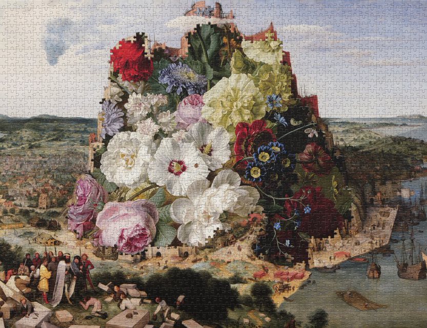
As Langdon-Pole treats things in the world like jigsaw-puzzle pieces waiting to be put together, it’s no surprise that jigsaw puzzles have inspired a huge new body of work. Learning that puzzle makers use the same templates to cut different images, he realised he could create surrealist-style collages by substituting pieces from two different puzzles. The puzzles he uses mostly reproduce old-master paintings and encyclopaedia-plate illustrations. The works combine on two levels: not only do the jigsaw pieces fit together, the original images themselves fuse suggestively, uncannily. Titles add a further prompt and twist. 

Pollinations, for instance, mashes genres, combining Pieter Bruegel the Elder’s famous painting of the Tower of Babel (c.1563) and a blooming floral still life by Jan Frans van Dael (1792). The Breugel refers to an account in Genesis purporting to explain the diversity of human languages. After the Great Flood, a united human race supposedly spoke a single language. But, when they decided to build a skyscraper tall enough to approach heaven, God confounded their speech so that they could no longer understand one another and scattered them around the globe, such that they might never again attempt a similar feat. In a Magrittian manoeuvre, Langdon-Pole switches out Bruegel’s ziggurat for Van Dael’s mixed posy. It works visually, but the upshot remains ambiguous. Do the flowers suggest the blooming of multiple human cultures, or have they grown over the ruined tower, with nature triumphing over culture? Someone may have solved the puzzle by putting the pieces together, but not necessarily the riddle that underpins it. Indeed, solving the puzzle only reveals its riddle.
.
5
Langdon-Pole’s works can be perplexing. Not only do we interpret them, they make us think about interpretation, about how we make sense of things. They’re meta.

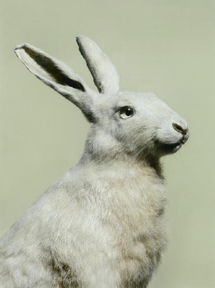
His works frequently address erroneous ideas that once passed for fact. Several works refer to the brightly coloured bird of paradise. In the sixteenth century, New Guineans traded the birds’ skins—after removing their legs—with visiting Europeans. It prompted the misconception among European naturalists that the birds were born in the air and flew without rest, until dropping dead to earth. For Tomb(e), Langdon-Pole presents a legless, preserved bird of paradise in a mirror-lined interior in a old safe, recalling the bird’s role as a trade currency between worlds. Another room is wallpapered with a pattern based on a blueprint photogram of its missing legs.

One of Langdon-Pole’s jigsaws makes error its explicit subject. The main image—Giovanni Paolo Panini’s painting Musical Fête (1747)—shows a packed opera house, whose audience attends to the sumptuous illusion being staged for them. However, Langdon-Pole has replaced that attraction with a dour black-and-white illustration of an old Indian parable. It concerns a group of blind men who chance upon an elephant—something they’ve never encountered before. Each man grabs a different part of the beast—trunk, tusk, side, leg, and tail—and proceeds to describe the whole beast based on their partial experience. As their descriptions are so divergent, they end up in a dispute. No one grasps the whole.

The lesson, of course, is that we are all ‘blind’, with a tendency to claim absolute truth based on our limited perceptions. This is equally true of the blind men, the theatre goers fixed in their seats, the person who assembled the puzzle, and those in the gallery looking at it. It’s a mise en abyme. Hence Langdon-Pole’s title, Two-Thousand-and-One Elephants.
.
6
While he knows we have limited access to the world, Langdon-Pole also believes we can be attuned to its richness. His show title Containing Multitudes is a nod to the nineteenth-century American poet Walt Whitman’s ‘Song of Myself’ from Leaves of Grass:

.
Do I contradict myself?
Very well, then I contradict myself,
(I am large, I contain multitudes.)
.

In this poem, Whitman famously captures what it’s like to live in a body, energised by worldly sensations and earthy delights. He realises his body is the result of epic evolutionary changes and part of an endless, ongoing proliferation of forms of life. Langdon-Pole’s title emphasises the contradiction. It may be about ‘multitudes’ (the abundance of nature and culture) but it’s also about ‘containing’ (the imperative to stretch ourselves to encompass it). 

Containing Multitudes is not only the title of the show, it’s also the title of one of the jigsaw works—itself a single image consisting of a plenitude of pieces. A key work for the show, it combines Henriette Browne’s charming painting A Girl Writing from around 1870 (which depicts a girl doing homework being distracted by a goldfinch that has escaped its cage) and Carl Wilhelm de Hamilton’s The Parliament of Birds from around 1730 (a pre-Darwinian view of avian diversity). Langdon-Pole removed the jigsaw pieces of the child from Browne’s image and filled in her silhouette with pieces from De Hamilton’s, so that her singular outline literally contains multitudes.

If the one bird was already a metaphor for the girl, distracted, freed from the cage of her studies, it has somehow multiplied within her, as if, in looking at one bird, she can conjugate the many forms that birds might take. Containing Multitudes is an image of identification and interspecies empathy: the one dissolved in the many; the one ‘containing multitudes’. (Another jigsaw work makes a similar analogy between multiple bird forms and the structure of the human brain that apprehends them. Memory Tree (A B) entwines two illustrations: Henry Scherren’s Picarian Birds and Parrots and Santiago Ramón y Cajal’s Neurons from the Human Cerebellum, from 1885 and 1899 respectively.)
.
7
Langdon-Pole’s art is riddled with allegory. In allegories, levels of meaning—concrete and abstract, literal and symbolic—coexist, often in tension. Metaphors may be poetic, opening up our understanding of things, but they are also limited. They depend on our appreciating what is salient and what is superfluous in them. But Langdon-Pole loves mixing his metaphors, perhaps to take us further into his subjects, perhaps to further expose our mindsets. 

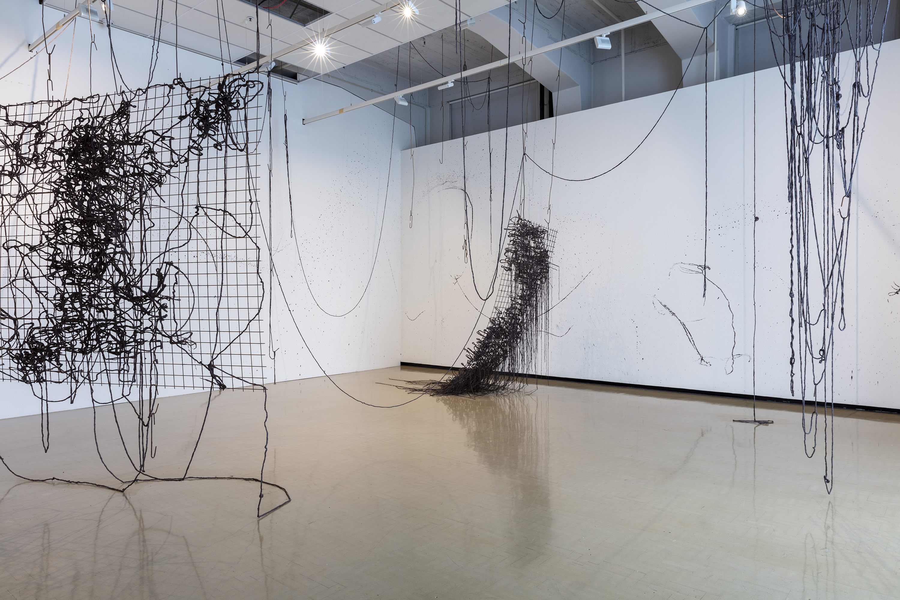
For his installation Punctatum (Library), Langdon-Pole has refloored City Gallery’s North Gallery with recycled once-borer-ridden native timber. The borer holes and tracks have been patiently filled with resin and gilded, recalling the Japanese art of kintsugi, where broken ceramics are glued back together and the cracks picked out in gold—damage becoming decor. It’s a perverse gesture, investing such care and expense in dressing spoilt timber. 

In doing this, Langdon-Pole highlights the beetles’ colonisation of the timber as a consequence of and parallel to Pākehā colonisation of the country. But how far can we take this? Sure, early colonists brought the pests with them unknowingly, but the little critters were less agents of colonisation than of hubris, destroying the colonists’ own homes. Unlike the settlers, they knew nothing of borders and sovereignty, and struck and broke no treaties. As Pākehā walk across the floor and look down, we can understand our own passage across the land—across time and space—as something akin, and not. The borer beetles are us and not us. How far might we take the metaphor before it collapses and gives up the ghost?
.
8
With its random fossils, artefacts, and oddities, Containing Multitudes recalls a wunderkammer or ‘cabinet of curiosities’. In pre-modern times, these proto-museums were all the rage. They were heterogeneous displays of amazing stuff: skeletons, dried insects, taxidermy, art works, scientific instruments, ancient texts, you name it. They were fanciful—labelling narwhal tusks as unicorn horns. Their creators favoured the exceptional and esoteric over the typical and exemplary.

Wunderkammers were superseded with the Enlightenment, which introduced scientific method and systematic taxonomies—proper museology. However, these days, wunderkammers are back in fashion, perhaps because they seem to offer escape from the straitjackets of scientism, suggesting other possibilities. As much as Langdon-Pole wants to disorient us, upsetting apple carts of habitual thinking, he also wants to throw us back into the world’s fecundity, the midst of things, with newly expanded horizons, dilated brains, and enchantment.

Take his work, Assimilation Study. At first glance, it seems to be a set of painted wooden ‘shape sorter’ blocks, a toy to teach children how to discriminate between shapes. On closer inspection, we can see the ensemble has been infiltrated by a foreign agent: a chunk of a meteorite tooled to the exact dimensions of a wedge block. It fits into the set spatially, but stands out materially. The two frames of reference implied are so divergent: a humble children’s game of recent origin and a piece of a meteorite that flew through space for millions of years before humans existed, landed on Earth thousands of years ago, and only recently found its way into Langdon-Pole’s game. Has the block infiltrated the game? Has it been assimilated? Is it just passing through? The gesture seems to exceed puny human frames of reference.

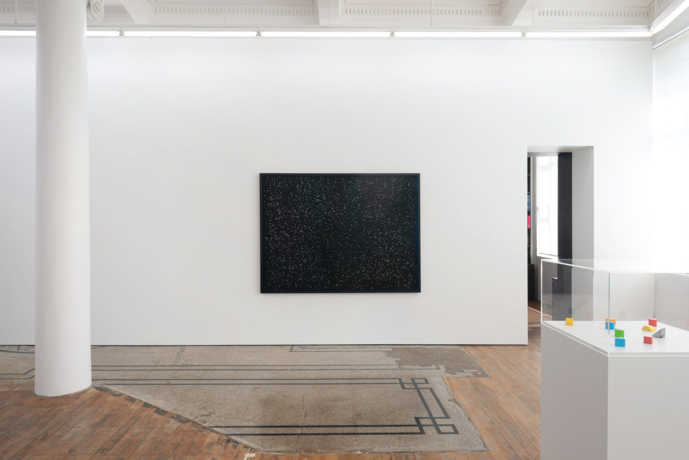
Something similar is going on with other Langdon-Pole works. In Dust as Dust as Dust (All the Way Down), a sixty-million-year-old tortoise-shell fossil rests on a vacuum cleaner uncannily similar in shape. And there’s his sand photograms—banal, depthless, cameraless images recalling the sublimity of deep space, with the shadows left by tiny sand grains (that had once rested on the print’s surface) suggesting immense stars (light years away from it). They seem to illustrate William Blake’s immortal lines, ‘to see a world in a grain of sand’ and ‘hold infinity in the palm of your hand’. Are such connections error or insight, or could they be both?

.
Do I contradict myself?
Very well, then I contradict myself,
(I am large, I contain multitudes.) 

[IMAGE Zac Langdon-Pole Pollinations 2020]

Isabella Loudon: Concrete Mixer

Here, no. 3, October 2020.


Curator Robert Leonard visits Isabella Loudon’s studio.
.
‘I nicknamed my studio the dungeon’, jokes Wellington sculptor Isabella Loudon. For the past three years she’s worked in the basement of a Mount Victoria apartment building. It leaks in one corner and it’s freezing in winter. There’s one powerpoint, one light. Extension cords traverse the space, suspended from hooks in the ceiling. Kicked-in street-level windows, taped over with plastic, rattle in the wind. The place is grotty, but not in a contrived, romantic, Francis-Bacon-studio kind of way. It’s perfect for Loudon’s messy experimentalism.

‘I love my studio’, she says. ‘It’s my favourite place to be. It’s mine. There’s nobody else there and I can do what I want. There’s no window to look out of and nobody can look back at me. I’m away from everything. I can make as much mess as I want. It’s limiting, but, within its limitations, I feel absolutely free. The space has influenced my work, which is odd because it’s the opposite of the white-cube spaces the work is destined for.’

When I visit studios, I usually find artists’ influences and inspirations—books and magazines, pictures and CDs, source materials and talismans—strewn about as creative compost and clues. But not in Loudon’s. She says she doesn’t want to think about other artists’ works—or anything else—when she’s working. No distractions.

At twenty-six, Loudon is already making a name for herself as a sculptor. She graduated from Massey in Wellington with a fine-arts degree in 2016, but she started her studies in Palmerston North, wanting to be a vet. 

‘I’d wanted to be a vet since I was eight. I did science and art at school—I loved both. I went to vet school, but I missed doing art and applied to art school. I started off in design. I wanted to do fine arts but initially I was scared of the interview—you had to do an interview to get in.’

‘The Massey art-school programme is oriented towards self-motivated students. It relies on you doing most of the work. Lack of structure doesn’t suit everybody. I tried everything: painting, printmaking, video, performance. It didn’t click until the end of my last year, when I found something I was really interested in. Concrete.’

Why concrete? ‘Because it’s hard to work with. With clay, you can build up forms. But a concrete slurry just sinks into itself or breaks off. It doesn’t do what you want it to. You have to find something to attach it to or to hold it. You have to find other ways.’

Loudon’s concrete sculptures featured in The Tomorrow People, Adam Art Gallery’s talent-spotting group show in 2017. But it was her first dealer-gallery show, Disintegration Loops at Robert Heald Gallery the following year, that opened eyes.

The stars of that show were Static Phase I and II, whose attenuated forms looked like they were made from steel cable—frayed, corroded, petrified. They could have been found on a demolition site, having been flattened under rubble. They sat on the floor as sculptures but also rested against the wall, looking like drawings—with the gritty, crumbly flavour of oil pastel. I couldn’t work out how they were made. It turned out they weren’t metal at all. Loudon had soaked twine in concrete, suspended it to cure, then inverted the results, so the loops formed by gravity now defied it.

Loudon took her twine-concrete idea a giant leap forward in her project show at Lower Hutt’s Dowse Art Museum in 2018. Labyrinth was space hungry. It colonised a whole room. Masses of dark twine-concrete welled up vertically like stalagmites, while also extending tendrils horizontally across the floor. Loudon made it in the studio in more than fifty parts, so it could be transported to the Hutt. It was a monstrous, abject thing. Loudon says she was thinking of the extraterrestrial symbiote that fuses with Peter Parker in Spider-Man 3 (2007). I was reminded more of the sci-fi special-effects sequence at the end of Lucy (2014), when Scarlett Johansson evolves into a similar morass of sticky black tentacles. Either way, you couldn’t get into the room with it, but had to observe it from behind glass. ‘It was breathing’, Loudon says.

For Loudon, sculpture is a dirty business. Concrete is caustic, which means working in a breathing mask and heavy gloves. She soaks the twine in concrete, massaging it into the fibres, before draping the results over this and that, and leaving them to set. Her gloopy twine-concrete mix combines properties of line and mass, of drawing and sculpture, but it’s not versatile—it’s recalcitrant, obstinate. There are limits to the forms it will take. Loudon’s work emerges from accepting and channelling what her materials will do. She looks back to anti-form sculpture, which emerged in the 1960s in reaction to the clarity, geometry, and regularity of minimalism. Artists like Robert Morris, Barry Le Va, Lynda Benglis, and Eva Hesse emphasised disorder and decomposition, material and process, preferring to drape, pour, and scatter stuff. Informal formalism. ‘Eva Hesse, definitely—a great influence, mostly for her love of materials’, says Loudon.

Loudon’s studio is now packed with a diversity of twine-concrete things. It isn’t clear which came first, which are experiments and which are works, what’s in progress and what’s finished. One thing hangs from a ceiling hook like an eviscerated carcasses in some abattoir; one rises from the floor like a termite mound; another permeates metal grids like strained spaghetti.

Confronted with numerous examples, you realise that Loudon adds colour to her concrete. ‘I pick colours but there’s a limited range I can work with’, she says. ‘I go through phases where I just work with one colour and everything is that colour. First it was green, then it was black, now it’s brown. Brown is warm and kind of yucky. It’s rusty and old, but also soft, earthy, and gritty. It feels very feminine to me.’

Loudon says, ‘I do completely different things at the same time. I’ll try everything. If something comes to mind, I’ll try to make it.’ She’s also been working with old rubber inner tubes, slitting them open, draping them, flattening them, sometimes threading wires through them—evoking corsetry as much as vivisection.

In November 2019, Loudon installed Platforms, her largest work yet, in the City Gallery Wellington show Unravelled. She wanted to combine her sloppy twine-concrete with metal grids, like they use for concrete reinforcing. She could try things out in the studio, but everything had to be made quickly in situ in the Gallery.

‘I found making this show really hard. I spent a lot of time freaked-out and panicked, trying to come up with ideas. Then, just days before the install, I rethought everything. I was in the studio, taking down the model. I started by flipping the grids down from the horizontal to the vertical. Suddenly, it had the feeling I’d been looking for. It brought the grids’ regularity and the twine’s irregularity explicitly into conversation.’

In the gallery, the ceiling gave her grief. She said, ‘I struggled with the false ceiling, which left few points to hang my hooks from and would have led to a big empty gap in the room. I thought of installing MDF over the ceiling to hang them from, but instead I took panels out and went straight through to the ceiling above. Suddenly I felt I was working with the space not just putting things into it.’

Loudon erratically wove her twine-concrete into three horizontally suspended metal-mesh grids. After it cured, the two largest grids were released from some of their hooks and gently lowered to the vertical. One met the floor and slouched, the other swung free. They suggested demented tapestries, scribble on graph paper, bad-hair days.

Loudon left up the hooks as clues to the process and added some finishing touches. Inspired by the suspended extension cords in her studio, she added lengthy drapes of twine-concrete to visually tie everything together. The walls were already splattered with concrete, but she added some big arcs by flicking lengths of wet twine-concrete onto them.

Platforms is bold and aggressive, but also brittle, fragile, ready to crumble. Three months later, Loudon remains pleased with it. ‘I look at it now and I feel like I’m inside the guts of one of my drawings.’

What’s next? Loudon’s looking for more opportunities to work big. When she gets them, her relationship with her studio may change. It will mean working in situ more, turning galleries into her studio, and making her actual studio more of a rehearsal space. As she says, ‘When you upscale, everything changes.’

.
[IMAGE Isabella Loudon Platforms 2019]

Zac Langdon-Pole: Rabbit Hole

Vault, no. 31, 2020.


Science, history, art? Robert Leonard takes the red pill.


Artists are curious, they pursue all kinds of obscure knowledge. Some like to do research, and art seems like as good a place as any to show off one’s interests. The ideas with staying power are those that intersect with an artist’s inclination for form, causing it to deepen and expand, like a paper flower that blooms when you put it in water.
 

—David Salle1

.
I
Two years ago, the Wellington collectors Jim Barr and Mary Barr invited me to their apartment to check out their latest acquisition, a work by Zac Langdon-Pole. Based in Berlin, the young New Zealander had been making waves—he’d just won the 2018 Ars Viva Prize. I wanted to see what the fuss was about. They poured me a glass of wine and directed me to a framed colour photo showing a river winding through the bush to meet the sea—somewhere in New Zealand, I assumed. It was nicely composed and appealing—a tasteful but generic scenic view. But I was confused. I thought Langdon-Pole was a conceptual artist, not a landscape photographer. ‘Is that it?’, I asked.

Then—as she knew she would have to—Mary told me the story. Langdon-Pole made the work for his graduating show at Frankfurt’s Städelschule. Perversely, he’d commissioned his professor, Willem de Rooij, to visit the Coromandel to shoot this specific location in his usual style. De Rooij was to provide one shot only—fait accompli. The site is significant. In 1769, Captain Cook landed there to observe the transit of Mercury and raised the British flag. It became known as Cooks Beach and the wider area as Mercury Bay, bypassing its Māori name Te Whanganui-o-Hei, after Hei, the Māori chief who had arrived there more than 500 years before Cook. This back story made the innocuous postcard view radioactive with politics: the macro-politics of Hei and Cook (who should have their name on this place?) and the Oedipal art-world micro-politics of professor and protégé (who should have their name on this art?).

But my hosts weren’t done. With the glee of knowing something I didn’t, Jim lifted the work from the wall to reveal its back side. There, I found an unattributed quote, ‘The only things that are true are exaggerations.’ (paraphrasing a Theodor Adorno quip on psychoanalysis); a key for a substitution cipher using empty-frame symbols (‘Baroque Frame’ dingbats); and the quote translated into it. As a curator, I’m used to scrutinising the backs of pictures for clues, but I’d never seen an artist place them there so wilfully. At face value, the quote seemed so inherently illogical that it made me question everything. The cipher prompted me to think of the photo as a coded message, with a concealed meaning for those in the know. Was it all just a play of empty frames?

But that wasn’t all, for—as I discovered—there are at least ten variants on this work, each pairing the same photo with an alternative B side, a secret hidden key or digression. Back sides include a seashell sculpture made by the artist’s mum, an excerpt from Cook’s Journals, an article about New Zealand’s flag debate and treaty settlements, and a photo of poet Gregory Corso’s gravestone. As the series is ongoing, Langdon-Pole will continue to make variations on this theme, potentially without end.

So, De Rooij’s photo, the ostensible work, was just part of the puzzle. Here—where one became many, front met back, fresh water mixed with salt, protégé trumped professor, and Pākehā encroached upon Māori—frames of reference were scrambled. I felt I might never get to the bottom of this. Or was I there already?
.
II
After that, I didn’t give Langdon-Pole much thought. Then, late last year, his Auckland dealer Michael Lett sent me a copy of his new monograph. Constellations had been published off the back of Langdon-Pole’s winning a prestigious award, for his 2018 Art Basel Hong Kong show (where he craftily inserted carved meteorite fragments into paper nautilus shells).2 The BMW Art Journey award enabled him to undertake a personalised round-the-world research trip. He based his itinerary on white stork and Arctic tern migration routes and on the history of celestial navigation by Pacific peoples and their colonisers. During the five-month odyssey—from London to the Netherlands and France, through the Pacific Islands, before arriving home in New Zealand—Langdon-Pole stopped off at significant spots to research celestial-mapping practices. The book interspersed documentation of the trip, documentation of six years of works (including works resulting from the trip), plus essays and an interview. The first plate was the De Rooij photo.

Constellations was a crash course in Langdon-Pole’s work. It was fascinating, but daunting. The works were varied, broaching a bewildering span of topics, with the artist never clearly settling into a signature idiom, medium, or manoeuvre. No one could understand the works by just looking at the pictures; each required some explanation, commentary, or key—its own reading list. I was constantly flipping between sections of the book, cross-referencing different orders of information to get my head around the project. Perhaps mirroring the artist’s wide-ranging erudition, his essayists largely dealt with the work at the level of its content, emphasising what it was about rather than how it was about it. There was mention of marine biology, astronomy, ornithology, colonial history, and personal history, but little on how the work fitted into and changed the landscape of art.
.
III
After reading Constellations, my head hurt—like a student cramming a year’s required reading the night before the exam. However, when I stepped into Langdon-Pole’s Interbeing show at Lett’s in the new year, the work opened up—like a paper flower that blooms when you put it in water.

From the book, I knew Langdon-Pole had been making photograms of sand sampled from stops on his trip. They were labelled with evidential precision: place and date. However, while locations were distinct and specific, the photograms were largely indistinguishable and interchangeable. They didn’t offer up significant forensic insights into the sites, which included both Cooks Beach, where Cook had enjoyed a mini break, and Kealakekua Bay, Hawaii, where he was killed. Was place a red herring? Perversely, these depthless, cameraless images recalled the sublimity of deep space, with those tiny grains (resting on the print’s surface) suggesting immense stars (light years away from it). In the show, some photograms were presented at original scale, others were enlarged, one to mural scale. These enlargements were rhetorically impressive, but contained no extra information. I was reminded of the 1966 film Blow-Up, where successive enlargements of photos of a possible murder scene dissolved into film grain. The photograms seemed to riff on Langdon-Pole’s research mission: traversing the Earth’s surface while pondering how we had looked to the heavens to help us find our way. Did he have his head in the sand?

Langdon-Pole had also been messing about with anatomical models. For Orbits (2019), he inserted glassy spheres into pairs of eye-socket models, where the eyeballs would sit. In one pair, the spheres contained a dandelion head and petrified sequoia wood; in the other, a dandelion head and rainbow obsidian. There was a disjunction between the time frames suggested by those ephemeral dandelions (albeit now fossilised) and the other materials (although they too were once something else, something organic or liquid). In the company of the photograms, the glassy spheres looked like little planets. But what the works had to do with eyes was hard to see. The Orbits seemed to be non sequiturs—pointless, puzzling, poetic. In another anatomical-model work, Cleave Study (2019), Langdon-Pole grafted a human-tongue model onto an actual xenophora shell, as if the tongue had taken the place of the shell’s former inhabitant. The xenophora is a curious thing. As its shell grows, it fuses with things in its vicinity, mostly other shells, assimilating them. But, here, had the shell colonised the human tongue or vice versa? If the Orbits made me think about myself looking at them, Cleave Study made me think about how it would feel and taste to have my own tongue there.

I lingered longest with Assimilation Study (2020). Painted wooden blocks were scattered in a Perspex-topped display case. They came from that common educational shape-sorter toy that teaches tots to put square pegs into square holes. Shape-sorter blocks are a selective-attention exercise, asking us to focus on a specific dimension of difference (shape) at the expense of all others. That may be why it took a moment to notice that Langdon-Pole had switched out one piece. A wooden wedge had been replaced with a metal one—a piece of Campo del Cielo meteorite—tooled to the same dimensions. Over four billion years ago, its nickel iron had been in the core of a small planet that broke apart. It fell to Earth some 4,000 years ago, landing in what is now Argentina. In Langdon-Pole’s work, it’s as if this alien artefact had infiltrated the children’s game and was hiding in plain sight. As two blocks were star shaped and as the work was surrounded by photograms that looked like night skies, this meteorite might have already felt at home.

Assimilation Study set me thinking. I was reminded of the nineteenth-century inventor of kindergarten, Friedrich Froebel, and his ‘gifts’ for children, which include geometric blocks. A crystallographer, he wrote ‘my rocks and crystals served me as a mirror wherein I might descry mankind, and man’s development and history’.3 I thought of Stanley Kubrick’s 1968 film 2001: A Space Odyssey, where geometric minimalist monoliths of ancient origin—some passing through the cosmos—prompt giant leaps in human education. And I remembered a 1993 Michael Parekōwhai installation of enlarged shape-sorter blocks—Epiphany: Matiu 2:9 ‘The Star in the East Went before Them’—that asks us to rethink the Christian story within te ao Māori. In retrospect, none of these connections was irrelevant. Or, rather, the work begged the question: ‘What is relevant?’ That meteorite had been flying through space for aeons—aeons before Langdon-Pole, before Parekōwhai, before Kubrick, before shape-sorter blocks, before Froebel, before Christ, before humans—but on a collision course with us anyway, addressed to us before we were a twinkle. Here, retooled, it comes to rest in Langdon-Pole’s work at an Auckland gallery in 2020. Has it been domesticated by the artist, drawn into his game, or does it exceed his presumption to frame it? Langdon-Pole relativises frameworks—even his own.

.
IV
Langdon-Pole is an artist, not a historian or scientist. His works refer to history and science, but don’t contribute to them; they contribute to art. Once upon a time, serious art eschewed ‘content’; formalism was all the rage. But these days, art’s in thrall to content. I call it ‘aboutism’. There’s bad aboutism (all ‘about’, no ‘art’) and good aboutism (veined and animated by artistic complications). Simon Starling is a pioneer of good aboutism and Langdon-Pole and fellow Städelschule graduate Danh Vō are among its current heroes. In good aboutism, information and objects with backstories operate as springboards into epistemological-hermeneutical enquiries concerning how we think—our turns of mind. But this doesn’t mean that content is arbitrary (a means to an end). Indeed, Langdon-Pole’s skeptical-conceptual shell games insistently orbit his favourite hot-potato topics—empire, environment, etcetera—where we now pay the price for past certainties.


  1. ‘Introduction’, How to See: Looking, Talking, and Thinking about Art (New York and London: W.W. Norton, 2016), 3–4.
  2. Constellations: Zac Langdon-Pole’s Art Journey (Berlin: Hatje Cantz, 2020).
  3. Autobiography of Friedrich Froebel, trans. Emilie Michaelis (London: Swan Sonneschein and Company, 1892), 97.


Kirsty Lillico: Let Me Tell You About My Mother

blog, https://citygallery.org.nz/blog/let-me-tell-you-about-my-mother/, 20 April 2020.


.
I first saw Kirsty Lillico’s work in 2015, in the City Gallery show
Demented Architecture. Back then, the Wellington artist was cutting out shapes derived from floor plans for modernist buildings from old bits of carpet. She would then hang the shapes, so they draped and distorted. It was modernism coming unstuck. The work prompted me to make our current show Unravelled, which brings together Lillico and four other abstract artists who eschew the regular, the geometric, preferring their formalism frayed and informal. However, by the time I visited Lillico’s studio to discuss the show, she had taken a new direction. 

Robert Leonard: Tell me about the work you made for Demented Architecture back in 2015.
.
Kirsty Lillico: I was making works based on floor plans of modernist buildings, particularly brutalist buildings. Back then, modernist social housing was on my mind. I cut the shapes out of pieces of discarded carpet and hung them so they draped and slumped. I was asking what has become of modernist ideals—do they still have relevance?
.
Why carpet?
.

At the time, I was looking at a lot of post-minimalist artists, including Robert Morris. He made these amazing sculptures out of industrial felt in the 1960s. I’d love to use industrial felt. I’m very drawn to textiles, and industrial felt has a skin-like quality—but it’s very expensive. However, my studio, then in Lyall Bay, was next to a carpet warehouse that threw out loads of used carpet taken out of houses and offices. I thought: great, it’s free, and I can work at a large scale.
.
Was there a link between the concept and the material?
.

Modernism is one of the most successful, durable styles. Now, we all live in neo-modernist houses with neo-modernist furniture and carpet that’s all one colour. I see one-colour carpet as a kind of mass-produced, disposable, minimalist monochrome.
.
I came to see you because I thought that the idea of modernist-building floor plans made droopy was conceptually perfect for my show. But I found you weren’t doing the floor plans any more. What had changed?
.

I felt restricted by just appropriating existing designs. I also got more interested in the formal aspect, the painting aspect. I got interested in colours and started dyeing carpet.
.
So, you were a conceptual artist who got distracted by materials and aesthetics and jettisoned ‘the concept’. Was that a big lurch or an easy transition?
.
It was a bit scary, but I wasn’t going to be using architecture as a subject for the rest of my life. There’s a point where you have to make a break and take a different direction. I tried out a lot of things. At first, I wasn’t happy with my own shapes. But I shared my studio with fashion designers who make brown-paper toiles (patterns) for clothing. There were lots lying around. With their arm and neck holes, they were better shapes than mine, and I started making models out of them. (I also make models from craft felt, with a layer of screenprinting ink on the back to simulate the latex-glue layer of carpet.) For me, clothing and architecture are connected. They are both protective systems we inhabit that can be used to express identity.
.
When you’re a conceptual artist, you go: here’s the idea, now I execute it, now I hang it, and there it is, more or less. But, operating in an abstract-painting mode, it’s different.
.

I’ve never been a painter, so I’m not used to that style of working—to improvisation.
.
So, how long did it take to make the two works in Unravelled: Soft Option and Mother?
.
A few months. I tried to make them quickly because, when I labour over stuff, the outcome is never good. With Soft Option, I originally thought I’d make a superstructure of the turquoise carpet. Once it was on the wall, I’d lace on other things using the holes I’d already punched in the edges—like Meccano or something. But it didn’t work out like that.

There were some stains and bits of chewing gum on the carpet that I cut out (I’m all in favour of the abject, but some stains are not very aesthetic). And I inserted other bits of carpet.

I had an idea to glue lentils to the felt, so it could be a composting seedbed for new biological life after the apocalypse—a joke about the 1970s and now. But I scrapped that too.

Soft Option was physically challenging to make, because I had to work on the floor, moving bits around, then put the whole thing back on the wall to look at. Taking it down, putting it up, taking it down, putting it up. I would ask my studio-mates for a hand sometimes, but I felt bad because the dust from the carpet gets in your hair and clothes and the hessian backing scratches your skin.
.
Soft Option
is quite complicated.
.
In the past, I tended to use industrial carpet, flat colour. My works used to be monochromatic or two colours layered. But Soft Option uses lots of different colours of carpet, even some patterned Axminster, which is typically used in blokey social spaces, pubs and clubrooms. I have inserted small motifs from it into zones of loosely woven rope, like flowers caught in a spider’s web. Soft Option is an abstract work but I initially thought about it as a garden or landscape, whereas my carpet sculptures are usually vertical, like bodies.

A recent development is using rope to join shapes together. I wanted a way of joining that was obvious, evident, not hidden. It’s like brutalist architecture, whose coarse textures and raw surfaces reveal the way it was made—the grain from the wooden formwork imprinted in the concrete.
.
The stitching is something new.
.

It started as a functional element but became a focus. The stitches are extreme, comic stitches—big folksy artisanal stitches. They remind me of Philip Guston’s big-stitch lines. The thicker the rope got, the funnier it became. It amused me to use an exaggerated handicraft technique to join industrially produced textiles. It set up a contrast between the premodern and the modern. At the time I was reading the catalogue for the Hippie Modernism show, which considered the interplay of the hippie (the body, the emotive, what connects us to nature) and the modern (machines, the indifferent, what sets us apart from nature). I was ruminating on doomsday scenarios of future material scarcity, so it’s also a joke about upcycling.
.
I never thought of you as a folksy person, more a ‘protect me from what I want’ modernist-architecture person.
.

Making a pastel-coloured work with big stitches was a leap. It made me a bit uncomfortable. The work was ‘cooler’ before. Its monochromatic palette and straight lines gave it a minimalist, intellectual quality.
.
Soft Option
changed when you brought it into the Gallery.
.
My studio is narrow. When I was working on Soft Option, I couldn’t step back and take it all in. When I hung it in the Gallery, it was a surprise to be able to finally see the whole form. Now I can, it seems quite calligraphic—graffiti-like. The wall in the Gallery goes higher too, so the work moved up the wall. I didn’t know if I’d cut off those dangling rope bits, but I left them on. They work quite well with Isabella Loudon’s installation.
.
In 2017, you won the Parkin Drawing Prize for a carpet piece. That must have annoyed all those neglected old-school artists who make real drawings and see the Parkin as their one opportunity. Do you think of your work as drawing? 
.

My work is all about drawing. My Parkin work was a translation of an existing drawing (an architectural floor plan), so it had a direct relationship to drawing. Soft Option also translates drawings—toiles are drawings. I like the process of becoming that drawing represents—of potential, where the outcome is still unknown. I never feel that my work is finished either. It’s subject to gravity and shift. I think of my works as bodies, which are never static. I don’t think I’ll ever do a cast stiff shape that’s unchanging.
.
Mother
and Soft Option have different characters. Mother is brightly coloured rather than pastel, vertical rather than horizontal.
.
Most of my carpet sculptures are vertical, like bodies.
.
Mother
reminds me of 1970s essentialist-feminist soft sculpture, particularly the Polish artist Magdalena 
Abakanowicz. Were you being ironic?
.
I was both paying homage to and making fun of the vagina imagery associated with 1970s feminist art—what my friend Lou and I used to sneeringly refer to as ‘cunt art’, when we studied it in high-school art history. Since then, I’ve come to appreciate that work.

I’m interested in the work of female artists who used textiles in the 1970s—the fibre-art movement—and what happened to them. They became marginalised, because of their association with craft, which traditionally has had a lower status. Their position was further weakened by the hobbycraft craze—macramé. But, in contemporary art now, textiles are having a resurgence. Maybe because they allow artists to critique aspects of gender, cultural identity, globalisation, consumerism, etcetera.

With Mother, I had formal ambitions. I wanted to make something dark, hulking, and enveloping. When City Gallery Director Elizabeth Caldwell came to the studio, she said, ‘Of course, Mother, because it’s got a pouch.’
.
When did you title it Mother?
.
When I chose the title, I was thinking about the 1970s-feminism connection, but I was concerned that it sounded a bit wholesome and earnest. Then, while I was working on it, I saw the film Suspiria (2018). In it, the coven’s head witch—Mother Suspiriorum—is old and hideous; fat, wrinkly, and tumorous. She is preparing to take over a younger body. I made a connection between her and my Mother, which, in collaging parts and offcuts of previous failed sculptures, is similarly monstrous and voracious.
.
There’s online debate over whether or not Suspiria is feminist. Do you see your work as feminist?
.

For Mother, I dyed the carpet strips red. They were inspired by Suspiria’s ritualistic dance sequence, where the dancers’ red-rope dresses suggest drips of blood and paint. A feminist scream.
.
What’s next?
.

I’m making a work for the lightboxes on Vivian Street outside Victoria University’s School of Architecture. I’m proposing to present photos of a series of paper sculptures that revisit architectural floor plans. One of the plans I’m using is for the Gordon Wilson Flats, the now-derelict, high-rise social-housing block on the Terrace.
.
What goes around comes around.
.
[IMAGE Kirsty Lillico Mother 2019]

Steve Carr: Taking the Fun out of Fireworks

Unpublished.


.
When Steve Carr opened his project Chasing the Light at Christchurch Art Gallery in 2018, Gallery staff may have felt a bit like Stanley Moon. In the 1967 film Bedazzled, Moon (Dudley Moore) sells his soul for seven wishes, only to find his desires continually frustrated by the Devil (Peter Cook), who delivers what was agreed to to the letter, but always with a twist that spoils it for Moon.

Carr relocated from Auckland to Christchurch in 2016 to take up the position of Senior Lecturer in Film at Ilam School of Fine Arts. Known for his crowd-pleasing video works, Carr was swiftly offered a major commission. Christchurch Art Gallery signed up to his elevator pitch: to video a fireworks display using drones and present the results as a multiscreen installation. The idea seemed to have ‘spectacle’, ‘eye candy’, and ‘extravaganza’ written all over it. Or did it?

When the show opened, the Gallery’s intro text promised ‘a spectacular and immersive new project … placing the viewer in the middle of a beautiful and bewildering night-time adventure … The viewer is immersed in an impossible boundless space.’ But Chasing the Light defied crowd-pleaser expectations. It was chilly, disorienting, and confusing. Carr’s deconstructed expanded-cinema work was an installation, yes, but was in no way immersive, keeping viewers on their toes and at arm’s length emotionally.

I can’t blame the Gallery for mischaracterising the work—they hadn’t seen it. Shooting had been delayed. Carr not only had to coordinate a team of six drone-cameramen, he had to wait for the right weather—a clear sky and enough wind, but not too much. In the end, the shoot happened less than a fortnight before the show opened, leaving Carr one chance to nail it. The wall text was written sight unseen.1

I love Chasing the Light—we’ve just shown it at City Gallery Wellington—but entertaining it isn’t. It’s the opposite. Its virtue lies in wrongfooting its audience, and in draining drama, spectacle, and pleasure from a quintessentially dramatic, spectacular, orgasmic subject. It cues entertainment expectations only to frustrate them, pulling the rug.

In the Gallery, the six unedited takes—shot from different altitudes and angles, like a sports event—are projected in sync; each drone feed presented on its own dedicated freestanding screen. With their rusty armatures, the screens look like scaled-down drive-in-movie screens, which you’d more likely find outside—and in America. They’re scattered through the space, so you can’t see them all at once—there’s no ideal viewing position. Carr backlights the screens, making them stand out sculpturally, preventing viewers from simply immersing themselves in the projected action. Throughout the Gallery, backs of screens are visible.

More importantly, as the drones don’t record sound and Carr didn’t want the contrivance of adding it, the work is silent. There’s no soundtrack to link what is happening on the separate screens. It’s weird to see explosions without hearing them. There’s no bang for your buck.

Carr’s drive-in screens cue us to think of the movies. The movies are virtual travel, transporting stationary viewers to elsewheres and elsewhens via camera movements and editing, among other things. But Carr’s work is made not for stationary viewers but for ambulant ones, traversing the space, ‘chasing the light’. Viewers aren’t locked in, in front of a screen, like a standard cinema goer in their theatre seat or parked in their car in a drive-in. Instead, they became like live-action video editors at their consoles, grazing on multiple feeds, editing them together not with the flick of a switch but by moving their bodies and attention from one screen to another. 

It’s hard to find the perfect view—there is none. The drones are erratic. A particular drone might capture one explosion beautifully but completely miss the next. Constantly distracted by the prospect of a better view appearing on another screen, viewers move through the space, themselves like drones on the look out. Curator Lara Strongman observed that viewers become aware of the position of their own bodies.2 This is the opposite of immersion, where you forget your self and become engulfed in the image—which is usually what happens when we park our bodies in a cinema seat and look at a single screen.

The whole piece is seventeen-minutes long, and loops, but viewers seldom watch the whole thing, leaving before the show is over, with more to come but nothing new to see. Indeed, even if they wait, it would be hard to know when the sequence repeats.

Chasing the Light is disorienting in many ways. It’s an outdoor fireworks show brought inside, but shown on outdoor screens. It’s impossible to calculate the drones’ position in relation to the action and to one another, because the explosions appears against a black sky with no external reference points for scale, angle, or perspective. It’s hard to tell if the drones are hovering or moving, especially as the exploding fireworks are themselves moving.3 The action is spatialised, but the orientation of the screens has nothing to do with the positions of the drones in relation to the fireworks; while drones share a common target, the screens point away, in apparently arbitrary directions.

Chasing the Light was made possible by the sudden availability of cheap drone technology, which is enabling small-budget filmmakers and art students to incorporate dramatic aerial shots—once the exclusive purview of big-budget film directors with helicopters—into their work. On YouTube, you can find endless drone-fireworks clips similar in feel. Now overused, drones are becoming as much of a film cliché as fireworks, but that’s part of the attraction for Carr, who perversely revels in tropes, memes, archetypes. Even something as intrinsically dramatic and spontaneous as fireworks can begin to feel like stock footage.

Carr loves clichés. His videos have catalogued familiar fantasies, often ones with a sexy tinge. He enjoyed pillow fighting with young girls and smashing up a panel van with lads; he wore scuba gear to perve on swimming bikini girls; and he had a woman soulfully smoke a full packet of cigarettes in one sitting. Other videos explored orgasmic motifs: bursting paint-filled balloons, forbidden fruit shredded by bullets, a watermelon exploding under rubber-band pressure, a burnout. Chasing the Light fits in, playing on fireworks as a cinematic euphemism for orgasmic sex.

Alfred Hitchcock famously used this idea as a joke at the expense of Hays Code prudery in To Catch a Thief (1955).4 He intercut Cary Grant and Grace Kelly’s petting with the fireworks exploding outside to show what couldn’t be shown—sex—simultaneously concealing and exaggerating it. But in Carr’s work, there’s no cutaway—it’s just fireworks, fireworks, more fireworks, linked to nothing. It isn’t sexy. The fireworks explode incessantly, unrelenting, in an endless money shot, which, precisely because it’s endless, can’t function as a money shot, instead feeling exhausted and exhausting formally and symbolically. 

In combining drones and explosions, Chasing the Light is haunted by military associations. The Christchurch Art Gallery intro compared the work to ‘a barrage of artillery’. In representations, celebratory pyrotechnic displays often recall deadly exploding ordnances—and vice versa. Of course, Chasing the Light also recalls the military use of drones, where pilots trained on silent video screens strike surgically, terminating with extreme prejudice yet distanced from their deeds, which they see but never hear.5 Carr’s work’s affect is similarly flat—psychotic. I’m reminded of the closing scene in Brian De Palma’s political thriller Blow Out (1981)—a homage to Hitchcock. After Jack (John Travolta) discovers his love interest Sally (Nancy Allen) strangled, dead, mismatched Liberty Day parade fireworks go off, signifying the orgasmic happy ending that isn’t. La petite mort.

Anthony Byrt has called Carr a trickster.6 Chasing the Light is confusing, irritating. It’s an exercise in bathos—it leaves us cold. In not delivering what we expect or want, it makes us painfully aware of what we’re missing. But is this Carr’s failure or the ultimate trick—a trick on us? Others will disagree, but I say it’s the trick, because every twist Carr has added thwarted the expectations he fostered from day one with his elevator pitch. Chasing the Light is anticlimax consummately delivered.

We can usually count on Carr for a fun time, but, in Chasing the Light, he goes against type. Perhaps he’s like one of those rebellious comedians who, in seeking to become a serious actor, alienates his fan base—who ‘love his movies, especially the earlier funny ones’.7

The devil is in the detail. Get used to disappointment.
.

  1. That said, when Chasing the Light was shown as part of White Night Reimagined at National Gallery of Victoria in 2019, the boosterism persisted, with the Melbourne Gallery describing the work as an ‘enveloping and a sublime exploration of an explosive display’, ‘an engaging and memorable experience’. https://whitenight.com.au/melbourne/program/steve-carr-chasing-the-light/.
  2. Lara Strongman, ‘Everyone to Altitude: Making Chasing the Light’, Christchurch Art Gallery Bulletin, no. 194, 2018–9, https://christchurchartgallery.org.nz/bulletin/194/everyone-to-altitude.
  3. It doesn’t help that fireworks are intrinsically symmetrical, exploding outwards, looking similar from all angles.
  4. It was later exploited in the title sequence for the TV show Love, American Style (1969–74) and satirised in The Naked Gun 2½: The Smell of Fear (1991).
  5. Although drone pilots do suffer post-traumatic stress disorder. www.nytimes.com/2013/02/23/us/drone-pilots-found-to-get-stress-disorders-much-as-those-in-combat-do.html.
  6. ‘Fool’s Gold: The Recent Films of Steve Carr’, Art New Zealand, no. 150, Winter 2014, 84–7.
  7. Apologies to Woody Allen, Stardust Memories (1980).

Explaining Peter Peryer to a Dead Hare

Vault, no. 30, 2020.


.
Was Peter Peryer’s project tied to its time and place? Robert Leonard offers an old-white-male perspective.

.
New Zealand photographer Peter Peryer died in 2018 aged seventy-seven. Four years earlier, critic Peter Ireland observed that Peryer’s curators and writers tend to be ‘baby boomers’, ‘born well before 1980’, and that ‘the Peryer orthodoxy’ is ‘now a period piece itself’.1 A new documentary, Peter Peryer: The Art of Seeing, seems to agree, wheeling out a procession of authoritative old white men (my friends) to explain the work.2 For them and me, who were there at the time, Peryer’s work will always be radioactive with significance. However, I find it hard to explain to millennials and to visitors to our shores why Peryer has been so important (to us) and why they might care. Perhaps, ultimately, his importance will be tied to his time and place.

If you didn’t know, Peter Peryer is a giant in New Zealand photography. He came to the medium late, in his early thirties, in the early 1970s. In New Zealand back then, photography was a separate scene, with its own gurus, spaces, and journal. It hadn’t yet merged with the art world proper. Peryer would play a key role in the campaign for it to be recognised as art—his work epitomising why it should be. 

From the outset, Peryer was special. He began as an expressionist, making brooding portraits and haunted location studies. He often used a Diana camera, exploiting the toy device with its distorting plastic lens to imbue his subjects with angst. His portraits were mostly of women—especially his wife/muse Erika—and of himself.3 They were compared to passion plays and psychodrama—the ex-Catholic seemed to be working through stuff. Peryer’s work proved an overnight sensation. It was swiftly profiled in the local photography journal PhotoForum and in Britain’s 1978 Creative Camera Yearbook, and picked up for shows.

A change of heart in the early 1980s saw Peryer largely jettison portraiture and adopt a cooler, more formalist, ‘clinical’ approach. He went on to make still lifes, animal studies, botanical studies, location shots, landscapes. He explored New Zealand’s scenic vistas, tourist spots, and back blocks, its flora and fauna, and its cultural talismans, revelling in their settler-colonial ambience. But he also threw in odd shots from travels abroad (the Statue of Liberty at Denmark’s Legoland). His subjects ranged from nice (flowers) to nasty (a sheep carcass spilling its guts, the swastika on a V1 rocket). He didn’t work much in series, preferring to generate singular images of singular subjects in odd treatments and sizes. His shows often felt like miscellanies.

Peryer’s work had a familiar, belated, nostalgic quality, keyed to photography as a memorialising medium. Much of it seemed concerned with the New Zealand of his childhood. With his early Diana-camera pictures, the déjà-vu aspect was emphasised by a soft-focus style, yet it persisted in his subsequent sharp-focus work. Peryer’s work was never avantgarde. It wasn’t about pioneering new ways of photographic seeing, but about revisiting earlier ones, both art and vernacular ones—the snapshot, pictorialism, scenic postcards, new objectivity, botanical photography, etcetera. There was seldom anything topical within his pictures to reveal that they had been taken only yesterday. Plus, Peryer typically presented them old-school style, as small, black-and-white prints in white mats, in frames. Their time-warped, secondhand, quotational quality found Peryer included in the 1989 show Imposing Narratives: Beyond the Documentary in Recent New Zealand Photography—not that he was remotely interested in postmodernism.4

Peryer was obsessive. He talked about his image making as if it were a grail quest. He was known for contriving his apparently found subjects: having a model bus built (The Meccano Bus, 1994), tarting up a playground drawing (New Zealand, 1991), and killing a grin of possums before getting one with its tail just right (Trap, 1991). He had a knack for making his subjects his own. Curator Jim Barr famously observed that Christine Mathieson was nothing like Peryer’s 1977 portrait.5 

A restless autodidact, Peryer juggled all manner of niche interests. A 1994 documentary finds him dripping ink into water to photograph the patterns.6 He said it was his second attempt to get the picture, having tried six to eight years earlier. No work eventuated because, I assume, the results didn’t satisfy him. But it was sometimes odd what did. While he produced stunning, iconic images, some pictures were deadpan, unremarkable thematically and formally, their only distinguishing feature being that he considered them worthy, leaving us scratching our heads.

While Peryer’s project was explicitly about the singular image, implicitly it was all about affinities and cross-references between images. His work cultivated close readers attuned to his auteurism, to telltale resonances between pictures—rhymes in subject matter and treatment. Fans observed his penchant for patterns, aerial views, ambiguities of scale, phallic objects. Although Peryer admitted that he favoured certain ‘templates’, it all seemed hardwired. The insistent peculiarities of his way of seeing may have been a mystery to him too.

Accumulating over decades, Peryer’s work has become a mind map—a guide to (or stand-in for) the world and himself. Historian Peter Simpson called it ‘Peryerland’.7 In this secondhand universe, individual pictures operate like nodes in a mysterious implied emotional-energy field, leaving us to speculate on the precise and full nature of their interconnection. Some—shots of a satellite dish, a trig station, a power substation, a pylon, a radio mast, a racecourse observation tower—admit this, as visible pointers to invisible links.

Peryer spoke and wrote a lot about his individual works—particularly what attracted him to their subjects—while remaining oddly quiet about his overall approach, his art-world strategy, which made it seem like he didn’t have one. Yet this approach proved compelling. As much as Peryer griped about museums, their curators favoured him. His work was incorporated into diverse shows and arguments. In many ways, his ideal viewers were curator types, keen to find links, to join dots.

Despite enjoying international recognition, Peryer’s work was always a New Zealand thing. Not only are his subjects mostly from here, the work’s reception has been here. His project coevolved with its local audience, who became extremely familiar with the work, enabling the close reading it increasingly seemed to demand. Peryer fans looked forward to his latest ‘new picture’, for how it would elaborate on or derange their understanding of his oeuvre. Overseas, Peryer was another photographer; in New Zealand, he was a paradigm.

Peryer did things to stay current. In the twenty-first century, he abandoned the darkroom, preferring digital cameras and processes—even shooting pictures on his iPhone. He turned to colour and printed big. Nevertheless, his m.o. was grounded in an earlier time. Today—as we operate in a post-medium-art moment, a digital-photography moment, a post-conceptual-photography moment, a wall-scale-photography moment—Peryer looks anachronistic. To my generation, his work was consciously quotational, subtly time warped, and faux naive, but, to new audiences, coming in cold, and with different expectations of photography, I fear it will look simply derivative, old, naive, with all nuance lost. I can’t see the uncanny compositional isomorphism of Peryer’s European Hare (2008) and his Camelia (2010) persisting as a burning issue for the culture.

                                              •
Peryer once told me about a book idea—Peter Peryer’s Alphabet—reproducing twenty-six of his photos, one for each letter.8 A is for Alligator … But he lamented that he wasn’t ready yet. There were many candidates for some letters; for a few, nothing. He’d get there one day, he promised.

I loved the concept. It was accessible and gimmicky—the book could have been popular. It was also canny, foregrounding his desire to make his defining images of subjects. His work had come to feel like a personal dictionary or encyclopedia.

Everything that can be said can be said using twenty-six letters, but twenty-six photos will never be enough. While Peter Peryer’s Alphabet may have represented some goal of completion, it also pointed to the arbitrariness of making any finite group of images stand in for the world or the artist. But, I guess, Peryer considered the alphabet was as good a curatorial framing—or unframing—device as any.

The book concept stuck with me. I wanted it to happen. In later years, when I saw Peryer, I would raise it. ‘What happened to Peter Peryer’s Alphabet? Do you have all the images yet?’, I would ask. But Peryer would look at me nonplussed. He seemed to have forgotten it was his idea. He’d moved on. 

Peryer’s gone now, so his Alphabet book will never happen and I can’t press him over it any more. Paradoxically, however, an oeuvre that seemed tantalisingly incomplete and always ‘becoming’ is now a closed book, and no one can enjoy it in quite the ways we did before. You had to be there. Sorry.

.
[IMAGE Peter Peryer European Hare 2008]

  1. Peter Ireland, ‘Carving the Granite’, EyeContact, 8 September 2014, http://eyecontactsite.com.
  2. Dir. Shirley Horrocks, Peter Peryer: The Art of Seeing, 2019. The film chooses Jim Barr, Luit Bieringa, Grant Kerr, John McCormack, Hamish McKay, Paul McNamara, and Peter Simpson as its art-world experts.
  3. Back then, photographing your wife had a pedigree: Alfred Stieglitz with Georgia O’Keeffe, Harry Callahan with Eleanor, and Emmet Gowin with Edith.
  4. Imposing Narratives: Beyond the Documentary in Recent New Zealand Photography, curated by Greg Burke, City Gallery Wellington, 1989.
  5. ‘Peter Peryer’, Photo-Forum Supplement, Summer 1977–8, 13.
  6. Dir. Greg Stitt, Peter Peryer: Portrait of a Photographer, 1994.
  7. Peter Simpson, ‘Mapping Peryerland’, Peter Peryer: Photographer (Auckland: Auckland University Press, 2008), 105–31.
  8. Not to be confused with Peryer’s 1980 Alphabet Series—shots of leaves, legs, and lilies.

Stuart Ringholt: Committing Time

Vault, no. 29, 2020.


.
What has Stuart Ringholt been up to in the last few years? Building another clock. Thinking of his future. Robert Leonard reports.

.
In the beginning, our sense of time was keyed to nature’s obvious rhythms. Day and night, the tides, the waxing and waning of the Moon, seasons, and years regulated our work, play, sleep, and prayers. Our first timepieces were sticks in the ground, whose shadows tracked the movement of the Sun. When we invented mechanical clocks, their faces were based on sundials. As technology evolved, balance-spring and pendulum clocks gave way to quartz-crystal and atomic ones, as analogue gave way to digital. With time, time has become increasingly abstract. Once its measure was deduced from the familiar macrocosm (a second was a sixtieth of a sixtieth of a twenty-fourth of a mean solar day), but it is now calibrated with the invisible microcosm (a second being the duration of 9,192,631,770 periods of the radiation corresponding to the transition between the two hyperfine levels of the ground state of the caesium-133 atom at zero kelvin). Clocks once reflected natural rhythms; they have now supplanted them. These days, when time is money, we rock around the clock and slave to the rhythm. From the worker crucified on his clock-machine in Metropolis (1927) to workers being paid in seconds, minutes, and hours of life in In Time (2011), clocks belittle us, symbolising our alienation from nature and our true selves. No wonder people fear them. They call it chronomentrophobia.

In 2013, Melbourne artist Stuart Ringholt decided to explore his love-hate relationship with time, becoming a clockmaker. It was a big gear change. Before that, Ringholt was largely known as a performance artist. He got our attention with his 2006 self-help memoir, Hashish Psychosis: What It’s Like to Be Mentally Ill and Recover. His subsequent Anger Workshops enabled participants to purge negativity, while his naked gallery tours helped them reconnect. Meanwhile, his absurd collages (of images) and assemblages (of objects) offered a topsy-turvy view of the world—either reflecting psychotic delusions (bad) or bypassing orthodox ways of seeing (good). Being deranged could be disease and cure.

Ringholt’s crazy assemblages include a collection of watches he defaced by changing the numbers on their dials, adding hands, adding straps, taping over their faces, and subverting their mechanisms. Perhaps these inspired him to make a giant clock. Assisted by a horologist, he designed and constructed a three-metre-high version of a humble, old-fashioned mantel clock, taking an indoor-domestic clock and enlarging it to grand outdoor-public-clock scale. Making it was an epic feat of problem solving. Umpteen parts had to be designed, made and calibrated.

Untitled (Clock) (2014) is made to last—the case is solid steel. But it’s also unreal. It has an Alice in Wonderland quality, looming over viewer and artist alike. Installation shots only make sense when someone stands next to the work, for scale. It takes a while to notice, but Ringholt not only enlarged the clock; he also sped it up. You can see the second hand moves faster than normal; an hour of the clock’s time passes in just  forty-five minutes of ours, and its day in eighteen of our hours. A second dial gives the day, in fifty-day months. The clock’s back is glazed, revealing its novel mechanism: big cogs, an Earth globe that rotates every eighteen of our hours, and tubular bells that chime every fifteen of its minutes. Ringholt said it doesn’t tell the wrong time, but the correct time on a hypothetical planet—one that rotates faster, perhaps on a different orbit. He furnished a new calendar to match, with many more days per year. It’s as if clock and calendar had been teleported from another dimension, albeit in a disarmingly familiar form, in an uncanny Star Trek moment.

Untitled (Clock) prompts us to consider how we might do things differently under its alternative temporal regime. When would we work, play, sleep? When would we eat, pray, love? How would we perfect a new work–life balance, and what would it be? It also asks us to consider how we have managed our time to date, given the contingency of our place in the universe and the clocks we devised to rule us. 

But does Untitled (Clock) represent liberation or a new prison? When it debuted in Ringholt’s 2014 survey show Kraft, it resonated with another new piece. In Club Purple (2014), visitors were invited to break old habits by going nightclubbing during daytime, in a gallery, in the nude. It was inspired by the daytime Rajneesh disco Ringholt had frequented in Perth, while getting over his psychosis. Perhaps a change is as good as a rest.

After Untitled (Clock) was unveiled, Ringholt started to think about it differently—not as correct for some imaginary planet, but for Earth itself hundreds of millions of years ago, when it was rotating more quickly. This thought promoted him to imagine a similarly distant future, when the planet will rotate more slowly. He envisaged a second clock, a companion piece, for then. Unveiled in Japan’s Aichi Triennale in August last year, Ringholt’s Nuclear Clock (2019) upped the ante. It’s more complex and ambitious than its predecessor—it took four years to build. Like Untitled (Clock), it’s an architecturally scaled public clock, but dramatically cantilevered from its base. Its dial is plain, bold, industrial-looking, featuring no-nonsense Arabic numerals: 03, 06, 09, 12. Its tardy second hand revolves every eighty seconds. Ringholt says it will be accurate for the Earth in 900 million years’ time.

The clock’s workings—again visible from behind—are organised around the format of the yellow-and-black ‘nuclear hazard’ symbol, lending an ominous association. Up top, a device queues small coloured balls (Ringholt says they’re ‘moons’) and larger Earth globes (dollar-shop stress balls). A moon is released every quarter hour of the work’s time, and an Earth every hour. As they fall, they may collide with a much larger rotating yellow sphere, which Ringholt says represents the Sun—or a neutron (not to scale). Moons and Earths visibly accumulate in the clock’s base, occasionally falling out through a hole, forming random constellations on the black carpet below. Another feature is participatory. Visitors can donate small items to be inserted into a grinder that turns every quarter hour. Ringholt wants to stage a divorce ceremony where estranged couples can insert their wedding rings and have them atomised.

Nuclear Clock is ominous but gimmicky. It’s part scientific model, part prize-dispensing fairground attraction. It suggests a bomb, but is more about dissipation. By the time reality catches up with it, all our nuclear waste will long be inert.

Ringholt’s clocks demonstrate the hubris of trying to get our heads around inhuman expanses of time, asking us to imagine absurdly distant times via the historically specific, anachronistic form of an analog clock with moving hands. In 900 million years’ time, it’s unlikely we’ll be around. (Homo sapiens has only been here for a few hundred thousand years thus far, and will be lucky to see out the current century.) But, if we are still around, we probably won’t be telling time using a clock with hands, in hours, minutes, seconds. Despite our desire to look impossibly far forward (and back), Nuclear Clock shows that we can only imagine the distant future (and past) in terms of the metaphors to hand, here and now.

Amelia Barikin described Ringholt’s first clock as ‘the materialisation of a science-fiction thought experiment’.1 Justin Paton said it is as if ‘a “what if?” proposition has been dragged, cog by cog and nut by nut, out of the realm of speculation and into the world of things’.2 It’s crucial that Ringholt’s clocks are not just concepts, but made for real. While they could be understood as amplifications of his earlier watch pieces, they are equally their antithesis. It’s one thing to vandalise cheap watches, another to build giant clocks. Ringholt’s clocks represent a major commitment. He voluntarily slaved around the clock to make them, and they remain a nightmare to move, install, and maintain. While they read as conceptual statements about how we might be liberated from time’s arbitrary grip, this lesson is qualified by the time he invested into them, as others danced away their days and nights. Time off.
.
[IMAGE Stuart Ringholt Nuclear Clock 2019]


  1. Amelia Barikin, ’Time Outside of Time: Stuart Ringholt’s Club Purple and Untitled (Clock)’, Stuart Ringholt: Kraft (Melbourne and Brisbane: Monash University Museum of Art and Institute of Modern Art, 2014), 32.
  2. Justin Paton, ’At Odds: Opening Remarks on Kraft by Stuart Ringholt’, 15 February 2014, www.monash.edu/__data/assets/pdf_file/0011/216947/justin-paton-opening-remarks.pdf.

John Stezaker: A Ship’s Steering Wheel and a Hangman’s Noose

Eyeline, no. 91, 2020.


John Stezaker has one foot in conceptualism and the other in surrealism, but his work is also a reaction to both. His deceptively simple collages generate complex sensations, thoughts, and feelings. Instantly appealing, they occasion lengthy unpicking—formally, psychologically. There always seems to be more to say.

The London-based artist says collage is about ‘stuff that has lost its immediate relationship with the world’ and involves ‘a yearning for a lost world’. He works from an archive of out-of-date images—mostly old film stills, old actor head shots, and antique postcards. These images come in standard sizes and are highly conventionalised—variations on themes.

Collage involves taking existing images, decontextualising them, reorienting them, cutting them, pasting them. But Stezaker may perform just one or two of these operations. Sometimes he cuts and pastes, sometimes just cuts, sometimes just pastes. Isolating these moves, highlighting the contributions they make, he foregrounds collage’s grammar and logic.

Stezaker’s exhibition Lost World has just been touring through Australasia. He talks to the curator, Robert Leonard.


Robert Leonard: Your work is an inquiry into the language and typologies of collage.
.
John Stezaker: That’s maybe part of what I do. I make three kinds of collage: image fragments, image subtractions, and image combinations. The fragments are the rarest, the combinations the most numerous.

My Underworld works are image fragments. I crop off the top thirds of film stills. They remain rectangular photos, but you can tell they’re fragments, because heads have been cut off.

Beheading was one of my earliest strategies, but, like most things in my work, it first occurred by accident and came as a revelation to me. When I cut the heads off an image of a kissing couple, I was after the heads, but I ended up with the bodies. I always think my best work is when I’m not so involved, when things happen by accident. My contribution is recognising that moment where things have escaped my intentions.

In film stills, the key information tends to be in the top third. Cropping them makes them illegible in narrative terms, and refocuses attention on minor characters and extras, settings, props, and so on. My Underworld works often feature children, who operate beneath the adult world, literally and symbolically. They occupy the pre-linguistic, preconceptual world of the image.
.
My favourite fragment is Camera (2015). In the still, the central figure is about to be guillotined. He’s also the tallest—the star. When you crop the still, you prematurely behead him. And the shape of the guillotine suggests a camera.
.
Camera was inspired by Daniel Arrasse’s book The Guillotine and the Terror. The guillotine and the camera are technologies that steal life. This analogy comes up over and over: the mechanical shutter and the mechanical blade. The arrested photographic moment has always been associated with death, while the guillotine has been called a ‘portrait machine’..
.
With the image subtractions—where you again remove part of the image—have a very different logic.
.
I wanted to find a way to create a deeper sense of incompletion or ruin, so I cut holes in film stills, subtracting the central object of attention. The image fragments are implicitly subtractive, yet remain whole rectangular images, but the image subtractions make the subtraction explicit, as an excised circle, a triangle, or a foreshortened rectangle. Georges Didi-Huberman writes about extras in films, who, in French, are called figurants. He says a figurant is not a figure, an appearance, but is there only to disappear behind the star. However, when I cut out the star, the figurants ‘appear’.
.
You subtract from images in different but specific ways.
.
With the Tabula Rasa series, the cuts are foreshortened rectangles. I started out thinking of them as blank canvases replacing subtracted figures, but a critic pointed out that they are like cinema screens, and I realised that there is some truth in this observation. I started to think of them as being like those overexposed cinema screens in Hiroshi Sugimoto’s photos. In my Circle series, the holes are like spotlights. In other works, the cuts are triangular, and emanate from eyes in the picture, like cones of vision or projector beams.

With the subtractions, the failure rate is huge, but that doesn’t worry me. In a given session, I might cut circles in half a dozen stills, and reject most of them. But, the failures can be reused, becoming apertures onto other images in my image-combination works. I invest in failure; failure guides me. But I need to have an idea first, in order for it to be subverted, to find another solution, another way. My work involves sacrificing images, but also redeeming them, resurrecting them.
.
You also use silhouettes as apertures, as frames.
.
This is something I’ve been doing since the late 1970s with my Dark Star series, and continued in my Shadow series. Later, in my Double Shadow works, I cut figures out of stills and placed them over other inverted stills. With film stills, the tops tend to be well-lit and the bottoms dark. So, by inverting the one underneath, I can emphasise the silhouette.

I’m fascinated with shadows and silhouettes. Pliny tells the story of Dibutades, who traced the shadow of her departing lover on the wall. She’s praying for his return—wanting his body to reconnect with its shadow—or lamenting his loss. The silhouette tradition has always been about remembering the dead. Silhouettes are visual prayers for their return, even if only in the imagination. In my collage Touch (2014), a cut-out silhouette—an absence—touches its shadow. I like the idea of absence connecting with absence in something tangible.
.
Where did your interest in film stills come from?
.
As a child, the cinema, particularly X-rated movies, was illicit—forbidden territory. I pored over the stills displayed outside cinemas. In the 1950s, there would be the latest colour feature, then a B movie afterwards. Those were the ones that really interested me. The B movies seemed to embody a shadowy underworld that I was desperate to engage with. Of course, it was terribly disappointing when I actually saw the films. I realised that the enchantment I felt was attached to the promise of the film still itself. Interestingly, you never got to see the stills in the film, as they were taken separately, by a stills photographer.

In the mid-1970s, the ritual of Saturday-night cinema was dying, because of TV and other things. Britain’s big Gaumont and Odeon cinemas were closing. Their informal archives of film stills, accumulated over decades, started to find their way into junk shops, which is where I found them. By then I already had a postcard collection and was making postcard collages.

When I began collaging postcards on film stills, it felt like an epiphany. In Negotiable Space 1 (1978), the film still shows a psychiatrist’s office—you can see the picture of Freud on the wall, the patient on the couch, and the psychiatrist leaning back, probably listening intensely to the patient’s dreams or whatever, and then there’s a postcard superimposed, with a train rushing out of a tunnel into the room, as if from the patient’s head—a Magritte reference.

That opened up a problem, because, in the late 1970s, at the height of conceptualism, surrealism was about as taboo as it could be. There was something clandestine about those early works with film stills—a private pleasure. I was keeping surrealism at arm’s length. I felt I hadn’t fully committed myself to it, but I was probing that area. I didn’t imagine for a moment that that work would still be going forty years later.
.
Uncanny temporal disjunctions occur when you collage much older postcards onto film stills and actor head shots.
.
The average date of the film stills I use is somewhere in the late 1940s. I was born in 1949, so I think of them as parental images—images from just before my time. But, with postcards, I prefer colourised hand-tinted black-and-white photos from the pre-war period—grandparental images. Even though they are literally on top, I don’t think of the postcards as being in front. I feel they are excavating a space behind. Not only behind spatially, but behind temporally. Placing the postcards onto the film stills suggests a drift backwards in both space and time. It creates images of subjective interiority or that balance that Gaston Bachelard refers to as ‘a dialectics of inside and outside’—an ambiguity that can inspire what he calls ‘reverie’. A lot of the scenic postcards I use in themselves exemplify this reverie, featuring partial enclosures, ruins, forests, creeks, caves, and so on.
.
In your Masks, where you superimpose postcards on portraits, places on faces, the postcards add a dreamy element.
.
It’s amazing how little you need to make a viewer see a face within a landscape, or within any kind of amorphous figuration. It only needs to be a white dot to represent the eye or whatever. We are hardwired to see faces. There’s been psychological and neurological research into this, which suggests it is to do with how we’ve survived and evolved as hunter and hunted. Ernst Gombrich, the art historian, spoke about ‘the beholder’s share’, the way the viewer fills in amorphous shapes. A lot of my work exploits this.

There’s an uncanniness about masks. The face is a space of fluidity, flux. But, the fixity of the mask suggests death. The face is in perpetual movement, never still—until we get very old, when we become our own masks. When you wear a mask, your body is animated but your face is fixed, so masks are often to do with bringing back the dead, the animation of the inert.
.
A lot of your Masks use postcards featuring rocks or water.
.
In recent years, I’ve become interested in images of erosion: the relationship between flowing water and rocks. It’s invaded a lot of my works, particularly the Masks. There’s this ambiguity between stillness and movement, blockage and flow. Some Masks use postcards of waterfalls, which become veil-like. I like the idea of geological time invading the momentary image of cinema.
.
The Masks recall medical photos of faces eaten away—the opposite of the glamorous head shot. Was medical imagery important for you?
.
Medical images may have been the original inspiration for the Mask series. Many years earlier, as a first-year painting student, I had a small collection of obsolete medical manuals. I was traumatised by an image of a once-beautiful lady from the turn of the century whose face on one side had been consumed by cancer. It seemed incredible that she was still alive and capable of striking a dignified pose. That seemed to be the source of the uncanniness in the photo. I kept going back to it. As a painting student, I was wise enough to realise that there was nothing I could do with or to the image. I also found that Henry Tonks’s dignified portraits of facially disfigured soldiers, which mitigated their injuries, create more profound feeling of the uncanny than Francis Bacon’s more frontal expressions of horror.
.
In the Masks, postcards mask single faces, but, in the Pairs, they mask couples on the verge of a kiss. They mask relationships, concealing them and revealing them. They combine euphemism and exaggeration. The space between the lovers might be replaced with a country track, a torrent, a ravine, or a massive rock.
.
Since the 1970s, I’ve been working with ‘the kiss’. I don’t fully understand why I’m drawn to this image over and over, but it seems to have to do with its relationship with cinema. I like collecting images which are plentiful. You can always find kissing stills; there are lots of them. The kiss is even more ubiquitous in film stills than in films. It seems to be an image of cinema itself—the way cinema presents itself in still terms. The kiss is both a narrative consummation and a pause within the cinematic flow. It’s a euphemism for sex, but, equally, it is part of sex. Georges Bataille talks about the way that the sexes intermingle in the most intense way through the mediation of masks. The kiss seems to be an image of that intensity.
.
You play with gender a lot. In your Marriage works, male and female portraits are collaged to create new hybrid characters.
.
I like the idea of creating new personae out of the remains of existing ones. For me, my Marriage series is one of my most pleasurable. I can leave it for years and come back to it, and it feels like I’ve come back to exactly where I left off. It’s as if the whole series is preordained. Each time I start working on it again, it’s like dipping into a river. I have this sense of pure flow. I’m not saying it’s easy, but it’s instantaneous—you cut a face in half, you put it on another face, and a transformation occurs.

They work when they effectively suggest a real persona. There’s a slightly Frankenstein aspect to them. I often find portraits that match up seamlessly, but these don’t have the power to elicit empathy. The power is to do with disjunction and with where you align them. Some I align through the mouth, others through the eyes. Sometimes I produce a lot of Marriages at once. Some settle but most don’t—most don’t survive the night.

On one occasion, I completely ran out of head-and-shoulders portraits and found myself having to use three-quarter-length ones, that included hands, and something else happened, a different feeling, something more parodic, slightly comic. Crossdressers are often said to be betrayed by their hands, so I called them Betrayals. After all, betrayal is what comes after marriage.
.
Your works can be tender. They can also be violent.
.
In our culture, the incessancy of images is a violence we live with. There’s certainly violence in cinema: the movie camera developed out of the machine gun and celluloid comes from the munitions industry. I see my work as a tiny touch of violence to mediate a bigger violence—a homeopathic dose of poison.

I’ve spent a lot of my life teaching theory in art colleges, and I’ve often lectured on the relationship between trauma and the image. When I first saw Un Chien Andalou (1929) as a teenager, I didn’t realise the eye-cutting scene was faked. I thought it was for real. I don’t think I’ve ever been so traumatised by an image. The idea of blinding—a cut through the eye—stuck with me. The glossy surface of a photo is like the surface of an eye. In my Blind series, I ‘blind’ portraits by excising horizontal slivers across the subject’s eyes. I felt I needed to do it to exorcise the trauma. I’m not sure it was totally successful as I still find it difficult to watch this moment in the film.
.
Collage involves a dialectic of hurting and healing, rupture and repair.
.
Collage is about breaking up the world, but also carries the hope that it might be put back together. I relate to the Humpty Dumpty story. I always felt sad that he couldn’t be put back together again. Collage is a symbolic protest against this impossibility.
.
You’ve also been making movies from still photos. What does that add to the equation.
.
I’m exploring a dimension of image consumption in film which my collages and image fragments deliberately overlooked—the purgatorial, violent, and incessant qualities from which I was mostly trying to release the image. The films started out as an attempt to address the irredeemable qualities of the cinematic image but I am not sure that is what I achieved.

My first film was Horse (2012). I became interested in Giorgio de Chirico in the early 1970s. I travelled to Italy and started collecting images of equestrian statutes in profile, tiny little ones, with the idea of creating a de Chirico flip book, where the horses would move. But, it was completely unfeasible. It didn’t work at all. About a decade later, I came across the Stallion Annual, a book of stud horses, for those who want their mare inseminated by a champion race horse. On one page, you get the stallion’s form, all the races it’s won, and, on the other, a photo of it in profile. The book was a soft back, and the photos were identically formatted, so, when you flipped the pages, it was like a reverse Muybridge—instead of one horse being made to move, hundreds of horses were stilled. It took me another ten years to find a second Stallion Annual. Then, with eBay, I got the whole lot, and made Horse, with each image for one twenty-fourth of a second. I also made the film Cathedral (2013), using postcards of church interiors, each for a twenty-fourth of a second. It feels like you’re going in and out of a church.

So, in answer to the question—what do the films add to the equation?—I think it is more what they subtract. I think they are more about the absence of the image than the presence, about being caught between images.
.
You’ve also made films out of film stills, perversely re-animating them.
.
In Horse and Cathedral, there’s a recognisable central anchoring subject. Blind (2013) is different. It’s random film stills, each for a twenty-fourth of a second. I called it Blind because I made it blindly, not really knowing what would happen, and because we are supposedly perceptually blind to an image at one twenty-fourth of a second. But that turned out not to be the case. I expected a blur, but instead got an intense sense of the visuality of the image. When I first made Blind, one of my dealers said, ‘That’s wonderful. But I’m worried about all those swastikas.’ And, I said, ‘Swastikas?’ I got my assistant to go through however many images, and he found four with swastikas and took them out. Then my German dealer saw it and said, ‘Wonderful. Amazing how the nudity stands out.’ And I knew there was no nudity, whatsoever.

I characterise Blind as ‘cinema of discontinuity’—rather than enjoining us as viewers, everyone sees something different. Then, I realised that, every time I see it, I see something different. The brain takes in one or two images per second at most, so each time I see something different. So, not only is everyone seeing something different, everyone sees something different each time. Some people watch for hours to see every image, because eventually you do see every image, I suppose.
.
Crowd (2013) is a variant on this idea, using stills of crowd scenes.
.
With Crowd, I was trying to explore territory between the singular central image, as with Horse, and the chaotic multiplicity of Blind. My aim was to create the surging feeling of a crowd, but that didn’t happen. Something else happened, which was equally fascinating. It felt like a kind of white noise of the image, a bristling quality, like a crowd of crowds on the edge of perception.

It seems like a culture of images should be a culture of seeing, but it’s not. In our culture, images are overwhelming and reflective vision is almost impossible. With cinema, particularly, we never see a totality. We are always one step behind seeing. We chase the image but never catch up. We only have a partial sense of vision. In Crowd, there’s a couple of images I notice each time: a ship’s steering wheel and a hangman’s noose. Once I mention them, everyone sees them. I’m fascinated by the kinds of images that catch transient perception in this way.
.
[IMAGE John Stezaker Mask CCVII 2016]


Gavin Hipkins: No Place (Like Home)

Gavin Hipkins: The Homely II (Auckland: Bouncy Castle, 2020).


.
The colonists arrived with their pianos and their bibles, ready to transform wild New Zealand into an idea of idyllic, pastoral England—to make it home. Here, they would perfect a conflicted sense of ‘home’. It would be where they hailed from and where they now laid their heads—their home away from home. Both would become equally homely and unhomely. Pākehā artist Gavin Hipkins explores this colonial condition and its legacy in his new work, The Homely II (2001–17). This epic frieze of eighty photos, taken on touristic excursions in New Zealand and the United Kingdom, scrambles here and there.

.
The Original
Unveiled at City Gallery Wellington in the show This Is New Zealand (2018), The Homely II is the sequel to Hipkins’s The Homely (1997–2000), which also debuted at City Gallery, seventeen years earlier, in 2001.1 The Homely had the same aesthetic, format, and feel. Both series were shot on an amateur tourist camera. Both featured the same number of photos, framed and presented in the same way. However, The Homely images were shot in New Zealand and Australia. To appreciate the sequel, we need to know the original.

Hipkins called The Homely ‘a postcolonial gothic novel’, adding that he sought to evoke ‘the sense of unease that young nations face in defining nationhood’. Even if they have common origins as British colonies, are neighbours, and have near-identical flags, New Zealand and Australia pride themselves on being different—distinct. But The Homely confounded such nationalism, while playing on the anxiety that underpinned it. Even if the odd location might be recognised, most images could have come from either place (or somewhere else), sending viewers scurrying to the works list for clarification. Despite being cued to read the sequence as a travelogue, viewers necessarily lost their bearings.

The Homely was a miscellany. As a sequence, it suggested a narrative, but a fragmentary, inconclusive one. Shots ranged in register, oscillating between familiar photographic manners: postcard pictorialism, documentary, and snapshot. Some images cued the colonial: a model ship’s rigging, a faux-Māori gateway, and a Union Jack. Some images were taken in museums and at war memorials—favoured sites for national representation—with Hipkins revelling in their more dowdy, forlorn aspects. However, other shots—a tyre swing, a hooded jacket—seemed menacing because oblique or random.

The Homely struck a chord. It became Hipkins’s best-known and most-loved work. It toured to Auckland Art Gallery, Dunedin Public Art Gallery, and Whanganui’s Sarjeant Gallery, and was subsequently shown—whole or in part—in numerous other shows. It was routinely cannibalised by curators to make all manner of points. Wellington’s Te Papa and Auckland Art Gallery both acquired generous selections of the images and Brisbane’s Queensland Art Gallery got a full set. Individual images from the work have became iconic, like multiple hit singles emerging from a great album. (Hipkins’s shot of a figure dwarfed by a waterfall—recalling Caspar David Friedrich’s 1818 painting Wanderer above the Sea of Fog—is the great favourite.) So, it’s no surprise that Hipkins would draw on The Homely’s commercial and artistic success with a follow up.

.
The Sequel
The Homely II turns on its sequel status. Like the original, its images encompass tourist spots and more neglected destinations. New Zealand sites include Moeraki (the famous boulders), Milford Sound (the iconic waterfall), Rotorua, and Cape Reinga, as well as obscure backwaters. Hipkins visited colonial-settler museums, documenting cogs at Christchurch’s Ferrymead Heritage Park, a saddle at Nelson’s Founders Heritage Park, and an empty Victorian pram at Houhora’s Wagener Museum. In the old country, he did likewise. He shot a majestic concrete-stag sculpture at Crystal Palace and a tall ship’s rigging in Portsmouth. He shot landscapes in Avebury (standing stones), the Lake District, and Scotland’s national parks, as well as locations associated with the industrial revolution, such as New Lanark and Ironbridge.

Like The Homely, The Homely II is jittery—restless. Hipkins demonstrates a flair for bathos, lurching in tone from the profound to the trivial, the pompous to the vile. There may be grand vistas (like Milford Sound’s waterfall and Westminster viewed across the Thames), but there are also tasteless moments (dead flies on a window sill, a softcore-porn beer-can collection) and the grotesque (a stillborn lamb, an offal pit). There’s tragedy (a crumpled blanket in that empty Victorian pram; a photo of the ill-fated Diana Spencer, with Charles and the boys), but there’s also comedy (sizzling sausages, a faecal-coloured fundraising thermometer). Hipkins tugs the rug.

.
Out of Place
The title The Homely nods to Sigmund Freud’s 1919 essay on the ‘unheimlich’. This German term translates as ‘unhomely’ or ‘uncanny’, and encapsulates, at once, the familiar (the homely) and the strange (the unhomely). It would seem to fit the home-away-from-home thematic of The Homely II like a glove. However, Hipkins says he thinks of the sequel less in terms of Freud’s ‘uncanny’, more in terms of Mark Fisher’s writings on the ‘weird and eerie’: things out of place, not where they should be.2  

The image that represents physical displacement most explicitly—perhaps the key image in The Homely II—is of the meeting house Hinemihi. Originally situated near Lake Tarawera, Hinemihi sheltered the people of Te Wairoa village during the 1886 Tarawera eruption. In 1892, William Onslow, fourth Earl of Onslow, then Governor of New Zealand, bought it and shipped it to England. It has long been installed in Onslow’s ancestral home, Clandon Park in Guildford, Surrey. It ended up there as the colony set up shop here. In Hipkins’s photo, it seems out of place in the English landscape. A souvenir.

Actually, in The Homely II, there are other potential key images. We can read the entire sequence through the Hinemihi image, but we can also read it through the Diana-and-Charles image (something rotten in the house of Windsor) or the image of a wrecked house hanging over the cliff at post-earthquake Sumner (colonials building their houses on sand). Then again, we can read it all through the Ferrymead image. The antique cogs are stacked neatly (vertically), but are no longer part of a functioning machine—their purpose has been lost. They are like the images in The Homely II, stacked neatly (horizontally)—disordered cogs from the now-defunct signifying machine of empire. No one knows how to put Humpty back together again.

.
Out of Time
Hipkins’s Hinemihi image makes us think about spatial dislocation, but The Homely II is also about temporal dislocation. A time-warped sense of return haunts Hipkins’s entire oeuvre. It was already part of The Homely, but Hipkins adds twists with the sequel.

With both Homelys, there’s a temporal play between the works as collections of deadly still images and as vital unfolding cinematic narratives. Images are sequenced in a prescribed order—this, then this, then this. The sequences feel like travelogues, but the itinerary has no clear spatial or temporal logic, no apparent point. In The Homely II, why would we go from Wainuiomata in 2002 to London in 2015 to St Arnaud in 2005 to Auckland in 2013 to Bovington in 2015 to Wanaka in 2004? That said, there is something dreamlike in the ordering and pacing of apparently unrelated shots. The images seem to be taken on the way to somewhere, leading somewhere, but there’s no resolution; the suspense is never relieved. There could be an unfathomable logic to it all, something we don’t get, maybe something we’ve forgotten.

In both Homelys, Hipkins is drawn to photographing memorials and museums, statues and mannequins, as if making an analogy between their uncanny arrested quality and the memorialising effects of photography. This memorial association spreads out across all the subjects in both friezes. Hipkins plays on the temporal dislocation inherent in photography itself. By arresting time, it frames everything in the future-perfect tense—this will have been. Even with the most contemporary-looking subjects in The Homely II—a petrol bowser and a modern airport runway—it’s like we’re looking back on them from the future, imagining them as akin to colonial-period museum objects—relics.3

While the touristic Hipkins can return to places of historical significance—places already photographed—he can’t return to their significant moments. He’s always belated, stuck in the present. He can travel in space, but not return in time. In The Homely II, this idea is underlined in his photo of a photo of the royals, Charles, Diana, and the boys, taken at Highgrove in happier times. Hipkins’s photo captures glare on the image. This blemish makes us think about the time that elapsed between when the original photo was made (when it signified innocence, optimism, and love) and when Hipkins rephotographed it (after the couple’s bitter split, after Diana’s lonely Taj Mahal photo op, and after she died after crashing in that Paris tunnel). We can’t recapture the innocence, can’t erase hindsight.

There are also new forms of temporal dislocation specific to The Homely II as a sequel. In the cinema, sequels seem to move on in time, but don’t. They loop. They present what happens next in the story, but by riffing on tropes in the original, recycling the same jokes with a twist. Images in The Homely II echo images in The Homely. The Homely features a shot of a model ship’s rigging; The Homely II has one of real ship’s rigging. The Homely includes a shot of archery targets from behind; The Homely II, archery targets from​ the front. Both feature images spoilt by backlit glare; both show woolly-hatted heads from behind. Etcetera. Hipkins’s sequel doubles down on the sense of déjà vu already implicit in the original series.

The idea that Hipkins’s record is stuck is reinforced by the repetition of the same format and aesthetic seventeen years on. Shot on film, The Homely had an analogue look at the end of the analogue-photography era. But The Homely II appears in a moment when digital photography is the norm—today’s tourists don’t use film cameras, they use their phones—yet it has the same look.4 It’s as if, uncannily, nothing has changed in between, and Hipkins could simply pick up where he left off. Or is he trapped, personally incapable of doing otherwise? 

.
Times change. The cultural assumptions and excuses that animated the colonial project may no longer hold, yet everything we see around us is a consequence. We may operate in a new moment, with new assumptions and excuses to take for granted, but Hipkins either doesn’t see that or won’t let us move on. He nags and mesmerises us with unfinished business—lest we forget, because we forget. He casts us adrift in colonial space-time, without access to coordinates or enough clear reference points, without reassuring maps and clocks, making us hanker for—or fret about—the missing links, the story that might bind and justify these images.

But is Hipkins critiquing the colonial project or basking in its residual background radiation—its afterglow?

.
[IMAGE: Gavin Hipkins The Homely II 2001–17]

  1. Selections of images from The Homely were shown earlier in Flight Patterns at Museum of Contemporary Art, Los Angeles, in 2000, and in Bright Paradise, the first Auckland Triennial, at Auckland Art Gallery, in 2001.
  2. Mark Fisher, The Weird and the Eerie (London: Repeater Books, 2016).
  3. Hipkins’s pseudo-archeological inquiry into the remnants of the empire recalls Gustave Dore’s fantastic image The New Zealander (1872), which shows a future kiwi tourist contemplating the now-ruined city of London, like the remains of ancient Greece or Rome.
  4. Hipkins shot The Homely II on film, old-school style, but scanned his negatives and printed them digitally, careful to retain the analogue look.

It Feels Like Yesterday
Gavin Hipkins talks to Aaron Lister and Robert Leonard
.
In 2001, Gavin Hipkins unveiled his photo frieze, The Homely, at City Gallery Wellington. Consisting of eighty photos taken between 1997 and 2000 on travels in New Zealand and Australia, neighbouring antipodean colonies, it became his best-known and most celebrated work. In 2018, he unveiled its sequel in the exhibition This Is New Zealand, also at City Gallery. The Homely II also comprises eighty photos, shot in the same manner, arranged in the same frieze format. Hipkins shot the images between 2001 and 2017 on excursions through New Zealand and the United Kingdom, the former colony and the colonial homeland. The Homely and The Homely II are skewed, fractured travelogues. Instead of offering reassuring signs of either belonging and identification or exotic otherness, they trace a more fraught, fragile, restless cultural condition.
.
Aaron Lister and Robert Leonard: The Homely is your best-known work.
.
Gavin Hipkins: Back in 2001, The Homely struck a chord, resonating with issues of national identity at a key bicultural, postcolonial moment. The work has been shown extensively, in total and in pieces, nationally and internationally, including in the Walters Prize (Auckland Art Gallery, 2002) and Unnerved: The New Zealand Project (Queensland Art Gallery, Brisbane, 2010). Auckland Art Gallery and Te Papa own selections of the images, while Queensland Art Gallery has the full set. It remains my most travelled, most loved work. Still, now, there always seem to be one or two images from it on display somewhere.
.
Why make a sequel?
.
The short answer: unfinished business. There are sequels in literature and film. Making a sequel suggests there wasn’t enough room to tell the whole story within the initial format or timeframe. We compare the original to the sequel to see what’s changed, but also to reevaluate the original. With film sequels especially—from the Alien to the Toy Story franchises—there’s a drive to cash in on the success of the original. However, nostalgia for the originals can also negate the value of sequels.
.
No one makes a sequel to a flop.
.
I didn’t want The Homely II to suffer from second-album syndrome—when a second album falls flat, when it doesn’t reach the same lofty heights. That’s probably why it took so long to complete.
.
How did the sequel idea come into focus?
.
The Homely
 was a conversation between images taken in two antipodean former colonies, New Zealand and Australia. It generated comparisons by juxtaposing images from both. In The Homely II, it’s images from the UK and New Zealand. That might seem to be a simple transition, but it took time to work out whether it was a conversation worth pursuing. It took time for me to build momentum and commitment for it.
.
In a sequel, the story continues, but it’s marked by the repetition of tropes from the original.
.
Both series operate within the same parameters. Both were shot on film using a small, amateur camera, with the aesthetic oscillating between pictorialist, documentary, and snapshot. Landscape traditions, including the picturesque and the sublime, play across both. The idea of collecting images through travel is consistent—both series are fragmented travelogues. In both, the images are the same size, there are the same number of them, and they are presented in the same frieze format. The images are not singular, isolated within matts, but abut one another. Each image affects the way we read those adjacent. Both series engage our desire for a sense of place, of belonging. Both explore ideas of community and nation by collecting and presenting photographic traces of actual communities and occupations. Both are about intimacy, albeit a dysfunctional one.
.
How do the Homely projects differ?
.
The Homely II was never going to tune in to the same postcolonial zeitgeist. It’s part of an overlapping but new cultural moment. It aligns with other concerns, particularly republican discussions like the flag referendum. It addresses Commonwealth romanticism—our specific relationship, real and imagined, to the motherland, at the end of empire.
.
What does the Commonwealth mean to you? 
.
Empire with blurred borders. The Commonwealth is an idea, an ideological construct. My generation had a sense of it through our grandparents’ and parents’ relationships to Britain. My parents—both Pākehā New Zealanders—were married in London. I remember my father’s stamp collection and tuning in to the Queen’s speech on TV. My brothers and I were boy scouts. Later, there was my proverbial OE, where my mates and I bought a VW Kombi van and took off to Britain and Europe with other young Kiwis and Aussies. As an artist, I’ve made works across the settler colonies of Australia, Canada, and New Zealand, and I’ve explored Commonwealth literature through unpacking postwar boys-own annuals in my Empire series (2007).
.
Does The Homely II make sense on its own or do we have to read it as a sequel?
.
Others will have to answer this, but I suspect it makes sense on its own. It could also be a prompt for younger audiences to discover the original.
.
Is unfinished business ever finished?
.
It’s conceivable that a number of Homely projects addressing different territories could eventuate. I’ve staged similar conversations in other projects. For example, my short film This Fine Island (2012) maps Darwin’s observations of Northland via a bicultural romance. When I was applying for funding, its working title was The Homely II, which was a way of saying ‘this is important—it’s linked to The Homely’.
.
The Homely II incorporates images from 2001 on, but when did the idea take shape? When did you start photographing with the project in mind?
.
It’s complicated. In 2001, I was thinking of a series with pictures from London, Paris, Rome, Amsterdam, and other European imperial capitals to be called The Last Empire. Returning to New Zealand, after studying in Vancouver in 2002 and having just completed another frieze, The Next Cabin (2002), I started photographing in earnest towards The Homely II. Then, the series was just going to be just pictures from New Zealand. Some of the images were cannibalised for other projects—Romance (2003) and The Village (2006). I kept travelling through New Zealand with my wife Kinstry and our newborn son Jaspar, photographing with the same simple film camera. I also took specific South Island road trips in 2004 and 2007 with my old mate, photographer Ian Richardson (whose work featured in Folklore: The New Zealanders, the group show I curated at Artspace in 1998). The collecting continued but slowed when I  began working with digital montage and making short films. In 2012, I commenced my first feature film, Erewhon (2014), and started planning photographic excursions again. It was a great opportunity to reconnect with the project. Then, in 2014, while on sabbatical, I travelled to Edinburgh to be part of the exhibition Where Do I End and You Begin, which featured artists from Commonwealth countries. In 2015, I returned to the UK with the family, a camera, sixty rolls of film, and a road map. The UK photos were mostly taken then. I sought out specific locations I thought would be photogenic, but the other consideration was to have a sense of travel adventure with the kids (aged seven and twelve at the time).
.
So, you were being a tourist while commenting on the tourist condition.
.
For my UK itinerary, I worked from a book called 501 Days Out for Kids in the UK and Ireland. It provided an excellent sample of heritage-themed attractions, from Avebury to Minerva Lead Mines in Wales, from HMS Belfast on the Thames to Wookey Hole Caves. My only regret is we didn’t have the time to visit all 501.
.
When we see your travel companions, it’s from behind, concealing their identities.
.
People are usually out of shot, but their presence is implied. When we do see them, it’s from behind, and they’re concealed by hats and hoods. There’s my son Jaspar at St Andrews, a twelve-year-old in his armour-helmet-like knitted woollen hat; my daughter Milla, looking at exploding fireworks at the end of our street in Titirangi; and Kinstry, photographing Avebury’s stone circles. There’s also a friend, Bryce Galloway, wrapped in a towel. The subjects are always engaged in an activity, even if it’s simply looking out over the vista. Ownership of land is connoted.
.
Before you take an image, do you have a clear idea whether you’ll use it?
.
Not usually. There are exceptions, like the image of Hinemihi from Clandon Park. Sometimes images arose from visiting photogenic sites like Balmoral Castle, the Royal Family’s Scottish estate, purchased by Prince Albert. I had a feeling it would be a worthwhile visit. Sure enough, several Balmoral images ended up in The Homely II. At other times, making images relies on having a camera on hand, at friends’ homes, kids’ birthday parties, weddings, school fairs, etcetera. The decision to use an image takes place at edit stage: how compelling is it, how does it work in the series, what does it add? The editing process is lengthy.
.
What guides the sequencing?
.
There has to be a feeling of cinematic continuity and coherence. The images need to work together, to rhyme, through subject matter, treatment, and composition. The sequencing is somewhat structuralist, with consideration of denotative, connotative, and playful meanings.
.
Does a narrative underpin the sequence?
.
Yes. I wanted to create a sense of narrative, but a fragmented one. It’s simple. The sequence begins in the mountains and ends at the beach, or the other way round, depending on which end you start at. There are loosely-defined chapters, including a folksy fairground chapter, an abject chapter, and a monarchy chapter (with photos of photos of the Royal Family). The chapters blur into each other, but they help order the project.
.
Will it always be arranged in the same fashion, with images in the same order?
.
Some of my other series can be mixed up, but with The Homely and The Homely II there’s a set order, a linear narrative. It could start at this end or the other. But, either way, there’s a sequential flow which I’ve worked on—it’s a given. I foresee having conversations with curators about what would be the best way to sequence smaller selections of images for specific shows, as happened with The Homely, but I prefer the effect of the full frieze.

It was lovely seeing people interact with the full version of The Homely in Unnerved at the Gallery of Modern Art in Brisbane in 2010, watching them flow in and out of the sequence, and seeing where, for various reasons, they stalled.
.
In The Homely, it’s sometimes hard to know whether we’re in New Zealand or Australia, and, in The Homely II, whether we’re in New Zealand or the UK. In both, we get lost.
.
You’re presented with sets of images and it’s difficult to know where or when they were taken. Some spots may be recognisable. If you’re from New Zealand, you may recognise Milford Sound, the Alexandra Clock, the Moeraki Boulders, Cape Reinga, or Rotorua. If you’re from the UK, you could recognise the shell grotto at Margate or the River Thames. Importantly, for the images’ documentary value, there is an accompanying title list available in the show. You can just look at the images and wonder where they are from, or go through the show with the list and identify where they are from.
.
The work doesn’t stay in register. There are sublime vistas, like the waterfall at Milford Sound, but also tasteless moments, like a bloody stillborn lamb, an offal pit, and sizzling sausages next to a faecal fundraising thermometer.
.
There’s tragedy—the shot of grubby fabric in the empty Victorian pram and the shot of the photo of Charles, Diana, and the boys in happier times. I wanted it to exude a sense of rot and decay, but playfully. There’s also horror and comedy. The project doesn’t take itself too seriously. There’s enough earnest New Zealand postcolonial photography out there already.
.
What attracts you to small heritage museums, like Ferrymead Heritage Park, Christchurch, and Founders Heritage Park, Nelson?
.
They present the colonial story of Pākehā pioneers breaking in the land. They are mostly renovated buildings that look like old ones. The displays tend to be less polished, as if put together by enthusiastic volunteers working with small budgets. They can feel warmer than big museums, but some are downright spooky. Standing alone among these collections of artefacts on an overcast winter’s day can be disconcerting.
.
You went to similar sites in the UK, including the Annie McLeod Experience Ride at New Lanark, on the River Clyde. There, you photographed a sculpture of Annie McLeod.
.
She represents the child workers employed in the New Lanark cotton mill during the industrial revolution. The mill was progressive and humane—it incorporated a school. In the ride, McLeod tells her story of growing up there. I didn’t get a chance to take the ride, and initially snapped the sculpture without understanding her story. In the sequence, that photo sits alongside one of the Clyde. This is one of those rare moments in the sequence where it doesn’t jump around, but enables a connection between adjacent subjects to unfold.
.
The heritage industry is a key theme.
.
The heritage industry is important again, with films like The Queen and television series like The Crown. There’s a dark side to it, with Britain grasping for its national identity in a time of turbulent change. It was the same in the Thatcher years, when the National Trust and heritage industry came to the fore to proclaim how great the nation was after the demise of empire.
.
When did you first go to the UK?
.

I was sixteen. My father worked for Air New Zealand and we were able to travel cheaply under the company’s staff-travel scheme. I bought my first camera in a duty-free shop at Auckland Airport in 1984, while en route to London with my family. I read the manual on the flight and figured out how to use it. I made snaps at Madame Tussauds and London Bridge, the same touristic territory that appears in The Homely II. In 1989, in my early twenties, I returned for my OE. I lived in pubs in London and experienced the miseries of Thatcher’s Britain first hand. It was a depressing experience. England was lost; I was lost. It would be another decade before I returned, in the summer of 2001, when I started work on the series. I attempted to revisit the pubs where I’d lived, but they had been replaced with apartments. The King George IV pub in Montpelier Square had stood since the 1820s. When I saw Patrick Keiller’s film London (1994) in the mid-1990s, I was touched by his portrayal of ‘the problem of London’.
.
You called The Homely a ‘postcolonial Gothic novel’. What would you call The Homely II?
.
I came up with that catchphrase for The Homely and it stuck. I think The Homely II is more ‘Victorian melodrama’. Its nineteenth-century framework connects sites and events: from the transportation of Hinemihi to the importance of Ironbridge for the industrial revolution. The risk is that ‘Victorian melodrama’ sounds a bit serious, a bit too The Piano. I’m still searching for a tagline to describe The Homely II.
.
The sequence includes a photo of a photo of Victoria on horseback, with her Scottish groom. There’s another photo of a photo, of Charles, Diana, and the boys caught in a now-ironic golden glow. If Victoria is the heyday of the empire and aristocracy, Charles and Diana feel like its undoing.
.
Yes, here’s the melodrama. The family photo of Charles and Diana and their sons was taken in Highgrove, before the divorce, before Diana’s death. Standing in front of it at Balmoral years later, that glint of light reflected in Diana’s face recalls the obscure marks of foreboding captured in photos in the horror film The Omen (1976).
.
A key theme is obsolescence or redundancy: an empire that no longer operates, a failed royal marriage, cogs from disassembled machines. Even when we see very current images, it’s like you’re asking us to imagine them viewed from the future, in the future-perfect tense—they ‘will have been’.
.
This remains the power of photography. The gas station and airport runway are current technologies but become inherently obsolete once photographed. Chris Marker mined this idea in his film La Jetée (1962).
.
Between making The Homely and The Homely II, photography has changed. Everything’s digital now.
.
The Homely II
 mimics the analogue look of the original, based on film and chemical processing. The Homely II images were shot on film, but were scanned and printed digitally. This mimicking of an earlier process brings a nostalgic dimension. There’s something odd and haunting in repeating the format of the original. It implies that there have been no technological developments, that we haven’t actually left the analogue-technology period, that we are stuck.
.
Between 2001 and 2017, something else changed. You became a filmmaker. How did that inform The Homely II?
.
My photo-installations were always cinematic. In a way, they are more cinematic than my films. They deconstruct the filmic process and expose the role of the single image within the illusion of narrative continuity. I am not sure how becoming a filmmaker has substantially changed how I edited and sequenced The Homely II. Perhaps I’m more aware of associative jumps across montaged elements.
.
In The Homely II, does Sigmund Freud’s notion of the uncanny remain a reference point?
.
Not as pointedly. The Homely spoke to Freud’s famous 1919 essay, ‘The Uncanny’. In a way, The Homely was already in conversation with an earlier project, The Unhomely, a show of photos from the Alexander Turnbull Library that I curated in 1997. In both, I was interested in Freud’s idea that the homely and unhomely are connected and interchangeable—they are ‘that class of the terrifying’ that’s both familiar and unfamiliar. But, in The Homely II, I attempted to move on.

The Homely II is more about the eerie. In his book, The Weird and the Eerie, the English writer Mark Fisher argues that there’s been too much emphasis on Freud’s uncanny. He suggests we should be reconsidering the categories of the weird and the eerie instead. For Fisher, the eerie occurs when we stumble across something which shouldn’t be there; for example, if we step out into Civic Square and find a 747 parked there. We also encounter the eerie when we expect something to be there and it isn’t—it’s disappeared.

A key image is of the beautiful wharenui Hinemihi in Clandon Park, south of London. Viewers might first assume it’s been shot in Aotearoa, but it hasn’t. It doesn’t look right. Some Ngāti Hinemihi survived the 1886 Tarawera eruption sheltering in it. Then, about five years later, it was transported to the UK. (Mark Adams has also photographed it.) The Hinemihi story looks back to one of the most iconic images in The Homely, Te Wairoa (Falls) (1999), showing a figure by a waterfall. It’s shot in the area Hinemihi comes from. There’s something cyclical there that speaks to notions of placement and displacement, longing and belonging, and the eerie. After Clandon Park House was gutted by a fire in 2015, a conversation must be open for the wharenui to return home, to Te Wairoa.
.
In This Is New Zealand, the very appearance of The Homely II seemed eerie.
.
In This Is New Zealand, some of those familiar with The Homely experienced a double take. At first, they were unsure of the status of the work—was it a new suite of photos or the same? This confusion was compounded by the fact that The Homely itself could have been included in the show. It was a double bluff, where the familiar-unfamiliar was played out in the presentation of a sequel in the absence of the original.
.
Apart from Hinemihi (Clandon), are there other iconic ‘hinge’ images? 
.
Images become iconic. They take time to float to the surface. The Homely II is still young. I think the shot of Charles, Diana, and the boys and the shot of a wrecked house over Sumner Beach following the Christchurch earthquake may become iconic.
.
The Sumner image recalls Peter Peryer’s shot of the divided house from Mars Hotel. Peryer seems to haunt your work. Early on, he also made disjointed, melancholy photo-sequences using a cheap Diana camera—Mars Hotel and Gone Home (both 1975). His retro aesthetics also meander between modernist formalism, postcard pictorialism, and the snapshot. How do you see your project in relation to his?
.
With his celebration of the vernacular, Peryer influenced my early photography. I was impressed by the way he understood the constructed nature of photography and his complete passion for the medium. Even though his images could look entirely found, he wouldn’t shy away from fabricating elements to exaggerate particular qualities. His work functions between the found and the constructed—like all good documentary work. Inevitably, comparisons between us will be made, especially when I knowingly return to some of the same touristic locations that Peryer has photographed, including the Alexandra Clock and Moeraki Boulders. We are both attracted to photogenic subjects that have attracted photographers before us. But Peryer and I also have very different methodologies. While he made singular, iconic images that relate to one another across his oeuvre, I collect images for a specific project and present them together as installations. He presented his images matted and framed in a standard way, while my work explores and plays with modes of presentation.

.
In twenty years time, will we be seeing The Homely III?
.
That’s a realistic timeframe for the next, potentially final Homely canto. I’ve mapped out some possible geopolitical parameters but I’m not ready to start photographing yet.
.
In 2038, you’ll be seventy.
.
Thanks for the reminder.

Copyright © 2026 · Genesis Framework · WordPress · Log in