Robert Leonard

Contemporary Art Writer And Curator

Gavin Hipkins: The Revenant

Gavin Hipkins: The Domain, ex. cat. (Wellington: Victoria University Press, 2017).


In 2010, Gavin Hipkins took a major turn; he became a filmmaker. It was not just a change of medium; it was a change of code. His work in still photography had long been haunted by cinematic references and associations, and he had made a few video works, but now he aimed to become a real filmmaker. No longer content with making moving-image works for galleries, he aspired to make films to show in cinemas, to cinema audiences, with cinema-audience expectations. Partly, his new interest was artistic; he was intrigued by the medium. Partly, it was professional. At the time, he was frustrated by the politics of the art business, where progress depended on the patronage of curators, museums, and galleries. Making films offered new opportunities for production and distribution, especially international distribution. But it meant he had to start again, learning to translate his ideas into this other medium and establishing himself as a filmmaker.

In retrospect, it makes total sense that Hipkins would gravitate toward filmmaking. Tourism has always been at the heart of his work and cinema is the ultimate in virtual tourism, transporting sedentary audiences to other places and times, real and imagined. From the beginning, Hipkins was understood as a tourist of photography.1 He was always a photo-tourist (out and about, photographing things in the world) and a tourist of the medium itself (navigating its history, modes, manners and mechanics). Many of his projects developed out of photographic pilgrimages: across Germany for The Blue Light (1997), to Chandigarh in India for The Trench (1998), through New Zealand and Australia for The Homely (1997–2001), and then through the Pacific Northwest for The Next Cabin (2000–2). At the same time, he treated the history of photography as something analogous to a landscape to be traversed, quoting from a range of established photographic approaches, oscillating between populist pictorialism (The Homely and The Next Cabin) and avantgarde abstraction (The Field, 1994–5, and The Colony, 2000–2).

We habitually distinguish the tourist from the traveller. Tourists are sightseers, exploring places of preordained significance, photographing the already photographed, while the traveller veers off the beaten track, expecting the unexpected. In reality, Hipkins is a committed traveller, yet his work wallows in touristic déjà vu. It’s always about revisiting the old new frontiers, not about opening up new ones. But he’s not nostalgic. His returns are never reassuring; they’re always melancholic, uneasy, haunted by skeletons in closets. For Hipkins, the present is tainted by the past, by the history of colonialism, modernism, fascism, empire—and photography is implicated, it’s ideological. Hipkins leaves us with the suspicion that we can’t see photography outside of this history, nor this history outside of photography.

From the outset, Hipkins’s still-photography work was riddled with cinematic suggestion. Typically starting with the definite article, his titles recalled those of horror films. The Blue Light, borrowed its title from the 1932 movie starring Leni Riefenstahl (who would become Adolf Hitler’s go-to director) and included a still from Walt Disney’s Fantasia (1940). In his more abstract photographic works, Hipkins would mass identical or near-identical images to generate jittery pseudo-cinematic effects. In Zerfall (1997–1998), the images were commercially printed on lengths of photographic paper—one per roll of film—and hung, like footage at a film editor’s desk, waiting to be ordered, assembled, reanimated. Similarly but differently, the pictorialist images Hipkins was also shooting around this time would be edited together as a frieze in The Homely, suggesting a meandering cinematic narrative.

Despite such cinematic references and qualities, it wasn’t until The Pack, his 1999 residency show at Artspace, Sydney, that Hipkins made his first moving-image work. The Relay was simple, crude; a long take showing spherical bath bombs dissolving in turn in a tub of water. Later that year, he incorporated another entropy-themed video into his Dunedin Public Art Gallery show, The Circuit. His monitor-bound video diptych, The Rim, observed coloured jelly crystals dissolving in milk. Both video works were literal (documents of studio-based experiments) and suggestive (of The Rim, Justin Paton observed, ‘crystal-sodden plates of milk bloom to resemble both wounds and eyes’).2

With The Host (Part II) (2003), Hipkins entertained a wider range of filmmaking techniques: editing and voiceover. He dissolved his way through a sequence of still-life photos of polystyrene cones ‘hosting’ parasitic accretions. He described the cones as ‘phallic’ and compared the add-ons to ‘barnacles’ and ‘penile warts’. In the voiceover, a man and a woman read what sounds like an old prayer: a litany of teats, in alphabetical order by name.3 The man recites the female ones, such as ‘Teat of Albertine’ and ‘Teat of Mary’; the woman the male ones, ‘Teat of Arthur’, ‘Teat of Jack’, and so on. They talk over each other, neutralising each other. The Host (Part II) conflates male and female (penis and breast), Madonna and child (Mary’s breast and Christ’s body—the Eucharist), sacred and profane (sacrament and sex), ye olde and contemporary.

Hipkins also plays up the innuendo in The Field (Part II) (2004), while returning to a single long take. In the studio, his camera negotiates a field of suspended coloured polystyrene balls, prodding them. The only illumination comes from a light mounted on the camera itself, recalling the amateur film look celebrated in the indie horror movie The Blair Witch Project (1999). Hipkins explained: ‘The (hidden) lens in its phallic glory probes and toys with the suspended balls in a sexually charged (and at times) aggressive manner. A rhythmical rimming and swaying occurs as polystyrene balls spill around and around the lens hood … in a prolonged tease.’4 It’s like point-of-view pornography.

After that, Hipkins stopped making moving-image works for six years.

By the time he began making real films, he was a mid-career artist. Nevertheless, Hipkins took the pathways expected of rookie filmmakers: writing scripts and pitching for arts council short film grants. Where his artist videos had been basic and abstract, his early shorts featured actors and were made with crews.

The first, The Master (2010), was surprisingly conventional. As a first-time filmmaker, Hipkins followed the manners of the old masters of transcendental cinema, Carl Theodor Dreyer and Robert Bresson. Shot at Auckland’s Elam School of Fine Arts—where Hipkins had studied and was now teaching—The Master is a portrait of a tormented young artist (the antithesis of Hipkins himself). After some agonising, the young man confronts a Suprematist square-on-square canvas hung in a corner. With a knife, he makes a single Fontanaesque incision down its middle, then forces his hand through, as if reaching into the void, or a vagina, or a wound. The accompanying voiceover seems biblical, but is adapted from Oscar Wilde’s prose poem ‘The Master’ (1894). In it, a sad young man claims he too has performed miracles, but hasn’t been recognised as the Messiah—hasn’t been crucified. We identify the young man we hear with the young man we see. Then, Hipkins transitions from artsy black-and-white to colour, showing the painting now miraculously intact. Has it been healed or was it never really cut? Is the young artist truly the master or just a deluded student on a Christ trip? Is Hipkins being sincere or snide?

In 2013, Hipkins made another angsty psychological portrait. His third film, The Dam (O), was shot in two days, improvised, without a script. It stars Matthew Sutherland, known from New Zealand films and TV. For no apparent reason, he wanders around the Waitakeres, passing by various dams. Sometimes this lonely man seems a bit demented. Is he oppressed by nature or by culture? There’s no dialogue, though he portentously intones ‘dam o’ three times at one point; his open mouth recalling that of Munch’s screamer. The film’s blurb explains: ‘The film traces a physical and psychological journey through interconnecting waterways, native bush, and small-gauge railways … navigating the metaphor of the dam as a psychological block.’ But, despite its often compelling shots of bush and water, The Dam (O) doesn’t fully deliver on the press release, and Hipkins quickly rejects this way of working.

Actually, it’s Hipkins’s second short, This Fine Island (2012), that shows the way forward. It develops the voiceover idea. The text comes from Charles Darwin’s account of visiting the Bay of Islands in 1835, in The Voyage of the Beagle (1839). The film follows a young couple—Pākehā girl (Florence Noble), Māori boy (Joe Dekkers-Reihana)—camping, in the Bay presumably.5 They visit an old kainga, pitch a tent, explore the landscape, enjoy a spliff, and juggle. Over these images, we hear Darwin’s condescending observations of unwashed Māori followed by his pleasure in discovering an English farmhouse ‘placed there as if by an enchanter’s wand’ with ‘large gardens with every fruit and vegetable which England produces and many belonging to a warmer clime’. This fills him with hope for the future of ‘this fine island’, though he goes on to observe the annihilation of the bird population by the introduced rat. The couple stands in for us, as viewers, pondering colonialism from the other end of history.

This Fine Island is coherent, demonstrating Hipkins’s abilities as a cinematic storyteller, but it’s over-engineered. He dots the i’s, crosses the t’s. For instance, as we hear Darwin’s words, we see the girl reading them in a book, clarifying why we’re hearing ‘then’ but seeing ‘now’. It’s all spelt out. However, in the first minute, things aren’t so clear. We open on a moody shot of a rough ocean; we pan across an old entomological illustration; there’s a shot of falling water, then views of the Moon. At the same time, we hear a disconnected litany of suggestive section descriptions from Darwin’s book: ‘blue haze, wasp killing a spider, sacred tree, driving horses, return to the ship, second visit, fire made of bones, scenes of violence, religious feelings, return to the ship, edible fungus, zoology, frozen carcasses, hummingbirds, great earthquake, the sea black, red snow, locusts, leafless bushes, terrestrial lizard, succession of waterfalls, New Zealand, Bay of Islands’.

It’s only after this introduction that intertitles indicate the source of the voiceover, that actors are introduced, and that the voiceover becomes expository. But it’s this opening sequence—combining heterogeneous words and images in an intriguing, fractured montage—that will become the germ of Hipkins’s subsequent films, his MO. He stops working with actors and crews (though he continues to engage collaborators on his soundtracks). He starts to shoot everything himself. Instead of depicting disoriented characters, as in The Master and The Dam (O), he focuses on disorienting his viewers, typically without a person in shot.

The Quarry (2013) combines a voiceover from John Ruskin’s meditations on architecture and beauty in The Stones of Venice (1851–3) with views of Christchurch. It is read by a child, a girl, who struggles with articulating words that are clearly not her own. In the wake of the traumatic 2011 Christchurch earthquake, Ruskin’s words take on new pertinence. In describing the elements of nature for culture to imitate, he explains: ‘It may be asked why I do not say rocks or mountains. Simply because the nobility of these depends, first, on their scale, and, secondly, on accident. Their scale cannot be represented nor the accident systematised. No sculptor can in the least imitate the peculiar character of accidental fracture. He can obey or exhibit the laws of nature but he cannot copy the felicity of her fancies nor follow the steps of her fury. The very glory of a mountain is in the revolutions which raised it into power and the forces which are striking it to ruin. But we want no cold and careful imitation of catastrophe.’

The accompanying images encompass straight, relentlessly locked-down shots of both grand, elemental nature (rocks, mountains, clouds) and of Christchurch culture (parks and gardens, suburbs and building sites). People barely figure, except as specks in a few shots. The film’s almost oppressive coherence (its Christchurch conservatism) is broken when Hipkins intercuts inexplicably reversed-out shots of landscapes and building sites. By inserting these jarring elements, he exemplifies the use of non-naturalistic, experimental film language to indicate the deranged or uncanny. He suggests his film is itself both a convulsion and a building site ‘under construction’—a ruin and a ruin-in-reverse. But does The Quarry illustrate Ruskin or contradict him?

Hipkins hones his illustrated voiceover approach in The Port (2014). It’s ambitious. The blurb explains: ‘The Port has been described as ‘apocalyptic’ and aims to negotiate a plurality of spaces including utopian urban planning, charting of the solar system, time travel, ecological fragility, the hesitancy of memory, and an uncanniness of revisiting sites.’

The Port scrambles images from India and New Zealand. It juxtaposes India’s Jantar Mantars (its eighteenth-century architecturally scaled astronomical instruments) with the suburban architecture of Stonefields, Auckland’s new master-planned community—as if equally weird—and it works in more besides. The voiceover—drawn from H.G. Wells’s 1895 science-fiction novella The Time Machine, and read by Mia Blake—describes the time traveller’s sense of dislocation, as if describing our own dislocation as viewers of Hipkins’s film. Wells’s hero experiences different landscapes by travelling in time rather than space, as Hipkins’s film takes us to different places (and, by implication, different moments in history) while we remain stationary.

Hipkins took a playful approach in presenting The Port, emphasising the idea of things coming unstuck. In addition to creating a cinema version with a synchronised soundtrack, he made a gallery version with separate looped video and audio components of different lengths. In this iteration, Wells’s words align with Hipkins’s images at random, differently each time. The Port has also been shown as live cinema, with electronic music by Torben Tilly and Mia Blake reading bits of Wells’s text from cards drawn at random.6 Perhaps here Hipkins shows his hand, suggesting that any coincidence of words and images might be portentous and/or bewildering.

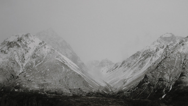
Hipkins also made his first feature in 2014. Erewhon is a tour de force. It shows that his voiceover/montage approach can hold audience attention for ninety-two whole minutes. Like The Port, its voiceover draws on early science fiction—Samuel Butler’s 1872 novel, Erewhon. This book was informed, in part, by the years Butler spent working on a New Zealand sheep station. Frequently compared to Gulliver’s Travels, the novel is an account of an exotic land (Erewhon being an anagram of ‘nowhere’) and its people (the Erewhonians). Their peculiar values and beliefs invert those of Butler’s own Victorian society. According to their law, criminals are treated as ill and the sick as criminals, vegetarianism is compulsory, and machines are banished for fear that they will become conscious and take over (which caused the Erewhonians to regress technologically). After sketching this fascinating culture, Butler’s account ends with a twist, outlining a scheme for profitably converting the Erewhonians to Christianity and exploiting them as labour in colonial Queensland. Hipkins’s voiceover, which cherry-picks sections from the book, is faithful to the novel in retaining this bleak postscript.

Despite its coherent first-person prose, the novel is disorienting—it takes us to another place. Hipkins’s adaptation doubles down on that disorientation. Laurence Simmons has described it as ‘a film of continual interruptions, juxtapositions and breaks in perspective and mood’.7 It sometimes seems like a sequence of more or less unrelated or arbitrarily related shots. Like The Quarry, Erewhon opens with reassuringly straight images, then introduces treated, manipulated ones. The film is sedate in pace yet lurches back and forth between the naturalistic/pictorialist and the manipulated/abstracted. Even its gorgeous scenic landscapes seem framed by ominous scare quotes. The camera is generally static; there are few camera movements to weave shots together. Movement within shots is negligible. Some shots look like stills—indeed, some are. Despite the grounding consistency of the voiceover (another male account read by a woman—Mia Blake again), the accompanying images do not establish any coherent register—which is precisely what compels our attention. Where will it go to next?

Erewhon is a study in montage. It feels as if Hipkins might have shot his subjects without a script, and then organised his images alongside the words as well as he might—like a bricoleur.8 It’s like an accumulation of second-unit cinematography (establishing shots and details), without the main event action to link them. Images seem to illustrate the voiceover, but obliquely, feeling like stand-ins, the next best thing. For instance, when the narrator describes first contact with the Erewhonians (‘The people were of a physical beauty which was amazing’), we don’t see people, we see flowers. We hear descriptions of Erewhonian colleges of unreason yet see brutalist New Zealand university buildings. We learn of that bleak plan to dispatch Erewhonians to toil in Queensland yet see the Wheel of Brisbane and an idyllic Gold Coast beach with iconic high-rises. There are also apparently random images, which add to the confusion: an unmanned electric sander jiggling on a wooden floor, a grotesquely decorated cake, a kid in a rubber mask, female faces from pin-ups, medical models, a bat, a skull, an aeroplane propeller, a box of extracted teeth, a gas mask, a toadstool, tendrils of electricity, and so on. We don’t know if the images are connected to the words. Are we making connections that aren’t there or missing ones that are?

Is Erewhon a work of fact (Hipkins’s documentary images) or of fiction (Butler’s fanciful text)? Are we even in New Zealand? Although we might assume it to be a film about New Zealand, some footage was shot in India (soaring birds, industrial machinery, a screaming steam engine) and in Queensland (including that flowers sequence). This recalls the way The Homely combined images shot in Australia and New Zealand, so we couldn’t tell which were which. It also recalls a familiar filmmaking practice: the way movies set Vietnam, say, are shot in the Philippines and Thailand.

Hipkins moves back and forth from views of nature (that could be from any time) to views of culture (historically specific). There are elements of infrastructure: a train, a bridge, a dam, a windmill, a radio transmitter, a factory. There’s a suburb with cars on a road. There are Orwellian touches: a mainframe computer, a drone. We don’t see people. The landscapes are empty. There are quaint museums, deserted workshops, ruins, junkyards—New Zealand as the Marie Celeste. By flicking between nature and culture, Hipkins constantly underlines the ‘settler’ dimension, prompting us to think of the colonial past as somehow implicit in the present, reminding us that ‘invasion is a structure, not an event’, as Patrick Wolfe put it.9 And yet, it isn’t clear whether Hipkins is equating Butler’s fictional then-and-there to the here-and-now, or contrasting them. What’s the relation between Butler imagining another culture and Hipkins filming his own? Are we the Erewhonians or did we supersede them? And who will supersede us and write our anthropological obituary?

As with The Port, Hipkins has presented Erewhon in different ways. It’s been projected in cinemas. He’s shown a segment as live cinema, with Rachel Shearer performing the music and Mia Blake reading the text.10 In galleries, he’s exhibited a looped chapter on a flatscreen. He’s also shown still photographs lifted from the film, arranged in frieze-style sequences. So, Erewhon is at once a film that recalls still photographs and a series of stills that evokes a film.

With Erewhon, Hipkins could have called it a day. It feels like the culmination. But he’s made two short films since, in the same idiom. New Age (2016) expands his subject matter, combining a voiceover drawn from an English spiritualist manual from the 1870s with images of Avebury’s stone circles. New World (2016) is an enquiry into genre—a deconstructed Western. In it, Hipkins rejects voiceover. This time, the text, excerpted from a Victorian travel report encouraging emigration to Texas, comes as intertitles. These are interspersed with still images appropriated from a variety of print sources and digitally treated, aerial views of Texas from Google Earth, and basic flag-like abstracts. Although it’s mostly silent, there are sporadic sound-effect elements. New World demonstrates how little is required to cue us to read a film as a ‘Western’, and, having anchored it there, how this determines and skews our consideration of every other element.

Hipkins’s films belong to and comment on a tradition of travelogue films as old as the medium itself. They counter both national-pride promotions (like Hugh Macdonald’s This Is New Zealand, 1970) and soulful globetrotting spectacles (like Godfrey Reggio’s Koyaanisqatsi, 1982, and Ron Fricke’s Baraka, 1992). They share more with the alternative-cinema tradition of personal essay films, such as those of Chris Marker and Patrick Keiller, which are often portraits of places. But, unlike them, Hipkins doesn’t write his own voiceovers and illustrate them. Rather, he borrows someone else’s words and interferes with our understanding of those words through his choice of images. Hipkins-the-filmmaker is not identified with his narrator. For him, the film essay is a trope.

Throughout Hipkins’s films, we find similar images, similar treatments; images and approaches seem interchangeable. And, as Hipkins presents his films in different ways, nothing is exactly finished, definitive. We are left with a sense that any presentation is provisional and that works themselves are porous. It’s as if they open up onto one another and onto his other works. A film about Texas is, by analogy, also about frontier New Zealand and about contemporary New Zealand. Butler’s Erewhonians could be Darwin’s Māori or they could be us. Darwin could be Wells’s time traveller. Colonialism could be science fiction and science fiction could be colonialism, and both are Westerns. Avebury’s stone circles are Auckland’s Stonefields. Erewhon is homely. And so on.

Hipkins’s project is voracious, ever-expanding and complex, but it’s also claustrophobic. No matter how much it absorbs (in techniques and genres, sources and references), everything becomes snared in its historical imbroglio. If Hipkins started out making works of still photography that were haunted by cinema, he has ended up making films that look like photo sequences. Now, he operates in a nowhere land, an uncanny place between cinema and gallery, between the moving and the still, between life and death. If his foray into filmmaking once seemed like an aberration or a detour, it now makes complete sense. He has come full circle.

.
[IMAGE Gavin Hipkins Erewhon 2014]


  1. Giovanni Intra, ‘Photogenic’, Signs of the Times (Wellington: City Gallery Wellington, 1997), 24–5.
  2. Justin Paton, ‘The Anatomy Lesson’, Gavin Hipkins: The Circuit (Dunedin: Dunedin Public Art Gallery, 1999), np.
  3. Caspar Millar described it—or imagined it—as a ‘Celtic mantra of the Teat Prayer’. www.christopherbraddock.com/artworks/bodylogue-nine-imprints-from-the-fleshly-worn-series-2003/.
  4. www.ima.org.au/gavin-hipkins-the-field-part-2/.
  5. It’s actually shot in a variety of locations, not just the Bay of Islands.
  6. St Paul Street, Auckland, 17 May 2014, in conjunction with the exhibition Gavin Hipkins: Leisure Valley. There was also a live-cinema presentation of The Quarry exactly a year earlier, at The Physics Room, Christchurch, 17 May 2013.
  7. Laurence Simmons, ‘Erewhon: Filming Nowhere’, Pacific Journalism Review, vol. 21, no. 2, 2015: 35.
  8. Hipkins explains, ‘The footage was collected and only later fell into place with the script. I shot things without knowing exactly where they would end up. Just general themes: machinery, animals, plants, etc.’ Email to the author, 2017.
  9. Patrick Wolfe, ‘Settler Colonialism and the Elimination of the Native’, Journal of Genocide Research, vol. 8, no. 4, December 2006: 406.
  10. Mangere Arts Centre, Auckland, 6 June 2015.

Gavin Hipkins filmography
The Relay 1999, VHS, 60min
The Rim 1999, two-channel monitor-based installation, VHS, 60min
The Host (Part II) 2003, digital video, 8min 27sec
The Field (Part II) 2004, digital video, 11min 21sec
The Master 2010, shot on Super 16mm transferred to digital video, 6min 4sec
This Fine Island 2012, shot on Super 16mm, digital video, 12min 10sec
The Dam (O) 2013, digital video, 7min 46sec
The Quarry 2013, digital video, 11min 30sec
The Port 2014, digital video, 17min 24sec
Erewhon 2014, digital video, 92min
New Age 2016, digital video, 10min
New World 2016, digital video, 12min 38sec

John Stezaker: Twice Removed

John Stezaker: Lost World, ex. cat. (London: Ridinghouse, 2017).


John Stezaker is known for his distinctive, deceptively simple collages. He’s been making them for decades. His practice is based in collecting. He works with a massive personal image archive of film stills, head shots of actors and actresses, postcards, and other stuff. With the film stills, he is particularly drawn to examples from forgotten, run-of-the-mill B-films from the 1940s and 1950s. With the head shots, which are of a similar vintage, he prefers those of anonymous hopefuls who barely enjoyed fifteen minutes of fame. Meanwhile, his usually somewhat older postcards document picturesque destinations through the otherworldly haze of now-obsolete printing technologies, which sometimes seem to scramble the aesthetics of painting and photography. All these image types come in standard sizes and are formulaic. They are variations on themes.

Dated material attracts Stezaker. He likes ‘stuff that has lost its immediate relationship with the world’1—its currency. His source images advertise things no longer available: films we can’t see, thespians no longer at large, and places we can’t visit (at least, not as they were depicted). They are quaint reminders of other times, the way we were. Redundant, cast adrift from their referents and reasons for being, they are ripe for repurposing. Stezaker’s approach to collage is also time warped. He eschews the digital. He doesn’t use Photoshop to rescale and composite images, to smooth transitions between them. He uses his found images as is, actual size, enjoying and exploiting the way they line up or don’t. There’s always a degree of match and mismatch, of images accepting and rejecting one another.

Stezaker says collage ‘reflects a universal sense of loss’ and involves ‘a yearning for a lost world’.2 But that is not necessarily true; there are other approaches. Stezaker belongs to a particular school of collage, the reclusive-surrealist-nostalgic-romantic school, the Joseph Cornell school. Indeed, the American surrealist’s posthumous 1981 Whitechapel Gallery show proved to be a big influence on him. Famously, Cornell was something of a shut in, a closet fantasist. His work was a parallel world, peppered with depictions of a France he never visited and of haunting remote beauties, like Lauren Bacall. Stezaker says, ‘Cornell’s life and art … represented for me a kind of ideal, a living exile from life.’3 But what is an ‘exile from life’, if not death? Or is there somewhere else, which isn’t life or death?

.
Stezaker’s collages are about collage. Collage involves taking existing images or materials, reorienting them, cutting them, pasting them. But Stezaker often does just some of these. Sometimes he cuts and pastes, sometimes he just cuts (without pasting) or pastes (without cutting), sometimes he simply reorients. Indeed, sometimes he just selects, presenting a found image more or less as is. (He calls his uncollaged collages ‘readymades’, as a nod to Marcel Duchamp.) Through isolating different collage moves—revealing the world of difference between a horizontal crop and a circular excision—Stezaker exposes collage’s language and logic.

Stezaker plays out the possibilities and permutations in ongoing, open-ended series. One of the largest is his Masks. For these works, he places postcards on top of head shots, covering the sitters’ eyes. The cards add an element of disguise, intrigue, and seduction, as one might expect from guests at a masked ball. Who are these people? Forms in the scenes line up with those in the faces or coincide with where we assume facial features would be—sometimes more, sometimes less. Arched bridges, caves, and windows, for instance, suggest eye sockets; other aspects stand in for noses, mouths, hair. It’s as if the faces were caught, mid-transformation or mid-erasure. Stezaker exploits our predisposition to see faces in anything and everything (pareidolia) and to mentally intuit wholes from collections of fragments (gestaltism). However, once the initial illusion dissolves, we take stock of the contradictions: the face may be convex and shallow but the scene concave and deep; the postcard covers the face yet we register it as a window; scales and registers are wildly out; and so on.

The Masks suggest a cinematic logic, recalling the way filmmakers cut from close-ups to location shots to make a point: to show where the actor is, what they see, or what they’re thinking. On the other hand, they could suggest what we, as viewers, think, when we look into faces. Getting lost in the face of the other can be like ambling through the countryside or spelunking. Stezaker conjures a wealth of implications—expressive and metaphoric—from the simple gesture of superimposing a place on a face. Some Masks are dreamy, some grotesque, some amusing—but all are somehow deadly. Masks are inherently morbid, being dead part-faces that conceal alive ones. Stezaker’s Masks play this up, suggesting a zombie army: skull heads, rotting heads, petrified heads. It’s as if his troupe of bygone actors—now six feet under, food for worms—were still popping up for their auditions, ready for their close-ups.

Mask CCVII (2016) conflates death and the maiden. The postcard shows a rough-hewn railway tunnel opening onto a magnificent vista, combining a lake (probably) and a snow-topped mountain. It’s placed over a glamorous woman’s face; her head tilted, wistful. The railway lines push forward, into her head, as if providing an explicit track for our gaze, as if its course were inevitable. Together, the images suggest something vile (her brains blown out, Terminator 2–style) yet dreamy (landscape beauty and female pulchritude cross-referenced). Does this escapist landscape represent what’s in our thoughts in looking at her, or what’s in her pretty head? But, really, could she think anything anyway, being debrained; her now mindless head made into a picture frame? And, is that our fault? Have we drilled her brains out, effacing her with our hungry gaze—decades of looking, longing, loving? Paradoxically, all this violence is achieved by simply aligning two brands of beauty, each in itself innocent, orthodox, and reassuring. Is the artist celebrating the penetrating gaze or calling it out?

.
Actors’ and actresses’ faces are, of course, already masks—tools of their tricky trade. Stezaker often grafts their head shots, cutting one  person’s in half, laying it over another’s. The first impression is of a single face; then, we see the seams. Some facial features match up almost perfectly; others don’t. Eyes and noses might align, leaving mouths and hairlines awry. Which face is real and which the mask? And, is this duplicity or duality? Stezaker’s mix-and-match identikits suggest hybrid, schizoid personalities—cracked actors. Although there’s an element of caricature at play, the effect is mostly subtle; any picturesque, cubist asymmetry being generated in an attempt to create a plausible match. For these works, Stezaker says he uses the blander, less remarkable faces from his archive, and that the combination is always an affective improvement, more engaging, more characterful. Value added.

Most of Stezaker’s composite portraits lean to the attractive, fewer to the grotesque, demented, or pathetic. While some are same-sex concoctions (the Hes and Shes), most are gender-and-genre-blending hybrids who can’t tell if they are Arthur or Martha, or what movie they should be cast in. (Are they confused or versatile?) Stezaker calls these ones Marriages and Betrayals, suggesting both how we coexist with our better halves and how male-to-female transexuals are betrayed by their big hands. Marriage and betrayal are metaphors for collage itself. Together, they suggest the temporary détente achieved between lovers, between transplanted organs and their host bodies, and between puzzle pieces that don’t quite fit.

Everything is forever coming together, falling apart. It’s the way of the world. Exploring it has long been collage’s mission. Stezaker explains: ‘Living in a culture of images is also to live in a culture that is essentially divided and fragmented. “Marriage” is a word that I use a lot because I’m trying to heal those divisions in some ways, use collage as a kind of healing process, to bring back together. Sometimes the bringing together can be preposterous and seem comic … It’s not always to do with a happy marriage. It can be a very unhappy marriage. It can be a feeling that things can never be reconciled.’4

.
We are curious. We want what we can’t have. We are fascinated by what’s hidden, what’s invisible. In his Circles, Stezaker cuts circular holes in film stills. These holes suggest where the centre of interest in the photo would have been for us, perhaps also for those depicted in the photo. Certainly, the holes now become the centre of interest for us, as image becomes frame and offscreen space moves centre stage. What remains of the image now points to the hole, offering clues to what may have disappeared behind the event horizon. We are transfixed by the nothing in the midst of the something. The hole suggests an optical blindspot, but also a psychological one, even though we can’t tear our eyes away. The hole is a question. What does it mean for the figures in the photo and what does it mean to us? The same thing or something different? Does the hole exist in the depicted world of the actors, in the real world of the viewer, or hover on the border between?

It gets more complicated. Circle VIII (2014) suggests an allegory about photography and gender. Stezaker started with a film still, a photo of someone taking a photo. Two 1940s men—generic, suited, hatted—stand on a porch. Perhaps they are gentlemen of the press. One just looks, the other aims a camera with a circular flash unit. Stezaker has removed what draws their attention, leaving a circle-hole. Poking out below it, we see a hint of a woman (a flash of dress). The blank shape of the hole rhymes with that of the camera’s flash unit, suggesting that the circle is the light of the flash, bleaching out what it was supposed to illuminate, overexposing it. But that doesn’t make sense. It’s broad daylight, so it’s unlikely the flash would be used, and, even if it was, it would not produce a hard-edged circle of light. The film’s title, printed on the still, Shadow of a Woman, prompts us to associate the camera’s flash with this ‘shadow’, even if it’s the opposite (light not shadow); or to imagine the shadow of the woman that would be cast by the flash. But where is Stezaker going with this? It’s a non sequitur.

Stezaker does something similar in his Tabula Rasas. Here, he cuts foreshortened rectangles out of film stills, suggesting blank movie screens or monochrome canvases hovering in the depicted space. It’s as though these otherworldly abstractions have invaded grey-scale world of the film stills, haunting it, like the enigmatic black monolith in 2001: A Space Odyssey (1968) or the ominous, anamorphic vanitas skull in Hans Holbein’s The Ambassadors (1533). The blanks are usually positioned to suggest the field of vision of one or more characters in the still (though our visual fields aren’t rectangular), while obscuring or excising what they would actually see. Their attitude to what was removed—be it stoic indifference, bemusement, or surprise—becomes their attitude to its removal, its absence. The Tabula Rasas cross-reference our looking at the work with people in the work looking at something, at nothing. We stare idiotically into the collage in the same way that the figures in it appear to gaze pointlessly into the void. It’s a mise en abyme.

Subtle, minimal interventions can have complex, diverse ramifications. In Tabula Rasa XLV and Tabula Rasa LII (both 2012), Stezaker makes nearly identical excisions in two film stills, to very different effect. In Tabula Rasa XLV, a generic male, in a plain black suit, seems to be looking at another man in a pin-striped one (we can see bits of him behind the screen-hole). The still is inscribed with the movie title, This Side of the Law, prompting us to think of the hovering screen as an inscrutable, accusative Kafkaesque void, with the law on one side—but which side? Is our man on the right side or the wrong? And, looking at him from outside his frame, and unseen by him, which side are we on? By contrast, in Tabula Rasa LII, a seated, suited man looks at a standing woman and man, probably (we can see her side and his trousered legs). A love triangle? Here, the movie title is So This Is Love, cuing us to see the man as a suitor blinded by affection. The blank screen hides the woman (the love interest?) but also stands in for her, suggesting she’s a screen for his projected fantasies, perhaps ours. The shape implies a puzzle for the man in the suit to solve and the work implies a puzzle for us to solve. But are they the same puzzle?

The use of the term ‘tabula rasa’—suggesting a new beginning, a clean slate—is laden with irony. As a collage artist, Stezaker never starts from scratch, but is always managing the noise of existing imagery. His tabula rasa motif is only ever visible as a rupture or rift in representation.

In the Circles and Tabula Rasas, we look through holes at nothing, but in other collages we look through a hole in one still at the contents of another beneath it, now framed by it. In his Double Shadows, Stezaker cuts the figures out of film stills, leaving human-shaped voids, silhouettes. He lays these on top of other stills, which have been inverted. The result is a confusion between figures taken out (reduced to outlines, but right-way up) and figures left in (but inverted). In a classic figure-ground switch, the absences are more legible than the presences. The Double Shadows recall those games in which a template is used to reveal a message buried in another text or image, or those head-in-hole fairground attractions that invite us to pop our real heads through holes in painted scenes. Stezaker plays out his Magritte-style displacement games—shell games of presence and absence, visibility and invisibility—endlessly.

.
The film still and the head shot are parasitic, secondary forms. They refer to another realm of representation, the fictional world of cinema. The collages Stezaker makes from them always seem to be implicated in the language and logic of movies, but at a remove or two. There’s something cinematic, but not quite cinematic, about his cuts and splices. Offering differing degrees of continuity and disjunction, they feel analogous to match cuts and jump cuts. Stezaker continually mixes his cinematic metaphors. The foreshortened rectangular apertures in his Tabula Rasas remind us of cinema screens, while circular apertures recall old-fashioned iris shots. And, when he places a postcard (of a meandering river, a torrent, a country path, a ravine, a bridge, or a big rock) over an image of a couple sharing a moment, he recalls those cinematic cutaways (fireworks and trains entering tunnels) that conflate coy euphemism and vulgar exaggeration. Masking and unmasking.

Stezaker is constantly exploring the gap between the languages of cinema and of collage. He has even made collage movies. In his flicker-video Crowd (2013), he presents hundreds of film stills of crowd scenes, each for a single frame, twenty-four per second. He runs together ‘the chorus line, the racecourse, the political rally, the bloodthirsty mob tearing after the villain, and the team of synchronised swimmers’.5 Reanimating film stills, breathing life back into them, is a perverse idea. Crowd operates at the limits of perceptibility; its images coming hard and fast, too fast to read. If occasionally we glean a fragment from the torrent—when an odd genre, gesture, or grimace lingers with us—it may feel as though it’s been wilfully implanted for subliminal effect (picking us), when, really, it is our own eye-brain that singles it out from the melange. Everyone has a different experience of the film.

.
Stezaker’s works are poignant—‘touching’. There’s an intimacy to their scale, their subject matter and its treatment. His preloved source images have passed through other hands, and are full of romantic intimations. His collage techniques emphasise his own hand, as he cuts into images with a blade and repositions them. The stress on touch is implicit in the results; say, in Marriages and Betrayals, where flesh meets flesh, and in the triptych, Touch (2015), where figures are beheaded to highlight where their hands are at, to make a point of body language.

Hands are crucial for Stezaker. He has a collection of found-object sculptures—vintage mannequin hands that rest on or grip small plinths. They offer a melancholy repertoire of rhetorical poses. He calls them Touch when they are palm down, Give when palm up (suggesting begging). These uncanny, disembodied hands—rescued from the past—recall those autonomous horror-genre hands with minds of their own, like Thing in The Addams Family and the vengeful severed hand in the 1981 film The Hand. Plaintive but creepy, they seem poised between life and death.

Death haunts Stezaker’s work. He says: ‘Death has been a central preoccupation of my thinking. There are often connections between fascination, death and the activity of being a collector. The found object can be seen as the death of the commodity and the collection as its mausoleum.’6 Stezaker also cross-references death and photography. For Camera (2015), he took a film still showing a group of men posing by a guillotine, as if having their photo taken. The condemned man just happens to be the tallest. All Stezaker does is to imagine that the photographer had composed the scene differently, by slicing a bit off the top of the still, beheading the condemned man prematurely. This gesture—combined with the title—promotes the looming guillotine as analogous to a giant view camera; its neck hole suggesting a lens. Like the guillotine’s blade, the camera’s shutter (or Stezaker’s scalpel) separates head from body, life from death, before from after. It’s a visual dad joke.

.
Stezaker is not a film historian. He knows little of the films in his stills or of the actors and actresses in his head shots. If he did, it would just get in his way. Not knowing means his source images can prompt his speculative associations and imaginative reveries. Not only are his sources conventional and repetitive, Stezaker takes pleasure in performing the same manoeuvres on them, over and over. On the one hand, this repetition could be owing to something insistent in his source materials, something in them he is uncovering and channelling, as if unable to escape their gravitational pull. On the other hand, it could suggest his own insistent, impressive turn of mind, purposefully projected onto his sources (repetition compulsion). Stezaker’s work sometimes has the quality of a recurrent dream, whose point nevertheless remains concealed or deferred.

This all raises questions about the artist’s agency. Stezaker often speaks as if his work involved putting his own interests and desires on hold, in deference to the inner life of his images, obeying their wills rather than exerting his own. He is, in his own words, ‘fascinated’—in thrall of his sources. He says, ‘images find me rather than the other way round’.7 He describes ideally working late at night, tired, lacking the energy to exert conscious control. And, he knows he’s finished a work when ‘I’m somehow not present. It’s there in front of me. It’s necessary, I see it, and that’s the end of it.’8 But, is this true or a cover story? Perhaps letting go consciously is just a way for your unconscious to get a grip. Believing the world is speaking to you when you are projecting your desires into it is the crux of fantasy—the world is asking for it. Of course, projection (or transference) is already a major theme in the works themselves—a conceit, then.

I can’t help but wonder about the gender politics. Stezaker cut his teeth as an artist in the 1970s, a time dominated by the rise of feminism and other critiques of ‘ways of seeing’. There was no escaping it. However, his source images hail from an earlier era, a pre-feminist time when gender roles were more constrained, when men were men and women women, and particularly so in the movies.  His work is full of images of men and women playing their parts. Stezaker adopts an ironic attitude towards gender stereotypes, keeping them at arm’s length but also within arm’s reach, having his cake and eating it too. Affectionately revelling in and queering cliches, his work could be cast as a reaction to or an expression of feminism. Either. Both.

Stezaker makes his loving scalpel attacks on his orphan images, but he also rescues them from oblivion, redeeming them, keeping them in circulation. He gives them a second chance. He isn’t exactly retreating into the space of old movies (already a fictional parallel world, an escape) but forging a new fantasy space from its remnants. However, in our minds (and doubtless his), this new collage world and the old world of his source material remain inextricably entwined. His collages imply a perversity latent within his sources, even if it is a perversity he brings to them. Stezaker may cut and paste normative images from yesteryear, but they are no longer normative. They’ve outlived their authority and point. Through collage, he détournes them, reinvests in them, has his way with them, makes them dance to his own tune. He doesn’t so much discover a lost world as invent one, albeit in the guise of discovering it, disappearing into his image-world, becoming one with it.

It’s a marriage, but is it also a betrayal?
.
[IMAGE John Stezaker Mask CL 2010]


  1. John Stezaker quoted in David Lillington, ‘A Conversation with John Stezaker’, Collage: Assembling Contemporary Art (London: Black Dog Publishing, 2008), 27.
  2. Ibid.
  3. John Stezaker quoted in ‘The Third Meaning: John Stezaker in Conversation with Christophe Gallois and Daniel F. Herrmann’, John Stezaker (London: Riding House and Whitechapel Gallery, 2011), 37.
  4. ‘John Stezaker: Resonating Nostalgic Lyricism’ (video), Gestalten TV, 2013, https://vimeo.com/82096614.
  5. Laura Cumming, ‘John Stezaker: Film Works Review: An Overwhelming Onrush of Images’, The Guardian, 26 April 2015, www.theguardian.com/artanddesign/2015/apr/26/john-stezaker-film-works-review-de-la-warr-pavilion.
  6. John Stezaker quoted in David Lillington, ‘A Conversation with John Stezaker’, 28.
  7. www.mudam.lu/en/le-musee/la-collection/details/artist/john-stezaker-1/.
  8. ‘John Stezaker: Resonating Nostalgic Lyricism’.

Michael Parekowhai: The Empire of Light

Art Monthly Australasia, no. 299, June–July 2017.


.
Our living marae is really our suburban family home. It is a 1960s two-storeyed brick-and-tile house with five bedrooms, four toilets, and a carport that can hold a trailer and a caravan. That’s how it is. That is the marae I know, that’s the meeting house I know. Our house is not decorated with taonga. We have TVs, a radiogram, some Copenhagenware crystal vases, beige Berber carpets, and central heating instead. We have been taught that being Maori does not necessarily depend on physical things or the traditional symbols to express itself. Being Maori draws upon all that’s around you so that we might understand its underlying spirit.
—Michael Parekowhai1

.
It’s hard to make good public art. There are too many constraints and obstacles, especially for artists adapted to operating within the philosophical and aesthetic safe haven of the white cube. They have to render their nimble ideas in forms and with materials that can cope with the weather, the authorities, and the vandals. Their work has to operate rain or shine, 24/7. It has to hold its own within the scale and hubbub of its environment and engage both an uninitiated know-nothing public (who come to it cold) and a know-everything art world (who’ve already absorbed the backstory and are alert to the strategy). Plus, there are those random irritations and petty humiliations: stakeholder expectations, bylaws, consents, health and safety, contractors, third-party liability, plus the media pundits and other fools sent to judge your work. With his new public sculpture for the Auckland waterfront—The Lighthouse (2017)—Michael Parekowhai has risen to the challenges and conquered the problems. It’s a bit of a coup, really.

Parekowhai is a star. He’s been a fixture on the New Zealand art scene since 1990, when he debuted in Choice!—the game-changing contemporary-Maori-art show at Auckland’s Artspace. He was still at art school, an undergrad. His work didn’t look like the contemporary Maori art that preceded it. It was an odd alloy of craftiness and conceptualism, and eschewed obvious Maori references and tropes. And yet, despite this—or because of it—it made a fine point of its cultural difference. It proved to be a golden ticket. Parekowhai would go on to become a market darling and museum staple, a university professor and an Arts Foundation laureate. In 2011, he represented New Zealand in Venice and Te Papa bought the big work for $1.5 million. And, in 2015, he had the mother of all solo shows—The Promised Land—at QAGOMA, Brisbane.

The Lighthouse has been a while coming. Parekowhai received the commission back in 2013. Auckland’s most powerful real-estate agents, Barfoot & Thompson, had put up a cool million dollars for a public sculpture for Auckland to celebrate their ninety years in the business. Parekowhai said he’d erect a 1950s-style state house on Queens Wharf. The project became rolling news, bringing a flood of public debate as to its virtues.

State housing has been a keystone of New Zealand egalitarianism since our first Labour government was elected in 1935, at the end of the Depression. After that, our citizens would come to look to government to guarantee that one and all would enjoy roofs over their heads, be kings and queens of their own quarter-acre castles. But, ultimately, state housing would mean different things to different people; to some, the caring society; to others, a stigma, the ghetto. And its meaning is changing still. Since neoliberalism began to unplug the nanny state, inequality has been on the rise. In the 1990s, government started to ask market rents for state houses. More recently, it has been getting out of the landlord business, selling off state houses. Now, in Auckland especially, there’s a housing crisis. As prices skyrocket, former state houses can change hands for $1 million-plus. Essential workers can’t afford to live in the city and many in the working class (including Maori and Pacific Islanders) are finding themselves homeless, some living out of their cars. The ‘boom’ is creating a new political divide, between those already on the property ladder and those who will never get on it. Now, the state house reminds us how the system has failed us.

On the basis of media reports, many assumed Parekowhai’s work would essentially be a readymade: an actual state house (more or less), designated as an artwork. But it was also revealed that Parekowhai planned to install a custom-made Venetian glass chandelier inside it—representing the Matariki/Pleiades star cluster—that was to consume much of the budget. According to critic Anthony Byrt, the chandelier would refer to New Zealanders’ looking to the old world for cultural affirmation and to the crucial role New Zealand forces played in liberating Venice at the end of World War II.2 But surely the point was more obvious—the incongruity of hanging a chandelier in a poor house. Was this about working-class aspiration (Maori making their state houses into dream homes) or about gentrification (the property boom that was making them homeless)? Although the chandelier idea would be rejected, it lingered in people’s minds and would inform their reception of the project.

The budget seemed to be part of the idea, the elevator pitch: the million-dollar state house! (It would ultimately bloat to $1.5 million, with the shortfall covered by private sources.) Some questioned the expense, even though no public money was involved, looking a gift horse in the mouth. But, the big question remained: why build a civic monument to state housing when the civic authorities had turned their backs on it? Did it imply a critique of its commissioner by the artist; or was it callous, with Barfoot & Thompson and the artist enjoying an in-joke at the expense of the homeless? Parekowhai didn’t clarify his position, but allowed speculations and expectations to expand around the project, ultimately to confound and exceed them. Although it got out that Parekowhai would replace the chandelier with neon lights (still referring to star constellations), he kept the big twist under wraps.

When The Lighthouse was unveiled on 11 February, it was clear that Parekowhai hadn’t produced a state house at all, but a sculpture of one. From a distance, it looked familiar enough. But, as you approached, things changed. The house was built not on land, but over the water, on a timber deck, like a jetty. On the water side, the window shutters were embellished with chevron patterns, suggesting tukutuku panels from a Maori meeting house or warning signs. On closer inspection, what looked like a cheap weatherboard house had been custom painted with automotive spray paint, giving it a ‘finish fetish’ sheen. The windows were double glazed, the guttering was copper, and the steps up to the second floor had a glass balustrade—none of which you would expect in a state house. Parekowhai had seriously pimped this crib.

With lights flashing inside, it looked like a party was going on, day and night. But, when you peeked through the windows, you got a surprise. You expected there to be two floors and various rooms, as with a state house, but there was just one huge, brightly lit, double-height space, with glistening pale-green fibreglass walls, a polished black-maire wood floor, and a moulded fireplace. The walls and windows were traversed by coloured neon squiggles, going on and off, representing constellations—the stars that provided ‘guiding lights for early Maori and European navigators as they voyaged the Pacific Ocean’.3 (This aspect isn’t finished yet. Parekowhai will attach more neons to the floor, representing signatures from the Treaty of Waitangi, arranged in the shape of the Matariki constellation.) If the house looked old, familiar, and plain on the outside, inside it was newer, grander, slicker, weirder, seemingly larger—like Dr Who’s TARDIS. And spatio-temporal dislocation would seem to be the point, entirely.

And, the twist … as a centrepiece, Parekowhai had installed a larger-than-life stainless-steel sculpture of Captain Cook, the eighteenth-century English explorer who circumnavigated and mapped New Zealand on the Endeavour. Based on Nathaniel Dance’s iconic 1776 painting of Cook, Parekowhai’s slick statue offered an update on traditional statuary, appearing both metallic and plastic, and nodding to Jeff Koons. Then again, it also recalled the shape-shifting liquid-metal terminator from Terminator 2: Judgment Day (1991). At about six foot two, Cook was already large, but, here, he is a giant, like Gulliver. Indeed, he is so big that the building had to be erected around him. He’s a ship in a bottle.

It’s not a heroic depiction. Cook sits on a sculptor’s stand. His feet dangle, they don’t touch the ground, perhaps referring to the fact that he never actually set foot in Auckland. He seems ungrounded, dislocated, trapped. Despite his glitzy treatment, his face has a pensive, melancholy aspect. He can be observed through all the windows, from every side, from above and below, making him as much a prisoner of our gazes as of the house itself. He looks down and away, avoiding our stares, seemingly caught up in his own thoughts, while the neon light plays off him. He’s an odd cocktail of authority and helplessness, disco and depression.

Typical of Parekowhai’s work, The Lighthouse is ambiguous and allegorical—a Magritte-like mixed metaphor.4 You can read it on different levels simultaneously, setting up interpretive interference patterns. Lighthouses are navigational tools, like stars. They can be welcoming and warning: welcoming people into the harbour and warning them away from rocks. Parekowhai’s example looks out, both to the North Shore, where Parekowhai grew up (it’s visible from his parent’s place in Northcote) and towards Bastion Point (Maori land occupied in the late 1970s by Ngati Whatua protestors, who didn’t want to see it appropriated for luxury housing). The Lighthouse is at once a family poor house and a grand civic monument. We can see it as a colonial imposition (a European-style ‘state’ house) or as a Maori house (social housing or a meeting house). It could be a colonial outpost (on Queens Wharf at the end of Queen Street) or a protest occupation (also on Queens Wharf at the end of Queen Street). The lights that never go off could also be understood as fires of occupation (ahi ka), ‘keeping the home fires burning’—asserting title to land through continuous occupation. Is The Lighthouse a celebration of New Zealand egalitarianism or a memorial to its demise? Why are we locked out, and Cook locked in? He contemplates the infinite universe, yet this great beyond is contained within his cell, leaving the real stars outside, with us. Is he a lighthouse keeper, tending the flame for us, or a prisoner, making us his warders? Is Parekowhai demonising Cook as the source of Maori woes (the beginning of the end) or identifying with him (as a fellow traveller who also navigated by the stars)? Etcetera. The work doesn’t have a point, but operates as a conversation starter, a prompt.

When The Lighthouse opened, there was a festival atmosphere, with local pop stars jamming inside the house. But there were picketing protesters too, outside, shouting ‘shame’, staying on message. The Lighthouse is ‘calm and confrontational’, argues Anthony Byrt, one of its champions. You could also say it is spectacular and smart, kitsch yet conceptual, fun but grave. It certainly is a conundrum, collapsing or distilling a welter of contradiction into a single arresting image. As the philosopher Francis Bacon once explained, ‘In order for the light to shine so brightly, the darkness must be present.’

The Lighthouse has become a must see, a crowd pleaser. Punters clamber over it constantly, exploring, peering through windows, making of it what they will. And they can make a lot. The Lighthouse asserts a universal ideal (social security, home/turangawaewae) while broaching the realities that divide us and keep that ideal at bay (colonisation, prejudice, poverty, the housing crisis), constantly reminding us that things might be read differently.


  1. Quoted in Jim and Mary Barr, ‘The Indefinite Article: Michael Parekowhai’s Riff on Representation’, Art Asia Pacific, no. 23, 1999: 73.
  2. Anthony Byrt, ‘State House Rules: Michael Parekowhai’s Sculpture Is Auckland’s New Best Thing’, Paperboy, 8 February 2017, www.noted.co.nz/culture/arts/state-house-rules-michael-parekowhais-sculpture-is-aucklands-new-best-thing/.
  3. Michael Parekowhai quoted in Dionne Christian, ‘Artist Shines Light on Controversial Work​’, Herald, 11 February 2017, www.nzherald.co.nz/entertainment/news/article.cfm?c_id=1501119&objectid=11797673.
  4. In his 2015 show, The Promised Land, at QAGOMA, Brisbane, Parekowhai installed the same Cook figure inside an almost actual-size house. Around Cook, the walls were studded with smaller figures: Maori security guards and Magritte bowler-hatted men familiar from Parekowhai’s earlier work. That installation, titled Memory Palace, we can now see as a dry run for The Lighthouse. Memory palaces are familiar architectures or landscapes, committed to memory. Into these mental spaces, adepts insert arresting, even surreal images representing a sequence of things or ideas they wish to remember. The Maori meeting house is also mnemonic architecture.

Colin McCahon: On Going Out with the Tide

(with Wystan Curnow) Colin McCahon: On Going Out with the Tide, ex. cat. (Wellington: City Gallery Wellington, 2017).


The painter Colin McCahon is New Zealand’s most celebrated artist—his name is synonymous with New Zealand art. He emerged in the late 1940s and was active into the early 1980s. Over this time, his work underwent major formal and conceptual transformations. His diverse oeuvre includes landscapes, figurative paintings, abstractions, word and number paintings, and various combinations of these. McCahon’s work was inventive and inspiring—New Zealand art developed around it. Critics argued over its virtues and implications; other artists produced work in response to it. McCahon cast a long shadow. In 1987, he died.

In the 1990s, McCahon’s position in the culture changed. His work ceased to be part of the cut-and-thrust of the contemporary-art discussion and he became a more canonical, historical figure. In 1997, his works were reproduced on postage stamps. It is now fifteen years since the last McCahon survey show—Colin McCahon: A Question of Faith at Amsterdam’s Stedelijk Museum in 2002. Our project is a response to the questions: What aspects of McCahon’s work have not yet been fully explored? What kind of McCahon show might speak to the current moment?

On Going Out with the Tide addresses McCahon’s works on Maori subjects and themes from the 1960s and 1970s. These works have not been brought together before. The show locates them at the heart of his project. McCahon’s most radical and consequential work—the work on which his international reputation rests—is his later work, from the mid-1960s on. On Going Out with the Tide, then, is an opportunity to consider how things Maori influenced the most important period of New Zealand’s most celebrated artist. Now, in the twenty-first century, we can understand this work in terms of a tectonic shift in New Zealand culture—emerging biculturalism. This show seeks to place the work in its historical context: first, to understand it in terms of the times in which it was made; second, to attend to how it was interpreted and framed subsequently; and, third, to imagine how it might be read in the future, in the wake of Treaty settlements.

McCahon’s work was a product of its time. In the 1960s and 1970s, as Maori continued to migrate to the cities, mainstream awareness of Maori culture grew, a protest movement pressed for the return of Maori lands and the recognition of Maori language, and contemporary Maori artists and writers emerged—an alternative cultural narrative was revealed. This period has been called the ‘Maori Renaissance’. McCahon’s art fed off and contributed to it. In the early 1960s, McCahon began to incorporate Maori imagery and language into his work. In the late 1960s and 1970s, his interest deepened to include elements of Maori history and cosmology. Maori ideas became integral to his project, his world view. McCahon’s interest was fed by new resources on Maori culture, friendships with writers and artists, and the births of his Maori grandsons, first Matiu, then Peter (Tui). While his interest in things Maori sustained and consolidated longstanding features of his work, it also changed it.

The 1980s were the beginning of a new chapter for New Zealand. The government began to embrace the Treaty of Waitangi as the nation’s founding document, it grappled with the implications of implementing biculturalism, and it extended the powers of the Waitangi Tribunal. As contemporary Maori art and its advocates became increasingly visible, prominent Pakeha artists who had incorporated Maori elements into their work in previous decades were now criticised as appropriators. In this time, contrary views on McCahon’s use of Maori material emerged. For instance, in 1986, the academic Ngahuia Te Awekotuku criticised McCahon for quoting whakapapa in his 1969 painting The Canoe Tainui, considering it culturally insensitive. However, in 1992, the art historian Rangihiroa Panoho would celebrate McCahon’s work for sympathetically engaging Maori content, in contrast to Gordon Walters, whom he criticised for appropriating only the outward forms of Maori art. In the 1990s, a new generation of Maori artists—Michael Parekowhai, Peter Robinson, and Shane Cotton—created works drawing on McCahon and Walters that would complicate and shift the appropriation debate. Today, that debate, itself, seems to be part of history.

These days, McCahon is sometimes read, through post-colonialism, as a ‘settler’ artist, linking his work to the nationalism of such poets and commentators as Charles Brasch, Allen Curnow, and M.H. Holcroft. This emphasises McCahon’s earlier work, where he is seen as naming and claiming a silent and empty land, implicitly sidestepping prior Maori occupancy, history, and claims. From this viewpoint, his later works on Maori subjects and themes represent a change of heart, a course correction.

This reading distorts McCahon’s and his immediate circle of friends’ relation to the Pakeha mainstream. In his formative years, in the 1940s, McCahon was, in his own words, ‘a real Red’, like his Communist Party friend Ron O’Reilly. With Rodney Kennedy, McCahon briefly joined the Quakers (Kennedy was jailed during the war for his pacifist stance). McCahon’s closest painter friend, Toss Woollaston, successfully registered as a conscientious objector. When they gathered in the Nelson region, during the summer fruit-and-tobacco-picking seasons, they visited Riverside, the Christian Pacifist Society’s commune near Mapua. Established in 1941, it’s still a going concern. McCahon’s broad sympathy with its leftist Christian Pacifist values remains implicit in his work from then on, and, in part, explains his interest in the Maori prophets. Like Riverside, Te Whiti’s Parihaka community was based on pacifist principles. Like Parihaka and Rua’s Maungapohatu, Riverside is an experiment in independent community building.

McCahon’s knowledge and understanding of Maori culture was partial and piecemeal. He related to Maori ideas through their spirituality, either seeing Christian and Maori ideas as parallel or looking to the hybrid forms of Maori Christianity. His biculturalism was entangled with his Christianity, which has been seen as limiting it. For Maori, Christianity remains a thorny matter. On the one hand, it was an instrument of colonialism; on the other hand, the Maori prophets hijacked and remade it in their resistance to colonialism. Questions hang over McCahon: To what extent does he engage with Maori cultural difference and to what extent absorb it into his syncretic Christian disposition? How does it change his Christianity? Does it subvert it? Does McCahon’s work represent an opening or an obstacle for the biculturalism that follows and for one yet to come—a gate?

On Going Out with the Tide is a research project. We intend it to be a platform for ongoing discussion, both about McCahon’s work and about the ways the cultural landscape it occupies has shifted. As part of the project, we will be presenting a programme of lectures, talks, and screenings. Our aim is to produce a substantial book later, drawing on what we learn as a result of doing the show and the responses to it.
.
More.

.


Copyright © 2026 · Genesis Framework · WordPress · Log in