Robert Leonard

Contemporary Art Writer And Curator

Julian Dashper & Friends

Julian Dashper & Friends, ex. cat. (Wellington: City Gallery Wellington, 2015).


‘The museum wants the artist timeless. It is waiting for the death. Only with the closure of death does the oeuvre completely and happily begin.’ So wrote art critic Francis Pound in 1991, in a catalogue essay for the then-young artist Julian Dashper.1 His words returned to haunt us on 30 July 2009, when Dashper died from melanoma, aged just forty-nine. Julian Dashper & Friends is a tribute to this key New Zealand artist and a response to the question of how to represent him, in retrospect.

As a self-consciously art-historical artist, Dashper’s works were always in dialogue with other artists and with art history. So, in Julian Dashper & Friends, I present his works ‘in conversation’ with works by other artists—older artists, his contemporaries, and younger artists. This reflects Dashper’s own practice of making two-person shows and curating other artists into his ‘solo’ shows.

Julian Dashper & Friends includes important artists. In addition to Dashper, there’s Rita Angus, Billy Apple, Daniel Buren, Fiona Connor, Colin McCahon, Dane Mitchell, Milan Mrkusich, John Nixon, John Reynolds, Peter Robinson, Marie Shannon, Imants Tillers, Peter Tyndall, Jan van der Ploeg, and Gordon Walters. But the list is indicative, not exhaustive. There are other dimensions and artists I could have explored. I would have loved to include Donald Judd. (I tried, I really tried!) As large as it is, our show remains a sketch.
.
TIME AND PLACE
.
Dashper was an artist of his time and place who reflected on his time and place.

He studied at Auckland’s Elam School of Fine Arts from 1978 to 1981. He would often list two of his tutors there as early influences. They were diametrically opposed: Philip Clairmont, the old-school expressionist, and Billy Apple, the visiting expat pop-conceptualist. Back then, the local discussion was dominated by the nationalism/internationalism debate. During the 1970s, the New Zealand painting mainstream had been challenged by two kinds of internationalism: abstraction and conceptualism (post- object art, we called it). However, internationally, in the early 1980s, both would be eclipsed by neo-expressionism (via Dashper’s namesake—the American, Julian Schnabel). Dashper would go on to explore and scramble all these idioms—the New Zealand art mainstream, abstraction, conceptualism, and neo-expressionism. Although his first solo show was a post-object-art installation,2 in the 1980s he would make his name as a neo-expressionist painter. By the end of the decade, however, he would have ditched painterly spatter. He went on to work in an increasingly cool manner, mixing up abstraction and conceptualism.

Dashper took liberties. He was forever riffing on other artists’ works, but putting his own spin on things. His homages were perverse, because they did not address his elders through their central achievements, but approached them obliquely. Although Dashper referred to major international figures, including Barnett Newman and Edvard Munch, his citations of local heroes, like McCahon, Angus, Walters, and Michael Smither, would seem more poignant and pointed, given the peculiar intimacy of the local scene.

Dashper also made works addressing the conventional nature of art’s supports and supplements, the things in art that we typically consider beside the point, not ‘the work itself’. These included behind-the-scenes stuff (gallery spaces, packaging materials, hanging systems, documentation) and front-of-house stuff (advertising, exhibition signage, catalogues, art magazines, ads and reviews, his CV).

Dashper’s work was full of in-jokes. For outsiders, it could seem dry and arcane. But for those whose business and pleasure was the art world and its machinations, it was witty and consequential.

1992 was the crucial year. An inaugural QEII Arts Council Fellowship enabled Dashper to quit taxi driving and to go full time as an artist. His exhibition practice expanded dramatically. That year, he had seven solo shows, presented an ambitious magazine project in Artforum, created the five drum-kit installations that would become known as The Big Bang Theory, and starred in the exhibition Headlands: Thinking through New Zealand Art at the Museum of Contemporary Art, Sydney. As one of the curators, I can say that his work was not only included in Headlands, it informed the show’s whole revisionist attitude and cheeky tone.

After that, Dashper increasingly looked offshore. He became a frequent flyer. In 1993, he had his first overseas solo show, at Melbourne’s Store 5. Later, he would regularly exhibit in Europe and America. He showed in museums and with dealers, but also utilised a network of internationally dispersed artist-run spaces, often those devoted to non-objective art (‘artists’ clubhouses’, artist Simon Ingram calls them). As he sought to locate his work in an international discussion, he largely jettisoned his references to New Zealand art, instead weaving his mixed messages out of tropes drawn from abstraction and conceptualism.

Dashper represents the end of something and a beginning. When he started out, New Zealand art was a more-or-less enclosed discourse; our artists rarely showed overseas. By the time Dashper died, our young artists were studying offshore and enjoying international residencies, and New Zealand was participating in the Venice Biennale. Dashper paved the way for a brave new generation of New Zealand artists to operate internationally. For New Zealand, he represents a transitional figure, a bridge between the insular, nationalist, medium-based art that preceded him and the globe-trotting, post-national, post-medium art that followed.
.
PERVERSE HOMAGES
.
Dashper’s perverse homages had a precursor in Colin McCahon. Operating in New Zealand, in splendid isolation, McCahon worked his way through art history, on his own terms. His citations were self serving. For instance, his cartoon-like Entombment (After Titian) (1947) was the antithesis of Titian’s painterly sensuousness, his Bellini Madonnas (1961–2) looked more like suprematism, and his abstracted Waterfalls (1964–6) would never have been confused with those of William Hodges.

McCahon’s Here I Give Thanks to Mondrian (1961) was particularly odd. Piet Mondrian was the purest-of-pure abstract painters. McCahon had seen his work during his 1958 trip to the US. However, for McCahon, art needed to have a message and pure abstraction risked being vacuous. In 1972, he wrote: ‘Mondrian, it seemed to me, came up in this century as a great barrier—the painting to END all painting. As a painter, how do you get around either a Michelangelo or a Mondrian? It seems that the only way is not more “masking-tape” but more involvement in the human situation.’3 Here I Give Thanks to Mondrian was not so thankful or so Mondrianesque. It was, rather, anti-Mondrian: in it, McCahon painted diagonal lines, used a creamy-beige-and-black palette, and conjured up a landscape space. It was McCahon processing his anxieties about abstraction in general, Mondrian in particular.

If Mondrian was a problem for McCahon, McCahon would be a problem for the New Zealand artists that followed him. Like Mondrian, he came to represent ‘the painting to end all painting’, someone to ‘get around’. He may have been a model for Dashper’s perverse homages, but he would also be a target of them. Dashper’s Here I Was Given (1990–1) is a McCahon pastiche. Dashper attached pieces of fabric, tape, and cord to three picture frames. In addition to echoing the composition of Here I Give Thanks to Mondrian, Here I Was Given refers to McCahon’s interest in frames, his use of unstretched canvas, and his provincial understanding of abstraction as landscape. Although Dashper carries over these elements from McCahon, the effect is different. Dashper has his fun with McCahon’s ideas and imagery, but drains them of gravitas, metaphysical pretensions, and religious implications. That Dashper could do this in the early 1990s demonstrated not McCahon’s ongoing relevance but his new irrelevance. His treatment of McCahon was not unique. After McCahon’s death in 1987, other artists got over him by doing impressions.
.
Dashper’s Here I Was Given may look like McCahon’s Here I Give Thanks to Mondrian, but Dashper’s homages to Rita Angus barely resemble her works. In 1989, Dashper produced a series of paintings that referred to Angus’s AD 1968 (1968). In this magic-realist painting, things she had recently seen (some clouds, a bit of driftwood, seahorses, and oil tanks) were arranged to spell out the date—‘AD 1968’. Ron Brownson believes it was a ‘monument’ to her father, who died that year.4 Dashper’s paintings, however, did not represent the year they were painted. Most were of ‘1960’, the year of his own birth. Although they referred to Angus, their style barely resembled hers and they had nothing to say about her. The numbers were drawn in a decorative style, but were not represented through objects. Drafted using French curves, they suggested Walters as much as Angus. Was Dashper testing how oblique and pointless references could be? In our show, we have a 1989 ‘1960’ painting. We also have a 1989 ‘1982’ painting, titled Nineteen Eighty-Four. Perhaps Dashper just wanted to infuriate art historians and fact checkers.
.
Dashper’s homages did not necessarily celebrate the artists they referred to. For his Murals for a Contemporary House (1988), he painted gridded geometries on absurdly fat, square canvases. He hung these canvases on clunky freestanding room partitions, upholstered in a retro fabric and resting on blocky feet. Curator Christina Barton put one into her 1989 Auckland City Art Gallery show After McCahon, noting their similarity to McCahon’s 1950s works. However, the Murals could have been related to works by other artists of the day. In his review of After McCahon, critic Francis Pound lamented the McCahon connection, arguing that the Murals were more akin to Gordon Walters’s 1950s work and observing that the culture’s obsession with McCahon came at the expense of Walters and full-blown abstraction.5 For Pound, Dashper’s work should have been a feather in Walters’s cap, not McCahon’s.

The canon is constantly being rewritten in and for the present. Young artists confer status upon their elders by citing them. Pound called this ‘canonisation from below’, taking Dashper’s (supposed) nods to Walters as an example.6 But, here, in coopting the younger artist, Pound overlooked something crucial. Any similarity between Dashper and Walters was skin deep. The Murals may look like Walters’s work, but they belong to a different paradigm—a conceptualist post-formalist one, which has left Walters behind. Dashper quickly mocked up a 1950s-period look, but, in the 1950s, Walters was patiently grail-questing for some ineffable formal rightness. In paying homage, Dashper addressed the past only to distance himself from it.

In our show, Dashper’s Mural 2 is hung alongside a classic 1950s abstraction, Milan Mrkusich’s Head (1955), and a late Walters, Construction with Pale Blue (1989), painted a year after Dashper’s Murals. Instead of going for a 1950s Walters, I went for a late one, where Walters was himself looking back to his work of the 1950s, quoting himself as much as Dashper was. But there’s a big difference. That late Walters is a formalist work painted in a post-formalist moment.
.
CANON FODDER
.
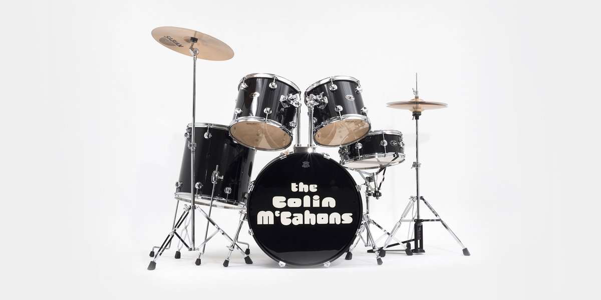
In 1992, Dashper developed the ultimate expression of his perverse-homages idea. He made five site-specific installations, placing drum kits bearing the names of canonical figures of mainstream New Zealand art in towns associated with them. They suggested tribute bands. There was The Woollastons in Wellington, The Drivers in New Plymouth, The Anguses in Christchurch, The Hoteres in Dunedin, and The Colin McCahons in Auckland. The kits weren’t much in themselves, but their placement released associations latent in the sites. While the installations were often seen as celebrations of the mainstream canon, they were in a hostile idiom—post-object art. Had Dashper come to praise his subjects or to bury them? Later, he would dub the project The Big Bang Theory.

Dashper wanted to present The Colin McCahons at Auckland Art Gallery. The Gallery is heavily associated with McCahon—New Zealand’s most important artist. He had been a curator there. They had staged several retrospectives of his work and held lots of his work in their collection and on loan. The Gallery derived much of its authority from their connection with him. However, when the young Dashper had the presumption to ask to set up and photograph his The Colin McCahons kit in one of the Gallery’s galleries, the powers-that-be said no. So, he went rogue. He rented a supplementary space, the Gallery’s auditorium, set up his kit on the stage, and photographed it. Dashper could say it was shown in the Auckland Art Gallery, even if it wasn’t part of the official programme. The installation was seen by Dashper, his photographer, and one expert witness, art-history professor Tony Green. Apart from that, there was no audience.

In The Big Bang Theory, Dashper played on the inside-out question: Where does the work end and the world around it begin? What is content and what is context? Later, Dashper re-presented the drum-kit works as the drum kits themselves (out-of-context relics) and as photos of the original installations (documents showing the kits in context), begging the question as to which represented the idea better. Where was ‘the work’? In our show, The Colin McCahons is presented in both forms.
.
Dashper and John Reynolds met at Elam in 1978, Reynolds’s last year, Dashper’s first. In the 1980s, they shared a studio and often exhibited together. They were a dynamic duo. Their big, brash, painterly paintings tapped the neo-expressionist zeitgeist.

In 1986, at Wellington’s Peter McLeavey Gallery, they famously produced a collaborative painting, in situ. Dashper started on the left-hand side of the triptych, Reynolds on the right, and they met in the middle. The work’s title, Omaha Beach, could have referred to the beach north of Auckland or to the Allied invasion of occupied France during World War II. (Was this nationalism or internationalism?) Both artists later dropped the neo-expressionist approach and took different directions.

The Reynolds in our show is not from that neo- expressionist moment. It was made much later. Works End (2008) references the canon of New Zealand art history, as Dashper did in The Big Bang Theory. It is not a painting, but a vast, commercially fabricated road sign. Instead of placenames, it bears the titles of the ten most expensive New Zealand art works sold at auction in then-recent years. They become a found poem. The works’ rankings are indicated by numbers, rendered as state-highway insignia. People will recognise some titles, but not all. Let Be, Let Be is clearly a McCahon, but who will know that Mount Cook and the Southern Alps is by Nicholas Chevalier or that No. 2 is McCahon’s No. 2? It’s a quiz! Works End has been shown indoors and out, but operates best in a gallery, where it can be mistaken for a functional piece of wayfinding. If previously we lived in a real landscape, where signs pointed to real locations, today we operate in a cultural landscape, where signs only point to other signs. Postmodernism 101.
.
THE ARTIST IN HIS STUDIO
.
Photographer Marie Shannon also met Dashper in 1978, when they were both in their first year at Elam. They became an item. Their son Leo was born in 1996. Dashper and Shannon made very different kinds of art, but they shared a playful attitude. Dashper’s pet name for her was Brains.

Over the years, Shannon has made many works referring to Dashper and their relationship. In the early 1990s, she made parody portraits, replacing her real-world subjects with generic pipecleaner figures. They were ‘real portraits, just not of real people’, she explains. Several pictured Dashper. In King for a Day (1991), he languishes in bed in front of his favourite boudoir painting, Diego Velázquez’s Rokeby Venus. The fabric of his model quilt is an offcut from one of his actual works.

The work in our show, Portrait of Julian Dashper (1991), finds him in his studio, making art by talking on the landline, surrounded by dollhouse versions of his works. Shannon’s Portrait is a parody of those famous shots of romantic-hero artists in their studios, as popularised by books like Alexander Liberman’s The Artist in His Studio (1960), Lord Snowden’s Private View (1965), and, closer to home, Marti Friedlander’s Contemporary New Zealand Painters A–M (1980). However, Shannon was not cutting Dashper down to size. His own project was already a parody of the heroic artist. He was a post-studio artist, but one who loved hanging out in his studio.
.
BUREN … TILLERS … DASHPER …
.
Dashper bumped into the French artist Daniel Buren at the 1979 Biennale of Sydney, European Dialogue. He would become a major reference point for Dashper.

Buren had made his big move back in the 1960s, when he stopped painting and began to produce installations instead. In these works, he used a standard pattern of alternating white and coloured vertical stripes to mark out spaces. He did this in a bewildering variety of ways. He tagged gallery walls, staircases, and other features, challenging the neutrality of gallery spaces by drawing attention to their quirks. He also worked in public spaces, pasting up striped posters, flying striped flags, and applying stripes to train doors.

Buren’s works looked abstract, but they prompted their audiences to look at relationships between the work and the world (rather than simply at relationships within the work), and thus to consider the political, cultural, economic, and aesthetic implications of their locations. Buren’s installations worked two ways. By locating his nondescript stripes in art galleries, they became art. But, once his stripe-signature was established, their appearance in other spaces prompted us to understand those spaces as art places.

Buren’s approach would become increasingly formal, mining the compositional and optical opportunities offered by his pared-back language. Buren made the three works in our show for his 1992 solo show Coloured Transparency: Situated Works at Auckland’s Sue Crockford Gallery.7 These works are portable, not site-specific, and explore formal permutations within Buren’s restricted visual language. They are, perhaps, more Walters than Dashper.
.
Australian artist Imants Tillers is a key figure for New Zealand art. He was the only overseas artist included in After McCahon in 1989. In the 1980s, Tillers put an antipodean spin on appropriation, influencing our own thinking about the provincialism problem. He argued that, especially here, on the margins, we have been exposed to international art first and foremost in reproduction, through which art works lose their scale and materiality. In response to this, he painted art images appropriated from reproductions, granting them a new sense of scale and materiality, while creating his own allegories from them. His favourite sources included international names like Giorgio de Chirico, Georg Baselitz, and Sigmar Polke, but also a fellow provincial, McCahon. Tillers repainted his images on arrays of canvasboards, making epic paintings from this modest amateur-painting medium. The canvasboards also addressed provincial isolation, allowing Tillers to pack down large paintings to send to distant exhibitions. Sometimes, Tillers exhibited the boards piled up, as sculptural stacks, as if ready to be installed or moved, their content concealed.

Tillers’s enquiry anticipates Dashper’s. Like Dashper, he was a wilful magpie, having his own way with big-name artists, taking liberties. His work also scrambled the logics of different art idioms: he was a conceptual artist who defected to painting during the heyday of neo-expressionism (or did he simply go under cover?). His work can be read through the frameworks of both painting and conceptualism, to different ends.

Tillers chose The Conquest of Space (1987) as his contribution to our show. Wystan Curnow has described this work: ‘Perhaps Tillers’ most brilliant hybrid is the Polke/Schnabel combine, overlaying a Kabuki screen pattern and Buren stripes, topped off with a grid of metallic dots’.8 The Conquest of Space is based on several sources, including Polke’s painting Scissors (1982), whose own source is a printed image of the early twentieth-century Polish medium Stanisława Tomczyk, apparently levitating a pair of scissors. So, Tillers makes a third-hand image, a reproduction of a reproduction of a reproduction (carefully reproducing Polke’s careful reproduction of the original dot-screen image). Tillers also co-opts Buren back into painting, appropriating his conceptual- art stripes for painterly effect, as a courtly-decorative feature.

The Conquest of Space is accompanied by a new stack work, Repeatable Form (1) (2015), in which a bronze reproduction of a stack of canvasboards sits on a plinth—an actual stack of canvasboards.
.
Before we went ‘digital’, artists would show dealers and curators slides of their works. How well and how much they documented their work was a measure of their seriousness and ambition. Some artists could only afford to make a few slides of each work, others made dozens, enabling them to be dispersed far and wide. Documentation was a particularly vexed matter for antipodean artists, as offshore dealers and curators would be unlikely to ever see their works in the flesh.

Dashper addressed this in a sequence of works that drew on Buren’s and Tillers’s examples. It started with a Buren steal. Dashper stretched a piece of printed striped canvas on a stretcher to make a generic, readymade ‘painting’—Untitled (1991). The work was unremarkable. However, as if anticipating excessive market and curatorial interest, Dashper made 400 unique slides of it. The trouble and expense of making and mounting the slides may have been greater than that of making the painting itself. Dashper exhibited the slides, hung in a line in twenty slide sheets, as if they were the work—Untitled (Slides 6–25) (1991). Dashper was commenting on how art circulates and is consumed in reproduction. He joked about making ‘camera-ready abstraction’.

The project’s next iteration would not be in galleries, but in art magazines. In the Summer 1991–2 issue of Art New Zealand, Dashper advertised an upcoming show.9 It would not take place in a gallery but in the advertising pages of another magazine, the January 1992 issue of Artforum. Based in New York, Artforum is the world’s most influential art magazine. Art New Zealand is something else.

In the January 1992 Artforum, Dashper’s ‘show’ took the form of a full-page ad that mimicked an Artforum cover, as if expressing Dashper’s art-star aspirations. For the image, Dashper chose a grid of stripe-painting slides. The ad, then, was a photographic reproduction of a photographic reproduction of a Buren knock off. In his ad/exhibition, Dashper changed the Artforum masthead from ‘Artforum International’ to ‘Artfrom New Zealand’, suggesting that New Zealand was excluded from the international. There’s the international Artforum art world and then there’s ‘art from New Zealand’.

In the February 1992 Artforum, Dashper followed up with a further full-page ad, this time mimicking an Artforum review page, in which Dashper’s ‘show’ in the previous issue was assessed. But the review read more like a promo-blurb.

In this string of works, Dashper fudged distinctions between work and documentation, between art and advertising, between editorial, review, and puff piece. His project extended Buren’s inquiry from primary exhibition spaces into the supplementary spaces where the real business is done.
.
CLOSER AESTHETIC RELATIONS
.
John Nixon has been a key figure in Australian art since the 1970s. A champion of the avantgarde tradition, his work draws on familiar strategies from early modernism, particularly the readymade (embracing the everyday) and reductive abstract painting (embracing the transcendental). Marcel Duchamp and Kazimir Malevich have been reference points for him. Nixon has also produced experimental music through his project Anti-Music (1979–83) and has been a key figure in the development of Australian artist-run spaces.

Dashper met Nixon in New Zealand in the 1980s, and their friendship grew after Dashper visited Sydney in 1992 for the Headlands exhibition. Their interests dovetailed and Dashper entered Nixon’s circle. His first overseas solo show was with Nixon associates, Melbourne’s Store 5, in 1993. Nixon and Dashper would show regularly with the same dealers: Sarah Cottier Gallery in Sydney, Sue Crockford Gallery in Auckland, and Hamish McKay Gallery in Wellington. They made collaborative works, juxtaposing signature elements from their respective oeuvres (for instance, Dashper target drumheads with Nixon orange monochromes). They also released records on their label, Circle Records. Dashper would be highly influenced by Nixon’s physically and conceptually streamlined approach to exhibition making. Like Nixon, he would increasingly exhibit far and wide, making portable shows he could carry in a suitcase or create in situ.

In 2005, Auckland’s Gus Fisher Gallery presented Julian Dashper / John Nixon: The World Is Your Studio, a show addressing Nixon’s and Dashper’s artistic conversation. As a centrepiece, curator Ben Curnow juxtaposed Nixon’s installation Blue Rider (1994) and Dashper’s Untitled (The Warriors) (1998). This pairing is repeated in our show.

In Nixon’s installation, four red monochrome panels rest on a grand piano. The piano epitomises the bourgeois classical-music tradition, but also suggests fluxus artists, like Joseph Beuys, who used it to attack that tradition. Via Malevich, the red monochromes recall the Russian Revolution. The work’s title refers to a band of German expressionists, operating from 1911 to 1914, who gathered around Wassily Kandinsky, another Russian pioneer of abstraction. Blue Rider, then, is a mix of contradictory references—to iconolation and iconoclasm, to tradition and revolution (artistic and political)—held in tension.

The Warriors also holds ideas in check. In this work, Dashper fitted his signature target drumheads to a downscaled child’s drum kit. His title also refers to a collective, to the only New Zealand team playing in the Australian National Rugby League.10 The Warriors has been read as symbolising New Zealand’s little-brother relationship to Australia. But, like the Warriors, if New Zealand artists are in competition with Australian artists, at least they are now in the same league. The juxtaposition of Blue Rider and The Warriors declares the artists’ differences as much as their allegiances. Nixon’s work is serious, portentous, and melancholic; Dashper’s comic and pop—a Happy Meal.
.
INANE ANECDOTES
.
Dashper revelled in art-world legends. He was forever spinning yarns himself, as artist statements and in talks. For this, Andy Warhol and Julian Schnabel were among his models. Warhol’s autobiography, a, A Novel (1968), was a rambling unedited transcript of taped conversations, while Schnabel’s autobiography, C.V.J: Nicknames of the Maitre D’s and Other Excerpts from Life (1987), included such valuable insights as ‘In New York, my plan was to eat pizza and paint pictures.’

Dashper’s tales expressed a similar faux naivety. One Dashper exhibition statement included an account of John Nixon purchasing ill-fitting secondhand Levi’s in New York. Nixon tried to offload them onto fellow Sydney artist A.D.S. Donaldson, but they didn’t fit him either. Eventually, Dashper took them, but they got irreparably stained in the rear when Dashper sat on a rusty bollard outside Matthew Marks Gallery in New York.11 Relevance? Is there some unconscious subtext to this suggestive tale of artists in one another’s pants, rusty bollards, and stains? Is it a would-be Cinderella story, in which the New York glass slipper is a pair of jeans—an allegory about antipodean artists’ fantasy relationship to the Big Apple? Or, is simply it a digression into real-life randomness? Dashper left the question hanging.

Marie Shannon joined in on the fun. Several of her photos reproduced texts purporting to recount Dashper’s dreams. In one, Dick Frizzell’s Retrospective (1994), Frizzell scores a retrospective in Fiji and pronounces his name ‘Frizzle’. In Julian’s Dream, Julian’s Nightmare (1995), a gallery goer, joining the crowd avoiding Dashper’s bizarre contribution, accidentally spills their Dutch Fristi drink onto an esteemed terracotta-and-blue Mrkuisch painting in a neighbouring space (the dream), and Shannon similarly spills mustard on Dashper’s Christian Dior shirt, which she happens to be wearing (the nightmare).

Dreams have an ambiguous status. On the one hand, we don’t feel responsible for them (it’s our unconscious); on the other, we do (it’s our unconscious). Tinged by both schadenfreude and resentment, Shannon’s tales could have been dreamed by Dashper and recounted by Shannon, but, equally, they could also have been made up by her and attributed to him (and his unconscious). We can’t tell whose unconscious (or consciousness) is at work here.
.
CIRCLES AND LINKS
.
The circle is a modernist trope, one particularly associated with the constructivist tradition of abstraction. The constructivist-art bible of 1937 was called Circle. In the late 1980s, Dashper drew circles in his paintings to acknowledge this international tradition, and, closer to home, its local exponents Mrkusich and Walters. But, Dashper was never exactly an abstract artist. Even his most rarefied abstractions point beyond themselves, into the everyday world. Take Phili Shave Red (1989). Its title prompts us to think of its circles as the heads of an electric shaver.

Dashper endlessly played on formal and conceptual relationships between circles, targets, Os, and frames; between frames and chain links; between records and drumheads. A series of untitled paintings from 1990–2, nicknamed ‘the bagels’, reproduce, in different colours, the Futura Extra Black letter O from the Ilford trademark. This O is almost a circle. Dashper also made works based on the condensed O from the Artforum masthead. Exploring semantics, he reproduced that O as a screenprint on a canvasboard and as a photograph. The screenprint was unframed, the photo framed and glazed (the frame reiterating the shape of the O).

Dashper also made records—which are, of course, circular—on his label Circle Records. Some were of experimental-music jams, others were field recordings (for instance, some made in front of Jackson Pollock’s Blue Poles at Canberra’s National Gallery of Australia). He displayed the records, silently, as art objects; in their sleeves, or out of them. The idea was typically more important than how it sounded.

Like records, drumheads can make sounds, but not when treated as paintings and hung on a wall. When Dashper painted targets on drumheads, he superimposed one circle idea on another.

Dashper also played on the relation between frames and chain links. In Chain Frame (1992), he linked two empty gold frames, like a magician’s linking rings. Did this suggest the intersection of their contents (like a Venn diagram) or their inability to contain anything? He also made works using lengths of store-bought plastic chain, whose links, incidentally, recalled the Artforum O. Sometimes he hung works from them, sometimes left them dangling.

Circles, Os, and frames don’t have to be physically linked to form chains of association …
.
Dashper’s interest in frames and chains links him with Australian artist Peter Tyndall. Tyndall’s works have evolved out of his symbol for the art work: a rectangle (suggesting a frame) with two lines extending from it (suggesting the strings from which it hangs). This symbol deftly conveys the insight that an artwork is, at once, a thing apart from the world (framed off from it) and connected to it (strings attached). The work—any thing or ‘detail’, in fact—is at once independent and interdependent. In elaborating on this deceptively simple idea, Tyndall has engineered a complex body of work. In it, his frame signs are frequently organised in algebraic equations or collude as chains and networks. Sometimes, these signs escape the diagram and enter into the real world to interact with it. Tyndall’s work is a parody of analysis. His madness-in-his-method mantra: ‘LOGOS/HA HA’.
.
Peter Robinson recalled Dashper’s O-and-chain imagery with his 2001 Venice Biennale project Divine Comedy. It addressed themes of nihilism and nothingness via bookish references to Dante, existentialism, Stephen Hawking, and stealth technology. In this project, the O was not a letter but a number—zero. Divine Comedy included Null and Void (2001), a sleek minimalist sculpture consisting of a hefty stack of identical, large, red-lacquered MDF ovals. Their shape was the negative space inside the Gill Sans zero. Robinson materialised the absence in the heart of nothing. In our show is another work from Divine Comedy, Zero Red Shift (2000), a chain whose plastic links are zeroes cut in every typeface available on Robinson’s computer—different faces of nothing.12
.
READYMADE ABSTRACTION
.
Dashper did not see abstraction as something apart, but as a part of the world. He said that he approached abstraction as a ‘readymade’, sourcing it both in the everyday world and in the world of art. By the time Dashper became an artist, abstraction was not revolutionary, but a well-mapped tradition, one he could work within and freely quote from. His work was less about formal invention (boldly going where no man has gone before), more about working an already busy room. It was convivial.

In 1992, Dutch artist Jan van der Ploeg visited New Zealand to present his work as part of a project marking Abel Tasman Year, the 350th anniversary of Abel Tasman discovering New Zealand.13 He and Dashper became pals. In 1993, they had a two-person show at Leiden’s Stelling Gallery, and, in 1994, Dashper organised a residency in Auckland for Van der Ploeg. Over the years, they often showed together. Van der Ploeg was a co-founder and director of PS Projectspace, an Amsterdam exhibition space that showcases new abstract and conceptual art. Dashper became part of the stable, having solo shows there in 1999, 2002, 2005, 2007, and 2008. And, in 2013, Van der Ploeg curated a show there, pairing Dashper with American minimalist star Donald Judd.

Van der Ploeg is known for his architecturally scaled murals. With their simple hard-edged geometries and bold colours, they echo the art languages of minimalism and pop (Sol LeWitt and Ellsworth Kelly) and design aesthetics (supergraphics). He also produces smaller works on canvas featuring the same geometric elements. Van der Ploeg often bases his abstractions on real-world things. Since 1997, he has been exploring his ‘grip’ motif—a long, horizontal rectangle with rounded corners, based on the hand holes in cardboard removals boxes. For our show, he’s produced a new wall painting in this series.
.
PERIPHERAL VISION
.
Barrie Bates escaped New Zealand in 1959. He left to study at London’s Royal College of Art, where he became part of a new generation of British pop artists. In 1962, he reinvented himself as Billy Apple and used his work to promote this new art brand. In 1964, he moved to New York, and, in 1969, he established Apple, one of the city’s first alternative spaces. There, he would produce increasingly conceptual and process-based works. His work became a unique blend of pop and conceptualism.

Apple returned to New Zealand twice in the 1970s, invited by the QEII Arts Council, who were keen that the local scene play catch-up with international developments. On these visits, Apple came to represent everything mainstream New Zealand art was not. Both times, he presented a series of shows in spaces throughout the country. On the second visit, in 1979–80, his shows, subtitled The Given as an Art-Political Statement, addressed the physical properties of galleries as symptoms of art- world politics, exposing the relationships between galleries, artists, and audiences. In the installations, Apple identified problems with gallery spaces and proposed or made improvements. His shows surprised audiences, because they addressed elements of art that seemed to be outside the scope of art and the art discussion.

In our show, Apple is represented by two works produced following his Exposé show at Wellington’s National Art Gallery in 1979. For Exposé, Apple decided to retire two large paintings by British painter Sir Frank Brangwyn that had been permanently installed in the foyer. In the process, he discovered that they had been screwed to the walls through the canvases and their stretchers. Only one screw came out whole; the others had their heads drilled out, leaving the shanks stuck in the wall when the paintings were demounted. A poster explained what Apple had done. Exposé began with the thought of questioning the dominant positioning of the Brangwyns, but became a critique of their mistreatment by the national institution.

In one of the Exposé-related works in our show, Apple framed two of his posters and attached a shard of the wooden batten that concealed the screws and the single screw he managed to extract. The work was a kind of reliquary, with the screw and shard suggesting a nail and splinter from The Cross.

If Exposé dealt with the institution’s mistreatment of the murals, the second work documented Apple’s own mistreatment at their hands. Although the original concept was his, Apple hated the Exposé poster. He wanted it to conform to the look of the other posters he produced for the 1979–80 tour, with his signature typography. However, the National Art Gallery’s designer had his own ideas, changing Apple’s layout, typeface, palette, and paper stock—everything, really. In the work, Apple juxtaposed his original design rough and the end result, marked up with corrections, pointing out every error and deviation. Bad Gallery!

Dashper was influenced by Apple’s treating the artist as a brand and by Apple’s fascination with overlooked art-world supplements (everything that was not the art that the art depended on). Apple placed such supplements centre stage—for instance, the gallery became the art, or the poster became the art. Similarly, Dashper produced quirky ads, letterhead, and business cards. He framed promotional materials as art and addressed gallery spaces. He made catalogues for many shows, at a time when this was unusual, co-opting the critics. Apple’s The Given as an Art-Political Statement was a model for Dashper’s project, The Big Bang Theory, which also took the form of a national tour. Our show includes the official photo documenting the installation of Dashper’s The Colin McCahons in the Auckland Art Gallery auditorium in 1992.
.
Dashper taught Dane Mitchell. Like Dashper and Apple, Mitchell went behind the scenes, exploring the operations of galleries, public and private. He framed his works as museum-studies research. He loved catching gallery directors doing their jobs with undue zeal. He cut records of his phone calls with Auckland Art Gallery’s Chris Saines (where Saines defended his staff) and me at Artspace (where I screeched, demanding the return of my sandwich board). He later invited in the public to mix the recordings at a DJ booth.14 In 2000, he exhibited the tell-tale contents of Auckland dealer gallery Gow Langsford’s rubbish bin, offering insights into the Gallery’s operations and culture. When the Gallery’s lawyers petitioned him to cease-and-desist, he exhibited their letter with his legal reply. From 2003 on, Mitchell sampled dust and bacteria from various galleries, grew it in Petri dishes, and sent it to the lab for analysis, as if seeking to diagnose art-world ills.

In our show, Mitchell is represented by Collateral, the work that won him the 2009 Trust Waikato National Contemporary Art Award, at Hamilton’s Waikato Museum. His work was a pile of rubbish. Mitchell asked that discarded wrapping materials from other entries be gathered and presented as his own work. Judge Charlotte Huddleston, Te Papa’s Curator of Contemporary Art, annoyed other entrants by giving Mitchell the prize, belittling their craft (and craft in general) by implying that their works were somehow less than the wrapping they came in.15 (In a sense, Huddleston co-authored the work by picking it, because Mitchell’s gesture would have meant little if it hadn’t won.) It was another case of ‘the given as an art-political statement’.

.
Fiona Connor first became known for making works that replicated peripheral elements of gallery architecture: Artspace’s staircase, Michael Lett’s facade, and the New Gallery’s ceiling bracing. Like Apple with his ‘givens’, she went for features that normally go unseen and unmentioned. While Apple drew attention to givens by removing or highlighting them, Connor did so by mimicking them, fastidiously. Where Apple was politically motivated, addressing politically loaded features, Connor was less pointed, less judgemental. Indeed, it wasn’t clear why she picked the things she did. She created Working Title (2006), a replica of Artspace’s glass door, for Artspace’s 2006 new-artists show, Headway. It became an uncanny double. In placing it near the actual door, Connor made people look twice, drawing attention both to the door’s properties and to her powers of mimesis. ‘I like the idea of making works about difference where there is not that much difference’, she said.16 Connor went on to explore other kinds of peripheral phenomena, beyond art galleries.
.
Like Apple, Dashper often addressed the not-art part of art. Our show includes Julian Dashper at No. 5 (1992), the absurdly grand, even triumphal, promotional banner he created for his solo show at the humble No. 5 Gallery in remote Dunedin. It was the kind of point-of-sale device one would expect to see outside a major metropolitan museum doing a blockbuster show of a star artist. But Dashper was still a young buck and had only just given up his taxi-driving day job. A routine show became an alibi to indulge in extreme marketing, implying he had the product to match. It was all about the bling.
.
EMPTY CHAIRS
.
In 1993, Dashper presented his installation What I Am Reading at the Moment at Wellington’s National Library Gallery. A stack of Artforum magazines was accompanied by an old armchair that had seen better days. The chair had form. Before Dashper acquired it for his studio, it appeared in the iconic Art New Zealand cover photograph of the cast of the 1982 exhibition Seven Painters/The Eighties.16 That show turned out to be a belated New Zealand attempt to promote abstraction as the great leap forward, neo-expressionism being almost upon us. In Ian Macdonald’s photo, the only expat, the one actually living in New York, Max Gimblett, sits in the chair, with the locals grouped around him. (In fact, during the shoot, others had a go in the seat, but the magazine preferred a Gimblett-centric view.) Dashper’s work, then, represents his provincial situation, sitting on a discarded, dilapidated throne, inherited from an older generation of antipodean internationalists, still working his way through back issues of Artforum. Or, is he inviting us to sit there?
.
The title of Marie Shannon’s video What I Am Looking At (2011) pointedly recalls that of Dashper’s installation. It is also about empty chairs. She made it after Dashper died, while wondering what to do with the contents of his studio. We hear her describe the studio’s contents, listing objects—precious, mundane, and baffling—as she considers the work required to make sense of all this, in the artist’s absence, without his advice on what counts. She makes decisions, she changes her mind. While her account is matter-of-fact, this only emphasises how emotional the experience must have been for Shannon. As we listen to her, her words scroll up the black screen. The work of the dead has become the work of the living.
.
NEVER CYNICAL
.
In 1992, my essay for the Headlands catalogue described Dashper as a ‘postmodern cynic’.18 It was early days and I meant no offence. Indeed, at the time, I thought being a postmodern cynic was a good thing. But, Dashper considered it a slight—he took it to heart. While he was part of the postmodern turn, it was important for Dashper to be seen as a believer.

Dashper was romantic about the art world and the art business. If he preyed on the legends and reputations of famous artists, it was because he would have liked to join them in the canon. When he cast his spotlight on the art world’s supplementary devices and supports, it was not to engage in institutional critique but in fetishistic delight. He didn’t want to stop the machine but to polish it and to enjoy his reflection in it. Dashper’s love of art and the art world was a provincial thing. His desire to be included was honed by a sense of being excluded, as a New Zealand artist.

Dashper’s project was about the adventure of being an artist, whether it was working away in his studio or being on the road, making shows. In the discursive space of art, his works were in dialogue with those of other artists, and, in the real world, he was in face-to-face conversations with the actual artists whose paths he crossed and shared. Dashper was, at once, one of our most influenced artists and one of our most influential artists. Friendship wasn’t incidental to his project, it was his medium.

The conversation continues.
.
[IMAGE: Julian Dashper The Colin McCahons 1992]


  1. Francis Pound, ‘Deathdate’, Water Color (Auckland: Julian Dashper, 1991), np.
  2. Motorway Schools, 100m2, Auckland, 1980.
  3. Colin McCahon: A Survey Exhibition (Auckland: Auckland City Art Gallery, 1972), 28.
  4. www.aucklandartgallery.com/the-collection/browse-artwork/13863/ ad-1968.
  5. Francis Pound, ‘In the Wake of McCahon: A Commentary on After McCahon’, Art New Zealand, no. 52, Spring 1989: 82.
  6. Francis Pound, ‘Walters and the Canon’, in Gordon Walters: Order and Intuition (Auckland: Walters Publication, 1989), 61.
  7. Buren was no stranger to New Zealand. In 1990, he filled Wellington’s Shed 11 with his installation Kei te Anganui/At the Opposite. He returned in 1992, for his Crockford show. He also produced an outdoor installation, Green and White Fence (1999– 2001), for Alan Gibbs’s farm in the Kaipara.
  8. Wystan Curnow, Imants Tillers and the ‘Book of Power’ (Sydney: Craftsman House, 1998), 90.
  9. No. 61, Summer 1991–2.
  10. Dashper was a huge Warriors fan. Warriors hard man Ruben Wiki visited him during his final illness.
  11. Dashper was offering the backstory to his work Untitled (After Nixon, Donaldson, and Pistoletto) (1995–), included in his 1998 solo exhibition at Hamish McKay Gallery, Wellington. ‘Artist’s Statement’, This Is not Writing (Auckland: Clouds and Michael Lett, 2010), 79.
  12. Later, Robinson returned to the chain idea, creating installations using white polystyrene chains with links of different scales, from tiddly to massive—different scales of nothingness. For instance, Snow Ball Blind Time, at New Plymouth’s Govett-Brewster Art Gallery in 2008.
  13. The visit was a speaking tour; there was no gallery exhibition. Van der Ploeg spoke about his work in public galleries and art schools in Auckland, Wellington, New Plymouth, Christchurch, and Whanganui.
  14. For the group show, Only the Lonely, Artspace, Auckland, 1999.
  15. ‘Other local artists Collette Fergus and Bruce McLachlan said nthe winning entry was “the worst yet”. “A pile of rubbish that wasn’t even created by this guy is worth $15,000?”, Fergus asked. She said it was a “sad mockery of us all and an embarrassment to the arts community”.’ ‘Losers Complain about Winning “Rubbish” Artwork’, www.3news.co.nz/entertainment/losers-complain-about-winning-rubbish-artwork-2009090814#axzz3qwKKpiAR.
  16. www.thearts.co.nz/artists/fiona-connor.
  17. No. 28, Spring 1983.
  18. ‘Mod Cons’, Headlands: Thinking through New Zealand Art (Sydney: Museum of Contemporary Art, 1992), 167.

Love Not Given Lightly 

A contribution to the panel discussion, Choker: Twenty Years On, City Gallery Wellington, 1 October 2015.


Choker (1993) is my favourite Fiona Pardington photograph.1 It’s so concise, so resolved, so iconic. No fancy collaged matt, no gilt or lead framing, no arcane symbolism, no pictorialist flourishes, no mucking about. A young woman’s neck is decorated with bruises. Everyone assumes she got them from her heterosexual male lover in a moment of grand passion (or lustmord).2 In posing for the camera, the woman seems calm and complicit, displaying her necklace with pride—chin up. Her cleavage is not emphasised, so our attention can focus on the love marks, and Pardington records them admiringly. Indeed, we might imagine that, as the photographer, she is adopting the position of the imagined vampiric male lover, compelled to document his handiwork.

The work turns on the question of whether to read the bruises as benign love bites (making the title’s choking reference metaphoric) or as the result of strangulation (making it literal). Pardington keeps both possibilities in play and that’s the point.

Choker was not produced in a vacuum. Pardington was already known for works like Prize of Lilies (1986), Saul (1986), and Bracelet (1987), which celebrated and eroticised an implicitly violent male ideal—Pardington gazing lovingly upon beefy thuggish guys, as if through rose-tinted glasses. Choker begs to be read in relation to such earlier pieces. When it came out, Choker was not controversial. In the 1970s, it would have been hard to imagine a New Zealand woman photographer producing it, let alone it being understood as feminist. Such an image would have been condemned as a celebration of domestic violence. But, by the early 1990s, things had changed.

Choker reminds me of an earlier photograph, whose reception was rather different. Peter Peryer made Anne Noble, Easter in 1979, during his early passion play, psychodrama period. In it, a naked woman lies across a leopard-skin pattern. It wells up beneath her like a torrent, like an altar, or like flames of martyrdom. She seems to be magically levitated by it, recalling Bernini’s Ecstasy of Saint Teresa (1647–52). She is naked, but for two items of jewellery, a bangle (suggesting a handcuff) and a luminous pearl necklace (so tight that it seems to separate the head from the body3). The woman’s face is averted, so we can’t identify her, although the title tells us exactly who she is: Anne Noble, an equally known New Zealand photographer. This photo foreshadows Pardington’s work. The inclusion of the word ‘Easter’ in the title links masochism and martyrdom, sex and spirituality, sin and sanctity—ideas that Pardington will make her own. As a lapsed Catholic, Peryer deftly ties up his woman-issues with his religion-issues in this one-stop-shop image.

At the time, critic Tom Hutchins read the work in terms of an interaction, a transaction, between the photographer and his subject: ‘a female nude, lying as if in some sacrificial rite, offering up her body in a contradictory gesture that shows willing participation … The whole is a private theatre, a ritual of interplay of tensions, of superordination, submission and acceptance, acted out—making accessible its strange significance far beyond the initial transaction of the two participants.’4

Seven years later, in 1986, AGMANZ Journal published an article by Merylyn Tweedie (the artist now known as Et Al.)—‘Feminist Issues in New Zealand Art (with Particular Reference to Imaging of the Nude Female/The Naked Woman)’.5 In it, Tweedie made a very different reading, based on the idea that the artist simply framed his subject. In it, Tweedie wrote: ‘In portraying women as sexually powerless, passive and available, Peter Peryer in Anne Noble, Easter makes visible his own claim as a sexually dominating presence (even if he himself is absent from the image). Indeed Anne Noble … is reduced to little more than a good fuck.’ Rather ripe language.

Tweedie went on to contrast Peryer’s image with Carole Shepheard’s etching Joyce’s Lilies (1983), from her Body Covers series. Here, the quintessential Woman’s Movement artist presented an ambiguous, suggestive photographic close-up of a woman’s exposed body and juxtaposed it with her own impressionistic graphic depiction of ripening lilies—as if equating the two. Casting Shepheard as good, Peryer as bad, Tweedie wrote: Peryer ‘operates within “historically reinforced codes of male gratification as the privileged user of the language of his culture”’, while ‘Shepheard attempts to undermine/deconstruct dominant forms of representation of the female nude and intervenes as a feminist in the politics of pleasure’. But, regardless of Shepheard’s intentions (or politics), her image hardly sits outside of ‘historically reinforced codes of male gratification’. One could argue that her nice image is at least as reductive and essentialist as Peryer’s nasty one. Actually, the Shepheard and the Peryer have much in common. Both feature women we can’t identify from the images (but who are more or less named in the titles). And both link jouissance with another element—the fabric pattern in the Peryer, lilies in the Shepheard. If Peryer’s image was made by a woman and Shepheard’s by a man (which is not impossible), I think Tweedie would have created a rather different argument for them.

Tweedie’s critique, then, was something of a set-up. It turned on a false opposition. It denied Noble any agency (or potential agency) in the Peryer image, even though Peryer’s subject-naming title prompted us consider how the work might also fit into her oeuvre as well (one which already included sexy female nudes).6 Indeed, it raised that question of agency more sharply than a Noble self portrait could have.7 Tweedie seemed to assume that male artists necessarily operate at the slugs-and-snails Peryer end and female artists at the sugar-and-spice Shepheard end, failing to mention that, by the time of writing, Noble’s racy sex-fantasy series, Night Hawk, had been touring the country in the 1982 National Art Gallery show, Views/Exposures. One of the images, Rope, was a veritable bondage manifesto. In 1994, Artspace would reproduce it on the catalogue cover for its R18 pornography show, One Hundred and Fifty Ways of Loving, which included Pardington. Noble, then, is a key precursor for Pardington.

Of course, hindsight is a great thing. In 1986, when Tweedie published her essay, the scene was turning. Fiona Pardington made Prize of Lilies and Saul, Nan Goldin published The Ballad of Sexual Dependency, and David Lynch released Blue Velvet. Carole Shepheard’s essentialism would soon be old news, as earth mothers, shields, shells, and tipis gave way to French theory. In the very same issue of AGMANZ Journal that Tweedie’s essay appeared, Lita Barrie published her Francophile attack on old-school essentialist feminists, titled ‘Remissions: Toward a Deconstruction of Phallic Univocality’ (although, on the contents page, they mistakenly called it ‘Toward a Reconstruction’—which shows just how confused everyone was). By 1990, the American feminist Camille Paglia would be hailing cock rock, celebrating sex as a dark force, and suggesting that prissy coeds get over it. By 1991, New Zealand women artists had veered so far into ethical grey zones that the new women-artists book would be titled Pleasures and Dangers, and it wouldn’t even raise an eyebrow. The following year, Madonna and Steven Meisel published Sex and Cindy Sherman arranged prosthetic limbs and mannequins for her obscene Hans Bellmeresque Sex Pictures.

In the 1980s and 1990s, our idea of feminist art stretched to embrace diverse approaches. Now we know that feminist art can be deep and cavernous or shallow and cosmetic. It can be tightly patterned or monstrously organic. It can be confessional and true or feigning and duplicitous. It can be abject or genteel, political or mystical. It can confront gender as deeply contingent, a ‘social construction’, or assert it as fundamental. It can embrace femininity or repudiate it. It can align women with nature or reject the very idea as sexist. It can rail against pornography and prostitution or defend them. While ‘bad girl’ feminists attack middle-class values as patriarchal, preferring the rude and transgressive, other feminists can celebrate politeness and decorum, as if middle-class values were always already feminist. In a 1996 essay, ‘This Is Not a Cigar: On the Feminising of Mikala Dwyer’,8 Rex Butler observed that, as feminist art can now take virtually any shape, it is impossible not to make feminist art. I disagree, slightly. It is not exactly that everything in art is feminist, but that utterly polarised and mutually exclusive things are. In art, what one feminism promotes another will oppose. One woman’s feminism is always another’s anti-feminism. Because of this, feminism in art now is not one thing or the other, but one thing and the other. It is works that have questions or issues, rather than answers, in common.

These days, everything is scrambled. It’s hard to work out which way is up. Empowered autonomous females have become ideal sex objects—Lara Croft and Co. are every boy gamer’s wet dream. Meanwhile, the Fifty Shades of Grey books have been translated into fifty-two languages, with over 125 million copies sold—women everywhere asserting their preference for submission fantasies. The customer is always right. On top of this, the rise of genetics has white-anted feminism’s key argument, that gender is a ‘cultural construction’. What’s a girl to do?

After One Night of Love (1996–2001), Pardington stopped making nudes, male or female. She also retreated from the Choker idea and from celebrating violent masculinity. And, recently, on Facebook and in talks, she’s been criticising Jono Rotman for supposedly glorifying violent males in his Mongrel Mob Portraits. Although Pardington has largely left the Choker idea behind, it persists in other artists’ works. I think especially of Sydney painter Fiona Lowry and her airbrushed paintings of the noughties. In 2006, Lowry painted Richard, a romanticised portrait of the ‘Night Stalker’, the American rapist and serial killer Richard Ramirez (who, on death row, had endless female groupies, including one of his jurors). That year, she also made portraits of the women members of the Manson family, based on their high-school-yearbook images. Lowry also made inappropriately beautiful scenes of the bush where vulnerable, naked women await their fate (Ivan Milat territory). As if relayed through their women subject’s eyes, these scenes have a disoriented, wrongly wired, Stockholm Syndrome aspect; as if the subjects—and, via them, we viewers—have become complicit in violent men’s fantasies. This is nailed by Lowry’s plaintive romantic titles, like Anything You See in Me Is in You (2006), For You I have Lived and for You I Will Die (2009), and Will You Speak before I Am Gone? (2009). In such works, Lowry draws out and amplifies Choker’s issues. Can we call her works feminist? And, if we can, what does that mean for feminism? How far can the word stretch and remain useful? And what comes next? Can we, should we, dare we go further?
.
[IMAGE: Fiona Pardington Choker 1993]

  1. Choker is elsewhere dated 1994. There seems to be some confusion.
  2. Pardington was bent, but resolutely heterosexual—not queer. Which is not to say her work has no resonance for queers.
  3. Or so imagined reviewer Tom Hutchins, at the time. ‘Exhibitions: Auckland: Three New Zealand Photographers: Fiona Clark, Laurence Aberhart, Peter Peryer’, Art New Zealand, no. 14, Summer 1979–80: 19.
  4. Ibid.
  5. AGMANZ Journal, vol. 17 (1986): 11–2.
  6. See the catalogue Anne Noble/Bruce Foster: Two Contemporary New Zealand Photographers: Both Born in Wanganui (Wanganui: Sarjeant Gallery, 1978).
  7. Peryer and Noble showed together early on, having a two-person show at Snaps, Auckland, in 1978. Noble’s work was also informed by her Catholic upbringing.
  8. Rex Butler, ‘This Is Not a Cigar: On the Feminising of Mikala Dwyer’, in Mikala Dwyer: Hollowware and a Few Solids (Melbourne: Barberism and Australian Centre for Contemporary Art, 1996), np.

City Mission

Unseen City: Gary Baigent, Rodney Charters, and Robert Ellis in Sixties Auckland, ex. cat. (Auckland and Wellington: Te Uru and City Gallery Wellington, 2015).


Auckland is a city of contrasts: a city of change: a city of people. Victorian wooden buildings jostle modern glass and concrete against a background of wharf derricks, silvered oil storage tanks, and the masts of pleasure yachts: a giant motorway sweeps across manicured front gardens and forgotten backyards: mini-skirts walk with lavalavas on pavements cluttered with telegraph poles, potted trees, and parking meters: front doors open onto hustling streets, back doors onto quiet bush.
—The Unseen City, 19671

.
This exhibition grew out of my longstanding affection for two works from the 1960s by then-young artists—the short film Film Exercise (1966) by Rodney Charters and the photobook The Unseen City: 123 Photographs of Auckland (1967) by Gary Baigent. Both works record a lost Auckland, its geography and culture. They capture a city in transition, contrasting a conservative, older generation with the beautiful people—it was the dawn of the counterculture. Both works cast roads, cars, and motorbikes in leading roles. Intentionally or not, Charters and Baigent left us time capsules.

Originally, my plan for the show was to juxtapose the film and the photos. Robert Ellis came in later, when the discovery of some 1960s drawings revealed how much his enjoyment of Auckland’s new motorways had informed his famous Motorway paintings.2

The works in the show are little known. For me, they have personal resonance. I was born in Auckland in 1963, so most of them were made when I was a small child. Although they tally with my earliest memories, they concern a place I never really knew. I suspect, for others—and in different ways—this show may also be something of a nostalgia trip.
.
Auckland has long been our largest city, the big smoke, our closest thing to a metropolis. In the 1950s, its population was increasing fast (in the 1960s, it would pass half a million).3 In response, motorways were built through the 1950s and 1960s, and the Auckland Harbour Bridge was opened in 1959. Motorways enabled suburban sprawl and turned Auckland into a car city. Today, as the population approaches 1.5 million, these monumental structures are associated with congestion and epic commutes, but, back then, they represented speed and access, innovation and growth—urban hygiene.

In 1957, Robert Ellis—a graduate of London’s Royal College—arrived in Auckland. He came to teach at Elam art school. The Motorway paintings he began making in the mid-1960s were informed by two distinct experiences of the city. In the first, the city was remote: in the late 1940s, during his national service in the RAF, Ellis had processed aerial photographs surveying German cities, where the war’s devastation was abstracted into patterns. In the second, the city was immediate: in 1958, he had bought a Ford Prefect and had learned to drive on Auckland’s new motorways. ‘That car altered my ideas about space, movement and time … very exhilarating’, he wrote.4

The Motorway paintings look improvised, like abstract expressionism, as if their subject matter might be an alibi for the artist’s painterly adventures. As they were not intended to be representations of any particular city, Ellis had huge freedom with the compositions—he could make his marks anywhere. The Motorway paintings are also ambiguous. For instance, they can be, and were, read both as exuberant celebrations of postwar expansion and as prophecies of congestion, ruin, and apocalypse.5 Similarly, the macrocosm of the city suggested the microcosm of the body—forms may be rivers, motorways, or roads, but, equally, could be sinews; arteries, veins, and capillaries; nerves and synapses. Ellis thus conflated the concrete infrastructure with the fleshy beings that inhabit it—and with himself.

Despite their urban subjects, Ellis’s Motorway paintings fitted the dominant paradigm of New Zealand painting, which Wystan Curnow has identified as ‘expressive realism’. Typified by Colin McCahon, expressive realism is a contradiction in terms, conflating the idea that the artist represents the world beyond himself (realism) with the idea that he represents the world within (expressionism). The expressive realist finds the truth of himself in his subject and the truth of his subject in himself; inside and out become as one. Ellis’s Motorway paintings are textbook examples. They offer a God’s-eye perspective on the city, as if it was observed from thousands of feet up, but they are also textured, drawing our attention to the expressive brushwork, to the canvas as coalface, equating the painter’s business with urban bustle itself. Ellis’s city’s structures and flows are his painterly gestures. This identification of the immediate self and the remote city is explicit in Ellis’s painting Self Portrait as a City (1965–6), where the city doubles as the artist’s head—as if the city was happening inside his head.

Ellis’s Motorway paintings may not specify Auckland as their location, but his inventive drawings in this show make the city’s influence explicit.6 In some, the city is named (Auckland Motorways, 1963, and Auckland City, 1964). Some feature recognisable sites, including Auckland Harbour Bridge (Pylon with Auckland Harbour Bridge, 1966) and the Dominion Road Interchange (City Suburban Motorways, 1964, and Homage to Pylons, 1968). Part observation, part fantasy, there’s a comic aspect to the drawings—spaghetti motorways veer off at roller-coaster angles. The drawing Motorways Heading North (1962) seems to have begun within a designated frame, but spilled out into the margins, colonising unused space, as motorways do. While the Motorway paintings present exclusively God’s-eye views, the drawings mix it up, offering a range of viewpoints and varieties of information. For instance, Pylon with Auckland Harbour Bridge conflates high and low viewpoints: the Bridge (viewed from on high) and a pylon (viewed from below) share a common blank background. The collision of terrestrial and celestial views—explicit here, but only implicit in the Motorway paintings—is reinforced by two microscopic inscriptions: one addresses the everyday reality of pylons and motorways, the other is the Lord’s Prayer.

Motorways not only enabled cities to expand, they also provided access to the hinterland, changing the relation between town and country. Two Ellis drawings in the show refer not to Auckland but to rural Te Rawhiti, up north, in the Bay of Islands, the ancestral lands of Ellis’s wife-to-be, Elizabeth Mountain. Te Rawhiti Marae with Motorway (1963) depicts Te Rawhiti marae from behind, with a motorway on the horizon. Motor Vehicle Bypassing Te Rawhiti (1964) goes the other way, with a car in the foreground and the marae, small, in the distance. Both imply that modernity threatens to destroy this close-knit rural community’s way of life—and this at a time when Maori were leaving their traditional lands for employment in the cities. And yet, the drawings are also fantasies. At the time, there was barely a dirt road at Te Rawhiti. When the metal road finally came, it would prove to be a mixed blessing. Rates increases forced locals off their lands, and, when it rained, mud and clay run-off from the road flooded properties and killed shellfish beds.7 In the 1970s, Te Rawhiti and Maori social, political, and economic issues would become central to Ellis’s work.
.
Motorways and roads traverse the city, linking different aspects of life—work and play, culture and nature, public and private. Rodney Charters made Film Exercise (1966) as a second-year Elam student. It’s a road movie—it’s structured around a journey. This eleven-minute, 16mm, black-and-white short film tells a simple story: a gorgeous girl (played by Shelly Gane, in real life an Architecture student) meets an enigmatic boy (Ted Spring, an Elam student) on a windswept West Coast Auckland beach. She strokes his motorbike suggestively, he draws on his roll-your-own cigarette nonchalantly. Following this brief courtship ritual, they drive off together, across the beach, through the Waitakeres, down the motorway, into the city. As night falls, they pass through Queen Street (the main drag). Finally, they head to a party in a run-down villa (in reality, an art-school share house in Mount Eden). There, boy unceremoniously dumps girl, preferring to hang out with his mates. Despite the promising set up, there is no boy/girl consummation. Disappointed, she exits, returning to the parked bike—perhaps the true love object for both.

What is remarkable about Film Exercise is not the story (there barely is one), but the way it is filmed. It is literally a ‘film exercise’. Sequences are shot in distinct styles. The opening beach scene looks like advertising. (At the time, Charters was paying his way through art school by taking photographs for ad agencies and magazines.) A sequence with snaking, strobing road markings, filmed from the bike riders’ point of view, recalls Len Lye’s abstract films (although Charters wouldn’t have known them, back then). The main-drag sequence is a montage, where images pile up so fast that, at points, it looks like the film has been double-exposed. The final sequence, in which the abandoned girl pathetically eyes herself in the mirror, is expressionist, like some Maya Deren psychodrama.

Film Exercise is not only Charters’s first film, it’s probably the first film ever made at Elam. It’s remarkably accomplished and precocious, especially considering there barely was a film industry in New Zealand at the time. After it was shown at the Sydney Film Festival in 1967, it earned Charters a place in the new film school at London’s Royal College, from which he went on to become a Hollywood cinematographer and director.

In Film Exercise, Charters’s technology was basic—he borrowed his dad’s Bolex—but he was inventive. He used a huge variety of shot types, as if exploring every possible approach. In one sequence, for low-angle tracking shots, he took the door off the Fiat 500 he borrowed from his ad-agency boss Bob Harvey, and, for high angles, he opened its roof. At one point, he even turned the camera upside down, to follow the couple on the bike under a bridge. Much of Film Exercise was shot at night, using fast film and available light.

Synchronised sound was too complicated, so dialogue was out (although Charters did make occasional use of scene-setting diegetic ‘sound effects’ that didn’t require fine synching—waves, revving engine, a traffic-lights buzzer, party hubbub, etc). Instead, the film was cut rhythmically to a tailor-made soundtrack provided by West Auckland’s top rock band, the La De Da’s. Heavy on the guitar and organ, it was all instrumentals, except for one song at the end, ‘Don’t You Stand in My Way’, whose lyrics seem to taunt the abandoned girl, adding insult to injury. Film Exercise feels like an extended music clip. Here, Charters acknowledges two key influences. First, Richard Lester’s Beatles film A Hard Day’s Night (1964), which combined a black-and-white cinema verite look with music sequences. Second, the documentary short Snow (1963), by director Geoffrey Jones, with cinematographer Wolfgang Suschitzky, which his Elam photography lecturer Tom Hutchins had shown him. Made for British Transport Films, it showed trains ploughing through snow, edited to the accelerating tempo of a cover version of Sandy Nelson’s 1959 hit rock instrumental ‘Teen Beat’.

Today, half a century on, Film Exercise has social-history appeal. It offers a picaresque cross-section of the city, passing from nature to culture, and from the public space of Queen Street to a private home. The main-drag sequence is remarkable for its kaleidoscopic presentation of pedestrian crossings, shops, and burger bars, neons and flashing lights, with Charters contrasting oldies (an office worker and a prune-faced pensioner) with the young ones (groovers in long hair and striped suits, chicks in miniskirts and berets). And, in the final sequence, it’s fascinating to see how art students partied, swigging beer from big brown bottles, in front of unframed expressionist paintings. The way we were.
•
At the end of 1962, after graduating from art school in Christchurch, Gary Baigent drove his motorbike to Auckland. There, he worked part time as a labourer and wharfie to make ends meet and took photographs. He was a ‘street photographer’, carrying a 35mm camera with him and shooting scenes he encountered, documenting close friends and total strangers. He later described his 1960s Auckland as ‘a large number of houses spread about Grafton, Parnell, Mount Eden and Ponsonby, all filled with students, artists, pseudo-intellectuals, layabouts and bums, both bohemian and hobohemian’.8

Taken over a three-year period, The Unseen City’s images capture Aucklanders at work and at play. Baigent avoided the beautiful and picturesque, preferring to dwell on bleak, neglected aspects of the city.9 He used fast film and pushed it, and printed on hard photographic papers, achieving a contrasty, grainy look. The book includes many ‘bad’ photographs: double-exposed, underexposed, or shot facing the sun. Images of ruin and decay seem to echo Baigent’s attitude to technique. A shot of the head of a bum, passed out, is so illegible that the photographer might himself have been drunk. (I had to go to the illustration list to identify the subject.) Like Charters, Baigent contrasts straights and hipsters, speaking to the emerging generation gap. One image is of a (presumably bewildered) old man looking at some risqué Pat Hanly Figures in Light paintings in Auckland City Art Gallery. Its tongue-in-cheek title—Hanly Admirer. Other images feature youthful revellers and thoughtful beatniks.

Bernard Hill described the Auckland of The Unseen City as ‘an unusual, unexpectedly exotic metropolis’, noting that Baigent’s photos ‘create beauty and design or high drama out of the city’s marked ugliness’.10 The book is bewilderingly random—a mix of the poetic and the banal, the artsy and the casual. There is no narrative, no logic to the sequence. Images move from style to style, site to site, and subject to subject without rhyme or reason, perhaps evoking the way one loses oneself in a city, experiencing fragmentary ‘chance’ encounters. Subsequent commentators have observed echoes of other photographers, like Walker Evans, Robert Frank, Bruce Davidson, and William Klein, but Baigent hardly knew their works then, except for a few shots of Frank’s and Davidson’s in Esquire magazines. It would be years before he would see Frank’s 1958 book The Americans. Filmmakers were more influential, particularly the gritty hand-held and night photography of John Cassavetes’s Shadows (1959).

Tom Hutchins criticised The Unseen City for ‘mistaking a highly restricted fringe world of decay, social isolation and a kind of scruffy freedom as the only arena of urban life’.11 Certainly, the book was addressed to those sympathetic with Baigent’s down-at-heel, warts-and-all view of the city. It was quickly identified as an antidote to classy ‘beautiful New Zealand’ coffee-table books, with their quality reproductions and texts by eminent novelists and poets. These were exemplified by painter Peter McIntyre’s 1964 book Peter McIntyre’s New Zealand (whose first edition sold out in six days and which remained in print for twenty years), and by the new photobooks, particularly Kenneth and Jean Bigwood’s New Zealand in Colour (1961), with its text by poet James K. Baxter (over 120,000 copies sold), and Brian Brake’s New Zealand: Gift of the Sea (1963), with words by novelist Maurice Shadbolt.12 While the Bigwoods and Brake books argued the artsy status of photography, Baigent rejected eye candy and supplementary prose (although, early on, Brian Roche had been lined up to write).

The Unseen City was criticised for its careless photography and sloppy production. It was printed on cheap, uncoated paper, which flattened contrast and suppressed detail (many images were already blown-up details, not full frames). Betraying their conservatism, other photographers proved to be Baigent’s harshest critics. In the Auckland Star, Hutchins despaired, ‘Mr Baigent could be too important a photographer not to learn photography.’13 In New Zealand Camera, Frank Hofmann also decried Baigent’s lack of craft.14 In Craccum, Max Oettli wrote: ‘… Mr Baigent worked at a double disadvantage. Firstly he lacked the technical competence to produce good photographs consistently, and secondly his publishers appear to have failed to find a printer who could make adequate reproductions of the pictures.’15 But, even Baigent’s critics recognised his audacity.

Today, everything about The Unseen City seems classic. The bad printing and paper seem perfect for Baigent’s aesthetic and subject matter. It’s hard to imagine the book being different. But it could have been. Originally, Baigent planned to call it ‘Eyes in a City’ and he wanted the cover image to be a shot he had made through a car’s dirty windscreen. The publishers had other ideas. As a title, they preferred ‘The Unseen City’, and, for the cover, they picked a quintessential ‘bad’ photograph—a pigeon, reduced to an incoherent silhouette, flying over railway yards, against a grey sky. Countering the pop-romanticism of Don Binney’s harsh-lit bird paintings, Pigeon, Parnell became iconic, coming to stand for Baigent’s whole project, while the dirty-windscreen shot was dropped from the project entirely.

Now, The Unseen City looks conventional. This is, arguably, a mark of its influence. At the time, it was new. Its publication coincided with the New Zealand release of Michelangelo Antonioni’s 1966 film Blow-Up, which helped make street photography cool. In the 1970s, street photography would become a dominant idiom in New Zealand art photography. But Baigent got there first.
.
Back in the day, Auckland was still small and intimate. People knew one another. At Elam, Charters was taught by Ellis, and he went on to study at the Royal College, where Ellis had trained. In his 1987 Metro article on The Unseen City, Baigent name checks Charters and Ellis, among others.16 Doubtless, all three crossed paths in the Kiwi Tavern, but none of them were close. While this show might seem to describe a particular milieu, in fact the artists approached their city from very different directions. Born in 1929, Ellis was already an establishment figure—a key New Zealand painter. Born in 1941 and 1945 respectively, Baigent and Charters were outside the art world proper—photography and film were not yet part of that discussion (Alternative Cinema wouldn’t be formed until 1972 and PhotoForum until 1973). Charters was on a trajectory to be part of the film industry, while Baigent was living a hand-to-mouth existence. Their works reflect that difference. It is telling to view Film Exercise alongside The Unseen City. Despite the clear parallels in imagery and treatment, they are radically different in feel. Film Exercise is jaunty—it looks like advertising or a music clip. The Unseen City is disorienting, melancholy, and politically conscious—embracing aspects of working-class life and protest culture.

This exhibition sets out to recover the conjunction and the disjunction of these three artists’ attitudes, and to consider how they triangulate the now-lost city of Auckland.
.
[IMAGE: Gary Baigent Pigeon, Parnell 1965]

_

  1. From the dust-jacket blurb. Gary Baigent, The Unseen City: 123 Photographs of Auckland (Auckland and San Francisco: Blackwood and Janet Paul and Tri-Ocean Books, 1967).
  2. Some of these drawings were first shown in Ellis’s 2014 Auckland Art Gallery retrospective, Turangawaewae: A Place to Stand; others are shown here for the first time. Ellis’s Motorway paintings develop out of his City paintings, which were partly inspired by a visit to Spain. In practice, it is often hard to distinguish City and Motorway works.
  3. Auckland celebrated passing the half-million population mark with a street parade on 10 July 1964.
  4. Robert Ellis (Auckland: Ron Sang Publications, 2014), 285.
  5. In the catalogue that accompanied Ellis’s 1965 show at Auckland’s Barry Lett Galleries, Hamish Keith took a negative view: ‘… the city in which we live, as young and small as it is, already demonstrates the seeds of its eventual corruption. A hardening, as it were, of the urban arteries.’ More recently, he wrote: ‘The Auckland to which Robert returned was being gutted. The city had caught the car-borne disease of endless sprawl. Some nine hundred houses had been ripped out of the inner suburbs of Newton, Grafton, and Arch Hill. One of those houses was the crumbling cottage I shared with Barry Brickell and, a little later, Graham Percy, one of Robert’s brighter students. To us the character of Auckland was being destroyed—Robert took a more positive view. He had learnt to drive. He had a small car. To him the burgeoning motorway was a new and stimulating mobility.’ Hamish Keith, ‘The Ambassadors’, in Robert Ellis (Auckland: Ron Sang Publications, 2014), 18.
  6. Even those occasional koru forms in the Motorway paintings could be topographical features from elsewhere on the planet. In the 1970s, Ellis incorporated motorway imagery into more geographically specific paintings, such as his Te Rawhiti series (1974–5) and his Auckland International Airport mural, North Auckland Itinerary (1977–8).
  7. In the early 1970s, Gary Baigent went off the grid for a spell , living in Te Rawhiti. He would write, ‘Formerly the rates had been too high for many of the local people, but after the road reached Hauai, and with evidence that it would soon reach Kaimaramara, the rates had all increased along with the land values. Although some were happy to sell for a good profit, others who didn’t were forced to anyway because they couldn’t afford the new rates. It was something of a Catch-22 situation.’ Gary Baigent, ‘Rawhiti: Before the Road’, Metro, September 1987: 153.
  8. Gary Baigent, ‘Hobohemia: Making The Unseen City’, Metro, December 1987: 236.
  9. For a view of Auckland as modern and progressive, see the short documentary, This Auckland (dir. Hugh Macdonald, 1967). www.nzonscreen.com/title/this-auckland-1967.
  10. Bernard Hill, ‘Eve’s Special Book Review: The Unseen City’, Eve, November 1967: 55.
  11. Robert (Tom) Hutchins, ‘Struggle of Issues in 40 Photographs of the City’, Auckland Star, 13 October 1967.
  12. Baigent did like some New Zealand photobooks, including Jane and Bernie Hill’s Hey Boy! (1962) and Les Cleveland’s The Silent Land (1966).
  13. Robert (Tom) Hutchins, ‘Struggle of Issues in 40 Photographs of the City’.
  14. Frank Hofmann, ‘The Unseen City’, New Zealand Camera, June 1968: 23.
  15. Craccum, 29 April 1968.
  16. Gary Baigent, ‘Hobohemia: Making The Unseen City’: 239, 241.

Feel the Love in Venice

Art News New Zealand, Spring 2015.


New Zealand is a relative newcomer to the Venice—our participation began in 2001, with exhibitions by Peter Robinson and Jacqueline Fraser. This year, Simon Denny’s Secret Power is our seventh official presentation. Denny’s show addresses the intersection of knowledge and geography in the post–Edward Snowden world. It investigates new and obsolete languages for describing geo-political space, focusing on the roles played by technology and design. 

The show is split across two sites: one historical, at the heart of Venice; one modern, at its edge. The Renaissance- period Marciana Library in Piazzetta San Marco houses historical manuscripts, maps and globes, and old-master paintings. Here, Denny has created a server room, whose modded server racks double as vitrines, housing material based on selected Snowden slides and on the work of former NSA designer David Darchicourt. The server-vitrines echo the library’s function as a repository for knowledge. The second venue is the arrivals lounge at Marco Polo Airport, where arriving passengers walk across life-size reproductions of the Marciana’s painted ceilings, applied as a ‘skin’ to the floor. 

Opening on 9 May, Secret Power has attracted more press than any previous New Zealand exhibition in Venice, with many commentators calling it a ‘must see’. American publication ARTnews described it as ‘incisive and surprisingly humorous … easily one of the strongest national pavilions in Venice this year’. Virginia Were talked to Secret Power commissioner Heather Galbraith and Secret Power curator Robert Leonard.
.
Art News: Heather, as Deputy Commissioner for New Zealand’s two previous Venice exhibitions, can you talk about any differences you’re seeing this time. What is your perception of the buzz surrounding Denny’s show?
.

Heather Galbraith: Each New Zealand project has been different, in form, scale, and texture. They have also involved artists at very different points in their careers. Denny is a young artist who has experienced a meteoric rise internationally, and we sought to tap into that. So far, the responses from media, critics, and curators have been overwhelmingly positive. It made so many must-see lists that I lost count!
.
Did Secret Power exceed your wildest expectations?
.
Robert Leonard: I was expecting a huge success. Interest in Denny has been growing and growing. Venice in 2015 was always gearing up to be a 2001 moment for him, with all his planets coming into alignment. The MoMA PS1 show and the MoMA acquisition were key elements in the build-up.
.
Galbraith: My expectations were exceeded. It was not just the numbers (5–6,000 a week, during the first months), but who was coming. During Secret Power vernissage events, like the Frieze launch, it crossed my mind that, if there were some terrible disaster, a large part of the art-world elite would be wiped out.
.
Do you think the success this time will impact on New Zealand’s future participation.
.

Leonard: Secret Power was a big success. But it’s important for New Zealand not to be overawed by that, not to let that success make everything else seem like failure. The fact is that we always get a lot out of going to Venice. Engaging with Venice has transformed New Zealand art. It’s all good.
.
Galbraith: New Zealand is recognised for putting on strong shows at Venice. During the vernissage, I met many people who remembered previous New Zealand pavilions. We have established a profile in Venice, and it’s important that we continue to build on it by returning. The Venice Biennale is 120-years old. This is only our seventh outing. In the scheme of things, we are babies.
.
What was the biggest challenge in bringing the exhibition into being?
.
Leonard: Logistics. It was a huge, complex, expensive project, installed in difficult venues. It needed to be managed like a military operation.
.
Galbraith: There were killer spreadsheets. Big ups to Project Manager Jude Chambers, Project Administrator Cassandra Wilson, and Studio Simon Denny. Denny was a powerhouse during preparation and delivery. His unflagging energy was awesome.
.
What is the biggest pleasure in bringing the exhibition into being?
.
Galbraith: One of my special moments was seeing how proud Denny’s parents, John and Heather, were. It had nothing to do with art-world politics or achieving our KPIs, but it brought a lump to my throat.
.
Leonard: For me, as a provincial antipodean curator, it was amazing to witness the international system—the critics and the curators, the dealers and collectors—responding at full throttle. I felt I was in the eye of the storm. I had one priceless moment. At the opening, someone who wasn’t on the list harangued me saying, ‘But I was personally invited by the curator.’ I said, ‘But I am the curator.’
.
Has the fact that Denny’s star is on the ascent made a difference to how his work is being received in Venice?
.
Leonard: Of course. Some people have a naive idea of Venice. They assume that if you simply send good art, people coming cold to it will appreciate its quality. But audiences go to Venice with expectations. They are interested in particular artists, and that interest is informed by things they have seen or heard, and by their personal and professional connections. All that informs reception. This year, it went our way. Denny had such strong critical and market support. He was surfing a wave of engagement.
.
The Artfacts.net website ranks artists, living and dead, in terms of exhibition and media visibility. Denny is currently at 420. He has the highest ranking of any New Zealand artist. What makes him one of contemporary art’s brightest stars?
.
Leonard: The work is distinctive and timely. On the one hand, it’s topical. Denny is involved in Zeitgeist subject matter—ideas and aesthetics the art world is only just catching up with. At the same time, the work has a lot to do with the past—the 1960s. It echoes 1960s obsessions (McLuhanism, computers, media) and conjures with 1960s-art aesthetics (pop, minimalism, and conceptualism). Secret Power makes me think about the connections between our current concerns over Internet mass-surveillance and Cold-War-period anxieties.
.
Galbraith: It was hard to do elevator pitches for the project, the threads running through it were so rich and layered. Secret Power is visually commanding, but not easy to digest. The aesthetics Denny works with are not commonly explored within contemporary art—infographics, charts, diagrams, data flows, logos. Some of the imagery is slick; some, frankly, a bit clunky and ugly. This is the visual data that surrounds us, especially online and through corporate Powerpoint presentations.
.
With Secret Power, Denny’s starting point was the 2013 Snowden leaks. Denny sees the Snowden slides as important cultural documents—twenty-first-century masterpieces. He said to the Guardian, ‘These images contain a lot of cultural information that we just haven’t been unable to unpack. The attempt with this exhibition is to give people the tools to do that. My skill is as an artist—I’m trying to contextualise this material from my tradition, which is the history of conceptual art.’
.
Leonard: Denny was being provocative when he called the Snowden slides masterpieces and when he called David Darchicourt a master, like Titian or Tintoretto. That prompted people to think about the Snowden slides and about David Darchicourt in a different way, but, importantly, it also changed their minds about old-master art. It made them think of Titian and Tintoretto not as masters, but as wage slaves like Darchicourt, as hired hands, illustrators of power. Denny’s comment collapsed the master-slave distinction.
.
Robert, you wrote that Secret Power ‘is a complex puzzle. Each element is nested in and reframed by other elements in an expanding allegory, making interpretation potentially interminable. And yet, despite this, Denny gets us close to his ostensible subject—the visual language of western intelligence agencies.’
.
Leonard: The show took shape after Denny discovered Darchicourt’s online portfolio and decided to make him a key to the whole project. At the time, I didn’t understand Denny’s fan-boy obsession with Darchicourt. I thought: We already understand the big-picture political issues around the NSA without investigating the minutiae of its design language, so why take this massive digression through Darchicourt? What does it tell us? But, then, it clicked for me. I saw that Secret Power is not simply about giving us information—information we can get from newspapers, Wikipedia, whatever. It is more about toying with the way that that information is framed and toying with us as subjects, in the process of interpreting it. We trawl through the material in the vitrines—through all this data and metadata—only to realise that our interpretative activity mirrors the NSA’s. The NSA is us.
.
In Metro, Anthony Byrt wrote: ‘With Snowden and Five Eyes, Denny was in seriously dangerous political territory, on the biggest stage on the world. Snowden, frankly, is not something you muck around with.’ Given that subject matter, how risky was it choosing this exhibition for Venice?
.
Leonard: The project was a brave choice for Creative New Zealand. Denny was addressing national secrets in an official national exhibition. The politics turned off some potential supporters, but engaged others.
.
Galbraith: When Denny’s project was selected back in 2013, the Snowden leak was breaking news. We were concerned that it might not still be topical by the time the show opened. We need not have worried. Its relevance only deepened, with all manner of further revelations, including some about New Zealand’s role in Five Eyes. We are fortunate to live in a democracy, where artists can engage with charged subject matter without fear of censorship or overriding pressure from government.
.
When the selectors chose Et Al. to represent New Zealand in 2005, they probably saw them as ‘edgy’. But, the press and public reaction was so negative that New Zealand’s participation in Venice was put on hold for two years.
.

Galbraith: Et Al. weren’t perceived as edgy at the time of their selection. They were influential senior artists, whose work was held in most major New Zealand art museums. The international response was engaged and positive. It was only at home that there were issues, after the New Zealand media got fixated on the ‘donkey in the dunny’—a work which wasn’t even in the Venice show. The public followed the press.
.
In the past, New Zealand’s participation in Venice and public perception of its ‘worth’ has been shaky. It’s much debated among the public, politicians, and the press.
.
Leonard: I don’t think it has been ‘much debated’, but I do think Venice has become a soft target for the New Zealand media. General reporters can take pot shots at the artist, at CNZ, and at art in general, without engaging in too much research or analysis. North and South titled their Venice story ‘But Is It Art?’. I doubt that they would title an article on the Rugby World Cup ‘But Is It Rugby?’. That would be silly.
.
What are the roles of Commissioner and Curator? Do both have a role in selecting the work or does someone else do that?
.
Galbraith: Although I had been Deputy Commissioner in 2009 and 2013, it was no foregone conclusion that I would be Commissioner in 2015—but I was very pleased to be asked. I worked with CNZ Chair Dick Grant and Project Manager Jude Chambers to devise the selection process and choose the selection panel. The panel chose Denny unanimously. As Commissioner, I had to be across every aspect of the project, ensuring its artistic integrity remained, while securing the resources to enable it. I worked closely with the artist, curator, and Project Manager. I also worked with Leigh Melville, Head of the Patrons; Denny’s gallerists; the Biennale office; Cath Cardiff and the communications and media team at CNZ; the international PR company; and Karen Mason and Sarah Farrar at Te Papa.
.
Leonard: This time, CNZ invited artist-and-curator teams to pitch projects. Some nineteen were received. From those, they picked Denny’s and mine. This time—as in every other time previously—they picked an ‘artist project’, commissioning a major new work from an artist. People often ask me about the role of the curator in such a project, which is necessarily artist-led, not curator-led. Here, the curator operates as the artist’s sounding board, enabler, and agent. In the future, I think CNZ could consider different kinds of projects, including more curator-led ones.
.
Who are you selecting the exhibition for—the public or the art-world power brokers?
.
Leonard: That’s a false opposition. I don’t think ‘the general public’ goes to the Venice Biennale. I guess tourists may pop in to a few random things, but the Biennale’s ‘public’ is essentially an informed art-interested one. It includes artists and arts professionals, but also art students and other informed and committed art lovers—not tyre kickers.
.
Galbraith: The Biennale audience is also an international one, including, of course, the New Zealanders who attend. That is not to say the audience back home is not important to us—we do try hard to engage them. We work with national media to share the exhibition with New Zealand audiences. This time, we received excellent national print and radio coverage. The New Zealand at Venice website and social-media were also important.
.
What can success at Venice mean for an artist’s career and a country’s reputation?
.
Leonard: It can mean a lot. We don’t go to Venice as an end in itself—it’s always a stepping stone. The ultimate benefit is not immediate, it’s downstream. Exposure leads to bigger and better things. Denny’s already had offers off the back of Venice.
.
Did Denny’s concept for the exhibition change dramatically once he knew where his work would be sited?
.
Leonard: Absolutely. The project became site specific. The venues operated like mediums.
.
Denny played the two venues off against one another. This added enormous richness to the work.
.
Galbraith: The counterpoint they offered became central to the project. But there was more to it. The airport provided a threshold context. It’s a space of passage and transformation, surveillance and security; a space where people are sorted and processed. The library was one of the world’s first public repositories of manuscripts and maps. Its architecture echoed the contemporary data collection and analysis activity implicit in the Snowden leaks.
.
These sites are easily the most prominent New Zealand has ever secured at Venice. How important is site for an artist at Venice? Why do you think New Zealand had the pick of the venues this time?
.
Leonard: The Marciana is a great location. You couldn’t find anywhere more central. It was perfect for Secret Power, but it would be a bad context in which to present other kinds of projects—no white walls! We got in early and made our initial approach before the 2013 Biennale had even closed. And we used the space in a way it hadn’t been used before. In previous biennales, it had been used as part of the Museo Correr complex. Its visitors got to see what was installed there. But, we organised it so visitors could enter directly from the Piazzetta, the Marciana’s front door, which emphasised the specificity of the Marciana and its history. It also meant people could visit for free. As for the airport, I don’t think anyone had ever thought to use it before. And, now that Denny has made it his own, I doubt others will. It’s been done now.
.
Why is it so important for New Zealand to be at Venice? And what has our participation achieved—both for individual artists and for New Zealand as a whole?
.
Leonard: Venice is the biggest, oldest, and most important biennale. And it’s the only one of significance that still has national representation. We may have our artists picked by curators for other biennales, but we can’t count on it. And, even if we do, we have little say over what is shown and how it is shown. But, at Venice, participating countries have some agency regarding how their art is presented. They are involved. That’s huge.
.
Will the funding change? Will there be more money?
.

Galbraith: I believe CNZ funding will remain consistent, but there could be stronger support from other individuals and organisations as part of a public-private partnership.
.
This year, Australia opened its first national pavilion in the Giardini. Is there a chance New Zealand will ever have its own pavilion, or is this not an aspiration? Is it an advantage to have a national pavilion? Is there is a loss of opportunity and flexibility?
.
Leonard: It wasn’t Australia’s first national pavilion—they’ve had one in the Giardini since 1987. But their Philip Cox building was only supposed to be temporary. This year, they knocked it down and built a more permanent one–designed by Denton Corker Marshall–on the same site. After Korea built its pavilion in 1995, there’s been no land in the Giardini for other countries to build on. New countries had to develop off-site pavilions. However, this year, many countries took up long-term leases on redeveloped spaces in the Arsenale, making off-site national pavilions less prominent overall. There are pluses and minuses to having a permanent pavilion. Denny certainly took New Zealand not having one as an opportunity. He said, if he had represented Germany, he would have had to use the German pavilion; he couldn’t have used the Marciana and the airport. In short, he couldn’t have made Secret Power.
.
[IMAGE: Simon Denny Modded Server-Rack Display with Some Interpretations of Imagery from NSA MYSTIC, FOXACID, QUANTUMTHEORY, and Other SSO/TAO Slides 2015]

Simon Denny: Too Much Information

Simon Denny: Secret Power, ex. cat. (Berlin: Mousse Publishing, 2015).


In 1964, Marshall McLuhan came up with a big idea: ‘the medium is the message’.1 Culture is shaped more by the media people use to communicate than by the content of their communications. Media structure and frame our thoughts, defining our connections with the world and other people, our ways of life. McLuhan saw that times were changing, that new electronic media were linking people and places with greater speed and immediacy, turning the globe into a global village.

Although he would go on to be celebrated as ‘the first seer of cyberspace’, McLuhan was alert to the downside. In 1967, he wrote: ‘Electrical information devices for universal, tyrannical womb-to-tomb surveillance are causing a very serious dilemma between our claim to privacy and the community’s need to know. The older, traditional ideas of private, isolated thoughts and actions—the patterns of mechanistic technologies—are very seriously threatened by new methods of instantaneous electric information retrieval, by the electrically computerized dossier bank—that one big gossip column that is unforgiving, unforgetful and from which there is no redemption …’2

Despite such warnings, we have perfected a rather Pollyannaish view of electronic media. Living online, it is easy to imagine ourselves as part of a network of disembodied, dislocated free spirits engaged in immediate, unmediated communication—heart to heart, mind to mind. As technology becomes faster, smaller, cheaper, and ubiquitous, it also becomes transparent to us. Whimsically, we think of the Internet as a cloud, as ethereal and nowhere in particular, so, when whistleblower Edward Snowden began to leak top-secret NSA documents to the world media in June 2013, it was a rude awakening. We discovered that our intelligence agencies have developed draconian mass-surveillance capabilities, enabling them to snoop on anyone and anything. Snowden’s leaks reminded us that our beloved Internet is a creature of the military, technocrats, and capitalists, and overseen by spooks. It exists firmly on the ground, in particular jurisdictions, in data centres the size of football fields drawing down more electricity than some countries.3 The cloud has a big footprint.

Simon Denny has been called a post-Internet artist. He grew up with the Internet and several of his recent works address, directly and indirectly, its logics and aesthetics, its politics and its personnel (those who produce it and those who police it). McLuhan prompted us to look beyond the content of communications to their delivery systems but also warned us that we could not necessarily understand media from within. He used to say, ‘We don’t know who discovered water, but we know it wasn’t the fish.’ Perhaps this is why Denny uses so many other media in pursuing his inquiry into the Internet.
.
Denny’s All You Need Is Data—The DLD 2012 Conference REDUX (2013) is a portrait of the Silicon Valley set, based on a tech conference. The Digital-Life-Design conference (DLD) happens every year in Munich. For three days, elite thinkers in technology, science, politics, design, art, and the media from around the globe gather to gaze into their crystal balls and prognosticate.4 From eighty hours of HD video of the 2012 conference, Denny grabbed images and transcribed quotes to provide the basis for ninety inkjet-printed canvases representing each conference session. Uniform in size and format, the canvases combined DLD’s aspirational alpinist design style with the look of iOS5, the then-ubiquitous iPhone operating system, an extreme example of Apple’s skeuomorphic interface design.

Skeuomorphs are familiar features from older forms carried over into new ones, where they have no functional value. Apple used them to make personal computing ‘user friendly’. It started with working on a ‘desktop’ and putting documents into ‘folders’, and evolved into ebooks with pages that turn and shutterless cameras that go click.5 But, long after people had made the transition to the new technology, skeuomorphic interface design persisted. With increased processing power and screen resolution, Apple went to absurd lengths with iOS5 and 6, featuring nostalgic gimmicks (Cover Flow suggesting record covers flipping in 3-D space) and real-world textures (green baize in Game Center and wooden bookcases in Newsstand).

Denny’s All You Need Is Data canvases echo that look. Their proportions suggest an iPhone screen while the two background options refer to the conference’s stage sets: one based on abstracted alps (standing for the future), the other on an alpine wood-cabin interior. Speakers are identified by ID tags on lanyards and their images are presented as Polaroids, casually pinned, taped, and paper-clipped at jaunty angles. Although the canvases look like pictures, you feel that you could click on anything. By the time Denny unveils All You Need Is Data at Kunstverein Munich—as a contribution to the 2013 DLD conference—skeuomorphism’s days are numbered. Apple is preparing to launch iOS7, which jettisons skeuomorphic funkiness in favour of chic flat design. Captured in Denny’s canvases, last year’s view of the future already looks outdated.6

Denny has said, ‘I’m an acceptor of the world as it is. I’m not out to change the world, I’m out to figure out what it is.’7 But one can see a critical dimension to All You Need Is Data. It’s a textbook example of what American artist Dan Graham called an ‘anti-aphrodisiac’.8 Capitalism is a culture of perpetual newness, which paradoxically makes newness the status quo. Graham advocated throwing spanners into the works by foregrounding the repressed ‘just past’—that which is no longer novel, but not yet retro—lest we forget.

All You Need Is Data is a group portrait. It presents representatives of the digital creative sector, exposing their beliefs, values, and aspirations: some participants want to make another million, others to save the world, some both. In his TV documentary, All Watched Over by Machines of Loving Grace, Adam Curtis accuses Silicon Valley of scrambling psychedelia with cybernetics, Gaia with technological determinism, and communes with The Fountainhead (dropout with startup), effectively collapsing the traditional political poles of left wing and right. Thus, Silicon Valley and its associates admit no place, no outside, from which critique might come—they have everything covered.9 Denny’s installation makes this presumption palpable.

For All You Need Is Data, Denny creates a passageway using metal railings, recalling the queuing stanchions used in banks, passport offices, and Disneyland. Hanging his canvases on the walls and rails, he makes you view them in a prescribed order. Although the work suggests a website expanded into the real world, its structure is hardly interactive, more a book on walls, a dense book on walls. You leave feeling overwhelmed by the quantity of content, the unrelenting blue-sky rhetoric and candy colours, the snappy soundbites. It’s easy to suspect that you are not processing the work, but being processed by it. This compressed, claustrophobic exhibition design—which reminded New York Times reviewer Roberta Smith of a slaughterhouse10—puts paid to DLD’s sublime alpinist livery.
.
Denny’s other big 2013 project, The Personal Effects of Kim Dotcom, is another portrait. Kim Dotcom is the German-Finnish founder of Megaupload, a Hong Kong–based file-sharing service that enabled users to swap big files anonymously, to Hollywood’s chagrin. Since 2010, he has been living in exile in New Zealand. In 2012, local police raided his auckland mansion, arrested him, and seized property on behalf of the FBI, who wanted him extradited to face copyright infringement and money laundering charges. Dotcom’s US Government Indictment included a list of 110 confiscated items, which sounds like something out of Lifestyles of the Rich and Famous. There are bank accounts, millions of dollars, a fleet of luxury cars (Mercedes, Cadillacs, a Maserati, a Lamborghini, and a Rolls-Royce Phantom), a Harley-Davidson, a Sea-Doo jetski, enormous TVs, a Hästens horsehair bed, a Devon chronometer, a life-size Predator sculpture, and numerous other art works expressing gamer taste.11 Wondering how we might understand Dotcom’s situation through his stuff, Denny decided to exhibit the spoils.

Denny knows he can never gather genuine examples of everything on the list, so he makes do with parts, fakes, and stand-ins. Stacks of cash are replaced with shredded notes and a massive flatscreen is mocked up. Cars are represented by wheels, engines, remade vanity plates, and models. For the bank accounts and companies, Denny documents his own thwarted attempts to make similar financial and legal arrangements. Denny calls his exhibits high-res and low-res copies, suggesting the way Megaupload users themselves trafficked in unauthorised copies of dubious quality. Each time Personal Effects is shown, the exhibits are different, depending on what Denny can access. The project is an exercise in substitution and synecdoche. The exhibition feels like a showroom, an evidence room, or Charles Foster Kane’s crates store. Viewers wander around, trying to match objects to their entries on the list. The work is at once about what Dotcom owned and about Denny’s attempt to represent it.

Denny is drawn to topical subject matter, making the context for interpretation volatile. As Personal Effects was presented in successive venues, the plot thickened. Before the raid, Dotcom had lived large, cultivating his image as a wide boy, pirate, gangster, party animal, and playboy—a Dr. Evil type. After his arrest, he became more a family man, DJ, and civil liberties watchdog—a man of the people. Still fighting extradition, Dotcom went on to create a New Zealand political party, the Internet Party, advocating for less surveillance, copyright reform, and cheap Internet. It merged with Mana, an existing Maori-oriented party, to contest the 2014 election. Despite well-funded campaign hooplah, Internet Mana tanked, and Mana’s only MP lost his seat. The electorate was confused. Was Dotcom a self-interested one percenter or a freedom fighter? It seems he wanted to be both, Robin Hood and the Sheriff of Nottingham. Here again, the idea of Silicon Valley’s left-right collapse makes sense.

Two weeks after the election, as Dotcom is licking his wounds, Personal Effects opens at Wellington’s Adam Art Gallery (its third outing). On this occasion, Denny includes a life-size sculpture of a Maori security guard by Michael Parekowhai. It stands in for an item listed vaguely on the seizure inventory as ‘fibreglass sculpture’. The suggestion that Dotcom has engaged a Maori security guard to protect his stuff implies he coopted Mana for ‘protection’. For Denny, who is always at pains to cultivate the appearance of documentarian neutrality, it is a rare moment of editorialising.
.
New Zealanders were surprised when their government was found to have illegally spied on Dotcom before the raid. The Government Communications Security Bureau (GCSB) was in cahoots with the Americans. The GCSB would come under increased public scrutiny from June 2013, following the Snowden leaks.

Those leaks included sets of PowerPoint slides for internal training presentations about mass surveillance data-mining programmes, including PRISM and XKEYSCORE. The slides are intriguing both for what they show and how they show it. Never intended to be seen by outsiders, they lack the cautious tone and graphic consistency we expect from government communications. Peppered with acronyms, codenames, jokes, motivational slogans, mission crests, and collaborators’ logos, the Snowden slides have an amateurish clip-art aesthetic. NSA projects may involve billions of dollars and a high-tech infrastructure, but their slides recall the giddy days of DIY desktop publishing. Looking through them, you feel like a spy or a voyeur yourself.

On TV, Stephen Colbert joked about it, saying, ‘Snowden leaked a top-secret PowerPoint presentation that details how the government gathers massive amounts of information on everything but graphic design.’12 Concerned less by the slides’ political implications than by their inferior design, presentation designer Emiland De Cubber published his improved versions, offering the police state a free lesson in style.13 Denny joined in, redesigning two XKEYSCORE slides in the new iOS7 flat style as a pagework for the German newspaper Frankfurter Allgemeine.14

People asked: Doesn’t the NSA employ designers, and, if it does, what do they do there? Seeking answers, the designer David Bennewith, who often works with Denny, discovered the Behance online profile of graphic designer David Darchicourt.15 NSA’s Creative Director of Defense Intel from 2001 to 2012, Darchicourt was now pitching for freelance work. His profile made no bones about his former life and concentrated on his facility as an illustrator. Exhibition designs for the NSA’s National Cryptologic Museum, at Fort Meade, Maryland, were included along with graphics headed ‘Counterintelligence Awareness’ and ‘Security’. Through Darchicourt, Denny could put a face to the faceless NSA.

Denny’s Venice show, Secret Power, presents itself as a case study of the visual culture of the NSA. Its central conceit is to compare Darchicourt’s work to a selection of Snowden slides that Denny feels resonates with it. The installation itself takes the form of a server room: an ensemble of nine server racks and a workstation. Pictorial and sculptural treatments of Snowden-slide images and Darchicourt images (some NSA-related, some not) are integrated into the racks and workstation, along with functioning LED-flashing computer equipment containing information we can’t access. Some of Denny’s ‘server-vitrines’ focus on Darchicourt’s work, others on Snowden’s slides.

In creating these displays, Denny made great use of current commercial-printing and prototyping techniques. The aesthetic is garish, vulgar, more trade fair than art gallery. The ensemble suggests a phalanx of wunderkammern—an ethnographic-museum display mapping intelligence-agency culture, whose iconography is grounded in geek-gamer culture and mired in its tropes, myths, and memes. However, it is hard to ascertain if Denny’s bewildering display is supposed to be coherent or confusing, and whether it offers an emic (insider) take on its subject, or an etic (outsider) one—casting the intelligence agencies as an exotic other.

Secret Power riffs off maps as tools and products of the territorial power delivered by systems of knowledge. One vitrine is devoted to documenting maps in the snowden slides. Another features a New Zealand centred world map that Denny and Bennewith commissioned from Darchicourt. Although based on an illustration in Nicky Hager’s book Secret Power, the 1996 exposé of New Zealand’s complicity in US spy work, Darchicourt’s version looks like something from a souvenir shop. Spruiking New Zealand as a tourist destination, it features feel-good national images, including a hobbit. However, there is one particularly telling inclusion—Waihopai Valley, which is in fact the site of a top-secret spy station. Perhaps this map is only masquerading as a tool for tourists. In other vitrines, there are more map references. Images of Positive Press (Darchicourt’s map-like kid’s educational boardgame) resonate with images from NSA slides for the TREASUREMAP program.16 In this company, you can’t help but wonder if Positive Press is as innocent as it looks. Tellingly, Denny devotes another vitrine to material from Britain’s GCHQ’s training slides for ‘The Art of Deception’, which include images of famous magicians. Might Denny himself be misdirecting us, or is he showing his hand? Denny makes us suspicious.

And then there are the animals. Secret Power features a lot of animal imagery. Inspired by a translucent lizard in Darchicourt’s ‘Security’ poster, Denny commissioned him to create a graphic identity for a tuatara character for what was described as a New Zealand history project.17 Denny showcases treatments of the creature (cyborg and humanoid) alongside Darchicourt’s cute CryptoKids humanimal characters, made for the National Cryptologic Museum to engage children as would-be future code makers and code breakers. Denny also introduces more biting animal images. One vitrine features a crude rendering of a fox being dissolved in a barrel of acid. It comes from a leaked slide for FOXACID, an NSA malware system used to destroy opponents’ reputations and careers. Here we see a direct contrast between Disneyesque presentations for external audiences (saturated with feel-good ideology) and brutal, sadistic ones for insiders (lacking any such pretence).

Secret Power is also about art. Denny’s projects make analogies between the visual language and design protocols of art exhibitions and those of other kinds of display—PowerPoint presentations, websites, conferences, showrooms, trade fairs, evidence rooms, even cakes.18 In Secret Power, Denny’s high-spec vitrines frame their contents with fetishistic delight, compartmentalising and integrating different orders of representation. The units are dense with information, with materials displayed inside them and upon them. Nodding to Ashley Bickerton’s work of the late 1980s, the vitrines compete with their contents for our attention.

Denny absents himself to focus on Darchicourt. One vitrine features a life-size image of Darchicourt at his workstation presiding over the show, quite the artist in his studio. This big-headed, wide-eyed caricature was enlarged from a self portrait on Darchicourt’s profile and is accompanied by details from his LinkedIn page. another vitrine is crowned by the David Darchicourt Design logo and his contact details, as if he were in Venice pitching for work (aren’t we all?). Do we take Darchicourt-the-artist as a stand-in for Denny-the-artist? Is Denny identifying with him or distancing himself? Is he presenting Darchicourt as an agent or a fall guy? And what does it mean to single out one former employee to exemplify the visual culture of the NSA (which employs an estimated 40,000 people)?

Denny’s installation frames Darchicourt’s commercial art practice (illustration, largely) within his own contemporary art one (grounded in pop, minimalism, and conceptualism). To some, including Darchicourt perhaps, Denny’s art language may itself bristle with NSA-like occult significance.

Denny not only places the Darchicourt and Snowden materials in counterpoint with each other, he also places them, together, in counterpoint with the installation’s venue, its frame, the Biblioteca Nazionale Marciana, in Piazzetta San Marco. Like the Snowden slides, the Library represents an era of expansionist confidence, globalisation, and empire, but from a very different time. It was built during the Renaissance, when Venice was a major world player. It is home to precious historical manuscripts and books, globes and maps—including Fra Mauro’s iconic world map. The Library’s architecture and decor were conceived as an allegory celebrating knowledge. Walls and ceilings feature paintings by prominent artists, including Titian (depicting wisdom) and Tintoretto (depicting a philosopher). So here, Denny nests a current representation of power-knowledge within a redundant historical one, inviting us to compare and contrast. It’s one inner sanctum within another.19

Denny prompts us to find links between the Renaissance iconography of the Library’s painted decorations and the contemporary images in his vitrines. Although separated by centuries, they rhyme. Both levels feature representations of bearded wise men, soldiers, weapons, and battles. Ideas about strategy, territory, and conquest, power and knowledge, and social hierarchy and civic duty ricochet between them. For the contemporary images, these affinities owe much to gamer culture, with its love of historical fantasy and power games. (This culture must be alive and well in the nsa, at least among those tasked to make its slides and other graphics.) Implying links between militarism, computers, and gaming, Secret Power nods to game theorist John von Neumann and to Alan Turing, and even, perhaps, to Ronald Reagan—whose Strategic Defense Initiative was nicknamed ‘Star Wars’).20 And of course, the Marciana Library’s decor was itself always already an historical fantasy, cloaking its contemporary Realpolitik with classical mythology.

If all that isn’t complex enough, Secret Power has another twist—a second venue. If the Library is an historical space in the heart of Venice, the other venue is modern and on the edge of town—it’s the arrivals lounge at Marco Polo airport. Denny is the first Venice Biennale artist to use it. While it is not exactly a public space—access is restricted—it’s popular, with millions passing through it each year. In the lounge, passengers transition from Non-Schengen space (subject to international law) into Schengen space (subject to European law). While, in the Marciana Library, the contents of Denny’s vitrines picture the way the globe is policed, his airport installation straddles a literal border, where actual people—his viewers—are actually being processed.

For the work, Denny ‘drags-and-drops’ two 1:1 high-resolution photographic reproductions of the Library’s decorated walls and ceiling across the floor and walls of the lounge. The image is inverted: the Library’s painted ceiling ends up on the lounge’s floor—the gods are brought down to earth. These huge images incorporate inset plaques, reproducing masterpieces of historical cartography from the Library’s collection. The plaques look like notices for what’s on at the Library, so the Airport installation doubles as promotion, directing people to the Library (and Denny’s show), while creating false expectations about the secrets to be uncovered there.

In Secret Power, Denny explores the Library, the Airport, and the Biennale as frames. He presents a contemporary computer server room within a very historic library (completed 1588), within a fairly historic Biennale premised on a now anachronistic model of national representation (established 1895). Then, he re-presents the very historic library within a modern Airport terminal, completed soon after 9/11, at the beginning of a new era of global insecurity. Everything is nested in something else, everything is conditional. The now in the then, the then in the now. Global imperatives from different historical moments link these spaces, and distinguish them.
•
In calling it a case study exploring NSA visual culture, Denny deftly casts Secret Power as a research project, where we might reasonably put two and two together. But it’s not really a case study. Although there’s a vast amount of information, there’s no clear methodology for how to deal with it. Denny doesn’t define what he means by visual culture, he simply asserts that the NSA has one. His juxtapositions are speculative, impressionistic, and circumstantial. The vitrines include evidence Denny has found, but also evidence he has commissioned. Indeed, nothing is unprocessed. Denny has treated almost every item, determining scale, sheen, and placement, translating from it from one medium into another. He even makes images—like TREASUREMAP’s skull logo and the NSA Special Source Operations eagle-and-globe logo—into sculptures (prompting us to take their metaphors literally).

In Secret Power, we can see dots, but don’t know how to join them. We don’t know whether to take things at face value or to drill down for subtext. The work presents speculative conspiracy-theorist connections alongside clearly causal ones (for instance, where Denny tracks down an image from the NSA’s QUANTUMTHEORY slide set to its source, the role-player card game Shadowfist). In this exercise of visual Snap, it’s often hard to know whether things are already connected or whether Denny and we are making up connections. Presenting consequential information alongside trivia, corrupting media and mixing metaphors, piling on the complications and frames, Denny makes interpretation never ending. But why?

In 1964—the year McLuhan came up with ‘the medium is the message’—the American social scientist, Bertram Gross, described ‘information overload’: ‘Information overload occurs when the amount of input to a system exceeds its processing capacity. Decision makers have fairly limited cognitive processing capacity. Consequently, when information overload occurs, it is likely that a reduction in decision quality will occur.’21

So, information can be too much information. Even the NSA feels the strain. It is struggling to manage the volume of today’s telecommunication, especially with so many new encryption techniques to decode. In 2013, it asked for almost $US50 million to research ‘coping with information overload’.22 As much as it wants to ‘collect it all’ (hoovering up every scrap of our telecommunications), it constantly needs more capacity to ‘process it all’. The NSA does not like complexity. It needs to defeat information overload in order to distill complexity into simplicity, into goodies and baddies, us and them. Denny, by contrast, revels in information overload for the uncertainty it brings. He uses it to exercise us, to stretch us, to make us more suspicious, self-conscious.

The real irony is that—in Secret Power and elsewhere—Denny places himself and us (as artist and viewers) in positions oddly analogous to the NSA’s. We also trawl through data and metadata, engaging in analytics, pattern recognition, and profiling. We also make examples of others—be they DLD conferees, Dotcom, or Darchicourt. With Secret Power, the ultimate risk—for Denny and for us—is being seduced by this contemporary war-machine mindset, by its fascinating semiotic richness, intricacy, and intrigue.

•

  1. Marshall McLuhan, Understanding Media: The Extensions of Man (London: Routledge and Kegan Paul, 1964), 7.
  2. Marshall McLuhan, The Medium Is the Massage (Harmondsworth: Penguin, 1967), 12.
  3. See Mark Mills, ‘The Cloud Begins with Coal: Big Data, Big Networks, Big Infrastructure, and Big Power’ (2013). www.tech-pundit.com/wp-content/ uploads/2013/07/Cloud_Begins_With_Coal.pdf?c761ac. retrieved 10 February 2015. see also Metahaven, ‘Captives of the Cloud’ (2012–13) Parts I-III. www.e-flux.com/journal/captives-of-the-cloud-part-i/. retrieved 10 February 2015.
  4. 2012’s roster of star speakers included Chris Poole (who created 4chan, the website which spawned the hacktivist group anonymous), Andrew Mason (founder of Groupon, then the fastest growing US company), Sheryl Sandberg (Facebook CEO), and Yoko Ono (artist).
  5. A perfect illustration of skeuomorphic excess is found in the 1994 film Disclosure. Michael Douglas dons VR glasses and gloves, so he can trudge through a virtual historical building to retrieve a virtual piece of paper from a virtual filing cabinet.
  6. Denny’s show opened on 19 January 2013. Apple would not announce iOS7 until 10 June 2013, but we assume it was in the air.
  7. Henry Oliver, ‘The Art of Success’, Metro, November 2014: 64.
  8. Dan Graham, in Discussions in Contemporary Culture: Volume 1 (Seattle: Bay Press, 1987), 88-91.
  9. BBC, 2011. Curtis drew on Richard Barbrook and Andy Cameron’s party-pooping critique of neo-con digital hypsterism, ‘The Californian Ideology’. It was first published in Mute (vol. 1, no. 3, 1995) and revised for Science as Culture (vol. 6, no. 1, 1996). See also The Whole Earth: California and the Disappearance of the Outside, ed. Diedrich Diederichsen and Anselm Franke (Berlin: Sternberg Press, 2013).
  10. Roberta Smith, ‘Digital Dogma, Deconstructed’, New York Times, 11 July 2013.
  11. Dotcom’s art collection reflected a gamer aesthetic and included works unlikely to be seen otherwise in the art museums where Personal Effects was shown.
  12. Design guru, Edward Tufte tweeted: ‘The real NSA scandal? The horrible slides.’ and Oliver Wainwright wrote: ‘a car crash of clip art and bubble diagrams, drop-shadows and gradients, they look like the work of a drunken toddler, high on the potentials of AutoShapes and Wordart. There are bevelled boxes in shades of tangerine and mint, yellow blobs floating on meaningless green arrows, and that all-pervasive header choked with a congested scatter of company logos.’ ‘Prism: The PowerPoint Presentation so Ugly It was Meant to Stay Secret’, 12 June 2013, www.theguardian.com/artanddesign/architecture- design-blog/2013/jun/12/prism-nsa-powerpoint-graphic- design. Retrieved 10 February 2015.
  13. ‘Dear NSA, You can do whatever with my data. But not with my eyes. Those slides are hideous.’ www.slideshare.net/EmilandDC/dear-nsa-let-me-take- care-ou. Retrieved 10 February 2015.
  14. 1 September 2013.
  15. www.behance.net/ddarchicourt. Retrieved 10 February 2015.
  16. TREASUREMAP is the codename for an expansive electronic surveillance and data-mapping operation conducted by NSA and GCHQ.
  17. The tuatara is a native New Zealand lizard.
  18. When Denny and Daniel Keller got the green light to stage their own TEDx conference in 2013, Denny reproduced their accepted proposal on the icing of display cakes, as if asking how this medium might change the message.
  19. Secret Power begs comparison with the 2008 show Jeff Koons Versailles, where Koons’s big-ticket tchotchkes were installed in the opulent crib that symbolised the absolute monarchy of the ancien régime.
  20. In 1983, the year Reagan proposed ‘Star Wars’, Hollywood released the film WarGames. In it, a young hacker unwittingly accesses a US military supercomputer and runs a nuclear-war simulation, believing it to be a computer game, and nearly triggers World War III.
  21. Bertram M. Gross, The Managing of Organizations, Volume 1: The Administrative Struggle (Glencoe IL: Free Press, 1964), 856.
  22. Barton Gellman and Greg Miller, ‘“Black Budget” Summary Details US Spy Network’s Successes, Failures and Objectives’, Washington Post, 29 August 2013..


.
And the Secret Power brochure blurb …
.
In recent years, Simon Denny’s research-based art projects have explored aspects of technological evolution and obsolescence, corporate and neoliberal culture, national identity, tech-industry culture, and the Internet.

His Biennale Arte 2015 project, Secret Power, was partly prompted by the impact of NSA whistleblower Edward Snowden’s leaks of PowerPoint slides outlining top-secret US telecommunications surveillance programmes to the world media, which began in 2013. These slides highlighted New Zealand’s role in US intelligence work, as a member of the US-led Five Eyes alliance. Now in the open, the slides have come to represent international surveillance work and its impact on individual privacy.

The New Zealand pavilion is split across two state buildings: the Biblioteca Nazionale Marciana (Marciana Library), in Piazzetta San Marco, in the heart of the city, and the terminal at Marco Polo Airport, on the outskirts.

In the Library, Denny has installed a server room, with server racks and a workstation. In addition to holding computer equipment, the server racks and workstation double as vitrines, displaying a case study in NSA visual culture, consisting of sculptural and graphic elements based on the work of a former NSA designer and Creative Director of Defense Intelligence David Darchicourt and the Snowden slide archive, suggesting links in iconography and treatment. The server room resonates with the Library’s decorated Renaissance-period interior, with its maps and allegorical paintings—Denny’s inquiry into the current iconography of geopolitical power being framed within an obsolete one.

The Airport terminal—a busy hub for millions of travellers—incorporates restricted spaces, surveillance spaces, and interrogation spaces, and is equipped with high-tech security systems. Denny has ‘dragged-and-dropped’ two actual-size photographic reproductions of the Library’s decorated interior across the floor and walls of the arrivals lounge, traversing the border between Schengen and non-Schengen space. The installation incorporates plaques that reproduce examples of early maps from the Library’s collection, which could be mistaken for advertisements for what’s currently on show there.

Secret Power is site specific, exploring La Biennale Arte di Venezia, the Library, and the Airport as media. Denny hints at geopolitical imperatives that cross-reference and distinguish these frames. Completed in 1588, the Library represents the Republic of Venice as a wealthy world power during the Renaissance. Established in 1895, La Biennale is premised on a model of national representation that seems obsolete today, in a time of cosmopolitan global art. Completed soon after 9/11, the Airport represents a new era of global security.

Denny’s project is a complex puzzle. Each element is nested in and reframed by other elements in an expanding allegory, making interpretation potentially interminable. And yet, despite this, Denny gets us close to his ostensible subject—the visual language of western intelligence agencies. Paradoxically, he places himself and us (as artist and viewers) in positions oddly analogous to these agencies, as we trawl through data and metadata, engaging in analytics, pattern recognition, and profiling, trying to make sense of things.

Secret Power takes its title from investigative journalist Nicky Hager’s 1996 book, which first revealed New Zealand’s involvement in US intelligence gathering.

Steve Carr: Annabel

Eyeline, no. 82, 2015.


In America, before the 1920s, cigarettes were a male thing. Few women smoked. It was seen as slutty and unladylike. But, as tobacco companies recognised that women were an untapped market, they set out to change the culture. They enlisted the help of Edward Bernays, a public-relations mastermind and a nephew of Sigmund Freud’s. He asked psychoanalyst A.A. Brill what women’s unconscious motivation to smoke might be. Brill said that cigarettes were symbols of masculine empowerment, little penises, and that ‘penis envy’ could drive women to smoke. Armed with this insight, Bernays staged an intervention during a 1929 New York Easter parade. He organised for a group of fashionable debutants, whom he handpicked (not too pretty, not too plain), to join the parade, then to all light up simultaneously. He tipped off the press, saying the women were suffragettes lighting ‘torches of freedom’. The press took the bait. The photographers were waiting. It was free promotion and an early instance of psychoanalysis being used to shape desires (before the fact) rather than simply analysing them (after).1

Big tobacco cashed in on the association between smoking and feminism. They recruited modern heroines, like trans-Atlantic aviatrix Amelia Earhart, for endorsements. Smoking was linked to female strength, defiance, and emancipation, and also promoted as a way to stay slim. They created special brands for women, shaping and styling cigarettes and packs ‘for the feminine hand’, turning them into seductive props.2 Even after 1964’s damning Surgeon General’s Report, Virginia Slims (introduced in 1968) could still be promoted as defiance of patriarchy: ‘You’ve Come a Long Way, Baby.’ Today, in the affluent west, women are as likely to smoke as men, achieving a dubious form of equality.

As we all know, tobacco’s fantasies contrast with its realities: stained teeth, bad breath, enhanced cellulite, emphysema, heart disease, lung cancer, gangrenous toes, botched babies, etcetera. On average, smokers lose more than ten years of their life to the habit, yet smoking remains a defiant, ‘supermodel’ thing to do. Although Linda Evangelista ended up in hospital with a collapsed lung in 1991 and quit, she soon returned to smoking. And in 2011, Kate Moss lit up while on the runway during No-Smoking Day, joyously defying a ban on catwalk smoking.

The sight of attractive, young women smoking has long provided a nexus for compelling but contradictory ideas we have about sex and gender, glamour and power, illness and death. Auckland artist Steve Carr plays on it all in his 2007 video Annabel. It’s Carr’s longest video to date, an epic single take of one-hour-and-ten-minutes duration—a portrait of a young woman chain smoking. Annabel is slender, with high cheekbones, and long chestnut hair, cut in a fabulous fringe. She has bedroom eyes and full lips. As she smokes, she works though a repertoire of acquired gestures: holding her cigarette like this, like that, bringing it to her mouth, sucking on it, inhaling, exhaling, blowing smoke, looking bored, thoughtful, pensive, eyes watering slightly. The already sedate, flattering lighting is only enhanced by the accumulating haze—a subtle veil of smoke. The woman says nothing, but she becomes a screen onto which we can project our speculations as to what she might be thinking, including what she might be thinking about us watching her in the future. Of course, we can never know what she’s thinking, only speculate.

Annabel positions the viewer as a voyeur. The camera remains static throughout—like a surveillance camera. The filmmaker could have been present during the filming, or not (perhaps he ducked out for a cigarette). Although we cannot know if Annabel was being watched at the time, she is completely aware of being filmed. She avoids making eye contact with the camera, which perhaps shows how conscious of it she is. As a medium close-up, Annabel recalls Andy Warhol’s filmic portraits, his Screen Tests of glamourous sitters, some of whom enjoyed a cigarette, cigar, or joint while being filmed.3 But equally, it recalls smoking-fetish pornography (lots of good stuff on YouTube).

They say that smoking’s erotic appeal is tied to its prohibition, which is probably why, looking back to the 1920s, women smoking is sexier than men smoking. If many men find smoking women sexy, for a few it is acutely, exquisitely so—it is a fetish called capnolagnia. Most capnolagniasts would agree with Brill that cigarettes are little penises, enjoying the female smoker as a ‘phallic woman’. However, everything contains its opposite. Their number also includes ‘black lung’ or ‘lung damage’ fetishists, a sadistic sub-group who get their kicks from the thought of women being damaged by the habit.

Carr wrote a blurb to accompany Annabel on the Circuit website. It’s written in the third person: ‘Annabel documents the performance of one of Carr’s students engaged in the act of attempting to smoke an entire packet of cigarettes one after the other. Like a naughty child being caught [smoking] for the first time and made to smoke the entire packet as punishment, the viewer is witness to Annabel’s endurance and eventual failure.’4

The blurb tells us things we could not deduce from the video itself (notably, that the sitter is one of Carr’s students) and suggests that we might consider her chain-smoking here as aversion therapy or as reliving a childhood punishment. After reading the blurb, I felt like a creepy teacher, perving on a hot student I’d held back on detention. The blurb places me in the role of her punisher, albeit benevolent (it’s for her own good, of course). The pretext that she is being punished provides an alibi for my scrutinising her, her hair, her fingers, her lips.

A telling feature of Carr’s blurb is a grammatical error. The first part of the second sentence—‘Like a naughty child being caught for the first time and made to smoke the entire packet as punishment’—should have been tacked on the end of the first sentence, so it refers to Annabel. But Carr made it part of the second sentence, which is about the viewer. This Freudian slip suggests that, while viewers may see themselves as punishers, we may also identify with her as punished, somehow sharing in her punishment through empathy. So, as much as I might take pleasure in Annabel’s slow poisoning, I can also identify with her, as if this is an ordeal we go through together. Perhaps it is ‘hurting me more than it hurts her’.

With Annabel, real-time duration is crucial. It’s a meditative work, a little vanitas. It cross-references our reflection upon it to smoking itself, as a reflective activity. It gives us time to enjoy looking at Annabel, to cruise her with our eyes, and to think about what is at stake in this, for us, for her. It lets us ponder beauty and addiction, desire and death. Its duration allows us to work through contradictory insights, accumulating them, rather than having one erase or supersede the others.

It’s interesting to watch Annabel alongside another Carr video, Smoke Train (2005). Here, a young mother entertains her young daughter on a domestic doorstep. As mum enjoys her cigarette break, she modifies the pack so she can use it to puff out smoke rings to entertain the toddler. We are drawn to this magic, nostalgic, loving scene, but also disturbed by the way mum (who should know better) inducts her wide-eyed daughter into the joys of the filthy habit. Shot on film, Smoke Train looks as though it could have been made decades ago, before there were such taboos around smoking.5 Viewing Annabel through Smoke Train, we might fantasise that Annabel is that little girl, now grown up, facing the consequences.

One of Carr’s perennial concerns is pleasures—innocent and guilty. Mostly these pleasures are gendered and many are sexual (albeit sublimated). In his videos, he has a pillow fights with little girls in their jammies; he smashes up a panel van with skater boys; he drinks Tiger beer with a ‘throng of models’ in a jacuzzi; and, in scuba gear, he watches bikini girls swim around him in a pool. In his more recent videos, Carr’s pleasure is often abstracted in the form of cars doing burnouts, paint-filled-balloons bursting, and the fruit of the Tree of Knowledge being obliterated by bullets in orgasmic slo-mo. Carr shares pleasures with the people (and the things) in his videos; he also shares these pleasures with us, his audience. However, his pleasures, their pleasures, and our pleasures are never exactly the same, even if they overlap and reflect one another.

Pleasures may involve identification, but it is one thing for a punisher to identify with his victim, another for the victim to identify back. Identification doesn’t mean equality; indeed, it can mask inequality. Annabel is about our seeing ourselves, in turn, as artist, as viewers, and as subject; but it is also about the difference between being Annabel and filming her, the difference between being Annabel and watching her, and the difference between filming Annabel and watching a film of her. Carr’s work provides opportunities to meditate upon the nuances, mechanics, and politics of these differences. In a relay of compromised identifications, we may share a cigarette, but we can never fully become the other. We can never get inside her head, can never know her. Nor she us. In the end, Carr’s Annabel highlights loneliness: hers, ours. After making Annabel, Carr quit smoking.


  1. With apologies to Adam Curtis, from whose 2002 BBC television documentary series, The Century of the Self, I lifted this account.
  2. In 1937, New Zealand’s own Rita Angus, freshly-separated from her husband, would defiantly brandish a cigarette in her famous self portrait, to signal her feminist independence and modernity. The painting is in the collection of Dunedin Public Art Gallery.
  3. Made between 1964 and 1966, Warhol’s screen tests were each about four-minutes long—a single roll of film. A number of subjects—including Marcel Duchamp—smoke during the filming. In 1964, Warhol also made a feature-length film of Henry Geldzhaler smoking a cigar. While the camera was running, Warhol apparently walked off to make phone calls.
  4.  www.circuit.org.nz/film/annabel.
  5. For Carr, Smoke Train is genuinely nostalgic. His own mother showed him the trick when he was a child. Significantly, here, he has chosen to have his role played by a little girl, complicating (or simplifying) our relays of identification.

Copyright © 2025 · Genesis Framework · WordPress · Log in