Robert Leonard

Contemporary Art Writer And Curator

Shane Cotton: The Treachery of Images

Shane Cotton: The Hanging Sky (Christchurch: Christchurch Art Gallery, in association with Institute of Modern Art, Brisbane, 2013).


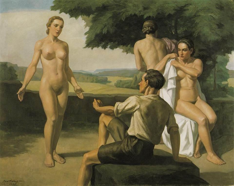
In 2003, Shane Cotton’s big exhibition at Wellington’s City Gallery was in two minds. The gallery wanted a curated show with all the key works, summarising Cotton’s development, explicating his imagery, themes, politics, and achievement. But Cotton didn’t want the museum-retrospective treatment. He wanted to do a ‘project’ show of new work. Museum and artist both got their way. Downstairs, curator Lara Strongman assembled a tight, greatest-hits selection of Cotton’s works from the previous decade. Upstairs, Cotton presented a cycle of seven large diptychs that were wildly new in imagery and treatment. The show felt like two shows in counterpoint, as if two artists were being presented: downstairs, the Cotton the gallery and ‘the culture’ expected, even demanded; and upstairs, the Cotton Cotton wanted. You could take your pick, or compare and contrast.

In retrospect, the show’s polarised quality seems symptomatic of a dilemma Cotton faced. In the ten years since his 1993 breakthrough show at Wellington’s Hamish McKay Gallery, Cotton had tapped the biculturalism zeitgeist, becoming a key figure in the paradigm-shifting ‘new generation’ of Maori artists that Jonathan Mane-Wheoki would call ‘the young guns’.1 Feted by curators and collectors alike, Cotton seemed to tick all the boxes: as much as his work was rooted in local history, it also offered a new spin on the most current of international art concerns (appropriation). However, being typecast as an ambassador for Maori causes proved to be something of a trap for this artist, still in his thirties. Prevailing cultural politics were overdetermining readings of his work, casting it as illustration and instruction, and bypassing the exploratory, speculative nature of his practice as a painter. By 2003, Cotton was no longer riding the waves of biculturalism, they were riding him.

While the downstairs part of the City Gallery show locked Cotton into a pious and by now familiar discourse about history, place, and identity, the diptychs upstairs, with their pop-art quality, were unexpected. Style and imagery felt utterly experimental. Riffing on their place in Maori lore, birds suggested harbingers of death, emissaries from the beyond, intercessors between earth and the heavens—‘translators’, Cotton called them. Meanwhile, bull’s-eyes recalled archery targets and Royal Air Force insignia—although Cotton said he saw them more abstractly, as vortexes. Their juxtaposition seemed visually vital, yet fatalistic. But, given the cultural anxiety surrounding them, Cotton’s images of toi moko (Maori preserved heads) were far more morbid and provocative.

Preserving heads dates back to pre-contact times. Maori kept the heads of important men who had died, from their own tribe (to venerate) and from vanquished enemy tribes (to lord over). However, following contact, toi moko became curios, trophies, ornaments for the Pakeha—tourist art. During the intertribal Musket Wars, slaves were tattooed and killed so their heads could be traded with Pakeha for guns and ammunition—these heads are known as mokomokai. Having never previously been tattooed, slaves were now inscribed carelessly with a ‘jumble of meaningless motifs’, contributing to the desacralisation of the moko and its decline as a status symbol and art form.2 Fast-forward to the 1990s and toi moko have become a sore point. On the one hand, Maori condemn museums for their insensitivity in continuing to display their tapu heads and petition them to repatriate these ancestral remains to relevant iwi. On the other hand, the same heads are also evidence of indigenous brutality, Maori insensitivity to their own ‘cultural values’, and shamefully at odds with popular feel-good representations of the tangata whenua as children of nature and noble victims.

Presented repeatedly, frontally and in profile, Cotton’s toi moko took on a cut-and-paste, decal-like quality. His heads were not exactly tattooed: some were camouflage-patterned or rainbow-striped. The camo-heads seemed to nod at once to military fashion and to Andy Warhol’s camp 1986 pop-goth self-portraits, in which Warhol superimposed camo-patterns over an image of his own disembodied, white-wigged, toothless, pasty face. (Interestingly, he died the following year.) But, what was at stake in Cotton subjecting toi moko to Yellow Submarine or Warholian graphic treatment? Was this some somewhere-over-the-rainbow redemption of the heads, or blithe disregard to their sensitive nature—insult added to injury? Was Cotton pointing to a problem or a solution? Whose side was he on?

Although Maori references permeated the new work, Cotton seemed to have largely dispensed with customary Maori stylisations; his birds could have been lifted from an encyclopedia. His images were not organised on trees, feast scaffolds, or shelves, or integrated into bold emblems, as they had been previously. Now, they were more like tokens, provisionally placed on flat black void-fields and spray-painted skies, less organised than disorganised—lost in space. Cotton’s diptychs were inscrutable, cryptic. Sure, his earlier works had dispatched critics and curators to the library to double-check the citations and to brush up on their history and their Maori language, but the diptychs were beyond obscure, they were positively deranging. They begged for interpretation, but defied it. They made you wonder not only if you understood what Cotton was doing now but whether you had even understood what he had been doing before. As much as the diptychs could be seen as continuing Cotton’s previous concerns, they could also be read as a dummy spit, with Cotton shrugging off the worthy expectations weighing down on him and cutting himself some slack.

With the diptychs, a surrealism previously implicit in Cotton’s work had suddenly become explicit and urgent. Now Cotton was clearly not being prescriptive or normative—making ‘signs and symbols for people to live by’, as Colin McCahon had put it3—but was free-associating with images, crashing together Maori and Pakeha image fragments in the manner of Lautréamont’s notorious ‘chance encounter on a dissecting table of a sewing machine and an umbrella’.4 If the surrealists had clashed codes to explore the repressed, unfinished business of the psychosexual unconscious, Cotton was doing the same with the post-colonial historical and cultural unconscious. The surrealists had been disinclined to analyse the latent content of unconscious imagery, preferring to bask in its manifest poetry—its non-sense. Where psychoanalysis sought to heal the patient in order to reintegrate them into society, surrealism declared society itself sick and their unconscious, automatic imagery a revolt against it. So, perhaps at this point, the idea that Cotton was advocating some ‘sane’ bicultural reconciliation should have gone by the wayside.

In the years that followed the City Gallery show, Cotton would continue to explore the directions opened up by his 2003 diptychs, refining and expanding his speculative cultural-surrealist approach. With his increasingly acrobatic, reckless, even suicidal birds, he took to the skies, largely leaving the land (and any safe hermeneutic footing) behind.

•
In 2011, Cotton acknowledged the influence of the surrealists in titling his Hamish McKay Gallery show The Treachery of Images. Cotton borrowed this title from Rene Magritte’s famous 1928–9 painting of a pipe that is not a pipe.5 Cotton’s work owes much to the Belgian surrealist. The links to Magritte are obvious in Cotton’s endless plays of substitution and displacement, in his disorienting and illogical scale shifts, in his puzzling mismarriages of images and idioms, in his penchant for frames and frames-within-frames, and in his witty title play. Both artists exploit chains of association and analogy within works and between works, making interpretation interminable, postponing closure. Their puzzle pictures foreground the machinery of representation while transporting us into poetic other worlds.

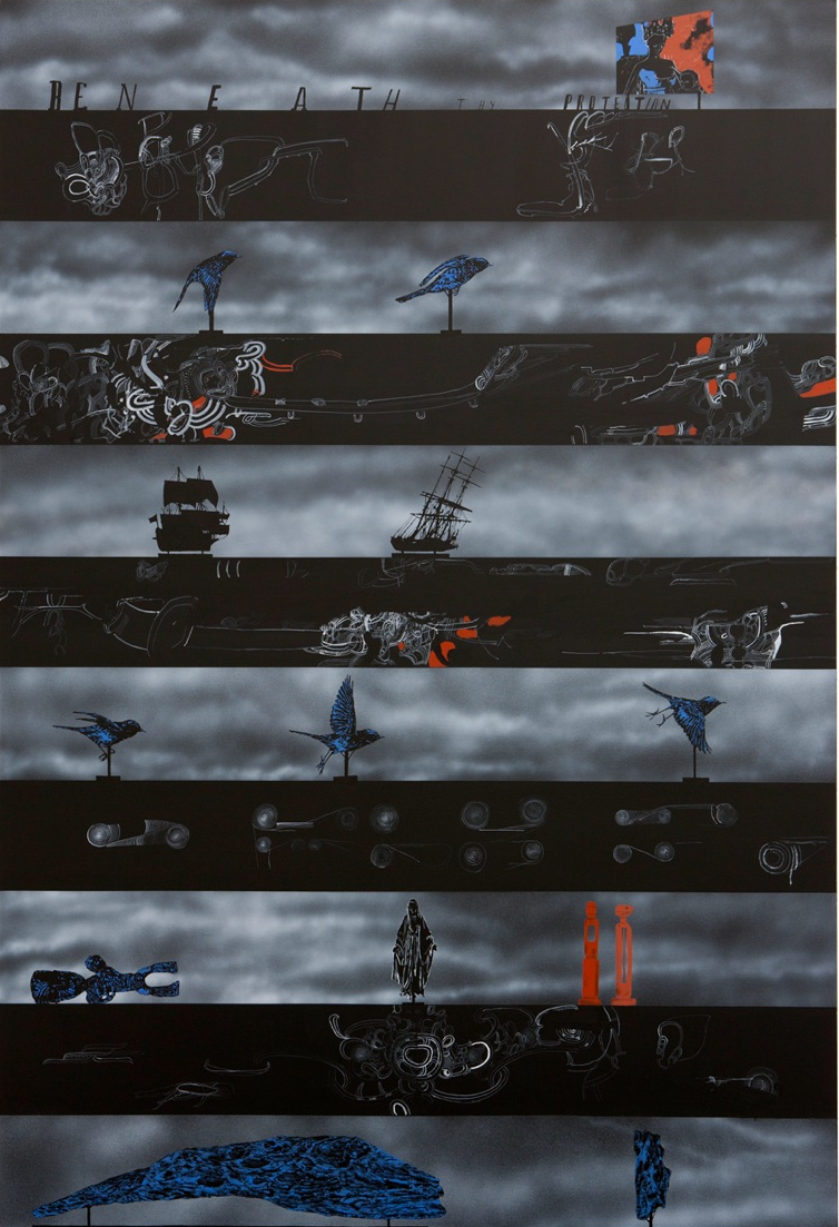
Magritte keeps it simple; in each work, he tends to isolate a single trope, to tease out a particular ambiguity. Cotton, by contrast, prefers complexity, hybridity, and excess. Consider Back Words (2011), from Cotton’s Treachery show. The painting is divided into eleven horizontal sections: flat black bands inscribed with scribbly Maori spirals alternate with deep spray-painted skyscapes that provide backgrounds for exhibits. These exhibits include stuffed birds on stands, dead, yet frozen in different stages of flight (recalling Eadweard Muybridge’s animal-locomotion studies); tall ships, the same size as the birds and also on stands; a billboard (or is it a drive-in movie screen?); that famous Maori carving from the 1840s of a mokoed Madonna and Child (now in the Auckland Museum), toppled;6 a Western-style Madonna sculpture; two red Arnold Wilsonesque Maori-modernist sculptures; and a couple of blue pitted rocks, also on museum stands (are they pebbles or asteroids?). There are also some freestanding letters, which recall both Colin McCahon’s text paintings and the Hollywood sign; they spell out the title of a Christian hymn ‘Beneath Thy Protection’. (If this derelict signage acknowledges a caring God, it seems to be one who has left the building.)7

Not only does Cotton mix imagery here, he also scrambles styles and idioms. References to printing, painting, Maori carving, Western sculpture, model ships, moko, kowhaiwhai, hymns, and taxidermy collide. The silhouetted ships look like shadow puppets, while the birds and stones are painted to look like they were printed old-school style, with black-and-white ‘line work’ filled in with solid ‘spot colour’. The way the skyscapes are stacked recalls McCahon’s serial landscapes. They could represent sections of a continuous scene or different places and/or times (a history, a narrative)—or not. One can only ponder the relationship between the skyscapes and the inscribed black bands that insulate and link them. Are we to understand those bands as labels or shelves, supporting and distinguishing the exhibits above them? In relation to the skyscapes, are we to read the inscriptions on the black bands as source, translation, crib, or critique?

In Cotton’s works, images seem sometimes to belong to obscure or obsolete frameworks, sometimes to exist in-between various frameworks, and sometimes to have come adrift from any framework whatsoever. Adding a twist to Magritte, Cotton exploits the ways that images can move in and out of plural, even antagonistic, cultural value systems, connecting and disconnecting with alternative signifieds. This idea informed a suite of painted baseball bats that Cotton also included in his Treachery show (perhaps intending to recall the way Magritte had painted on phallic objects—rendering nudes and clouds on bottles).8 While the bats suggest partisan politics, the need to take sides in conflicts, be they sporting or violent, these ‘sides’ are not explicit. On the bats, Cotton painted his characteristic mélange of historical and contemporary, Maori and Pakeha imagery. One bat features an image of the Maori Madonna and Child carving. Is Cotton suggesting that such images—and the ideologies they refer to—are symbolic weapons, which might do violence upon us (or for us) without touching us? Or is he suggesting that those images are actually frail and endangered, for one would surely not swing the bats for fear of damaging their exquisite surfaces?9 Similarly, as much as Cotton’s line of bats suggests an arsenal, implying we might take our turn to pick one up in defence of the realm, they also suggest a colonial-history museum display of pathetic, retired spoils of war. Perhaps these conflicted bats are at war with themselves.

To an audience anxious for answers, Cotton offers allegorical impasses and frustrating interpretive feedback loops. His works radiate an enigmatic quality, like yet-to-be-deciphered Rosetta Stones. Cotton piles language upon language, reference upon reference, trope upon trope, scrambling different modes of representation, offering too many clues (and perhaps a few red herrings), generating cross-cultural moiré patterns. There are simply too many, contradictory ways to read his works, so that any clear interpretation seems wishful. There’s no advocacy here—confusion reigns. Cotton’s pictorial imbroglios recall the awesome snowballing wreckage famously contemplated by Walter Benjamin’s ‘angel of history’: ‘His face is turned toward the past. Where we perceive a chain of events, he sees one single catastrophe which keeps piling wreckage and hurls it in front of his feet. The angel would like to stay, awaken the dead, and make whole what has been smashed. But a storm is blowing in from Paradise; it has got caught in his wings with such a violence that the angel can no longer close them. The storm irresistibly propels him into the future to which his back is turned, while the pile of debris before him grows skyward. This storm is what we call progress.’10

For Magritte and Cotton, images (signifiers) are slippery. They are slippery because they don’t behave in the way their signifieds do, and because they don’t stay attached to their signifieds. You can do things with an image of a pipe or a bird that you can’t do with an actual pipe or an actual bird. Images rhyme and relate in ways their referents don’t, and you can picture things that have no parallel in reality. It’s as if, in Cotton’s paintings, real-life conflicts that may have long ago ended continue to play out in a parallel world of images, perhaps with different results. For instance, in Cotton’s 2010 painting Son(s) of Gods, a musket discharges a disembodied moko pattern in place of gunsmoke—a visual non sequitur. Even if we could draw some conclusion from this image, what would we do with it (now)? How might we apply it to the real world?

The title of Cotton’s show—The Treachery of Images—was more than just a nod to Magritte. It was a manifesto of sorts, one that distanced Cotton from the prescriptive identity rhetoric that was settling around his work a decade or so ago. In the Maori meeting house, we are told, images are not ambiguous, only familiar and reassuring. They situate the locals within the family, within the community, within history, within the land, within the universe. They tell the faithful who they are. However, in arguing that images are traitors, Cotton turns his back on this idea. Saying that images are treacherous implies that they have agency, lives and projects of their own, and that they are duplicitous—not to be trusted. As much as his art is about meetings (collisions more like), it is the antithesis of meeting-house art.11

•
Cotton’s work broaches an old dilemma: (how) can you be Maori and modern? This has long been a vexed matter, not just because what is commonly considered authentically Maori predates exposure to Western modernity, but because Maori culture is inherently traditionalist, being based in ancestor worship and whakapapa (understanding people and things in terms of their origins). Maori and modern may be chalk and cheese. Responses to the Maori-modern dilemma polarise. Some argue that contact was catastrophic for Maori culture, others that the culture is dynamic and that foreign ideas and values have been absorbed and adapted into its framework. Both ways of thinking are wishful.

Cotton’s breakthrough works, like those shown at Hamish McKay Gallery in 1993, were explicitly keyed to the dilemma. They drew on the creole iconography of Rongopai, the novel meeting house built for Te Kooti in 1888, in the wake of the Land Wars, when the people were dispossessed, disillusioned, and disoriented. It remains hard to know if Rongopai’s carefree appropriation of European materials, motifs, and manners was a canny, empowered response to encroaching modernity or a symptom of cultural breakdown—clutching at straws. This ambiguity intrigued and transfixed Cotton. In the early twentieth century, the Ngata Revival would sidestep this chapter of Maori art (sometimes called ‘Maori folk art’), asserting classical art styles in its programme for cultural survival in modern times.12 However, in the 1960s and 1970s, the pendulum swung back, when the Maori modernists promoted the idea that Maori and modern could be ‘blended’: Arnold Wilson conflating Henry Moore with pou and Paratene Matchitt scrambling Victor Vasarely’s op art with tukutuku.13 In the 1990s, it seemed that Cotton might be pursuing precisely this kind of merger. But, since his City Gallery show, it has become ever clearer that he is grappling with the Maori-modern conundrum in a very different way. Neither a conservative revivalist nor a utopian blender, Cotton has created a new idiom, which he has called ‘Maori Gothic’.14

I was once told that Cotton’s favourite film is F.W. Murnau’s Nosferatu (1922), and it’s telling to compare his recent paintings with that film’s source, the classic Gothic vampire novel Dracula. Bram Stoker’s tale—published about ten years after Rongopai was built—also had a conflicted relationship with modernity. Stoker’s Victorian characters were modern, they were neophiles: they rode trains, practiced stenography, used typewriters, sent telegrams, dictated their scientific observations onto wax cylinders, and transfused blood. But, for all their scientific and industrial nous, they were both plagued and excited by a dark occult figure from an earlier, aristocratic, pre-enlightenment time. This vampire was a remnant—the last of his kind. Dracula was not the past as appropriated by the present to explain and legitimise itself, but a past that couldn’t be assimilated, couldn’t be read—a past that exercised its own excessive claims on the present. Stoker was explicit about this. At Castle Dracula, a twitchy Jonathan Harker famously observed: ‘unless my senses deceive me, the old centuries had, and have, powers of their own which mere “modernity” cannot kill.’15

Vampires are a sign that modernity is a house built on sand. As Jeff Wall explains: ‘The vampire is neither alive, nor dead, but exists in an accursed state of irremediable tension and anxiety … he embodies a certain sense of cosmic grief … the vampire signifies not simply the unwillingness of the old regime to die, but the fear that the new order has unwittingly inherited something corrupted and evil from the old, and is in the process of unconsciously engineering itself around an evil centre. The presence of the phantasm of the vampire in the consciousness of modern, liberal men signifies the presence of an unresolved crisis in the creation of the modern era itself.’16

In coining the term ‘Maori Gothic’, Cotton acknowledges the haunted, vampiric quality of his paintings. With their glaring severed heads, suicide cliffs, tormented skies, graffiti ‘written on the wind’, and plummeting birds, they seem spooky and ominous. It’s as though, in the course of his iconographic enquiries, the artist, like some latter-day Lord Carnarvon, had unwittingly prized open a Pandora’s box, releasing ancient, dark, disavowed forces into the world. Under their corrupting influence, familiar items now behave in unfamiliar ways. Passages from the good book, lava lamps, and baseball bats begin to mean something else entirely. Everything is haunted; nothing can be trusted.

But how exactly is Cotton positioning himself in relation to Maori-as-vampiric? Does he see the Maori vampire as pathetic or powerful, as provoking sympathy or dread? To what extent is he on the vampire’s side and to what extent is he invested in the new world that the vampire threatens? Many interpreters presume Cotton sides with his historical Maori imagery, but the reality may be more complex. After all, Cotton came to that imagery late, largely as a result of the research he conducted in order to teach Maori art in the early 1990s.17 His historical Maori imagery may be less familiar, less ‘natural’, and more mysterious to him than his modern images of digital clocks and PlayStations. Perhaps his position is not simply that of a Maori insider, but simultaneously that of insider and outsider. When interpreters align Cotton with his Maori imagery, as if he were simply a booster in matters Maori, they neglect and override his work’s experimental, surrealist imperative. Cotton thrusts images together to explore the outcome, not to illustrate a point or argue a case.

They say that the meeting house locates and grounds its community, providing some turangawaewae, some place to stand. If so, Cotton’s work does the opposite. It’s all about uprootedness, uncertainty, nowhere to stand, being up in the air. For Cotton, being Maori is not conservative; it’s not about a sense of cultural certainty, the succour of tradition. It’s more about identifying with and embracing the epistemological crisis that came with contact, a crisis that split open signs, tearing signifier from signified, turning images into traitors. It’s about being fundamentally conflicted. And perhaps Cotton finds a certain pleasure and freedom in this, where all meanings and frameworks, Maori and modern, might come unstuck, or, equally, repossess and plague each other. Rather than reconcile the indigenous and the modern, Cotton revels in their terrific, caustic, game-changing antagonism, reaping its dark abundance as that ‘pile of debris before him grows skyward’.

For Cotton, it seems, biculturalism is not about finding a bureaucratic solution, not about policy and partnership, not about reconciliation, but rather, as Ian Wedde once put it, about keeping a certain problem alive,18 and, if not alive, at least undead.19
.
[IMAGE: Shane Cotton Back Words 2011]


  1. Jonathan Mane-Wheoki, ‘Toi Hiko: Maori Art in the Electronic Age’, in Hiko: New Energies in Maori Art (Christchurch: Robert McDougall Art Gallery, 1999), np.
  2. Christian Palmer and Mervyn L. Tano, Mokomokai: Commercialization and Desacralization (Denver: International Institute for Indigenous Resource Management, 2004. nzetc.victoria.ac.nz/tm/scholarly/tei-PalMoko-t1-body-d1-d3-d1.html.
  3. Colin McCahon, Colin McCahon: A Survey Exhibition (Auckland: Auckland City Art Gallery, 1972), 26.
  4. Comte de Lautréamont (Isidore Ducasse), Les Chants de Maldoror (1868–9).
  5. The French title, La Trahison des Images, is sometimes also translated as The Treason of Images.
  6. This carving is thought to have been made in the 1840s by Patoromu Tamatea of Ngati Pikiao for a new Catholic chapel in the Bay of Plenty. The carver indicated the Virgin’s spiritual status in Maori terms by giving her a full moko. The piece was rejected by the local priest.
  7. Back Words is permeated with references to the Virgin. The hymn ‘Beneath Thy Protection’ addresses her. And, according to Cotton, the image on the billboard is based on Jean Fouquet’s Virgin and Child (ca. 1450).
  8. Incidentally, Magritte’s The Future of Statues (1937)—with sky and clouds painted on a commercial plaster reproduction of Napoleon’s death mask—offers another precedent for Cotton’s camo-heads. Magritte’s work suggests transcending death through dreaming.
  9. Cotton’s painted bats also recall Marcel Duchamp’s notes on the idea of the ‘reciprocal readymade: use a Rembrandt as an ironing board’ in The Green Box (1934).
  10. Walter Benjamin, ‘Theses on the Philosophy of History’ (1940).
  11. Although, I note, Cotton did paint kowhaiwhai panels for the wharekai at Motatau Marae, which opened in 2009.
  12. For more on Ngata, see Jeffrey Sissons, ‘The Post-Assimilationist Thought of Sir Apirana Ngata’, New Zealand Journal of History 34, no. 1, 2000: 47–59.
  13. Thinking here of Matchitt’s 1965 mural Niho Taniwha.
  14. Cotton titled his 2005 Hamish McKay Gallery show Maori Gothic.
  15. Bram Stoker, Dracula (1897), (London: Penguin, 2003), 43.
  16. Jeff Wall, ‘Dan Graham’s Kammerspiel’ (1985), in The Gothic, ed. Gilda Williams (London: Whitechapel Gallery, 2007), 211–2.
  17. From 1993 to 1996, Cotton taught Maori art at Te Putahi-a-Toi, School of Maori Studies, Massey University, Palmerston North. As Cotton explains: ‘I shifted to Palmerston North and took up a lectureship in the Maori Studies department, and all of a sudden I was exposed to a different kind of history, a Maori colonial history—it was something that I didn’t know about in any great depth but I had to try to teach the stuff. I was learning, teaching, learning, teaching, all at speed, and it started feeding into my painting. So a lot of the work through the nineties was dense; it was dense with biblical scripture and dense with Maori history, which was new to me. I wasn’t so much trying to teach people about this stuff as trying to understand it for myself.’ ‘Shane Cotton: Stamina, Surprise, and Suspense’ (interview with Justin Paton), B.170 Bulletin of Christchurch Art Gallery, Summer 2012–3: 14.
  18. See Ian Wedde, ‘The Delft Effect’, in ‘Voices He Putahitanga’, Midwest, no. 3, 1993: 16.
  19. ‘For all its supposed darkness and disruption, the Gothic is fundamentally romantic and reassuring: it’s a mode of enjoyment, a way of taking pleasure. And that’s why it will never be part of a utopian bicultural solution. Because in preferring the Gothic, we prefer the problem.’ Robert Leonard, ‘Hello Darkness: New Zealand Gothic’, Art and Australia 46, no. 1, Spring 2008: 95.

Geek Moment

Art Collector, no. 66, November–December 2013.


Caltech-based theoretical physicist Dr Sheldon Cooper is the lead character in the hit US sitcom The Big Bang Theory. He is a stereotypical geek (or, more correctly, a laughably extreme one). Cooper has a brain the size of a planet—he knows he is smarter than everyone else. Whenever he thinks he has trumped lesser beings—exposing their gullibility or inferiority—he lets them know by declaring, ‘Bazinga!’. Despite this, Cooper is bewildered by everyday social interaction. He had to devise a friendship algorithm to connect with others and wrote an epic roommate agreement to manage his relationship with his presumably less brilliant flatmate Dr Leonard Hofstadter.

The rise of technology is necessarily accompanied by the rise of the technocrat. Today, while Dr Cooper’s geekiness may be amusing, it is nothing to be ashamed of. Indeed, as social dysfunctionality is now recognised as mark of supreme intelligence, geeks can come out of the closet waving their Asperger’s test scores. You see their ascendency in TV detective shows. PC Plod has been replaced by lovable lateral thinkers with astronomical IQs—specialists, consultants, and backroom boys and girls. There is the neurotic-compulsive Monk, the hot-goth science-girl Abby in NCIS, the lab guys in CSI, the mathematician in Numbers, the arch-manipulator in The Mentalist, the genius inventor in Person of Interest, the blood guy Dexter, etcetera. Interestingly, the smug proto-geek Sherlock Holmes has been simultaneously reincarnated in England (Sherlock) and America (Elementary). Geeks abound.

In art, we are also seeing the emergence of a geek-and-proud sensibility. Anyone who gets about galleries cannot fail to notice an abundance of arcane works referring to science and science fiction; to mathematics and statistics; and to technology, computers, computer games, and the Internet. Endless bookish, laptop-bearing artists happily pursue the arcane, engage in inane pranks, and make their social bewilderment our problem. They are happy. Their time has come.
.
Botborg
Equal parts techno-boffin and experimental videoand- music maker, Botborg’s performances use analogue video and sonic feedback to conjure an awesome variety of synesthetic audio-visual effects in real time, coaxing patterns out of scrambled collapsed signals. The Brisbane-based artist claims to follow the occult science of photosonicneuroeasthography, supposedly pioneered by Dr. Arkady Botborger sometime last century. A quick Google search, however, suggests that this is an elaborate fiction—a work of pataphysics.
.
Antoinette J. Citizen
Melbourne artist Antoinette J. Citizen (not her real name) decorates galleries with computer graphics, so she can imagine herself trapped in a vintage video game. In her special-effects video, Artist in Studio, she imagines having awesome sci-fi powers: she brandishes a light sabre, is beamed up by a Transporter, and fires radiation beams from her eyes like Cyclops in X-Men. Citizen likes pranks. She forges signatures on prank letters to other geek artists, and, with artist Courtney Coombs, harassed the poor curators at Paris’ Palais de Tokyo for months with more pointless proposals than they could possibly deal with. Currently, Citizen is developing a Human Needs Meter (2011–), which adapts the look and function of the health bars in the 2009 computer game Sims 3 to the real world. In the game, these bars indicate the well-being of characters, in terms of ‘health’, ‘social’, ‘hygiene’, ‘energy’, ‘fun’, and ‘comfort’. But Citizen’s thought—that real people might log information into her wrist computer to help them determine that they are, say, dirty, hungry, or lonely—is absurd. Surely we know such things instinctively, without recourse to a computer.
.
Gabrielle de Vietri
Back in 2004, Melbourne artist Gabrielle de Vietri sought to clarify and codify matters romantic. She had a lawyer draft a set of standard Relationship Contracts for different kinds of connections, including ‘Casual Fuck’, ‘Workplace Romance’, and ‘Meaningful’. Making these contracts freely available, she may have seen herself as offering a useful social service. But, although her contracts reveal detailed relationship analysis, they fail to understand our motivations for getting into them. Like Sheldon Cooper’s roommate agreement, they are contracts no one would want to sign, because something unspoken (bad faith, perhaps) is necessary to keep any romance alive. Recently, De Vietri has been writing stories using CAPTCHAs, those meaningless Internet passwords we are required to type in to prove to computers that we are human. Her tales are told in her video CAPTCHA (2010–2), where we see the original CAPTCHAs while hearing the stories. They include a steamy, suggestive romance in which ‘Desmodowe’ hankers for his beloved ‘Siseelly’. If you didn’t know that CAPTCHAs were used, you could imagine that the stories were written using jargon, an archaic or foreign language, or Klingon.
.
Daniel McKewen
Brisbane artist Daniel McKewen has a Rainman-like penchant for statistics. For his video installation Top Ten Box Office Blockbusters of All Time, in Dollars, he screens the current ten top-earning films on ten monitors. Each film is overlaid with two sets of animated numbers: one tallies up the film’s budget, the other its earnings. It is hard to know what to pay attention to: the popular mythologies of these much-loved films or Hollywood’s compelling performance reports. The work is a labour of love for the artist, because, every time he shows it, he has to update it, as earnings increase and as new titles enter the top ten. McKewen’s fan-boy love of factoids also extends into the content of entertainment. In Conditions of Compromise and Failure (2011–2), McKewen plays armchair detective (or conspiracy theorist), using coloured threads on a pinboard to node map the labyrinthine interrelationships between characters in the US TV series The Wire. However, he completes this epic task in such obsessive detail that nothing is clarified. There are so many links, so many clues, that they cancel one another out. Information overload.
.
Danielle Freakley/The Quote Generator
French semiologist Roland Barthes famously argued that texts are ‘tissues of quotations’. For a time, Perth’s Danielle Freakley/The Quote Generator spoke only in quotes, which she had collected into a book and memorised. In conversation, she would repeat the quote then cite her source, indicating that her words had been recycled from an often radically different context, for instance using Adolf Hitler’s words to express her thankfulness. Communication proved infuriating, for her and for others. The video records of her social experiment show Freakley exasperating one man who had the misfortune to be seated next to her on an airplane and confusing other people whose own reality we now realise is always already scripted, including a Captain Jack Sparrow impersonator.
.
Ross Manning
Brisbane artist Ross Manning plies us with eye-catching science displays, experiments in sound and light. Ever attentive to the quirks of technology, Manning noticed that DLP video projectors fire red, green, and blue light in rapid succession, knowing that our brains will mix them together to make white. For Fixational Eye (2011), he positioned a DLP projector to project white light onto a gyrating string. Fractionally separate in time, the red, green, and blue components hit the string at different points in space. Because of the ‘persistence of vision’, we see all the colours at once, separated in space. The work generates a prismatic, psychedelic effect, recalling, perhaps, Isaac Newton’s experiments in light refraction.
.
[IMAGE: Ross Manning Fixational Eye 2011]

On Curating

www.abc.net.au, 2013.


Hannah Mathews interviews Robert Leonard.
•
In 2005, Robert Leonard moved from New Zealand to Australia to take up the directorship of the Institute of Modern Art, Brisbane. Leonard is one of New Zealand’s most experienced contemporary art curators. He has worked in a range of capacities in art museums and contemporary art spaces, including a stint as Director of Artspace, Auckland (1997–2001). In 1992, Leonard collaborated with Bernice Murphy on the landmark exhibition Headlands: Thinking through New Zealand Art. Reviewing the show, John Daly-Peoples wrote: ‘Headlands will be reviled, revisited, reinterpreted and reassessed, but ultimately it will be the significant exhibition of the nineties having marked out the points of reference for the next decade.’ Leonard got the art bug at nine years of age after his father took him to see Surrealism, the Museum of Modern Art touring show, at Auckland City Art Gallery in 1972. According to Leonard, ‘That show left me with the idea that art’s job is to offer an alternative account of the world and I guess that is still essentially how I see it.’


Hannah Mathews: How did you get into curating?

Robert Leonard: I did a curatorial internship at the National Art Gallery (NAG) in Wellington in 1985. It was good timing. The Director, Luit Bieringa, had transformed the NAG from a dusty old place into something quite contemporary. He was building an international photography collection and bringing in sharp shows via Australia. That year, I helped install The British Show, from the Art Gallery of New South Wales. With my internship, there was no formal curatorial training. I spent time in various departments (registration, conservation, education, the print room, etc), and learnt by osmosis. The NAG’s curators were mostly old-school art historians. They weren’t interested in new developments in exhibition making, so there wasn’t much philosophical discussion. The most useful discussions I had were with people outside the institution, particularly Jim and Mary Barr, the Wellington collectors and freelance curators. Their house seemed to be the centre of the Wellington art world. After my internship, I was cut loose and did couple of freelance projects. I did Pakeha Mythology (1986) at New Plymouth’s Govett-Brewster Art Gallery. It was like an artist’s project. I made-over a gallery as a corporate boardroom, complete with wood panelling and a big table. Above the table, I hung three icons of New Zealand painting, Christopher Perkins’s Frozen Flame, Rita Angus’s Cass, and Colin McCahon’s Crucifixion with Lamp; nearby, a TV screened a compilation of ads featuring nationalist imagery. When they caught wind of it, the museum that lent the McCahon asked for it to be returned immediately, but were talked down. Pakeha Mythology was terribly self conscious. I fancied myself to be an enfant terrible. A little later, I got a job at the NAG, and soon I was working there as a curator.


What’s your approach to working with artists?

It’s hard to generalise. Artists are different and I work with them in different ways. In some projects, I am more in the driver’s seat; in others, more in the passenger seat. It depends on the artist and the project. It can be a pleasure to work with artists, but it can also be a pleasure not to. Artists can be very controlling, limiting the ways their work can be shown. When I started curating, people were excited by ‘the death of the author’ and wary of ‘the intentional fallacy’. The idea that artworks might operate outside the artist’s intentions gave curators a license to be willful, to provocatively juxtapose works in ways that the artists might not necessarily like. The curator was not expected to affirm the artist’s view, but could put it under pressure. You could test and challenge artists, holding up their works against the claims they made for them and presenting them in alternative contexts. Of course, that’s easier when you are working in a museum and you own the works, harder in a contemporary-art space where you are more dependent on artists for access to work. These days many curators talk as if their job is primarily to please artists—to represent and protect their interests. Keeping artists happy is important, but it’s not the only important thing. As a curator, there are times when you work for artists, times when you work alongside them, and times when you work against them. For a curator, it’s important to find opportunities to operate in all these registers. Curators need to be more than just artists’ enablers.


You’ve worked as a curator, but also as director of Auckland’s Artspace (1997—2001) and Brisbane’s Institute of Modern Art (since 2005). Do you see yourself more as a curator or a director?

I see myself as a curator-director rather than as a director-director. I became a director in order to have the freedom to curate. When I started working in museums in the mid-1980s, curators were in the directorate. But, in the early 1990s, with the advent of managerialism, they lost that privileged position. Now it’s their manager that gets invited to the meeting. It’s a shame that museum curators have become so marginalised.


So, are you happiest running contemporary art spaces or working in museums?

I move back and forth. The advantage of running a contemporary art space is that you can have an idea in the morning and make it happen in the afternoon, and you can shape everything holistically. The disadvantage is being undercapitalised, having a limited ‘indie’ audience, and being on a treadmill. I enjoy the creative freedom that comes from running my own show but I miss access to larger audiences.


You curated the New Zealand representation in the Asia Pacific Triennial (1999), Sao Paulo Bienial (2002), and Venice Biennale (2003). What have you found most rewarding about this?

It’s great to have the opportunity to work offshore in these contexts, to be part of these huge shows, but, usually, one is simply assisting artists on stand-alone projects. I’d love to do offshore projects which are more my own, where I am actively shaping them. I would relish the opportunity to make another Headlands-scale show, especially if I could have final cut.


The Asia Pacific Triennial (APT) is the biggest art show in Queensland. You have watched it evolve. How has it changed?

It has changed a lot. In the 1990s, the APT was instrumental in establishing the Asian contemporary art scene. It was where artists and curators from the region met and did business, and Brisbane artists and curators were part of that exchange. But after that, things changed. Asian artists and curators became more visible internationally, and no longer needed the APT as a platform. The Gallery brought the curatorial process in house, and started addressing the show less towards the art world, more towards maximising local general audiences, targeting families with things like Kids APT. These days, the APT draws huge audiences by specialising in entertaining G-rated art, art-as-spectacle, and the theme always seems to be ‘bigger than last time’.


So, you’re not a fan of blockbusters?

They have their place. Actually, I’ve always dreamed of doing a meta-blockbuster, a blockbuster about blockbusters. It’s called Salvador Dali vs. Damien Hirst. It’d be so popular. Dali and Hirst are from different moments, yet have much in common: sex and death, putrefaction, religion, dots—the big themes. Both exploited a popular idea of ‘the artist’, taking a radical model (the transgressive avantgarde provocateur) and transforming it into something conservative and complicit (the tabloid showman, the brand, kitsch). Both artists shamelessly courted the media and did films, jewellery, interior design, magazine covers, and merchandise; both got hooked on high-production values; both were in and out of step with the art world.


Many Queensland art institutions have faced uncertainty in the past nine months as the state government implements budget cuts. It has been argued that, in times of austerity, the agency of art increases. Certainly in the late 1970s and early 1980s, under Joh Bjelke-Petersen, one of Brisbane’s most exciting art scenes emerged.

I’m not from Brisbane, so I don’t share in that nostalgia for the post-punk Joh years. I guess you had to be there. While austerity may kill off some less interesting practices that depend on an overheated market, I have never subscribed to the view that it actually generates incisive art. Quite the reverse. In my view, art needs to be resourced, but intelligently. Anna Bligh’s government was seen as arts friendly. It put a lot of money into art, but much of that went on internally administered, politically-oriented projects that were about branding the government (like the Cairns Indigenous Art Fair, the Premier of Queensland’s National New Media Art Award, and public art), rather than on sharp artists and independent projects. As for the new government, we’re still waiting to see how things will shake down.


Art curatorship is a growing field, nationally and internationally. What are the directions and urgencies of the profession?

I’m concerned that the discussion is currently dominated by biennales. Broadsheet has largely become a journal of biennale commentary and criticism. I love going to biennales. They are excellent opportunities to see new work en masse and the growth and transformation of the biennale form is fascinating. But, in my experience, biennales rarely exemplify thoughtful, considered curating. Their typically grand but vapid themes are expressed in absurd titles, which are either feel-good and universalist (Plateau of Humankind and All Our Relations) or oxymoronic (The Dictatorship of the Viewer, Optimism in the Age of Global War, Spectacle of the Everyday, and Parallel Collisions). I get twitchy when biennale curators promote themselves as experts in everything, social-justice missionaries, and the embodiment of the world spirit, rather than be seen as operators, gatekeepers, and insider traders. Their messianic manifestos cloak art world realpolitik. It’s not that I think curators should limit their scope or ambition (because art can touch on anything and everything), but we need to dial back on ideology and hubris.
.
[IMAGE: Ivo Saliger The Judgement of Paris 1939]

Craig Walsh: Elephant in the Room

Craig Walsh (Sydney and Brisbane: Museum of Contemporary Art Australia and Institute of Modern Art, 2013).


.
There is no document of civilisation which is not at the same time a document of barbarism.
—Walter Benjamin1
.
Where there’s muck, there’s brass.

—Yorkshire slang
.
This year, SBS screened a compelling three-part documentary. Dirty Business revealed how, since the gold rushes of the 1850s, mining has shaped Australia, its landscape and its people.2 The industry’s booms and busts have generated waves of immigration, nationalism and racism, and have seen fortunes made and lost, towns built and abandoned, and governments rise and fall. However, despite mining’s dominance, most Australians distance themselves from it; they see it as happening, literally and metaphorically, over there. Indeed, mining has sponsored the creation of that distance. Many of our earliest civic and cultural institutions were built using mining profits, laundering fortunes forged in dirt. More recently, my state, Queensland—the economy of which is thoroughly grounded in mining—called itself ‘the smart state’, prefering to align itself with the virtual rather than the material, the digital not the dirty.3

Such denial is hardly specific to Australia. Last year’s Manifesta addressed it as a global phenomenon. The Deep of the Modern was held in Genk, Belgium, in the old Waterschei coal mine, which ceased production in the late 1980s.4 The show’s premise was simple: as much as modernism ushered in utopian fantasies of crystal palaces and lives of leisure, these were enabled by an industrial revolution premised on coal; coal mining was modernity’s repressed. With consummate detective work, the curators found sufficient works addressing coal mining to create a corrective, explicitly coal-centric view of modern art.

For some time, Craig Walsh has been interested in addressing mining in his work.5 But, in 2012, when mining giant Rio Tinto offered him a project commission, it wasn’t to look at mining, but to celebrate Indigenous rock-art sites on the Burrup Peninsula in the Pilbara, in Western Australia. The Pilbara has long been a frontline in the struggle between mining interests and the first Australians. From its inception, mining was enabled by denial of Aboriginal citizenship and land rights. Applying the principle of terra nullius, the law held that, although Aboriginal people had lived on the land for millennia, they didn’t own it. Unsurprisingly, Aboriginal people felt differently. In 1992, after decades of resistance and protest, the landmark Mabo decision forever overturned terra nullius, paving the way to the recognition of native title, which would force mining interests to negotiate with the traditional owners.6 It changed everything.

In her 2012 Boyer Lectures, The Quiet Revolution: Indigenous People and the Resources Boom, Aboriginal academic Marcia Langton argued that the mining industry has now transformed from the Aboriginal peoples’ former foe to their newfound friend.7 A new relationship with mining has fostered Aboriginal education, employment and economic advancement, creating an Aboriginal middle class.8 For Langton, the private sector is forging new models for working with Indigenous Australia, while government initiatives lag behind.9 Walsh’s Rio Tinto commission is rooted in these changes. As part of their 2007 Burrup Conservation Agreement with the Federal Government, Rio Tinto undertook to invest in raising awareness of the Peninsula’s ancient rock art, implicitly acknowledging traditional ownership. One outcome was a coffee-table photography book documenting petroglyphs, published in 2010.10 A little later, Elizabeth Ann Macgregor, Director of Sydney’s Museum of Contemporary Art Australia (MCA), suggested that Rio Tinto (one of the MCA’s major partners) commission Craig Walsh to develop a project offering a more personal response to the rock-art sites. The work would be presented in a show at the MCA, ensuring an explicit public outcome. Rio Tinto agreed.

In January 2012, Walsh visited the Pilbara, to view the rock-art sites and meet with representatives of Rio Tinto and Murujuga Aboriginal Corporation. The Corporation encompasses the five Indigenous language groups with relationships to the Peninsula. Walsh explained to the Elders that he wanted to look at the rock-art sites not archeologically but in terms of the local Indigenous people’s living connection with place. They gave his project the green light. In June, he returned with a technician and gear. During a four-week residency, he developed two multi-channel video works and a series of related photographic portraits.

Walsh videoed Murujuga Elders talking about their relation to country. Through personal connection, ancestral protocol and Aboriginal law, his subjects—Tootsie Daniels, Tim Douglas, Lawrence Kerr, Pansy Hicks and Wilfred Hicks—have the right to comment on specific sites. Of course, some things cannot be discussed on camera. At night, Walsh projected the videos at Mount Rushmore scale over rock formations across the Peninsula and revideoed them. With the resulting footage, he created a five-channel flatscreen video panorama called In Country, and a series of still photographs. In the video, each screen shows one of the Elders speaking in turn. The scenes are deftly composed and juxtaposed to suggest a continuous landscape. Superimposing the video portraits (with their temporality and currency) onto the craggy landscapes (which imply deep time), Walsh argues the inseparability of the locals and the land. Although they had minimal involvement in the projection process, considering it dangerous to venture into the sites at night, Walsh says his subjects felt empowered by the idea of occupying the landscape on this grand scale.

Walsh produced another multi-screen video work, a single-channel video wall. Standing Stone Site shows a sacred site on the Burrup, which contains the largest concentration of standing stones in Australia. This otherworldly, rocky red landscape is clearly significant, but is shrouded in mystery. The traditional people of the area, the Yaburara, were decimated in the 1868 Flying Foam Massacres, and much knowledge of the stones was lost.11 From a fixed position, Walsh took high-resolution photographic stills of the scene at three-second intervals in two sequences, one at sunrise, the other at sunset. The stills were composited and animated to create a looping sequence. The way the light changes seems weird, perhaps supernatural. At points, Walsh replaced the sky with a deep black, making the rocks appear incandescent. Here, there are no human figures to provide a sense of scale; no one to speak in, of or for the landscape. Although none of the works in Walsh’s Murujuga project refer to mining, they are all about mining. One can see their commissioning as political—an extension of Rio Tinto’s diplomacy. For the Circle of Elders of Murujuga Aboriginal Corporation, they are political too, recalling past conflicts and asserting native title. As part of the agreement with Rio Tinto, Walsh was required to exhibit the Murujuga works at the MCA, but he was also able to include other work in his show. He took this as an opportunity to reframe the Murujuga works to address the elephant in the room: mining as the conversion of country to commodity.

While mining is a hot-potato topic—something all Australians have opinions about—few of us feel implicated in it. Not many of us even know what iron ore looks like. In response, Walsh brings the stuff into the gallery. His 2013 MCA show, Embedded, features twenty-one massive industrial bins brimming with it. Painted a garish fluoro yellow, the bins are arranged in a regular array across the floor, with absences here and there where columns stood in the way.12 Viewers will, no doubt, be reminded of the innumerable containers of ore lined up and transported daily by rail to the sea, for export to China. Walsh has also painted the gallery walls with a lurid colour scheme based on the standard high-visibility uniforms worn by miners and other industrial workers for their health and safety: fluoro yellow to a height of 1.1m (matching the colour and height of the bins), dark blue above, separated by a reflective silver strip, suggesting a horizon.

The bins and the wall painting condition the ways we read the photos and videos. The bins impede visual and physical access to the works, becoming a landscape to be negotiated; one in which viewers may feel buried, embedded, trapped. The bins both get in the way and frame the view; for instance, creating an avenue down which we approach Standing Stone Site. The rude literalness of the ore and luridness of the wall colours contrast with the warm tonalities, holistic atmosphere, allusive symbolism, and implicit humanism of the videos and photos. They are chalk and cheese.

The title, Embedded, is a prompt. It hovers over Walsh’s show, suggesting different ways to think about it. An obvious association is embedded journalists. The US started embedding journalists with their troops during the Iraq War as a way to secure politically favourable coverage. Embedded journalists are routinely criticised for their complicity, for lacking critical distance and independence, for doing their masters’ bidding. In choosing his title, Walsh acknowledges his own embeddedness with Rio Tinto. But, if his Murujuga project fits Rio Tinto’s public-relations needs, advertising their respect for the locals, it also enables the subjects to speak for themselves. So, Walsh is equally embedded with Murujuga, and committed to endorse the Elders’ claims to country. Indeed, the project finds Walsh embedded on both sides.

In the Murujuga works, mining was in the background—indeed, invisible. But, in Embedded, it comes into the foreground—bins of iron ore are the first things we see. By reframing the Murujuga works within this new mise-en-scène, Walsh puts them in scare quotes, making us ask what is at stake in them, for their various stakeholders and for us. As viewers, we are stuck in the ore in a way that is at once like, and yet totally unlike, the Murujuga Elders shown projected onto their land. Thus, Walsh asks us to consider the nature of our own embeddedness in this scenario.

Art-literate visitors will quickly spot precursors to Walsh’s installation in classics of minimalist and post-minimalist sculpture. There’s a nod to American artist Walter De Maria’s Munich Earth Room (1968), in which soil was dumped into a gallery, filling it to a consistent depth. Similarly, for 20:50 (1987), English artist Richard Wilson filled a gallery to waist height with recycled engine oil. And, for his House in the Mud (2005), Spanish artist Santiago Sierra defiled Hanover’s Kestnergesellschaft by swamping its ground floor with mud from the Maschsee, the nearby lake created during the Nazi period using forced labour. (Sierra’s ‘return of the repressed’ cannily recalled Margret Mead’s understanding of dirt as ‘matter out of place’.)

In various ways, Embedded dialogues with all these works, but it reminds me more of the American artist Robert Smithson’s ‘nonsites’, particularly A Nonsite (Franklin, New Jersey) (1968). Smithson distinguished his site-specific works, made in the landscape, from his nonsites (or ‘indoor earthworks’), where he brought materials from specific sites into the non-specific site of the gallery—a somewhere that could be anywhere. In the Franklin work, for instance, he juxtaposed bins of rocks with aerial photographs of the site from which they were sourced. Walsh’s Embedded similarly juxtaposes iron-ore samples with views of the landscape from which they derive.13 As much as the Murujuga works are about the locals’ integration with landscape, Embedded is ultimately about the opposite—the transformation of site into nonsite, mining as disembedding. The contrast between Walsh’s holistic images of Indigenous people projected onto their land and the bins of ore extracted from it suggests the morphing of country (site) into a fungible commodity (nonsite). Mining turns landscape into a resource that could come from anywhere.

‘Embedded’ is an ambiguous title. It carries positive and negative connotations. While it suggests being holistically grounded within place and culture, it also suggests being trapped, stuck, typecast. There is a popular, idealised image of Aboriginal people as noble savages, as people who have coexisted with the landscape for eons and who have a deep spiritual connection with it. In recent times, this idea of the ‘spiritual Aborigine’ found Aboriginal people characterised as natural conservationists and presumed them to be aligned with environmentalists against the big bad mining companies. However, now that Indigenous people have a stake in economic development—now that they can participate in it and reap its benefits—this presumption is becoming untenable. Today, Langton says, one cannot assume that Aboriginal people will necessarily side with the Greens against development. We are witnessing the emergence of, what she calls, the ‘economic Aborigine’.

The popular image of traditional Aboriginal owners as spiritually embedded in the land is double-edged. On the one hand, it has and can serve to disempower them, keeping them in their place, either by assuming they have no rights (terra nullius) or by presuming how they will exercise them (co-option by the environmentalists). On the other hand, it can provide the basis for the land rights that now enable Aboriginal development. In reframing his images of spiritual Aborigines with bins of iron ore, Walsh’s installation addresses this twist. Taken straight, his heartfelt Murujuga works identify locals with land, asserting a deep spiritual and cultural connection. However, by reframing them within Embedded, Walsh also makes it impossible to see these works in themselves, but only as part of a larger picture, in which the spiritual is always already framed by the economic—indeed, is, paradoxically, embedded within it.

With this provocative show, Walsh prompts us to consider not only how he, his Aboriginal subjects, and the MCA have negotiated their embeddedness, but also how we—as casual viewers and interested parties—might now negotiate ours.
.
[IMAGE: Craig Walsh Embedded 2013]

  1. Walter Benjamin, ‘Theses on the Philosophy of History’, 1940.
  2. Dirty Business: How Mining Made Australia was directed by Jacob Hickey and Sara Tiefenbrun for Renegade Films, Melbourne.
  3. The Queensland state government retired the tag in 2012.
  4. Manifesta is a nomadic European biennial that occurs every two years in a different European city.
  5. This interest emerged during Digital Odyssey, with Walsh’s growing awareness of the effects mining has on regional communities, even those far from the mining locations, who engaged in the boom employment opportunities.
  6. The law began to change with the Aboriginal Land Rights (Northern Territory) Act (1976), which overturned terra nullius, but proved toothless in protecting the rights of the traditional owners. Real change only came after Mabo.
  7. Marcia Langton, Boyer Lectures 2012: The Quiet Revolution: Indigenous People and the Resources Boom, Harper Collins, Sydney, 2013.
  8. Some Aboriginal communities enjoy benefits of mining, others don’t. The money may also be temporary. What happens for Indigenous communities when the mining companies go?
  9. Langton’s work also has its critics. Some were quick to point to the support her research has received from mining interests. Expatriate Australian John Pilger paints a bleaker picture in his recent article ‘Australia’s Boom Is Anything But for Its Aboriginal People’, Guardian, 28 April 2013.
  10. Mike Donaldson, Burrup Rock Art: Ancient Aboriginal Rock Art of Burrup Peninsula and Dampier Archipelago (Fremantle: Fremantle Press, 2010).
  11. The Flying Foam Massacre was a series of confrontations between white settlers and Aboriginal people around Flying Foam Passage in Murujuga, on the Burrup Peninsula, between February and May 1868. Triggered by the killings of two police officers and a local workman, the confrontations resulted in the deaths of unknown number of Yaburara people.
  12. This gesture draws on themes of inundation familiar from Walsh’s video installations, such as Blurring the Boundaries, where architectural spaces appear to be flooded with water and overrun by fish. Here, however, Walsh turns his back on virtual inundation and goes for the real thing.
  13. At least, that is what is suggested. Actually, the iron ore Rio Tinto supplied does not all come from Dampier, or from any one specific mine in the Pilbara. It consists of samples from all over the world, including South Africa. Iron ore has, indeed, become a fungible commodity.

Copyright © 2026 · Genesis Framework · WordPress · Log in