Robert Leonard

Contemporary Art Writer And Curator

Jim Speers: Outdoor Cinema

Auckland Art Gallery News, November 2005–February 2006.


Jim Speers is our poet of everyday modernism. He revels in the vernacular of corporate signage, strip malls, airports, concrete carparks, and glass-box corporate atriums. Recently, he has been developing ideas for public sculpture, but he’s also interested in the rhetoric of the architectural proposal. He’s been using CAD (computer-assisted drawing) as a design tool, partly because it brings aesthetic features to his proposals that have nothing to do with the works as they would be realised.

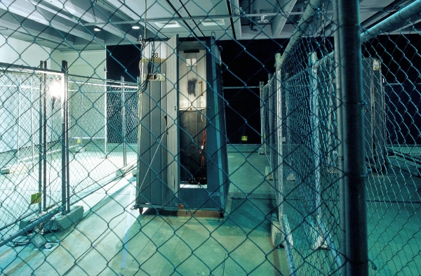
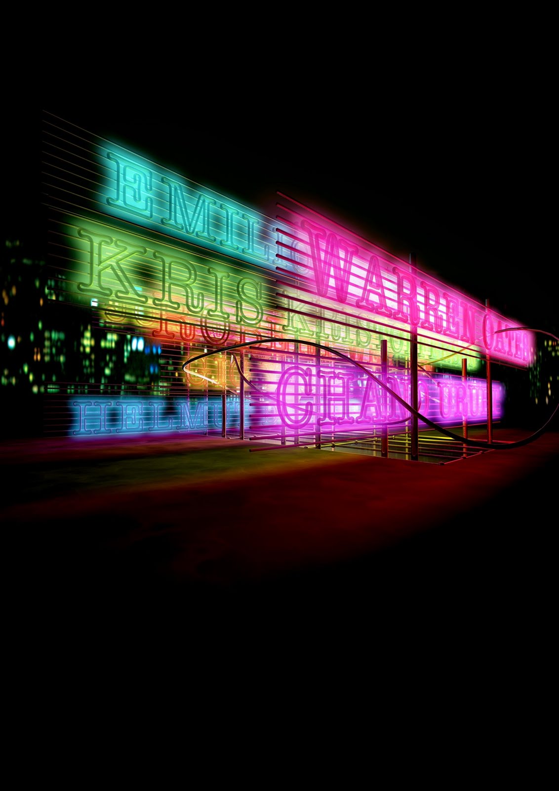
Outdoor Cinema presents architectural plans—from basic line elevations to fully rendered 3-D ‘artist’s impressions’—for four imagined outdoor cinemas: an underground one, a circular one, a wedge-shaped one for a hillside, and one elevated on poles. In these odd structures, films would be shown in eccentric ways. For instance, in the Underground Cinema, conceived for the Desert Road (as a neighbour for Waiouru’s bunker-style National Army Museum), Speers would continuously screen Sam Peckinpah’s ultra-violent 1974 road movie Bring Me the Head of Alfredo Garcia.

Preposterously ambitious, Outdoor Cinema recalls monumental heroic American earthworks of the late 196os and 1970s, which were often placed in desert locations. The irony is that these earthworks promoted a direct engagement with the specifics of site, the here and now, while cinema is a means of virtual tourism, offering transport to elsewheres and elsewhens. Outdoor Cinema is an odd mix of the site-specific and the site-irrelevant.

Curator/Surfer

Flying Arts Gazette, no. 90, 2006.


Contemporary-art curators are to art as surfers are to the ocean. We surf the waves of art. Oceanographers and fishermen appreciate the waves in one way, but surfers know them in another. As surfers, we are necessarily fickle. We go where the action is. We are not loyal to any single wave, but to ‘the waves’. When one wave dies, we paddle out and catch another. We walk, hitch, drive, or fly in search of surf. We spend a lot of time in the water, but only moments on the board, but that’s what it’s all about. To do it properly, you need to know stuff. You need to line up some fugitive and ineffable things: the right beach, the right wind, the right swell. Of course, the game itself has changed. In the old days, it was all about running away from the wave’s power, enjoying protracted, slow, arching turns. That was the graceful, long-board Malibu style. Nowadays, it’s our pleasure to linger in the power zone, requiring short boards and a responsive, jerky agility. But some people still do it the old way.
.
I’m a contemporary-art curator, an exhibition maker. I caught the art bug when my dad took me to the Auckland City Art Gallery to see the touring MOMA Surrealism show some time in the early 1970s. I was about nine, at the time. A lot of kids come to art through surrealism, it seems. I realised I wanted to be a curator when I was in my last year at high school, studying renaissance art history. But, looking back, I wonder if I even knew what being a curator meant. I went to university and did art history plus a few art-school papers. I hung out on the art scene and attended openings religiously. I got a placement as a curatorial intern at Wellington’s National Art Gallery in 1985 and I’ve been working as a curator ever since. I’ve been rather lucky. I climbed on early and stayed on. With just a Bachelor of Arts degree, I am less qualified than most of the guides who worked on the floor at my last public gallery.

I’ve worked as a curator for twenty years now, in New Zealand galleries big and small, in the cities and in the sticks. I was a curator at the National Art Gallery, at New Plymouth’s Govett-Brewster Art Gallery, and at Dunedin Public Art Gallery. I directed Artspace, Auckland’s contemporary art centre, for five years, and then worked as contemporary art curator at Auckland Art Gallery. Now, I’m at the Institute of Modern Art in Brisbane. Over the years, I’ve made all sorts of shows with artists from New Zealand, Australia, and all over the world. My international curatorial experience includes organising New Zealand representation for the Asia-Pacific Triennial in Brisbane in 1999, Arte Guarene in Turin in 2000, the Sao Paulo Bienal in 2002, and the Venice Biennale in 2003. I never say no to travel.

Curators are lucky. We enjoy a very privileged relationship to art. Our work combines aspects of what the artist does (making shows, making art) and what the viewer does (having the experience, navigating it all). I love that combination of production and reception, having a foot in each role. I value the ‘show biz’ factor and the ‘feed your head’ factor. I like the excitement of putting on a show that people are talking about, and I like the fact that I can learn so much about art and other things along the way. And being a curator is a great calling card.

When I say I’m a curator, people often ask: ‘But do you do anything yourself?’ Meaning: ‘But do you make your own art?’ The truth is, I never wanted to be an artist. Curators and artists have a lot in common but there are big differences. To succeed, artists need to develop a very particular set of concerns, a focused body of work, whereas curators can chop and change. I prefer that promiscuity, that intellectual freedom. A lot of people complain about the fickleness of curators and of the scene in general, but I think it’s generative. It’s the life of contemporary art. It’s far preferable to stasis and orthodoxy and the canon.

I started curating at a time when curators had got big-headed. The new ideas associated with postmodernism allowed them to imagine themselves as authors. Curators like Harald Szeemann (who called himself a ‘spiritual guestworker’), Rudi Fuchs, Jan Hoet, and Christian Leigh were stars. They split from traditional approaches and the scholarly methodologies of art history to become more speculative, rhetorical, playful. They made curating cool. Szeemann particularly established the idea of the curator as a showman, conjuring with cultural capital. Under their influence, curators everywhere began presenting themselves as cultural mixmasters, as uber-artists who made their own art by juxtaposing artists’ works. Suddenly thematic, issue-based and Zeitgeist-diagnosing shows took priority over retrospectives. For a moment artists were grist to a curatorial mill.

The work I did through the late 1980s and early 1990s was informed by this adventure. I was motivated by the thought: what happens if I hang this next to that? This code-clashing curatorial imperative was aligned with the philosophies of appropriation and image-scavenging current in art at that time. If artists would reiterate and recode other artists’ imagery to their own ends, why couldn’t curators?

For me, this impulse culminated in Headlands: Thinking through New Zealand Art, which I curated with Bernice Murphy for the Museum of Contemporary Art in Sydney in 1992. A survey of New Zealand post-war art, it remains the most comprehensive export exhibition of New Zealand art ever. But in place of the careful art historical approach one might expect from such a show, Headlands was wilful. We put together works in odd but also oddly plausible ways, leveraged on iconographic affinities and rhymes of style. We read the art against the grain—against the grain of orthodoxy anyway. Back home, the show proved controversial. Its critics included artists in the show.

Headlands was an exercise in deranging the canon, but it was also very curator-centric. You always had a sense of a curator being behind the scenes pulling the strings or pointing. Doing Headlands got that overtly-curated approach out of my system and I’ve never wanted to do a show like that since. It freed me up to do different kinds of projects. Since then I have focused more on solo shows and artists’ projects where the curator’s role is less prominent, less explicit but no less important, and where there’s more collusion. That was especially so in my time at Artspace, where the program was based on a quick turnover of solo shows and artists’ projects.

I like the craft of exhibition making, the intricacies, the problem solving. When I make a show, I have to think about which artists, which works, and how I’m going to articulate them in space. But it’s more than that. I have to think about the design of the catalogue, the marketing campaign, the flavour of the education programmes, who is going to review it (and how). I have to think about the way the show operates within the frame of the gallery’s program, the artists’ practice, and the history of my own shows. I need to take into account everything that contributes to the way the show reads.

For me, curating has always been stimulating—such a pleasure. So, I am surprised that so few art-history graduates want to go on to be curators. When would-be curators start out today, it may seem that there are limited opportunities, but there are lots of ways to get experience without having a museum job and getting that experience puts you at the head of the queue. If you are interested in becoming a curator, I suggest you simply roll your sleeves up and dive in. Infiltrate the scene, get to know the artists and other players, put together some shows for artist-run initiatives, and get your writing out there—establish yourself as a voice. Curating is one of those things you learn by doing. The next wave is yours.
.
[IMAGE: Robert Longo Untitled (Backdoor Pipeline, Hawaii, Spring 1999) 2000]

Gordon Walters: Form Becomes Sign

Art and Australia, vol. 44, no. 2, 2006.   


The Asia Pacific Triennial always offers a particular slice of New Zealand art, prioritising Maori and Pacific Island work and work engaged with matters of cultural identity. So, when I hear New Zealand pioneer abstract painter Gordon Walters (1919–95) is being showcased in the new APT, it gives me pause. It makes no sense and it makes perfect sense. Walters has had the luck—good or bad—to find his work caught up in a series of paradigm shifts in New Zealand’s art and cultural history. This, as much as the indisputable excellence of his work, has made him New Zealand’s highest-rated modern artist after McCahon. As the purest formalism, Walters’s work was never addressed to cultural politics and really has little to contribute to them, and yet the work has become so embroiled in cultural debates that now it’s hard to see it in any other way. It comes to us freighted with all it is not. How did this happen?

When Walters starts out, there isn’t much of an art scene in New Zealand and little engagement with modernism. Walters’s long-distance relationship with modernism is nurtured by his friendship with émigré Indonesian-born Dutch artist Theo Schoon, who he meets in 1941. Schoon, who did his art school in Rotterdam, fosters Walters’s growing appreciation of modernist painting. He also shares Walters’s interest in Maori art and encourages him to introduce indigenous elements into his work. Unlike most New Zealand artists of his generation, Walters travels. In 1946, he visits Sydney and Melbourne, making contact with Charles Blackman, Grace Crowley, and Ralph Balson. In 1950, he spends a year in Europe, checking out modern art in the flesh. At the Denise René Gallery, in Paris, he sees the geometric abstraction of Auguste Herbin and Victor Vasarely, and, in the Netherlands, he enjoys Mondrian and Co. Returning to Melbourne in 1951, Walters produces his first non-figurative works, before heading home in 1953. Over the next decade, Walters’s work riffs on modernist abstraction, Maori and Pacific arts, and a folio of intriguing drawings by Rolfe Hattaway, a diagnosed schizophrenic at the Auckland asylum where Schoon worked as an orderly in 1949. Walters’s designy hard-edged abstractions declare his abiding interest in figure-ground ambiguities. 

In 1956, Walters starts exploring the koru, the curving bulb form from Maori moko (facial tattooing) and kowhaiwhai (meeting-house rafter paintings). Through a series of studies, he Mondrianises the koru, straightening and regimenting its scroll-like forms; taking it from organic to strictly geometric. His version of the motif consists of lines and circles: alternating horizontal stripes of equal width with circular terminations, the circles two stripes wide, extending upwards.1 Walters’s koru recalls the Chinese yin-yang symbol, in which dark and light mutually invaginate, each equally figure and ground. Paintings follow. The first is Te Whiti (1964). Walters makes Koru Paintings regularly through into the early 1980s, when he largely exhausts his interest in the possibilities of the form. All the time—before, after, and during—he produces other non-koru works, but the Koru Paintings will become his trademark.

Walters’s oft-quoted rationale is: ‘My work is an investigation of positive/negative relationships within a deliberately limited range of forms. The forms I use have no descriptive value in themselves and are used solely to demonstrate relations.’2 Despite their restricted language, there’s huge and subtle variety in the Koru Paintings. Some are sedate, others jaunty; some are assertively flat, others push out into three dimensions. Walters discovers and explores all manner of effects through varying, for instance, the proportion of the stripes, the density and orientation of the circles, the size and shape of the support, and the colour scheme. (While the Koru Paintings are typically remembered as black and white, Walters actually engages a variety of contrasts of tones and hues.) With their uninflected surfaces and precise geometries, the Koru Paintings might seem cool and mechanistic. In fact they are highly intuitive, with Walters adjusting paper collage mock-ups to determine his compositions seeking an ineffable rightness. 

The Koru Paintings have much in common with the contemporaneous op art of Victor Vaserely and Bridget Riley. They are phenomenological. They play on the way we see; they test our ability to map them. The compositions are organisations of tracks and gates for channeling vision. They have an implicit grid: the lines providing the horizontal element, the circles the vertical. Our eyes scan the lines, coming to rest on the circles; then, travel up and down and through alignments of circles. Circuit diagrams are thought to have influenced Walters, and the idea of switching is key. Curious figure/ground shifts occur as our brain tries to resolve whether to prioritise the lines or the circles. When we attend to the lines, our mind privileges the distinction between the contrasting colours, reading one or the other as figure, or oscillating between these alternatives. But we privilege the circles, we see them—positive and negative—collectively, as disruptions from the regularity of the striped field, which falls into the background. In some paintings we even link positive and negative circles jointly as a shape. The Koru Paintings’ great achievement is to hold these different formal possibilities in equilibrium, so they flicker under our scrutiny. This is not something Walters takes from Maori art, but is tied up in his particular stylisation of the koru.

The reception of Walters’s work is a complex matter. In the late 1950s and 1960s, the New Zealand art discussion is dominated by a search for national identity. ‘The big three’—Colin McCahon, Toss Woollaston, and Rita Angus—are local-landscape painters, and the big arguments are about New Zealandness. Abstract work is shown, but there is barely a discourse around it. It’s a blindspot. There is little understanding of modernist painting and the scene just doesn’t get formalism, preferring to see abstracts as symbols and emblems. While abstract painters like Milan Mrkusich are included in the New Zealand painting canon, their interests are not engaged by it. So, perhaps it is not surprising that, apart from his 1947 show at Wellington’s French Maid Coffee House, Walters does not exhibit in public until 1966, by which time the Koru Paintings are fully developed. 

In 1969, Hamish Keith and Gordon Brown release their gospel, An Introduction to New Zealand Painting 1839–1967. Abstraction is mentioned, Mrkusich and Walters are mentioned, but the thrust of the book is elsewhere, promoting and entrenching the idea of a national school built around a representational landscape tradition. For a decade or so, the Introduction is hugely influential on the New Zealand art scene. But there’s resistance. The more-or-less-Greenbergian critic Petar Vuletic counters the parochialism of the national school idea, championing Walters and Mrkusich as the maligned real heroes of New Zealand art, and fosters a new generation of artists emerging in their wake. In 1972, he opens Petar/James Gallery in Auckland, to provide a more sympathetic environment for abstract painters to show in. With this move, formal abstraction seems to pull out of the mainstream of New Zealand art somewhat, to go its own way. 

In the early 1980s, the tide turns and formal abstraction is belatedly recognised. In 1982, abstract painters claim the future in the presumptively titled show Seven Painters / The Eighties. In 1983, Walters gets a retrospective at the Auckland Art Gallery, then features centrally in its show The Grid. However, despite the fact abstraction is lauded as ‘internationalism’, the international discussion is moving in another way entirely. Figurative neo-expressionism and various post-modernisms are current. The idea of an inevitably abstract future is gone and Greenberg is now a dirty word. That’s a bit of a problem for the internationalist argument, or it should have been. 

In the 1980s, Francis Pound becomes New Zealand’s most influential art critic. When Brown and Keith’s Introduction is re-released in 1982, with a new chapter but with its old biases intact, Pound savages it. Pound resents its nationalism and wants to praise whatever stands in opposition to it. So he asserts the international, both the modernist formalism of Walters and Co. (what was international then) and anti-modernist post-formalist post-modernism (what’s international now), skipping over the obvious philosophical clash. New Zealand is a time-lagged provincial art-culture playing catch-up, and a modernism (which understands abstraction as form) and a post-modernism (that wants to read it as sign) seem to arrive in the same breath and share the same foe. Walters gets caught in the conflation.3 

Walters’s advocates assert his nobility in the face of the culture’s neglect: his work becomes synonymous with abstraction as a cause. His work is increasing centralised in the story and becomes increasingly collectible. If the New Zealand art market had once turned its back on abstraction, now it makes up for it: abstraction is seen as advanced taste. But no sooner has Walters attained his place in the sun than his work is challenged from a new quarter. As Maori issues hold increasing sway and as contemporary Maori art claims increasing attention, Walters (who has now largely stopped making Koru Paintings) is tried as an appropriator, for stealing the thunder from Maori art and for misrepresenting things Maori. The tone of the times is typified by Maori writer and academic Ngahuia Te Awekotuku, interviewed in Antic in 1986, who slates Walters for ‘plundering’.4 

Heavily informed by Thomas McEvilley’s critique of the Museum of Modern Art’s 1984 Primitivism show, the New Zealand appropriation debate comes to a head with the exhibition Headlands: Thinking through New Zealand Art at Sydney’s Museum of Contemporary Art in 1992 (I was one of the curators).5 The show willfully presents Walters’s work alongside trailblazer Maori modernists like Para Matchitt (who was clearly influenced by Walters) and Sandy Adsett, in an attempt to reimagine his work as part of a wider national cultural discourse. However, it is less the show than Rangi Panoho’s catalogue essay that generates the furor. Panoho criticises Walters’s ‘programme of abstraction … which progressively simplified the [koru] form, divesting it of meaning and imperfection and distancing it from its cultural origins’.6 Panoho counterposes Walters as the bad appropriator with Schoon the good. For Panoho, Schoon treats Maori art respectfully, seeking understanding, while Walters takes without giving back. But it’s an arbitrary distinction. Sure, Walters drew on formal aspects of Maori art and he did not claim access to Maori cultural knowledge. But this could also be seen as respectful compared to Schoon, who presumed to regenerate what he saw as a dead tradition. 

Paradoxically, rather than undermining Walters’s status, the debate proves crucial in keeping his work in the public eye, allowing its defense to be vigorously maintained. Walters’s supporters circle their wagons. In 1994, Pound publishes The Space Between, a book-length response. He marshals fascinating facts, but is anxious to consider them only in ways that advance a case against Panoho. If the appropriation debate was simplistic, now it becomes scholastic and arcane, turning on the relative weight and interpretative slant that can be given to details. Pound makes a lot of Walters’s and Schoon’s involvement as illustrators for the Maori Affairs Department magazine Te Ao Hou in the 1960s, countering Panoho’s suggestion that Walters gave nothing back. He skips the old argument—of Walters as an abstract painter unconcerned with the koru’s cultural values—to recast him a harbinger of biculturalism, a broker of a different brand of national identity. Pound’s case-for-the-defence involves such deftly spun arguments that the book ends up pointing to what it wants to deny—that there’s a problem here. But in a way, it doesn’t matter. The appropriation debate is a moral debate not an art-historical one. It doesn’t say anything about the qualities of Walters’s art and Walters’s art really has nothing to add to it: Walters’s work is not about ‘cultural issues’.

The debate swarming around Walters’s koru participates in its transformation from form into sign. Walters’s modernised koru is hugely influential on graphic designers: its reconciliation of opposing forms—black and white, circle and line—inform new emblems of cultural reconciliation.7 While the artworld argues about its cultural safety, the wider culture adapts the Walters koru as a badge of biculturalism.8 Designer Michael Smythe even proposes a new New Zealand flag based on it, arguing it offers ‘an astute metaphor for the bicultural basis of our nation. The black is distinguished by the presence of the white. The white is distinguished by the presence of the black … one colour comes to the foreground and flourishes. But it becomes infinitely enriched when that dominant colour backs off and allows space for the other to flourish alongside. It eloquently articulates the emergence of our nation.’ ‘This is not what Gordon Walters had in mind’, he adds.9 

Walters’s work also becomes a sign in art. Starting in the late-late 1980s Julian Dashper quotes Walters’s aesthetic to express a nostalgia for a heroic modernism marginalised in New Zealand, literally so in a series of works in which he writes the date ‘1960’ using french curves. Others follow suit. And, in the wake of Headlands, artists—including young Maori artists like Peter Robinson and Michael Parekowhai—quote Walters’s koru as shorthand for the debates that now flow around it. (Walters’s 1968 canvas Kahukura and Parekowhai’s giant kitset version of it, Kiss The Baby Goodbye, 1994, both feature in the new APT.) Even those who hurry to Walters’s defense participate in his post-formalist undoing. In the wake of Headlands, jeweler Warwick Freeman designs his Walters-styled Koru Whistle (1993), ironically pitched to cultural whistle-blowers. ‘Rape whistles were in vogue’, Freeman recalls.10

After Walters’s death, Richard Killeen eulogises him in his 1996 Sue Crockford Gallery show, The Dreaming of Gordon Walters. Killeen’s paintings combine Walters-style abstracts with figurative images that rhyme with them. Killeen goes on to use Walters’s koru to represent all manner of things: corpses, canoes, war-plane insignia, and body armour. Killeen’s response to Walters is complex, even conflicted. Killeen has survived a major paradigm shift, evolving from a formal-abstractionist showing with Vuletic (with Walters as his mentor) in the 1970s into New Zealand’s pre-eminent postmodernist sign painter in the 1980s. His 2001 painting Local Face exemplifies but also critiques the transformation of Walters’s koru into a sign. Four blank white-male Identikit faces are given Walters korus for features. The korus are arranged into alternative countenances, happy and sad. The image carries suggestions of identity, criminality, blindness, and gagging.11 The alternative arrangements of the koru features recall the logic of Killeen’s classic post-formalist cut-out paintings, whose component images can be arranged in any order and are offered up for viewers’ free association, supposedly unencumbered by a sovereign authorial logic. Local Face deftly expresses Killeen’s ethical conflict, between his cut-outs’ ‘democratic’ ideals—that empower readers (the so-called ‘death of the author’)—and concern at what Walters has suffered at the hands of his readers.

The fate of Walters’s koru is at once fascinating and tragic. We are all familiar with the intentional fallacy: a work’s meaning is not what its author intended, but a function of the way it is received by and employed within the culture. But it is equally true that the Koru Paintings have become so totally subsumed by cultural issues that this has blinded New Zealand audiences to the way they operate as paintings, their formal-phenomenological concerns. While it has been argued that Walters appropriated and silenced things Maori by reading them in terms of his own interests, one can see that the culture appropriated and silenced Walters similarly. So, in showcasing a group of Koru Paintings, will the APT continue this process? Or, by presenting the Koru Paintings outside New Zealand and its thorny local politics, perhaps there is finally a chance that they might be enjoyed for what they are—works that remain to be seen.
.
[IMAGE: Gordon Walters Painting No. 1 1965] 


  1. A few works feature vertically oriented korus. The 1972 painting Black Centre is rare in featuring upward and downward circular terminations on horizontal korus.
  2. Statement from the invitation to Walters’s 1966 New Vision show.
  3. Pound’s revision of New Zealand art history is more conservative than it appears. In focusing on Brown and Keith’s book, Pound suggests the debate in the early 1980s is still where it was back in 1969. In the process he obscures and downplays other domains of art inquiry that largely emerged in the 1970s: post-object art, contemporary Maori art, the women’s art movement, and photography. Compared with them, formal abstraction is only relatively marginalised.
  4. Shown a slide of Walters’s 1968 painting Mahuika, she famously complains: ‘I can only respond, at this point anyway as an individual and as a Maori, as a Maori woman. I think it’s damn cheeky! The insolence of the man is extraordinary! The gall! The sheer gall! Mahuika is … a lady of fire, of strength … and there she is, all black and blue! Frost in the night. Weird.’ ‘Ngahuia Te Awekotuku in conversation with Elizabeth Eastmond and Priscilla Pitts’, Antic, no. 1, 1986: 50. The matter of Walters’s titles is a gnarly one. According to legend, he frequently sourced his Maori titles from street names. His images were never intended to illustrate their Maori titles.
  5. ‘Doctor, Lawyer, Indian Chief: “Primitivism in Twentieth Century Art” at the Museum of Modern Art in 1984’, Artforum, November 1984: 56–60.
  6. ‘Maori: At the Centre, on the Margins’, Headlands: Thinking Through New Zealand Art (Sydney: Museum of Contemporary Art, 1992): 130.
  7. Walters himself designed a koru logo for the New Zealand Film Commission back in 1979.
  8. From 1984, New Zealand is defined by a perverse conflation of ideologies—New Right economic rationalism and biculturalism—and state agencies especially are rebranded with feel-good bicultural liveries. For Walters’s place in this, see Anna Miles ‘Peter Robinson, Gordon Walters, and the Corporate Koru’, Art Asia Pacific, no. 23, 1999: 77–81.
  9. ‘The Return of the Flutter Bug’, Listener, 21 February 2004: 29–30.
  10. Email to the author, 2006.
  11. See also Anna Miles, ‘Koru Koru Koru: The Freewheelin’ Richard Killeen’, Art Asia Pacific, no. 36, 2002: 40–5.
    .
    [I’ve made changes to this essay since it was published in Art and Australia, including correcting one major, glaring, rather embarrassing error. I originally referred to Ngahuia Te Awekotuku praising Chris Booth’s and Colin McCahon’s use of Maori imagery before she criticised Walters’s in her 1986 Antic interview. In fact, Te Awekotuku expressed concerns over McCahon’s work The Canoe Tainui, then went on to praise the beauty of Chris Booth’s work (saying its sense of land and space ‘makes it indigenous’) and McCahon’s Waterfalls (which do not use Maori imagery), before criticising Walters. Sloppy, sloppy, sloppy. My apologies to Ngahuia Te Awekotuku.]

Et Al.’s Neo-Brutalist Playground

Et Al.: The Second of the Ordinary Practices (Brisbane: Institute of Modern Art, 2006).


Not only are they not being abused, they are still providing relevant and valuable information. Read the article and check out the long list of links. Michelle has been on top of this story since the beginning. The cookbook contains nearly 100 actual recipes and menus for the food served to the Gitmo detainees, along with interesting quotes and facts about how American soldiers are working every day to treat prisoners humanely while still getting the information we need to protect ourselves. ALL PROFITS GO TO THE USO.

.
The devious New Zealand collective Et Al. are known for their moody installations linking art, technology, science, politics, the occult, surveillance, and indoctrination. For their exhibition The Second of the Ordinary Practices, the Institute of Modern Art has been theatrically made over to suggest a makeshift laboratory, temporary workshop, construction site, or internment camp. Visitors used to ambling around the massive gallery will feel constrained. The darkened partitioned space leaves little room for the viewer. Behind cyclone fencing units that scream ‘No Trespassing’, ‘Autonomous Purification Units’ trundle erratically back and forth across the floor on wires, driven by cranky mechanisms. Crudely constructed and functional-looking, the APUs recall human-proportioned garden sheds, sentry boxes, port-a-loos, confessionals, and orgone accumulators. From speakers within, computer-generated voices read extremist texts from cults in art, religion, and politics. Transcripts of some of the texts are video-projected. The primitively engineered ensemble appears to be driven from a computer desk in another room, but there’s no sign of the controller; perhaps it’s on autopilot. Disoriented, viewers might wonder what they have stumbled upon. The purpose—diabolical or benevolent—remains unfathomable. Et Al. prompt us to consider both possibilities.

The Second of the Ordinary Practices is a rejigged version of The Fundamental Practice, New Zealand’s 2005 Venice Biennale project. In the Venice catalogue, curator Natasha Conland put a positive spin on the work. While the APUs spouted extremist views, she argued that Et Al. juxtaposed extremisms only to create a cacophony of conjecture, refutation, and opposition—the antithesis of fundamentalism. For Conland, the fundamental practice was ‘parliamentary rather than symphonic’, a model of democracy in which all can be heard, rather than a totalitarianism in which everyone marches to the same beat. Similarly New Zealand Listener reviewer Ian Wedde cast the work as reasonable, describing it as ‘a complex accumulating dossier of evidence and a programme for managing and analysing it’. These readings may have been concerned to sell the work to a New Zealand public anxious at the cost of participating in Venice, but they sidestepped the work’s great virtue, its sheer ambiguity. While Conland might consider The Fundamental Practice a parliament, the APUs are not listening to one another, or moving towards concensus, just talking past each other. Conversely, despite their radically different pronouncements, the APUs could also be seen as implicated in a conspiracy as parts of the same machine. So, contra Wedde, The Fundamental Practice is just as plausibly a Hydra-headed brainwashing machine whose conflicting expressions exist only to befuddle and destabilise us. The work’s overt ambiguity speaks to our ambivalence: it asks us why we want to read it in the way we do.

Et Al.’s work has always been rife with conflicts and misdirection, and impossible to pin down. It’s hard to distinguish what’s crucial, what’s contingent; what’s signal, what’s noise. While the collective famously engage in postmodern play with personae, persistently exhibiting under noms-de-plume and sidestepping interviewers, the work is instantly recognisable, and astonishingly consistent even signature in style and content. Et Al. may use conceptual art formats and trowel on philosophy citations, yet, perversely, beneath this, the work feels almost expressionist—emphasising mood and sensibility. The work is haunted by authority figures, quoting heavily from Duchamp, McCahon, and others, but are they being celebrated or mocked? The work is full of references to things institutional, but it is never clear whether Et Al. are at war with the institution, conspiring with it, or both. Et Al.’s refusal to reveal their identity is promoted as a fighting the power, not playing the art system’s name game, but it could equally be an assertion of institutional politics, an evocation of top secrecy and strictly-need-to-know-basis.

Of course, Et Al.’s work is not about analysing or attacking real institutions. It doesn’t offer concrete insights into al-Qaeda, Rio Tinto, Opus Dei, or the Bush government. Rather, it’s a dystopian fantasy. With their bleak, grungy aesthetic and penchant for detention-centre decor, the artists have perfected a signature scenography. Recalling Louise Bourgeois’s Cells of the 1990s, the mesh enclosures and brooding atmospheres of Et Al.’s recent installations allow the artists—and ourselves—to explore inner conflicts over authority. We can play prisoners or warders. We can rail against the system or perversely overidentify. If the super ego is the external social world imprinting itself upon us (masquerading as our own inner voice), Et Al. project their sensibility out into the world (masquerading as the Big Other).

Et Al. give us cause to think that perhaps that eternal bogey, ‘the institution’, was only ever a fantasy; one which answers our needs, even as, and especially when, we feel ourselves done wrong by it. Which may be why some of us can only feel truly ourselves, only know ourselves, only feel release, when constrained. Prisons are us.

Hany Armanious: Catalogue of Errors

Hany Armanious: Morphic Resonance (Brisbane: Institute of Modern Art, 2006).


In former times towers, pyramids, candles, milestones and even trees had a phallic significance, and for Bouvard and Pecuchet everything became phallic. They collected swing-poles of carriages, chair-legs, cellar bolts, pharmacists’ pestles. When people came to see them they would ask, ‘What do you think that looks like?’, then confided the mystery, and if there were objections they would shrug their shoulders pityingly.
—Gustave Flaubert, Bouvard and Pecuchet1

•
Hany Armanious’s work used to perplex me. I was unsure where he was coming from. Was he making fun of superstitious neo-pagans, quaint crystal-gazers, and Raëlians, or was he one of them himself? I couldn’t tell whether he believed in his elven foundries, psychedelic mythologies, and new-age cosmologies, or not. If he was sending up his occult sources, how had he become so au fait with them? I was afraid of discussing this with him for fear of getting it wrong and committing some dreadful gaffe, presuming him to be a believer when he was not, or vice versa. Now I realise that my confusion is central to his work.

•
One of the most persistent features of Armanious’s work has been his fascination with the process of casting. It has become the backbone of his inquiry, as both method and subject. He seems obsessed with its practical as well as its semiological and metaphysical implications, which have become conflated in the work. His grail-quest has unfolded and deepened in successive shows, without finding any ultimate resolution. Nothing is really explained or cleared up, and we get mired in complexity, elaboration, digression.

In 1993, Armanious discovered ‘hot melt’, a liquid petroleum-based vinyl that can be coloured and cooked up on a stove top, and that sets quickly to form a rubbery cast. It became his muse. He experimented with it, sometimes casting it into found objects, using them as moulds, or dropping it, molten, into water, where it would instantly congeal. Without a mould, the hot melt forms blobs and folds that betray its nature—its viscosity and the speed at which it sets. Armanious took liberties with the stuff, revelling in the diverse inchoate forms it would take, his efforts recalling wobbly viscera, blubber, toxic chemical residue, sump matter, blobs, dribbles, flanges, ectoplasm. One might imagine that the artist lacked control or that the material had a mind of its own.

In 1994, for the first solo show at a new dealer gallery, Armanious arranged the lurid technicolour products of his experiments on four basic workshop tables. Collectively, they suggested the yield of an archaeological dig; a fabulous landscape of fragments to pick through, play with, and compare; an out-of-control chemistry experiment; a kindergarten wet area. Armanious titled the show Snake Oil, advertising his beloved hot melt as an elixir, a Wild West cure-all (perhaps imagining it to be a quick fix for all his sculpting problems). The title also suggested a hoax, something bogus, having the wool pulled over our eyes; making the artist—the work’s peddler—a charlatan. True to their name, Armanious offered his abject lumps for sale by the pound, inferring that their value was in the material rather than what he had done with it. Snake Oil seemed to make light of the new gallery’s business and its congregation.

Despite the suggestion of a hoax, Snake Oil‘s shapes remained fascinating, magical. According to Armanious, the title was a nod to Carlos Castaneda, the popular hippie-period author who introduced peyote-inspired quest philosophy and shamanism into popular culture. Castaneda’s informant, Don Juan, the Mexican Yaqui Indian shaman, had explained to him that we are possessed by predatory reptiles that control our minds from their subterranean realm. ‘There are no more dreams for man but the dreams of an animal who is being raised to become a piece of meat: trite, conventional, imbecilic’, reported Castaneda, complicating the theme of human gullibility.2

Later, in 1998, Armanious created a neat and tidy sequel, Untitled Snake Oil. He poured the candy-coloured vinyl into wine glasses, casting the space that a magic potion would fill. He turned out the solidified volumes like mousses and jellies, perching them triumphantly atop their inverted moulds, making those moulds into dainty plinths, directing us to consider the oddness and variety of the glasses’ internal spaces. It was, as if, after the botched forms of Snake Oil, the alchemist had finally got it right. His upraised casts had become a phalanx of curious comic characters, each with a different personality: some blunt, some pointy; some graceful, some squat. His variations-on-a-theme suggested abstracted figures (like chess pieces), Disneyland architecture (towers, domes, minarets), mushrooms and toadstools (with all their pixie-psychedelic implications), and silicon breasts and sex toys.

If Snake Oil was fleshy and deranged, Untitled Snake Oil was shapely and prim. While Snake Oil recalled viscera on a mortuary slab, Untitled Snake Oil was civilised, recalling like teacakes on individual stands. The two states implied polarised brands of pleasure: the jouissance of the rude, excessive, and meaty on the one hand; the discrimination of the refined, discrete, and nicely-done on the other. And yet each state also seemed to imply the other. Snake Oil looked like a collection of failures produced on the way to making a successful casting, while Untitled Snake Oil looked like watercolour pallets, waiting to be dissolved. This dialectic of form and informe, of making and unmaking, has become a constant feature in Armanious’s work.3

•
Snake Oil and Untitled Snake Oil were like art wares on display, but with his room-scale installation Selflok (1994–2001) Armanious looked behind the scenes, into the artist’s studio, or rather a fantasy of it. ‘It is almost as if we were witness to a primal scene in the life of the work’, wrote Eve Sullivan at the time.4 A rig of cauldrons, alembics, and steins rested on a makeshift platform of fake-wood polyester shelving crowned with a pergola. A frozen river of hot melt nectar descended a channel, coming to rest in a little pot. The scene suggested Santa’s workshop, a hobbit foundry or elven distillery, a Middle-Earth drug lab. The machine was littered with bits-and-bobs, like a giant mantlepiece. A collection of found ceramic tchotchkes, suggesting a gingerbread-house view of medieval Europe (the domestication of some distant woodcutter memory), communed with lumps of hot melt, many of which appeared to have been cast in the ceramics, Armanious promiscuously dribbling his favourite substance into the hollows of upturned vessels and figurines as if to see what would happen. The result: a plague of ‘abject “bunnies”, gnomes and other anthropomorphic beings’.5

Selflok was fanciful. Much of it was produced on a Moet et Chandon residency in the French countryside, in idyllic Champagne country, at a time when Armanious was notoriously haunted by rustic stereotypes, explaining that he saw pixies in the texture of the wallpaper in his chateau. Like many of Armanious’s works, it was an allegory of art making. It was a classic demonstration of bricolage, the French word for ‘do it yourself’. Unlike the engineer, who is systematic, the bricoleur cobbles things together in a make-do fashion, using materials to hand in a provisional way, for purposes they were not designed for. Certainly Selflok was improvised from bizarre elements: a ceramic in the form of a hardcover book simultaneously propped up a shelf and provided a channel for hot melt, which trickled from it into a receptacle (a metal gnome mould); packaging for two Elf Shelf Kits (the kitset shelving unit which had sparked the work); and a framed found photo of a strongman, standing before a huge woodpile, bearing a stove on his shoulder.

Selflok was sheer kitsch: a whimsical evocation of a supposedly pre-industrial artisanal past. A bowdlerised Teutonic fantasy, like something out of Walt Disney, it seemed to revel simultaneously in nostalgia and debasement. Back in 1939, in his famous essay ‘Avant-Garde and Kitsch’, Clement Greenberg railed against kitsch, which he saw as pretend-high-culture, marinated in sentimentality to make it palatable for the plebs.6 But Selflok suggested something else again if read in relation to 1980s contemporary art’s ‘high culture’: those German neo-expressionists with their celebration of folk-nationalist traditions—Anselm Kiefer, with his preposterous occult beliefs (frequently passed off as weighty historical engagement) and Georg Baselitz (with his love of woodland tropes, his preference for the gnome over the angel). Selflok didn’t add something bogus to high culture so much as make explicit something already bogus within it, as if flagging high culture’s unadmitted truth.

•
An age-old procedure, casting remains the basis of contemporary manufacturing. Just about every mass-produced thing made of plastic or metal is made by casting. However, its role in art is more specific. Traditionally, casting has not been a primary medium but a means of reproducing fragile carved or moulded forms in durable metal. In the second half of the twentieth century, however, artists were drawn to casting as a process in its own right, often treating the world as they found it as a mould.7 Art’s interest in casting-as-process was keyed to a shift from representation to literalism, which became most apparent with conceptual art in the 1960s and 1970s. In her famous essays ‘Notes on the Index’, Rosalind Krauss argued that conceptual artists preferred collecting impressions, traces, or measurements of the world to picturing it.8 A textbook example was Richard Serra repeatedly casting molten lead into the edge where floor meets wall in the Leo Castelli Gallery in 1969. Armanious engages with the literalism of ‘process art’ while also aware of artists who were attracted to casting for its occult appeal, its potential for contagious magic.

Armanious called a 2004 show The Cult. A cult is a small community of believers at odds with the mainstream, galvanised by conviction. We share the same world, but for the cult members it is animated by altogether different meanings. Armanious’s show featured three still-life arrangements, collections of similar-looking objects. One had the sense of looking at an obscure ethnographic museum display where, lacking context, one couldn’t tell whether what one was seeing were mundane utilitarian objects or primitive religious fetishes. Although the objects seemed modest, the titles hinted at a grand, obscure ‘cultish’ significance. Then again, the titles also seemed to strain plausibility, as though mundane objects had been mislabelled, wilfully or cluelessly. There was a sense that they could be viewed or valued either from within or from without a framework of belief, appearing radically different in either case.9

The symmetrical bulbous forms in Finding the Assemblage Point (Clay Pipes from ARABBA) looked like they had been turned, either carved on a lathe or modelled on a potter’s wheel, but, in fact, all were cast. Recalling peppermills, lamp stands, lightbulbs, and Arabic instruments, they were made of wax, suggesting ex votes. Some were formed around wicks, making them candles. Forging the Energy Body (Swegypt) featured castings of bells and horn speakers in aluminium and pewter, perhaps making an analogy between speakers and bells as sound-generators. Amanda Rowell stressed the magical links, writing: ‘Bells are employed in shamanistic rituals, and the material—pewter—has a connection to fortune telling in the northern European practice of casting molten pewter into water at New Year’s Eve and reading the resulting form like tea leaves in order to learn what the coming year holds. Pewter is also a classic material of trinkets and lucky charms.’10 Of course, bells and pewter have just as many banal applications.

The groupings also suggested practical issues for casting. In order to cast the interior spaces of the bells, Armanious had to remove the clappers, which were cast and exhibited separately. Continuing this chain of logic, he found a related formal dilemma in the task of filling a peppermill with peppercorns, a process analogous to casting: the spindle got in the way, nearly impeding the very purpose of the device. This was illustrated by a short video on a monitor incorporated into Forging the Energy Body (Swegypt). Armanious’s concern with the ‘problem of the core’ seemed to relate to the way many of his objects were formed around central wicks, rods, or voids. Armanious focused on the ‘problem of the core’ as if freighted with huge metaphysical import, although how or why it was a ‘problem’ was left hanging.

Armanious also stretched the idea of casting. Scaring Away the Human Form (Death as Adviser) involved the most primitive casting technique. Forms were made by pouring two-part polyurethane into a sack of peppercorns. The fluid traveled through the peppercorns until it set, bonding with them, forming peppery poo-shapes. The work exemplified Armanious’s obsession with casting as ‘the exploration of a cavity by a viscous substance’. ‘In the case of the peppercorns, the cavity did not exist prior to the introduction of the casting medium which permits the discovery, retrieval and revelation of a form that could not otherwise have been known.’11

•
The Cult, with its small objects, was modest and underwhelming at first glance. By contrast, Armanious’s follow-up show Centre of the Universe (Central Core, Soft Core, Hard Core) (2004) was unduly grand. It elaborated on his growing preoccupation with the core. It took the form of an orientalist folly, a ‘sheik’s tent’. Within, a circle of vaguely Middle-Eastern-looking Axminster carpet was littered with peppercorns, whose aroma filled the air. On top of it, a foot-operated potter’s wheel was hoisted up on sawhorses, with peppercorns in its slop tray. On the wheel stood a turned phallic form, like a gigantic Brancusi-esque peppermill turned in clay. It rose magisterially to the roof, where it penetrated a horn speaker at the apex of the tent like a trumpet mute.

From this horn blared Armanious’s Arabba soundtrack, of ABBA pop songs covered cheesy muzak-style on synthesised Arabian instruments. As Jason Markou observed, ‘The key is changed to a minor scale and the tempo slowed. At this key and speed, Arabba aspires to the hypnotic and somber musicality of Islamic devotional song.’12Arabba conflates the Nordic ABBA and Arabia, blue-eyed Scandanavians and swarthy moors, dancing queens and whirling dervishes.13 As we were at ‘the centre of the universe’ perhaps Armanious was hinting at a cosmic ‘singularity’, as occurs in the vortex of a black hole or at the birth of the universe, when the laws of physics don’t hold and relativities collapse.

Around the ‘central core’ were two C-shaped tables. Inscribed on one was a ‘double C’ Chanel logo, marked ‘crop circles’, perhaps reminding us of the theory that crop circles are formed from the air—the crop circle being simply a cross-section of a bell-shaped field of emanation. On the tables, a variety of turned-looking cast objects were displayed as wares. Some suggested take-home souvenir versions of the big peppermill. The selection was rife with formal puns (a burnt-out lightbulb-candle) and dysfunctional simulations (peppermills that can’t grind, bells that won’t ring). Armanious’s objects were also sexually evocative, suggesting variants on elemental Hindu lingam (phallic/male) and yoni (vulval/female) forms, and recalling Marcel Duchamp’s sculptures from the 1950s that played on male and female sexual organs as mould and cast.14 There was even a glass bowl of castings of keys—an obvious reference to swingers’ ‘key parties’ as well as being another variation on the lingam-yoni theme. This pornographic twist was echoed in the subtitle: ‘Central Core, Soft Core, Hard Core’.15

Centre of the Universe looked back to a pre-scientific time, when people resorted to rustic metaphors to explain the universe (indeed, numerous early cosmologies were based on the potter’s wheel). As with Selflok, we seemed to have strayed backstage, this time into the cosmic engine room. Armanious’s ‘central core’, however, proved to be a mixed metaphor of dubious explanatory value, combining three different devices—wheel, mill, and speaker—whose relationship was compelling but unclear. For instance, it was impossible to know if the potter’s wheel was there to shape the mill or drive it. On the one hand, a flattering analogy was made between the artist and God, the unmoved prime-mover. On the other hand, recalling the scurrilous implications Duchamp drew from chocolate grinders, the work also suggested a giant masturbation machine, whose absent operator could enjoy turning a giant peppermill between his (or her) legs. It was an ego-trip: artist-wanker as centre of the universe, with those peppercorns underfoot exactly like prodigiously spilt seed.

•
Building on and deranging the logics of The Cult and Centre of the Universe, Turns in Arabba (2005) presented a curious selection of Armanious’s fake artefacts—many now familiar—in a large freestanding cupboard. It recalled a Wunderkammer (a cabinet of curiosities) or a cargo-cultist’s closet. It also recalled those quaint museum displays still preserved at Oxford’s Pitt Rivers Museum, which throw together similarly shaped or purposed things from vastly different cultures hinting some underlying shared significance. There, one sifts though the displays trying to work out how the pieces are related, trying to understand both the cultures that fashioned the objects and the culture that grouped them together. The contents of Armanious’s case exemplified and conflated apparent opposites—chic Scandinavian modernism and Arabian bazaar kitsch. Armanious seemed to revel in the fact that these objects, which represent diametrically opposed tastes, share uncanny formal similarities. He was also playing on a coincidence: Arabia is also the name of a Scandinavian brand of ceramics.

While Snake Oil and Untitled Snake Oil were collections of variants, all of their members having a number of qualities in common, the objects in Turns in Arabba were more of a family.16 The collection seemed to exemplify the idea of ‘family resemblances’, in which family members share characteristics but don’t necessarily all have any one thing in common. But was it a real family? Things can share characteristics and not be related. Armanious’s objects seemed linked through a variety of qualities: their shapes, their materials, the processes by which they were made, and their purposes or, indeed, the lack of them (lightbulbs and candlesticks that don’t make light; bells, a wax radio, and a peppercorn microphone that don’t make sound; a bongo drum whose skin has been replaced with a loudspeaker). Many pieces appeared to have been made from one another. Armanious cast replicas of a classic Swedish Orrefors cast glass ashtray (which has an uncanny resemblance to a lingamyoni with its draining lip). He fused two duplicate ashtrays face to face to create a mould (the depressions for resting the cigarette joining to form a sprue), which he then used to cast pewter spheres, which were threaded onto a length of dowel to suggest a classic Scandinavian designer candlestick. So the objects in Turns in Arabba not only suggested fertility fetishes, they were also sexualised at the level of their morphology, their manufacture: everything seemed like it could be cast out of something else—crossbreeding, morphing, mutating, in relays of begetting.17 ‘Turns’ here implied less the turning of a lathe or potter’s wheel than successive complications or generations of an idea.

As much as it was about new life, Turns in Arabba also carried strong funereal overtones. The component objects looked like tomb booty. The extinguished candles and sooty-looking case suggested a vanitas. The wax objects suggested ex votos, and the moulds sarcophagi and Canopic jars. Those ever-present peppercorns might here even refer to the ancient Egyptians, who used peppercorns in the embalming process. On the back of the case hung pewter keys (cast from decorative key-impressions in a found Scandinavian lamp base, one of the objects in the case). With their evil-eye fobs, Armanious’s swingers’ keys now revealed their true purpose: to unlock doors to the afterlife. Sex into death.

•
Armanious’s unruly work has always had a provisional logic. Pieces get radically reworked. Old works are cannibalised for parts to make new ones and titles get changed (much to the despair of art-museum registrars). Projects seep and resonate into one another materially and conceptually. New works derange the interpretations demanded by old ones. The whole oeuvre seems to be ‘grist for the mill’, available to be melted down and recast.

It is often noted that Armanious’s work is marked by its playful use of analogy; links based on resemblances of material, form, function, and process; word plays, homonyms, anagrams. There are rhymes within works and rhymes between works. An habitual category corrupter and cultural recaster, Armanious uses rhyming to connect and conflate opposing values, sometimes with seriousness, sometimes with humour. He exploits our tendency to see links between ideas due to arbitrary superficial resemblances between their signifiers, as if these affinities underpinned a deeper connection—a classic fallacy called ‘isomorphism’.18 Thus he infects process art with hippie-trippy values, he morphs high-minded modernist formalism into rustic neo-paganism, he confuses Scandinavian modernism with Arabian bazaar kitsch, and he short-circuits Bauhaus ‘intelligent design’ with fundamentalist Christian ‘intelligent design’ and Raëlian ‘intelligent design’. Armanious points to the turns of mind that generate these miscategorisations.19

Armanious’s works, and his casting works especially, can be read in counterpoint to contemporary art’s alchemists, the late Joseph Beuys, his disciple Matthew Barney, and their ilk. As Mark C. Taylor attests: ‘For Beuys and Barney, art is a religiomythical quest to overcome social, political, and psychological division and conflict and to recover the unity once enjoyed but now lost. In pursuit of the dream of recovering lost unity, they both return to Celtic mythology and occult spiritualism.’20 They may contrast aesthetically—Beuys’s grunginess being at odds with Barney’s ad-man aesthetic—yet they have much in common. They are both alchemists, assuming that the elemental material transformations they preside over have metaphysical implications. Casting plays a key role in both artists’ practices. Much of the power of their work is generated through complex symbolic systems which mix up ‘engineering’ (metaphysical formulas and geometric schemas) and bricolage (the contingent stuff of life).21 Both conjure with huge swathes of intellectual and cultural history. Like a shell game, we become entranced but never get to the bottom of it.

Armanious shares much with Beuys and Barney: the alchemy idea, conspiracies of art and occult knowledges, fantasies about the artist as the centre of the universe, a preference for arcane complexity and deft equivocation, and a passion for casting.22 But his work couldn’t be more different. Beuys and Barney frame up their endeavours as deadly serious and deeply consequential, suggesting some grand synthesis, while holding it tantalisingly at bay. By contrast, Armanious’s works suggest late-night studio epiphanies, which he or we might well reconsider in the light of day.23 Rather than masterful, his persona has more in common with the old literary trope of the ‘unreliable narrator’. While he engages us in the seductive idea of art as a transformative or transcendental project, the deeper we get into it the more we become mired in mixed metaphors and conceits. This is why, unlike Beuys and Barney, Armanious is ultimately not really an alchemist. Alchemists conflate the physical and the metaphysical—framing their desire to transform base metals into gold as a spiritual quest, say—but ultimately they invest in a distinction between high and low as real, as something out there. Armanious instead revels in high and low as states of mind. His work is psychological and phenomenological rather than cosmological or religious. He sponsors metaphysical inquiry and pulls the rug out from under it.


  1. Trans. A.J. Krailsheimer (Harmondsworth: Penguin, 1986), 114–5.
  2. Carlos Castaneda, The Active Side of Infinity (New York: HarperCollins, 1999), 223.
  3. The play between formed and unformed is there in Armanious’s Muffins (2003–), which combine a moulded base and an overflowing ‘muffin top’.
  4. ‘Hany Armanious: Prostrated Offerings from a Twentieth-Century Alchemist’, Art and Australia 39, no. 2, 2001: 231.
  5. Ibid.
  6. (1939), Kitsch: The World of Bad Taste, ed. Gillo Dorfles (New York: Universe Books, 1968), 116–26.
  7. After centuries of cast figurative sculpture, artists began to cast directly from the body. In the 1950s, Marcel Duchamp made cast-like studies of genitalia (with the pervy thought that a cast of the inward female organs suggested outward male organs, so one might use vaginas to cast penises and vice versa). Through the 1960s and 1970s, inspired by Duchamp, Jasper Johns and Bruce Nauman developed a penchant for casting from real body parts. Casters were also drawn to found spaces. In the 1960s, Bruce Nauman cast the space under his chair in concrete and Richard Serra cast the meeting point of floor and wall with lead. Joseph Beuys made many cast works, notably Tallow (1977) (casting the massive void beneath a Munster pedestrian underpass in fat), and Lightning with Stag in its Glare (1958–85). In the 1990s, drawing on Nauman, Rachel Whiteread would make an entire career from casting neglected spaces, within buildings awaiting demolition and under chairs. And, Matthew Barney, following Beuys, has made casting a staple of his practice. He recently used the tearoom set from his film Drawing Restraint 9 (2005) as a massive mould, casting it in Vaseline.
  8. Rosalind Krauss, ‘Notes on the Index: Seventies Art in America’, Parts 1 and 2 (1977), The Originality of the Avantgarde and Other Modernist Myths (Cambridge, MA: MIT Press, 1985), 196–219. The idea of ‘resemblance by contact’ was elaborated by Georges Didi-Huberman in his 1997 exhibition L’Emprinte (Centre Georges Pompidou, Paris, 1997).
  9. Compare the way utilitarian objects and ritual objects become equalised in ethnographic or art displays.
  10. Amanda Rowell, press release for The Cult, Roslyn Oxley 9 Gallery, Sydney. www.roslynoxley9.com.au
  11. Amanda Rowell, op cit.
  12. Jason Markou, Turns in Arabba (Auckland: Michael Lett, 2005), np.
  13. Elsewhere Armanious refers to ‘Swegypt’, his fantasy amalgam of Sweden and his homeland of Egypt.
  14. The lingam (phallus) is one of the most common Hindu objects of worship. Erect, stylised and austere, it represents the cosmic pillar and emanates its all-producing energy to the four quarters of the universe. As the symbol of male creative energy it is frequently combined with the bowl-like yoni, the source of all that exists. Duchamp’s trilogy of erotic objects are Female Fig Leaf (1950), Objet-Dard (1951), and Wedge of Chastity (1954).
  15. Elsewhere the logo refers to Carlos Castaneda and to the Central Core Component (Armanious’s potter’s wheel / peppermill conjunction). It’s as if Coco Chanel, Carlos Castaneda, crop circles, and Armanious’s Central Core shared some deeper connection betrayed by their shared initials. By calling his giant-phallus machine Central Core, Armanious was surely connecting with Judy-Chicago-school feminist artists, who had earlier used the term to describe their vagina paintings.
  16. For instance, all the casts in Untitled Snake Oil were made of hot melt, they were all cast in wine glasses, and they all sat on top of the glasses they were cast in.
  17. For a close reading of this, see Jason Markou Turns in Arabba, op cit.
  18. See Rex Butler, ‘Hany Armanious: The Gift of Sight’, Art and Text, no. 68, 2000: 66–70. The problem of isomorphism is pronounced in Australian art today, where Aboriginal desert painting is habitually read through its resemblance to modernist painting.
  19. Just like Armanious’s cast inflatable alien starring quizzically at something that could be mysterious high-technology but is, in fact, a pants hanger (Rabbit, 2006), we might mistake his clogged sandpaper for the heavens.
  20. ‘Forgery’, All in the Present Must Be Transformed: Matthew Barney and Joseph Beuys (Berlin: Deutsche Guggenheim, 2006), 107.
  21. Consider the way Barney’s relatively arbitrary choice of the Saratoga Raceway as a location in Cremaster 3 (2002) or of Ursula Andress as a star in Cremaster 5 (1997) attain the appearance of sheer necessity.
  22. In Barney’s 2005 film De Lama Lamina, his character, the Greenman, coats the drive shaft of a logging truck then masturbates against it. The scene uncannily recalls Armanious’s obsession with phallic turned objects and particularly his Central Core Component from Centre of the Universe, his giant masturbation machine.
  23. Here, one might compare Armanious with another slapstick DIY cosmologist, the German sculptor Georg Herold. ‘What makes Georg Herold’s works particularly conspicuous is their ineluctable banality and excessive self evidence. Their banality is so striking, so precisely conventional and familiar, that it simply can no longer be consumed, ironically for instance, but instead draws threateningly close to the viewer; and their vacuous clarity is so overly lucid, so tautological, that it can no longer be categorized in the field of conventional stupidities and platitudes, but instead develops a threatening enigma-like quality and impenetrability.’ Johannes Meinhardt, ‘Underfulfilment In Overabundance: Georg Herold’s Process of Subversion’, XTOONE (Wolfsburg: Kunstmuseum Wolfsburg, 1996), 110.

Copyright © 2026 · Genesis Framework · WordPress · Log in