Mixed-Up Childhood, ex. cat. (Auckland: Auckland Art Gallery, 2005).
–
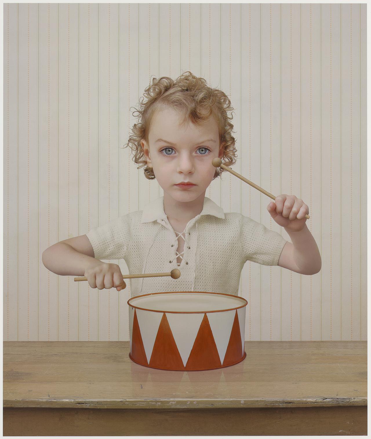
[IMAGE: Loretta Lux The Drummer 2004]
Mixed-Up Childhood, ex. cat. (Auckland: Auckland Art Gallery, 2005).
–
[IMAGE: Loretta Lux The Drummer 2004]
Contemporary New Zealand Photographers (Auckland: Mountain View Publishing, 2005).
Yvonne Todd got her training in commercial photography, and you can tell. Her work draws heavily on its techniques and genres: particularly portrait, product, and scenic photographies. But while commercial photographers are trained to make things look perfect, to promote a fantasy-of-reality, Todd’s images are always not-quite-right, they miss their mark. Her images cue us for the fantasy but deliberately fall short of the commercial ideal, contriving punctum-like effects, feigning hubris. This was typified by Asthma & Eczema (2001), the suite which won Todd the 2002 Walters Prize and made her famous.
It features fine-detailed commercial style images: a giant too-perfect sympathy-card shot of a dewy rose, an elegant but cadaverous female hand, looming backlit women, vignetted profiles of slightly trashy made-over girls-next-door, and a lonely satellite dish. An awful pall hangs over the series, a nagging sense of staleness, of déjà vu. The pictures irritate with their knowing artifice, their creepy airlessness, their cloying, over-processed sentimentality. Asthma & Eczema traffics in clichés, in kitsch, and yet it is not ironic. It is more concerned to recuperate stereotypes, pointing to the profound emotional investments that underpin them.
Hubris is the crux of Todd’s next two series, both of portraits of women. At first glance, Bellevue and Sea of Tranquility (both 2002) suggest a documentary project, as if Todd were cataloguing human types in the pseudo-scientific manner of August Sander and his German heirs, or indeed parodying their taxonomies. Each series presents its subjects in a more or less consistent format, inviting us to compare and contrast. Bellevue and Sea of Tranquility are neither documentary nor directorial, fact nor fiction, but a mix of both.
Bellevue consists of nine portraits of cosmetic-counter consultants from Auckland’s department stores and upmarket pharmacies. As a girl, Todd had appreciated such women as the epitome of beauty and good grooming. Plucked and polished, they approach the ideal, embodying their expertise in the use of lotions and potions to conceal irregularities and eliminate unwanted detail. They put their best face forward, aspiring to a generic mainstream good-look, buying into the ideology they sell to others. However, the women are not models and the images are far from perfect. We see beauty techniques grapple with wayward human faces that refuse to conform; we catch freckles poking through concealer and register faces too hard to fix. Like a magnifying mirror, Todd’s photos show up the irregularities that make-up and airbrushed studio photography typically seek to suppress. Todd’s barbed title translates as ‘beautiful view’ but recalls illness (New York’s Bellevue being America’s oldest infirmary).
Sea of Tranquility approaches the same idea from the opposite direction. While Bellevue presents its subjects as they present themselves, the five women in Sea of Tranquility are elaborately dressed and made-over with wigs and false eyelashes by the artist. They are styled like ‘the daughters of Mormon pastors, circa 1969’ but she photographed them like starlets. With her dead eyes, Alice Bayke looks like she’s stepped out of Valley of the Dolls, while Susan Blunton is more Little House on the Prairie. Recalling internet sites for mail-order brides and glamour shots of suburban housewives seeking to perk-up their marriages, these images fence-sit between fantasy and reality. Suggesting stoicism, gawkiness, and pathos by turns, the images invite us to imagine the women’s back stories.
Large, imposing, and authoritative, the images explore habits and conceits of studio photography as much as their sitters. Sea of Tranquility can be compared to Hiroshi Sugimoto’s photographs of Taussauds exhibits, but, where Sugimoto gives waxworks a pulse, Todd’s images are killers. They play off the uncanny sense that reality is already aspiring to the conventional quality of the photograph. All this begs the question: what is Todd’s relation to feminism? Bellevue and Sea of Tranquility certainly engage familiar questions about women being pressed to live up to mass-media prescriptions but they are less about pointing the finger at men as beneficiaries of the gaze—indeed, to date, men barely figure in Todd’s work—than exploring the space of women’s investments in living through these fantasies.
After Bellevue and Sea of Tranquility, Todd returned to the manner of Asthma & Eczema. The Book of Martha (2003) doesn’t inventorise similar images of similar subjects but offers an odd group of diverse images, whose genres crash against one another. It works as an ensemble, with associations ricocheting between images, prompting us to imagine narratives linking them, or at least to wonder what was going on in the artist’s head. Suggesting a missing installment of the Bible, The Book of Martha features images of a severe nurse (Draize), a dark mysterious cripple in a wheelchair (Advancia) and a heavily doctored self-portrait as witchy anorexic (Martha). They are attended by a close up of an ice skate (Prell), a bleak Bauhaus-style shot of North Shore Hospital (Tide), a catalogue shot of blank signs emerging from fog based on how Hell appeared to Todd in a dream (Forment), and a desktop sculpture of an iron lung (Lung)—Todd’s one and only foray into sculpture. The Book of Martha has a cinematic quality, its combination of portraits, still-lifes, and landscapes suggesting stars, props, and locations. It has the logic of a David Lynch movie, mixing heavy expressionist images with seemingly benign ones, made ominous by association.
Like Lynch, Todd maps the suburban gothic. Her bios habitually note that, as a teenager, her favourite reading was V.C. Andrews’s notorious and trashy Dollanger novels. And today, gothic melodramas are more typically set not in mouldering castles but in suburban homes and strip malls. Gothic novels reject love and light for the dark side. They are typically presented as case histories of damage, pain, dislocation, and insanity; cocktails of repressed childhood trauma, violence, vampirism, narcissism, gender confusion, and more. Characters are enthralled at the prospect of psychic fragmentation, investing in others as doubles, representing repressed parts of themselves. Things are never as they seem and our engagement is maintained through suspense. With its preference for female protagonists, the gothic genre has become a site of heartfelt and, at times, bitter debate for feminists. Does it embody a feminist spirit or is it part of the problem? The jury is still out.
Women are clearly Todd’s key subject. Her oeuvre is overrun with female characters: damaged, gawky, misfit, variously hobbled or proud. All seem to exemplify some physical, psychological, or sociological malaise, implicit or explicit. Her work is ‘symptom city’, agony-aunt territory. Her allegorical figures suggest saints and martyrs, exemplary and superior sufferers, like the sadistically named Advancia in her wheelchair (2003), the desiccated, windswept anorexic, Resulta (2004), a visibly pregnant Youth-for-Christ type, the sexy-frumpy Bo-Drene (2004), or The New Helen Keller (2004), whose disability is invisible. Masochism looms large in the work. Roba (2004) looks like a cloaked, preternaturally calm cult member or suffragette, while her accompanying petrol can suggests potential immolation, fanatical self-sacrifice: Nana Mouskouri meets Carrie. Todd describes her cast as a ‘rainbow of affliction’, stressing an oddly utopian underside to their collective or cumulative condition.
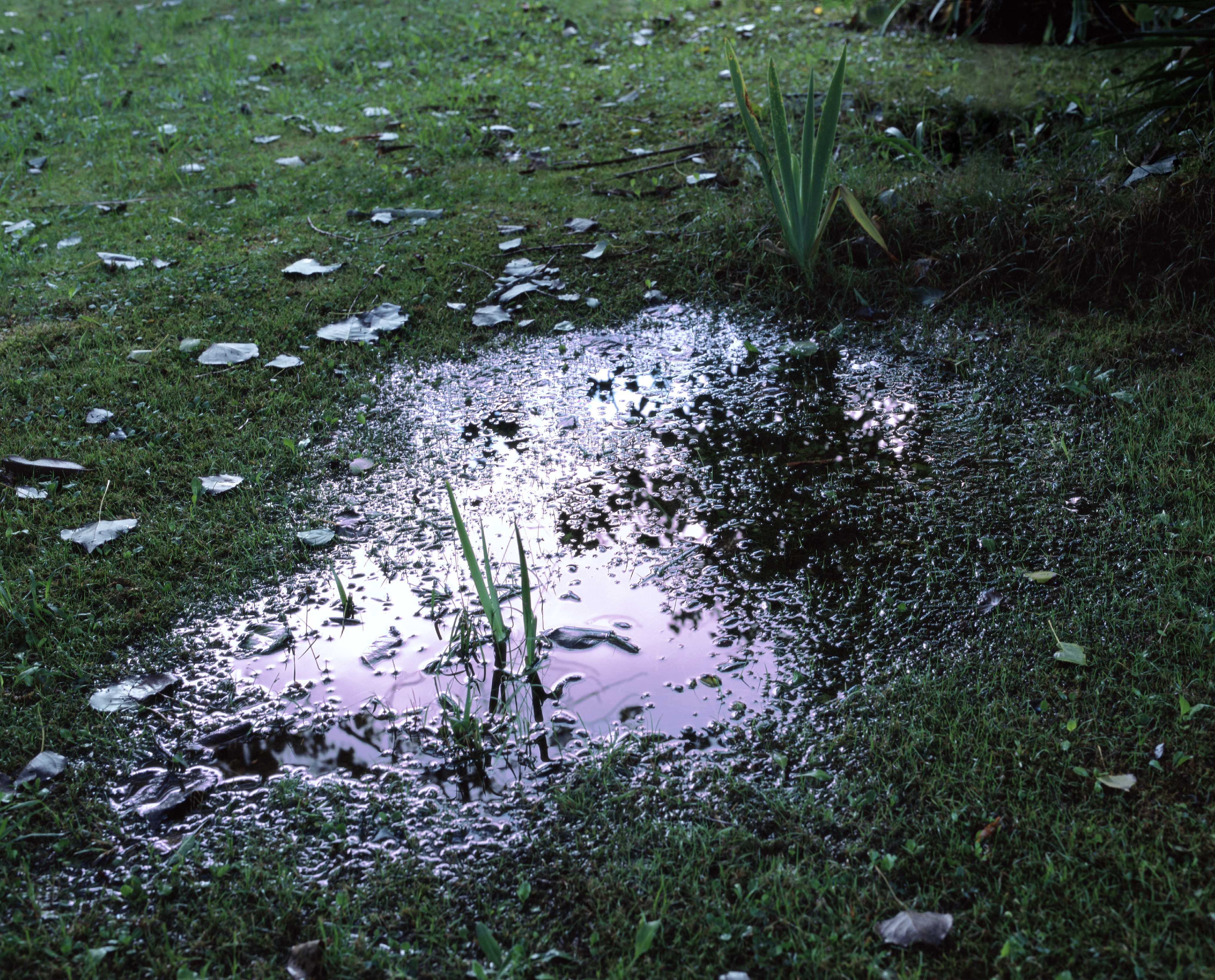
Todd’s non-portraits breathe in same diseased air. In her still lives, picturesquely twisted driftwood becomes shorthand for a world-weary heart (Vol-Ron 2004) and burnt birthday candles and a diet pill on a mirror are a sermon for the eating disordered (Homage to Dr Spackman 2004). Candy-coloured asthma inhalers float majestic in a clear Magritte sky, and the only thing that spoils it is a single mucus-like drip (Empire 2005). Todd’s denatured landscapes are equally repellent. Her sublime waterfall is a man-made one, its frothy highlights picked out in white, in the manner of old-school photo-retouching (Dreft 2002). A pastoral puddle is betrayed by its poisonous, pearlescent, petrochemical sheen (Methylated Puddle 2004). And, she lines up corseted Van Gogh cypresses against a depressing grey sky (Seriousness 2004).
Perversely, Todd casts disease and disability as status symbols. As a child, she admits being jealous of the attention her sick friends received; one broke a leg and got a walkman, while an asthmatic cousin was cherished as ‘delicate’. Craving attention from her working parents, she indulged in hypochondria. She repeatedly leapt from an oak tree hoping to break a leg and sometimes pretended to be paralysed from the waist down. So, it is no surprise that Todd would identify pain as a kind of pedigree. It makes perfect sense in a culture where trailer-trash sufferers earn their fifteen minutes on Jerry Springer and women’s magazines offer pain, pain, and more pain, real or imagined, as the guarantee of authentic femininity.
But Todd’s images are so ambiguous that it’s hard to know whether to read her women as victims or villains, threatened or threatening. Take Fractoid (2004). The figure suggests a sexy nurse-type in a synthetic-looking retro pink uniform; svelte, albeit working class. Megan Dunn calls her ‘an Avon Lady gone wrong’. She stands on crutches, but, incongruously, in heels, showing off her legs. Her face is a dark, formless blank, as if digitally excised to conceal her identity—but for whose benefit? Perhaps it is a fetishist’s image, only including the detail that counts. Fractoid evokes a standard trope of horror films, where the trauma someone suffered grants them a supernatural power, and we have to rethink their curse or injury as a menace to ourselves.
So, are Todd’s characters genuine sufferers, saints, and martyrs or self-indulgent thespian ‘look-at-me’ types. Perhaps, in each case, our gut-level response to the question tells us more about ourselves.
.
[IMAGE: Yvonne Todd Methylated Puddle 2004]
Auckland Art Gallery News, July–October 2005.
I was introduced to New Zealand art at high school. Scattered among the old-master and modern-master reproductions lining Takapuna Grammar’s corridors were screenprints from Barry Lett Galleries’ 1968 Multiples portfolio. It featured the key painters of the day, from the nationalist-landscape end (Colin McCahon and Michael Illingworth) through to geometric abstraction (Milan Mrkusich, Gordon Walters, and Ralph Hotere). It was the canon, more or less; a kind of New Zealand art primer. Back then, screenprinting was considered a poor cousin to real printmaking, yet it perfectly captured the hard-edged aesthetic of the day; only Toss Woollaston struggled to make something of it.
My favourite image was Michael Smither’s Wave Invading Rock Pool. It was hard-edged impressionism, if that makes sense. Basic stenciled shapes and a few unmodulated colours—simple. But the forms were ambiguous. You had to orient yourself to the image through the title, otherwise those rocks could have easily been clouds. If Smither’s paintings of that time suggested a devotional investment—in the labour spent in patiently rendering, say, hundreds of individual pebbles—this print’s virtues were different, exploiting what screenprinting achieves easily. This pared-back look would typify Smither’s prints through the 1970s and beyond.
Working with his father, Smither produced lots of screenprints, and got them out there. They were unashamedly populist and appealing. Featuring iconic local landforms, they promoted and embedded Smither’s vision of Taranaki. Following McCahon and Don Binney, their graphic look seemed to imply an environmentalist ethic, suggesting not only a pure landscape but a pure attitude towards landscape. When I went to live in New Plymouth in the early 1990s, Smither’s prints were ubiquitous, hanging in hotel rooms, waiting rooms, cafes, and homes throughout town, ever on message, instructing citizens in how to regard their environment. Smither’s prints achieved their mission: opening their public’s eyes to the particularities of the place or predisposing them to see it his way.
.
[IMAGE: Michael Smither Wave Invading Rock Pool 1968]
(with Janita Craw) AES+F: King of the Forest (Maricaibo: Juan Ruiz Galeria, 2005).
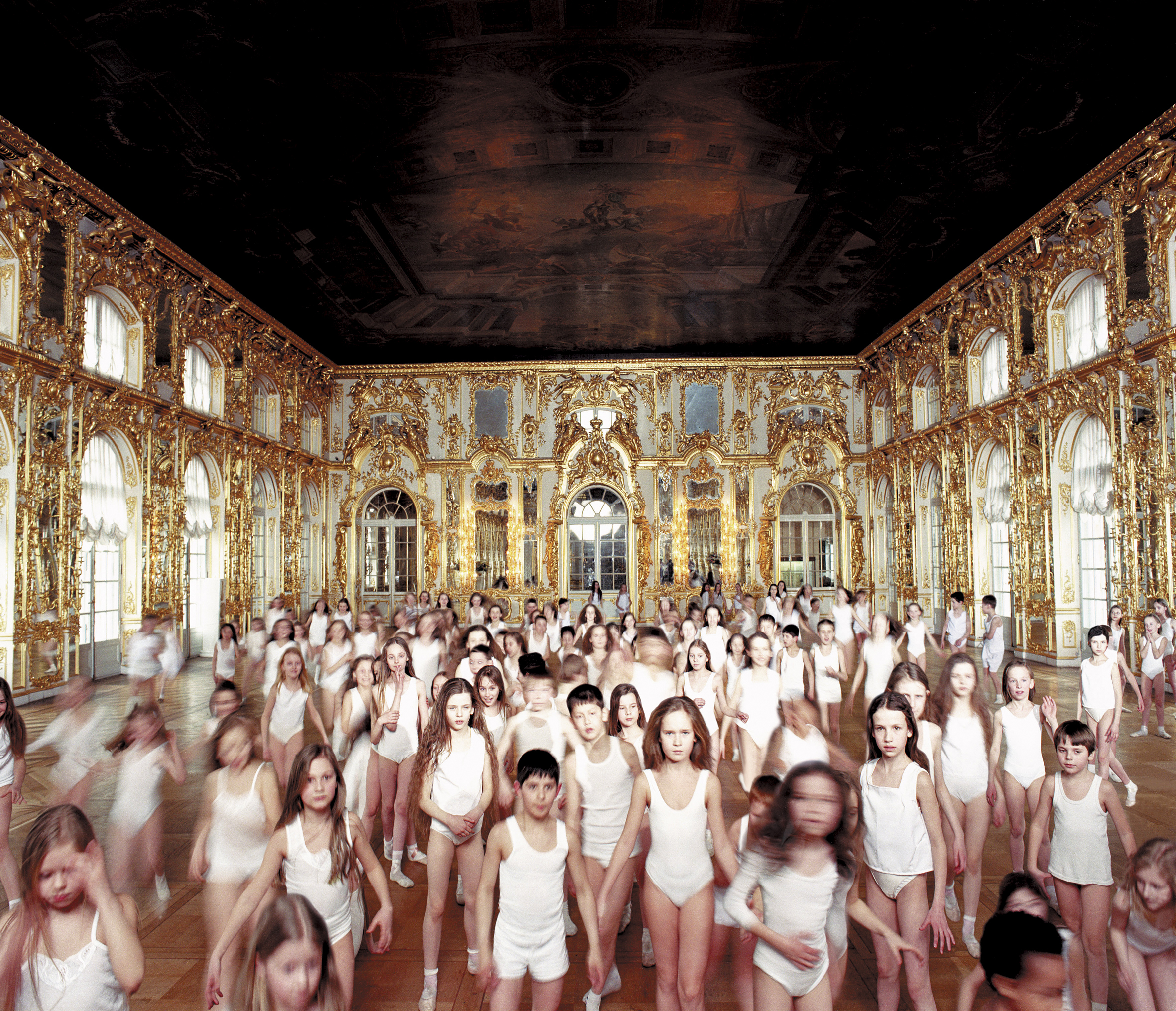
Advertising agencies know they can always use beautiful wide-eyed children to pull on our heart strings and prize open our wallets. It’s the feel-good factor: fresh-faced kids sell the future, attaching their appeal to any product or ideology they’re aligned with. AES+F address this in their film trilogy King of the Forest (2001–3). Recalling the medieval folk tale of a King who imprisoned beautiful children in his palace for his pleasure, AES+F ‘steal’ hundreds of children, recruiting them from local model agencies, ballet schools, sports clubs … They dress them generically, in classic whites, sometimes suggesting sports kit and underwear. They install them in picturesque locations, film them in lingering slow-mo, then cut the footage to music. AES+F chose locations in the Old World, the New World, and the Third World. Le Roi Des Aulnes (2001) was shot in the gilded, mirrored halls of Tsarskoye Selo, Catherine the Great’s St. Petersburg palace. This film of beautiful children caught in a hall of mirrors suggests a mass audition or a ballet studio study after Degas. The kids instinctively court the camera, striking poses. More than Paradise (2002) was shot in Mohammed Ali, Cairo’s mosque-castle. AES+F required the children to demonstrate well-known ritual situations such as processions and circling, which have become cliches of the Islamic world in the Western media. For a complete contrast, KFNY (2003) was shot in the hubbub of New York’s Times Square, with Navy-recruiting ads playing on overhead video screens, displaying dramatic images of battleships, warplanes, and helicopters. Attentive to the ironies of the new world order, this final installment involves a deep contradiction. Its all-embracing multi-cultural cast of ‘heroes’—its ‘rainbow coalition’—lining up on the side of America.
King of the Forest drips with art, advertising, and pop-culture associations. AES+F put a real spin on Vanessa Beecroft (with her performance-tableaux of inscrutable glamorous naked women), Shirin Neshat (with her orientalist videos of massed milling ‘others’), and Art Club 2000 (a tribe of identically dressed juveniles who gathered in Times Square to be photographed). It also recalls fashion advertising campaigns for Benetton (whose multicultural appeal veils dubious third world labour practices), Calvin Klein and others. The King of the Forest trilogy remains ambiguous. The films are like ads which largely forgot to mention their product. The children instead seem to absorb the background ideological associations of their locations. The films’ extended durations grant us the chance to map a variety of contradictory interpretations and affects: to see the children as innocent and knowing; as vulnerable and sublime; as the filmmakers’ patsies and as coquettish spoilt agents. One moment we are jealous of their perfect existence and good looks, the next fearful for their safety. Equally our concern over their possible exploitation gives way to a realisation that their beauty can be used to exploit us. Kids may be captive but they are also captivating, their beauty exercising a magical force over us. As Elena Zaitseva explains, AES+F leave us ‘balanced on a fine line between nobleness and treachery, bewitched by a beauty that has turned into a trap.’ ‘Our protest against the “stealing” of children does not prevent us from admiring them.’
Sometimes reality intervenes after the fact, changing the significance of an artwork forever. It’s hard not to read King of the Forest in this way. On 1 September 2004, terrorists calling for Chechnyan independence ‘stole’ hundreds of staff and students at a school in the Russian town of Beslan. They herded their hostages into the school’s gym. Deprived of food and water, the hostages were forced to drink their own urine. To cope with the stifling heat they were stripped to their underwear. On several occasions, released or escaped children were photographed fleeing in their smalls. By targeting ‘innocent children’, the terrorists were guaranteed the glare of world attention. The media milked it for all it was worth, giving the terrorists the publicity they sought, viewers something racy, and their advertisers a bigger audience. Three days in, a shoot-out between the terrorists and Russian security forces claimed the lives of over 300 hostages, more than 170 of them children. Despite moralising over evil, the media would be criticised for participating in it by running exploitative suggestive images of traumatised children in their whites. It is at such moments that our moral panic over child abuse spectacularly aligns with reality, and our obsession with safeguarding childhood innocence reveals its pornographic underbelly.
Stella Brennan 0–10 (Auckland: Ondine Publishing, 2005).
A small image in Stella Brennan’s 2004 exhibition Tomorrow Never Knows gave me pause. Her digital print reproduced an aerial view of a gigantic geodesic dome on fire, a plume of dark toxic smoke billowing from its pre-fab acrylic panels. It could have been a riff on Ed Ruscha’s The Los Angeles County Museum of Art on Fire (1965–8), except that Brennan’s fantastic image was for real, a genuine news photo of Buckminster Fuller’s forward-looking US Pavilion for the 1967 Montreal World’s Fair, a ‘symbol of man and his world’. In 1976, a welding accident started the fire and all the acrylic cladding melted away in just half an hour, the mishap making geodesic domes a somewhat harder sell. Brennan chanced on the image flicking through the 1978 instalment of Shelter, the faddish ‘scrapbook of building ideas’, in its special section on dome building. To me, Brennan’s purloined image conjured up those 1970s disaster movies obsessed with the hubris of Think Big projects and looked forward to Chernobyl, Bhopal, and 9/11. Brennan reproduced the shot as a sepia duotone, but this styling was tongue-in-cheek, her aim being to puncture romanticism, curdle nostalgia.
Brennan maps modern times from a postmodern vantage point. Her work explores the history and currency of modernity—the dream of human perfectibility and emancipation premised on rationality, technology, progress. She researches modernity’s grand schemes and utopian ideologies, and their fate in the brave new world of the present. Her perspective is consciously generational. As she puts it: ‘Being twenty-five at the start of the twenty-first century has given me a fairly intensive experience of millennial preoccupation. I have looked on as my childhood dreams of Space and Armageddon turned into the Challenger disaster and UN Peacekeeping missions.’ Born in 1974, Brennan missed the Paris riots and the Moon landing, events that would shape her world, and inherited feminism and greenie politics as givens. She did however witness the digital revolution first hand.
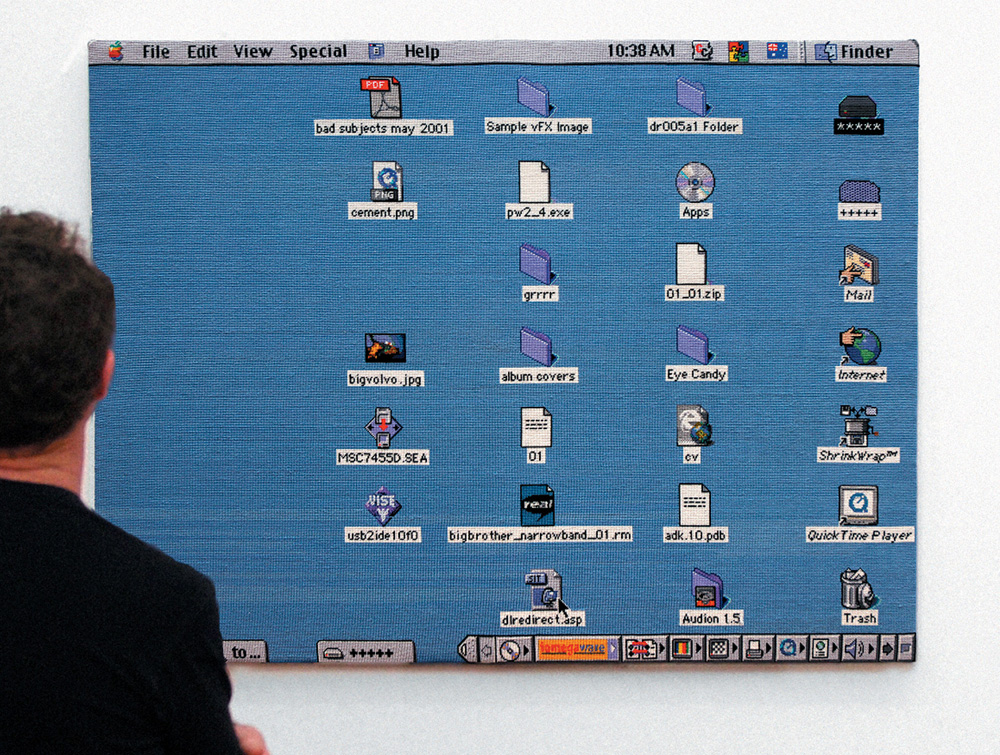
In her MFA dissertation, Brennan offers the night sky as a metaphor for history. She points out that the light from distant stars takes years to reach us. The Crab Supernova remnant is about 4,000 light years away, and the Andromeda Galaxy 2.3 million. We see them as they looked aeons ago. The stars themselves have long since moved on; some are dead. Astronomers are like archaeologists, reading the night sky as layered with historical traces. In doing so they realise that the stars’ appearance says as much about us, about the unique location in space-time from which we regard them. Brennan’s works emulate this condition, enfolding distinct moments, even distinct historical epochs, but always with an eye to the here and now. Take her 2001–2 stitch-per-pixel embroidery of her iMac OS 8 desktop. It took over a year to do and Brennan needed help; a sewing circle of friends and family helped complete it. And, by the time it was done, it was obsolete. Brennan had a new computer, running OS X. Translating the digital into the pre-industrial, Brennan’s work yokes opposing values—the computer screen’s currency, immateriality, and speed with craft’s traditionalism, materiality, and laboriousness; the ubiquity of the iMac, the quaintness of stitchery.
The woven computer screen can be read as daft, wrong, like an expressionist painting converted into paint-by-numbers. Perhaps the artist didn’t really understand computers, what was at stake in them, their revolutionary implication. It can also be read as deft when it prompts the consideration of more subtle historical connections. The work recalls the use of punch cards to programme automated Jacquard weaving looms during the industrial revolution and Ada Lovelace’s proposal to use them to programme Charles Babbage’s analytical engine, the proto-computer. The piece then poses questions for feminists and Marxists. Was the auto-mation of traditional women’s work liberating or oppressive? Were women—are women—the winners or losers with industrialisation?
Brennan’s time-hungry work asks that the viewer take time to consider such things. Although the title—Tuesday 3 July 2001, 10:38am—suggests an instant, the piece enfolds time: the time taken to view the work, the time taken to make the work, and the whole stretch of technological, economic, and social progress from the Bayeux Tapestry through the industrial revolution to the Macintosh. Brennan certainly puts an interesting spin on On Kawara.
Brennan relates the daft-to-deft flip to cargo cults. These religious and social movements developed when isolated Melanesians were suddenly confronted with the products of industrial modernity. Lacking the back-story of their function and evolution, they read Western commodities through their own values, making weird sense of them. Cargo cults show us not only the strange ways that outsiders can read our commodities, but also the peculiarity and contingency of our own understanding of them. They make us consider not only the gaps in their understanding, but also the assumptions and blind spots that underpin the naturalism of our own common sense.
Like cargo cultists, Brennan misreads. It takes a little while to work out what’s wrong with her video diptych ZenDV (2002). Brennan ran the digital blue screen and colour bars through a filter that emulates the scratched textures of celluloid film. Today’s moviemakers use this effect to imbue pristine digital images with authentic analogue texture, feeding our nostalgic desire for reassuring grain. And yet the irony of this work is that the blue screen and colour bars are the last things you would apply the effect to: they never had grain. Similarly, Brennan’s title promotes her videos as devotional objects when surely only a Martian or a bewildered head-hunter would make the mistake of meditating upon them. Like the embroidery, ZenDV enfolds time. It makes us ponder our evolution from analogue to digital, and the tricks we play on ourselves to soften the transition.
Brennan creates evocative mixed-up structures. For her 2001 installation The Fountain City, she walled off the space with polystyrene blocks. The wall was lit from within using fluorescent tubes, giving it an ethereal temple-glow. At one end, a head-sized gap allowed viewers to inspect the wall’s interior spaces, which suggested vaulted architectures both ancient and space age. The utopian title recalled the Emerald City of Oz; in fact, it is Hamilton city’s official tourist moniker. Brennan added a soundtrack of downloaded waterfall samples so tragically compressed they actually sounded unnatural, more like white noise. At once primitive and futuristic, natural and artificial, secular and religious, The Fountain City defied interpretation. It suggested the telescoped histories that typify science-fiction, where mud huts have hydraulic doors, people ride personal hovercraft but wear bearskins and still believe in the divine right of kings. Science-fiction is deranged history, carnivalised history. Sometimes it serves to obliterate historical understanding—as if to make us believe that somewhere mud huts with hydraulic doors might be possible. Sometimes in offering an estranged vision of the present it sharpens our consciousness of history, alerting us to contradictions.
The cargo-cult idea is relevant for another reason. We live in a world of technology so advanced that no one really understands it. Legend has it that only one person in the world knows the complete process of microchip assembly; others know bits of the process only. In many ways we are ourselves cargo cultists, recipients of advanced cultural material we can’t fathom. Brennan alludes to this in iBook Triptych (2002), where she monumentalises flatbed scans of the underside of her lovely new laptop—the latest—and the polystyrene packaging that came with it. She blew up the images as large as possible, tiling prints like she were Voyager photographing a distant planet, too big to capture in a single pass. However the lush information-rich images don’t tell us anything worth knowing about the computer. The polystyrene husks are irrelevant, and even the computer’s shell is just packaging of a kind. What is remarkable about computer technology isn’t visible to the eye. Perhaps that’s why computer design has to be so slick and fashionable, because we don’t register technology’s advance unless it comes in a new-fangled box with surprising new desktop gimmicks. Brennan succumbs to the culture’s general fetishisation of packaging, scrutinising it up close, like a dumb ape checking out the surface of the monolith in Kubrick’s 2001, with no idea how it works. The quasi-religious dimension of Brennan’s fascination is signalled by the altarpiece format.
Brennan’s oeuvre lacks stylistic consistency. One minute she’s using cheap polystyrene packaging to parody retro-moderne interior design, the next videotaping rustic salt-glazed pots as her computer mindlessly recites Hundertwasser’s ‘Mould Manifesto’. But however disparate the works are in appearance they are linked by a consistent methodology. Brennan’s sculptural language, if you can call it a language, is not expressive (it isn’t about saying something), it’s more experimental (it asks: what happens if I put this with that?). Locked on readymades, found objects, artefacts, her approach consists of presenting them, re-presenting them, arranging them, juxtaposing them, and translating or processing one through another.
This approach has its basis in Marxist dialectics. The Marxist-modernist idea—that history involves a dynamic interplay of antagonistic forces that resolve into a higher synthesis—has long been influential on artists. Modernist artists have frequently brokered bad marriages between odd elements—images, styles and processes—to release contradictions or expose unexpected sympathies. The idea particularly inspired those 1960s radicals, the situationists, whose favourite strategy was code-crashing, which they called detournement: deflecting, diverting, rerouting, distorting, misusing, misappropriating, and hijacking chunks of dominant discourse to expose their ideological undercarriage. Brennan however prefers to see her dialectical practice less in terms of antagonism than ambivalence.
Brennan is not only an artist, she’s also a curator and writer. Not only do Brennan’s curatorial projects provide a useful entry point into her art, the very idea of curating does. Her art is essentially about artefacts, researching them, presenting them, reframing them. This was Brennan’s own point when, in the face of harsh opposition from Elam’s powers-that-be, she insisted on curating a group show rather than offering a solo exhibition as her final MFA submission. Nostalgia for the Future, at Artspace in 1999, explored the recuperation of passé modernist style as retro-chic.
Modernity is a culture of eternal newness but also one of eternal return. Things go out of fashion but come back; today’s rubbish is tomorrow’s antique. Walter Benjamin argued that commodities attain a strong critical force when they drop out of fashion, when they are abject and nasty, before being recuperated as ‘vintage’, before they become That 1970s Show. Brennan’s centrepiece, Guy Ngan’s techno-futuristic 1973 Mural for the Newton Post Office was a great example. It had been ‘permanently’ installed in the Post Office beneath Artspace but, deemed unfashionable, it had been removed during a late 1980s revamp and dumped in the basement. Rescued for the show, the work opened up a forgotten vista of art (Ministry of Works modernism) and utopian social engineering (town planning). It surprised.
If the Ngan was an artefact that Brennan rescued, the other works, all recent, were actually or metaphorically rescued artefacts. Julian Dashper stretched garish old fabric to make a painting; Fiona Amundsen photographed our old motorway interchange, Spaghetti Junction; Mikala Dwyer’s work included a Danish designer lampshade from her childhood; Jim Speers’s lightbox looked like a deposed sign for the global systems-and-control company. Brennan presented two works of her own: a signature wall painting represented the groovy logo for Stella, a long defunct local electronics company; and Zen, a video of a DIY kinetic light sculpture (she made it from instructions in a hobbyist manual) back-projected onto an etched glass door, accompanied by a shrill electronic whine. There was a strong curatorial voice to the show and one almost had the sense that Brennan had effectively appropriated the other artists’ works as her own. The pieces she chose operated within her art’s existing concerns, syntax and rationale. Whether the show was Benjamin’s critical wake-up call or the advanced guard of recuperation was too close too call.
Brennan is hardly the first artist to develop such a research-based and curatorial approach to art making. Precursors and reference points would have to include England’s Independent Group, those pioneers of pop art, particularly Richard Hamilton’s 1955 ICA show Man, Machine, and Motion and various members’ contributions to the Whitechapel’s 1956 exhibition This Is Tomorrow. Enamoured of new technologies, mass media, popular culture and other latest-things-in-latest-things, these Independent Group displays blurred any distinction between art and artefact, gallery and museum show. In the 1960s and 1970s there was also the research-based art-writing projects of Americans Dan Graham (reading a wider social context into minimalism) and Robert Smithson (with his trippy telescoped histories and sci-fi themes). Smithson’s essay ‘Entropy and the New Monuments’ is one of Brennan’s touchstones. Also, in the late 1980s, Jewish-American artist Haim Steinbach presented commodities and other items on his Juddian signature shelves suggesting shop displays. His juxtaposed artefacts literally told time (clocks), moved in time (lava lamps and wave machines), and hailed from or referenced different epochs (antique Victorian money banks, contemporary Yoda and vampire masks, rocks). Steinbach’s works folded time; they played with newness and nostalgia.
The most apposite point of comparison, however, may well be another New Zealand artist, a contemporary. Michael Stevenson’s recent social-history displays perversely align evidence—artefacts, documents, reconstructions and quotes—to provide stranger-than-fiction views of the recent past. For instance his project This Is the Trekka at the 2003 Venice Biennale uncovered the story of New Zealand’s attempt to manufacture a New Zealand car in the late 1960s and early 1970s. Stevenson’s show drew on historical ironies. Although Cold War New Zealand aligned itself with America, it operated like a communist centralised command economy. While the quest to build Trekkas was informed by burgeoning nationalism and kiwi can-do, their guts actually came from Czechoslovakia; our national car was premised on behind-the-iron-curtain trade deals. Stevenson’s time-warped show looked like a reconstructed period trade display; its amateurishness and boosterism were tragic. This was neither how we remembered history, nor how we wanted to.
The comparison with Stevenson allows us to distinguish Brennan’s approach. Stevenson’s exhibition totally fulfilled Benjamin’s imperative, using forgotten, unfashionable, even repellent material from the recent past for critical leverage, to disorient the viewer and prise open history and rewrite it. It was a veritable ‘return of the repressed’. Stevenson wasn’t at all interested in recuperating the Trekka as cool. He’s totally sceptical about coolness, but Brennan isn’t. She is far more conflicted. Feeling seduced and abandoned by old modernist ideologies (and anticipating similar ecstasies and agonies at the hands of new ones), she identifies and prepares to criticise. The Benjamin in her holds out against the recuperation of the just past, but the rest of her is a sucker for it. Caught in a constant flip-flop, her achievement lies in being able to sustain and explore her ambivalence. She explains it more simply: ‘These things are really beautiful, but they are also quite troubling.’

Auckland Art Gallery News, March–June 2005.
Michael Parekowhai is known for toying with prevailing cultural stereotypes concerning Maori. For instance, his 1999 Ten Guitars project drew on a nostalgia for 1960s Maori showbands and the cliche of Maori as cultural performers, ‘as happy as the day is long’. While it was laden with cool ironies, Ten Guitars was ultimately positive about this now seemingly patronising and problematic image. It was all about putting differences aside and strumming our guitars in togetherness. Kapa Haka (2003) does something quite different. The work evokes a familiar cliché, one grounded in reality: the burly Maori bouncer. Parekowhai’s fifteen life-size fibreglass figures are based on a real person, his big brother Paratene, a security guard. The figures are generic, cast ‘out of the same mould’, Parekowhai compares them to chess pieces—pawns perhaps. Each figure is named for a colour, like the gangsters in Reservoir Dogs: Mr Pink, Mr White. The colour is written in Maori on each figure’s ID tag. They can be installed in groups or as individuals (they formed a phalanx at the entrance to the 2004 show Paradise Now? at New York’s Asia Society). Parekowhai plays on our recognition of bouncers’ power and authority, yet also their disenfranchisement—it is a bad job. Security guards don’t necessarily protect their own values, but their employers’. Parekowhai’s heavies appear to guard and secure whatever they are placed in front of. Because of this, the title becomes ironic, conflating kapa haka groups (as rent-a-tribe, collective, costumed, cultural performers) with the prevalence of uniformed Maori warriors in low-paid security work. And yet Parekowhai’s brothers do exude authority. If his previous works offered themselves as engaging—feel-good fun and games for the viewer—the Kapa Haka figures strike a pose of resistance: you can’t engage them in conversation, can’t access their thoughts. Kapa Haka is a study in staunch.
New Zealand Listener, 1 October 2005.
Judy Millar: I Will, Should, Can, Must, May, Would Like to Express, ex. cat. (Auckland: Auckland Art Gallery, 2005).
Robert Leonard: In this show you’re really letting rip, doing new things, expanding your terms of reference. There are huge canvasses, wall paintings, even a sculpture. What’s going on?
.
Judy Millar: It all comes out of my thinking about painting. I don’t think of paintings as discrete objects. For me, painting has always been a set of relations: relations between the painting and the space it occupies and beyond; relations between the painting and the history of painting. This show is an opportunity for me to explore these relations more thoroughly, more ambitiously. It’s an installation. Paintings are always installed, but their installed nature is usually downplayed. Having access to this much gallery space let me really investigate the relationship between paintings and the space, to make explicit the relationships beyond the frame. The paintings are made to be read together, so you can see them as one work or at least move from one to the other. You can see where things have been carried over from one painting into another, expanded, reduced, cancelled.
.
I’m used to seeing your works installed cleanly, discretely, where the white of the gallery wall sets them off. The white wall seemed crucial to the way the paintings read, until now.
.
I’ve put brushstrokes on the walls and hung the paintings on top. It complicates things. The canvases have a lot of open unpainted areas, and that’s picked up in the wall paintings. It’s hard to determine precisely what’s sitting where and what’s in front of what. The canvases and the wall paintings leach into one another. There are some cool moments, like there, where that little hot spot in the painting bleeds into that red mark on the wall. And you notice some of the colours are used in the paintings and on the walls.
.
The canvases are massive, around eight by three metres, your biggest yet. What does this increase in scale do?
.
It brings about an openness. When I was painting them I could literally move around within the canvas. It allowed me to make really large gestures but also leave areas unworked, so it’s difficult to see where the paintings stop and the wall begins. Being able to work so generously has liberated the gestures, letting them get out of the skin of the overall painting. It allowed me to find new compositional possibilities, new connections between thought and bodily movement.
.
At that scale they have a blockbuster cinemascope quality, echoes of the Pollock-McCahon heroic.
.
The intention was to show my ambition, to wear my painterly ambition on my sleeve if you like. I could talk about this in two ways. Painterly ambition is, I guess, inseparable from the heroic. Certainly it speaks of exertion and a desire for weight, a certain beyond-ness. But I overdo things, show off my ambition to be ambitious, which could be seen as overblown and exaggerated, absurd. Of course with paintings of this size you instantly think of billboards, yet these have no message.
.
From the sublime to the ridiculous then! Those swirling ‘tumbleweeds’ are certainly comic—I think of the way cartoonists depict fights as clouds of action lines. The colours are funfair fluro-lurid. And the big magenta painting, it’s like a child’s finger painting on the scale of The Raft of the Medusa.
.
I love the ridiculous. And yes, I think the paintings are a little funny. I’m certainly aware I’m making a caricature of the brushstroke. I’m often laughing in the studio. But then I laugh when I see Goya turn yucky ochre into gold buttons.
.
The three big paintings seem quite different. One has more of a composition logic, one more of a pattern logic, and the other is like an all-over field, but they are all unravelling.
.
I like the idea of paintings unravelling, coming unstuck. I’d become uncomfortable with the all-over nature of my painting, it’s limitations. I’d been trying to find a way through, which is incredibly hard. If you are not using a clear representational composition you have a problem, how are you going to organise the painting? We had the grid for a long time and we had the all-over. Perhaps there’s another way. For some time I’ve been thinking I could make paintings by simply accumulating actions, bringing different marks—signs of different attitudes—into play. I’m thinking of my paintings like construction sites. You see how things are placed on a construction site. On the one hand it’s chaotic, on the other it has this necessity to it. Clear decisions have been made to put this here, that there, but there’s no overarching governing idea.
.
How does that work? When you add, are you trying to enhance what you’ve just done or cancel it out, respond to it or ignore it?
.
It’s never that clear.
.
How much coherence do you need?
.
Well, that’s the question. Do you need coherence? Do you need unity? How much incoherence can you tolerate? Obviously, there has to be something holding it all together. I like it when the painting is just on the verge of resolution so it involves and implicates the viewer, forces the viewer to make the completion.
.
This magenta painting, you can tell it’s been painted in a series of sessions. You can’t tell the sequence exactly, but you can see this bit was painted before that.
.
That painting is the most composed, but you can’t really account for its logic. And that’s what I enjoy. It evolved out of purely painterly decision-making, where one thing leads to another to another. That’s what I mean by accumulation. You can register complex notions of time in a painting. Paintings are made over time; they are compressions of traces in time. Paintings can be taken in in an instant but also unpacked slowly. A lot of abstract painting in New Zealand downplays that temporal dimension. Our abstraction—the tradition of Mrkusich and Walters—comes out of constructivism. I’m not so interested in that. I’m more interested in the American painting I was fed as a student and cubism before that. Cubism was the first art that really excited me as a teenager. The temporal dimension in cubism is so important.
.
The earlier paintings were more decorative, likeable, they were eye candy.
.
Well, I was never trying to make them likeable or unlikeable. It’s not really of interest to me, although sometimes I can be surprised by what is likable in them. I just don’t want them to be static. And I think my earlier work was too static, too easily got, too bite sized.
.
These new paintings are one part pretty to one part gritty. Gerhard Richter was obviously a reference point in the earlier paintings, where the strokes are very clean, slick, and feel highly mediated. But these works make me think of Julian Schnabel, who refuses decorativeness, coherence, easy ideas of quality.
.
I’ve never been a big Schnabel fan. Certainly I wanted to create more excitement and more layers in the work. I guess I wanted to attack niceness, but really to offend myself, to take myself to the edge of what I could accept. I’m not sure if Schnabel was trying to do that. He may have wanted to offend people but I don’t think he was trying to offend himself. I think a good painting has to contain irritants, and that was really lacking in my earlier works. Now I’m keen to see how much I can push a painting in terms of agitation and irritation. I think of rock and roll, with a guitar that sets your hair on end but it’s exhilarating. I want a little of the screaming guitar.
.
The see-through wall.
.
At first I was going to simply unclad a wall, expose its insides. In the end I ended up building an unclad wall. The perversity of creating an undone structure appealed to me. It’s not exactly a wall, more a model, a 1 to 1 scale model of an unclad wall. Look how sharp and fetishised the construction is, with its thinned timber. It’s a conceptually slippery object. It looks like furniture or a Sol LeWitt sculpture. It allows views through to the paintings. It changes the quality of the space and sets up the idea of looking through, looking through the wall and looking through the paintings. It sets up all kinds of frames for the paintings to kick against.
.
You have described your approach as ‘cheap illusionism’.
.
Painting is always illusionistic and that’s its magic. Greenberg was wrong: flat painting is not possible. You put a mark on a surface and immediately you have an illusion. Painting is a virtual medium; as a viewer you project yourself into its fictive spaces. That’s why people love paintings and why they still travel enormous distances to see them. They’re fascinated by the magic, by painters conjuring illusions from coloured mud. That said, my paintings are never convincing illusions. They unravel and flatten out. They are full of holes, incomplete illusions. It’s like a magician performing a trick, but also showing how they do it.
.
You have been putting an interesting spin on action painting for some time. The title of the show declares an ambivalence about the expressive.
.
What is the expressive anyway? A Clairmont isn’t any more expressive than a Gordon Walters, they are just different forms of expression. The title is about taking a step back. It’s like, we could look at things this way. It lets in doubt.
.
But your paintings can be exuberant, immediate, confident. Lack of doubt has a place too.
.
Sure. You act out a certain position and it’s embodied in a mark. A shy approach will produce a shy mark, and so on. The viewer can read the commitment in a mark so quickly. They can read tentativeness in a mark, they can read confidence.
.
So you still have a lot invested in the idea of expressive mark-making, the idea that the marks betrays the maker.
.
But not in any essentialist sense. It’s not that they betray who you are but simply how you have gone about things. You can’t fake it.
.
You make it sound very speculative and experimental but there’s an aspect of breezy virtuosity in the painting, like it’s all well rehearsed.
.
Sure, part of painting is good technique. Sometimes I feel like a tennis player. I can put in a good day’s work just practicing my strokes. But there has to be more to it than the well rehearsed. Registered on the painting’s surface, there has to be a desire to find out. So, while you have a notion of what you want, and while you’ve rehearsed it to some extent, the decisions on the canvas have to be fresh. And if they aren’t, it shows, absolutely. Good technique really comes down to being better at finding things out.•
.
You talk about painting like it’s a thing; not this painting and that painting, but painting as such. You talk of issues of painting and for painting. It interests me that while you’re not interested in paintings as discrete objects you are interested in painting as a very discrete enquiry, a grand tradition.
.
For me painting is defined by its history. I often think of it as separate from the wider world of art. It brings its own set of problems and possibilities. Painting constantly redefines itself, but in terms of its own history. For me that’s rich. For me every time I make a painting I’m dragging the whole history of painting with me. I identify with Quentin Tarantino. His films refer to films, to the whole back catalogue of cinema. A black limo appears and it’s more than just a gangster mobile, it’s every gangster mobile that’s ever been in any film. You have the whole history of the genre there immediately. Tarantino sees cliches as a rich shorthand. It’s like the brushstroke in my work, or the drip, or the splash. They’ve already been played out endlessly. But while they could seem thin, I want to redeem their richness. I want to pick up those things and use them invested with everything they have ever stood for.
Victoria’s Art: A University Collection (Wellington: Victoria University of Wellington, 2005).
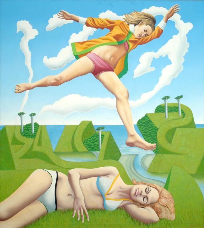
In the artworld, ideas come and go. Colin McCahon had a romantic-nationalist idea. He dreamt that he and his disciples might uncover the rhythms of their very selves within the landscape. It was a compelling idea, but also a difficult one. In the early 1960s, Don Binney filtered McCahon’s idea through a populist poster-art sensibility. His iconic images of birds frozen mid-flight over semi-abstracted New Zealand landscapes were feel-good McCahon, McCahon drained of existential struggle. Easy on the eye, they struck a chord with Auckland’s emergent art market, the bohemian bourgeoisie who lived in the suburbs but still wanted to identify with nature and had no time for McCahon’s heaviness. Then, along came Ian Scott. He was the next generation. He’d trained at Elam after Binney and under McCahon. Replacing Binney’s birds with dollybirds lifted from advertising, fashion mags, and men’s mags, Scott created iceblock-coloured pop-art Binneys, Playboy Binneys. Leaping through the air, flaunting their midriffs, or dozing in their knickers, Scott’s chicks could have been liberated modern women or pre-feminist sex objects. Their backdrop was clearly the wild West Coast—the mythic landscape celebrated by Binney. But it had become a stage-set, an abstracted landscaped landscape riddled with formal conceits and in-jokes—its geometry recalled the cubist letter-forms of 1950s McCahon. Collapsing the nature-culture dichotomy, Scott’s fantastic but inauthentic setting—inhabited by dwarf-phallic clip-art kauris and jism clouds—reeked sublimation. Scott exaggerated Binney’s cleaned-up view of nature, showing it up. While Binney images were intended as a celebration plain and simple, Scott’s Girlie Paintings were dark and complex. His nationalist-environmentalist-consumerist-swinger utopia—with its promises of emancipation—was haunted by a deep sense of control and repression. As New Zealand entered the 1970s, Scott attacked Binney’s paradise as an ideological blindspot. It was a turning point. It was pop.
.
[IMAGE: Ian Scott Jump Over Girl 1969]