Robert Leonard

Contemporary Art Writer And Curator

Adrian Hall: Bricks in Aspic

(with Wystan Curnow) Art New Zealand, no. 90, 1999.


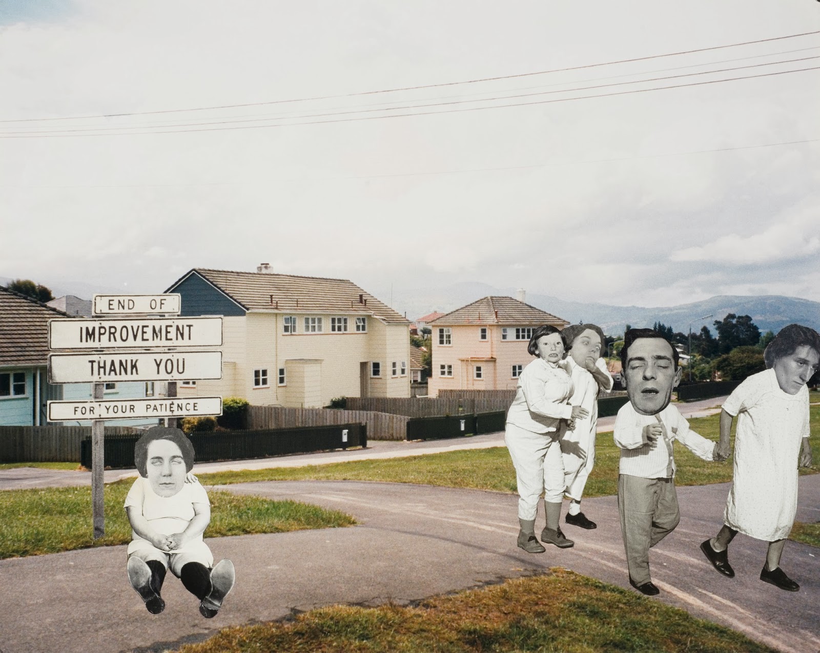
Late last year, British-born artist Adrian Hall returned to New Zealand to reconstruct his work Low Tide for the New Gallery instalment of Action Replay: Post-Object Art, an exhibition revisiting New Zealand post-object art of the 1970s. Hall played a decisive role in this neglected chapter of New Zealand’s art history. As a visiting lecturer at Elam School of Fine Arts from 1971 to 1972, he brought internationally current ideas into the local scene. Hall’s 1971 Barry Lett Galleries show The Plasma Cast Iron Foam Company Presents Adrian Reginald Hall, which included Low Tide, was one of the most audacious, unexpected, and influential sculpture shows of the decade here. Wystan Curnow and Robert Leonard talked to Adrian Hall before he returned to Sydney, where he now lives.
.
Wystan Curnow and Robert Leonard: Let’s set the scene. You studied at the Royal College, London, right?
.

Adrian Hall: Before that, I’d been at a very traditional art school in the West Country. Then, I had a year out working and making art in Somerset before I got into the Royal College. It was the work I did that year in Somerset that got me in. I spent three years at the Royal College, 1964 to 1967, very intense. Bill Culbert and Billy Apple had already gone through. Victor Burgin was a year ahead of me. John Panting, Nigel Hall, Terry Powell, and Steve Furlonger were among my contemporaries. Hockney had done his gold-lame-suit graduation, and he was down the corridor doing an edition of The Rake’s Progress about his trip to New York. Very smart. The Royal College had just decided to make art a respectable intellectual pursuit. They’d employed Iris Murdoch to run a philosophy course. That absolutely mortified me, because I’d never met anyone as formidable as that. Being locked in a small room for two or three hours at a time, while she chain-smoked Capstans and monologued, was something else, but it was a very strong experience. She’d been a student of Ludwig Wittgenstein’s and introduced me to the Tractatus and The Blue Book.
.
You were involved with Scratch Orchestra at this time.
.

No, I was involved in its first manifestation as AMM Music with Keith Rowe and Eddie Prevost, later Cornelius Cardew. We performed in my kitchen in Putney. At a previous place, Keith Rowe had been my flatmate (as was John Surman who went on to be a saxophone virtuoso), and Mike Westbrook had lived around the corner. It was a jazz milieu. The AMM performances involved a period of quasi-meditation, people picking around their instruments in various ways, then attempting to establish a sense of community through the activity of making sound. Some of the instruments were jazz derived. Keith Rowe had saved up for years to buy a Barney Kessel guitar, but—and, despite winning the Downbeat magazine poll for best jazz guitarist—within months he had sawn it in half and was playing it with hacksaws. My own forte as guest artist was the broken milk bottle (although later, in New Zealand with Phil Dadson, I would play gas cylinder and valve). Some AMM music could have been described as trance music. Sometimes the performances were violent, sometimes there would be deliberate humour, sometimes there would be laughter anyway, but the performances were always very probing—like watching a string of meteorites. Inevitable. I pulled away because I wanted to go a different way. They were very serious musicians and I was a very serious artist, but I was still a big fan. And the jazz thing has always been there in my work—innovation from within and without forms the city walls.

In the second year at the College, Peter Blake heard I was looking for a fabricating job and introduced me to this strange woman called Yoko Ono. This was long before she became a household name. I did things for her for a couple of years, a lot of fabrication and organisation. Yoko’s single-mindedness was a big influence on me, her unfazedly setting up an antagonistic, potentially dangerous relationship with her audience. She kept saying these things were beautiful. She recognised that provocation was a necessary part of the process of engaging with real life. I remember one performance, Tunafish Sandwich, maybe ten of us sitting on the edge of a stage in a theatre in London imagining we were eating a tunafish sandwich, looking impassively at an increasingly angry audience.
.
What were your sculptures like?
.

I guess you would now class them as primary structures. They were paintings that were not paintings, objects which were not objects—they were experiential. You could walk through them, or not. What really kicked me off was Le Corbusier’s book The Modulor, his concern to design architectural spaces around the proportions and movements of the body, and the writings of Frank Lloyd Wright and John Cage, who Yoko had introduced me to at an interactive dance performance. Later on, the writings of the phenomenologist Maurice Merleau-Ponty were important. What I was making wasn’t considered legitimate as painting at the College at the time, and I spent three years resisting them wanting to transfer me to Furniture. It didn’t occur to them, or me, that I might be making sculpture.

A couple of my works were included in the 1967 Young Contemporaries show at the Tate. I showed a slide last night of Yoko at the Tate standing next to the piece named after her, Just for Yoko: She Knows. It was a boxlike archway you could bend down and go under, and when you came up on the other side there was this box form hung on the wall like a painting. The back side of the archway was luminescent industrial orange, so it was quite an experience to bend over, pass through, and rise up in a space bathed in colour. Yoko had given me a copy of her book Grapefruit, in which she wrote about how entering a Japanese teahouse required humility, because you had to bow down to pass through the low doorway. She said it would be good if all the politicians in the world had to pass through the door of a teahouse and be humble before talking. A bit of serendipity, her giving me that book while I was working on that piece.

Yoko’s husband at that time, Tony Cox, saw what I was doing and told me I should go to the US and see the work of Donald Judd and Robert Morris, and that Yale would be a good place to do it—they visited the school regularly. So, I followed his advice and got accepted. I wrote dozens of letters of application to try to get the funds to get to the US, and finally I got a scholarship.

The Sculpture Department at Yale was small but vital. Within a month, I was getting drunk with Judd in his loft in New York, and that went on for about two years. Judd was incredibly generous and very interested in young artists. Robert Morris was another one. We tried to get him as the new Head of Sculpture. Each week, another now famous artist would visit, the likes of Christo and Lucas Samaras. Through these visitors, we were drawn into the New York art milieu—New York was only two hours from New Haven. Most weekends were spent in Manhattan, gallery hopping, schmoozing, or catching the latest Warhol movie as it rolled out of the Factory.

While I was at Yale, I found another fabricating job, one which actually paid good money, working for Naum Gabo. Gabo liked the fact I was Cornish. He used to talk about travelling across Europe with his cardboard-kitset version of Head in a suitcase. At his place in Connecticut, I helped fabricate a huge version, which he presented to the people of Denmark in appreciation of their helping him during his flight as a refugee during the War. The notion of Head in a cardboard suitcase, flatly constructed, easily put together and taken apart, has stuck in my mind ever since as a masterpiece of practicality and invention.
.
You first met Jim Allen in New Haven, when he was on his sabbatical.
.

The New Zealand graphic designer Graham Percy, who I was with at the Royal College and on the boat to New York, put Jim on to me. Jim was staying at the YMCA and I casually, politely suggested, ‘Stay with us, but we’ve only got a sofa’, and he said, ‘I’ll take it’. So we had Jim over for four or five days taking notes, and he got to meet various luminaries of that time, like Sheldon Nodelman, who was an influential young art writer who brought a phenomenological perspective to bear on abstract painting.
.
And then, Jim invited you over to be a visiting lecturer at Elam.
.

By the time I got the call I was lecturing at UCLA. I had come in as a lecturer in the design school. The teaching situation was impossible—I had hundreds of students. I attempted to make sense of it for myself and the students by instituting group projects which were synergistic, involving the available resources of the university—anechoic chambers in Physics, the film library—and the physical resources of LA itself, including the telephone system. I remember a laundrette event involving chocolate ice cream and blueberry pie, testing various washing powders. We did a magazine on the Gestetner. We did a James Dean performance event at Griffith Park Observatory.
.
There was a lot of unrest at UCLA.
.

Yeah, the Black Panthers had become increasingly militarised, and shoot-outs, assassinations, and legitimised murder had become normal. The atmosphere was pregnant with fear, anger, and, indeed, loathing. The LA Tac Squad had rioted across the UCLA campus after academics and students struck over the events at Kent State University, where four students had been killed by the National Guard. The board had tried to suppress the unrest by sacking 160 lecturers under thirty, but, after they fired me, they hired me back. In 1969, Ronald Reagan was Chair of the Board of Regents at the University of California. He was a figure of seemingly universal derision. No one could foresee his presidential future. We left LA on New Year’s Eve.
.
New Zealand must have been very different after that.
.
After LA, it was a profound relief to be in New Zealand. I could touch reality. I could get to a beach with ease—Takapuna beach was minutes away—not like in LA where such excursions had to be planned, navigated across miles of freeway. Returning home from the studio at night, I could stroll and wonder. Tidal phenomena, the jetsam, and the marks of ages became simple evidence to dwell upon.
.
Is that where Low Tide came from?
.
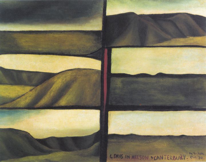
Yeah. That reality imported into the gallery. Low Tide was a seven-by-seven field of concrete-foundation piles, painted with green resin up to their notches. Six rows filled the alcove, while one row ‘seeped’ through the dividing wall. The resin was very painterly—it was a joke about painting. It was like dank, gravity-stricken seaweed. Foundations of existence and art-history and my memories of crab-scrabbling as a sodden child … I wanted the work to draw on the memory banks of the viewer-participant, to create a sense of rightness. The installation was specific to the space. ‘Site-specific’ was an unknown term then, as was ‘installation’—but they weren’t unknown ideas. It had to be done differently at the New Gallery. It was a bigger space, and there was nothing like an alcove to contain the grid, so I did something different, running the grid at an angle through two rooms, again seeping through a wall. This time a nine-by-nine grid. It was almost identical to the first notional scribbles I drew on the plan when Wystan introduced the idea to me in Sydney.
.
So, how did the show at Barry Lett come about?
.

As soon as I had arrived, Jim said I needed to meet Rodney Kirk Smith at Barry Lett Gallery, and that I was having this show there—in four months time!
.
The show really comes out of the blue. There was nothing like it in New Zealand before. It was so complete a statement that it must have been the result of a substantial build-up.
.

Absolutely, the Lett show was a crystallisation of probably ten years of work. I’d been doing loose stuff with AMM in London, and that was in that box, and then there was another box with stuff that was rigorous and geometric, the sculpture. But with the Lett show, I dispensed with all those divisions. It was the first time I really kicked out the walls of the boxes of the way. Before that I’d always had that New York sense of propriety in my work, the well-maintained oeuvre. You couldn’t play too much. It had to be clear, tidy, sequential. Getting better at less and less. You only have to compare the career of my friend Fred Sandback, who maintained that kind of Morandi consistency over thirty-odd years, to my career, with its leaps, jumps, and backtracks.
.
You mentioned Sandback, a fellow student at Yale. A couple of works in the Lett show used string to demark the space—string and plumb bobs.
.
There were two pieces. One, with a string line across the space from side to side. It had plumb bobs at either end, one at eye height, the other at hand height. The other string went from the back to the front of the space, from inside to outside. Inside, it finished with plumb bob hovering over a concrete disk. And, if you followed the string back, all the way along down the stairs and out of the gallery, it was tied to a big bolt set in lead on the pavement. The energies were earthed, but it was a bogus earthing. And the string bounced around the gallery and delineated the space. The plumb bobs were like absolutes, absolute truths that other recognitions could be read against. I suppose the difference between my strings and Sandback’s was that his were elegant and art, and mine were straight off the building site.
.
Several works looked like minimalism and yet they had associational aspects, which are not supposed to be there in minimalism. Low Tide is like a landscape piece. And there’s Life Size. How did that one work?
.
There were two stacks of bricks under pressure, contained by steel bars at either side to stop them bowing out, with a cable that ran around the outside and underneath. The whole thing was held in place by the tension generated by its own weight—compressed energy. My height, my width. Pillar was a companion piece, a giant paperweight, two stacks of bricks suspended in resin, with spaces between the bricks where the cement might have been. Bricks in aspic. They said it was impossible. I made a kind of giant fish tank to cast it in. There was a nice contrast: in Life Size, the bricks were hanging and potentially explosive; in Pillar, they were floating and encased.
.
Pillar
is like Low Tide, except the tide has risen again.
.
That was absolutely it, because that was the process: pour an inch of resin a day and hope it would stop smelling in time for the show. There was a lot of smell in the show when it opened.
.
Some of the works referred to your life quite directly, Cheque Piece—hundreds of your cheques pinned to the wall in a grid—pointedly so. It’s autobiographical.
.

It was cheques tracing two years of my life in New Haven, every cheque written, all in sequence. At the time, US banks would return your cheques with your statement at the end of the month. I’d opened the account in New Haven with a change of visa and a payment to the immigration board. Then, there are cheques for the rent, for the occasional substance, donations to the Black Panther party, lots of liquor stores. The last cheque was for a trucking company to take my stuff to LA, and then the account was closed. Everything, all life is there.
.
Is there a story behind Moominmamma Dead and Gone?
.

This is a difficult one. One day, I was in the studio. It was just before the Lett show. There was a knock on the door and in came a friend. It was the day after his wife had committed suicide and he sat down with me and we shared a beer. He was devastated. It was a very awkward occasion, as you might imagine. And I found myself looking at the mess on the floor. That chaos was indicative of what my friend had brought in, and I found it true and moving, and to make the work I simply moved all that stuff onto a metal plinth. In the show, there was so much stuff that was ordered and structured and at times authoritative, and it became essential that I put this work in also to demonstrate the randomness of experience. It was dangerous, because there were bare live electric wires on a metal platform. Moominmamma was a matriarchal comic-strip character of immense stupidity.
.
The materials you used brought a wider range of content than you’d typically get with ‘the specific object’, the minimalist object. The concrete piles, the line and plumb bobs, the bricks … they come from your experience working on building sites.
.

Yeah, one of the best examples of that in the show was Silent Wall. It was a hollow, stud wall, clad with four standard eight-by-four foot sheets of gib, with one stroke of a caulking gun on each side, cleaned up by one stroke of a palette knife. They looked like Barnett Newman stripes. It was called Silent Wall because the hollow was filled with foam. Sculptures like this were absolutely related to the everyday world. My work may have been involved in ideas about transcendence and personal development, but I made the decision back at Yale that it was not about virtuoso performance in any way. It was not about the sublime. It referred to working and to working-class life. I’ve always been able to make a living with my hands, at that time very much with my hands. I’ve always carried the sense of poetry that my father had when he was wiring a house, his nagging sense of precision in arranging screws at that angle, running electrical wiring this way, holding the hammer properly, and letting the tools work for you. The poetry of the artisan provided a resonance and a matrix more valuable than virtuoso performance. I’ve always been very particular about the qualities of the material. Things are put together quite obsessively. My neuroses won’t permit ragged edges that aren’t considered.
.
The show was funny. Pyramid particularly.
.
I used eight-by-four boards again. I liked the way they were standard. They originally made them that size because that was the size of the early railroad boxcars they moved them in. As a builder I was used to moving them. They seemed related to the body. And I had a minor epiphany when I realised I could cut the sheets diagonally and reassemble the pieces to create a pyramid exactly my height. Pyramid had light bulbs running down its edges on a dimmer hooked to a timer. Over 24 hours the bulbs slowly brightened up, then dimmed away. Full brightness was synced up with high noon over Cheops. It was a little joke about the pyramid cosmologies of the day. I had in the back of my mind a cartoon from the Yale School of Art and Architecture journal Perspecta which showed the Great Pyramid and someone talking to the Pharaoh: ‘This is all very well Ramases, but let’s plug it in and see if it works’. It had its serious side too. You couldn’t see the lights change. It was so slow. But as you walked around the show and looked at the other things, you could feel something happening. It provided significant if barely perceptible experiential change in the space, but you couldn’t put you finger on it. Of course, Pyramid was only fully lit when the gallery was shut. I think humour is another signature you can use: the tragic, the foreboding, and the humorous. We all cry, we all laugh—I told you I was a soppy humanist. But the Barry Lett show was the first time I had consciously employed humour.
.
The Lett show broke a lot of new ground. Reviews were good. Tony Green and Hamish Keith were positive. Even T.J. McNamara took the show seriously. How did people generally respond?
.

With some uneasy bewilderment, I felt. Someone said, ‘This is all very well Adrian, and very interesting, but how is anyone supposed to buy it?’ Within the art community, some artists were very interested, for instance Gretchen Albrecht and Jamie Ross. Gretchen swapped one of her works for one of mine. I suppose the thing which exemplified much of the response and that irritated me was that the humour—particularly the way the opening was presented as an event—seemed to prevent serious attention being given to the individual works. Some people were also offended by the art swipes.
.
Art swipes?
.

There were art jokes. Slab was a painting joke. I made a glass mould on the floor. I poured in a whole bunch of resin, plopped a foam mattress in, let it all set, and then pulled it all out of the mould. It produced this fractured, painterly, crisp surface with a very raw edge. Slab hung from chains set into the resin. I was playing with how painters were letting the dribbles show on the edges of their canvases as a convention.
.
The Lett show involved works that operated in a range of registers, with relays of associations running between them. And not just the works, but everything that went with them: the catalogue, the title of the show, the ritual of the opening, the hanging devices. That was new here: the exhibition as a medium.
.
During the opening, toast was served and homemade fruit wine. Maree Horner and her friend Jane were dressed in serving-maid outfits with T-shirts with PCIFCo across the front. And they greeted people as they came in and gave them PCIFCo badges, so every individual was made part of the conspiracy.
.
It was a riposte to authority.
.

Irritation with bureaucracy, the controlling things in all our lives—bogus authority. The little catalogue pamphlet was printed on forgery-proof, chemically imprinted, cheque paper. It included an entry ticket and a copy of a silly, pompous reference that had been given to me by that provincial West Country art school. My California driver’s license was reproduced on the cover, as if the catalogue were a certificate of authenticity, and the show title included my middle name, as if it were a legal document. Everything was underlined six times to say this is absolutely official. It was the spoofery of a certificate of authenticity upon a certificate of authenticity upon a rubber stamp of a signature. And probably, this was a response to the high art of New York, which I had already decided was very tight and provincial and hermetic, and at odds with my desire to make the art process an engagement with real life and real human beings.
.
The Lett show had a hand in introducing Marcel Duchamp into New Zealand art. Certainly, a number of the Sculpture students picked up on him subsequently.
.

Of course. I’d been to the big Duchamp show at the Tate, the one organised by Richard Hamilton and with his reconstruction of The Large Glass. I’d also run into Hamilton during a tour of that show. The depth of cryptography in Duchamp, the layering, really interested me. And in LA, I’d purchased a copy of the big facsimile edition of the notes to The Large Glass and I brought it with me to New Zealand and lent it around. I lent people books on Wittgenstein too.
.
What were your impressions of the school?
.

I have to admit I was fairly arrogant when I arrived. New Zealand was the bottom of the world. But when I arrived, it was a revelation. I was given carte blanche by Jim. I was given a studio and I went to look for students. The first people I got into conversation with were Maree Horner, Angela Day, and Malcolm Ross. Malcolm was actually holed up in his studio in a separate building, and I was taken to meet him, and we had this fragmented exchange over a couple of years. It soon became clear that I had nothing to feel complacent about, being nibbled at and challenged as I was. People were interested, they were also smart. It was a community of committed individuals. Trust came into it. Jim took upon himself the role of facilitator, allowing us to be as preposterous and silly as we wanted. He was in the office phoning the air force to get Phil Dadson flown to Fiji to meet Indian drummers, and he was harassing Fletchers for support for the Bledisloe Place project. I was some kind of catalyst, and I recognised at the time that this was my role. There was this flat bureaucratic system and we just got on with the business. Being there set in my mind an idea of the art school as a place where artists at different levels of experience enjoy a free exchange of ideas and information. It was a very special couple of years.

Gavin Hipkins: The Guide

Art and Text, no. 65, 1999.


Gavin Hipkins is a photo-tourist. Literally, pilgrimages play a major role in his work, and, metaphorically, he is a tourist of photography itself, of the spaces defined by its histories, its modes, manners, and mechanics.1 Hipkins is on a grail quest, hankering after some truth, some sublime, but always arriving late on the scene, discovering evidence, clues, engaging in cultural and art-historical forensics rather than basking in affect. While he tracks down the ideal, something unpleasant dogs his search.

Tourists prefer sites of preordained or readymade significance, places known by reputation. Hipkins’s 1997 show The Blue Light—named after the 1932 proto-fascist movie starring Leni Riefenstahl—developed out of a research trip to Germany. This package odyssey took him to the Pergamon Altar in Berlin, to Zeppelin Field in Nuremberg, to Munich’s 1972 Olympic Stadium, to Dresden’s German Hygiene Museum, and finally home, to Napier, New Zealand, the city that arose from earthquake rubble in art-deco style. While Riefenstahl’s film was romantic and moving, Hipkins’s show was not: it was bitsy. It included images gathered along the way, shot and presented in diverse styles—odd fragments divorced in time, space, and content. There was a still from Fantasia (1940), some architectural details, closeups of light fittings, and a blurry shot of a tooth resembling a hermit’s cavern in the mountains. We were left to join the dots, as though these images were less works than findings, clues that might shed some light on something. Detective work was required to piece together the story Hipkins was seeking, or perhaps the story of his seeking.

A sense of belatedness nags Hipkins’s work, which is routinely obscure, affectless. In 1997, Hipkins visited Chandigarh in Northern India. Le Corbusier’s ‘radiant city’, built in the 1950s, contains many of the architect’s celebrated buildings, but also his kitschy Monument of the Open Hand. Located alongside a sunken amphitheater, the giant, idealised hand slowly rotates to suggest ‘the direction of the wind (that is, the state of affairs)’. The judges and lawyers of Chandigarh once identified the monstrous disembodied hand as a representation of the Law, but, at the time of Hipkins’s visit, the Hand’s ‘Trench of Contemplation’ had been co-opted by kids as a makeshift cricket pitch, reflecting instead the fate of modernism’s lofty ideals. Hipkins’s The Trench (1997–8) is a slide show containing eighty images of the ominous Hand double-exposed with roses from Chandigarh’s rose garden. The hand rotates as the roses pass from yellow to orange to red … The scale of projection is intimate, bringing the Hand down to hand-size, just as that rosy overlay undermines its pomp and authority, its faith in the State.

Hipkins says the use of double exposure in The Trench echoes not only cheesy effects found in Indian commercial photography but also special-effects sequences from the old children’s TV series The Tomorrow People. Hipkins courts this kind of ambiguity. He homes in on suggestive retro styles or motifs we can’t locate in just one place, things that belong at once to different value systems, moments, discourses—or between them. Many of his works—The Track (1995–7), for instance—recall brands of early modernism, when an efficient, dynamic aesthetic was linked both with utopian social movements and with totalitarianism. This imposing work, some three metres high, is made from a tiny image, an unassuming closeup of some brown plasticine. Strips of machine prints of this snap are stacked horizontally. The work catches us in a web of slight references. It resembles an aerial view of an athletics cinder track, as one might find in a sports stadium. (Those who know Hipkins’s The Blue Light may be reminded of Riefenstahl’s 1938 film Olympia; the Fantasia still it incorporated recalled Albert Speer’s dome of light from Olympia’s finale.) It also looks like lengths of slot car track. The mechanics of the photographic process is likewise suggested: the softness of the plasticine is like photographic film waiting to receive the imprint of reality, a negative image. And the strips of prints, pinned through their tiny sprocket holes, make an analogy to the strips of film that run through the track of a still or movie camera. The strips also recall the backgrounds Eadweard Muybridge used for his protocinematic studies of animal locomotion.

In her essay ‘The Im/Pulse to See’, Rosalind Krauss observes that a pulsing, an agitation, a dissolving of the visual, marks certain early modernist art.2 She links it to the popular fascination with the flickering of protocinematic toys. The pleasure we take in the zoetrope, she argues, is dependent on recognising both the vitality of its effect and the artifice of its generation—the mechanism. Hipkins is no stranger to artificial life. For The Tunnel (1995–7), he alternated at random hundreds of brown snaps and yellow snaps of a ball in two meandering lines at head height and crotch height. Talking to eyes and testicles, The Tunnel was intended as an agitating erotic trench to channel our gaze, but to nowhere. It was a self-conscious instance of ‘round’ phallocentrism.

Pulsing has a long history in Hipkins’s work. It’s there in the Falls (1992–), a series Hipkins started at art school. Shown individually or in groups, each Fall is a vertical strip of machine prints that presents the content of a single roll of film—suggesting a session of almost identical shots of a subject from more or less the same angle, like a ‘shot’ of film footage. In Hipkins’s most recent collection of Falls, Zerfall (1997–8), shown at last year’s Sydney Biennale, the subjects are circular and hail from the kitchen and the bathroom, sites of eating and excreting, the ends of another tunnel. The effect is once enticing, static, hallucinatory, banal, vibratory, and inhumane.

Marxists have criticised dynamic product photography as the ultimate expression of commodity fetishism. Bringing the inanimate to life, it imbues commodities with a mystic vitality apparently independent of and superior to the lives that brought them into being. Hipkins’s images work somewhat similarly. But, while Krauss characterises early modern pulsing as a virile throb, Hipkins’s retro-pulsing is more a sterile jiggle, an already spent eroticism. Pointedly, ‘Zerfall’ is a German word meaning cultural dissipation, decay. Hipkins relishes exhaustion, the residue of vitality. Another photographic work, Zerfall: Wellington, 1 March 1996 (1996), freezes exploding fireworks, arresting their spectacle at the moment of fulfillment and expenditure.

In discussing Hipkins’s work, one can’t avoid mentioning the sublime, a worn-out idea that has done its dash. In The Field (1994–5), a thousand or so photograms of balls are massed and marshaled, papering the wall to create a starry cosmos or a cosmic computer screen. This work suggests a hollow, weary, denatured sublime—the sublime as a trope that can be routinely summoned, restaged, wheeled out, to satisfy the masses. When he showed The Field at Dunedin Public Art Gallery in 1996, Hipkins hung his small diptych, The Field Rats (1996), on the opposing wall, presenting a nasty tangle of plastic rats, their glowing eyes mimicking the lights of The Field. While the big work on its own might suggest shadows cast by a galaxy of ideal forms, read in association with the rats The Field became monstrous—glowing feral eyes lurking deep in the gloom of Plato’s cave. The sublime staring back. The romantic dream transformed into vermin.

Using grand, gravid, portentous titles like The Dam, The Well, The Drop, and The Movement, Hipkins offers his works as authoritative and thuggish. He says his titles may be heroic (suggesting mammoth engineering projects and mighty public works) but they are also pulp, recalling the corny language of horror-movie tides (The Howling, The Thing, The Hidden, The Omen, The Shining), where the definite article enhances the sense of some generic menace—something original, archetypal. An underlying uneasiness is always there in Hipkins’s work. It is the unease we feel when we get too close to the absolutism of utopias, when we realise the modernist project of creating the ideal city may not be far removed from the fascist’s project of creating the ideal extermination camp. Both lose the individual within the mass, the social machine, the big picture. In this way, Hipkins’s beautiful, bleak abstractions belong to the neo-gothic, with Le Corbusier’s severed but animated Hand serving as their fleurs du mal.
.
[IMAGE: Gavin Hipkins The Trench 1997–8]

  1. Giovanni Intra, ‘Photogenic’, Signs of the Times (Wellington: City Gallery Wellington, 1997), 24–5.
  2. Vision and Visuality, ed. Hal Foster (Seattle: Bay Press, 1988), 51–75.

Stephen Bambury: Chakra

Home and Away: Contemporary Australian and New Zealand Art for the Chartwell Collection (Auckland: Auckland Art Gallery with David Bateman, 1999).


Stephen Bambury’s paintings have been called elegiac, even belated. They operate in the wake of the discredited utopian programme of the historical avantgarde. Certainly, Bambury’s crosses can be read as death—the crucifixion of modernism. But they can also be understood as hopeful—a resurrection of sorts.

These days, modernism is routinely cast as univocal, dogmatic, and exclusive, and yet Bambury’s paintings touch on a diversity of art philosophies, histories, and technologies. They connect with Malevich and Mondrian, obviously; but also with icon painting, Navajo sand painting, alchemy, yoga … They also nod to other contemporary artists—Colin McCahon, Helmut Federle, Imi Knoebel, John Nixon—but without aligning themselves with any camp. Bambury’s paintings aren’t simply formalist, there is too strong a suggestion of symbolism in the motifs (crosses, I-forms, ladders, the word Hi-Fi) and too much investment in idiosyncratic materials and processes. On the other hand, they’re not exactly discursive either—what is their issue? They seem to imply a range of possibilities, but also keep them at arm’s length.

Bambury is dogmatic when it comes to not being dogmatic. He frequently resorts to a contradiction-in-terms to explain himself, describing his approach as ‘porous hermeticism’. I take this to mean that, though his abstract paintings may appear formal, self-referential, exclusively visual (in that arch-modernist vein), they also absorb the world, asking to be read in relation to the diverse things, histories, philosophies, and opportunities around them. They flicker open and closed. Does that make the artist a fence sitter? Not at all. It would be truer to say that Bambury prefers—even constructs—a space between.

Not surprisingly, writers have made much of the porous aspect of Bambury’s work—it enables their displays of art-historical and philosophical proficiency. However, Bambury’s work is equally compelling for its stand-alone qualities: its hermeticism, its lack of complicity with what it absorbs—its elusiveness. Exceeding, even countering, the work of the writer, Bambury’s painting also evacuates meaning—exquisitely. In emptying themselves, and our heads, his works belong to a meditative practice, meditation being precisely that blissful and contemplative state of mind where ideas may float in and out of consciousness without judgment, opposition, or approval—without touching the sides.

Bambury’s practice is a careful balancing act. He is constantly deterritorialising his work, deranging any position or dogma he might appear to be setting up, subtly disrupting the emerging coherency of his project in a series of ‘necessary corrections’. Take Chakra (1994). This work follows a series of ‘ladder’ works in which seven Maievich crosses are stacked vertically. In Tantric thought, the seven chakras are energy centres along the human spine arranged in an implicit hierarchy from low to high, from base to crown. Tantric practice involves aligning the chakras to enhance the circulation of energy. In arranging the crosses here horizontally, Bambury dehierachises the chakras, offering them as interchangeable, near identical. Similarly, in representing the chakras with Malevich crosses, he promotes the near identity of Malevich’s metaphysics and those Eastern philosophies thought to have inspired him.

Moreover, he does this beautifully.

Patrick Pound: Landscape of Mirrors

Home and Away: Contemporary Australian and New Zealand Art for the Chartwell Collection (Auckland: Auckland Art Gallery with David Bateman, 1999).


Patrick Pound is irresistibly drawn to the quaint. He is attracted to cultural products that the passage of time has liberated from moral or aesthetic pertinence—things piquant by virtue of being old-fashioned in appearance, ornamentation, and manner. Scouring secondhand bookshops, he locates raw material that is already obscure, outmoded, out of print: for instance, cancelled library books, discarded family photographs, used postcards. Not only does Pound work with quaint materials, his work emphasises quaintness. Take his recent collage of old book pages, A Guide: Towards a Theory of Everything (1998). Though the scale and title promise something major, this work is an accumulation of trivia, ironic juxtapositions, and arcane conceits. You have to go up close to discern the subtle liberties the artist has taken in arranging, grafting, and working the given. Pound thus declares his complex relation to the big picture, whether it comes in the form of a theory of everything, an encyclopedia, a library, or museum, or some other brand of empire—all of which are implicated in the raw materials chosen for A Guide.

In Landscape of Mirrors (1991), Pound treats the work of Colin McCahon, New Zealand’s acclaimed big-picture artist, painting McCahonesque minimalist landscapes across a number of disposable black and silver plastic serving platters. McCahon certainly had a major project. His late landscapes were the culmination of a search for national identity that had dominated not only his own work but also post-war New Zealand art and letters. McCahon practised an ‘expressive realism’ by which it was thought the self would be perfected in its search for the essence of the land, while the truth of the place could be simultaneously distilled via deep introspection.

Pound revisits McCahon’s heroic project, reworking it as something quaint. The platters he paints on are the cheap, ‘fancy’ kind some people use to serve dainty finger food. Pound creates a cheesy—a wine-and-cheesy—version of McCahon. Satirising the idea of the land as a mirror to the self, the platters are arranged as a gathering of portrait mirrors in which we might celebrate our good persons. As frames, the platters seem extravagant and prissy in the face of McCahon’s preference for the robust, unframed, and plain-spoken. Pointedly inappropriate, the supports are unsupportive: they pull McCahon’s punches. And so, Pound creates a McCahon for the powder room, conflating McCahon’s metaphysical presumption, his virile hankering for reconciliation with the land, with vanity and preening.

Pound’s project epitomises a camp sensibility: he is not revolutionary; he offers no alternative big picture; his work is necessarily parodic in that he is reliant on conventions to inflect, presumptions to deflect. As Susan Sontag explains: ‘The whole point of Camp is to dethrone the serious. Camp is playful, anti-serious. More precisely, Camp involves a new, more complex relation to “the serious”. One can be serious about the frivolous, frivolous about the serious.’1
.
[IMAGE: Patrick Pound Landscape of Mirrors 1991]


  1. ‘Notes on Camp’, A Susan Sontag Reader (Harmondsworth: Penguin, 1982), 115.

William Kentridge

Art and Text, no. 66, 1999. Review, William Kentridge, MACBA, Barcelona, 1999.


Animated-film maker William Kentridge has enjoyed a meteoric rise to fame. Aside from Marlene Dumas, he is the only contemporary South African artist to have gained international ubiquity (his work has appeared at Documenta 10, and recent biennales in Sydney, Havana, Istanbul, Johannesburg). Yet, by his own admission, the work is provincial and illustrative, the subject matter specific, close to home: the legacy of apartheid and the laying to rest of skeletons in closets.

Although troubling, Kentridge’s films are overwhelmingly nostalgic. Predominantly black-and-white, they recall silent movies with their intertitles and old music soundtracks. The imagery is also explicitly antique: old photos or newsreels of smokestack-era industrialism. The smudginess of the drawings suggests the blurring of memory. There’s a sense here that we are somehow stuck in the past, ensnared in unfinished business.

Most of the films rotate around two characters, both white (as is Kentridge). Soho Eckstein is the fat-cat tycoon, creator and ruler of Johannesburg. In his pin-striped suit, puffing on a cigar, he could have been lifted from George Grosz’s caricatures of Weimar bourgeoise. Felix Teitlebaum, whose features are those of the artist, is the artist, the sensual observer ‘whose anxiety flooded half the house’. Lost in romantic possibilities, he hankers after, and makes love to, Mrs. Eckstein. Felix’s struggle against Soho’s evil is played out against the backdrop of the exploitation of the miners and the land.

Soho and Felix are both ‘captives of the city’, but redemption is always a possibility, even for Soho. In Sobriety, Obesity, and Growing Old (1991), Soho outlives his greed to be reunited with his wife, leaving Felix in the wilderness. In The History of the Main Complaint (1996), Soho becomes the object of our sympathy: comatose, hospitalised, and attended by doctor versions of himself, he searches his soul, while his body is probed by a CAT scan. In Ubu Tells the Truth (1997), Kentridge even hints at the possible redemption of Alfred Jarry’s sadistic puppet leader, King Ubu, while, in real life, the Truth and Reconciliation Commission offers amnesty to those willing to come clean and so ‘heal’ the nation.

Kentridge’s animations are created by successively adjusting and re-photographing charcoal drawings. The process has its limitations: the effect is rude, primitive; the charcoal is hard to erase fully and smudges; the drawing betrays the ghosts of its previous stares. But, in the context of Kentridge’s concerns, it is somehow appropriate: his dubious romantic tropes must he employed, as Jacques Derrida put it, ‘under erasure’. There is no storyboard; Kentridge makes the narrative up as he goes along, out of the free associations drawing engenders. Objects are constantly transforming as if to reveal their true colors: a coffee plunger turns into a mine elevator, a cat turns into a telephone. The metaphors are urgent. They move faster than we can read, creating the sense of a world in which the imagination runs amok as compensation for social stasis, for the inability to transform the recalcitrant real world that is the bleak landscape of Johannesburg.

Kentridge writes of his inability to be lyrical, but in his poignant, deeply moving films, lyricism persists alongside, or as a response to, that which would pollute it. The volatile mix of escapism and realism reminds me of Terry Gilliam’s 1985 film Brazil. At the end of that film, the tortured hero finally cracks, escaping, as a sort of compensation, into a blissful utopia in his head. Kentridge’s films aren’t like that, and that’s why he remains a political artist. Lyricism and realism are both present as alternating currents: Kentridge refuses to quash utopian desires while attending to sad realities, and so impels us to seek some resolution in reality. While Adorno wrote that there could be no lyric poetry written after Auschwitz, the ongoing relevance of poetry is the heart of Kentridge’s project.

The End of Improvement: In Defence of Ava Seymour

Art Asia Pacific, no. 23, 1999.


For her latest series of photomontages, Health, Happiness, and Housing (1997), Ava Seymour travelled the length of New Zealand, photographing state houses in such suburbs as Otara, Glen Innes, Porirua, the Hutt Valley, and Brockville. Aided by a generous arts-council grant, but armed only with a plastic Olympus fixed-focus camera, she sought out the most plain, generic examples of these basic dwellings, preferring to record them on overcast days. Seymour avoided dilapidated and customised houses, with their distinguishing marks—the stuck-on butterfly or graffito, the hobby garden, the added-on games room, or the rusty Holden up on chocks. Into the dull, generic images that resulted, Seymour inserted black-and-white images of retards, cripples, amputees and other social rejects, clipped and adapted from old medical text-books and the like. The works derive their humour from the strange interplay between the scrupulously clean images of the built environment and the botched but playful inhabitants that cavort within it. Although the series title Health, Happiness, and Housing prompts the thought of some utopian possibility, the works fail to deliver on it. With individual work titles like Welfare Mom, Minnie Dean, Valley of the Fruitcakes, and Enema Nurse, the images suggest the degeneration of the democratic dream represented by state housing. Seymour writes: ‘Health, Happiness, and Housing not only addresses the issue of mental health but also places it in a humorous context—the place where Shirley from Avondale finds Dali’s decomposing finger in her soup.’1

State housing was part of a grand utopian plan devised in the 1930s in the wake of the Great Depression, when the new Labour government was looking towards the time when every family might enjoy its own quarter-acre castle. Building as many as 5,000 houses a year, they created new suburbs for the great unwashed—worker-housing developments where rents were determined not by market forces but by tenant income. However, by the 1960s, state housing developments had attained a stigma, being seen as a breeding ground for juvenile delinquency and signifying the squalor they were to provide an escape from. By the 1970s, state housing had become an emblem of repressive state paternalism, promoting a kind of bland conformism. State housing was no longer liberation, but house arrest.

Today, New Zealand is different. The New Right is the ruling paradigm and the welfare state is being dismantled. Double-think prevails: the lunatics are being turfed out of the asylums and into the street—they call it ‘community care’. Last year, the government decided to leave social security to the individual—they call it The Code of Social and Family Responsibility. In these dark days, state housing holds an ambiguous position in the New Zealand psyche, being at once nostalgically tied to modernist ideals of egalitarianism—the New Zealand Dream—yet also to a stigma of depressing sameness, a vicious cycle of poverty and paternalism. State housing is at once something to defend and something to be defensive about. In some quarters, the state house has even become ‘cool’, as belated yuppies run out of colonial villas to gentrify and happily embrace the state house as the embodiment of a rich, conflicted social history.

Seymour’s show predictably hit a nerve and drew a sharp response when shown at Artspace, Auckland, in 1997. Her work was read as an attack on the actual occupants of state houses and as an affront to the dignity of the poor, with visitors going into the Artspace offices to complain about the work, to defend egalitarianism as the New Zealand way, and to generally regale staff with their accounts of wonderful people who happened to be tenants of state houses.

Reviewing the show in the local paper, T.J. McNamara was similarly dismissive: ‘Lunacy and aberration rule. The faces are grotesque, haunted, set on bodies too small for the features. The result is an exhibition that is quite singularly offensive, patronising, and snotty. The state houses, for all their plainness, have from the beginning provided shelter and a stable place to live for hundreds and thousands of ordinary New Zealanders. Such houses helped them to achieve a sense of place. The inhabitants of state housing were not the grotesques shown here. Health and happiness were given to many of them by state housing. This exhibition … has no concern for social dignity but rather purveys a smart untruth that cares little for the reality of ordinary people.’2

Conducting tours of the show at the time, I can testify to the hostility of the general response. People are still talking about it. Last week, almost two years later, one of my friends said that Seymour’s collages should be used in the pamphlet to illustrate the government’s heartless Code of Responsibility: ‘It’s what they [the government] really think’, she said, ‘that poor people are all retards and degenerates’. However, all this criticism takes the works at face value, as if the works said simply: people in state houses are sub-human—mentally, physically, and morally defective. But to think this way is to assert a crushingly banal politics of representation, to read the images as if they were offered as simple photographic documents rather than as patent fabrications—photomontages. I would contend that these works can be read in a very different way, as commenting less on reality—the real life of the real people who live in actual state houses—than on other representations.

Health, Happiness, and Housing draws on a variety of registers and vernaculars of photography. Seymour’s research trip—largely unnecessary as these houses are everywhere the same—recalls those large-scale systematic documentary projects that promise to reveal one subject in depth through committed and comprehensive treatment, be it Robert Franks’s The Americans (1958)—enabled by a Guggenheim fellowship—or Ed Ruscha’s already parodic Every Building on Sunset Strip (1966). Seymour’s pallid background shots resemble the kinds of amateurish photos seen in New Zealand real estate agents’ windows; shots that never show a house at its best—bad angle, bad lighting, power pole in the centre. They also echo American art photography’s preference for deadpan documentation of the suburbs. The figures belong to the tradition of photomontage, the work of John Heartfeld and Hannah Hoch, and to Diane Arbus–style freak photography (several collaged figures were actually lifted from Arbus shots). Seymour’s works as a whole recall common snapshots of people standing proudly outside their houses as families or newlyweds (two images in the Housing series are wedding photos: Gas Mask Wedding and White Wedding, Invercargill). They also echo Walker Evans’s images of poor white Americans during the Great Depression, posed before their weatherboard houses. Crucially, Seymour’s images recall—and distance themselves from—the work of the New Zealand coffee-table book photographer, the late Robin Morrison.

Morrison scoured the country, habitually documenting old codgers standing proudly before their common homes, popularising his vision through books like The South Island for New Zealand from the Road (1981) and Sense of Place (1984). Morrison idealised his modest sitters, offering them as characters, while really telling us little about them as individuals. His images belong to the Family of Man brand of photo-humanism, which promotes diverse subjects as sharing in a common humanity at the expense of what distinguishes them from one another, and particularly what distinguishes them from us as viewers. Photo-humanism depoliticises its subjects, making them available for our empathetic response. Morrison’s positive images have become part of the reassuring grab-bag of signs known as kiwiana, which nostalgically evoke New Zealanders as das volk, suggesting simpler good-old-days and basic values. Morrison’s images have become emblems of collective, nationalistic, anti-urban matehood: a romanticised kiwi psyche. In the 1990s, Morrison’s work is constantly reprised by local advertising agencies to sell Mainland Cheese and McDonald’s Kiwi Burgers, while the population becomes increasingly fragmented, urbanised, and diverse, and the myth less and less tenable. Call it compensation.

Seymour’s Housing series could be understood as a punk parody of Morrison’s work, an alternative reduction, exaggerating what his photo-humanism would conceal. In Welfare Mom, a woman grips a baby, ignoring another lying naked on the pavement; Minnie Dean takes its name from the famed caregiver kid-killer. Seymour provides a low blow to a comforting image of the past, an ideal of the social. This was brought out by her inclusion in the group show Folklore: The New Zealanders, which presented works by fourteen photographers related to the subject categories of coffee-table-book photography. However, curator Gavin Hipkins chose images that were negative, bleak, dowdy; rejects from the great New Zealand photograph album. Folklore was a kind of shadow history of New Zealanders, the abject version of an ideal.3

Not only is Seymour’s series related to other modes of photography, it has many precedents in a strain of New Zealand art and literature, evident since the late 1950s, that interrogates the party line of the New Zealand suburbs as a utopia. This theme is extremely visible in the work of painters in the late 1960s and 1970s, for instance, in Michael Illingworth’s boxed-in suburbscapes, with their rows of generic detached houses and pathetic hydrocephalic-headed everymen; in Jeffery Harris’s pathologically distorted family groups, posed as if for a photograph; and in Richard Killeen’s milling suburban crowds, oblivious of the odd corpse. These works mess with egalitarian assumptions hard-wired into the kiwi brain. Seymour’s work is readily located within this context, as another, somewhat nastier, reply to the legacy of centrally driven programs of human perfectibility: New Zealand, the social experiment gone wrong. In fact this would seem to be the explicit message of Seymour’s Valley of the Fruitcakes, which prominently includes a Ministry of Works sign reading: ‘End of improvement, thank you for your patience’.

Seymour’s work exemplifies the dada tradition of photomontage as a device for rupturing the mythological completeness of normative images. In her previous series Rubber Love (1994–5), Seymour relocated figures from rubber-fetish magazines in sumptuous domestic interiors, collapsing the distinction between the conformist and the deviant. These house-proud gimps have spent all day cleaning their houses, fluffing their doggies, and greasing their rubber suits in expectation of the Conde Nasty photo-crew: they are ready to parade their drapes and butt plugs. Betraying evident pride in their defectiveness, they wear their deformities and perversities as badges of honour.

In both Health, Happiness, and Housing and Rubber Love, the figures appear deliberately posed—complicit in their presentation. And yet Seymour is not trying to humanise freaks in the manner of, say, the Australian photo-journalist duo Sandy Nicholson and Chris Johnston, whose recent Suburban Fetish series, a sympathetic portrayal of S&M and bondage practitioners, superficially resembles Seymour’s Rubber series. As photo-humanists, Nicholson and Johnston want to reabsorb deviants into the canon of normality, into an idea of das volk, promoting understanding, extending a shared humanity. In the end, their celebration of perversity is in the service of assimilation. Seymour’s images don’t attempt this kind of redemption. There is always a sense of non-empathy—no pretence of identification—with the subjects.

Health, Happiness, and Housing belongs to the Gothic, with its preference for the grotesque, the fragmented, the destructive, the uncanny, the diseased, the pathological, the blissfully freakish. Seymour messes with our need for reassuring ideological images of social life, getting us where we live, where we need that comfort. Her work is less about a violence done to the subjects of the images—here, the actual or imagined occupants of state houses—and more about the violence the photographs do to the viewer. Getting back to my friend’s comment that Seymour’s collages should be used to illustrate the Code of Responsibility pamphlet, of course Prime Minister Jenny Shipley would never put such images on the cover. Instead you get happy families—a spoonful of sugar to help the medicine go down, a clown mask on the executioner. But, no one would be surprised if they put a Robin Morrison on the cover.
.
[IMAGE: Ava Seymour Valley of the Fruitcakes 1997]


  1. Ava Seymour, Health, Happiness, and Housing (Auckland: Ava Seymour, 1997), np.
  2. ‘Purity and Patronising Snottiness’, Herald, 12 July 1997.
  3. My text has been heavily informed by Gavin Hipkins’s writing in Folklore: The New Zealanders (Auckland and Wanganui: Artspace and Sarjeant Gallery, 1998).

Colin McCahon

Toi Toi Toi (Kassel and Auckland: Museum Fredericanium and Auckland Art Gallery, 1999).


.
In thinking about how Colin McCahon could be introduced to a German audience, a comparison with Joseph Beuys is irresistible. Roughly contemporaries, Beuys and McCahon were artists of the post-war period: McCahon was born in 1919 and Beuys in 1921; Beuys died 1986, McCahon 1987. Both engaged with the project of post-war reconstruction, with its imperatives of healing and redemption. Both posed as teachers with an urgent desire to communicate: big themes, burning messages. Blackboards loomed large for both. Both combined a search for simplicity and directness—public address—with density, difficulty, and self-reference. Both were cast as romantic visionaries, grail questers, even prophets: legends surrounded them, they spawned disciples. Both seemed simultaneously ahead of their time and romantic, almost nineteenth-century figures: McCahon speaking to an increasingly secular audience in the language of the bible, Beuys posing as a shaman. Both enjoyed a complex relation to modernism and internationalism, being modern but ‘provincial’ in relation to the dominant art discourse emerging from the US. Both had strong veins of nationalism running through their work. As well as posing as teachers in their work, both were influential teachers in art schools. The artists who followed them literally made works in their wakes. Both remain essential to the art of their countries, little of which makes sense without reference to them. Of course, McCahon is not Beuys; the differences are just as compelling.

In the 1940s, New Zealand was still a young nation, an isolated place, a cultural backwater. Conditions for producing and receiving contemporary art barely existed. McCahon’s early works came from landscape. Confirmed by his appreciation of Professor Cotton’s technical line drawings of the distinctive faulting and folding of our land, McCahon imagined it stripped of vegetation and signs of habitation, denuded botanically and culturally; a place waiting to be claimed, named, settled; a place waiting for a culture—‘a landscape with too few lovers’. His pictures emphasised the land’s hard, buxom corrugations; its underlying structure; its rhythmic, monotonous geomorphology. This was not a pretty-picture landscape for the tourists, but something assertively, unspectacularly, blatantly here. Massive, rude, and empty, McCahon’s landscapes evoked the biblical ‘wilderness’, calling forth the possibility of a promised land, a utopian reconciliation of the people and the place.

Wystan Curnow has characterised McCahon’s early work through a contradiction-in-terms: ‘expressive realism’. Expressionists deform external reality to express the truth of their inner experience while realists eschew subjective distortions in the hope of capturing the external world. The expressive realist however conflates inner and outer realities, discovering and inventing his true self only in striving for the deep essence of the Other. This quest finds clear expression in McCahon’s Six Days in Nelson and Canterbury (1950), which contains six views of a landscape as though glimpses sampled from a journey. The work refers to the six days of Creation, but, less grandly, it was based on McCahon’s epic bicycle rides in search of seasonal work. God created the world in six days, each day a lurch forward providing a new level of complexity and detail, a new order of existence. And yet, McCahon’s six landscapes vary only in their profile, so it is hard to argue such a sequence. Here, McCahon implies, what is changing, what is being created, is not the World, the landscape, but rather the subject. The subject is refined in spending time with the land, tuning in to it. Geomorphology begets psychomorphology.

In the late 1940s, McCahon populated his bleak, majestic landscapes with figures and tales from the Christian story: Christ and the Virgin, annunciations, crucifixions, depositions, entombments. These works drew on a range of sources. Early Renaissance painters had already staged the Christian story as if it were happening on their own doorstep. The crude black outlines came from Georges Rouault and comics—notoriously, the speech bubbles came from a Rinso soap-powder packet. The artfully clumsy rendering and the mix of high and low sources suggested, to some, something urgent, pious, direct; to others, blasphemy. Poet Charles Brash reported: ‘Colin McCahon is saying that here in New Zealand men who are the sons of God … are betraying and crucifying one another daily, that daily the three Maries are being turned back from the tomb (or that we are looking for truth in the wrong place, and according to the letter and not the spirit) …’1

While they became notorious—critic A.R.D. Fairburn said they might pass as graffiti on some celestial lavatory—the ‘early religious paintings’ were not entirely satisfactory: they made literal, too literal, what was already implicit in McCahon’s unpeopled landscapes. McCahon would turn his back on this approach, rejecting illustration, edging towards a different approach, which we see in his mature works of the 1960s and 1970s. But, what would come next, in the early and mid 1950s, in retrospect, seems like a re-apprenticeship, with McCahon going back to the drawing board, schooling himself in modern ways of composing pictures, retooling himself in cubism and its offshoots. On Building Bridges (1952) says a lot about McCahon’s issues at this point. It offers three views of a distant local terrain framed by the struts of an unfinished or decomposing heavy-metal bridge. Bridges are artificial contrivances that take us places, that offer access to destinations we couldn’t reach otherwise; but McCahon’s bridge does not take us into the land exactly, in fact it could be seen as a barrier, running parallel to the landscape, bypassing it. However, the unraveling of the bridge also echoes the cubist facetingof the landscape, as though each might be melding into the other, or emerging from one another, as though at some deep level there might be some intrinsic sympathy between the bridge (the subject) and the land (the Other). Ambiguous, the work is an imbroglio.

When McCahon returned from his visit to the US in 1958, he made a breakthrough, informed by his exposure to abstract expressionism. McCahon geared up, bringing a new authority, scale, and complexity to the work. 1958 was the year of  the Northland Panels, a serial landscape, a landscape narrative, painted on big drops of unstretched canvas. Moving out of the easel painting mode, this was an installation painting, a painting to walk by. The Wake, same year, was like a sequence of giant illuminated pages which filled the room. Text drops featuringpoet  John Caselberg’s elegy for his dog were punctuated by thin abstracts representing kauri trees. The space of reading had become a forest of signs, the work an immersive environment. The following year, McCahon produced Let Be, Let Be, taking Christ forsaken as a metaphor for the lot of modern man. In the late 1940s, McCahon would have pictured Christ on the Cross, but, in this painting, the figure is replaced with a sign: a T shape, a Tau cross, the Jewish cross associated with the Passover. This cipher is both image and writing—a letter; is both Christian and pre-Christian. In the context of McCahon’s work, the cross here pointedly recalls the broken bridge in On Building Bridges, as though it were attempting to span the painting. And so Christ takes on the ambiguity of the bridge: he is both a barrier and a way through.

After 1958, McCahon moves onwards and outwards like never before, mixing orders of language, images, signs, and symbols; mixing different registers of significance; multiplying and cross-fertilising ways of making paintings. McCahon synthesises all manner of influences and content: abstract expressionism, minimalism, Maori nationalism, environmental concerns, Japanese scroll painting, Moby Dick … The Christianity complicates everything it comes into contact with, making religious nationalism, apocalyptic environmentalism, holy minimalism, divine conceptualism! With few artists in New Zealand practicing radical styles for McCahon to position himself against and no one else laying down the law, McCahon was free to make it up as he went along, making wilful use of his sources, grounding his explorations not in a broader context but back in his own work. As Wystan Curnow put it, ‘having invented painting in New Zealand, he could now work in a tradition of his own making’.2

Through the 1960s and 1970s, much of McCahan’s work turns on the idea of the fourteen Stations of the Cross. For Catholics, the Stations are a meditational conceit, a ritual by which they might accompany Christ through his last journey and reflect on his suffering. McCahon created many versions of the Stations. In a 1966 work, rudimentary landscape forms stand in for each stop. But McCahon’s most radical innovation was to resist representing the Stations, simply replacing each stop with a number—a mnemonic. His three Teaching Aids (1975) recall blackboards. Each is an array of ten sheets, two-up five-across; each sheet a performance of the Stations, thirty performances in all. McCahon counts up through the Stations this way and that, using Arabic numbers, Roman numerals, and words, sometimes making it to fourteen, sometimes not; with white lines subdividing panels, suggesting compartments, crosses, letters, landscapes. While we might impute specific readings to each panel, with this many variations McCahon is surely suggesting that we might read sense even into a random organisation of numbers if we approach them via the interpretative prompt and spiritual imperative of the Stations. And so the Aids invite and confound our hermeneutic zeal. Marrying the absolute and the provisional, they meet us halfway, affirming faith as a hankering, a coming to terms.

McCahon exploited the deep structural possibilities of Christian myth to create a labyrinthine oeuvre, a body of work we can ‘get into’. But was McCahon Christian? Anxious to promote him as a passionate agnostic who used Christianity as an armature for an art with other objectives, Wystan Curnow cites McCahon’s difficulty with organised religion, his persistent doubt, and his obsession with Christ’s death on the cross, as though this were the literal death of Christianity. Stuart McKenzie, however, characterises McCahon’s project in terms of contemporary theology, in which the death of god, the profane, and doubt are motors for religious feeling. There is, in fact, considerable common ground between these views. It is this: McCahon is aligned with existentialism, investing meaning into a meaningless world, a post-war world that God had forsaken. But more remarkable is how the work implicates us in this. The viewer is set up to relate to the works in the manner that McCahon himself once confronted the land, approaching it as an Other that is not easy, that is recalcitrant and shy to knowledge. And yet, we find ourselves, our own meanings, in it, as if we and they were one and the same. Deciphering implicates us in an invention, the invention of ourselves. McCahon’s work reaches out to embroil us in an epistemological contract.

Paradoxically, the artist who wanted to find a way through became an obstacle for a subsequent generation. In the 1970s and early 1980s, there was a feeling that wherever New Zealand artists wanted to go, McCahon had been there, done that, already. He had pegged out the territory, made his mark, everywhere. McCahon’s work was so heavily essayed, so closely read, and in itself so expansive and complex, so influential, that it seemed to belong to all moments: premodern, modern, post modern; regionalist, nationalist, internationalist; believer, doubter. Gravid, his work seemed to draw everything into itself. However, since his death in 1987, contemporary artists have found a way through McCahon by reading and rewriting the work perversely. Take some of the younger generation of artists in Toi Toi Toi. Ronnie Van Hout mimics McCahon’s ominous early landscapes in his 1992 photographic series, Return of the Living Dead. McCahon’s holy personages are replaced by a model Afrika Korps radio operator, as though conflating McCahon’s presumptive colonisation of the wilderness with Hitler’s dream of world domination and the legacy of German romanticism. Mike Stevenson’s hokey naive paintings of small towns and their churches and church halls from the late 1980s nodded towards McCahon’s early religious paintings. But his more recent works are less an illustration of Pentecostal life than a parallel instance of irrational fundamentalism—righteous and cranky. L. Budd draws on McCahon’s late text paintings, even painting on canvas blinds as McCahon did and often imitating his blackboard look. But rather than achieving a public voice, her works are solipsistic and arcane. It’s as if the search for the truth seriously fell off the rails, but just kept going, echoing McCahon’s voice in the wilderness, the man alone, the unbelievable believer. Peter Robinson draws on McCahon’s preference for plain-speaking vernacular sources—grocers’ signs and cricket scoreboards—as shortcuts to the truth, except in Robinson’s case the truth is the sad state of our race relations. Aping McCahon’s pedagogical aspirations, Robinson casts himself as the bad preacher, the evil McCahon. All these artists show great affection for McCahon in their own way, but as disbelievers they are all concerned to undermine his—perhaps anyone’s—purchase on Truth with a capital T. Perversely perhaps, McCahon’s legacy may have been to have generated a space for folly, disbelief, and cynicism in New Zealand art—a way through.
.
[IMAGE: Colin McCahon Six Days in Nelson and Canterbury 1950]

  1. Charles Brasch, ‘A Note on the Work of Colin McCahon’, Landfall, no. 16, December 1950: 338.
  2. Wystan Curnow, McCahon’s ‘Necessary Protection’ (New Plymouth: Govett-Brewster Art Gallery, 1977), 4.

Copyright © 2026 · Genesis Framework · WordPress · Log in