.
Last week, I had the pleasure of introducing my old friend Megan Dunn, before she did a public reading from her new book Tinderbox. This is what I said:
.
I’m introducing Megan Dunn … because she asked me to. I’ve known her for over twenty years. I first met her in 1997, when she was in her early twenties, at Elam, and running Fiat Lux gallery out of the front room of her Hobson Street flat. I had just returned to Auckland to direct Artspace. I was only in my mid-thirties, but to the Fiat Lux people I must have seemed ancient. I liked them because they were ‘the kids’. There was a new energy there. Fiat Lux represented a break in attitude not only from Artspace but also from the older kids’ gallery, Teststrip, with its half-ironic, half-pompous ‘international advisory board’. While I made Artspace into a white cube, Megan painted her tongue-and-groove gallery walls dark blue. While I wrote artspeak press releases, Fiat Lux issued smart-arse, in-joke, parish-pump newsletters, with insightful observations, such as ‘Charity—like madness—begins in the home.’
Back then, Megan made collage videos, frothy little pop-art epiphanies. They would have tormented Julainne Sumich, her high-minded no-fun Intermedia lecturer, who really was from another generation. Megan’s videos superimposed, recut, and intercut mainstream movies, TV ads, and art. They cross-referenced Fantasia, Nine-and-a-Half Weeks, Wild Orchid, Watership Down, and Labyrinth; the Kate Moss Obsession ad; Dali and Magritte; adding soundtracks by the Doors, the Cure, and Ultravox. There was always an uncanny fit, like these disparate things were meant to go together, were calling out to one another through space and time, and Megan had been the only one to spot it. The subtext was often the intersection of innocent childhood fantasy with knowing adult sex-and-violence. These works could only have been made by a woman in her twenties. Art people could see that Megan’s superimpositions related to the metaphorical overlays of Francis Picabia, Sigmar Polke, and David Salle, but also that this didn’t much matter. Her trick was making the work look intuitive, effortless, even lazy, yet unexpectedly affective. Her videos became a staple in the Artspace programme. (She also introduced me to her best friend, Yvonne Todd, whose work shared her generational reference field.)
Off the back of reading the Fiat Lux newsletters and a few of her exhibition pitches, I asked Megan to write art pieces for Pavement, where I was art editor. She turned out to be a natural and became a regular contributor. These days, she may be embarrassed by her Pavement juvenilia, but so much of what she has become, as a writer, was already there, in embryo, in those pieces. I loved the way she wrote. She didn’t come on like an art critic or historian, but despite this—or because of it—her writing was studded with unexpected insights. She had her own voice, her own map; she had cut-through.
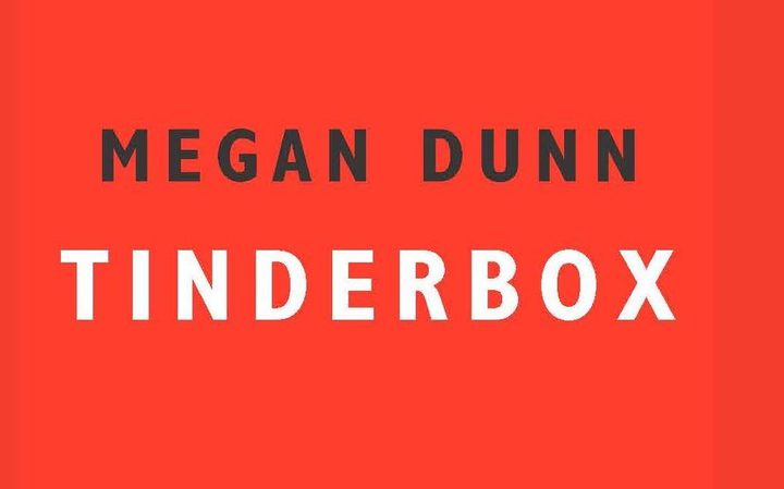
Megan decamped to England in 2001 and we lost contact. There, she abandoned art in favour of creative writing; reinventing herself. Courses, courses, courses. Writing, writing, writing. When she returned to New Zealand in 2010, her ambitions were tied up with becoming a novelist. But she also relapsed into art criticism—doubtless because it was writing that people would pay her to do. When I came back to Wellington in 2014, Megan was working for Booksellers New Zealand, writing art criticism, and working on a novella—a female-perspective reheat of Ray Bradbury’s Fahrenheit 451. Unfortunately, her attempts to get it published would be thwarted by the Bradbury estate. The bastards. To get around the lawyers, she reconceptualised it as Tinderbox. And here it is, her first book. And I love it.
But I’m not sure what it is. It’s not a novel—it’s non-fiction; non-fiction about writing fiction. It’s not exactly a memoir—that would be too pompous. It is more like a big personal essay. It shows how Megan has been able to expand her short-form writing—pieces like Submerging Artist and The Recipe for a Frosty Pussy—into book form. Tinderbox is a meta-book, a book about books. It switches back and forth between accounts of Megan struggling at writing her Fahrenheit 451 cover version and accounts of her day job as a manager at Borders Islington, flogging other people’s books—always at the coal face. It makes some kind of analogy between Fahrenheit 451, as a book about book burning, and Borders, as a book-selling empire in freefall—but I’m still not clear on the upshot.
Tinderbox is a book about a writer reading and about a reader writing. It foregrounds Megan’s techniques and toolbox—her NaNoWriMo course, her timer, and her dependency on SparkNotes, YouTube, and Wikipedia. It’s a time-capsule account of the way writers write these days, not in a bubble, but with their browsers open and someone playing video games in the same room, contrasting that with another time—Bradbury using a coin-operated typewriter in the basement of the UCLA Library.
I like Tinderbox because it’s so Megan. It’s multitasking Megan, hectic Megan, procrastinator Megan, neurotic Megan, masterful Megan. Somehow, she has transmuted her endearing admissions of failure and frustration into a racy page turner. Having known Megan since the early days, I find her book has a lot in common with the sense and sensibility of her old videos and Pavement reviews, both being about her discovering ways to express herself through other people’s art. I like to think I was there at the beginning. I’m grateful for this book and proud to know its author. [Megan Dunn, Tinderbox (Norwich: Galley Beggar, 2017).]
•