.
In 2009, I ran to the cinema for the first night of My Bloody Valentine 3D. It was little more than a sequence of set pieces in which people were killed using a miner’s pickaxe. Each instance was different—where it happened; how it happened; where the axe went into the body, at what angle, where it came out; etcetera. The filmmakers concocted novel solutions to a basic problem. However, it struck me as oddly bloodless—a formalist exercise, a physics experiment. I was reminded of the abstract painter Gordon Walters, whose work also unpacked the endless possibilities offered by ‘a deliberately limited range of forms’. As Walters explained: ‘dynamic relations are most clearly expressed by the repetition of a few simple elements’.
•
What Gold and Shit Have in Common … Art
.
In a flurry of Covid-lockdown recreational decluttering, I came across a talk I gave almost twenty years ago. Long before I’d heard of Baroness Elsa von Freytag-Loringhoven, I was trying to explain art after Duchamp to some university law students. Looking back, the talk was absurdly ill-conceived for its audience. It’s a problem, neglecting your listeners to indulgently think out loud. Here it is:
.
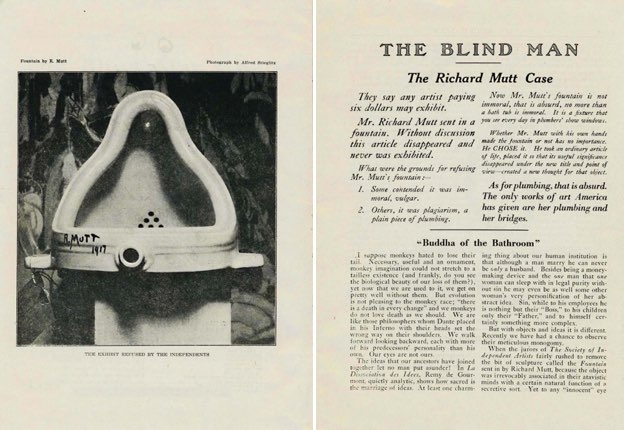
Marcel Duchamp made Fountain in 1917. It was a game changer. The French artist acquired a porcelain urinal, laid it on its back, titled it Fountain, and signed it ‘R. Mutt’, declaring it art. The work was rejected from a supposedly sympathetic, anything-goes, all-comers exhibition organised by New York’s Society for Independent Artists. They said anyone paying six dollars could exhibit, but Fountain tested even their limits. Perhaps they thought it was a prank; perhaps it was.
When Fountain was rejected, an anonymous article (likely penned by Duchamp) defended its status as art, arguing that ‘Whether Mr. Mutt with his own hands made the fountain or not has no importance. He CHOSE it. He took an ordinary article of life, placed it so that its useful significance disappeared under it under the new title and point of view—created a new thought for it.’ Of course, today, Fountain is not only accepted, it’s canonical. We live in a post-Fountain art world.
Before Fountain, art was different—it was a kind of thing. There were criteria—a traditionally grounded consensus about what art was, what forms it could take, why to do it and how. Back then, you could take an artwork out of an art context and still recognise it as art—it was clearly a painting, a sculpture, an etching, etcetera. But, when Fountain entered art, it changed everything. It signalled that being art no longer turned on an art object’s intrinsic properties, but on the position it occupied. It was art because it was in a gallery or an art magazine. Location, location. Fountain may have been iconoclastic, yet it bolstered the art institution. When art can take any form, the art institution becomes crucial in a new way, to assert and police what is art and isn’t. Now, the institution didn’t just recognise art status, it conferred it.
Fountain changed the art game, but it didn’t change it straight away. It took a while for its implications to filter through, and the Fountain idea has always faced resistance—still does. We have the Fountain idea of art, but it is everywhere attended—haunted—by the pre-Fountain idea. Some still want to think of art in old-school terms, praising beautiful, skilful, edifying art—‘good painting’—and dismissing lights going on and off. Curmudgeonly critics act as if Duchamp never happened. Pre-Fountain-idea art is still being made, but now the Fountain idea reframes it. There’s no way back.
What goes for art has changed, but ‘art’ includes what has gone for art in the past. In an art museum or an art-history book, we can move from a gilded Renaissance altarpiece (pre-Fountain) to Piero Manzoni’s tins of his own shit (post-Fountain) in a blink, and it’s all art, even as these works are premised on radically different, even contradictory, expectations as to what art can be. They are equally part of a tradition.
To address the implications of this, it’s useful to consider an insight from political science—anti-descriptivism. For descriptivists, names describe things. To be, say, ‘socialism’, a regime needs to have certain properties. If it once had them but lost them, it ceases to be socialism, even if it still bears the name. Anti-descriptivists go the other way. For them, names are proper and linked to their referents through ‘primal baptism’. Socialist regimes may evolve in all kinds of contradictory ways but remain socialist.
In his preface to Slavoj Žižek’s The Sublime Object of Ideology, Ernest Laclau takes this idea a step further: ‘What is overlooked, at least in the standard version of anti-descriptivism, is that this guaranteeing the identity of an object in all counterfactual situations—through a change of all its descriptive features—is the retroactive effect of naming itself: it is the name itself, the signifier, which supports the identity of the object. That “surplus” in the object which stays the same in all possible worlds is “something in it more than itself”, that is to say the Lacanian objet petit a: we search in vain for it in positive reality because it has no positive consistency—because it is just an objectification of a void, of a discontinuity opened in reality by the emergence of the signifier.’
This brand of anti-descriptivism offers a productive way to understand ‘art’. If the altarpiece and the tin of shit both belong to art, there’s something at stake in the name of art that exceeds its examples and transforms them.
•
Wunderkind
.
Last week, I was up in Auckland, interviewing artist Zac Langdon-Pole before a gathering of the faithful. The event was presented in conjunction with his Michael Lett show, Interbeing. I enjoyed it.
Two months earlier, I knew little about the young, high-flying, Berlin-based New Zealand artist—a winner of the 2018 Ars Viva Prize and the 2019 winner of the seventh BMW Art Journey. To prepare for the interview, I devoured Constellations, a new monograph covering the last six years of his work. As I ploughed through it, like a student cramming for a test, I found Langdon-Pole’s project erudite, juggling myriad knowledge systems—scientific, cultural, historical—through works that take ever-different forms. Brilliant and informative, the book yielded much, too much, leaving me gasping for air, with little space for my own speculations and responses. When I set foot in the Interbeing show, however, my experience of the work was very different.
Langdon-Pole had been making photograms of sprinkled sand, collected from various locations. While the locations were distinctive, the photograms were largely indistinguishable. In the show, some were presented at original scale, some were enlarged, one to mural scale. Perversely, these shallow images suggested the sublimity of deep space—with tiny sand grains standing in for solar masses—and the history of human endeavours to make sense of it. (I recalled a Cerith Wyn Evans text work, referring to astronomers confusing specks of dust on their photos with faint stars millions of light years away.) The enlargements were rhetorically impressive, but contained no extra information, as in the film Blow-Up, where successive enlargements of a possible-murder-scene photo offer no further clues, revealing only the grain of the negative itself.
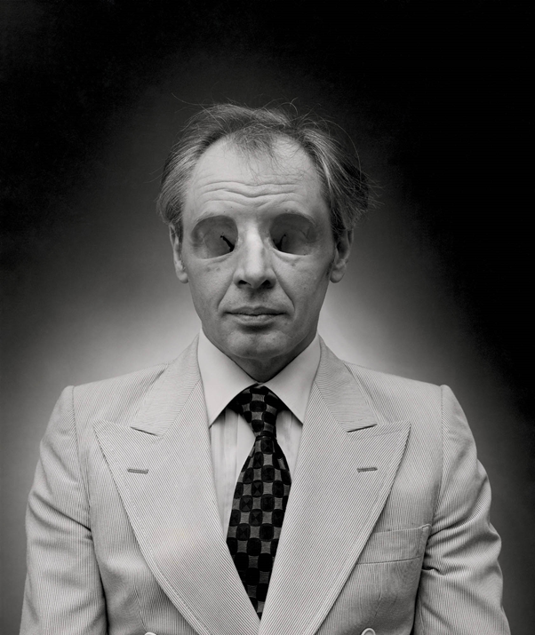
Langdon-Pole had also been messing about with anatomical teaching models. For Orbits (2019), he replaced the eyeballs in two paired eye-socket models with glassy spheres—one pair had spheres containing a dandelion head and petrified sequoia wood, the other a dandelion head and rainbow obsidian. There was a disjunction between the time frames implied by the ephemeral dandelions (albeit frozen) and the other materials, but what this had to do with eyes was hard to see. The Orbits seemed to be non sequiturs; pointless, but provocative, puzzling, poetic. In Cleave Study (2019), Langdon-Pole grafted a model of a human tongue onto a xenophora shell, as if a tongue like mine had taken the place of the shell’s former inhabitant. The xenophora is a curious thing. As its shell grows, it fuses with things in its vicinity, particularly other shells—it’s a collage artist, an appropriator. But was the artist’s idea that the shell had colonised a human tongue or vice versa?
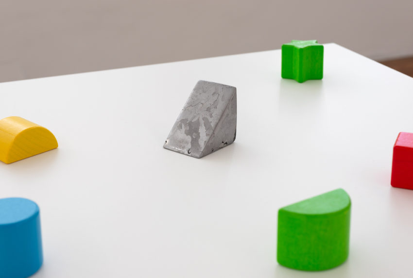
I lingered longest with Assimilation Study (2020). Painted wooden blocks—squares, circles, half circles, stars, wedges—were scattered in a perspex-topped display case. They came from that common educational shape-sorting toy that teaches tots not to put square pegs into round holes. It took a moment to notice that Langdon-Pole had switched out a piece. A wooden wedge had been replaced with a piece of Campo del Cielo meteorite tooled to the same dimensions. Over four billion years ago, this nickel-iron extraterrestrial had been part of the core of a small planet that broke apart. It fell to Earth around 4,000 years ago, landing in what is now Argentina. In Langdon-Pole’s work, it’s as if this alien artefact has infiltrated the common children’s game to hide in plain sight. The work draws attention to the way the game prioritises shape at the expense of other (here, more profound) factors. (Perhaps, as two blocks are star shaped—and as the work is surrounded by photograms that look like night skies—it’s easy to think of the blocks as a constellation in which a meteorite might already feel at home.)
Assimilation Study set me thinking. I recalled the nineteenth-century inventor of kindergarten, Friedrich Fröbel, and his ‘gifts’ for children, which include building blocks. He also happened to be the crystallographer who wrote ‘my rocks and crystals served me as a mirror wherein I might descry mankind, and man’s development and history’. I thought of Stanley Kubrick’s film 2001: A Space Odyssey (1968), where minimalist monoliths of ancient alien origin—some passing through the cosmos—prompt giant leaps in human education. And I remembered a 1993 Michael Parekōwhai work that enlarged and repurposed the very same children’s game, but to different ends. In his allegorical installation—Epiphany: Matiu 2:9 ‘The Star in the East Went before Them’—the star blocks prompt us to think of the star that heralded the messiah, but also to consider how this might be re-understood within te ao Māori.
In retrospect, none of these connections are totally irrelevant. Or, rather, the work begs the question ‘what is relevant?’ That meteorite had been flying through space for aeons—aeons before Langdon-Pole, before Parekōwhai, before Kubrick, before shape-sorter blocks, before Fröbel, before Christ, before humans—but on a collision course with us anyway, addressed to us before we even existed. And now, here, retooled, it comes to rest in Langdon-Pole’s work at Michael Lett’s gallery in 2020. Has it been domesticated by the artist, drawn into his game, or does it highlight his/our hubris, his/our presumption to intellectually frame it, albeit momentarily? Is he assimilating it or is it assimilating us? Langdon-Pole relativises frameworks—even his own.
•
It Simply Is
.
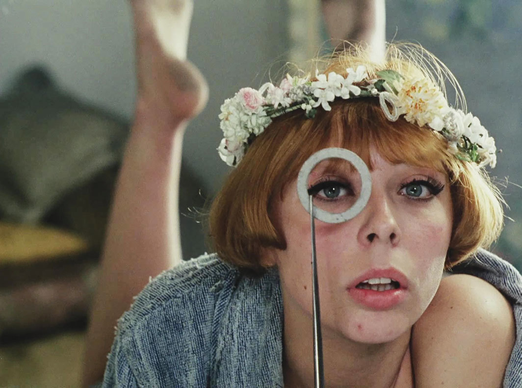
City Gallery is currently screening Daisies, an experimental, feminist feature film by Czech new-wave director Věra Chytilová, made in 1966. See it, if you can. It runs until 13 April 2020.
This female buddy movie follows the exploits of two young women, both called Marie, as they prank silly old men, conspicuously consume, and speculate on their existence. Their hedonism and irresponsibility was a rebuff to the bleakness of life in communist Czechoslovakia, and the film was initially banned for the wanton waste of its food fights and milk baths. Here, feminism holds hands with consumerism.
It’s hard to get a fix on the protagonists. They act like dolls or robots—but malfunctioning ones, off mission. They are adorable yet obnoxious, pretty but unladylike, mischievous yet vacuous, trapped but free. They scramble anarchic feminist agency with coquettish sex-object appeal. In Artforum, critic J. Hoberman described them as ‘all impulse and appetite, with food substituting for sex’.
Daisies exemplifies its mid-1960s counterculture moment: a time of underground movies, happenings, street theatre, nudism, bagism, body art, psychedelia, free sex, and feminism. It’s experimental and rebellious in its content, but also in its form, with disorienting, gimmicky special effects—often seemingly pursued for their sheer novelty. The anarchic filmmaker was out to break as many rules as her heroines. Daisies is, in many ways, confounding and unreadable. Hoberman writes, ‘the film does not lend itself to decoding. On a primary level, it simply is.’
Why screen Daisies now? Aside from it being an amazing romp of a film, it’s also an interesting space-time capsule from which to consider our current moment, as feminism, sexism, and capitalism cleave unto one another.
•
Living and Dying—the Same Thing
.
Life is a sexually transmitted disease and the mortality rate is one hundred percent.
—R.D. Laing
•
Instant Icon
.
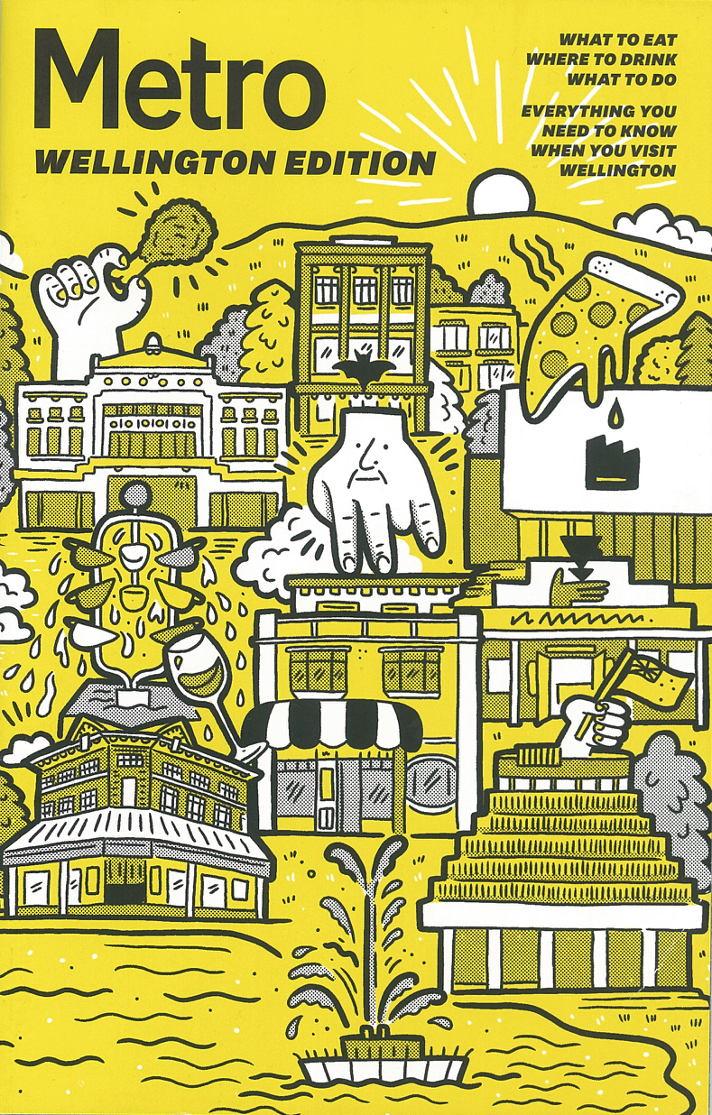
In a few short months, Ronnie van Hout’s Quasi has become a Wellington icon. On the cover of the Metro Wellington Edition, it takes centre stage, flanked by the Bucket Fountain and the Beehive. But how did the Dowse get to be so big?
•
Détournement
.
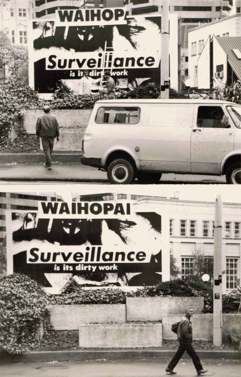
In 1988, New York artist Barbara Kruger had a big show at Wellington’s Shed 11. As part of it, she presented several billboard works around town. The top photo shows National Art Gallery Director Luit Bieringa catching Mark Roach (Wellington City Art Gallery’s Exhibitions Manager) and Nicky Hager (later to become the famous investigative journalist) in the process of amending, vandalising, or adapting one of her billboards, shifting its message from the generic ‘Surveillance is their busywork’ to the particular ‘Waihopai: Surveillance is its dirty work’, bringing its message home. (At that stage, the Waihopai spy base was still being built and was not yet operational.) It was a brilliant intervention. In 1996, Hager would publish his first book, Secret Power, an exposé of New Zealand’s engagement in international electronic espionage.
•
Tillers’s Path
.
I’ve just been in Sydney, where I kept bumping into Australian painter Imants Tillers and his work. Tillers is famous for colliding imagery appropriated from other artists on arrays of canvasboards. He’s been making these works for almost forty years now. In Sydney Contemporary, his work was in the Arc One booth. He also had a solo show at Roslyn Oxley’s Paddington gallery—work produced in the wake of his recent survey show in Riga. (I attended an event at Oxley’s, where Tillers spoke with Power Institute Professor Mark Ledbury—Power published the book for the Riga show.) Tillers also has an installation at Art Gallery of New South Wales, in connection with their show Making Art Public: Fifty Years of Kaldor Public Art Projects. That work addresses the first Kaldor project, Christo’s Wrapped Coast at Sydney’s Little Bay, in 1969. Tillers, then an architecture student, was a helper on the project, and the experience inspired him to become an artist. In Making Art Public, Tillers is also name checked as one of the three artists showcased in Kaldor’s eighth project, 1984’s An Australian Accent show at PS1, New York, and the Corcoran, Washington DC. In Sydney in September, there was no getting away from Tillers.
Tillers is an enduring figure in Australian art. His project has surfed and survived art-world fashion waves and paradigm shifts and it’s still standing. Discussion around it continues, although not as furiously as in the 1980s. Indeed, from the outset, Tillers’s work was engineered to be hardy—to escape irrelevance. It bridged antithetical tendencies—conceptualism and neoexpressionism. It deconstructed Australianness while epitomising an Australian condition. Peppered with references to Tillers’s Latvian-refugee heritage, it was ‘death of the author’ appropriation with an identity-politics twist. Etcetera. Tillers always had it both ways—with wiggle room. That’s why he complicated so many arguments, and why he continues to be relevant as arguments turn.
Tillers frames art history as much as being framed by it. His work makes me think about how we all read art in our own way. There’s the canon, the more-or-less shared story of art—the map we all refer to. However, each of us makes our own personal journey through art, based on what is to hand, coming to this or that artist or work in our own time in our own way, in a peculiar order, making our links for ourselves, tracing our own personal art history. Tillers’s work reifies his personal journey through art, as driven by his curiosity and idiosyncratic sensibility. He collages and entwines canonical art that everyone knows (Georg Baselitz or Giorgio de Chirico, perhaps) with the local (Aboriginal desert painting, say) and with art particular to his own background (Latvian art). Tillers’s art is akin to psychogeography; his sensibility is revealed even as he drifts, gets lost and distracted. His work is made entirely of other artists’ imagery, but the distinctive web of connections is uniquely him—a fingerprint.
One of Tillers’s new paintings at Oxley—Nature Speaks: GQ (2019)—features a quote from Buddha: ‘You cannot travel on the path before you have become the path itself.’ You could say Tillers has traversed art history by becoming art history.
•
Biblical Proportions
.
My friend Angela Goddard, Director of Griffith University Art Museum in Brisbane, is in hot water. Christians are attacking the Gallery for including Juan Davila’s 1985 painting Holy Family in its current show, and the media are all over it like a cheap suit. Davila’s work is based on Michelangelo’s iconic sculpture, the Pieta, which shows the Virgin cradling the dead, deposed Christ. In Davila’s painting, Christ’s body is replaced with a man-sized penis.
The media—as per usual—has amplified a storm in a teacup into a flood of biblical proportions. The rhetoric is ripe, the reports overblown. The idea—that Christianity and Christians are so fragile that such images need to be removed for their safety—is silly. No one is being forced to view the work. It’s in an off-off-Broadway, campus gallery, seen by a small art-world audience entirely familiar with such things—with trigger warnings added for anyone who isn’t. The claim that the Gallery shouldn’t show the work because the University gets millions from government is bogus. First, the Gallery is a tiny part of the University, and admirably run on the smell of an oily rag. Second, if that logic was applied across the board, no one working anywhere in any major university would be able to say anything that offended any taxpayer—universities couldn’t function.
Of course, the irony is that media coverage has given the work far more exposure and status than it would ever have enjoyed in the Gallery alone. Plus, I suspect, far from being genuinely injured, the plaintiffs are revelling in the spotlight opportunity that this engineered controversy has afforded them—milking it for more than it’s worth. Meanwhile, to the art world, it’s a yawn. We had the blasphemy debate in the early 1990s. The work itself is now almost forty years old and Davila part of art history.
But, putting all that aside, I don’t see how the work is even anti-Christian. What do the critics think it means? In The Sexuality of Christ in Renaissance Art and in Modern Oblivion, published two years before Davila painted Holy Family, Leo Steinberg drew attention to the frequency with which old masters once depicted Christ’s genitals. This highlighted the incarnation, the core Christian doctrine that Christ was God made flesh, made man, with all that entails—sexuality included. Artists deliberately exposed Christ to affirm his connection with humankind, with us all. Reiterated and monstrously exaggerated by Davila, this idea is surely the crux of Christianity, not a threat to it—even if Davila is out to offend.
•
Social Mirror
.
It’s been an odd week. Last Monday, Ronnie van Hout’s giant public sculpture—which grafts his face onto his hand—was installed on the roof of City Gallery, and mass media and social media went ape. Most of the big media in New Zealand have covered it, and, overseas, so has CNN, Time, the Guardian, W, and even the Hindustani Times. It’s provided an opportunity for harmless fake-news headlines and pseudo-hysteria—Giant Hand Terrifies Capital!—even though no one seems remotely terrified.
People see crazy things in the work. Some think it looks like Trump. Someone described it as the invisible hand of Adam Smith (even though it is excessively visible), another claimed it was the devilish white hand of Theo Schoon. One caring person proposed making a glove for it, to keep it warm in winter; another said they will not set foot in Civic Square until it is gone. It’s been suggested that there should be a trigger warning for those with suicidal thoughts. And, all the while, people flock to Civic Square to see it and take photos.
It’s true that public sculptures are the butt of jokes and a routine target of deranged interpretations, but Quasi is asking for it. It’s named after Quasimodo, the misshapen misunderstood bellringer from Victor Hugo’s novel The Hunchback of Notre-Dame, a target of scorn and fear. Van Hout wants to show how we reveal ourselves in our responses to ‘the freak’. In installing his curious figure without a narrative to explain its presence or intentions, Van Hout leaves it to us to provide our own explanations, revealing ourselves in the process, then to watch how our and other views play out in the court of public opinion. So those who think they are attacking Van Hout’s sculpture are simply playing the artist’s game. Quasi is a conversation starter. Everything will be revealed.
•