Robert Leonard

Contemporary Art Writer And Curator

Vernon Ah Kee: Your Call

Vernon Ah Kee: Born in this Skin (Brisbane: Institute of Modern Art, 2009).


Boosterism reigns in Australia and particularly in Queensland, which promotes itself as ‘the smart state‘—perhaps to forget those years under Premier Joh Bjelke-Petersen when it was more like a police state. In 2008, Vernon Ah Kee was invited to produce a work for the Queensland Art Gallery’s latest survey of Australian art. Titled Contemporary Australia: Optimism, the show planned to bask in positivity, riding on the back of an economic boom (although, by the time the show opened, we would be in the midst of the global financial crisis). Optimism seemed a perverse context in which to place Ah Kee: what would this Aboriginal activist artist have to be optimistic about? Indeed, rather than endorse the place as a land of milk and honey, Ah Kee drew attention to a shameful moment that the good people of Queensland would prefer to forget—the death in custody of an Aboriginal man, Cameron Doomadgee, on Palm Island.

On the morning of 19 November 2004, the thirty-six-year-old was on a bender. Doomadgee was wandering the streets, singing his favourite song, ‘Who Let the Dogs Out?’, when he was confronted by the police. He was verbally abusive and was arrested as a public nuisance. At the police station, the inebriated Doomadgee was seen to punch his arresting officer, thirty-three-year-old Senior Sergeant Chris Hurley, in the jaw. In less than an hour, Doomadgee was dead—with four broken ribs and massive internal injuries, including a split liver. (It would later be claimed that he fell on a step.) In response, the local Aboriginal community rioted, torching the police station and Hurley’s home.

At the inquiry, the acting state coroner, Christine Clements, found Hurley responsible for Doomadgee’s death, noting that police had ignored his cries for help, leaving him to die. Clements expressed surprise that Doomadgee was even arrested for such a trivial matter. Hurley was later acquitted of assault and manslaughter charges and the coroner’s findings set aside. By contrast, Lex Wotton, would be held personally responsible for the riot and received a six-year jail sentence. This sorry story serves as a reminder of a shameful history of race relations, in which Aboriginal death-in-custody has long been a fact of life.1

Ah Kee’s massive wall piece for the Optimism show, Who Let the Dogs Out (2008), introduced a new character into his work. Redhat (an acronym of hatred) is a short, skinny, rainforest Aborigine; a stick figure with a red Ned Kelly helmet. Ah Kee says that his hero is urbanised; he lives around billboards and newsstands, and speaks in quotes, slogans, and headlines.

In Who Let the Dogs Out, Redhat is surrounded by texts. The word ‘redhat’ is repeated unspaced, forming a fabric, so it can be read either as ‘redhat’ or ‘hatred’. Here and there are break-out quotes, including one from a native-American chief: the end of living and the beginning of survival’. All the rest are quotes from Shakespeare’s tragedies, full of venom and resolve: ‘I am in. So far in blood, that sin will pluck on sin.’ It is hard to recall the original context of all the unreferenced quotes; to know if they were originally uttered on the side of good or evil. Similarly, it is hard to know whether they are intended here to represent the attitudes of white Australians or Aborigines, and whether Redhat is endorsing or critiquing them. Ah Kee’s title certainly recalls the famous line about ‘the dogs of war’ from Julius Caesar, but it could equally refer to Cameron Doomadgee dying like a dog on the floor of his cell.

Who Let the Dogs Out breeds confusion and plays on double standards. If Chris Hurley is a killer cop, Ned Kelly was a cop-killer. In the late nineteenth century, Kelly was warring with the police—the colonial administration—but he would later be adopted as an icon for republicanism, embraced as an Australian Robin Hood. By identifying with Kelly, white Australia distances itself from its British colonial roots and fantasises about its own struggles to forge its identity in this place, and thus conveniently sidesteps the irritating existence of the traditional owners of the land. But when Ah Kee, as another kind of Australian, appropriates Kelly, it exposes the sleight. In imagining an Aboriginal Ned Kelly who reframes the Aboriginal struggle as positively Shakespearian, Ah Kee either condemns white Australia through its own icons and traditions or simply scrambles the prevailing common sense.
.
Vernon Ah Kee was born in 1967, a few months before the referendum that finally recognised Aborigines as Australian citizens. For those months, he says, he was, in a sense, a non-person—officially subhuman. However, in the short period that he has been exhibiting, Ah Kee has become one of Australia’s most celebrated Indigenous artists. His work addresses the situation and experience of Aboriginal Australians and is informed by a deep resentment, grounded in his awareness of historical injustices and a sense of the ongoing exclusion and invisibility of Aborigines in Australia.

First produced in 1999, while at art school, Ah Kee’s This Man Is … This Woman Is … was a starting point for the artist.2 Its sixty panels feature a repeating sequence of six mug shots: three each of a young Aboriginal man (Ah Kee himself) and of a young Aboriginal woman, who both stare back at the camera. It’s hard to know if their gazes reflect defiance, subjugation, or both. Under each image is a brief text, a life story. These are based on actual Aboriginal lives, many researched from Ah Kee’s family histories; several describe Ah Kee himself. The texts suggest the variety of abuses and indignities that Aborigines have suffered since colonisation.

One image of Ah Kee is captioned: ‘This man was 19 years old and Aboriginal. After being shot and killed by British soldiers, his body was hung from a tree as a deterrent to other people in his clan who would resist settler expansion throughout the Sydney basin in 1816.’ Elsewhere, the same image is captioned: ‘This man was 42 years old and Aboriginal. After being forcibly moved to an Aboriginal mission in 1938, he walked off the mission to return to his tribal land. Police, along with White pastoralists, hunted him down and shot him. He may have evaded them if it had not been for the Aboriginal trackers aiding the police at the time.’

Clearly, the subject of all the texts could not be the same person, let alone this person. Thus This Man Is … could be mistaken for a classic example of conceptual art: unpicking representation, interrogating the assumed link between photographs and their captions. However, it is precisely the opposite: Ah Kee is asserting all these stories as constituting his and other Aborigines’ identities, as if he were necessarily the culmination of these collected experiences.

Early in his career, This Man Is … established Ah Kee’s modus operandi, introducing key themes and devices that continue to mark his ongoing work, including his interest in portraits, texts, and their interplay; his interest in the ambiguous gaze of the colonised subject; and his interest in the way that racist values are projected onto Aborigines (but also how this projection necessarily constitutes their identity, both in their acceptance and their resistance). Operating on the verge between pathos and defiance, This Man Is … leaves us with a sense that, for better or for worse, the experience of Aborigines has been, and will be, overdetermined by their being Aboriginal. For them, the sad truth is that ‘identity’ is inescapable.
.
Ah Kee first became known for his agitprop-style textworks, which have been presented in a variety of scales and formats. At first they were printed on paper, on PVC, and on T-shirts, but later they were amped up, presented in vinyl directly onto the wall at billboard-scale or painted on canvas. The textworks operate through a range of registers. Most texts are short and punchy, with the strident high-concept compression of advertising copy-writing. Some are poetic, even biblical (In the desert I saw a creature naked bestial who squatting upon the ground held his heart in his hands and ate of it …’); others are vulgar like bumper stickers (‘100% Aboriginal’). Some are witty inventions of the artist’s, others quotes. Ah Kee’s lines range from crushingly self-evident no-brainers (‘if I am extremist it is because my people live in extremely bad conditions’) to erudite wordplays (‘who deicides/you deicide’—which could be a typographical error or could refer to killing God). They make a variety of points: ‘not an animal or a plant’ reminds us that Aborigines were once effectively categorised as subhuman, on a par with fauna and flora, while ‘first person’ plays on the fact that Aborigines might have been here first but are silenced in the culture—unable to speak for themselves. The bad pun, ‘mythunderstanding’, hints that the prevailing sentimental-romantic take on Aborigines may be flawed and self-serving.

Ah Kee’s textworks are more than words. Their ostensible messages are complicated by their typographic treatment, which was inspired by Russian constructivism but also recalls concrete poetry and the look of 1960s Madison-Avenue ‘big idea’ advertising,3 not to mention the various brands of conceptual and neo-conceptual art that subsequently drew on it (thinking here of Lawrence Weiner, Barbara Kruger, Haim Steinbach, and Christopher Wool). Ah Kee favours the familiar, no-nonsense, sans-serif, Swiss typeface, Helvetica.4 He typically uses it bolded and all lower-case. The effect is at once aggressively declamatory yet chic; anonymous yet signature. Despite opting for an ultra-legible font, Ali Kee runs words and lines of text together, avoiding conventions of leading and kerning, making his words harder to read. Sometimes you need to double check that you’ve read them correctly. For example, it’s easy to mistake ‘my duty is to persecute error’ for ‘my duty is to persecute terror’. Academic Anthony Gardener characterises Ah Kee’s impacted treatment of text as ‘breathless’, suggesting excitement as much as suffocation.5

On the surface, there is nothing remotely Aboriginal about Ah Kee’s graphic-design style; indeed, it is part of a mainstream media language that might be seen to suppress Aboriginal voices. Helvetica is often celebrated for its universal quality, its democratic air—which may be why advertising agencies often favour it for spinning dubious corporate messages. Ah Kee makes an issue of its Swiss neutrality. That we would interpret many of his texts in diametrically opposed ways if we didn’t know they were written by an Aborigine points precisely to Aborigines’ exceptional nature—their exclusion from the universal’.
.
In around 2004, Ah Kee began drawing portraits of members of his family, mostly males. The work developed out of thinking about photographs that he remembered from his childhood. Ah Kee’s grandmother always carried two photos with her in her purse: one of Ah Kee’s grandfather (her husband), Mick Miller; the other of his great-grandmother (her mother), Annie Ah Sam. She also had a shot of his great-grandfather (her father), George Sibley.

As an adult, Ah Kee became curious about the source of the photos. He discovered that they came from the Norman Tindale Collection, held in the South Australian Museum, Adelaide. Tindale had taken them as part of a massive project of documenting Aboriginal populations. Between the late 1920s and the late 1960s he photographed hundreds of Aborigines living on missions and government stations, seeking to create a scientific record of a race considered to be dying out. Tindale was well-intentioned, and motivated by a sympathy for Aborigines, yet he photographed them without identifying them by name—simply labelling them with serial numbers. Posing his subjects front and side, Tindale’s photos suggest criminal mug shots. Indeed, when Tindale photographed Ah Kee’s great-grandparents they were in a prison of sorts—they were living on Palm Island, which was effectively a detention centre for Aborigines who could not be constrained on other reserves.

Ah Kee has mixed feelings about the Tindale images; while they provide him a point of contact with past generations, they also come with considerable baggage. From Tindale’s images, Ah Kee made portraits of George Sibley and of Mick Miller. He copied the images to investigate and come to terms with them. He went on to create portraits of other male family members, including himself and his son. He made these drawings from photographs that he took himself. He wanted to show the intense gaze of the subjects in Tindale’s original images persisting in later generations. So, when his subjects posed for his camera, he asked them to express resilience and dignity, but not anger or defiance (qualities for which his grandparents would have been punished).

Like his textworks, Ah Kee’s portraits started small and became larger. He drew his first portraits on paper, then stepped up to massive grey canvases, using white crayon for the highlights. He used an old-school, academic rendering style, building up tone through cross-hatching, creating modeling and texture. His approach suggests restraint, control, and consistency; a dispassionate rendering, rather than distortion and expression. He says: ‘the portraits are a realisation of my efforts to establish a revisioning of the Aborigine as a beautiful and worthy subject full of depth and complexity. The Aborigine is a worthy subject to be sure, but my intention is to strip away from the image any of the romantic and exoticised notions of primitivism, virtue, and, most importantly, the decorative stone age.’6 The extent to which All Kee has achieved this, however, remains moot.

The portraits are ambiguous. Ah Kee may be motivated by a desire to redeem the images of his ancestors (as captured by Tindale), by investing time in exploring and registering their details; by emphasising the intensity of his sitters’ gazes, suggesting agency; by granting them an ennobling Mount Rushmore scale; and by identifying them, tying them to a specific genealogy—his own. However, his images of contemporary sitters are tainted by association with the Tindale images, as if Aborigines today—even his young son—might still be heirs to old attitudes; imprisoned by them. All Kee, himself, could even be seen as tying them to this past by viewing them through Tindale’s lens. While the portraits could be seen as idealising, heroic depictions—a celebration of resistance, showing generations of his family surviving racism—they could also be seen as neutral depictions to which we bring our own values, making them screens for our prejudices and romantic fantasies.

Ah Kee’s 2005 show, You Must Hit, at Bellas Milani Gallery, Brisbane, exploited this ambiguity by interspersing textworks—such as ‘who deicides’ and ‘you deicide’—within a ‘line-up’ of portraits, so it was hard to know which texts to associate with which faces, and whether to identify the sitters as the enunciators of the words, their subjects, or neither. The installation suggested an interrogation, but which of the faces was ‘you’? Or was ‘you’ the viewer? This interpretive dilemma drew attention to the way that we project meanings onto faces, both in relation to what they are associated with (as in film theory’s famous Kuleshov Effect), and on the basis of our own sympathies, desires, and fears, perhaps revealing our predisposed attitudes to Aboriginal men—as a mix of romanticism and fear.
.
Many of Ah Kee’s portraits have an unfinished quality, with faces seemingly still in the process of being rendered. This is especially evident in Ah Kee’s portrait of his cherubic son, Gavin, in the 2006 triptych See Me. The boy’s locks of hair and shirt are barely delineated, drawing attention to his intensely rendered eyes. The portrait looks unfinished, suggesting its child-subject is not fully formed or not yet fully seen.

Ah Kee elaborates on this thought in his Unwritten works, which are in many ways the antithesis of portraits. They feature generic, mask-like, male heads or faces—recalling the basic heads one might find in a how-to-draw book, offering the armature for a portrait before the distinguishing, individuating details are added. In the later examples, the faces emerge from striated lines as if they are pressing through into the viewer’s space from behind the canvas itself. For Ah Kee, these works represent an Aboriginal subject becoming visible. He says: ‘They are primitive people becoming more human to the Western eye. And as that happens, white features are ascribed to them. And where white people see those features ascribed to them—like learning to dress and learning to talk—they are rewarded. So these faces have high cheekbones and long noses, characteristics of a very general white Anglo-Saxon face, but they don’t have eyes, nostrils, ears, mouths. They are people who haven’t been recognised as human and, at the same time, are starting to have this white ideal applied to them, just enough to give shape to their faces. The work is about becoming.7

With the Unwrittens, Ah Kee catches us in a double-bind. If these images are about Aborigines ‘becoming’, then this act is qualified as ‘becoming’ in the eyes of the other. Recognition comes at a cost. The images simultaneously suggest birth (as if their subjects were breaking through the canvas to be born), and death (they could be being suffocated; the faces have deeply recessed eyes, reminiscent of skulls; they also suggest death masks). The faces could belong to victims or villains; they could equally be terrified or menacing. Ah Kee plays on the classic horror-genre scenario in which those we have maltreated and misjudged return to threaten us. Paradoxically, it is the very marks of their trauma—the suffering that they have endured—that now seems to empower them and terrify us. The Unwrittens certainly recall special-effects sequences from horror films. Ah Kee was, in fact, inspired by the face of Freddy Kruger pressing through the bedroom wall in A Nightmare on Elm Street, as well as Imhotep’s face, which materialises in a punitive sandstorm in The Mummy. The Unwrittens similarly suggest something supernatural intruding from the other side’—the return of the repressed.
.
Desert painting is routinely celebrated as the highest form of Aboriginal art, the expression of true Aboriginal spirituality and cultural genius. By contrast, the work of urban Aboriginal artists, like Ah Kee, operating in an explicitly contemporary-art idiom, is seen as comparatively inauthentic. However, Ah Kee and his colleagues in Brisbane’s urban Aboriginal artists’ collective, proppaNOW, challenge the seemingly self-evident authority of desert painting. ProppaNOW artist Richard Bell became notorious for his catch-cry, ‘Aboriginal art—it’s a white thing’, prompting us to reconsider the ways that ‘authentic’ art produced in remote communities is symptomatic of white values and interests. (The proppaNOW artists call it ‘ooga-booga’ art.) In contrast with what he sees as this always already compromised art of remote communities, Ah Kee understands proppaNOW’s urban art as the authentic Aboriginal art.

He says: ‘The reason I say that the art that we make is Aboriginal art is because the way we live our lives is an Aboriginal experience. What happens in the deserts and remote communities is that people create art and they try to live their lives in a way that correlates to a romanticised idea. It’s a white construction. That’s why I say that the only authentic Aboriginal people in this country are the urban Aboriginal people, they’re the only ones that behave autonomously. We are the only ones whose lives aren’t wholly and solely determined by white construction.’8

In this context, it is interesting to consider Ah Kee’s opting for an old-school, Western drawing style in his portraits. In doing so, many will be reminded of Albert Namitjira (1902–59), the first Aboriginal artist celebrated by white Australia. Painted in watercolours in a Western style, Namitjira’s landscapes were appreciated by white Australians because they met white aesthetic expectations—he was proof of assimilation. Of course, since the triumph of desert painting in the 1980s, white Australia is now in love with an Aboriginal art that is understood as totally Aboriginal. (Consequently, today, revisionist interpreters now assert Namitjira’s work as a claim on country, with his choices of subject and treatments revealing a specifically Aboriginal perspective.) So, are we to understand Ah Kee’s portraits as mimicry or détournement—seeing the artist as dupe or double agent? Ah Kee leaves that question hanging for the viewer, who must confront the possibility that their interpretation may betray them more than him.

It could be argued that Ah Kee’s appropriation of a conservative Western drawing style in the portraits, like his appropriation of a Madison Avenue graphic-design style in the textworks, is overdetermined. It makes a political point: Ah Kee speaks from a marginalised position by co-opting the impersonal authority of the language of the Big Other (which claims to speak to, and sometimes for, all), making an issue of its neutral tone. He has no other option: as an urban artist, it would be inappropriate and inauthentic for him to speak in an ‘Aboriginal’ idiom. It’s his preference: he considers the `Aboriginal’ idiom compromised in advance. Plus, it is expedient: he is largely speaking to white people, and in a language they understand. In drawing on dominant aesthetics to speak from a marginal=perspective, I suspect that Ah Kee would sympathise with Barbara Kruger—who famously explained: ‘We loiter outside of trade and language and are obliged to steal language. We are very good mimics. We replicate certain words and pictures and watch them stray from or coincide with your notions of fact and fiction.’9
.
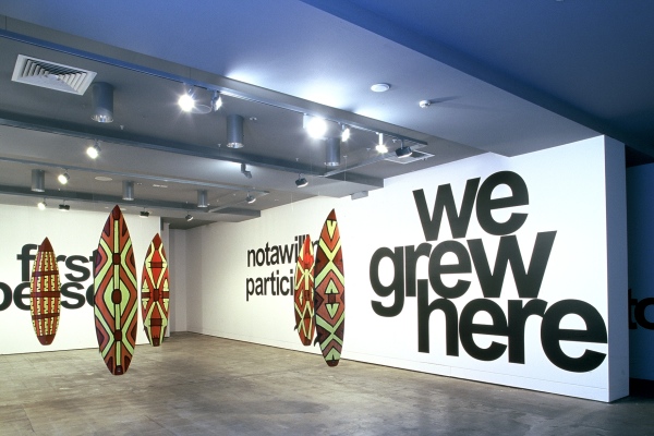
Undecidability is also at the crux of Ah Kee’s CantChant (2007). The project addresses that great Australian icon—that idyll, that commons, that leisure space invested with childhood nostalgia—the beach; the home of Max Dupain’s iconic Sunbaker (1937). For Ah Kee, Australia’s prevailing romanticised view of the beach masks a truth: while Aborigines are conveniently seen as people of the interior, the beach has been a site of racial conflict ever since British colonial settlement in the eighteenth century. The repressed history of the beach as a physical and ideological battleground returned with a vengeance in December 2005, when mobs of young white males descended on Sydney’s Cronulla Beach attacking Middle Eastern beachgoers while wearing and chanting such slogans as ‘We grew here, you flew here’, as if appropriating Indigenous rhetoric.

CantChant—the title of which suggests a ‘nonsense song’—highlights the superficial resemblance between surfboards and the shields traditionally produced by the Yidindji, Ah Kee’s father’s people from the North Queensland rainforest. These days the shields are seen as art objects but they were originally used in battles; their painted decorations were heraldic standards of identity. For CantCh,ant, Ah Kee decorated surfboards, painting the decks with shield patterns while incorporating cropped reproductions of his Western-style portraits on the fin sides. In CantChant‘s first presentation, at Brisbane’s Institute of Modern Art in 2007, Ah Kee hung the boards from the ceiling as a phalanx. Entering the space, we confronted them from the viewpoint of an enemy—facing the patterned sides—but, walking among them, we discovered the portraits. The surrounding walls were covered with textworks. One of the most prominent—’we grew here’—was reversely-appropriated from the Cronulla rioters. Here, Ah Kee was playing on the impertinence of these white youths in making such a claim; when their nationalist sense of entitlement is built on the dispossession and disavowal of the Aboriginal people. Another text, ‘hang ten’, conflated the American surf-clothing brand with lynching. Call it black humour.

The centrepiece of the show was a three-screen video installation in which the boards reappeared. The video clashed its genres and mixed its metaphors, each new sequence undermining the last. In a heavy-handed allegory, a dead board (a waterlogged surfboard) bound in barbed wire and hung from a tree was shot up. The meaning was obvious: the boards = Aboriginal bodies lynched and humiliated, and Australia = a killing field. And yet the solemn tone was immediately undercut by a comic sequence showing three Aboriginal men getting about Surfers Paradise in their garish designer surf gear. Carrying their rainforest-shield-patterned boards, they desperately try to fit in, but stick out like sore thumbs. Pointedly, we never see them get into the water. Cut to an inappropriately dramatic song, Warumpi Band’s throbbing `Stompin’ Ground’, the irony is thick. Does the sequence point the finger at the culture that excludes Aborigines, or poke fun at their desire to fit in with the white stereotype?

The idea that Aboriginal people are out of place at the beach is roundly disproved in the next sequence, which shows Aboriginal pro-surfer Dale Richards surfing on one of Ah Kee’s boards. Shot in the style of a consummate surf movie, the scene captures our attention, and we are left watching the graceful Richards ‘making it look easy’—erasing any anxiety established in the previous scenes. Political issues sink into the background as we simply marvel at—and identify with—his magisterial performance. It becomes a marker of his sovereignty, or suggests, perhaps, that the need to assert sovereignty is redundant after all?10 After that, returning to the argumentative images of dead boards under attack feels like a wake-up call. Moving genre from allegory, to skit, to surf movie and back—and tone from preachy, to silly, to sublime—the video is at once engaging and alienating.

CantChant‘s paradoxes of identification and opposition take us into an interpretative grey zone. The work draws on the ambitious position of the surfer’. As the 2007 Australian documentary film Bra Boys attests, surfers are simultaneously identified with mainstream Australian values and recognised as outlaws (an extension of the Ned Kelly mythos).11 When his three rainforest surfers line up on the beach with their rainforest surfboards, is Ah Kee pointing to the distance between Aborigines and Cronulla’s white surf-thugs or making an analogy between them? The Aboriginal surfers could be seen as equally tribal, territorial, and martial: staunchly defending their patch, or taking someone else’s. Or, they could be seen as equally deluded: why are these rainforest guys colonising Surfers Paradise? Similarly, it is hard to tell whether the rainforest shield patterns on the boards represent something authentic or inauthentic for Ah Kee; whether he is embracing the shield patterns as markers of his identity (underwritten by his portraits) or playing on them as clichés—decorative fetishes of a kind already co-opted by the hostile culture. CantChant impishly conflates white surf culture and Aboriginal sovereignty, making this seem plausible and absurd by turns, while posing the question of how we want to read it.12
.
In 2008, Ah Kee’s interrogation of Aboriginal stereotypes and racist clichés continued with a remarkable pair of installations made for that year’s Sydney Biennale. At first, Ah Kee only intended to show What Is an Aborigine?, a new suite of portraits, in the show. However, during a site visit to Cockatoo Island to select his exhibition space, Ah Kee discovered a ruined toilet block slated for demolition. The walls were covered in decades of obscene graffiti left by dockworkers. The graffiti was comprehensive: an outpouring of obscene racist, sexist, and homophobic sentiments. There were many anti-Aboriginal remarks, but racist sentiment was not limited to them. Where someone had written ‘Blacks will clean our toilets’, a republican had crossed out ‘Blacks’ and replaced it with ‘pommies’. Some writers named names, outing suspected gays and junkies. The walls conveyed a sense not of a common underlying humanity but of a common underlying vileness. Paradoxically, perhaps racism—anxiety over the other—is the one thing that links us all.

Thinking ‘people should see this’, and perhaps giving a nod to Duchamp’s Fountain, Ah Kee displayed the room as it was—as a readymade. Signing it, he put his own name to the collective anonymous scrawlings. He titled it, Born in this Skin, suggesting the way that Aborigines inevitably experience racism not only due to the colour of their skin but also upon their skin, in the most intimate way. The project drew an extreme response, becoming one of the most discussed and reported works in the Biennale. A complainant, taking offense on behalf of all potentially offended parties, wanted his day in court, threatening Ah Kee, the Biennale, and the Harbour Trust with legal action. Ah Kee said that was ‘shooting the messenger’.

Born in this Skin played off What Is an Aborigine?, also installed on the island, which visitors inevitably saw first. In a grand, albeit dilapidated, environment, Ah Kee’s portraits created a respectful space. But any tender feelings were violently overturned on entering the toilet block. If the portraits provided an uplifting experience, it only gave us further to fall. There was a clear link and contrast between the installations. Both were works of drawing: one refined and skilled, the other vulgar and obscene. One was invested with the artist’s own time and care, the other found. One could be read as celebrating Aborigines, the other as laced with cowardly attacks on them.

However, there was an added level of complexity. While the portraits gave white Australians the opportunity to empathise with noble Aborigines (and so, feel good about themselves), the toilet block offered no such reprieve. In confronting us with The Real in the toilet block, Ah Kee pulled the rug out from under his portrait project—rubbing our noses in our shit in the process—as if to say: here might be a better place to begin the discussion.
.
Ah Kee speaks like an essentialist. He says: ‘Because I am Aboriginal, because I was born with dark skin and dark, curly hair, I’ve never had the opportunity to be perceived as anything other than Aboriginal, and it has never occurred to me that I could be anything other than Aboriginal. So everything I think, say, and do is done from that position—never from outside that framework.’13 Ah Kee addresses all things Australian in terms of the suppression of Aboriginal interests, which condemns him to an art of pessimism and raining on parades!14 At first glance, he appears to have an urgent desire to broadcast basic, clear, political messages about the Aboriginal experience. The works seem plain speaking, direct, declamatory, even didactic. But looking closer, their power and intrigue come from the way that they engage and negotiate ambiguities, double-binds, and catch-22s, and by the way that they transfer the onus back onto the viewer. Through what they say and how they say it, the works implicate us in their inquiry. Thus, despite their seeming essentialism, Ah Kee’s works continually highlight the fact that identity has nothing to do with essences but is always and only forged in the interplay of an us and a them.
.
[IMAGE: Vernon Ah Kee CantChant 2007, installed at Institute of Modern Art, Brisbane, 2007.]


  1. For the full story see Chloe Hooper, The Tall Man: Death and Life on Palm Island (Melbourne: Penguin, 2008).
  2. The work, originally produced as screenprints, was re-produced as digital prints in 2003. A set is in the collection of the Queensland Art Gallery, Brisbane.
  3. See the ‘Big Idea’ entry in Steven Heller and Louise Fili, Stylepedia: A Guide to Graphic Design Mannerisms, Quirks and Conceits (San Francisco: Chronicle Books, 2006), 57-60.
  4. Or at least the Microsoft version, Arial.
  5. Vernon Ah Kee: Born in this Skin (Brisbane: Institute of Modern Art, 2009), 53–7.
  6. http://www.abc.netau/tv/ yours/artists/kee.htm
  7. Vernon Ah Kee, in conversation with the author, 2007.
  8. Vernon Ah Kee interviewed by Archie Moore, ‘Black Eye = Black Viewpoint A Conversation with proppaNOW’, Machine 1, no. 4 (2006): 3.
  9. Documenta 7, vol. 1 (Kassel: Documenta, 1982), 286.
  10. Alternatively, CantChant could also be read as a mark of how Aboriginal sport stars—like runner Cathy Freeman and boxer Anthony Mundine—have been embraced by white Australia, despite the marginalisation of Aborigines in sport Freeman, particularly, becoming ‘Our Cathy’.
  11. Bra Boys (dir. Sunny Abberton and Macario De Souza, 2007) is a documentary about a Sydney surfers’ gang. It has been described as ‘A documentary film about respect, surfing, loyalty, brotherhood, and murder. Narrated by Russell Crowe.’
  12. CantChant plays on the work of Gold Coast artist Scott Redford. See my ‘Rainforest Surfer’, Art and Australia 45, no. 4, Winter 2008: 640–5.
  13. Vernon Ah Kee: Born in this Skin, 23.
  14. Interestingly, Ah Kee’s Chinese heritage has not yet figured in his work. However, it may be the subject of an upcoming project for Sydney’s Gallery 4A.

Biennale Makers

Art and Australia 47, no. 2, Summer 2009.


Recent times have seen biennales bloom in every neck of the woods. Mapping the state of world art, these exhibitions have become synonymous with globalism. In this new world, curators Hou Hanru and Suhanya Raffel are seasoned campaigners. Hou curated the 2000 Shanghai, 2005 Tirana, and 2007 Istanbul Biennales, and now the 2009 Lyon Biennale, and he has played roles in countless more. Raffel has been on the curatorial team of Queensland Art Gallery’s Asia-Pacific Triennial since 1996, and is lead curator for its latest installment, APT6 (2009). Robert Leonard talked to them about biennale making.

.
Robert Leonard: A lot of lofty rhetoric springs from biennales. Their titles and blurbs often read like manifestos. They routinely present themselves as high-minded and socially progressive—forces for good. On the other hand, they’re also caught up in the bidding of governments and sponsors, not to mention the art world’s own politics of inclusion and exclusion. Do biennales live up to their utopian rhetoric?
.
Hou Hanru: This is a contradiction we face every day, and not only in biennales. The whole cultural system today is related to political and economic conditions—that’s inevitable. I don’t think we can solve the problem, it’s rather about how to take it up in any given context. Personally, I think—and maybe it’s related to the experiences of my generation—in whatever I do there’s always a necessity to articulate, on the one hand, a critical aspect, and, on the other, a utopian one. My work emphasises optimism—the fact that art can express the imagination. I know that’s idealistic. But then most of the energy behind biennales stems from some kind of idealism, particularly a desire to claim a place in the world.
.
Suhanya Raffel: Utopianism and utopian rhetoric are different. I would say, yes, biennales do live up to a utopian idealism, but the rhetoric—that’s another matter. We all work within constraints and there is no absolute freedom, sure, but we still reach for utopia. Yes, art is affected by the politics and economics, but, at the same time, it has a utopian energy that we respond to. In the most highly charged political and economic situations, art is still being made. In Sri Lanka—a country that’s gone through civil unrest, repression, and war—they have just made a biennale. Artists there want it. You have to take that energy seriously.
.
Hou: Life goes on. For me, it’s about how to create a situation where different energies can meet and what new possibilities can be produced out of the clash. Biennales are really the most intense moments we see in the art world. People always compare them with the Olympics. But biennales are not about artists competing. If anything, the competition is between the events themselves, each seeking to be more visible or consequential than the rest.
.
If biennales are developmental stepping stones, what are they stepping us towards?
.
Hou: Outside a few notable exceptions, big cities don’t do biennales. They start in places like Havana, Istanbul, Shanghai, or Gwangju, where there is no established infrastructure. They are created for art communities which don’t yet have museums or a market and they help those communities to develop them. After twenty years of the biennale, a solid art scene has emerged in Istanbul. In addition to the biennale, there are now other initiatives, including private and public foundations with their own galleries. They are all closely related to the biennale—an extension of its influence. In 2000, the Shanghai Biennale was China’s first international biennale. It helped make contemporary artists living in China visible and acceptable in society and forced the authorities to rethink their cultural politics. Consequently, after a few years, China developed policy to export their art, creating a national pavilion for the Venice Biennale.
.
Raffel: Biennales are typically impelled by isolation combined with a deep curiosity, a desire to experience work from outside. They are places for contemporary art to be intensely seen and discussed. They foster artists and audiences, provide contextualising educational platforms, and encourage collectors. Biennales ignite all that.
.
Hou: Biennales have been evolving. In the beginning, the model was a big show of establishment artists or the most interesting art of the moment. But now biennales are more than that. Now a biennale may be a research project, or a platform for young artists, or it may be deeply concerned with the local context. Biennales are also important in terms of education. More and more, they are conceived not simply as shows, but as interdisciplinary cultural projects. We’re seeing a lot of collaboration between biennales and universities. In the early years, the Sydney Biennale may have been crucial in bringing things like conceptual art to Australia, but it was a very Eurocentric show. Today, it is rather different, with artists from everywhere in the world, and it’s more political as well. In that regard, the last one, Carolyn Christov-Bakargiev’s Revolution—Forms that Turn, was particularly interesting.
.
But it too was rather Eurocentric. Christov-Bakargiev wanted to ground the diversity and abundance of global contemporary art back in a European avant-garde tradition. For her, revolution was about return, not rupture. She didn’t want to talk about the way the world has changed. How do you feel about such hybrid projects that fuse the contemporary-art biennale with the historicising museum show?
.
Hou: Personally, I enjoy that kind of biennale, even if it’s not the way I do mine. My biennales connect more into the experimental contemporary side. But it’s lucky that we have so many biennales and that it’s still possible to come up with a different approach.
.
Raffel: There are times when it’s important to acknowledge histories. In 2002, APT4 included work from the 1960s. But the point was to address contributions artists from the Asia-Pacific  region made to international art that are often ignored, side-lined, or orientalised. It was about history, but new history.
.
Hou: Historically, artists from the Asia-Pacific made important contributions to mainstream art but weren’t acknowledged for it. The APT and a few other biennales put this issue on the agenda. As a result of that, the Guggenheim recently staged the exhibition The Third Mind, addressing the way American artists have been influenced by their readings (and misreadings) of Asian culture.
.
What impact are biennales having on the way museums do their work?
.
Raffel: I can answer that directly, because APT was always already run through a museum. From the outset, the APT had a huge influence on the development of Queensland Art Gallery’s collection—with APT1 (1993) a major group of works entered the collection. The APT experience—particularly the way artists in APT3 (1999), like Surasi Kusolwong, Lee Mingwei, and Jagath Weerasinghe, required audience participation—changed how QAG works with contemporary art. Working interactively with such artists affected not only how we engage with art, it flowed on to how we engage with audiences, to the development of calibrated education and public programs, and to arguing for a cinémathèque.
.
Hou: From the outset, biennales went beyond traditional art-museum formats to create a more live space, closer to everyday life. Biennales show that exhibitions need not be limited to the traditional MoMA white-cube model. They have generated different formats for exhibitions and events and this has influenced the transformation of old museums as well as the creation of new ones, like the Palais de Tokyo, Paris. Because of the influence of biennales, cities such as Shanghai decided to create new museums. Biennales create opportunities to come up with new models for institutions.
.
Is new always good? GoMA wants to be a new kind of  populist art museum. It opened with a cinémathèque presenting a Jackie Chan survey. The Warhol show highlighted his engagement in projects outside of art: his TV shows and Interview. Cartoonist Michael Leunig and TV sitcom Kath and Kim featured in Optimism. GoMA has also had architecture and fashion shows. Is this the influence of the APT, which has long included work that isn’t typically considered contemporary art? Is GoMA about extending the bounds and purchase of contemporary art or about subsuming it within entertainment culture?
.
Raffel: Robert, you sound so conservative. Artists are not confined and museums must not be confined. It’s important to be open to all kinds of expression. Take the upcoming Pacific Reggae Project in APT6. Reggae is an important form within the Pacific. For us to exclude it because it doesn’t fit into a specific kind of art discipline is misleading.
.
Hou: Personally, I’m not interested in the question of whether things are art or not. Art has always mingled. It belongs to a larger picture, as you see in the history of modern art, with the Russian avant-garde and the Bauhaus for starters.
.
I’m not against mingling, and I’m not saying that anything that isn’t art isn’t important, creative, or worthy. I’m just surprised by the erosion of a space or argument for art as such within GoMA.
.
Raffel: Maybe that erosion is something that’s happening from within art itself.
.
There may be pressure within art to upset the category of art, but there’s also pressure from outside art to incorporate art into wider discourses of ‘culture’ and ‘social history’ (in the case of Te Papa in Wellington) or ‘the creative industries’ and ‘entertainment’ (with GoMA). I’m just surprised by GoMA’s zeal to include everything within art except the very category of ‘art’?
.
Raffel: Not so. GOMA’s diversity reflects something already integral to the ‘category of art’, as you put it. With the Warhol exhibition, we chose work across the spectrum of his activity. We showed his paintings, including some magnificent Disaster paintings, alongside his films, videos, television projects, publishing, time capsules, and so on. As curators we have to be lead by the ways artists make art, regardless of the pressure it puts on definitions. With the APT, it is crucial that we address the disparate local conditions and histories within which contemporary art is made, and that idea of contemporary art remains open ended.
.
Hou: MoMA and the Pompidou were created in response to the pressures and momentum of their times. So today, it’s important for us to ask, what re the pressures and momentum of our time? Today, contemporary art is spread out all around the world. Globalisation presses us to not just identify with one type of social structure or cultural institution, but to look to diversity. This challenge will be perceived differently by different societies. How should each take it up inventively? It would be a shame to miss this important historical opportunity to create something different.
.
With biennales, there’s a tension between globalism and localism, dealing with specific works, specific artists, specific places, specific audiences.
.
Hou: I’m always dealing with this tension, between embracing globalism and looking to how particular, how local, art can be.  But then you can always find the global in the local. All my projects have been based on research into the local context. With Istanbul, I started by researching the history of modern Turkey. The republic was one of the first non-Western modernisation projects and modernism influenced the formation and expansion of the city. Istanbul’s international-style buildings reflect this. I asked, what’s the function of the biennale in this context? And then I invited artists who were interested in such questions to react.
.
I like the way that you used the Ataturk Cultural Centre as a venue.
.
Hou: The Centre reflects how Turkish society thinks about its past, present, and future; economically, politically, and socially. It is currently caught in a crossfire between competing ideologies. It was built in the 1960s in a modernist style as a public space modeled on principles of social democracy, but now developers are threatening to upgrade it into a kind of American-style commercial entertainment complex. The transformation from social democracy to liberal market capitalism, a worldwide phenomena, is being played out here, but in a distinctive way.
.
When the APT started, it had a particular relation to the region and its art cultures, but, as the nature and status of region’s art changed, the APT co-evolved.
.
Hou: The APT was conceived in the late 1980s, when Australia was looking for a new identity, one related to Asia rather than Europe. It responded in a politically-correct but nevertheless interesting way. In the beginning, there was criticism of the idea that it was promoting Asia and Asian influences, saying the work didn’t look like contemporary art, but this changed. Other societies are going through similar processes, and biennales reflect and push these changes.
.
Raffel: It’s almost twenty years since the APT began. Initially it embodied a globalising impetus. It was exploring a region that hadn’t been explored. Of course, it was also about Australia, about Australia’s location in the world. But now, in the wake of so many globalising biennales, APT’s commitment to focus on contemporary art from a particular region sets it apart. I think the regional focus has become its strength.
.
Biennales typically exemplify cosmopolitanism, but cosmopolitanism is double-edged. On the one hand, it is about being curious about and engaged with other people and other places; on the other, it presumes a right to go anywhere with ease. The way the APT has necessitated protracted negotiation with different and difficult places seems to challenge this general presumption.
.
Raffel: Cosmopolitism is about a certain kind of urbanism. But the Asia-Pacific region is more disparate, with very different economic, social, political, and religious structures and agendas. There’s an urbanising, modernising aspect to the region, but there are other aspects that pull in different directions.
.
You are both diasporic. What’s the place of the diasporic in your work?
.
Raffel: Where you come from shapes not just your experience but how other people relate to you. It’s hardly ever assumed that I’m Australian—I’m always being asked where I’m from. That’s not to say that this is bad, but it does have an effect. Diasporas have existed as long as people have moved. Borders are porous. People move around even in difficult times, like war, for economic reasons, or just because its possible. Whenever you do anything defined by geography, like the APT, acknowledging diasporas becomes essential. They often provide the voice that challenges neat formulas.
.
Hou: Diasporas change societies. A society without a diaspora would be a boring place. Historically, since the creation of nation states, we have tried to exclude the migration dimension, thinking of it as the exception rather than the rule. Nations understand themselves as having a clear-cut territory and limit the movement of people in and out, thus consolidating their power structure. But art, by definition, is exactly the opposite. It’s fluid. It’s about creating dynamics that can challenge such power systems. Even if an artist lives in his own country, he has to be a kind of virtual exile.
.
What we can look forward to with your upcoming projects, the Lyon Biennale Spectacle of the Everyday and APT6?
.
Hou: Again, I’ve started from the local. In Lyon, you have a large working class and a lot of immigrants. It was in its suburbs that something comparable to the American civil-rights movement emerged. There’s still a lot of confrontation between the young people and authority, the police—it’s intense. I also became interested in the situationists’ critique of the spectacle and the ways the French intellectual tradition has impacted on artists understanding their role in society. So, with the Biennale, I’ve tried to create a platform where people who would usually never meet can live together and work with artists together.  We’ve been able to do some interesting projects. In addition to the exhibition spaces that have been used many times before, we have brought in other sites.
.
Raffel: In APT6, we will be looking at North Korea, by working with the Mansudae Art Studio and with co-curator Nicholas Bonner, a Beijing-based film-maker who has been in contact with North Korean artists and film-makers since the early 1990s. These artists make art under a system where every aspect of production (in art as well as industry) is collectivised. At Mansudae they produce mosaics for public buildings, textiles, carpet designs, propaganda posters, as well as traditional brush-and-ink paintings, calligraphy, woodcuts, and oil paintings. Including them in the APT challenges assumptions about what contemporary art is, but then the APT has consistently been concerned with how artists live and work under diverse conditions throughout the region. Obviously, working with North Korea is fraught and it’s impossible sustain any cosmopolitan illusions in dealing with that part of the world. It’s taken us five years of conversations to get to this point, but there’s been a will on both sides to make something happen. APT’s regional focus really distinguishes it. The great  international art-curatorial caravan doesn’t go to Pyongyang or to Port Vila in Vanuatu. But the APT does. Because of this, it privileges dissonance and provides a platform for very dissimilar perspectives.


.
Biennale de Lyon 2009: The Spectacle of the Everyday, 16 September 2009—3 January 2010. 6th Asia Pacific Triennial of Contemporary Art, 5 December 2009–5 April 2010.


Hamish Keith: The Big Picture

Australian and New Zealand Journal of Art, 9, no. 1/2, 2009. Review of Hamish Keith, The Big Picture: A History of New Zealand Art from 1642 (TV series and DVD, Auckland: Filmwork, 2007; book, Auckland: Random House, 2007).


The Big Picture is billed as ‘a history of New Zealand art from 1642’, the year Abel Tasman discovered the place. Written and fronted by Hamish Keith, the six-episode TV series and its accompanying six-chapter book cover a lot of ground. They go from the art of first contact (and probably earlier, starting with prehistoric Maori rock drawings, ‘New Zealand’s oldest art galleries’) to current market stars, painters Bill Hammond (a Pakeha) and Shane Cotton (a Maori). Keith says The Big Picture is ‘a personal view, which is not to say that it is a subjective view’.

It is, indeed, a personal view. To understand what Keith’s doing you need to know where he’s coming from. He has been around a long time. He is probably best known as co-author, with Gordon Brown, of An Introduction to New Zealand Painting 1827–1967. Published in 1969, this landmark book popularised the idea of New Zealand painting as a search for national identity, embodying a view of New Zealand art that took shape under Auckland City Art Gallery Director Peter Tomory, for whom Keith worked as a curator. The book recognised landscape painters Colin McCahon, Toss Woollaston, and Rita Angus as the heart of modern painting in New Zealand, linking them to precursors in colonial-period landscape painting.

After publishing the Introduction, Keith went on to wear many hats. He wanted to move into politics, standing for Labour in Remuera in 1969. He left the Gallery the following year and worked at various times as an art consultant, newspaper art critic, broadcaster, and bureaucrat. He was national president of Actors Equity, founding president of the Writers Guild, Chair of the QE II Arts Council, and a board member (and later Chair) of the National Art Gallery. He became a celebrity, a staple of gossip columns, and  was satirised on TV as ‘Beemish Teeth’. A dashing figure, Keith has been described as a raconteur, a boulevardier, a bon vivant.

In 1982, the Introduction was republished with an update chapter to fill in for the intervening years. It was not a wise move: the book needed an overhaul. Too much had happened since 1969 that questioned its  central assumptions about the past. Within the painting mainstream, the modernist abstractionists had demanded a more international context for New Zealand art and sought to elevate the reputations of neglected pioneer abstract painters Milan Mrkusich and Gordon Walters. Also, distinct scenes had emerged for new kinds of art—post-object art, the women’s art movement, contemporary Maori art, and photography. Each of these ‘domains’ had issues with the limitations and blind spots of the New Zealand art mainstream, as represented by the Introduction, but, in the 1980s and early 1990s, all would be absorbed into it, fundamentally altering the DNA of New Zealand art. In the early 1980s, critic Francis Pound led the charge against the Introduction.1 When Pound published Frames on the Land: Early Landscape Painting in New Zealand in 1983, correcting the Introduction’s account of nineteenth-century New Zealand landscape painting (and, implicitly, the basis of the Introduction’s view of New Zealand’s modern art), Keith retrenched in defence of his earlier work, famously dismissing Frames as a ‘slim, pink book’, ‘facile and flimsy’.2 After that, Keith would not be hugely visible as a writer in shaping the discourse around contemporary New Zealand art.

Keith did, however, remain busy in art politics. He became Chair of the National Art Gallery, sat on the board that transformed it and the Dominion Museum into the Museum of New Zealand (ultimately to become Te Papa), and in 1999 convened Heart of the Nation, a government review into New Zealand’s cultural infrastructure. As a writer, however, he mostly penned social history and self-help books, and, on the occasions when he did surface as an art commentator, he exemplified the ‘curmudgeon’, tut-tutting curators and bagging the winners of the Walters Prize and New Zealand’s picks for Venice.3 In recent years, however, he has ‘returned’, interviewing photographer Christine Webster and painter Judy Millar for television documentaries, and now fronting The Big Picture. Native Wit, his autobiography, has just been published.4

The Big Picture offers a Te Papa-style account of New Zealand art: it is bicultural, essentially casting New Zealand art as a confrontation or conversation between Maori and Pakeha cultures5; it tracks changes in art against broader developments in New Zealand’s cultural history (aka ‘the big picture’); and it is insistently nationalistic, presuming art is best understood as national art. Keith takes a more-or-less chronological tack through six episodes, but flashes back and forth in time to make points, continually weaving in favoured artists like McCahon, Hammond, and Cotton.

The first episode, ‘The World Intrudes’, focuses on the art of first contact, starring the artists of Tasman’s and Cook’s voyages.6 ‘Engaging with Difference’ considers early Pakeha artists coming to terms with a different place and a different people. Starting with Victorian architecture, ‘Civilising’ centres on art’s role in creating a Pakeha New Zealand, but intercuts a parallel Maori story juxtaposing culturally radical Ringatu meeting houses of the late-nineteenth century with the cultural conservativism of the Ngata Revival of the early twentieth. ‘Reinventing Distance’ is mostly about an emerging Pakeha sense of national identity in art, involving rethinking our relation to Britain and Australia—an initial, crude, illustrative ‘New Zealandism’ being superseded by the big three: Angus, Woollaston, and McCahon. ‘In Search of the New’ starts with expatriates, including Len Lye and Frances Hodgkins, but ends up preferring the homespun modernism of McCahon and Co., bringing in the Tovey generation of Maori modernists along the way. ‘The Braided River’ attempts to open up the space of modern-to-contemporary art.

The Big Picture is entertaining, good-looking television. Keith is a charismatic front man. His distinguished persona is part Kenneth Clark, part Robert Hughes, part Sister Wendy. The publisher’s blurb for the accompanying book spruiks him as ‘our foremost art commentator’ and ‘our most eminent cultural statesman’—‘He’s seen it all.’ Keith hangs a lot on personal experiences, like horsing around with Pat  Hanly at art school. He offers personal epiphanies—such as his decisive childhood encounter with Colin McCahon’s The Marys at the Tomb at the Canterbury Society of Arts—as justifications for his views. His anecdotes, haiku sound-bites, and throwaway judgements suggest we’re getting it all from the horse’s mouth. The problem is that The Big Picture is simply not that big a picture, especially when it comes to art since 1969.

The Big Picture may take a wider view than the Introduction historically and culturally, but much of it preserves the Introduction’s structure and emphasis, and Keith’s old biases are resolutely in place. Keith’s portrayal of New Zealand art’s early days may be rich and lively, but serves to bolster a conservative approach to recent art. His treatment of explorer-period and colonial-period art resolutely locks ‘art’ within ‘culture’ (social history and cultural politics). Keith still sets up artists as good and bad, winners and losers. The honest observation of colonial landscape painters like Augustus Earle and John Kinder is again celebrated, while foreign influence is anathema: William Mathew Hodgkins’s commitment to Turner was ‘wrong’. Art is still linked to a quest for national identity, albeit no longer just a Pakeha one, although McCahon remains the hero and crux of the story. Hanly is given a lot of airtime (which made more sense at the time of the Introduction, in which he got a whole chapter, not to mention the cover of the 1982 updated edition). Keith’s current-moment picks, Cotton and Hammond, who crop up repeatedly, draw on the McCahon idiom and are effectively positioned as McCahon’s heirs, implying that we are still essentially locked into a McCahon moment (or is it a Keith moment?). Keith seems unrepentant about his earlier neglect of New Zealand modernists, such as Milan Mrkusich, who is characterised as wearing ‘ill-fitting foreign clothes’. And while positive about the achievement of expatriates who left the country to seek modernism, he effectively reduces their significance to their expatriation, arguing their irrelevance to the New Zealand art story.7 It’s a shame Frances Hodgkins’s British works came back to New Zealand rather than remaining in the context in which they were made, depriving her of a place on the world stage, he argues. The real pity is that Keith didn’t take the opportunity offered by expatriates to construct a more complex post-nationalist art history. It would have served some of his key themes—the plurality of New Zealand art and New Zealand as a land of migrants.

The Big Picture veers from a historical chronicle format to an argumentative essayistic one. Keith brings in all manner of stuff to make his points, but, behind this apparent richness, he sidesteps much of the art story. The Big Picture is ultimately richer in social history than art history. For all his celebration of art’s ‘braided river’—a self-consciously bicultural metaphor—Keith turns his back on the emerging complexity of New Zealand art after 1969, with the exception of Maori art, which is writ large. He mentions post-object art, but trivialises it, and does little to show its relevance in the current moment. Indeed, he satirises conceptual art generally by portentously deflating a balloon in an empty gallery. A couple of photographers are mentioned in passing, but the role of photography in shifting our art is passed over. And feminism never happened. Keith also has no time for the subsequent set of artistic sea changes that, for want of a better word, we call postmodernism. Apart from those in Maori art, he barely deals with developments in New Zealand art since 1980.

It could be argued that The Big Picture does not address recent art well because it is essentially historical in scope. However, I think it is really the other way around: The Big Picture is historical in order to neglect recent art, while nevertheless trying to shape tastes (and prejudices) about it. The Introduction used colonial landscape painting to provide legitimising precedents for the new, for McCahon and Co. Forty years later, however, The Big Picture asserts ‘history’ as ‘the big picture’ to neglect what is contemporary in contemporary art, nostalgically clinging to McCahon-era thinking. Interestingly, it seems the TV series commissioner may have initially been looking for a more contemporary approach. According to Keith, ‘There was surprise expressed that it was not going to begin somewhere vaguely in the 1950s’.8 Drawing a longer historical bow allowed Keith to heavily frame more recent art within a nationalist narrative and to shorten the amount of attention given to it. If he had started with the 1950s, Keith couldn’t have sustained his nationalistic argument over six episodes—the gaps would have been too obvious. (It’s worth considering that more art has probably been produced in New Zealand since 1969 than in all the time before.)

It’s easy to see The Big Picture as Keith’s attempting to redeem his discredited Introduction by reframing its late-1960s nationalistic painting-centric view of New Zealand art within 1990s-style biculturalism, keeping his canon intact by placing it within a wider and more relevant bicultural discussion about identity. Although ‘contemporary Maori art’ / ‘postcolonialism’ / ‘ biculturalism’—call it what you will—was once seen as delivering a fatal blow to the nationalist assumptions underpinning the Introduction, here it reveals itself as ally, a reason to retain rather than reject a nationalistic bias. While rightly questioning Pakeha assumptions about nation, biculturalism can’t see beyond nation, which is convenient for Keith. His rhetorical assertion of ‘the one simple fact that runs through all of this story’—that ‘the art made here or influenced by this place is the only art that speaks to us directly about our experience’—seems hopelessly retrograde. The idea of ‘New Zealand art’—an art made by New Zealand artists in New Zealand, shown in New Zealand galleries, purchased by New Zealand collectors and institutions, discussed by New Zealand critics in New Zealand journals, and about ‘us’—doesn’t have the traction it did in the 1960s. Our relation to the world has changed, as has the world’s relation to us. New Zealand artists no longer operate in a national situation. At all levels, they increasingly operate internationally, finding the stakes for their work in other places, other discourses.

Keith’s relation to ‘the international’ is messy. He condemns internationalists in their ‘ill-fitting foreign clothes’, but celebrates others who dig deep into ‘the stew’ of international art to make something (supposedly) their own. Milan Mrkusich is ‘still a bit too faithful to the European master Piet Mondrian’; Hanly, however—with his mash-up of the School of Paris, Francis Bacon, and taschisme—is celebrated as distinctly New Zealand. Keith’s argument frequently turns on such line calls. While arguing that the best New Zealand art goes its own way, Keith nevertheless pulls out overseas experts to validate McCahon—including Clement Greenberg, perversely, and a slide-talk audience at the Museum of Modern Art who were stunned by the appearance of speech bubbles in McCahon’s King of the Jews decades before pop!

Keith’s ideas have long been discredited in the New Zealand art world. The Big Picture appeals to a general public—one unversed in the critiques of Keith’s work and unfamiliar with the breadth of recent art—to keep his ideas in play. It is rife with score-settling. Keith is constantly dismissing other, often unidentified and unelaborated on, points of view. He creates straw men—trivialising the cultural-appropriation debate, for instance—so he can wade in like the voice of reason. He takes so many swipes at curating, bureaucracy, and Te Papa that a naïve viewer might assume he had not been involved in them. Keith characterises artists he likes as going their own way, against the dictates of fashionable theories and curatorial bandwagons, yet he has little time for artists who depart from his own values.9 Conflicted, he is happy to act as an authority when it suits, then attack ‘the establishment’ as fashionable and repressive when it doesn’t. When, after providing a textbook-bicultural account of New Zealand art, he attacks the very idea of biculturalism, it all begins to seem like a shell game.

Forty years ago, Keith was a player. He co-authored the Introduction at a time when nationalism was implicated in cutting-edge New Zealand art. Despite its biases and blindspots, that book engaged a broad public in the vitality of new art and ideas, and fostered an emerging scene. The Big Picture, by contrast, is the work of someone out of touch with art and defensive about it. In the closing episode, Keith prompts his viewers to visit galleries to witness contemporary art’s unfolding, but sadly it seems he cannot accept that the excitement he experienced in front of McCahon’s Marys today’s schoolboy might legitimately experience in front of, say, an et al. The pity is that, being such compelling and accessible television, The Big Picture will probably still be being used as a teaching aid in our schools in ten years time.

  1. Pound’s critique was effectively a mainstream one. He was concerned to elevate internationalisms within New Zealand painting. He had little care for the ‘domains’.
  2. ‘“Intolerably True to Turner!”’, Art New Zealand, no. 28, Spring 1983: 59. That year Keith published his own book on the topic, Images of Early New Zealand (Auckland: David Bateman).
  3. In her profile on Keith, ‘I’m Sorry, You’re Wrong’, Listener, 10–16 November 2007, Diana Wichtel called him a ‘proud curmudgeon’. Soon after, Keith began contributing a regular ‘Cultural Curmudgeon’ column to the Listener.
  4. (Auckland: Random House, 2008). Keith conducted the interviews for the Webster and Millar documentaries. Described as part of the ‘Profiles’ series, they add to the series of six half-hour TV ‘Profiles’ documentaries on prominent New Zealand artists Keith made with director Bruce Morison in 1982.
  5. Keith lingers on early paintings that depict bicultural meetings—Issac Gilsemans’s A View of the Murderers’ Bay, as You Are at Anchor Here in 15 Fathom, James Barry’s The Reverend Thomas Kendall and the Maori Chiefs Hongi Hika and Waikato, and Augustus Earle’s Meeting of the Artist and Hongi at the Bay of Islands, November 1827—to set up this idea.
  6. For clarity I have used the book’s chapter titles. The TV episodes are not individually titled.
  7. Here, however, he also hedges his bets, pointing to a self portrait Barrie Bates—soon to become Billy Apple—made in London, where he sports a moko.
  8. Email to the author, 5 January 2009.
  9. While he champions the ‘ferals’—Tony Fomison, Philip Clairmont, and Allen Maddox—for operating outside fashionable theories, Keith neglects to mention how hugely fashionable they were in their day.

Julian Dashper 1960–2009

Art and Australia 47, no. 2, Summer 2009.


‘The museum wants the artist timeless. It is waiting for the death. Only with the closure of death does the oeuvre completely and happily begin.’ So wrote Francis Pound in 1991, in a catalogue essay for Julian Dashper. His words returned to haunt us on 30 July 2009, when Dashper died at forty-nine, following a battle with cancer. Dashper is survived not only by his partner, artist Marie Shannon, and son Leo, but also by his work. Not so happily, his oeuvre may now ‘completely begin’.

In the mid-1980s, Dashper was a self-styled infant terrible. It was hard to know whether he was sincere or a prankster. His neo-expressionist paintings owed much to another Julian, but, by 1988, he had dropped Schnabel’s painterliness for a 1950s geometric mock-modernist look. For his Murals for a Contemporary House (1988), he hung absurdly boxy grid canvases on freestanding room partitions that were upholstered in a vile period fabric. The Murals were salvos pitched into a scene pondering the neglect of New Zealand’s pioneer abstractionists Milan Mrkusich and Gordon Walters, but no one knew whose side they were on, whether they were homage or piss-take. Dashper could be extraordinarily oblique. The Grey in Grey Lynn (1989)—a square canvas painted grey, punctuated with a white area, with the masking tape still left on—may have looked abstract, but those in the know were prompted to overlook its formality in favour of its references to Colin McCahon. But was Dashper really interested in McCahon’s achievement or distracted by side issues?

In addition to art legends, Dashper began exploring art’s other unacknowledged and overlooked supports. His stripe ‘paintings’, made from found printed canvas, were so devoid of incident that they seemed more like placeholders, making conspicuous the occasion of their exhibition. Sometimes, instead of paintings, Dashper presented sheets of slides, reminding us that the artwork is principally active through reproduction. Fetishising the business of promoting, packing, and installing art, he offered a banner advertising a show as the show, and displayed paintings wrapped in plastic and hung from chains. In museum projects, he took the opportunity to curate his works into conversations with works by famous artists, justifying his juxtapositions with contrived wall and catalogue texts. He made works out of empty frames—suggesting art was all frame. Observing how artists pin up their CVs in shows, he exhibited his CV as a work—his life’s work, so to speak. Placing art’s marginalia and supplements at the heart of his practice, he asked: Where does the work begin and end—at its edge, at its frame, its title, its label, the gallery, the catalogue, the myth?

Dashper was often rebuked for self-promotion. He may have been the first New Zealand artist to print his own business cards, and he pumped out publications for every second show, but his work was anti-heroic. It embodied a critique of the romantic-heroic ideal of the artist, typified in New Zealand by ‘visionaries’ such as McCahon, Philip Clairmont, and Tony Fomison. But, if Dashper presented the artist, by contrast, as part of a system, he was deeply romantic about that system and its trappings—he loved the life.

Although Dashper’s work was initially keyed to the New Zealand scene, from the mid-1990s he increasingly exhibited outside New Zealand, jettisoning local references and themes, producing works that could travel, physically and philosophically. With a pared-back language of generic motifs—frames, stripes, concentric circles, stars—he continued to scramble the logics of formal abstraction and conceptual art. Dashper may have started out Schnabelesque, but his work became hyper-refined; his installations precise, even dandified.

Despite the quality of Dashper’s immaculate later work, for me his primary achievement lies in his work of the late 1980s and early 1990s, which explored art’s marginalia while taking liberties with New Zealand art history. Here, he opened up a huge territory not only for New Zealand’s artists but also for its critics, curators, and art historians. He made New Zealand art history seem rich and pertinent, but also available for revision and mistreatment. Offering himself as an unfolding case study of a provincial artist wanting to make his mark locally and offshore, Dashper was one of a kind.
•
[IMAGE: Over the Net]

Tomorrow Will Be the Same but Not as This Is

With Angela Goddard, The Same River Twice, ex. cat. (Brisbane Institute of Modern Art, 2009).


For the pre-Socratic Greek philosopher Heraclitus, the river was a symbol of inevitable mutability—flux. He famously observed that ‘no man ever steps in the same river twice, for it’s not the same river and he’s not the same man’. Implicit in his observation is the assumption that people might want to step into the same river twice, to wind the clock back—to return to origins. But, as much as we might desire to visit the past, we can do so only in the present, making any return illusory. Things have moved on.1

In recent years, reenacting history has become something of a genre in art, with artists remaking past moments with varying degrees of fidelity and for various ends.2 Some artists seek to bring the past closer, some acknowledge the hubris underpinning such an enterprise, and some have a bet each way. It is hard to see exactly why historical reenactment should be such a timely subject. Several factors, however, seem key: the increasing visibility of role-playing, historical-reenacter subcultures (be it battle reenacting or living history),3 contemporary art’s current infatuation with cinema (the medium of historical reenactment par excellence), the desire to put a new spin on postmodernist themes of appropriation and simulation, and a prevailing historicism (a desire to understand the present in light of the past).4 In these uncertain times, it is fascinating when artists are consumed not so much with the present or the future, but with the past.

In 2001, British artist Jeremy Deller produced a historical reenactment as an artwork. For The Battle of Orgreave, he addressed a scrappy conflict from just seventeen years prior, one that barely fulfills the grand expectations conjured up by the word ‘battle’. In 1984, during the national mineworkers strike, miners blockaded a coking plant at Orgreave, South Yorkshire, but were violently suppressed by police. The clash became symbolic of a larger conflict between workers and the right-wing Thatcher government, then transforming the British economy. Recreating the battle necessitated extensive research on historical accounts, media coverage, and eyewitness testimonials.

Historical reenactments are often politically motivated. Reenacters may identify with a past victory5 or, as in this case, draw legitimacy from a defeat. Deller sought to grant the miners’ resistance a historical status and redeem them in the process. Many performers and audience members had been involved in the original conflict—it was part of living memory. For them, the reenactment was a chance to gain deeper understanding of that traumatic day, to reconsider it in the light of their subsequent life experiences, and perhaps achieve some emotional closure. It was a work of remembrance.

With celebrated British director Mike Figgis, Deller made a documentary of the reenactment for Channel 4, bringing the project to a wider audience. The film presented not only the performance but also its preparations and rehearsals, and interviews with participants and commentators. It revealed tensions between the roles played and real life. For instance, in order to make up numbers, some miners from the original conflict had to play police, witnessing the event from the other side. Some had to be reminded that it was reenactment, not rematch. The film was also an opportunity to correct history. Originally, TV news—complicit with the government—notoriously reordered footage to suggest that miners provoked police, when, in fact, it was the other way around. Combining catharsis and nostalgia, The Battle of Orgreave affirmed the idea that a historical moment could be meaningfully and productively recovered.

Authenticity is understood to be the objective of historical reenactment. Reenacters speak of ‘magic moments’ when disbelief is suspended and ‘it seems really real’. But the corollary is that at other times they feel self-conscious, outside their characters. In reenactment, degrees of accuracy may be possible, but psychological authenticity is ultimately illusory. Reenacters simply know too much: they enter battle already aware of who will prevail and they experience, as history, moments that understood themselves to be modern. They know the consequences. There is also something surreal about reenacting—in a controlled way and for fun—battles that were chaotic and deadly.6 Of course, such dislocations, dilemmas, and pleasures are central to the adventure. Reenacters enjoy precisely the experience of zoning in and out of their roles, the schizophrenic layering of past onto present.

This layering is the subject of American artist Omer Fast’s video installation Godville (2005). Its ostensible subject is Colonial Williamsburg, the living-history theme park in Virginia where professional reenacters (or ‘character interpreters’) spend their days in costume, playing eighteenth-century militiamen, housewives, and slaves for the edification and amusement of tourists.

Fast projects videos on either side of a suspended screen. For one video, he questioned three character interpreters in their historical costumes, in and out of character. He reedited the interviews, overtly manipulating the dialogue to make his subjects say things they didn’t say, creating grammatically coherent, but illogical and clearly false testimony. In these reconstructed jump-cut sequences, the interviewees seem deranged, as though unmoored in time: discussion of eighteenth-century gender roles is scrambled with discussion of twenty-first-century gender roles, and the American revolution is conflated with more recent wars in the Middle East. In one sequence, Will, an African-American who plays a slave but is a church deacon in real life, spouts an ambivalent sermon, offering a litany of contradictory understandings of God. But who is speaking: the slave, the deacon, or Fast-the-ventriloquist? It is impossible to determine the accuracy of what is being said. The other video, projected onto the flip-side of the screen, features scenes of Williamsburg, showing mock-historical buildings and a reenacter in eighteenth-century garb rummaging in his car boot. The space between ‘the authentic’ and the faux has collapsed.

Godville plays up historical paradoxes, contradictions, and subtexts, presenting the past as the unconscious of the present and vice versa—or perhaps it simply scrambles sense. Meditating on social, political, spiritual, and psychic fragmentation, this uncanny portrait of America draws, at once, on the utopian spirit that attended the country’s original founding and on post-9/11 paranoia. It might simultaneously serve mutually exclusive readings: about how much things have changed, about how much they haven’t. Either way, it dissuades us from a simplistic, complacent view of either past or present.

British artist Emma Kay also explores the relationship between history and memory. If ‘history’ suggests the objective, comprehensive, and collectively endorsed account of the past, ‘memory’ implies accounts that are subjective, personal, and partial. In her digital projection The Story of Art (2003), Kay presents the history of art from earliest times to the present as she remembers it, without direct recourse to reference materials. Short paragraphs appear to travel towards us from the centre of a white screen, pausing briefly for us to read them before continuing on. They start slowly, accelerating gradually over the epic duration of the piece—some nine hours, forty-five minutes—ultimately reaching speeds where only the occasional word can be read. The acceleration reflects Kay’s superior recall of recent times, which have not yet been processed and distilled into ‘history’.

Kay’s title nods to Ernst Gombrich’s 1950 textbook, The Story of Art, a trusty staple of art education. In recent years, this tome has been discredited for its linear, Eurocentric approach. Like Gombrich, Kay recounts art’s ‘story’ in chronological order—from cave painting to now—but she presents her account less as a flowing text than as a series of crib notes. These fragments encompass summaries of key artists’ significance and trivial details alike, suggesting the way we recall history in bullet points. Kay shows how memory latches onto both the crucial and trivial. Some of her entries seem over-elaborated, others scant; there are mistakes and gaps. The Story of Art may not draw directly from reference works, but it shows how much Kay has internalised them. This personal art history indexes what registered with her from her education. As she regurgitates information, as if in an exam, we can pit our memory against hers, perhaps empathising with her in straining to remember. Alternatively, sometimes it seems like we, as viewers, are being positioned as students, witnessing this personal exegesis as if it were art history proper.

It is telling to compare Kay’s The Story of Art with her Shakespeare from Memory (1998). In this series of printed texts, Kay relays what she could remember from the plots of all Shakespeare’s plays: from Hamlet and A Midsummer’s Night’s Dream, a lot; from Much Ado about Nothing, nothing. In Shakespeare, Kay’s entire text is present at once. At any moment, we can choose which part of it we want to read. We can compare and contrast what she remembers from different plays. However, in The Story of Art, we can only see fragments at a time, as they flash up and disappear. We can’t compare the artist’s treatments of different periods except insofar as we can hold them in our own memory. In the end, The Story of Art is as much about our memories as Kay’s; it’s about what we can remember from what she can remember. Alongside the routine idea of history as distilling subjective personal memories into an authoritative, objective, historical account, Kay reminds us of the concurrent potential for generational loss—Chinese whispers.

French artist Pierre Huyghe also probes the limits and distortions of memory. In The Third Memory (1999), he explores a poignant ‘true story’ of love, heroism, and ineptitude; pathos and bathos. On 22 August 1972, urgently needing money to pay for his boyfriend’s sex-change operation, John Woytowicz held up a Chase Manhattan bank in Brooklyn. The police quickly showed up, leading to a protracted stand-off. The debacle unfolded live on television, becoming one of the first crimes to do so. Woytowicz was apprehended and his accomplice was shot dead. The botched caper became the subject of Sidney Lumet’s 1975 hit film Dog Day Afternoon, starring Al Pacino as Woytowicz, which perversely made Woytowicz into a kind of anti-hero.

Decades later, after Woytowicz served his time in prison, Huyghe invited him to reenact the events of that day on a movie-set version of the bank. In Huyghe’s two-screen video, an older, heavier Woytowicz walks and talks us through the robbery step by step, juxtaposed against footage from Lumet’s film. As Huyghe allows us to compare the two reenactments of the same event with one another, but not with the original media footage, one senses Woytowicz is recalling his actions from his memory of the film as much as from his original experience. Alongside the two-screen video, Huyghe re-presents an old television talk-show segment featuring interviews with Woytowicz (in prison) and his now sex-changed lover (in the studio), plus blow-ups of magazine and newspaper clippings related to the original robbery and to the film. Interestingly, we learn that Woytowicz studied Pacino in The Godfather in preparation for the crime, suggesting he had already conceived his act as cinema; and that, at the time of the robbery, reporters compared Woytowicz’s good looks to Pacino’s. In one clipping, Woytowicz discusses the film, questions its accuracy, commends Pacino’s performance, and complains that he never received his cut from Warner Brothers. The Third Memory is less about how well the media represents reality, and more about how media representations, memories, and histories are always already part of historical reality—implicated in it.

If Al Pacino’s method acting exemplifies ‘getting into character’ (which is reenactment’s objective), the opposite approach would have to be Brechtian alienation. The German playwright Bertolt Brecht sought to emotionally distance his audience from his characters so they could critically explore the action. This idea is a key reference point for Irish artist Gerard Byrne. In a series of video installations, Byrne has reanimated old magazine interviews by treating them as scripts. In New Sexual Lifestyles (2003) he restages a 1973 Playboy roundtable that featured academics Wardell Pomeroy and Ernest van den Haag, notorious porn star Linda Lovelace, feminist erotic artist Betty Dodson, and libertine editor of Screw magazine, Al Goldstein. Ranging across such topics as open marriage, orgies, S/M, homosexuality, and bestiality, the forum was an expression of changed attitudes to sexuality in the wake of the 1960s sexual revolution and at the start of second-wave feminism. The specific diversity of views it encompasses locate it in this precise moment. On the one hand, feminist Betty Dodson says, ‘Everybody’s first orgy is mind-boggling. I remember mine. Half of me was thrilled, the other half terrified … What should I wear? How should I get out of what I wear?’ On the other, the chauvinistic Goldstein explains, ‘If my wife cheated, I’d kill her. She’s part of my property.’ While the interview looks forward to a brave new sexual future, that idea of the future now seems terribly dated and compromised.

Byrne was not seeking to make a seamless, convincing reenactment—quite the reverse. He employs an arsenal of alienation devices to frustrate identification and draw attention to the way the text has been staged. He particularly exploits the way published interviews seem naturalistic when read off the page but reveal themselves as contrived fabrications when spoken as dialogue. He somewhat miscasts his largely Irish actors, none of whom much resemble the mugshots reproduced on the lead page of the original article (the subject of a photo within the installation). Their performances are rather wooden, and their accents and clothing seem out of place. Byrne also deranges the continuity of the interview, filming it in chapters that are presented in no particular order across three monitors. Some chapters are repeated in slightly different forms on different monitors. We have to move between all the monitors to see everything, but are left confused, never sure if we have.

The installation itself suggests a well-lit seminar room, with video monitors on stands with headphones and classroom chairs. On entering the space, one only sees the backs of monitors. They are arranged so that, while viewing a video, one is aware of other people watching other videos. Hung on the walls are five large colour photographs of views through the windows of Goulding Summerhouse, a spectacular modernist building near Dublin—where the performances were staged—suggesting a deserted theatre set. That this building comes across as a swingers’ pad is perhaps ironic, as Playboy was banned in Ireland at the time.

There can be no alienation without prior engagement. In New Sexual Lifestyles, we are alternately engaged in the fascinating social content of Byrne’s source material and the artifice of its treatment. We momentarily find ourselves engrossed within the historical text, only to be snapped back into current reality. Byrne neither endorses nor satirises the implicit, albeit dubious, utopianism of his source material: he looks back in time at Playboy looking forward, the gazes never quite aligning. Although experiential authenticity—‘being there’—and reflexive understanding may stand in opposition, New Sexual Lifestyles suggests that historical understanding only begins once we accept that history is beyond us.7

Artists don’t always seek to unveil reality through their reconstructions. The Melbourne-based group Slave Pianos use reenactment to honour and dishonour father-figures. A collaboration between two artists, Danius Kesminas and Michael Stevenson, and two musicologists, Rohan Drape and Neil Kelly, Slave Pianos has gathered an archive of obscure recordings of sound and music works by artists, including canonical international figures like George Maciunas and Louise Bourgeois and local heroes like Peter Tyndall and John Nixon. While much of the material is avant-garde fare, like George Brecht’s Comb Music, some is more traditional, like Domenico de Clario’s ECM-esque ‘Pensive Piano Moods’. Slave Pianos transcribed the recordings into standard Western musical notation, producing printed sheet music like grandma used to play. (This patient endeavour recalls the work of ethnomusicologists documenting ‘other’ musics by transcribing them into Western notation, as if it were a neutral form.) Adding insult to injury, Slave Pianos has these scores mechanically performed by a robotic ‘slave’ on a grand piano (typically, for these musics, a most inappropriate instrument). In the project’s latest iteration, The Execution Protocol, the piano sits in a giant electric chair—recalling the one at Sing-Sing, immortalised by Andy Warhol. An arcing Tesla Coil hums along in selected pieces.8 Perhaps it is an in-joke about ‘executing’ experimental music. Danius Kesminas argues, with a straight face, that the work has educational value, introducing new audiences to the avant-garde tradition. Some of the artists whose works are covered, especially those who have written cease-and-desist letters, would disagree. Slave Pianos’s cover versions productively miss the point of the originals and insert one of their own. Thus, the group enacts a measure of revenge on the historical avant-garde, although one suspects they may be belated avant-gardists themselves, sadly doomed to repeat the unrepeatable.

Even when reenactment is satirical and malicious, it can release some truth latent in the original. For their spoof video Fresh Acconci (1995), American artists Mike Kelley and Paul McCarthy redid classic 1970s Vito Acconci performances-for-video in the manner of a porn movie.9 The title suggests sexing up Acconci’s work for a new generation, echoing the way old films are remade with new technology, a new look, and new stars, for a new generation. Where Acconci typically presented himself in direct address to the viewer, Kelley and McCarthy substitute buff male and female porn-star types who mouth his words before a crackling fire and in a jacuzzi. Where Acconci’s work was about emotional authenticity, theirs is cynical—exploitative. Where his videos were crude and black-and-white, theirs is suffused in golden light. They put a 1990s spin on his 1970s art—a West Coast spin on his East Coast art. At first glance, the original may seem utterly transformed. Acconci’s telepathic guessing-games become new-agey couples therapy and his psychodrama monologues flirty phone sex. However, Acconci’s performances translate too well into the new idiom. Rather than trumped, the original is somehow amplified, so Kelley and McCarthy’s Oedipal satire semi-backfires—Acconci seems even sexier.

German artist Thomas Demand’s reconstructions are parodic but not in any way satirical. They play on the way we intuitively understand photographs as connecting us directly to reality and thus to the past, when, in fact, what photographs can tell us about reality and the past is rather limited. Demand typically starts with photographs sourced from the media, often documenting settings of cultural or political trauma, such as the archives of Nazi filmmaker Leni Riefenstahl, the corridor outside Jeffrey Dahmer’s apartment, and the kitchen in Saddam Hussein’s Tikrit hideaway—let’s call them ‘crime-scenes’. These source images are ‘straight’, artless, affectless. In themselves, uncaptioned, they don’t quickly yield their emotional or historical significance. Demand studiously remakes their scenes as 3-D models in coloured paper and cardboard, creating ‘paper thin’ simulations, like flimsy film sets, excising any people along the way. In transposing the pictorial information from a source photograph into his model, it’s as if he seeks to reverse the indexical action by which the original photograph was made in order to find his way back into the concrete reality it depicted—or, rather, to show the futility of such a quest. Demand then makes a large-format photograph of his model, and prints it large, betraying his model’s tell-tale lack of detail, texture, and substance—its artifice. It’s such photographs that he ultimately exhibits.

By presenting these photographs without identifying their sources, without ‘captions’, Demand defers recognition: there is nothing to tell us, say, that the object represented in Model (2000) is, in fact, the model for Albert Speer’s German pavilion for the 1937 Paris International Exhibition, copied from photographs showing Hitler admiring it. Twice removed from its origin, Demand’s photograph of his model of Speer’s model seems at once banal and affectless and haunted by a significance that we can’t put our finger on. It feels like the link between the subject and us has been interrupted and we are confronting, not the past, but the very distance that separates us from it. Pondering the relationship of copy to original, image to event, and present to past, Demand’s works highlight the fundamental inaccessibility of origins. We experience the affect of affectlessness and the significance of displaced significance.

Demand is attracted to scenes that are both quotidian and traumatic, subjects that exemplify ‘the banality of evil’. Perhaps for Germans of his generation, who experienced the fallout of Nazism even though they were born well after the event, this sense of dislocation is symptomatic. This raises the question: to what extent should we read Demand’s images as expressing a necessary, normal, natural separation from the past (the Heraclitus idea), and to what extent an abnormal one (pathological denial and repression causing cultural amnesia)?

Alternatively, perhaps we could read Demand’s benign-looking scenes as haunted-houses, with us as new tenants moving in unawares, ignorant of lingering malevolent spirits and their unfinished business. The fact remains that history itself has agency. We may not have access to historical knowledge, but the ghosts of history certainly have access to us, despite, and even in, our ignorance of them. Heraclitus was right, we can’t step in the same river twice. But, if the river is history, we can’t step out of it either—the river runs through us.
.
[IMAGE: Omer Fast Godville 2005]

  1. Jorge Luis Borges argued something similar in his short story ‘Pierre Menard: Author of the Quixote’, in Labyrinths (Harmondsworth: Penguin, 1981), 62–71. This tale is of a twentieth-century author who writes a text perfectly matching Cervantes’s novel; for Borges, Menard’s Quixote is superior because it must be considered in the light of world events since 1602. Compare the Amish, who, in living in eighteenth-century style today, are involved in a refusal of modernity that was not available to their eighteenth-century forefathers. Their refusal is paradoxically modern.
  2. Our show follows hard on the heels of several exhibitions that explore this tendency, including Life, Once More (Witte De With, Rotterdam, 2005), History Will Repeat Itself (Kunstwerke, Berlin, and MMK, Frankfurt, 2007), and Not Quite How I Remember It (PowerPlant, Toronto, 2007). Historical reenactment was also a key theme in the 2008 Biennale of Sydney, Revolutions—Forms That Turn.
  3. Historical reenacters reproduce times gone by in two ways. First, through reenacting specific events, usually battles—perhaps a clash from the American Civil War. Here, they typically pay fastidious attention to details of the battle’s course, its period weaponry, costume, grooming, and setting (many reenactments occurring on the sites of the original battles). Second, as ‘living history’, they reproduce the general conditions of everyday life from a previous era, by living as people once did. While reenactments are often produced for audiences, they are also made for the benefit of the reenacters themselves, who want to get ‘inside the head’ of a different epoch. Not satisfied to know that soldiers used muskets, they want to feel what it is like to fire one. In recent years, historical reenactment has gone from being an obscure, nerdy subculture to something more mainstream. This is reflected in movies and TV shows: in the cult of historical accuracy in The Passion of the Christ (2004), with its authentic Aramaic dialogue; in themes of temporal displacement in The Village (2004); and in the sadistic inquiry of reality-TV shows such as Colonial House and Frontier House, where contestants consent to live in the privations typical of earlier times. Historical reenactment has also been the butt of jokes in the film Choke (2008) and on The Simpsons.
  4. Historicism is at once illuminating (we are certainly products of history) and concealing (downplaying what is new about now).
  5. For instance, the massive Russian state reenactment of the storming of the Winter Palace staged in 1920, just three years after the event.
  6. While working as a doctor in a World War I field hospital, Andre Breton met a delusional patient who believed the war was fake, a hoax, an elaborate work of theatre. Giovanni Intra links this encounter to the emergence of surrealism in ‘Discourse on the Paucity of Clinical Reality’, Midwest, no. 7 (1995): 39–43.
  7. It is interesting to compare Byrne’s piece to Peter Watkins’s 1964 film Culloden. Watkins restaged the notorious suppression of the 1745 Jacobite uprising using wooden non-actors and shooting and editing in the manner of Vietnam-period TV reportage, complete with one-on-one interviews with combatants. Intending to bring history closer, Watkins’s conceits also suggest an unbridgeable historical gap.
  8.  Slave Pianos’s The Same River Twice installation reenacts a 2007 Slave Pianos installation The Execution Protocol: A War of Currents: Floating Paintings / Piano Execution—On Andy Warhol’s Electric Chair at the National Gallery of Victoria, Melbourne, in which their electric chair was surrounded by Andy Warhol’s Silver Clouds.
  9. The original Acconci works were Claim Excerpts, Contacts, Focal Points, and Pryings (all 1971), and Theme Song (1973).

Jemima Wyman: The Declaration of Resemblance and Fluid Insurgents

Jemima Wyman: The Declaration of Resemblance and Fluid Insurgents (Brisbane: Institute of Modern Art, 2009).


ROBERT LEONARD: Your recent work was inspired by the Zapatistas, the Mexican peasant liberation army. What interests you about them?

JEMIMA WYMAN: They’re a grass-roots army. Women fight alongside the men. As a uniform, some of them wear off-the-rack plaid work shirts, foregrounding their links to the land. The patterns double as camouflage, so the shirts function at once as a corporate uniform (a badge of identity) and as disguise. The Zapatistas also wear masks. Their leader, Subcommander Marcos, says they wear them in order to become ‘everyone’. The Zapatistas got me interested in the way clothing could mediate the relationship between the individual and their surroundings, the individual and the group (the social body). They got me thinking about camouflage, about figure/ground relationships, about how space opens into the body and the body opens out onto space, about how a body can stand out or blend in. The psychological and political experience of these things is the subject of my work.
Here, in Australia, plaid shirts are popular.
They are definitely in fashion: they are cheap, accessible, and associated with the recession. I wanted to play on the double reference: what they mean here and what they mean there. Plaid was an early form of camouflage. I wasn’t just interested in it as a fashion thing, or as an aesthetic thing. I was interested in its real-world functionality: if you don’t have the right camo on, you’ll get killed.
In his famous article ‘Mimicry and Legendary Psychasthenia’,1 Roger Caillois suggested that, for some insects, camouflage was not a ploy to escape predators, but something more psychological, perhaps a confusion or over-identification of self with surroundings. Was Caillois a reference point?
People often bring up Caillois in relation to my work, and I love that article’s pataphysical sensibility, but really I was looking more at gestalt psychology, alternative fashion trends, and artists, especially Yayoi Kusama. I like the way she uses pattern to articulate a sense of losing boundaries, creating a space that is simultaneously inside and outside. I was also researching camouflage in the animal kingdom, particularly with zebras. Their camouflage is not to help them blend in with their surroundings, but with one another, so a hundred zebras looks like a single mass. Herding zebras create dazzling moire effects, which confuse apex predators like lions. Zebras have strength in numbers. I see this as a metaphor for political struggle, with broad-based liberation armies resisting oppressive governments or big business. I think of Movement for the Emancipation of the Niger Delta (MEND). Their members patrol the waterways of their homeland, seeking to regain possession of their oil from the multinational corporations.
In your Aggregate Icons, individuals disappear into the crowd. The effect is rather trippy and psychedelic.
The Icons are large collages of handcut photographs. Individuals are collaged together to create a thriving mass that suggests another body, or a face, or a portal for the viewer. I was thinking about what it is to bring multiple bodies together as one, what those bodies can do or form, politically or socially. I see the Icons as corporate emblems, like the pirates’ Jolly Roger—a warning sign to the viewer, for and of the people.
Why do you call your clothes ‘combat drag’?
I’m interested in the ramifications of dressing up, of wearing another person’s skin. I think of masks and pattern-fabric garments as a communal skin. Generally speaking, I see fashion as drag. With fashion, you can have another gender, race, or personality. Unlike the skin we are given, it is something we can rewrite, manipulate, and play with. Fashion is performative. Fashion is all about advancing propositions, whether they are about standing out from your environment or blending in with it.
A lot of your earlier work was about gender but in these new works we can’t easily tell the participants’ genders. Nevertheless, the gender questions linger. Is there still a feminist politic at work?
Definitely. One of my teachers at CalArts, Andrea Bowers, was critical of the way that Matisse had made the female body into something decorative, into pattern, into wallpaper. However, she made me think that perhaps one could do this in a politically assertive way. It interests me that pattern, decoration, and fabric are routinely ghettoised as non-functional, trivial, and feminine, and yet, as a key military technology, camouflage is understood as utterly male. It’s aggressive and functional, but it is still fabric and pattern. So I’m rebutting the assumption that merging with your environment is a passive and detrimental thing. I’m trying to recuperate it as a stealthy resistance strategy. I’m interested in its empowering, protective, liberating qualities.
And the masks?
Wearing masks is dehumanising, but that can be oppressive or liberating. Prisoners in Abu Ghraib are masked to make them anonymous, so they can be more easily defiled—they lose their faces and their human rights. On the other hand, the Ku Klux Klan wear masks to empower themselves so they can oppress others without consequences. My work doesn’t take sides with either oppressors or oppressed, so much as explore the ambiguous nature of the mask in violence, seduction, and humour. The psychology of masks can go into a sexual place, an ultraviolent place, a humorous place, a childish place. My work goes into all these places. It’s a rich field.
So is your work endorsing the Zapatistas and their struggles or is it a piss-take?
I’m not trying to illustrate a narrative or a position. I don’t care to be so dryly academic. There’s something perversely funny about the masked body, its physicality becomes clunky, and, when there is a mass of masked figures, the performative potential can go anywhere from an orgy to a mosh pit to a pile of corpses. I’m interested in making work where readings are constantly shifting. Sure, I refer to liberation armies to register a political intent, but I let other things happen, perhaps an intense optical effect or some sexual titillation. This resensitises the viewer to the work and creates an affective space for contemplation.
The exhibition title—The Declaration of Resemblance and Fluid Insurgents—suggests both a political manifesto and a scientific treatise.
People in Brisbane knew my earlier, playful work, and there was a risk of being trapped by expectations. I wanted the title to sound authoritarian, not whimsical. I liked its irregular-military sounding quality. But it is still tongue-in-cheek.
The video is set in this nondescript bunker. It could be anywhere.
In the video, it’s unclear what’s happening. It resembles a terrorist training video or an Abu Ghraib torture document, but also do-it-yourself fringe pornography. I remember reading about someone who had been abducted and tortured. He was confined in a contextless place, his tormentors were anonymous, and why it was happening was never clear to him. So, for my video, I chose a nondescript space and had masked people.
With all their prelinguistic wheezing, moaning, and grunting, the people in your video reminded someone of Teletubbies. Why the baby talk?
On the one hand, their communication seems primal and infantile, a language that comes out of the body. It’s like an internal monologue that folds you into their experience, so you feel you are inside their skin. On the other hand, it could just be a language you don’t understand. Perhaps they are more intelligent. It could be at either end of that spectrum.
Similarly, your characters could be gimps or terrorists. Gimps are submissive neurotics while terrorists are threatening psychopaths, although sometimes it’s hard to tell the difference.
Not allowing viewers a stable point of reference keeps the work open, allowing them to engage through their own fears and desires.
I was reminded of Slavoj Zizek saying that, far from being un-American, Lynddie England was actually initiating Abu Ghriab prisoners into the obscene underbelly of American culture.
I’m not sure about the initiation aspect, but those photographs were so excessively reproduced they definitely played into some perversity in the psyche of America and the world at large. People wanted to see those images again and again. It was like watching a car crash. Those images are such economic representations of a common desire to exert power over others (and of a common fear that such power will be exerted over oneself). The soldiers took them assuming there wouldn’t be repercussions. They are like happy snaps from the dark side of war showing things the public wouldn’t otherwise have imagined. They offer the outside world a glimpse of the psychology of war from the perspective of an American soldier, but one stripped of weapons, technology, and pretence. This is intimate hand-to-hand combat. Bodies in close proximity on the prison floor.


  1. Roger Caillois, ‘Mimicry and Legendary Psychasthenia’ (1935), in October: The First Decade 1976–1986 (Cambridge, MA: MIT Press, 1987), 59–74.


Copyright © 2026 · Genesis Framework · WordPress · Log in